Challenge Spotlight: Quote Challenge
I hope I’m finding all of you in good health and good spirits! I had a COVID booster yesterday and feel a bit off today – poor sleep, sore arm, shoulder and neck, headache – which I expected. (I’ve had WAY worse reactions before that put me right in bed for a day… this is nothing.) So today is a bit low-key over here. The Challenge I chose, the Quote Challenge, is one I’ve only participated in once or twice. I love using quotes as journal prompts but find I can’t force it. That may be why there are only eight layouts for examination today. I’m showing them in the order they were posted to the Challenge thread. As usual, each layout is linked to its spot in the Gallery, simply click on the Scrapper‘s username and you’ll be whisked right to it.
The quote CathyK chose for this month reads: “We may not have it all together, but together we have it all.” ― Ellen Marie Wiseman Let’s see how it’s been interpreted.
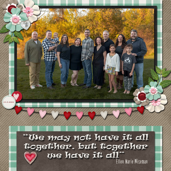
Up first is alexandergirl68. Her layout is simple, placing the focus on a casual photo of her extended family. The quote forms the entirety of her journaling. I only just noticed she’s matched the plaid shirt of the central figure in her photo with paper. How clever!
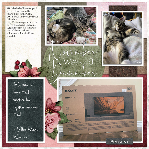
Our second layout is by pinklily. She’s diligently catching up with a Project 52 album and for the week of November 28-December 4, 2022, her chronology is so sad! She has used the quote as a sort of mental pep talk.
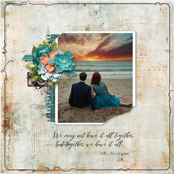
I love the ombre paper cinna has used for her background. It works beautifully with the other soft colours she chose to accompany her photo. She’s using the quote as her journaling to reflect her gratitude for the people she has in her life.

How beautiful is this layout by lm44west?! That grungy background and elegant cluster that pull colours from her photo creates something very special. Her use of the quote as a caption is quite effective.
For her layout, trinanne made the quote a theme, reflected in the photos of her family she’s used here. The grid style is ideal for this type of layout.

This layout by formbygirl transforms the quote with typography into a word art statement. The emphasis on “together” is reflected in her photos. Her colour choices meld with the photos so beautifully!

I adore the philosophical direction justpennys has taken here. That grungy background makes the cluster pop, and the quote is more of a guide than a statement.

When I look at this layout, I feel the pull of yin and yang… good and not-so-good. I think that’s what yvonne55 is conveying with her use of the quote. Most marriages/relationships have ups and downs, good and not good days, and she’s reminding us that as long as we meet our challenges together, we can do hard things.

Have these ladies given you some inspiration?
![]()