Challenge Spotlight: Use It All
![]()
Time for another Challenge Spotlight, where YOU are the stars of the show! I’ve been keeping track – in a haphazard sort of way – of which Challenges I’ve showcased so far; today I decided I’d go back over all of them and add dates to my list so I can try not to be too repetitive. Y’all. This is Challenge Spotlight #36!! Not all Challenges lend themselves to a head-to-head comparison; some have too many variables to work well in this type of post, so some repetition is a given. If you’re wondering, the last time I focused on Use It All was in October 2021… so it’s time!
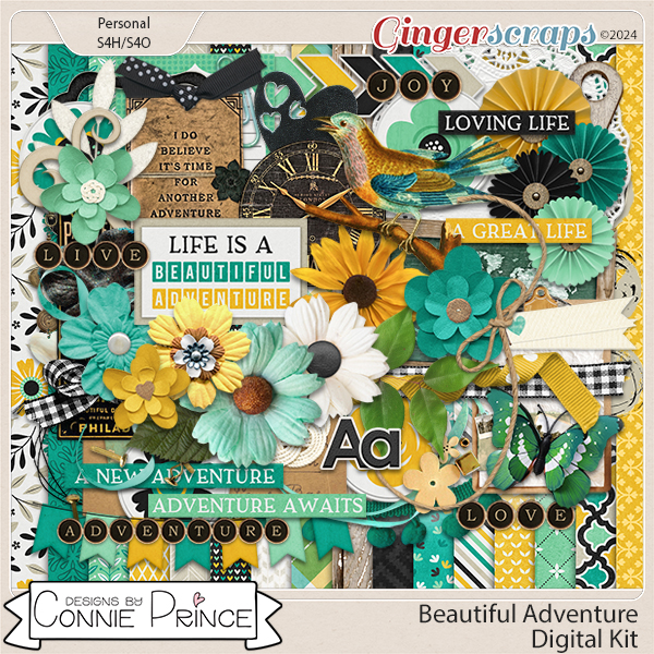
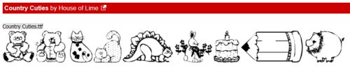
The Use It All Challenge is hosted by the very talented Karen Schulz. She provides a FREE mini-kit – part of a larger collection – and the Challenge is to USE IT ALL. That means every item in the mini MUST be on your layout somewhere. Karen also allows us to use any or all of the rest of the collection. This month’s mini looks like this:
The rest of the collection can be found HERE. Let’s take a look at some of the layouts posted to the Use It All Challenge Gallery. There were a LOT of entries there for this month, so rather than show them all here, I’ve instead chosen to go with every fourth layout, beginning with the very first layout posted. Otherwise this post would be so long, no one would want to look at it. As usual, each layout is linked to the Gallery so you can take a closer look, and leave some praise, if you’re so inclined. Just click on the Scrapper’s user name and through the magic of technology, you’ll be whisked right to it.
Our first entry is from Windswept. I can see all the bits from the mini, and a couple of additions from the collection. I like how she’s blended two of the papers.

Next is a layout from pbhill. It’s the first time she’s been part of the Spotlight! Hers is an interesting take;, she’s desaturated the colours of the papers. But I don’t see the pink flower……..

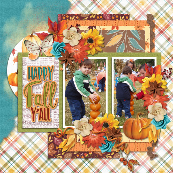
I’m not seeing any flowers on this one from jenasz. The doodles appear to be floating over the page.

Looks like makeyesup understood the assignment. All the items from the mini are there and she’s added some gesso too.

I can see dj_w has added some elements from the larger collection to her layout. The blended papers in the background are lovely. Do people just not like the journal blank, though? Seems like everybody wants to use just the border…

Macsandy has added a bunch of elements from the collection. The warm palette she chose really works well with her photos.

I see mdusell employs the KISS principle. Her layout keeps things simple, and she’s included all the required elements.

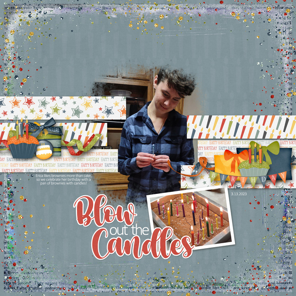
I LOVE this photo; it reminds me of my youngest two grandchildren. Her creative use of papers is another thing I like about photocrazy‘s layout.

Aha! Our first furbaby layout! I think that cat actually IS laughing, amirite, larkd? Don’t see the solid white paper anywhere though.

Celestine had added some daisies, a rub-on, and a bunch of other elements from the collection. I like the diagonal arrangement of her layout.

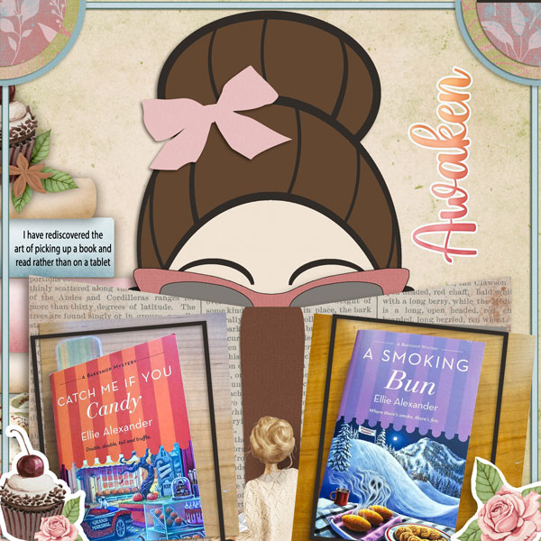
There it is! The elusive journaling block makes its first true appearance on mom2triplets04‘s layout. I’m glad to know my dogs aren’t the only ones on their best behaviour at day care!

Aw… bathtime photos are always a favourite. It looks like pepsibubbles borrowed the Beatrix Potter elements from another of Karen‘s kits.

The flowers got the royal treatment by lisar. Does anyone see the white solid paper though?

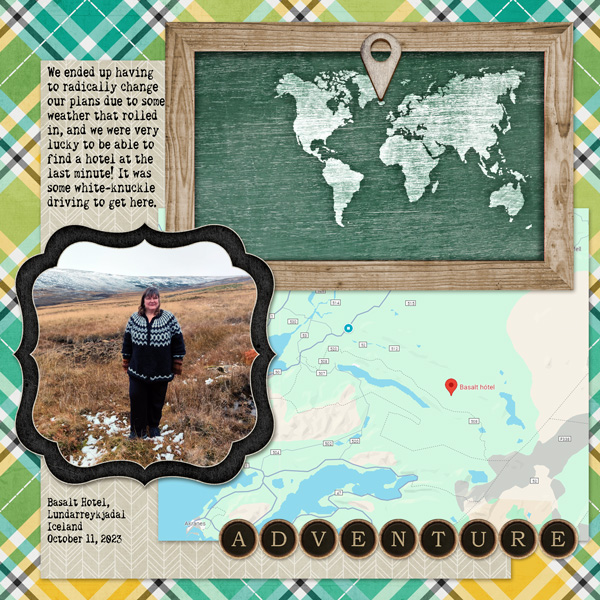
That paper fold is genius, dragonstarr! Lovely cluster, too.

I’ve been very busy here this last week and have had limited time for scrapping. Thanks for letting me look at your layouts, ladies!
![]()


