Tutorial Tuesday (Individual Style)
Challenge Spotlight: Photography

Today I’m shining the Spotlight on Cindy Ritter‘s Photography Challenge, and it’s serving two purposes. Her Challenge was to use a selfie on a layout, so now we’ll be able to put faces to user names! Cindy even obliged by posting her own selfie. Isn’t she beautiful?

As usual with the Challenge Spotlight, each layout you’ll see here will be linked to the GingerScraps Gallery for closer inspection and the leaving of praise. Simply click on the Scrapper‘s user name. [Editor’s note: whenever you see text that’s in bold, coloured text and is underlined, it’s a hyperlink. The work’s all done for you!] The layouts appear in the order they were uploaded to the Challenge Gallery.

Our first selfie is this very warmly yellow layout from pjm117 (aka Karen). Her choice of a spring-like yellow and green palette makes her selfie really pop.

This one is from zippyoh, and I love the way she’s used ombre paper and pulled the palette from her puffy vest. Lovely contrast is provided by pinks and peaches. So pretty!

Ah!! The many faces of Katherine Woodin! She has such a lovely smile, don’t you think? Going with black-and-white for all those “selfies” was a brilliant choice.

Stellar palette and paper choice, mdusellMarge! The shadows for her seagulls are perfect to give the illusion of flight.

Have you met lawyerlyn? She includes photos of herself on many of her layouts. This simple grid-style layout lets the photos tell the story.

Glee! What a morbid word strip… I think she’s aging gracefully. I like the spill of elements across the page, with her photos the focal point.

This is Alyssa, aka photocrazy. By keeping her layout clean and simple, that gorgeous sunset and those two beautiful smiles are where the eye goes first.

Who doesn’t love a grungy white space layout? It really makes the sky behind pbhill (otherwise known as Babette) pop… which leads the eye directly to her face. And the background emulates the colours of the desert.

Dorann (dorannmwin) is the one in the centre, in case you don’t know her. Those punches of orange echo the lights in the photo.

Tbear used a very similar palette here. That postage stamp frame highlights her photo and what I see first every time I look at it? Her twinkly eyes! I bet she’s a sweet, funny person everybody loves.

The next two layouts weren’t in the Challenge Gallery, but had been posted to the Forum thread. Ladies, don’t forget to post your layouts to the appropriate Challenge Gallery if you want them to count toward the Reward Collab. It’s easier for Missi to verify your participation there; she has thousands of layouts to vet every month, so let’s make her job a little easier, okay?

Sometimes I wish I hadn’t removed the SnapChat app from my phone; seeing photos like Sams Scraps‘ is one of those times. I have a bunch of photos of my son and me with these fun filters. Might have to reinstall it. Her palette works so well with those photos!

Here, princess-scraps has used some low-light New Year fireworks-related photos. Looks like it was a great party! The fragmented arrangement of her photos and papers give excitement and a tiny touch of chaos to the layout.

If I decide to take part in this Challenge, should I follow Glee‘s and Katherine‘s lead and go with a then-and-now retrospective, or should I use SnapChat photos of me with (or without my son)? Decisions, decisions!


Tutorial Tuesday (Potpourri)

Layering Patterned Papers and Loving It

Over the weekend I managed to finish a couple of Challenge layouts – hooray for instant inspiration! – and one of them received a comment I’ve heard before. Jill worte: “Lovely choice of papers, I am always impressed by those who can layer multiple patterned papers successfully.” That started me thinking about my process, how I choose and use those same patterned papers and maybe I could share some tips. This is the layout in question. So let’s talk about it.

There are NO solid papers on there and the papers haven’t been resized. (I can’t say that about many of the patterns I use, but more about that in a minute.)

1. First things first: While you’re getting comfortable with using multiple patterned papers, work with just one kit. Everything has been designed to work together. That makes colour coordination easier and gives more satisfying results. I used a new-to-me kit, ADB Designs’ Emerald Isle for my layout. Once you’ve gotten some practice, you can branch out and use more than one kit; GingerScraps’ Buffet kits all use the same palette, so that’s one way to find good matches. Differing styles of kit can make for really beautiful layouts.

2. I’ve mentioned before that I prefer a neutral background. But that doesn’t always mean solid. The background paper here is one with a very small repeating pattern in neutral colours. The way I describe it to myself is that it “reads as a solid”. Applying some paint splatters doesn’t war with or get lost in the pattern. Using a more obvious pattern for your background means you should have at least one paper selection that “reads as a solid” to layer between patterns. Tone-on-tone can be quite effective as well; the dark green paper I used almost “reads as a solid”, don’t you think?

3. Scale is important. Layering small-scale patterns with more grand ones is a strong strategy. The small-scale print gives the eye a spot to rest. I layered the small green diamond repeating print over the brown paper with gold floral pattern to break up the chaos.

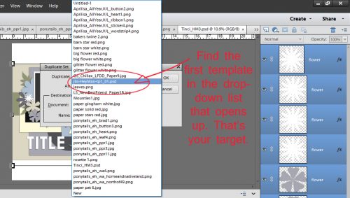
4. On the topic of scale, you don’t have to use the paper in its original size if the look is too aggressive. I will often resize the paper until I get the overall look I want. Constraints to resizing come from the specific paper layer place-holder shape if I’m using a template. Tinci Designs uses a LOT of paper layers for her templates; it’s one of the things I really like about them. (They’re a gift to creative teams – show off ALL the goodies!) I’ve also been known to shrink a paper to 1/4 its original size and create my own version of it by duplicating the paper 3 times then arranging them to fill a 12×12 square. It’s not really cheating…

5. You also don’t have to use the part of the paper that covers your place-holder shape either. Move the paper around – up, down sideways, rotated – until it looks good. Trust your eye!

6. Remember, nothing is final until YOU decide it’s final. If you look at your paper layers and think, “Ugh!”, rearrange them! Go back to the kit and get a couple more options. Turn off visibility to some or all of your other layers to see what it is you’re bothered by. If you were ever a fly on my wall, you’d get used to hearing, “Nope, don’t like that!” That’s one reason I always have the folder(s) for the kit(s) I’m using open on my toolbar until I’m positive my layout is finished.

I’ve been thinking about the wildfires in southern California a lot. The Grouse Complex fire here in 2023 followed a very similar script, and I know the terror and confusion the people affected are experiencing. It’ll be months before they can feel confident the worst is over. If you are (or know someone) affected, just know you have lots of people praying for you.

Designer Spotlight: January 2025

J. Conlon and Sons

Well, look at that! Here’s our first Designer Spotlight of 2025. Allow me to introduce to you Jennifer, the J of J. Conlon and Sons. Jennifer is a relative newcomer to GingerScraps, but she’s not new to the world of digital scrapbooking design. Let’s get to know her! [Editor’s note: to avoid confusion, Jan‘s the “O” in the following conversation.]

O: Jennifer, it’s so nice to meet you! I enjoy your templates for their simplicity but I haven’t really done a deep dive into your kits. How did you find designing?

J: In 2009, after the birth of my first son, I started exploring online for ways to create a baby book using my graphic design skills. I didn’t even know the term “digital scrapbooking” existed at the time; I was simply looking for creative ideas. I was amazed by the array of products and layouts I discovered. As I began designing my own pages, I realized how therapeutic scrapbooking could be, especially as a gratitude practice. While I wouldn’t call myself a prolific scrapper, it’s something I find myself returning to time and again.

O: So we came to the digiworld around the same time. 2010 for me, but as a beginning digiscrapper, I was reallllllllllllllly bad. As time went by and my skills grew, I seemed to just gravitate toward certain designers and found my own style – classic and elegant but with a touch of whimsy. If you could describe your style using just three words, what would you say?

J: I try to mix it up a bit sometimes but I think my overall style is realistic, colorful and fun.

O: I appreciate realistic elements when I’m scrapping. Over the years I’ve developed a workflow that keeps me organized and productive. Do you have a process you follow when you’re designing?

J: This can vary depending on my inspiration, but I tend to start with a general theme, and I’ll put together a color palette inspired by that. I like a lot of color in my kits and on my layouts so I usually have at least 15-20 colors. Then I seek out or design some paper patterns. This is where the kit name can begin to form for me as the details start to fall into place. Once the main patterned paper pack is complete, I look for flowers, leaves, ribbons, etc. that fit with the theme. For example, in my 365 Little Things kit (the January Daily Download) I knew I wanted lots of brightly colored fabric flowers. Real flowers wouldn’t have felt as light-hearted as I wanted the kit to feel.

I wrote out a long list of word art and icon ideas that I knew would be the focus of the 365 Little Things collection. I created the simple icon illustrations in Adobe Illustrator—which were so fun to make! —and the word art for all the “stickers” in the kit. My scrapping style leans toward realistic so I will make a lot of my illustrations and word art into stickers, so they feel like a physical product.

The rest of the collection (extra papers, painted edges, pocket cards, etc.) will then be based off the kit. It’s so satisfying to watch it all come together!

O: It really is, isn’t it? I created a memory book for my sister using photos she took while on her first real vacation in about 20 years and gave it to her for Christmas. It was definitely a labour of love, but also deeply satisfying. I ended up with 31 pages! I tend to do most of my “work” in the evenings while watching TV. What does a typical day look like for you?

J: I am 100% a morning person. I not only just like to wake up early but I’m also at my most focused then. I get up around 5-5:30, make my coffee, and sit at my desk for work. In the afternoon, I’m taking care of house and family stuff. I will occasionally sit back at my desk after dinner to get something finished up but more often I’m reading or playing a game on my phone. And then it’s early-to-bed!

O: I HATE getting up early, which is a bad thing when you’re a nurse and you have to be at work and ready to rock-and-roll at 7 am. Now that I’m retired, you’d think I’d get to sleep in every day, but nope… I wish! Lately I’ve been in a real rut and have to force myself to be productive instead of scrolling my phone. Where do you find inspiration when your mojo’s blocked?

J: I like to look at the GingerScraps Gallery to see what people are scrapping. Like what life events or emotions are they documenting. Because that’s really what this is all about for me—pretty patterns and embellishments aside—it’s about the stories we are telling.

O: Oh, yeah! That’s a great source of inspiration. I usually get charged up while I’m prepping the Challenge Spotlight and end up in the Zone for a day or so. Sometimes I do something completely different, like make some greeting cards, play around with my Cricut or do some gardening, and that refreshes my creative juices. If you weren’t a digiscrapping designer, what creative path do you think you’d choose?

J: I went to school for graphic design and worked as both a print and web designer for 20+ years. I also dabble in all kinds of crafts and art techniques. This past year I played around with watercolors and collage. I’m currently working on a hexagon quilt that’s all hand-sewn so it’s taking forever but I can listen to podcasts and stitch away… it’s definitely about the journey and not the destination with that project!

O: I tried quilting. Not for me! My son and I dabble with watercolours – abstracts, since he’s developmentally disabled. It can be a lot of fun. His philosophy of life is that it goes on. What it looks like is up to us. Is there a quote or mantra that guides your designing?

J: “Done is better then perfect.” A former boss of mine said this to me and it has stuck around in my head ever since. At first, I thought she meant to just get things out the door even if they have flaws and I couldn’t get behind that ideology at all. Now I take it to mean that to be done means it is correct but you may still be futzing over the radius of a curved corner or if a button should be light teal or sea green. Little tweaks like that can become a waste of time.

O: Gina Krupsky, of Gina K Designs, has a similar outlook. “It’s better than horrible” is a healthy way to look at our work. Now, I have to ask… how did you choose the name of your brand?

J: My brand name, J. Conlon and Sons, was inspired by small company names I see on local vans and trucks all the time…lol. Like a plumber will have a van with a big logo that says “O’Hare and Sons Plumbing”. I wanted it to both identify me and be a bit generic. Fortunately, I was blessed with two sons!

O: Hey, that works! Do you have any guilty pleasures?

J: I love anything CIA-international-crime-action (Bourne Identity, HomelandJack Ryan) and quirky comedies (Schitt’s Creek, New Girl). I can watch any of these over and over and often have something on while I’m working.

O: One of my daughters is a BAU-type criminologist so I’m always watching true crime shows. Literally always! I LOVED Schitt’s Creek. Canada produces the best comedians, we really do! [We also originated pineapple on pizza, and put gravy on our French fries…] My husband could eat poutine almost every day, although his doctor would not like it… if you could eat only one food for the rest of your life, what would it be?

J: I may get caught on a technicality here, but I’d choose pizza but change-up the toppings. Pizza is my favorite “naughty” food. It would be hard to eat only one thing for the rest of my life but if I could have a salad pizza or a white clam pizza every once in a while that might work!

O: You’d get along well with my son! He’s a pizza fanatic. And now I’m hungry… It was so good to chat with you, Jennifer. I’ll let you get back to work. For our readers, don’t go quite yet! I want to tell you a bit more about Jennifer‘s Spotlight. In addition to providing all of us the Daily Download kit, she’s hosting the Designer Spotlight Challenge on top of her usual monthly Template Challenge. AND… drumroll please! She has a coupon for all of us! [And it’s good for TWO months!]

Remember, any time you see a bold, coloured, underlined bit of text – it has to be all three – in any of my Blog posts, it’s a hyperlink! Click on it and it turns into a magic carpet, whisking you directly to the good stuff. Go check it out!

Tutorial Tuesday (Photoshop Elements)

Quick Trick: Styling Strokes

What a way to close out the year! Today is my husband’s and my 47th anniversary – yes, we got married on New Year’s Eve… so he wouldn’t be able to forget the date. 😉 And it’s Tuesday, so tutorial time. Today’s Quick Trick tut evolved out of a private message I received from Jennifer: “I use Photoshop Elements. I know how to add a stroke to a photo or title with a solid color from the color picker. Is there a way to use a style (like a glitter style) for the stroke outline? I can’t figure it out.” Well, of course there’s a way, it’s very quick and easy, and I think I know why she’s struggling. Let’s play!

I just whipped up a simple title using one of the alphas in Just So Scrappy‘s collection She Can. I Merged the letters in the title, and they’re on the top layer in the Layers Panel. The background layer is my working layer now.

The next step is to Select the edges of the title by CTRL/CMD>clicking on the Layer Thumbnail for the title layer. (Make sure you still have the background layer active!!)

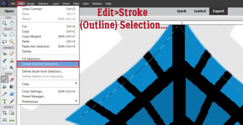
To create the Stroke, click Edit>Stroke (Outline) Selection…

The colour of Stroke here doesn’t matter because the Style will change it. I went with white, a width of 20 pixels and set the location to Outside.

The Stroke will pop up on the background layer, all by itself. So when I do something to it, nothing else is touched. I think this is where Jennifer was having trouble. If the Stroke is on the same layer as the title, the Style‘s going to hit EVERYTHING.

The following screenshots will show you some options. All the Styles I’ve used in these samples are available at GingerScraps. They’re either Just So Scrappy or Karen Schulz products. Here I’ve used a chrome Style from JSS. It’s shiny and rounded.

Remember when using glitter Styles that scale really matters here. If you use a really chunky glitter Style on a smaller object, like this title, it’s not really going to look like glitter. I’ve used the finest glitter in this JSS batch.

The best way to choose a Style from these batches is to try them on! When you find the look you like, you’ll know. This silver Style from KS has the look of wire.

JSS‘s Styles bundles usually include chipboard! There’s a coloured version and a painted, kraft-edged version.

This corrugated cardboard Style is from the same JSS Styles bundle. It gives an interesting look to the Stroke.

Now, here’s a little bonus for you. Let’s see what a TEXTURE does! Make sure you’re still on the background Stroke layer… Click Filter>Texture>Texturizer.

Don’t be intimidated by this Tool interface. Anything you do is Undoable! One thing I don’t love about this Tool is that the Preview is really hard to see (even with perfect vision, and Lord knows I don’t have that!) so I often have to CTRL/CMD>Z my way out of something ugly. Anyway, here’s where you choose what Texture you want, and how visible it is. There are four options: Brick, Burlap, Canvas and Sandstone. I went with Canvas. Scaling determines the size of the texture’s visible effect – for Canvas, think the width of each thread. Relief determines how high off the paper the Texture appears to rise. It’s almost like a Bevel effect. Play with your sliders. Don’t be afraid to experiment. Nothing is final until you’re satisfied! And Light source MUST match the light source for the rest of your layout, otherwise it’s going to look wonky.

I Zoomed in a lot so you could see the effect. Barely-there, but pretty. To my eyes, this looks a lot like satin stitch embroidery on canvas. Maybe it’s just me…

For 2025, there will be some new and exciting changes here at GingerScraps, and here on the Blog. We have some new Designers coming aboard, and each month, we’ll be offering TWO Designer Spotlights! (Designers are not expected to chat with me so I can Blog about them. 100% voluntary.) What does that mean for you? Double the Daily Downloads, for one! Plus some great coupon codes, maybe more Challenges… I guess we’ll see. Tutorial Tuesday will be changing somewhat too. There will be a Greatest Hits tutorial, a new content tutorial (as long as I can come up with something 😉 so keep the suggestions coming!) and a Challenge Spotlight each month. I’m slowly moving files onto my new laptop, and hope to have it finally set up soon. Then I’m going to strip this one down and only use it for Cricut Design Space… where the naked keys don’t matter so much. 🙂

Happy New Year to all of you!


Tutorial Tuesday (Individual Style)

Challenge Spotlight: Daily Download

The Challenge Galleries are just a-hoppin’! I thought everybody would be too busy to get much scrapping done (like me 😉 ) but I was wrong! I have a layout for the Daily Download Challenge, hosted by the lovely CarolW and featuring Twin Mom ScrapsFeel Better Soon, so I had a peep at the other layouts, and I’m going to share them with you. But first, let’s preview the DD kit. It’s bright and cheerful, with a smattering of themed elements.

The upcoming layouts are all linked to their spots in the Gallery, so if you choose to take a closer look and leave a comment, you just have to click on the Scrapper’s Forum handle. They’ll appear below in the order they appear in the Gallery, earliest first. Let’s have a look…

First up is trinanne. She has two layouts in the Gallery, so for her entries, they’ll be linked separately HERE and HERE. As you can see, she’s created a double-layout spread, recording the events surrounding her Achilles tendon injury (which is exquisitely painful). I like that she used the solid yellow paper for her backgrounds, which keeps the layouts bright. One page is dedicated to the injury and includes a number of themed elements, the other to how she filled her time while she healed.

It’s clear that people aren’t the only ones who need medical attention. Poor kitty… Alasandra added some text to the ID band and incorporated some themed elements into her cluster. I like how the banner ties the whole layout together.

Windswept‘s layout reminds me of the time my #2 daughter broke her wrist for the first time. It was also in 1992, oddly enough! I like how she’s anchored the photos with bandaids and made mirror images of the clusters.

For her layout, greenfiend27 managed a masculine look by using the plaid paper as a border and keeping the palette to blues with accents of the other colours. The placement of the fluid bag makes it look like it’s actually infusing into her subject. [Editor’s note: those thermal mugs are HORRIBLE!!]

Did your internal monologue just go, “OWIEOWIEOWIE” like mine did? No more tripping over kids’ shoes for Got2Scrap! I like the way she’s framed her photo with clusters to keep the eye moving.

Whew! An off-topic layout!! The palette of the kit coordinates perfectly with the photo kabrak1207 chose and that cluster is perfection. I love the way the rick-rack is anchoring the entire layout.

MarilynZ has used quite an assortment of papers to document her story. I think she changed the Blend Mode to give the red diamond-patterned paper a faded look. She also lightened the frame around her photo.

Here’s another non-themed layout from makeyesup, which is a desktop wallpaper. The little clusters don’t obstruct the calendar’s boxes, but do anchor it to the page. And that cutie-patootie extracted photo would put a smile on any face.


Content Warning! BriannasScrapper‘s photos are a bit gnarly. I like that she masked her large photo then added a photo strip down the side to show the reason for the large photo. The layout is clean and simple.

Here’s another nasty gash from domino44, but the way she cropped her photo blunts its impact a bit.

Is there anything that touches one’s heart more than the look on this little person’s face? The design of dhariana‘s layout makes the photo the focus, from the fade on the patterned paper into the solid to the arrangement of the embellishments. The little pops of red also lead the eye to the photo.

Route66‘s journaling reminds me of #1 daughter’s nose… broken multiple times. The record card is one of those priceless finds that only a documentor-of-life would understand.  I like the way it has been framed with all the themed elements, and the use of the word strips augments her story.

Content warning! More gnarly photos from nimble4u … but I love the ugly Christmas sweater! See how the clusters move the eye around the layout? The bits of black tie the sweater to the rest of the layout.

I think every hospital in the world has the same blue gowns. They’re more flattering than the yellow isolation gowns, but a lot more drafty. 😉 The paper choices pbhill made pick up colour from the photo for a cohesive look.

Content warning! More gnarly fingers. I think we’re pretty lucky if we depart this world with all of them still attached. Jill has built her layout around the photos. keeping the palette on the masculine side. I like the black frames on the photos, they accent them nicely.

The journaling on mom2triplets04‘s layout does a lot of heavy lifting. I’m very relieved for her family that it turned out well.

What a note to end on… my layout hasn’t been posted to the Gallery yet – Christmas time is challenging. We drove up to Kamloops on Sunday to see my mom and deliver their gifts, which turned out to be great timing. Yesterday it snowed ALL day, so I know the drive through the mountains would have been nasty, especially coming back in the dark.

Since next Tuesday is Christmas Eve and the last day before Chanukah, I’ll be giving you all the day off, so to speak. I have one more tutorial request for 2024 and we’ll close out the year with it. I wish you all the best for the holidays. Take care of each other, life is short.

Tutorial Tuesday (Potpourri)

Here’s a Hybrid Gift Card Tag

Today’s tutorial is a big departure from the usual. I’ve created a hybrid project that mashes up a gift tag and a gift card holder, using digital scrapbooking images. I used the GingerBread Ladies Magic of Winter to build the look I wanted.

My brother is a humbug kinda guy when it comes to special occasions. He always says he doesn’t want anything for Christmas, but he’s also relatively impoverished, so I usually get him a gas gift card, something he definitely needs and will use. This year, I plan to give him a gag gift with the gift card inside the tag. Let me show you how I made it.

I started by making a template using the Custom Shape Tool. I measured an old gift card to get the dimensions. The template is the actual size I’ll need.

I Clipped a paper to the template then added a snowy overlay, also Clipped to the template. Then I added some wintery embellishments, the same as I would for a layout. Note that the text (Merry Christmas with love from Jan) is upside down in the image. That’s so that when I fold the cardstock to form the pocket, it will be facing in the right direction.

Before I moved on to printing, I Saved the finished tag by clicking File>Save As>PNG then deciding which folder to stash it in so I can find it later. I gave it a name I would remember then clicked OK. Why a PNG? I want the background to remain transparent.

The dialog box default settings are the ones I typically use so that I have a clean, crisp, solid image.

After I Saved everything, I put a sheet of white 65 lb cardstock in my printer and hit Print.

I used a guillotine paper trimmer to cut away the excess cardstock to make cutting out the tag a bit easier. Scissors work equally well. Rounding the corners takes a bit of finesse though. If you have a Cricut or similar cutting machine, you could do a Print and Cut with it to save yourself some effort.

Well #%@&!***. I used a new scoring board and the stylus that came with it to score the fold lines. But the cardstock I used tore! I’ve had some scoring issues with that particular brand of cardstock before, so I shouldn’t have been surprised… [Note to self: DON’T use the stylus that came with the board, use one with a ball tip!]

Back to the printer. This time I used premium matte photo paper, which gives a somewhat sharper, brighter image. It’s a 61 lb weight, and the finer fibers in it make it very smooth. I know from previous experience it scores nicely.

You can sort of see the horizontal scored line in the photo below. I’ve folded in the flaps and reinforced the folds to make them sharp.

For this step I used narrow double-faced tape. You could use quick setting liquid glue or a glue runner if you have one. Only the two flaps will be stuck down.

I tucked the flaps in as I folded the back up to meet the front. I put a ruler across the tops of the flaps while I did the fold to keep them flat, so I wouldn’t stick them crookedly.

Here’s the back of the tag with a gift card inside. It slid in there easily and there’s a decent amount of room to spare… It could probably hold several cards.

All that was left was to add a twine loop to hang it from the gag gift package.

If you want to give it a try, you can download the template HERE.

Next Tuesday will be Challenge Spotlight Day. Which Challenge will I pick this time? Check back to find out. 🙂

Tutorial Tuesday (Fonts)

Wintery, Christmasy Fonts

I didn’t realize it’s been FOUR YEARS since I last did a winter/Christmas font post! Just what I need… more fonts while I’m trying to move all my Very Important Files to a new laptop (thank you Black Friday sale at Costco!), right? I’m going to have to make a resolution to get MainType properly set up so all my fonts are sortable. Might need y’all to hold my feet to the fire. Anyway, let’s look at some new-ish seasonal fonts and a few related dingbats, shall we? If you see something you like, click on the name, it’s linked for you, and the download is FREE….

Christmas Comeback is what’s known in the industry as a “display font”. It’s a solid font with an assortment of glyphs and ligatures – those extras that really zhuzh up your titles.

Last Christmas is a multilingual script font that would be legible enough for journaling. Now I’ just have to hope I escape Whamaggedon, having just typed out that title..

Home Christmas is another solid display font. It’s an all-caps typeface, but has an upper and lowercase set. It includes punctuation and numerals, but no fancy swashes.

Wonderful Christmas is a multilingual mash-up; it has curly-swirly uppercase characters and formal serif-style lowercase caps. It’s definitely legible, so it’s suitable for titles, subtitles and journaling.

Santa’s Air Mail has a lot of title potential. The snowy tops could be glittered, while the actual characters could be any colour, pattern or texture. It includes numerals and punctuation.

Whoa! Christmas Squad. Are you seeing what I’m seeing? The whole family in matching PJs on Christmas Eve… this title is included in the character map! The basic character set has those swashy caps, and offers multilingual options too.


Magic Christmas is an all-caps vintage display font. The character set includes both the version you see in the screenshot and a solid version. They could be layered with a shiny or glittery Style added to create a pretty fabulous title or siggie.

Magical Nordic includes BOTH of these typefaces in your download. Along with multilingual support, the snowflake is in the special character set. Since I’m currently working thrulines on my Swedish family tree, I was very drawn to this one.

Winterlight Season has such whimsy! The multilingual fairytale quality is charming, including punctuation and numerals.

Snowballs has a handwritten look to it, with snowflakes surrounding each character. Some characters have swash versions.

This one, Snowinter, started giving me ideas the second I saw it. The actual letters in white, with maybe a glossy coloured Style, and the crystally bits in matching glitter? Oh, yeah! I’m definitely going to play with it! It’s an all-caps-in-two-sizes multilingual typeset.

St Nicholas is giving me really strong A Christmas Carol or ‘Twas the Night Before Christmas vibe. It’s such an old-timey look; there are numerals and basic punctuation marks in the set.

This one, Mickey’s Merry Christmas, is my segué from font to dingbat. This all-caps set has a Mickey in a Santa hat in all the uppercase characters! Christmas at Disney World, anyone?

I’m really doomed… Last Christmas Symbols is a collection of Christmas and winter images.

If you’d rather have festive outlines, Christmas has got you.

And last, a seasonal but not festive set of mittens! Christmast Gloves could be used in so many ways.

I’ve got an idea for next week’s tutorial that might be a useful one. It’s a hybrid technique. Stay tuned!


Tutorial Tuesday (Photoshop Elements)

Quick Trick: Templates Without Drop Shadows

Templates are real time-savers (once you decide which of your hundreds of options you’ll use… speaking for myself) by literally telling you want to do. Many of them have integrated drop shadow Styles, which are super-easy to Copy and Paste onto your papers and elements, no great effort required. But some designers choose not to apply drop shadow Styles to their templates… which makes then less attractive to me, especially for repeat use. But I’ve come up with a bit of a hack for that! It only takes a few minutes and sets me up for even more options. Let’s talk about it.

For this tip to work, I’ll be using commercially-available drop shadow Styles, rather than creating a bunch of custom shadows. I can always change that up as I go along later. I’ll show you some options that are available in the GingerScraps Store:

Aimee Harrison‘s are pretty realistic. [Click on her name to be transported right to the Store!]

Scraps-N-Pieces has a simplified set.

Karen Schulz has LOTS of Styles and Actions in her bag of tricks.

Karen even has an Action that customizes your shadows for you! I haven’t tried it, but it’s been tested with Photoshop Elements 2018, 2019, 2020 using Windows, Photoshop Elements 2018 using a Mac and CC2020 in Windows so I have no doubt it would work for me. [Note to self: TRY THIS!!]

Okay, so now that’s been set up, I open my shadow-less template [Connie Prince Unwind 1]. I’m going to add shadows to ALL the layers, in batches by type. I’ll activate all the paper layers by click>CTRL/CMD>clicking on them one after the other until they’re all lit up. I start at the bottom, background layer and work my way up, but the other direction would also work.

Once I’ve got them all active, I’ll click on the Styles button at the bottom of the Layers Panel. Then using the Style Set Selector button, I’ll choose the Shadow Styles set I want to use. [Karen Schulz’] Hovering the cursor over the thumbnails, the type of shadow will appear so I can select a Paper Shadow. Then I click on it.

All the paper layers are now shadowed!

Working systematically, I’ll activate all the element types in the same way, adding the most appropriate shadow Style to each of them. For example, I’d activate all the flowers next, then use a flower shadow Style to add shadows to all of them at once. Then I could move on to leaves, flair, whatever layers remain unshadowed, until the whole template has a shadow on every layer. It really only takes a couple of minutes! Once that’s done, I’ll Save the shadowed version of the template in the same folder, with a new name [Connie Prince Unwind 1 shadowed] so I know which is which. Then I can go ahead and create my layout, knowing I can reuse the template later and the shadows will be there for me.

This may not be something you’d ever use, but now you know you have options.

Tutorial Tuesday (Individual Style)

Challenge Spotlight: Quote Challenge

I hope I’m finding all of you in good health and good spirits! I had a COVID booster yesterday and feel a bit off today – poor sleep, sore arm, shoulder and neck, headache – which I expected. (I’ve had WAY worse reactions before that put me right in bed for a day… this is nothing.) So today is a bit low-key over here. The Challenge I chose, the Quote Challenge, is one I’ve only participated in once or twice. I love using quotes as journal prompts but find I can’t force it. That may be why there are only eight layouts for examination today. I’m showing them in the order they were posted to the Challenge thread. As usual, each layout is linked to its spot in the Gallery, simply click on the Scrapper‘s username and you’ll be whisked right to it.

The quote CathyK chose for this month reads: “We may not have it all together, but together we have it all.” ― Ellen Marie Wiseman  Let’s see how it’s been interpreted.

Up first is alexandergirl68. Her layout is simple, placing the focus on a casual photo of her extended family. The quote forms the entirety of her journaling. I only just noticed she’s matched the plaid shirt of the central figure in her photo with paper. How clever!

Our second layout is by pinklily. She’s diligently catching up with a Project 52 album and for the week of November 28-December 4, 2022, her chronology is so sad! She has used the quote as a sort of mental pep talk.

I love the ombre paper cinna has used for her background. It works beautifully with the other soft colours she chose to accompany her photo. She’s using the quote as her journaling to reflect her gratitude for the people she has in her life.

How beautiful is this layout by lm44west?! That grungy background and elegant cluster that pull colours from her photo creates something very special. Her use of the quote as a caption is quite effective.

For her layout, trinanne made the quote a theme, reflected in the photos of her family she’s used here. The grid style is ideal for this type of layout.

This layout by formbygirl transforms the quote with typography into a word art statement. The emphasis on “together” is reflected in her photos. Her colour choices meld with the photos so beautifully!

I adore the philosophical direction justpennys has taken here. That grungy background makes the cluster pop, and the quote is more of a guide than a statement.

When I look at this layout, I feel the pull of yin and yang… good and not-so-good. I think that’s what yvonne55 is conveying with her use of the quote. Most marriages/relationships have ups and downs, good and not good days, and she’s reminding us that as long as we meet our challenges together, we can do hard things.

Have these ladies given you some inspiration?


Tutorial Tuesday (Photoshop Elements)

Rerun: Raindrops with Photoshop (Elements)

PDF Version : https://bit.ly/3YTcqgI

I’ve had a lot going on the last couple of weeks, with more yet to come, and I’m mentally exhausted. But rather than making excuses I thought I’d crank up the WayBack Machine and revisit a fun technique from 6 years ago… digital raindrops! (They look a lot like the ones that blasted my windows today.)

I started with a 12×12 blank, transparent canvas. Then I chose the Elliptical Marquee tool to make my droplets.

Water droplets are spherical when they’re suspended in space and have a domed appearance when they’re on a surface. So I set the Tool Options to Fixed Ratio 1:1 to give me a perfect circle. I clicked-and-dragged out my first droplet and filled it with white using the Paint Bucket.

You can click-and-drag out a random (odd) number of drops of varying sizes using that method, or you can just copy that first one then resize them to suit.

I made 5 round drops to start with. Then, because the photo I used in my layout looked stormy, I thought I’d add some falling drops too. The Custom Shape tool has a raindrop in the default shapes, so it was pretty simple to click-and-drag out a raindrop using white again.

I want to be able to resize and alter the shape a little bit, but there’s a raindrop!

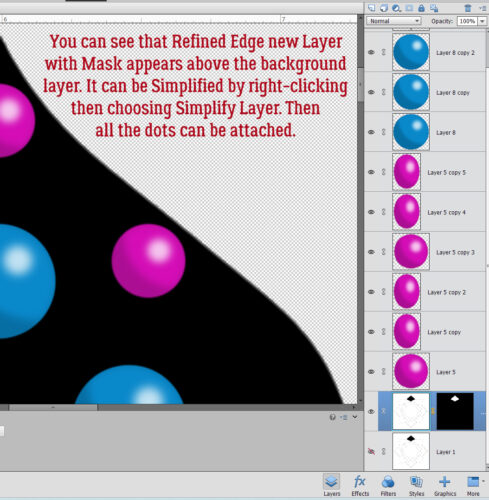
To be able to make changes to the image, I Simplified the layer.

Then I could change the angle on the drop to match the direction the rain would be falling from in the photo. I copied (CTRL/CMD>J)the layer a few times and resized them randomly.

After I had a good (odd) number of droplets, I Merged all the layers together. (CTRL/CMD>E) That way I could apply my next few steps to all of them in one click.

We’ve talked about Styles before in several other tutorials. What they are is a group of adjustments that make the layer take on a different look. Way down at the bottom of the list of Styles in PSE’s defaults is one called Wow Plastic. That’s the one I used. The menu looks like this.

One click on that Wow Plastic Aqua Blue turned them all into this.

I felt the blue was too blue, so I double-clicked on the fx icon on the layer in the Layers panel to get into the adjustment menu. I changed the blue on the shadow layer to one much lighter, and I turned off the Outer Glow setting because it made the drops look like they had a wire ring around them. The Bevel went to the max setting to make them look more spherical.

I also made sure the light source was coming from the same direction so there’s no visual conflict.

Below are my final adjustment settings.

As I’ve mentioned before, I have a variety of purchased Styles in my stash – including a water set, but I wanted to make sure everybody could accomplish the look without having to buy anything else.

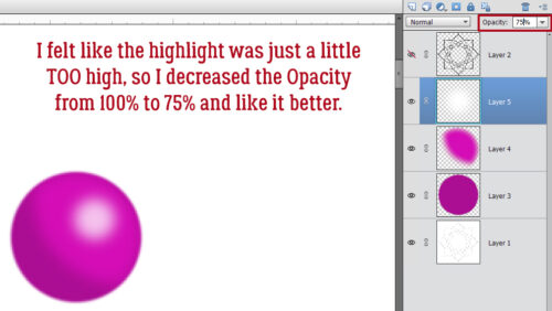
But OH they’re blue!! So I dropped the Opacity to 75%.

Then it was time to see how they all looked on my layout. So I dropped them onto it and moved it into place.

They still looked too blue and obvious so I dropped the Opacity again to 75% and liked it better.

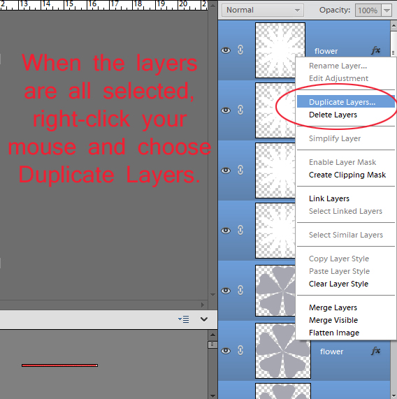
But alas, they’re not very WET. I didn’t want to mess up what I’d already done, so I Duplicated (CTRL/CMD>J)the layer to give me a throw-away if what I wanted to try didn’t work.

Because the two layers are only 75% Opacity, I can see the underlying layer through the top one. That’s helpful; I went into Enhance>Adjust Color>Adjust Hue/Saturation (CTRL/CMD>U) and played with that.

I took the Saturation down to 0 and increased the Lightness to +20. Now it’s got a stormy gray look to the top layer.

Now it’s looking more like a water droplet on the leaf, but not so much on the photo. Hmm.

There has to be a way…

Back I went to the Styles>Wow Plastic menu and this time I chose the Clear style. I’m still on that copy layer on top of my original droplet layer.

A few tweaks of the Style in the fx menu and NOW I’m happy!! For this adjustment I turned off the INNER Glow. You could follow all of these steps on your blank canvas before moving it to your layout now that I’ve done all the experimentation for you. 😉

You can see my entire layout in the Gallery. For the layout I used Ooh La La Scraps‘ Falling Slowly collection (sans Styles) and a photo I found on Pixabay.

Next week is Challenge Spotlight Tuesday. Maybe I’ll have time to actually participate in a Challenge before then. 😉