Autumn and Creepy Season Fonts
![]()
PDF Version : https://bit.ly/48Ay6lP
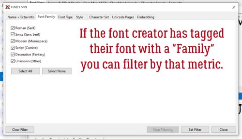
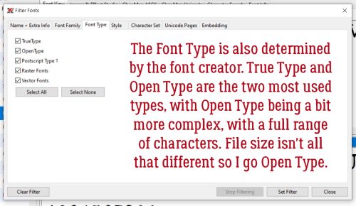
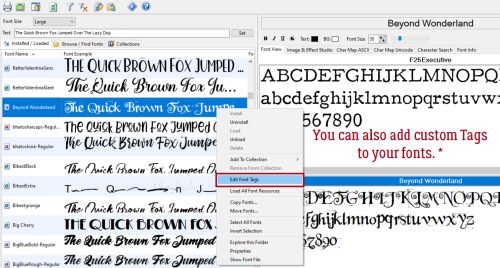
Have you chosen the font(s) for your October Signature Challenge siggy or Inspiration Challenge? Have I got some options for you! Now, Heather‘s instructions for the Signature call for a “beautiful font”, while Joy just wants 2 different fonts in the title. Since beauty is in the eye of the beholder, I think you’d be quite safe using a creepy/spooky font for the siggy, and anything goes for the other. I took a quick wander through the dafont.com collection of FREE fonts and found some I didn’t have but must… and I’m going to share them with you. Each font/dingbat’s name is linked to the site so you can quickly and easily download the ones you love.
I didn’t find any fonts that really proclaimed *AUTUMN*, but there are some lovely dingbats (little drawings). This one is called LCR Autumn Harvest Dings. The scarecrow sold me on it!

KR Fabulous Fall has some lovely leaves.

Next up is WM Leaves 1, which is literally all leaves, complete with the Canadian stylized maple leaf from our flag.

Autumn Days Clipart has a selection of solid symbols. Just look at that cute little fox.

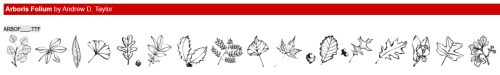
I love the line drawings in Arboris Folium. They can be used like stamps or brushes and are filled with potential.
While we’re doing dingbats, let’s carry on into the Hallowe’en sets I found. Freaky Halloween has some classic images, like those creepy jack-o-lanterns.

I LOVE the frame in Alit Halloween. And the spiderweb, and the crow, and the haunted house… well ALL of them.

Look at the creepy witches’ hats here in Halloween Dreams Doodles!

This set, simply named Halloween, has more, very detailed line drawings.

Ooh, Vintage Halloween is really creepy.

Now on to some actual fonts. I’ve never seen this one before. Gnarly Skeleton has both an outlined alphabet and a bold version. That skull is in the glyphs section, along with an assortment of symbols and accented letters. No numbers though.

Halloween Guises is a bubble font with more of a cute look to it. There are numerals and a bunch of glyphs too.

Spoky Spider (not a typo) is both cute and creepy.

Halloween Party 3 has elements of both font and dingbat. There are numerals and glyphs galore here.

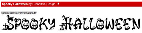
I feel like Spooky Halloween is my favourite of all today. It has upper and lower case alphabets and numerals but no glyphs.
Nightside is a bold, Gothic font that made me think of Tim Burton’s Nightmare Before Christmas. It’s a demo font, meaning only upper case alphabet, no numerals or glyphs.

Then I found Nightmare 5… which also made me think of Tim Burton, or maybe the Addams Family. It has no numerals or clyphs; to achieve the look in the sample, use alternating upper and lower case letters.

And THEN… I found Burton’s Nightmare! It’s not really scary or creepy, but definitely has a vibe. There are numerals, some accented letters and some punctuation.

Okay, so maybe Single Ghost is my actual favourite! It’s got it all, wrapped up in a very elegant package.

Last, I have Dracolas for you. It’s Goth, it’s vintage and elegant. It’s a bold, all-caps font with the lower case characters smaller and less fancy. And there are glyphs!

Did you see anything you like? Did you find Inspiration for Joy‘s Challenge? I think I might pair Nightmare with Single Ghost. I’ll have to go back and make sure I’ve downloaded all the ones I love.
![]()

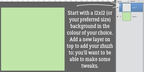


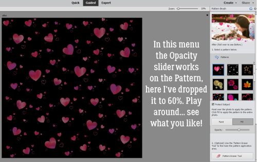


 In Expert mode, you can see the new layers Elements has added to the paper. The top and bottom layers are the only ones that matter. You can activate that pattern layer at the top and add a Layer>New Fill Layer>Solid>Clip to change colour, or you can play with the Blend Mode for that layer to see what works best for you.
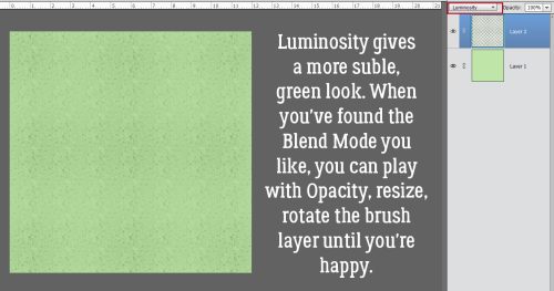
 Here’s a close-up of the pattern so you’ll easily see the Blend Mode change.