Method Scrapping – What’s My Motivation?
![]()
Actually, I think I should call this tutorial “WHERE is my Motivation??” I’ve really been struggling lately trying to find some inspiration and some enthusiasm for scrapping. Between our move, all the things that moving entails, my dad’s failing health and all the other minutiae of life, it feels like my mojo just got left behind. So I started to think of all the different methods of resurrecting it and thought maybe I should put them all down in a blog post as a way of solidifying them for myself while possibly helping someone else who’s in the doldrums too.
I think the easiest and most obvious mojo-recharger is to do a GingerScraps Challenge or two. What makes them a good jumpstart? Well, they take a lot of the work out of the process. The challenge gives a framework for the layout, whether it’s a beautiful brush, inspiring word art, a terrific (free) template, a beautiful layout to scraplift or cutting out all the hardest part by providing a recipe. But the best part of this is that you’re not limited to only this month’s Challenges! The Challenge forum has 5 months’ worth of them to look at and find inspiration from.
Another way to stir your creative juices is to look at what other people are doing. Pinterest, Instagram and our GingerScraps Gallery are filled with incredible layouts to draw sparks from. A way to refine that even further is to narrow your browsing to a favourite Designer Gallery. There’s where you can see their designs in action and find innovative ways of using them.
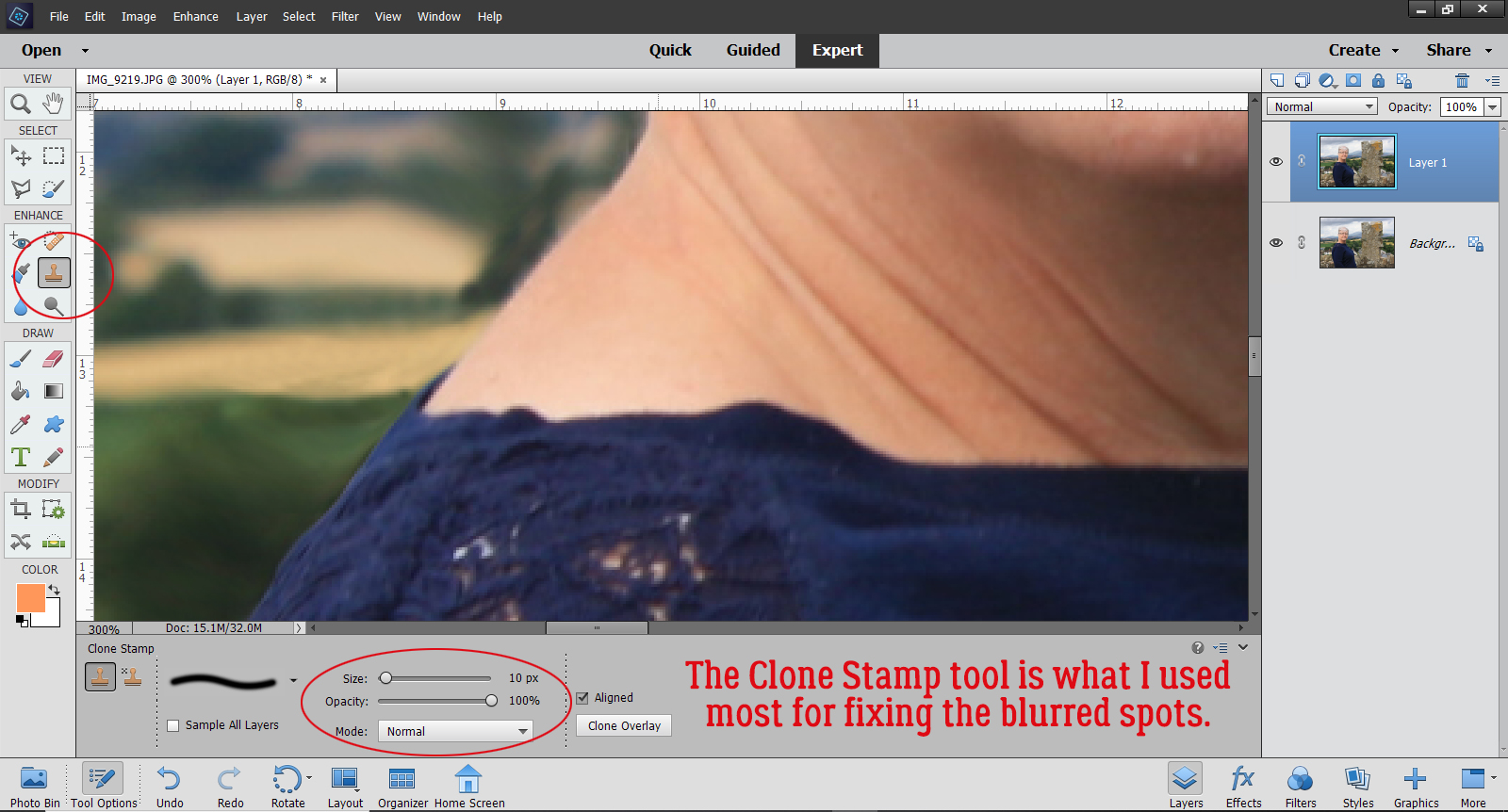
That brings me to a motivator that might seem more like a cattle prod… organizing your supplies. Sometimes I get caught up in the acquisition part of it all, adding more and more beautiful kits to my stash without any clear plan for how I’ll use them. And, of course, I forget what I have and go buy more! I had a HUGE downloads folder filled with still-zipped files sitting on my laptop and every time I opened the folder, I had an anxiety attack. So the other day, I took the first step and ran them all through ExtractNow. I have only a handful of really new files that I picked up over the weekend that need extraction; the next step will be to sort through the files and condense them into kit-specific folders. Then I’ll have refreshed my brain and might find my way back to productivity.
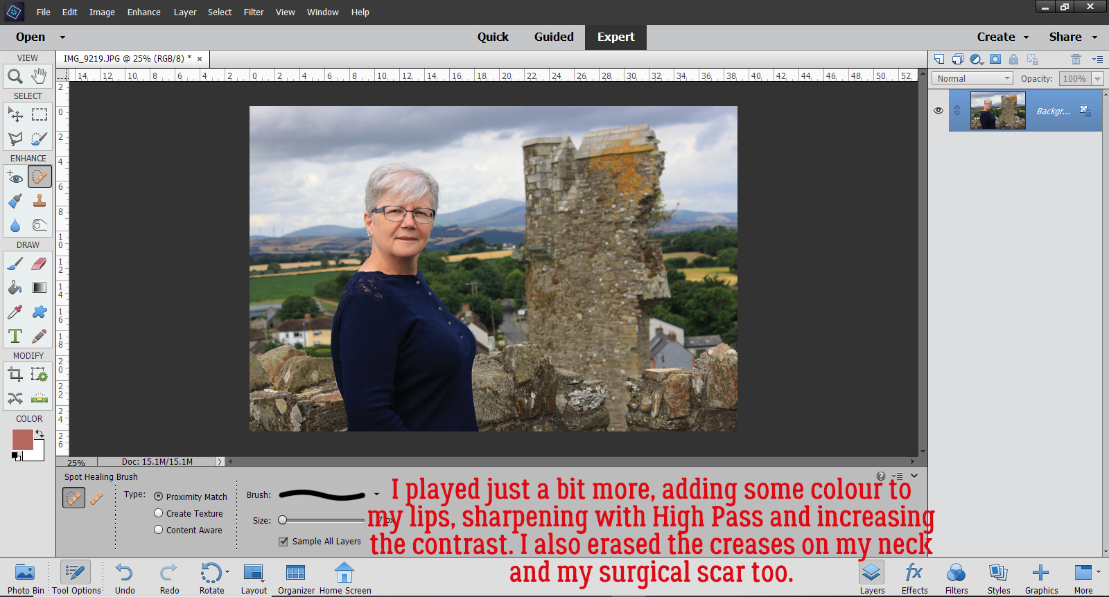
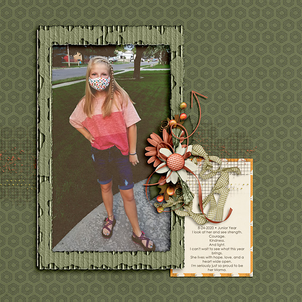
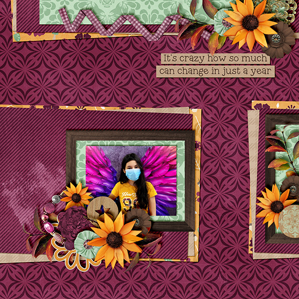
A much more fun way to get back in the saddle is to look at all the recent photos on your phone or computer. We take photos so we can remember a special person, event, place or object. Recapturing the moment by looking at the photos can be very stimulating. Over the weekend (Thanksgiving in Canada) I went on a mini wine-tasting tour with my daughter, her husband and sister-in-law. It was so much fun, and so educational. And naturally it spawned a LOT of photos. I know I can scrap them into more than one layout, and right there, I have some motivating ideas. (I also have quite a number of photos of my grandchildren that are crying out for some spotlighting!)
Trying a new technique is another way to stir up some interest. Working through one of my tutorials or watching a YouTube video by someone whose work you admire can be very invigorating. Our own Karen Schulz (formerly Snickerdoodle) has a YouTube channel filled with great ideas. Why not watch one or two of hers?
Project Life offers a good compromise between free-wheeling and quick ages. Katherine Woodin is a prolific Project Life scrapper. If you’re unfamiliar with the concept, Project Life is a method of celebrating the everyday activities that we often overlook as food for creativity. And it’s very flexible. You can choose to do a layout a day, keeping track of what happens and how it affects you each day as a form of daily diary. You can do a weekly layout (P52) with just the highlights of the week, or a monthly one (P12). You can use pocket-style pages, or free-form it.
Focusing on a single event or family member (a wedding, a birthday, a new job, a new house, a pet… you get the idea) can be another way to get going again. This one is a bit more of an exercise in self-discipline; making a decision to scrap a layout about fill-in-the-blank and just doing it may break the drought. I think this is where I’ll start. I haven’t changed my Signature in the Forum since MARCH!! And my Facebook header is one I created in July 2019. (It hasn’t been on display all this time, I swear! But it’s due for a refresh.)
Before I post this, I think I should remind all of us that turning a hobby into a chore isn’t a good thing. If you’re in a scrapping funk, especially one that has endured for awhile, it can be extremely daunting to think about picking up the tools and getting back to work. If you’re really not feeling it, don’t push it! Do something else that feeds your soul. It’ll be okay!
What are your methods of breaking a slump?
![]()