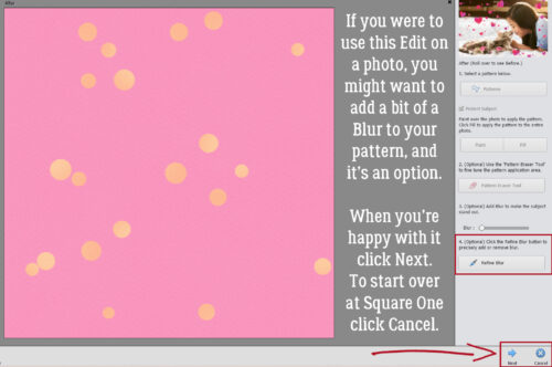
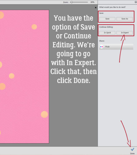
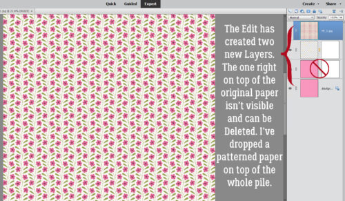
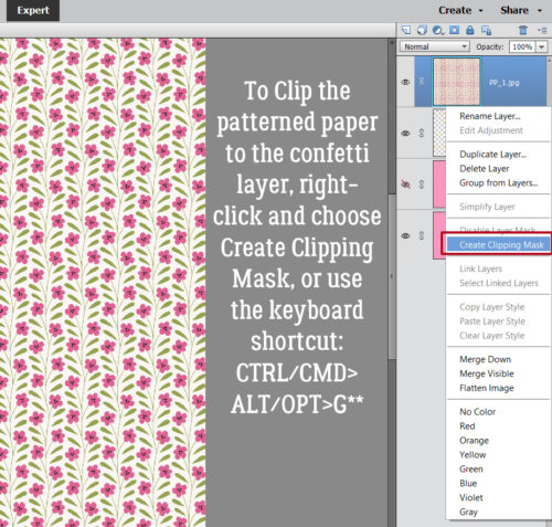
Aimee Harrison

This month we again have TWO Designers in the Spotlight. Many of you already know Aimee, or have used her amazing designs, and she’s been in the Spotlight before, so our little chat took a bit of a meandering path. How so? You’ll see!
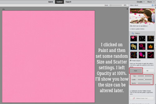
J: Aimee! It’s good to chat with you again. I apologize in advance if you hear my son cacking in the background. Things are still not back to normal here and he’s spending all his time with Mom. I’ve got a movie on for him and he’s nothing if not easily amused. Last time we visited, we talked about all the meat-and-potatoes stuff related to your designing, so this time, let’s do something a bit more informal. You okay with that? Oh wait… there are a couple of design-related things I wanted to ask about… Do you have a favourite theme or occasion that you always turn to when you’re designing?
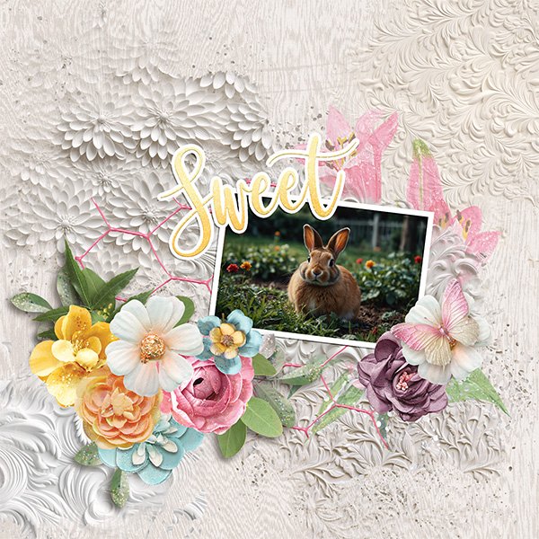
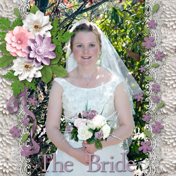
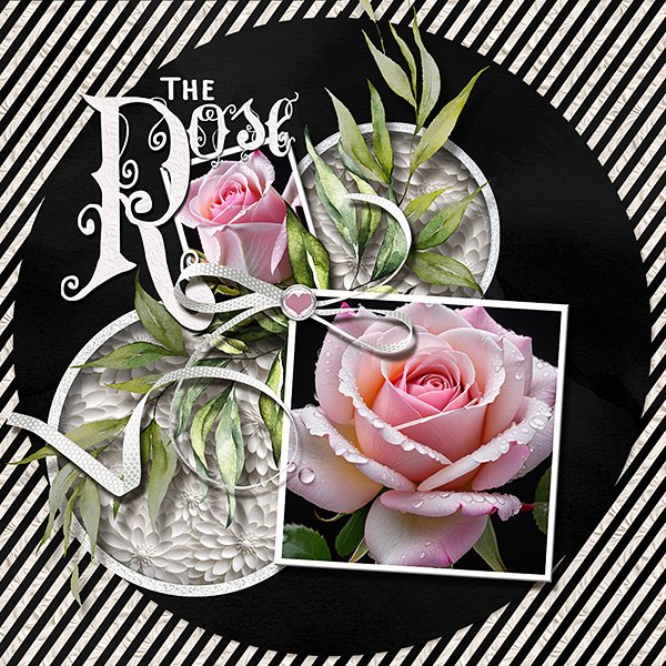
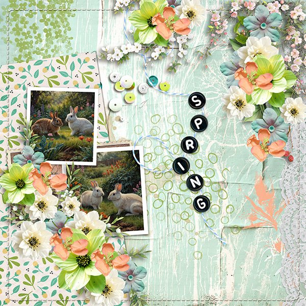
A: I love to design flower types, I never run out.
J: Your flowers are always so gorgeous! You’ve clearly had lots of practice creating them. Do you have a favourite season or holiday that you MUST design for?
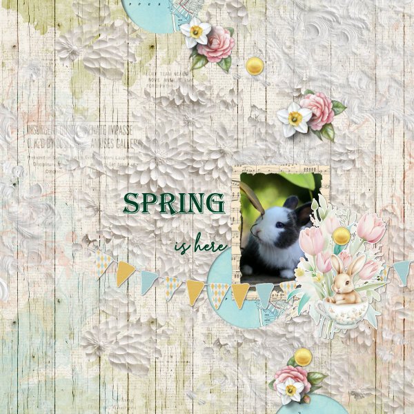
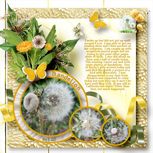
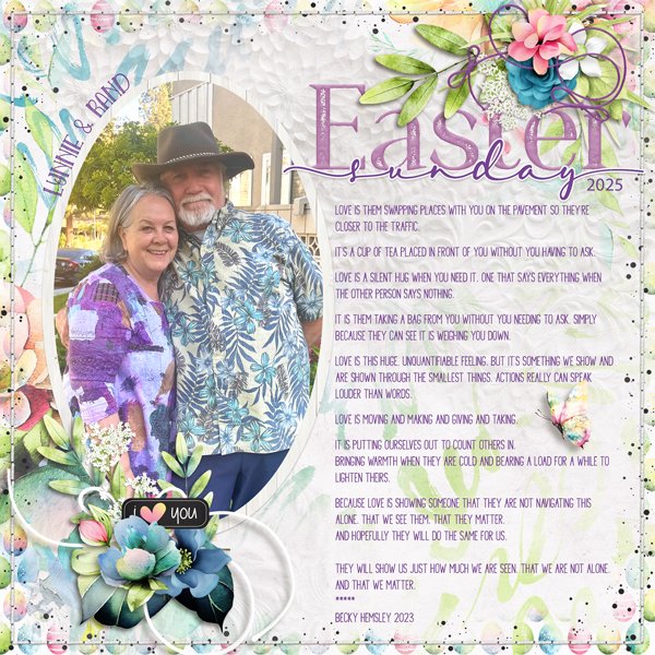
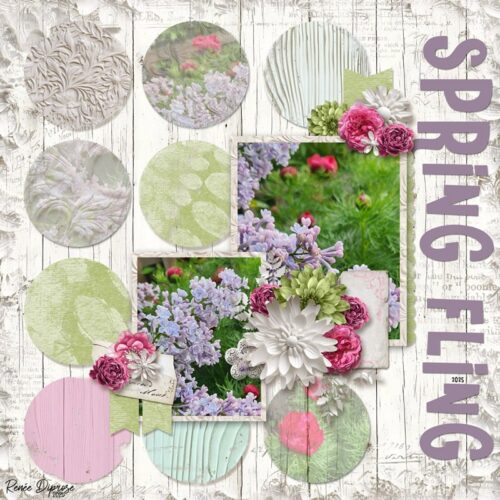
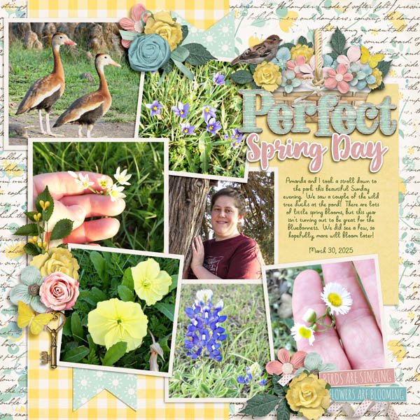
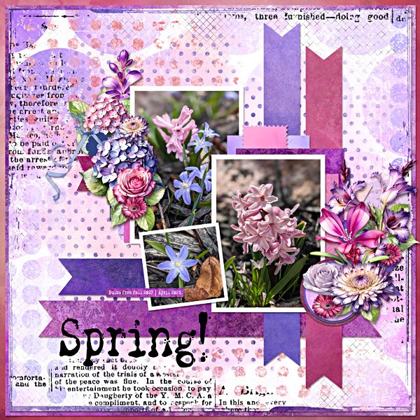
A: Spring because I love the colors and new growth.
J: I love all the seasons for different reasons, but spring is special, isn’t it? There’s so many ways you can portray spring and spring-like subjects, and still have it be relevant and coherent. You mentioned flowers and colour… do you have any design routines or rituals you follow when you start designing a new collection?
A: I am very methodical in my designing. I design the packs first in a certain order, then I design the kit and each portion is designed in order as well. Makes sure I have a well rounded kit and collection.
J: It makes sense to have a formula of sorts, to make sure you don’t forget an important aspect of the collection. Do you think you have a signature element or technique that makes people know instantly that YOU designed something?
A: I think it’s my titles both in the kit and as a standalone pack. Also probably my Alphas.
J: I know your titles are a great feature, especially for the new-to-digi Scrapper who might not be ready to design their own. And I LOVE a nice, matching Alpha!! The literal alpha, although there are some very fine Alpha men out there. 😉 Especially in those superhero movies I’ve been watching with Adam. If you could live in any fictional universe, which one would you choose?
A: Harry Potter, I would love how convenient magic is.
J: As long as you could control it completely, it sure would be convenient. Do you have a TV or movie guilty pleasure?
A: I do. It’s Outlander.
J: Mmmmhmmmm. Speaking of Alpha males! Although Brianna holds her own. Strong genes. She and Clare have had to adapt to such huge shifts in technology but they make it look easy. If you could instantly learn a new skill, what would you want it to be?
A: How to paint. I would love to be able to do watercolors especially.
J: Watercolour painting is fascinating. The way the colour moves with the water on the paper, and how it can be turned into something beautiful with just a few strokes… I could watch watercolour videos all day! Oh, and alcohol inks, They’re really interesting too. Lately I’ve been watching some how-to videos on my tablet while I get myself into the bedtime zone. I find I can turn off all the intrusive thoughts by concentrating on the processes. How do you unwind?
A: I like to read.
J: That would be my idea of a perfect day, to stay in bed and read.
A: I would live in pajamas if I could. For sure!
J: One thing I can’t do near bedtime though is listen to music. I find myself singing the lyrics in my head, over and over and sleep goes out the window. The other night I sang the entire eight minutes and forty-two seconds of American Pie. In my head. I think that would be my go-to if I ever did another karaoke night. Do you have one of those?
A: Jolene, by Dolly Parton, I believe. I don’t sing karaoke very often because I’m terrible lol.
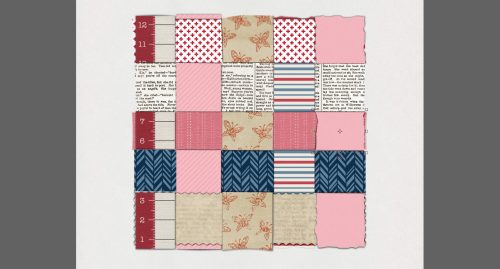
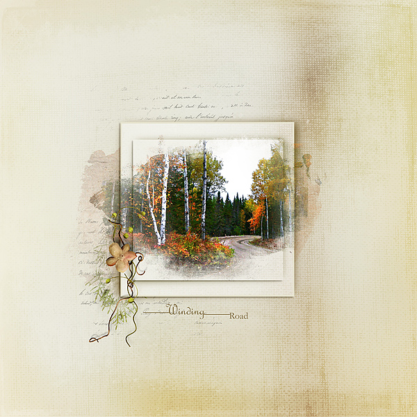
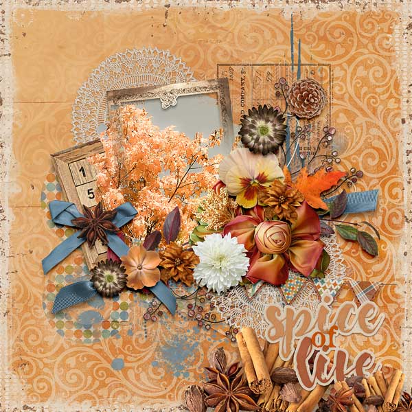
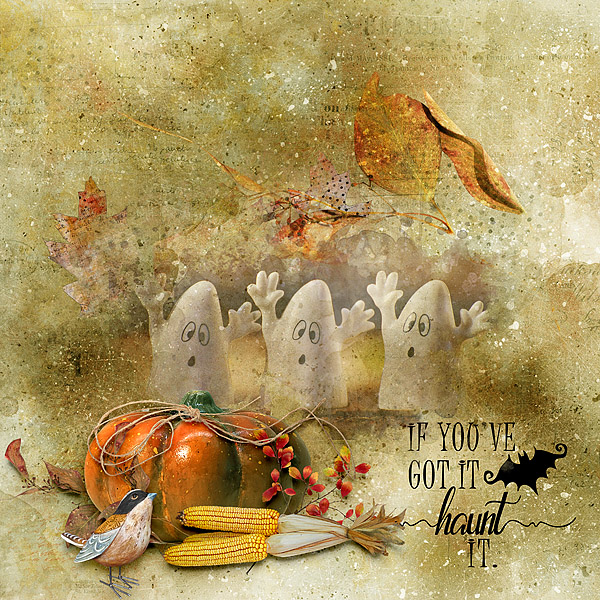
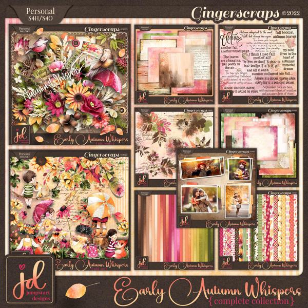
J: I didn’t say I was good, just that I know all the lyrics. 😀 Karaoke is Adam’s favourite part of his day program. He makes up for his lack of talent with great enthusiasm. Speaking of Adam, I think his movie is over. I should check on him, I suppose. But before we end this little conversation, I want to remind our readers that Aimee will be hosting one arm of the June Designer Spotlight Challenge in addition to her regular, long-running Color Challenge. And she’s also giving us a stunning Daily Download! Don’t forget to check out her June Buffet collection Jardinière.
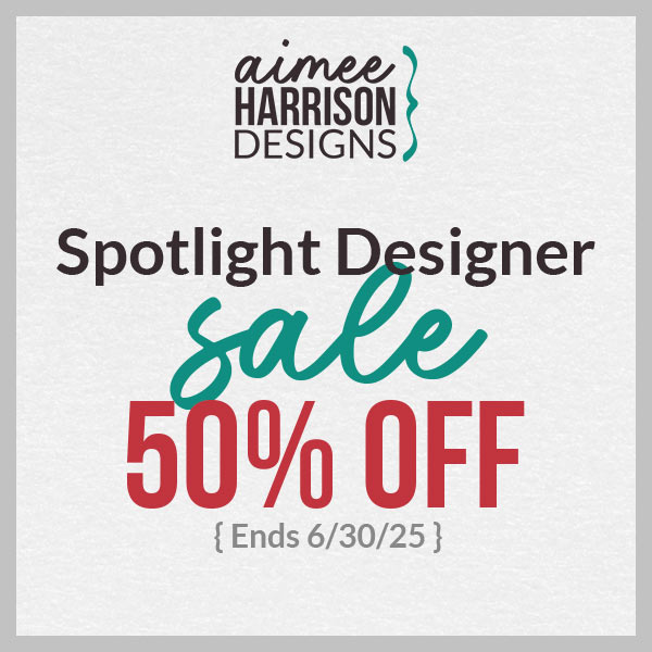 Aimee has a coupon!
Check back on the 4th for Part Two of this month’s Designer Spotlight, Twin Mom Scraps!
![]()