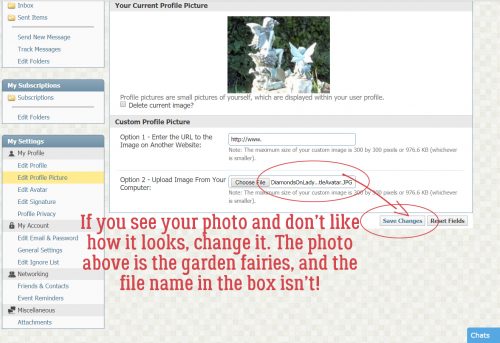
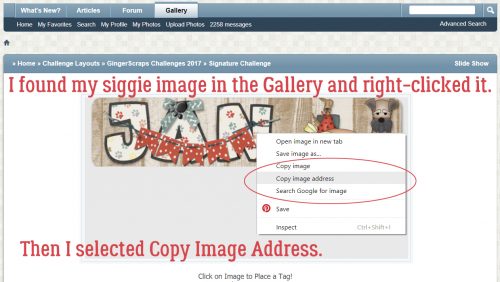
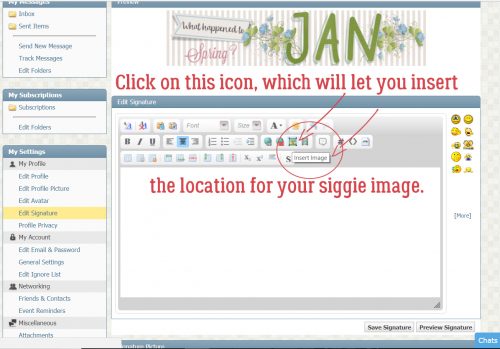
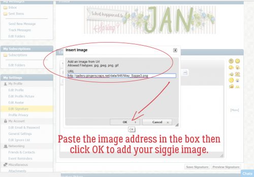
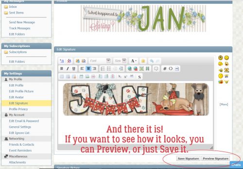
Greatest Hits: Faking it – Those Incredible Full Moon Photos…
![]()
How’s everybody doing on this first Tuesday of Daylight Savings Time? I’m not gonna lie, I’m riding the struggle bus right now. Between inadequate sleep, the gray, chilly weather and all the political nonsense going on, I’m exhausted. Oh, and I finally was forced to switch laptops, which ate up a ton of time and I still haven’t found all the 2500 fonts I have on my old one. Maybe that’s a good thing… remains to be seen. Anyway, we have an astronomical event this week, a lunar eclipse of a full moon – a Blood Moon. Thursday’s eclipse will replicate a sight not seen since 1504! It’s going to be visible across North America from 11:57 pm EDT on Wednesday until 6 am EDT on Thursday, with totality – the best part! – between 2:26 am EDT and 3:31 am EDT. Since I’m in the Pacific time zone, if the sky is clear I won’t even need to stay up late to see the beginning. So what has this to do with a tutorial? Well, let’s have a look!
Have you ever looked at those totally amazing full moon photos where it looks like the moon is rising out of the ocean, or it’s rising behind a silhouetted city skyline and it’s huge and bright? And have you ever wondered how the photographer was able to capture that image? I know how they do it, and after this tutorial you will too. Because it’s all faked!
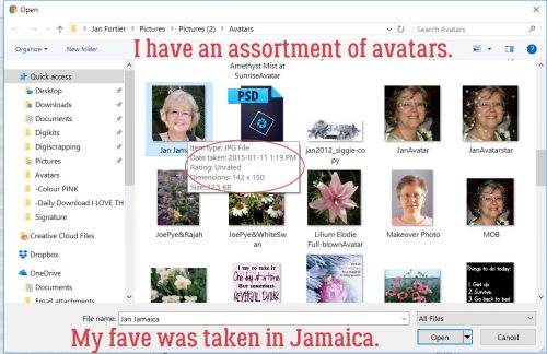
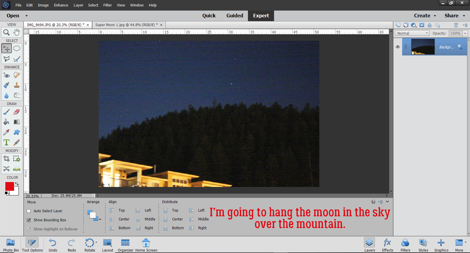
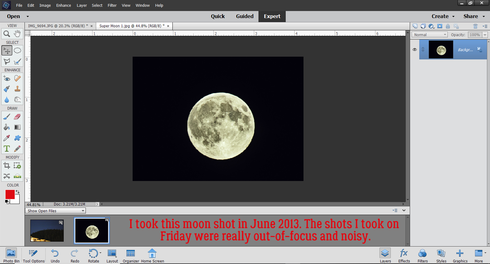
I have a crystal-clear photo I took of the June 2013 Super Moon and that’s what I’m going to use to show you how I can make it look like the moon was over the mountain when it was quite far away in reality. This photo of the mountain that our subdivision snugs up to has been edited a bit to make the sky a bit brighter and the details a bit sharper. If I’m lucky enough to get Blood Moon photos, I’ll give this another shot.
I wasn’t planning to take photos of last weekend’s full moon so I didn’t prepare for it. But then I took the dog out for a potty break and saw it hanging so brightly in the sky with Mars at its shoulder. So I grabbed my pretty decent DSLR, my telephoto lens and my very sturdy tripod and set up on the driveway. Rushing never makes for good results though and every one of the 70 photos I took was out-of-focus. The shots I took of the mountain were better, but pretty grainy. Thankfully I have a crystal-clear photo I took of the June 2013 Super Moon and that’s what I’m going to use to show you how I can make it look like the moon was over the mountain when it was quite far away in reality. This photo of the mountain that our subdivision snugs up to has been edited a bit to make the sky a bit brighter and the details a bit sharper.
Here’s my 2013 moon shot. I used a long shutter, a tiny aperture and manual focus to get it this bright and clear.
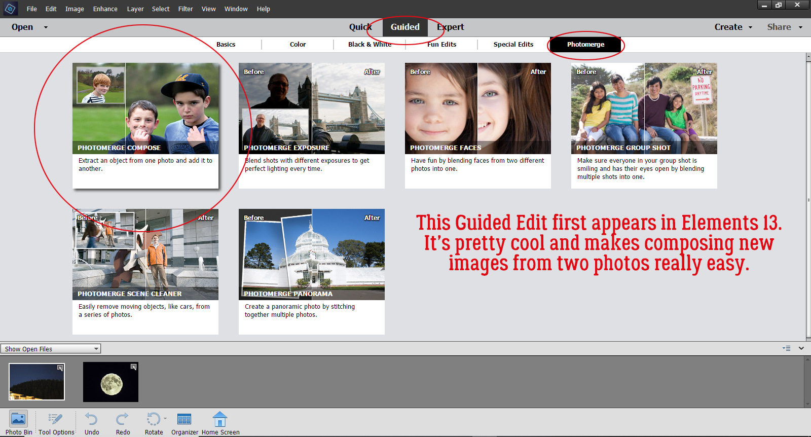
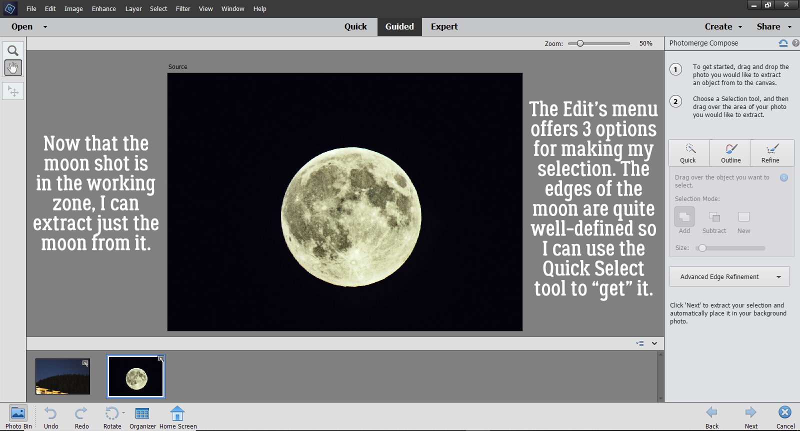
To hang the moon over the mountain, I’m going to use a Guided Edit that first appeared in Elements 13. Guided>Photomerge>Photomerge Compose.
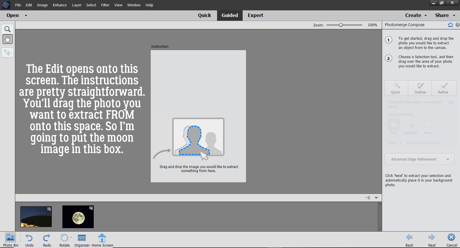
Once you’ve activated the Edit, this screen opens. The instructions are fairly clear, even for the uninitiated. It says to drag the photo I want to extract FROM onto the space, so the Moon is going here.
Okay, there it is. All I want from the photo is the Moon, which has a nice, clear, sharp edge, so selecting it from my photo will be easy. I can use the Quick Selection tool for this step. If my desired extraction had more detail, I could choose one of the other options. AND… there are further adjustments that can be made in later steps.
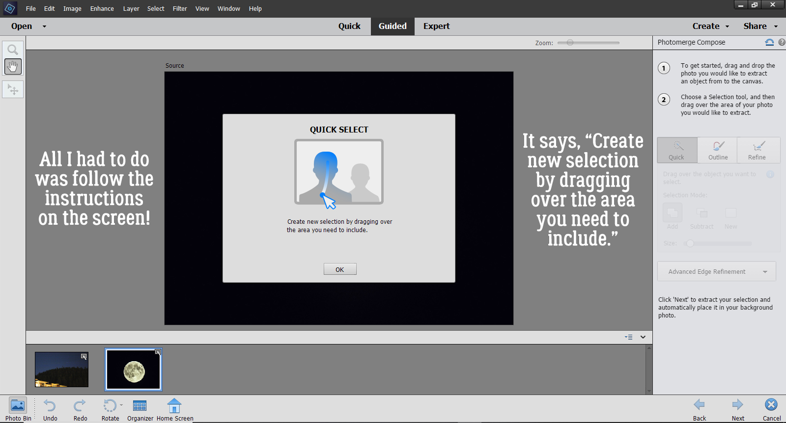
Once I clicked on the Quick button, this tool tip opened to Guide me through the next part. It says, “Create new selection by dragging over the area you need to include.”
It’s hard to see the marching ants in the screenshot but they are there. There’s even a little jaggy part that I’m going to adjust by switching from Add to Subtract and scrape it off.
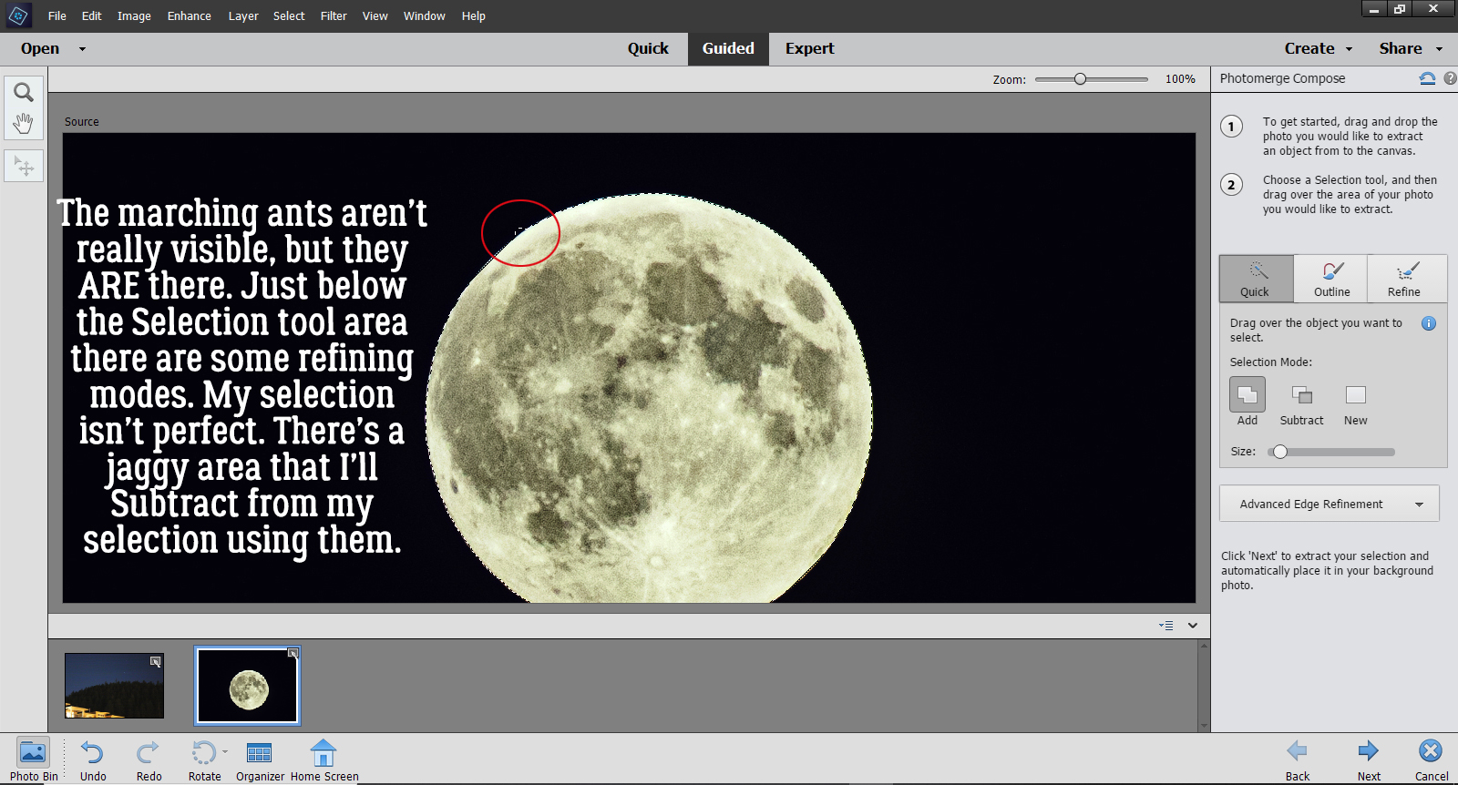
Done! As I mentioned, there are more refinements you can make to extract your desired image using the Advanced Edge Refinement menu. It’s found just below the red circle.
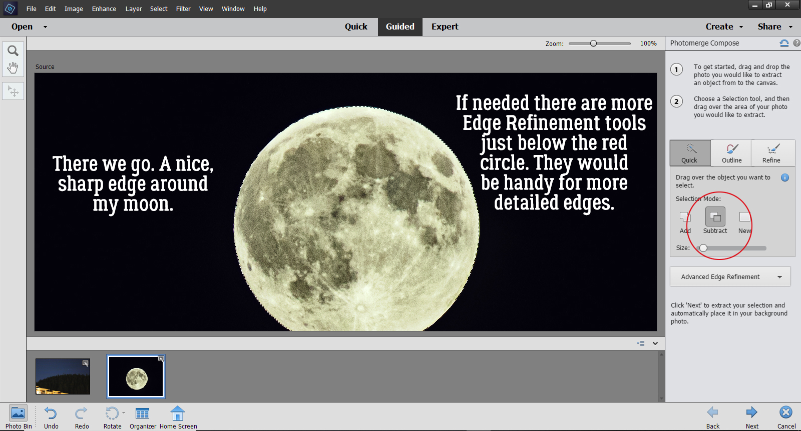
But since I just basically have a circle, I can move on to the next step by clicking the Next arrow at the bottom of the screen. Elements always drops things right in the middle of the canvas, so it’s great that I can move my moon off the mountain and into the sky.
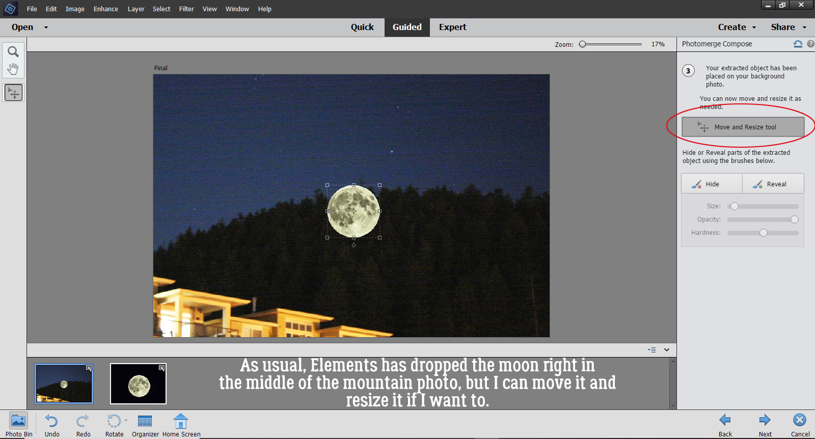
I decided to make it a bit bigger too, for dramatic effect. But I didn’t go too much bigger because I don’t want it to look completely phony.
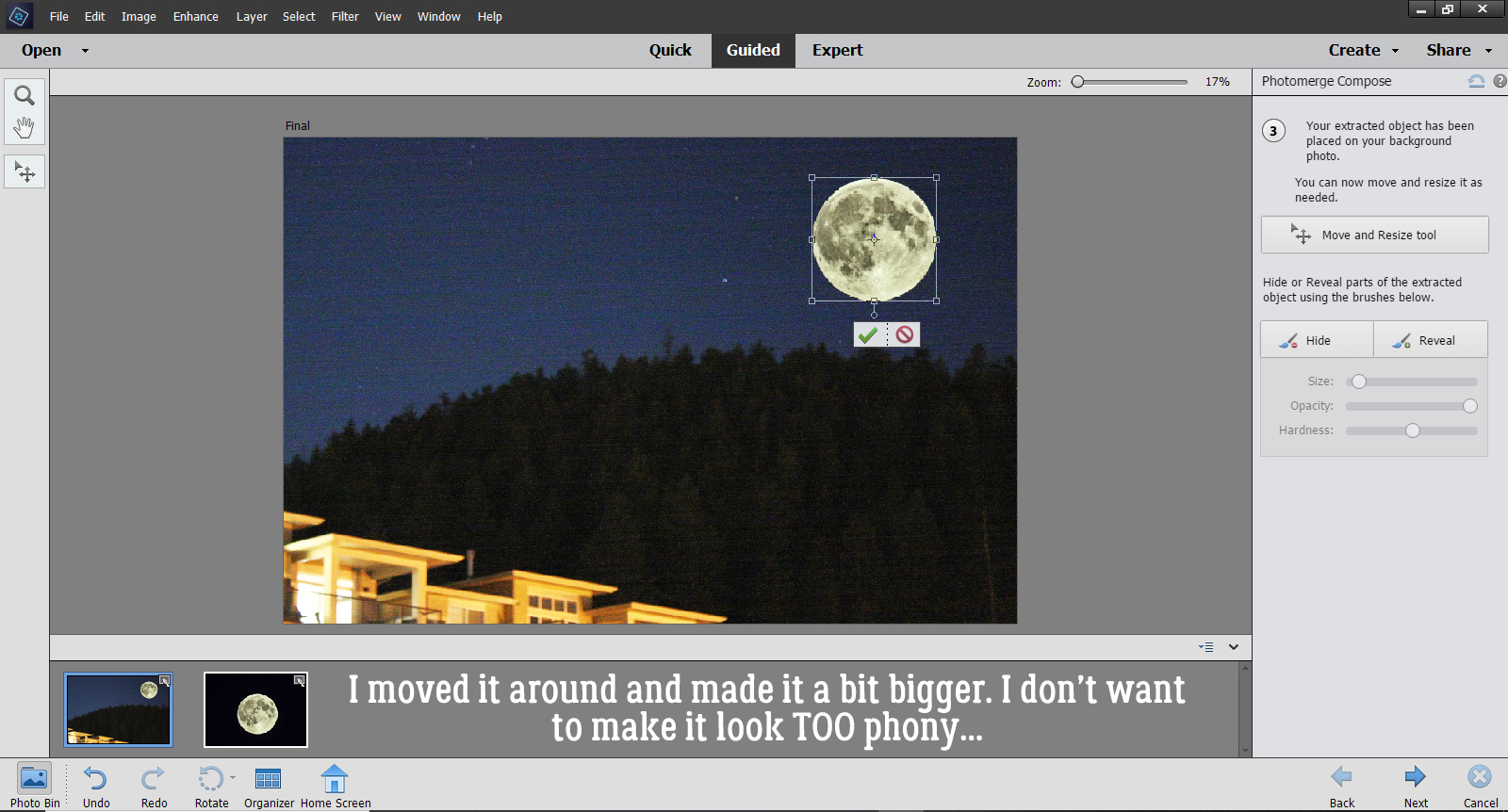
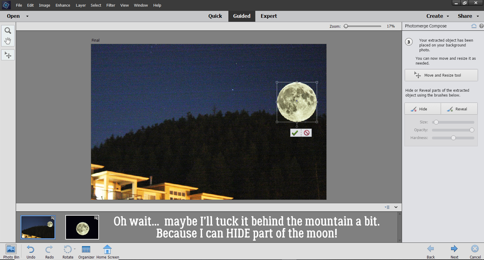
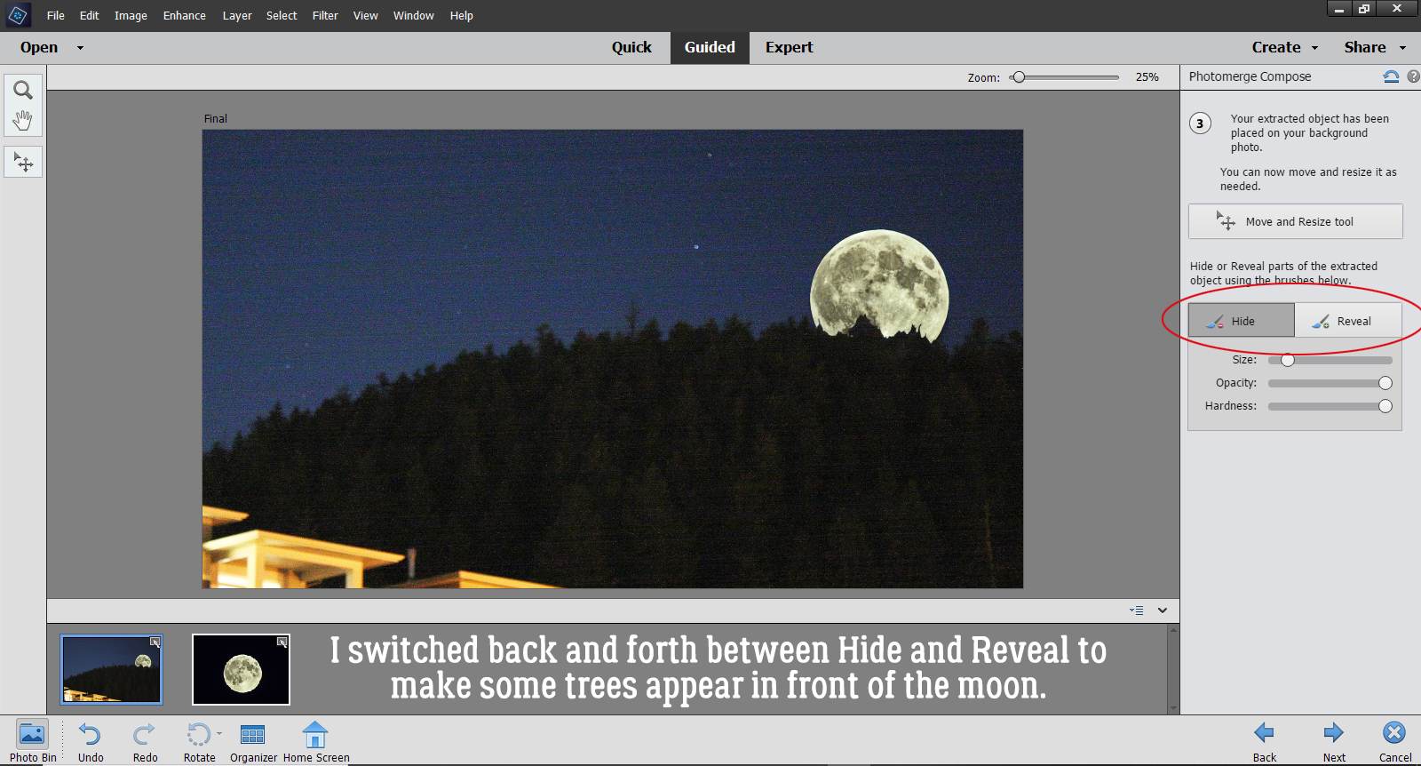
Then I had second thoughts and decided to anchor it a bit by tucking it behind the mountain a smidge… after seeing that I had some Hide and Reveal options.
I started that process by Hiding the lower part of the Moon just roughly. I used a hard round brush at 100% Opacity to brush over the area that will end up being hidden by the mountain and trees. It takes several passes to completely hide the parts that I want hidden. Once I had an idea where the trees actually are, I could go back and Reveal the Moon where the trees don’t obstruct the sky. You can see in the screenshot that some of the moon looks more blue than gray – that’s where the sky hasn’t been completely Hidden. I also adjusted the size of my brush tip as needed to make the trees appear “normal”.
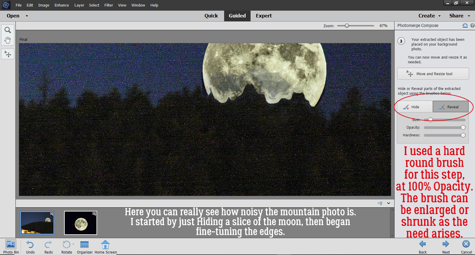
I switched back and forth between Hide and Reveal, adjusting the size of my brush tip until I had some natural-looking trees on my mountain. then I clicked on the Next arrow.
If your photos were taken at different times and in different lighting conditions, your composite might look pretty weird right now. Mine’s okay because night is night… But if you find your results aren’t making you happy, there’s still more in this Edit to help you get it right. The instructions say, “Click ‘Auto Match Color Tone’ to blend your extracted object with the background. You can fine tune the results with the sliders.” I highly recommend experimenting with this, because as you know, nothing is final in Elements until you say it is. If you click on the button and it does its thing but you hate the outcome, you can Undo it!! CTRL/CMD>Z should be an automatic movement. It sure is for me!
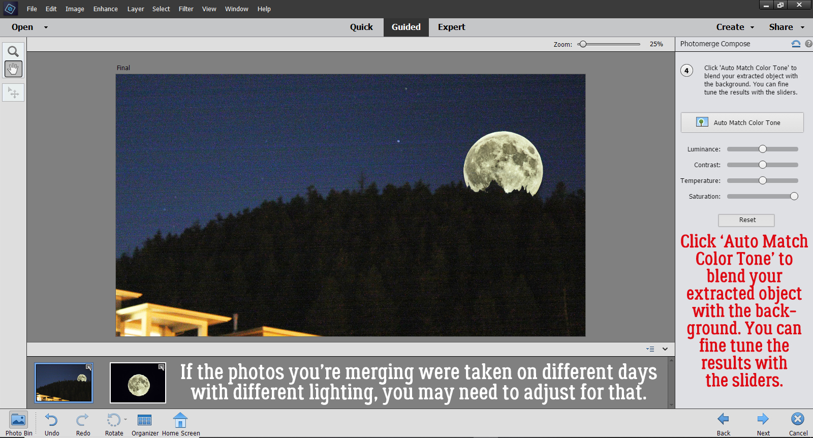
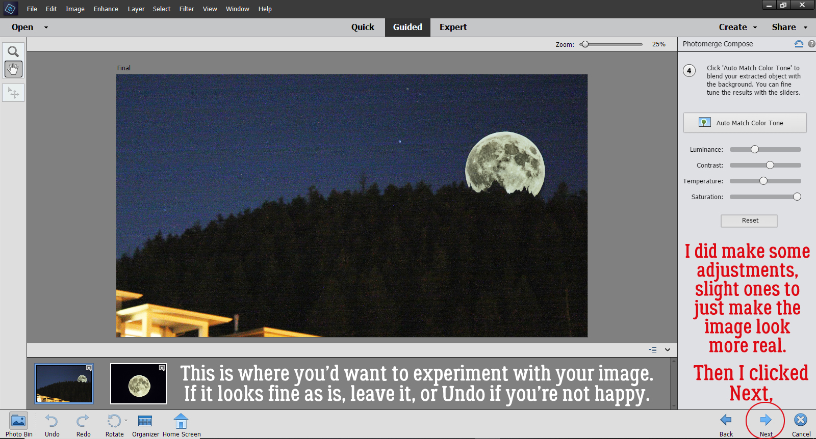
I didn’t like the results of the automatic process, so I made adjustments with the sliders. The image didn’t need a lot of adjusting to make it look more real. Then I clicked Next.
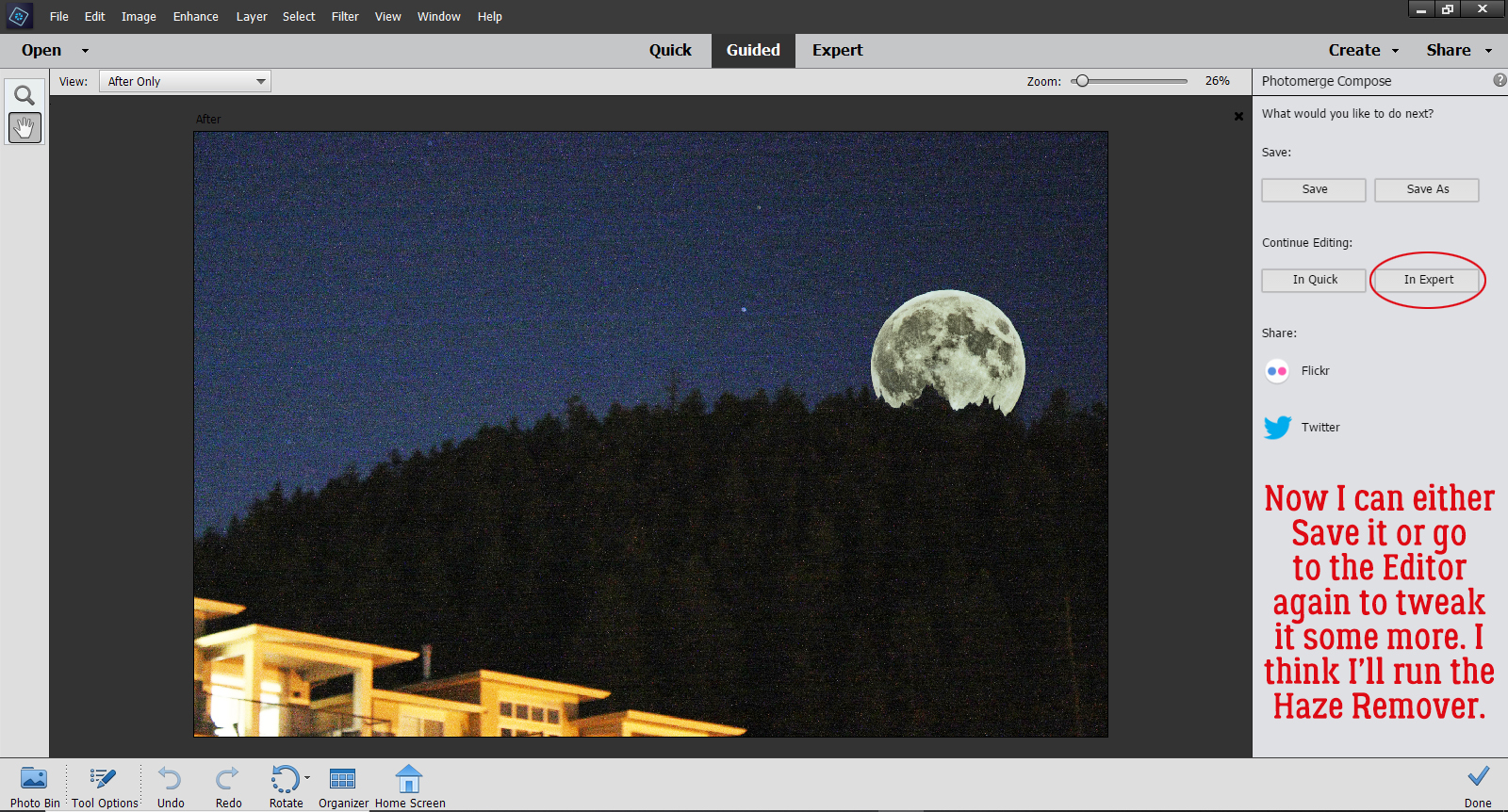
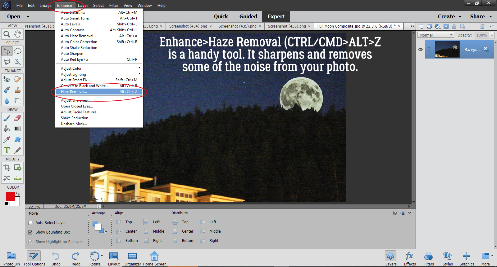
That’s the end of the Guided Edit. Now I can choose to Save, Continue Editing or Share my finished image. I want to clean up some of the noise by running the Haze Removal tool, so I’m going to click on In Expert and go there.
If you’re not familiar with the Haze Removal tool, I think you should give it a try! It sharpens your images and removes a lot of the graininess. You can get to it by Enhance>Haze Removal, or CTRL/CMD>ALT>Z works too.
It’s still an interactive process. This screen opens up and you can make adjustments to the amount of Haze Reduction it does, as well as the Sensitivity of the action. And if you’re not convinced it’s actually making a difference, you can flip between the Before and After images and see how it’s changed.
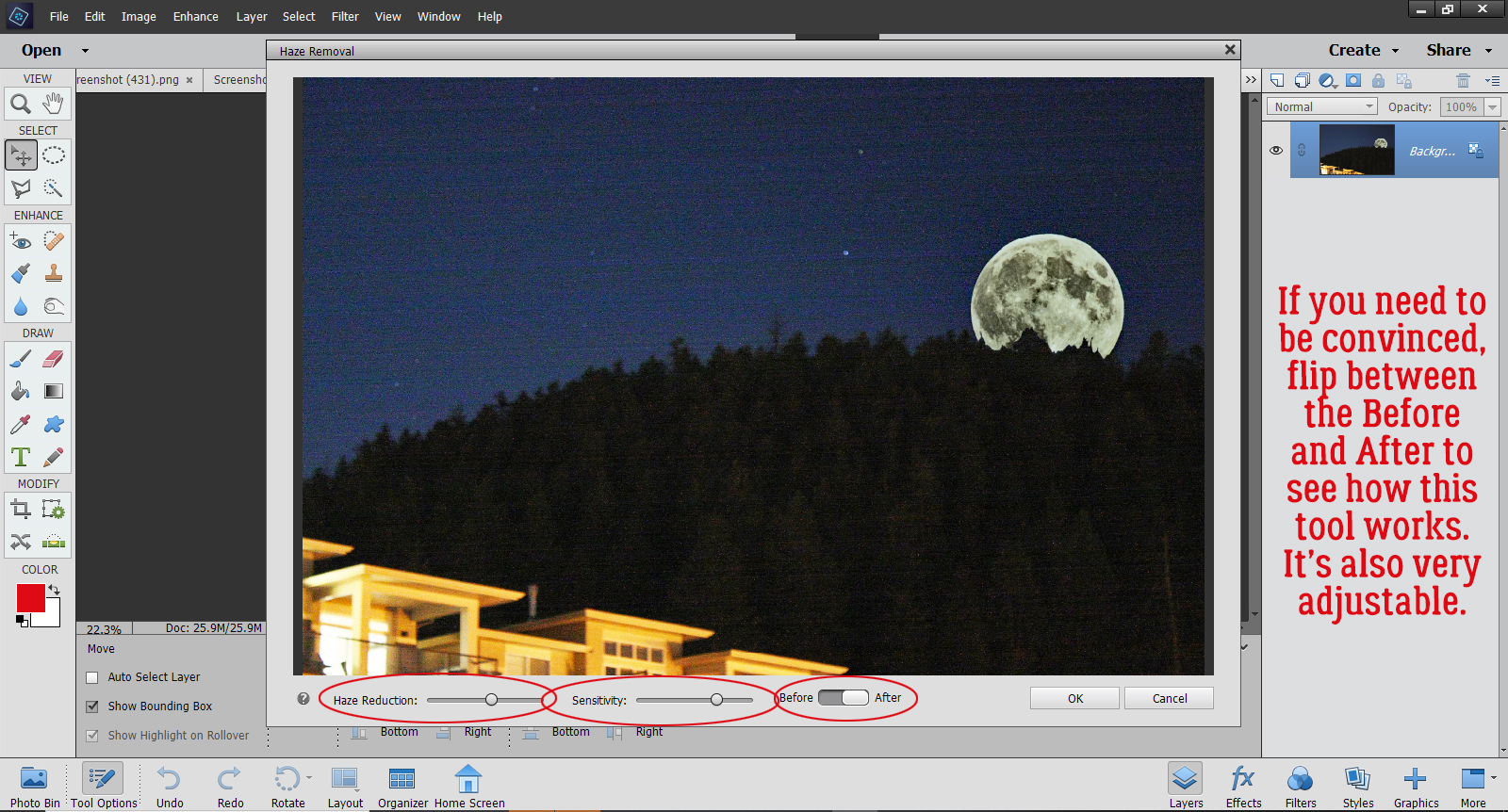
There! I think it looks pretty good, all things considered.
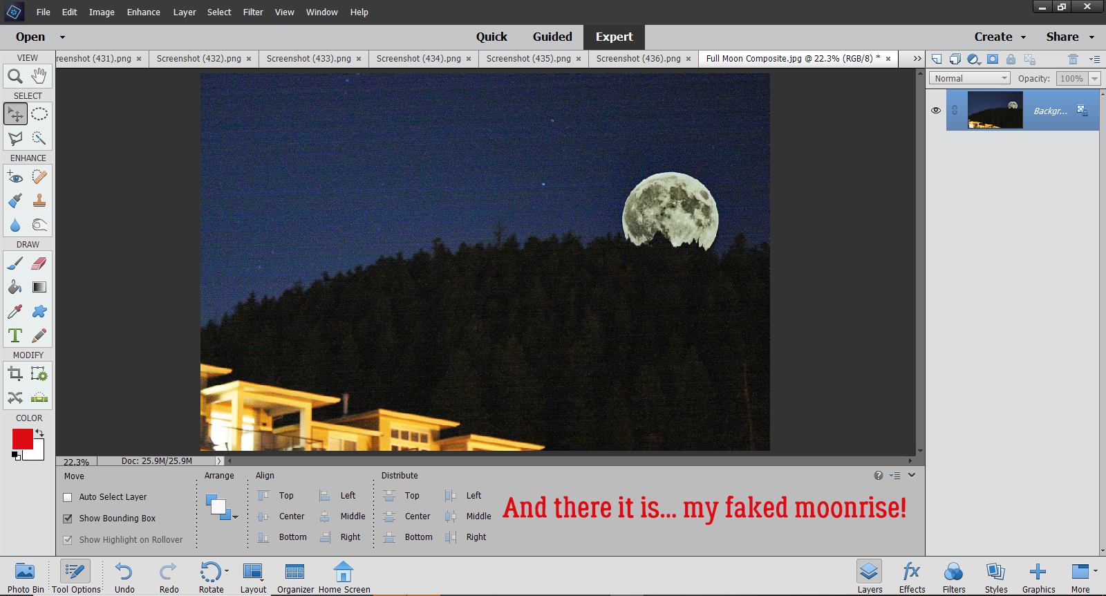
What do you think? Are you going to try this one? I think it would be good for adding a person who should have been in the photo but somehow wasn’t or to add someone who you only wished was there. Ooh, or maybe go right into fantasy and add a unicorn or a fairy to a photo of a baby. The sky’s the limit!
Next week, I’ll bring up a Guided Tour of all the changes here at GingerScraps, to help you navigate the new Forum and find the Gallery. See you then!
![]()