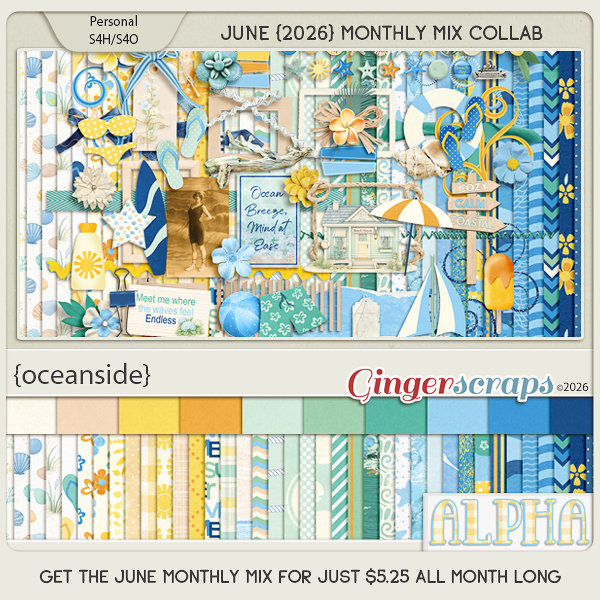
Zen Doodling the Digital Way – Part 4 of 5!
![]()
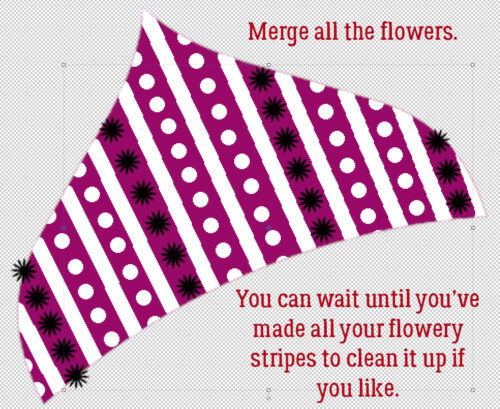
Yes! You read that correctly… this series is nearing its end. I just have to finish off the final version of the Mandala and it’s finished. Today I’m filling in the last of the 8 segments with some stripes. Of a sort. Some stripes, some lines of dots and some flowers are all in there. Much of this post will be basically reviewing what I’ve already shown you; most of these tips are much more broadly applicable than just to Zen doodling, too. Are you ready?
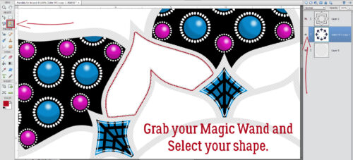
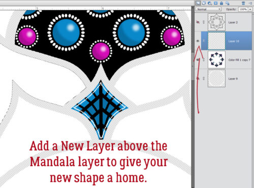
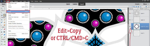
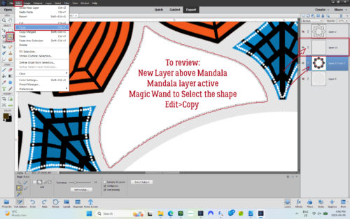
So first thing is to isolate the shape on its own layer so it can be manipulated. I popped a New Layer above the main Mandala layer but kept the Mandala layer the active one. Then I used the Magic Wand Tool to Select the last segmental shape. Then I made a Copy of it by clicking Edit>Copy [keyboard shortcut CTRL/CMD>C].
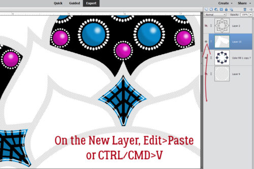
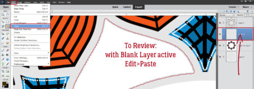
Then I made the New Layer active and clicked Edit>Paste [CTRL/CMD>V]
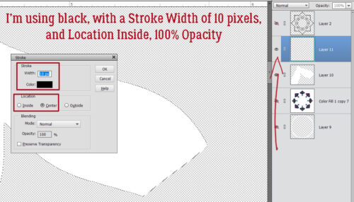
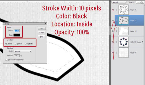
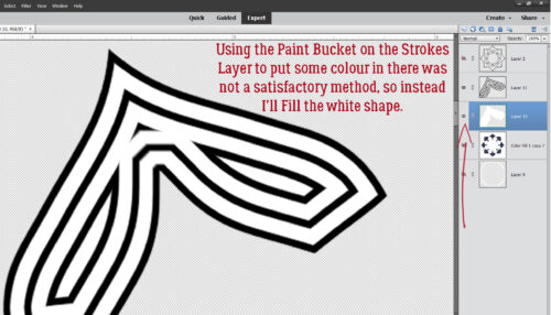
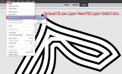
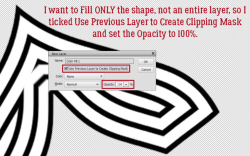
For this step I definitely could have used the Paint Bucket to change the colour, but have found I get better results with the Layer>New Fill Layer>Solid Color method.
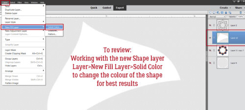
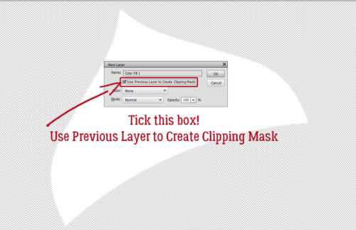
When you use this method, it’s imperative that you remember to tick the box next to Use Previous Layer to Create Clipping Mask. That puts the colour ONLY inside whatever is on the layer below it, rather than Filling the whole workspace.
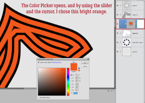
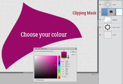
Then I chose my colour. Oddly, it’s one that I see in my closet all the time. 😉
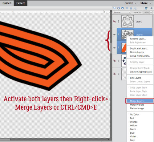
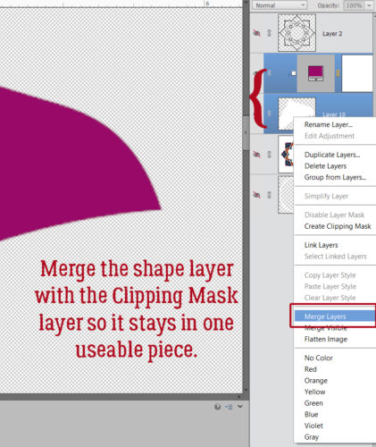
Then, so that I don’t lose track of the shape layers, I Merged them together. [CTRL/CMD>E]
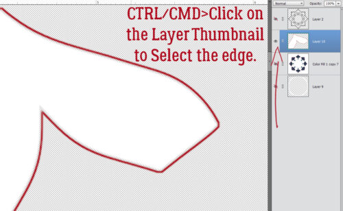
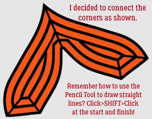
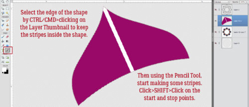
My first white stripe is 15 pixels wide, using the Pencil Tool as I’ve demonstrated before. To keep the stripes completely inside the shape, I CTRL/CMD>clicked on the shape Layer Thumbnail to Select the edge of the shape before I started drawing my stripes. Remember how do make a straight line? Click start>SHIFT>Click stop!
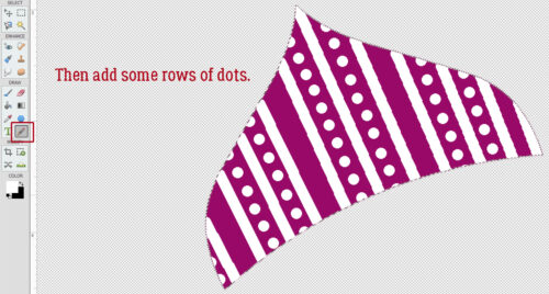
Then I added some rows of dots, using white and the same 15 pixel Pencil Tool. I just eyeballed them; at this scale, it would be hard to see a variation in gaps.
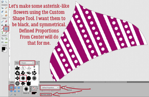
Do you ever use the Custom Shape Tool? It’s the one that might look like a rounded rectangle or an amoeba in the Tools Panel. This Tool is amazing for all kinds of purposes. I knew I wanted my flowers to be a uniform size and a symmetrical shape so I used the Tool Options to make sure it happened. I chose Defined Proportions – the default setting is 1:1 – and ticked the box for From Center to start. My colour is black.
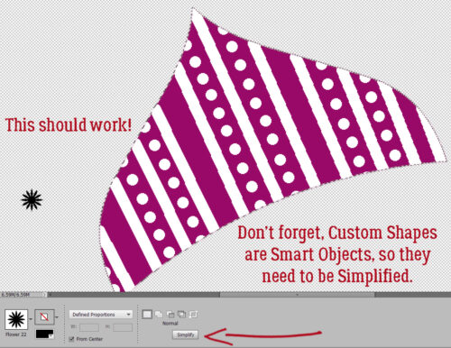
There it is! It looks to be about the right size, too! Remember, Custom Shapes start out as Smart Objects, which means they can’t be altered as is. They need to be Simplified first.
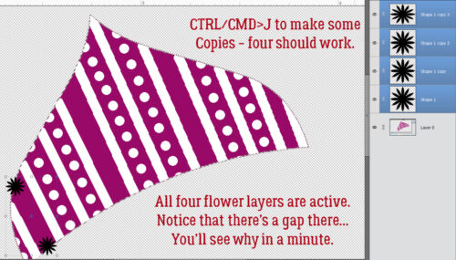
I guesstimated I’d need four flowers for that first stripe, so I used CTRL/CMD>J to make some Copies. Then I moved one down to about where I wanted the flower stripe to end. By making all four layers active, I can use some other Tool Options to Work Smart, Not Hard.
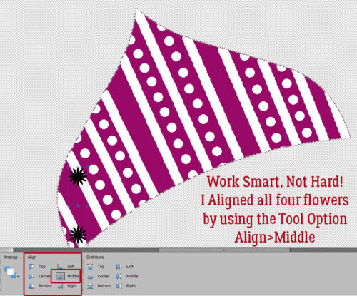
If you don’t see Tool Options for the Move Tool, click on the Tool Options bar at the bottom of your workspace. Then go to Align and click Middle. All four of the flowers will line up like little soldiers.
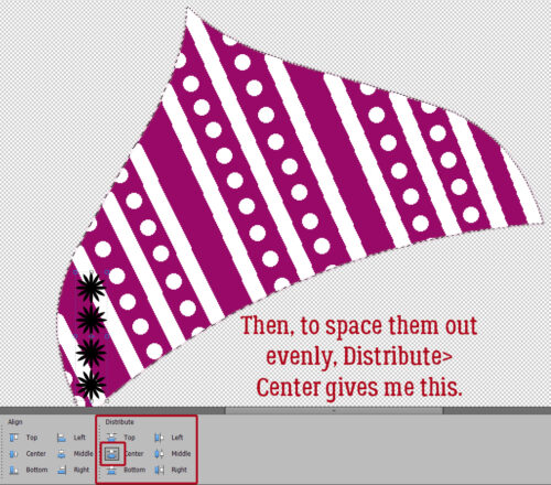
To get them all neatly spaced out, use Distribute>Center and they’ll jump into position. They can then be Rotated and Moved as a group into place on the stripe.
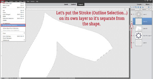
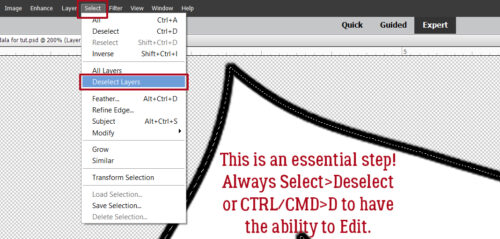
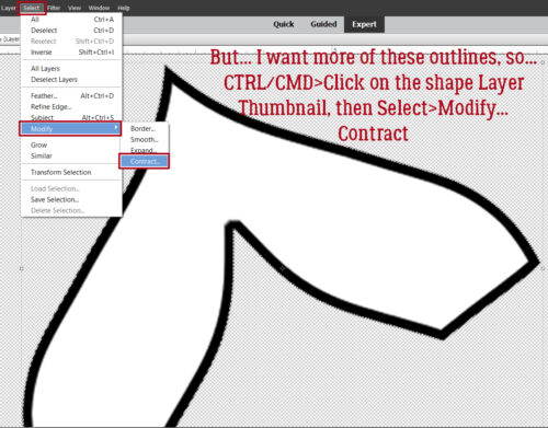
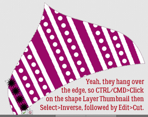
I’ll show you this tip now, but you might want to wait until all your flower stripes are in place and Merged into a single layer so you only have to do it once. To remove the dangling parts, CTRL/CMD>click on the shape Layer Thumbnail, then Select>Inverse [CTRL/CMD>SHIFT>I] to move the Selection to the outside of the shape. Then Edit>Cut [CTRL/CMD>X].
As you can see, I got ahead of myself. I made a bunch of flowery stripes following the same basic steps as for the first one, Rotated and Moved them into place and THEN I Merged them all into a single layer so I could clean them up in one move.
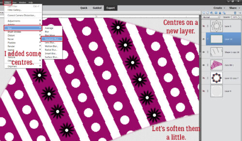
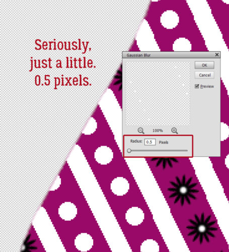
How about some little white centres in those flowers? I added a New Layer so they could all be together. To make them a little softer-looking, I added a Filter>Blur>Gaussian Blur. But I went gently.
SUPER-gently… 0.5 pixels worth.
To make the shape a single “thing” so it can be Copied and Distributed, I Merged all the current shape’s layers. [CTRL/CMD>E]
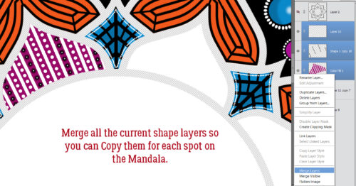
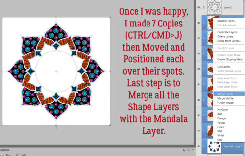
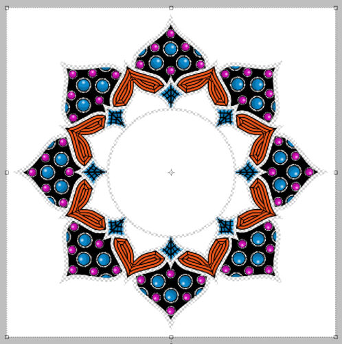
Eight Copies later, they’re all in place and ready to Merge with the main Mandala layer.
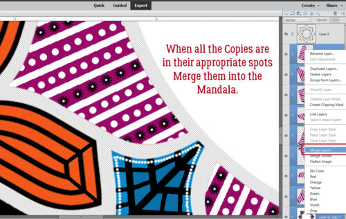
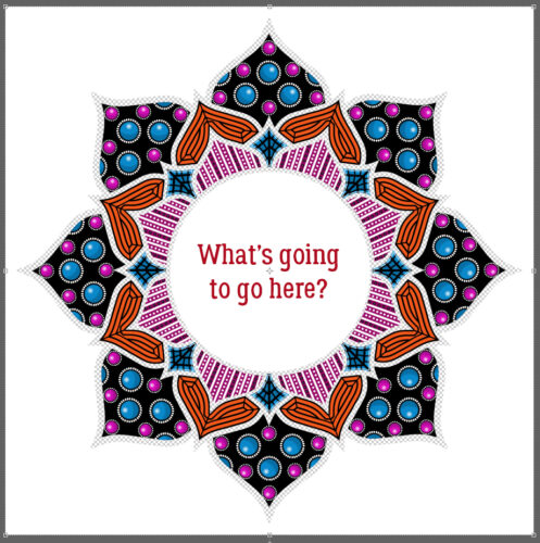
Any guesses?
One thing I’ve learned through this process is that my vision is deteriorating fairly quickly now. It’s becoming harder and harder to see the cursor in Elements, to see the text on the tabs, and to just generally function, and light levels really affect how well I see anything. I haven’t done a lot of actual scrapping in months now, and I do miss it! I can’t say for sure whether the surgery I’ll likely need in the next year or so will help or not. I guess I’ll find out. ;( It’s a good thing that we’ve already created so many great tutorials for you, from beginner to advanced, because I think my digiscrapping days are numbered.
![]()