Challenge Spotlight: DSD Quote Challenge
![]()
Thank you all so much for being patient while I worked off my muscle relaxants! I truly do become quite um… incoherent and puddly when I have to take them. Good news is, I’m pretty much recovered, despite an eventful weekend in which my son experienced some very unpleasant medication side effects himself. And I’m back on track with my closet overhaul, even though I blew past my deadline completely. Now, back to our regularly-scheduled program.
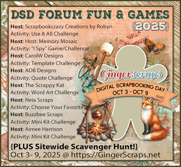
This month I chose the Digital Scrapbooking Day Quote Challenge created by Diane, of ADB Designs. I love to use quotes and song lyrics on my layouts, partly because they make it easy, and partly because I can always find something that fits. Diane chose two quotes, with similar themes but with a definite difference – one is poetic and calm, the other is more whimsical. These are the quotes.
The autumn leaves
Are too heavy with color.
The slender trees
On the Vulcan Road
Are dressed in scarlet and gold
Like young courtesans
Waiting for their lovers.
– Langston Hughes
One sunny Autumn day
When I went out to play,
An Elf-man in a tree
Dropped colored leaves on me.
– Gertrude P. McBrown
There were ten layouts posted to the thread in the Forum and I was interested to see which of the options saw the most uptake. Before proceeding, make your prediction, then see how correct you are. Each layout is linked to its spot in the Gallery so you can take a closer look or leave some comments. Just click on the Scrapper’s Forum name and you’ll zip to the Gallery.
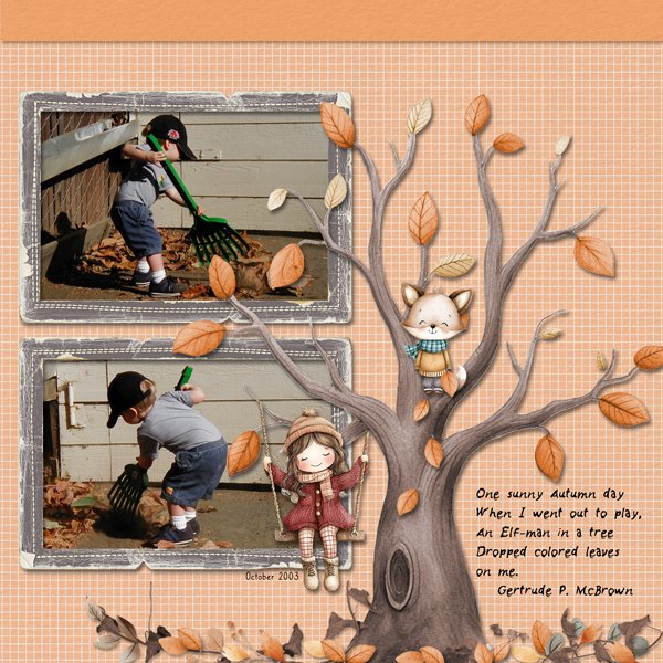
First off the bat we have trinanne. She went with the elf quote and used photos of a charming little man busily raking leaves. I like the simplicity of her layout, and her clever use of the partially-nude tree element to reflect the theme of the layout.
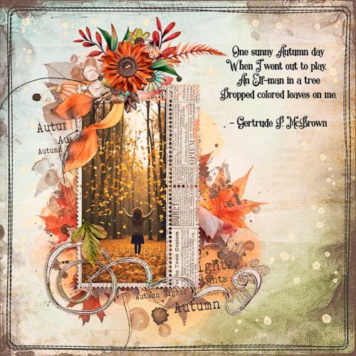
Our next entry is from zotova (I think this is her first TT Spotlight!) and she’s also chosen the whimsical quote. Her layout is stellar on so many levels. That artsy background, her gorgeous cluster and the newsprint border frame her photo and draw the eye right to it.
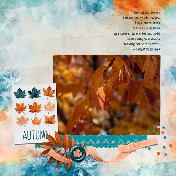
KatL chose the more lyrical Hughes quote for her layout. The way her paper and element choices pull colour from her photo is perfection! She decided the photo was the star of the show and everything else plays a supporting role.
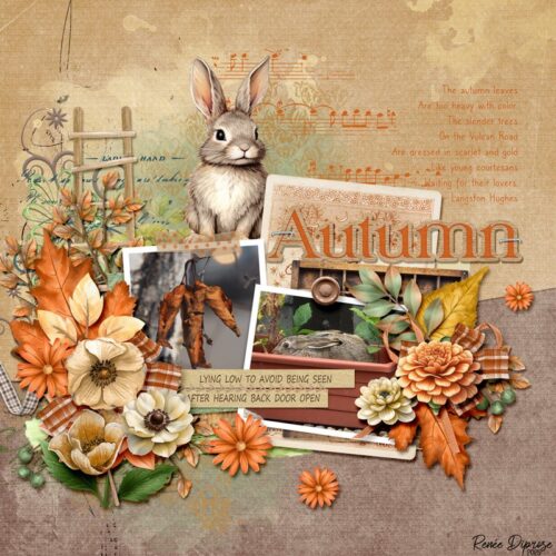
5grand also went with the Hughes quote. You really need to zoom in on this one! I love that the curled leaves look a lot like a bunch of carrots, and how the colour palette she chose coordinates seamlessly with her photos. That rabbit though!
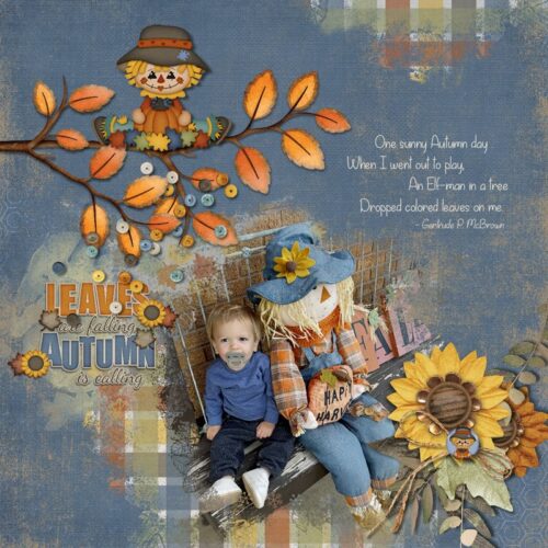
Here’s some more whimsy. Celestine chose the perfect papers and elements for her photo. Her clever blending of plaid paper and her photo along with the denim-blue background provide a solid base for the branch.
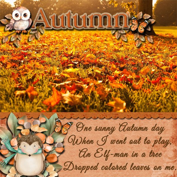
I feel like Windswept‘s focal photo would have worked equally well with either of the quotes. But I also feel like she realllllly wanted to use the owl and the hedgehog elements and that dictated her choice.
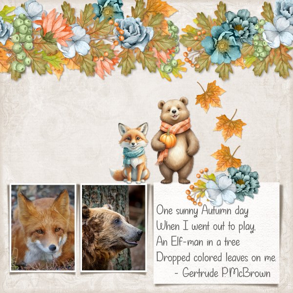
I LOVE this one! Grace.‘s imagination and nature play well together. The drift of leaves draws the eye to the quote, but also to the little fox and bear elements. So pretty!
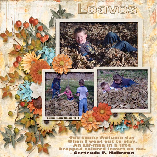
I have some photos of my son buried in leaves like these. They’re about 30 years old. 🙂 If you’re keeping score, the McBrown quote is in the lead. Katherine Woodin has created a lovely cluster of fall elements behind her photos.
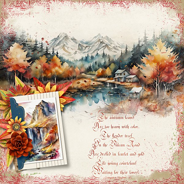
Look at that fantastic font biche57 chose! It’s got all the elegance of Hughes’ quote and meshes well with the artsy border.
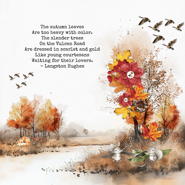
And last, we have this evocative layout from photocrazy. The watercolour paper she used provides a perfect backdrop to the fall cluster and the wildlife touches are sweet.
Did you guess correctly? I gave the edge to the playful quote before I started scrolling. It was a close one, six to four. Not as close as last night’s ballgame, and definitely not as um… drawn out. But a good competition nonetheless!
See you next week with the November Designer Spotlight. Can you guess who it is?
![]()
