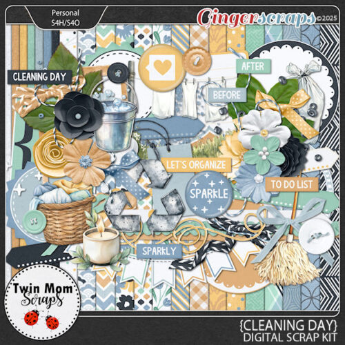
Part Two: Wetfish Designs

It’s my great pleasure to introduce to you the creative mind behind Wetfish Designs, Cyndi! She’s a relative newcomer to the GingerScraps world, and we had a lovely time getting to know each other. Our conversation went something like this:
J: Cyndi, thanks so much for stepping into our Designer Spotlight! You bring something quite unique to our community. What drew you to designing?
C: I am a photographer and wanted to create kits that were more “me” than what was on the market when my second son was born in 2006. I starting using my Photoshop skills to create my own kits for my personal use. I then started designing. I took a break when I started homeschooling my boys, but now I’m back. I consider it a daily learning process and I am constantly trying new things and watching tutorials for various software on YouTube. I have dabbled with AI and my go to AI software is Adobe Firefly. I could spend hours trying to create a perfect AI image—my writing background lends itself in many ways to this new technology.
J: I’m on the fence about AI. I think it could be a really useful tool when used judiciously, but also that it could become like Skynet… I’ve noticed a lot more AI content creeping into the digital scrapbooking sphere and I worry that productivity will kill creativity. But anyway. Where do you find your inspiration for developing a collection?
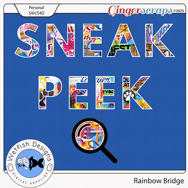
C: I always look at color trends in fashion, as well as textures and colors in home design. I am instantly inspired when I travel and see new cultures, styles, trends, colors, etc. When I visit a store that has a lot of unique clothes or home decor, that is always a motivator for me. I don’t like to look at the work of other designers as much as I’d like to. I usually don’t even see another designers’ work until it is posted for advertising or events. I feel that keeps my designs more true to my style and helps me keep what I’m working on unique. Feedback from customers is always wanted! In my last newsletter I created a survey and found out what types of themes my customers want. That was very helpful, and my “Rainbow Bridge” download a day kit is reflective of that survey.
J: It’s interesting that you mention not wanting to be influenced by what other designers are doing. There’s been quite a surge in very similar themes and palettes popping up all over the digi-world from different designers and it’s been commented upon more than a few times. Is it “all great minds think alike” or something else? But let’s not go down that rabbit hole! Give us a peek at your design process, please.
C: I always start with a color palette. From there I look at textures and themes. Color and texture are my starting points. Whenever possible I create my own seamless patterns. I’m still struggling to learn how to create plaid patterns that are seamless. I’m sure there is a solid YouTube video out there, I just haven’t found it yet. Once I have my ideas generated I start with papers. Papers are one of my favorite things to design! After my papers are done I make a preview with them and then I begin building my elements.
J: I’m all in on texture and dimension. I think the overall look is much more engaging and memorable when an image “moves”. My digi-scrapping has really transformed since I first started dabbling with it fifteen years ago; being invited to write tutorials for GingerScraps nine years ago was a huge motivator for that. 😉 How has your style evolved?
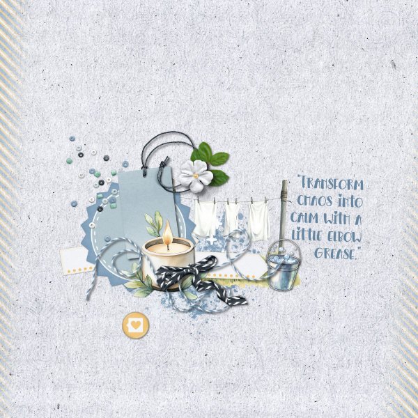
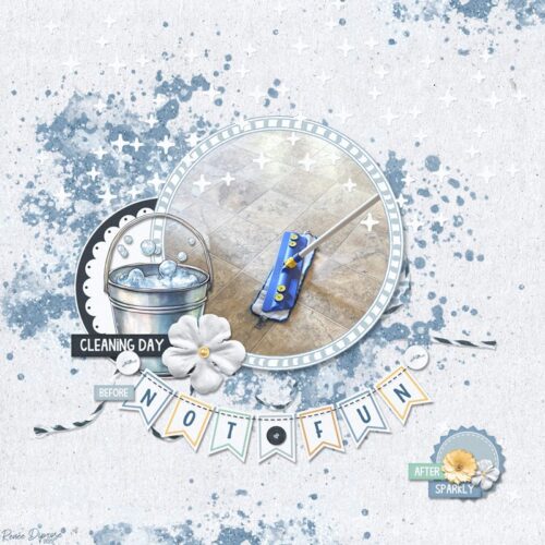
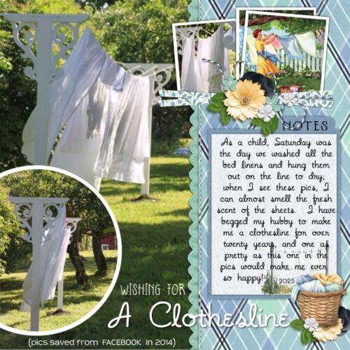
C: I am addicted to vintage and shabby chic textures. Always have been! Surprisingly, my home is not at all a showcase for these aspects of design! I have been trying to veer away from that look every now and again with my “Fish Food” newsletter mini kits. For these kits I use a more clean look, using more vectors and flat textures. Most of the time I can’t help myself and gravitate towards anything old, vintage and shabby. Pink has been my favorite color for many years, so it often pops up in my kits. One of my newer kits, “Pinkademic,” is reflective of my love for pink and quirky modern art. After pink, I gravitate towards shades of black. Halloween has ALWAYS been my favorite holiday and that is probably because my birthday is just before Halloween. That is the reason I have so many Halloween products!
J: Let me be the first to wish you a fabulous birthday! Halloween has been a favourite time of the year for me since my kids were small. I loved creating costumes for them out of things I had on hand. They complained about not having “store-bought” costumes like everybody else until people started pointing out how creative theirs were. Suddenly Mom wasn’t such a downer after all. 😀 One year when my middle was in high school, she asked me to give her a black eye… with make-up. We almost had a visit from Child Protective Services for that one. I guess you could say I’ve been a hobby-realist for a long time. Is there any hobby you’d really like to master but haven’t tried yet?
C: Knitting! I crochet a lot but I haven’t figured out how to knit yet. When I watch TV with my family I will crochet or do puzzles on my iPad. I believe knitting would require my full attention and that is probably the reason why I haven’t learned how yet.
J: I think you’d find that once you got the hang of it, you could let muscle memory do a lot of the work. I knitted a sixteen-foot square afghan for my sister while my son was in the hospital. Trust me, I wasn’t super-focused. Another thing you’ll find is that knitting usually uses less yarn… for those times when the budget is tight. You mentioned watching TV with your family. Do you have a guilty-pleasure favourite show or genre?
C: I could watch BookTube for hours, as well as cruise videos. Cruising once a year is my goal, but reading every day is a constant for me. Historical fiction is my favorite genre 🙂
J: I think I need to check out BookTube. How have I missed that?! But cruises are never going to light me up. I get peopled out fairly quickly and couldn’t hack being trapped on a boat with a thousand strangers. >< But if I could do the I dream of Jeannie eye blink and be somewhere else, I’d jump at it! How about you? Where would you go?
C: I would go to Scandinavia! I love watching travel videos on Norway, Sweden and Finland! I also hope to visit Slovenia someday.
J: One of my great-grandmothers was born in Sweden. I’d love to see where her family lived. She’s the only one who came to North America and stayed. Her older brother, who escorted her across the Atlantic in 1888 to live with her maternal uncle, seems to have walked off the ends of the earth. Give me a time machine so I can find Ernst, universe!!
C: Like Outlander!!! I love the books and the show! If I could time travel it would be back to the 1700s in Scotland and, of course, it would be by way of some standing stones!
J: I’d that too. Funny, my great-grandfather was an Ulster Scot. His heritage was originally Norman; the first of them arrived in Britain with William the Conqueror before heading north to Scotland a few years later. My branch left Scotland in the late 18th century for the north of Ireland (it’s only 12 miles away, after all) and then on to North America in the early 19th century. So maybe we could explore history together! We can learn to make real scones.
C: I’d rather have sourdough bread! I used to make it every day but let’s just say the weight gain was not working for me 🙁
J: For me it’s potatoes. The Irish in me. My hemoglobin A₁C was higher than I’d like back in March so I’m watching my carbs a bit closer that I was. ;( I wish I could walk my dogs again, but I get too short of breath. Good thing they love me anyway. I read about the background of your Rainbow Bridge Daily Download collection; I’m so sorry you lost TWO dogs in such a short time. If you could have any pet, real or mythical, what would you choose?
C: A cat of course! I love my dog, too, but my heart was made for cats.
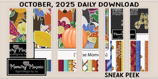
J: Hard pass. I don’t think we can be friends after all. Hahahahahahaha! Moving right along…… Thanks for chatting! I’m just going to finish up by filling our readers in on your Spotlight month and see where that takes us. I didn’t see a Designer Spotlight Challenge for you this month. I hope that’s just an oversight. But you are hosting your monthly Wild For Styles Challenge, so that’s cool. I don’t think anybody who frequents the GS Blog has missed your Daily Download sneak peek, but just in case….
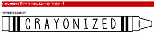
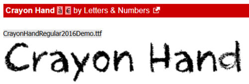
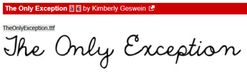
Thanks again for the visit! For the rest of you, next week’s Tutorial Tuesday could be a Greatest Hits… or it could be a Fantastic Fonts new fall fonts post. We’ll see how I feel in the morning. If I get some proper sleep, who knows what I’ll get into!
![]()