Wintery, Christmasy Fonts
![]()
I didn’t realize it’s been FOUR YEARS since I last did a winter/Christmas font post! Just what I need… more fonts while I’m trying to move all my Very Important Files to a new laptop (thank you Black Friday sale at Costco!), right? I’m going to have to make a resolution to get MainType properly set up so all my fonts are sortable. Might need y’all to hold my feet to the fire. Anyway, let’s look at some new-ish seasonal fonts and a few related dingbats, shall we? If you see something you like, click on the name, it’s linked for you, and the download is FREE….
Christmas Comeback is what’s known in the industry as a “display font”. It’s a solid font with an assortment of glyphs and ligatures – those extras that really zhuzh up your titles.

Last Christmas is a multilingual script font that would be legible enough for journaling. Now I’ just have to hope I escape Whamaggedon, having just typed out that title..

Home Christmas is another solid display font. It’s an all-caps typeface, but has an upper and lowercase set. It includes punctuation and numerals, but no fancy swashes.

Wonderful Christmas is a multilingual mash-up; it has curly-swirly uppercase characters and formal serif-style lowercase caps. It’s definitely legible, so it’s suitable for titles, subtitles and journaling.

Santa’s Air Mail has a lot of title potential. The snowy tops could be glittered, while the actual characters could be any colour, pattern or texture. It includes numerals and punctuation.

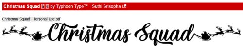
Whoa! Christmas Squad. Are you seeing what I’m seeing? The whole family in matching PJs on Christmas Eve… this title is included in the character map! The basic character set has those swashy caps, and offers multilingual options too.
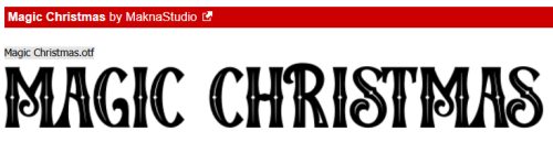
Magic Christmas is an all-caps vintage display font. The character set includes both the version you see in the screenshot and a solid version. They could be layered with a shiny or glittery Style added to create a pretty fabulous title or siggie.
Magical Nordic includes BOTH of these typefaces in your download. Along with multilingual support, the snowflake is in the special character set. Since I’m currently working thrulines on my Swedish family tree, I was very drawn to this one.

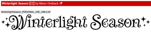
Winterlight Season has such whimsy! The multilingual fairytale quality is charming, including punctuation and numerals.
Snowballs has a handwritten look to it, with snowflakes surrounding each character. Some characters have swash versions.

This one, Snowinter, started giving me ideas the second I saw it. The actual letters in white, with maybe a glossy coloured Style, and the crystally bits in matching glitter? Oh, yeah! I’m definitely going to play with it! It’s an all-caps-in-two-sizes multilingual typeset.

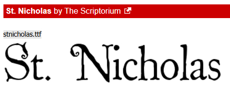
St Nicholas is giving me really strong A Christmas Carol or ‘Twas the Night Before Christmas vibe. It’s such an old-timey look; there are numerals and basic punctuation marks in the set.
This one, Mickey’s Merry Christmas, is my segué from font to dingbat. This all-caps set has a Mickey in a Santa hat in all the uppercase characters! Christmas at Disney World, anyone?

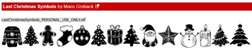
I’m really doomed… Last Christmas Symbols is a collection of Christmas and winter images.
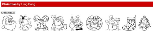
If you’d rather have festive outlines, Christmas has got you.
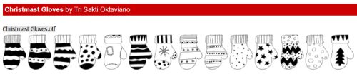
And last, a seasonal but not festive set of mittens! Christmast Gloves could be used in so many ways.
I’ve got an idea for next week’s tutorial that might be a useful one. It’s a hybrid technique. Stay tuned!
![]()


