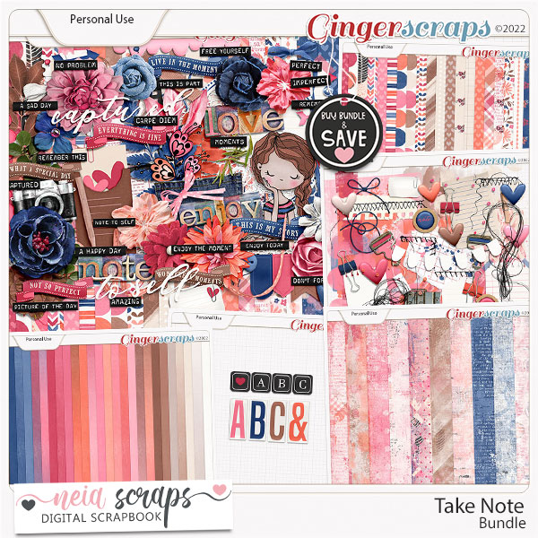
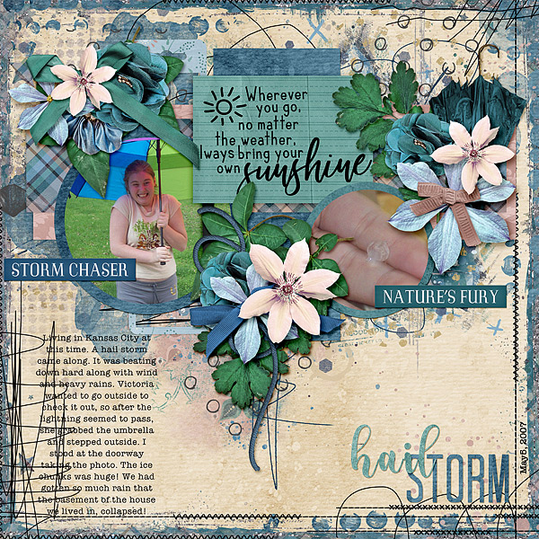
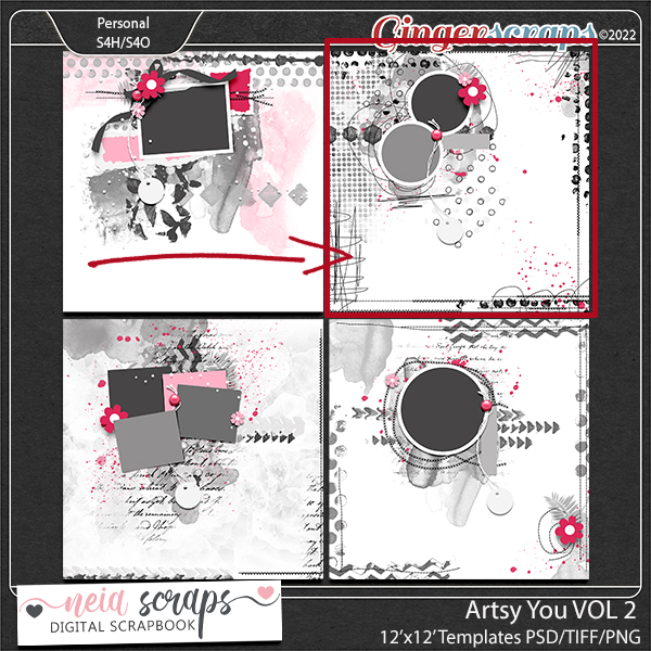
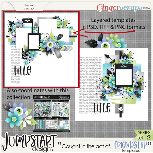
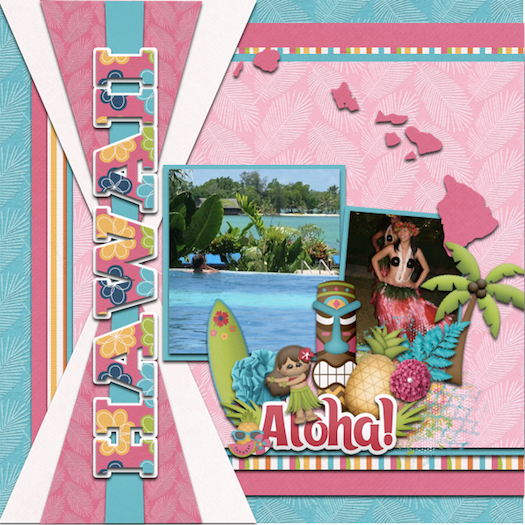
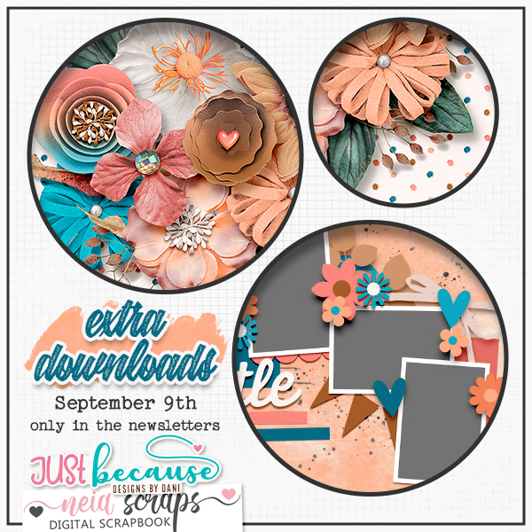
Designer Spotlight (November 2021)

Jumpstart Designs!

How the heck is it November already? Before we know it, Christmas will be here… and Jan won’t be ready. Given! New month, new Designer Spotlight. This month I’m chatting with Sheri, the creative mind behind Jumpstart Designs. Sheri is a relative newcomer to GingerScraps, but I’ve known her for years and was so happy when she joined our little digi-family. (She might not remember, but once upon a time I was on her creative team.) Our chat went sort of like this…

J: Sheri, let’s get the business part of this out of the way first. Tell me how long you’ve been designing.

S: Ten years this last July!

J: Wow, you’ve done a TON of designing in that time. Your (amazing) portfolio is HUGE! Where do you do your best work?

S: Our main family room is kind of long so I use one end of it for my office because I have windows on two sides that keeps this beautiful fall sunshine coming in. I have a desk with three large monitors because I’ve always got Photoshop, Illustrator, multiple folders, and several different browsers and tabs open all the time. I generally have music or television streaming in the background. I just recently purchased a new PC system and a stand-alone disk station. My “techie” son keeps my system in optimal working order, and I have no idea how I would do this without his help because it seems like something is always needing to be fixed or tweaked. I also have a tablet and just recently got an iPad so I can play around in Procreate. I keep my work area very organized because my brain is already in chaos mode, and I need all the structure I can get. Oh look! A shining thing! Or in my case… another email, memo, new event to add to the design calendar, or another deadline I’m running close to. I’m a great planner, but not nearly as good about keeping on top of it.

J: I think you do a brilliant job of keeping all those balls in the air. We’ve got the where, now let’s talk about the why. What inspires and motivates you?

S: Color, and spending time on Pinterest and similar sites. I always have a bunch of ideas of what I’d like to design and do differently but finding the extra time to play around with new ideas doesn’t seem to happen very often.

J: The way you use colour has always drawn me to your designs… which explains why I have a gigantic folder of your stuff. I won’t get into the whole Pinterest rabbit hole! Which of your current collections is your favourite and why?

S: EARLY AUTUMN WHISPERS. Fall is my favorite time of year and I wish it could stay autumn all year long! I try to enjoy every minute of this season before the cold and snow sets in.

J: Ooh, that’s a beautiful one! Oh look… it’s in my Downloads folder. How did that get there? 😉 Tell me, what one word would your family and friends use to describe you?

S: Probably “smart ass”. LOL (oops, that’s two words)

J: Right… okay! So what would you do if you won the lottery?

S: Probably buy just enough property in the mountains to build a few little homes so my kids and grandkids could all live with me forever. If I had my way, they’d be with me no matter how old they get! Oh yeah…. And I guess saving for retirement might also be good idea so I don’t have earn a living until my last dying breath.

J: We did something like that after my mother-in-law passed away. Except that our grandkids don’t live anywhere nearby and we haven’t seen them in a long time. But we have the mountains! And we’re both retired, so there’s that. Next up, a really odd question that I found on a human resources website: Are you more likely to sing, or to dance, in the shower?

S: Neither! I’d probably trip and fall over the edge of the tub, and God help anyone who’d have to hear my voice! That’s one talent I did NOT inherit from my parents. They were both musical and had a country-western band for many years. They were even good enough to play for President Ronald Reagan when he came through town back in the day, but it’s better for everyone if I don’t attempt singing myself! LOL

J: Wow! How cool is that? I love country music. But can you play a musical instrument?

S: I played the piano for many years but haven’t touched one in a long time. I also bang on our bongo drums now and then and have always thought it would be fun to be a drummer.

J: A minute ago you mentioned your parents and your grandkids. Speaking of both previous and succeeding generations, if you could travel through time, would you go forward, or back? Why?

S: BACK IN TIME for sure! I’m not too thrilled with society these days. I think we’ve lost our collective minds and I fear for how things will be for my children and grandchildren. I miss the good old days when most people valued self-reliance, integrity, and knew how to be respectful of others.

J: I hear you. We’ve really lost the best part of our society, where we all looked out for each other. There was a lot to be said for how much more respectful the world was a few decades ago. What has been the best compliment you’ve ever received?

S: That I must be a good mother because my children are awesome! Some days I question my parenting, but I’ll take that compliment any day!

J: Yes! I ‘ve always said our jobs as parents is to raise responsible, independent and genuine adults, with a good helping of courtesy and caring for others. What would your dream car be?

S: I’m an SUV sort of gal but ultimately I’d just like one that’s paid for, haha.

J: Hahaha! No car payment is a good place to be. If you could only eat one meal for the rest of your life, what would you choose?

S: Homemade tacos! Actually, anything Mexican with lots of cheese!

J: YUM!! Too bad I took pork chops out for supper tonight. Now, if you could have one superpower which one would you choose?

S: Being able to make time stand still.

J: Just think how much more we could get done in a day! (Or not. I’d probably just curl up with a book!) Aside from necessities, what one thing could you not go a day without?

S: Hugs from my grandkids!

J: I adore kids. All kids. If you came with a warning label, what would it say? Mine would say “Harmless old woman who WILL talk to your children in the grocery store”.

S: WARNING: Subject prone to sarcasm!

J: Maybe that’s why we get along! Last question, maybe the most difficult. Who would you want to play you in a movie about your life?

S: No clue but several years ago I was told that I looked like Jaime Pressly so many times that I finally had to watch that sitcom called “My Name Is Earl” just to see who she was. I think the only resemblance was in the “dumb blonde ponytail” I did sometimes. LOL

I don’t know anything about her, but I’d love to have her figure!

J: I can see the resemblance! I love the role she plays in “Mom“.

So ladies, Sheri’s entire store will be 50% off for the month, on top of her free Daily Download and Jumpstart Your Layout Challenge kit (and I can’t wait for them!!), maybe with some minor adjustments around Black Friday. She has given me permission to share a bunch of links with you, too. She has a highly-talented creative team, and you can see their work in Sheri’s Gallery. [Remember, whenever you see coloured text in my posts and it’s not someone’s name, there’s a hyperlink attached – just click and go!]

Newsletter

Facebook (and TWO freebies!! Here and here.)

Instagram

Pinterest

Thanks for chatting with me, Sheri! Enjoy your time in the Spotlight!!

Tutorial Tuesday (Individual Style)

Use It All! Challenge Spotlight

The response to my Jumpstart Your Layout Challenge post showcasing YOUR layouts and YOUR individual style was so good, I’m going to choose one Challenge each month and shine a Spotlight on it. It’ll be the last post of the month and I think it’ll be really a lot of fun! This month I’ve chosen another Challenge that includes a FREE mini-kit, the Use It All Challenge with Karen Schulz.

Each month Karen provides a mini kit – shown above – but for this Challenge, ALL the items in the mini MUST be included in your layout. Karen’s Challenge minis are add-ons to larger kits she has in her store, so if you like the mini you’ll LOVE the full collection! (Find Trick or Treat here!) [Pssst… Karen has a little surprise in the download, but I’m not going to include it in the upcoming layout showcase. Only those layouts using the 6 papers, 5 elements and 1 word art in the preview are shown.] Let’s have a look at how YOU have been inspired by this mini!!

In this layout, willow has given us a layout that isn’t about Hallowe’en. I had to really look to see how she blended the arty background paper with the much brighter orange-and-plaid paper, so skillfully was it done. Her beaded flower clusters frame her masked photo and the graffiti piece grounds it.

Sweetpea2020 has used a variety of paper shapes to mat her photos. The pops of orange draw the eye and the curly ribbon provides a frame for them.

Here, Flighty-188 has also blended the arty paper with the brighter orange-plaid paper but in reverse, and she’s given the graffiti the look of an actual piece of screen. Add in the raffia bow in the upper left corner of her photo and the cluster in the opposite corner, and she’s made great use of a visual triangle to create movement around the layout.

AlyciaIN‘s layout made me smile. Her little Hermione looks like she’s levitating! The basics of her layout are similar to Flighty-188‘s but with the paper borders’ straight edges, it looks quite different. Can you see a visual triangle here?

This simple layout isn’t as simple as it looks! khoskins has stacked the papers in a pleasing arrangement, and turned the graffiti into a pretty anchor for her photos. I like how she framed her photos with black paper to bring them into focus. She also created her own custom tag using the brighter orange paper and word art very creatively.

By clipping the lighter-coloured paper to a mask on a black background, KatL has cleverly drawn the eye right to that grinning Jack. Placing the beaded flower off-centre on the raffia bow adds interest to the cluster and tilting the word art is a nice, informal touch.


The way galaviktor has spread out the sheets of paper form a pattern that frames her photos nicely. Creating a brushed border for the word art, she’s pulled the colour variations from the arty paper into focus.

Isn’t Zelda just the cutest girl on four legs? For all its simplicity, NHSoxGirl‘s layout is very eye-catching, and the heart paper behind the word art has a lot to do with it.

The interlocking paper-strip squares AJRandom has created here both ground and highlight her photos. I like how she’s tucked the ribbon between the photos and then anchored them with the beaded flowers. I just noticed that she’s positioned the paper with all the eyes on it so that only one set of eyes is peeking at us. LOVE it!!

What can I say about greenfiend27‘s layout? It’s genius! Her paper borders are shadowed beautifully to give the appearance of papers overlying each other. Blending the graffiti into the paper behind it and using it to anchor her cluster shows her creativity. Having the ribbon dangle adds focus to her cat’s beautiful eyes and her clever alterations to the word art is just the right whimsical touch. A+!

Can you believe that October will be over the next time we meet? There’s snow on the mountains already but none here in the valley yet. It’s crazy how quickly time flies. Considering how awful this year has been for so many people, I’m thinking the sooner 2021 is in the rearview mirror, the better.

PDF Version : https://bit.ly/2ZZoWAO


Tutorial Tuesday (GingerScraps)

Giving Credit where Credit is Due

Or: Editing your Gallery images

Hi again ladies! Today I want to talk about something a bit more serious than usual. I’m going to do a Featured Challenge post next week, and have been perusing the Gallery to check out the layouts I want to include. I noticed that there are quite a few layouts that don’t include any credits; whether it’s an oversight or intentional, I don’t know. But I do know this. The Terms of Service at pretty much EVERY digiscrapping website that hosts a Gallery, and the Terms of Use included  by every designer in every kit include a requirement for providing proper credit to the designer(s) of the content the scrapper uses. I know that when I see a layout that’s exquisitely created, I’m going to look at credits to see which kit(s) the scrapper used so I can go shopping! If we think about it, giving credit to someone whose products inspire us and help us improve our skills should be automatic, as a courtesy if nothing else. And really, who wants to be accused of theft of intellectual property? Those who are new to our hobby may not realize they’re missing a step. And then there’s the well-known GingerScraps Gallery glitch that deletes some of the things we add to the first Upload screen that’s easy to overlook. (I think that might have been fixed, it hasn’t happened to me in a while.) But what can you do if your layout posts to the Gallery without that important information? Let me show you!

Here’s the layout I created for the Jumpstart Your Layout Challenge this month. At the bottom of the layout inside the red oval, the only detail that appears is the title I gave my layout. OOPS!

A quick word about titles… if you use a special character like a # or a @ or a ? for example, the Gallery uploader will lose everything you’ve typed AFTER the first of those characters. It’s going to mess up your Member Gallery but if you know ahead of time that will happen you can remember to follow these steps to fix it. Other things that may need to be changed in your layout’s details could be typos, omitted information, or an error on the layout itself that you’ve corrected already but the image you’re seeing is still the one with the mistake. When you click on My Photos and then choose the layout you need to fix, scroll down past the image until you see your avatar on the left, as shown. In that User Options box, click on Edit Photo.

When you upload a Challenge layout, if you want it to count for the Challenge Reward, it must be posted in the current month’s (and year’s!) Challenge Gallery. The website’s uploader default is to place uploaded images in the Member Gallery, which is fine, but not for being rewarded! (It’ll also sometimes default to the last Gallery you chose, or some other random Gallery, so check and see where it’s going!) This first change I’m making is to put my layout in the Jumpstart Your Layouts October 2021 album.

This next (optional) step is especially useful for people who create for designers on their Creative Teams. The layout can be Copied to other Galleries just by making a selection in the second dropdown. There’s also another advantage to using this Edit part of the uploader. If you put your layout into multiple albums when you first upload them, EACH of those copies will count as one of your 8 permitted daily uploads, but if you Copy them with the Edit feature, they only count once! Yeah, it’s an extra step and it’s a bit of a drag, but it’s a lot better than getting told you’ve already used up all your uploads for the day on only 2 or 3 layouts.

Okay, so let’s pretend you spotted a glaring typo in your title – maybe I spelled my title OTCBREO because I was tired, in a hurry and wanted to get my layout into the Gallery so I could go to bed. I get up this morning to several comments on my layout, all of them politely ignoring OTCBREO, but I’m still upset with myself that I didn’t notice it. So I open up my saved PSD version of my layout, fix my title, save it with a slightly different file name (more about that in a second) and now I want to post the corrected version instead of the trashed one. I can click on the Choose File button and select the corrected version to replace the other one. [If I didn’t Save my corrected layout with a slightly different file name, the uploader won’t know the image has been changed, and it’ll use the original one. So if you end up having to do this kind of big correction, add a number to the end of your file name and the uploader won’t be confused.] I can also fix the title if I notice it’s missing some special characters, or if in my addled, sleep-deprived state, I used the mis-spelled title here too. I also have the ability to add my credits here too, in the Photo Description section. Last, if I’ve changed my mind and don’t want to share my layout with the world after all, I can Delete it. It and everything I’ve typed about it will disappear forever. There’s no way to UNDO this step, so be really sure you can’t Edit it before you take this drastic step. When all the needed adjustments have been made, Submit changes.

Now everybody can see which kit and template I’ve used for my layout. The only time it’s not necessary to include credits is if you’re using Commercial Use products. Oh darn… I just realized I forgot one very important credit! Back to the Edit screen…

I neglected to give credit to my dear friend Sandy, the photographer who rescued Beau so that Beau could rescue her. She has graciously given me permission to use her photos for scrapping and deserves to be recognized for her talents too!

Now, which of this month’s Challenges should I Feature next week?

PDF Version : https://bit.ly/3xD8rqw

Designer Spotlight October 2021

Have You Met Christie (Scrappin’ Serenity)?

I’d like to introduce you all to Christie Dawn, whose wonderful designs are sold at GingerScraps under the Scrappin’ Serenity banner. We had a nice chat so I could know what to tell you about her. Here’s a transcript of our chat for your perusal.

J: Christie! So nice to see you! Let’s get comfy and get to know each other. First, tell me, how long have you been designing?

C: I started dabbling in 2009 and opened my first store in 2010! Wow…hard to believe it’s been 11 years!

J: Hey, that’s about the same time I started learning about digital scrapbooking. When I look at those first layouts, I cringe. I know why I wanted to start digiscrapping – saving money, not having to clean up, and being able to use kits over and over and over. What made you decide to design?

C: I was a stay at home mom, and I just needed an outlet.  I loved Scrapbooking, so I figured I might as well try it.

J: I didn’t actually start paper scrapping until 2005, long after my kiddos were grown up. When they were little I did things like counted cross-stitch and crochet. If digiscrapping would have been a thing then, I’d have been all over it! What do you use to create your designs?

C: I mostly design in Photoshop Elements 13, I should probably upgrade, but it still works, so why change!?

J: No kidding! If it ain’t broke… I do all of my digital stuff on a Dell laptop, sitting in a wing chair in my living room. Would you mind describing your design workplace?

C: Most of the time I work at home, downstairs, on my desktop.  But I do have a laptop I bring when we go camping and have worked from the RV many times.

J: My “other” creative space is a work-in-progress; I have so many boxes I haven’t even opened after our move… 17 months ago. Organizing it all is a big job! But back to you. Which of your current kits in the GS shop is your favourite? What makes it so?

C: Currently my Favorite Kit is – Gamer Girl.  We are big time gamers in my family!

J: My husband is a big gamer too. I’m not. Words with Friends is enough for me! Do you sing, or dance in the shower? I’ve been known to dance in mine a time or two…

C: Definitely Sing!  If I were to dance in the shower it would probably lead to a visit to the ER. lol.

J: I can relate – it didn’t end up in the ER but I discovered the shower base needed some no-skid strips that way. Here’s another odd-ball question: If time travel was possible, would you go back in time or ahead? Why?

C: I would go back in time and spend more time with my Granma.  Miss that lady so much!

J: I’d love to spend a few hours with my mom’s paternal grandmother. Maybe then I’d know more about her than just her name… Do you have a favourite colour? Are there any colours you really DON’T like?

C: Purple, Pink, Teal or Black are my favorite colors.  I tend to dislike oranges, yellows, and reds.

J: We’re kindred spirits! What would your dream car be?

C: A 1967 Mustang! We actually found one on FB market place and bought it about a year ago…but it still needs a lot of work!

J: How awesome is that?! Will you paint it purple? You don’t have to answer that. Last nosy question. If you could only eat one meal for the rest of your life, what would it be?

C: Love me some Sushi!!

J: You can have ALL of mine. Thanks for letting us peek into your world. Now I should spend some time outside before it gets too cold. Enjoy your month in the Spotlight!

Faithful readers, Christie is hosting the Designer Spotlight Challenge this month and is providing all of us with her Daily Download kit. And… she has this little gift for everybody. Check it out!!

Well. 2021 is 3/4 over already! I know most of us will be happy to have this year in the rear view mirror. See you again soon!


Tutorial Tuesday (Tips and Tricks)

It’s Almost DIGITAL SCRAPBOOKING DAY!!

Hey all you GingerScrappers! Digital Scrapbooking Day is coming up fast!! It’s on Saturday, October 2 and it’s going to be a blast. But don’t let “Day” throw you off. It’s not just a day, it’s a week-long celebration of our hobby and it’s always epic. This year’s theme is just perfect. Ginger has given me the go-ahead to share this sneak peak with you. Drum roll please!

All the digital scrapbooking stores around the worldwide web have special events and sales. Here at GingerScraps, there are a bunch of grab bags specifically designed for DSD, special challenges, another scavenger hunt, and a free-with-$20-purchase MEGA collab. (I’ve seen the MEGA collab… you’re going to love it!!!! It has about 100 papers… and the palette is beautiful.) Other stores will have designer blog hops and special events on their sites too…

So start with a PLAN! Don’t just jump into the deep end. Check out the forums at your favourite stores to see what they have going on. Then make yourself a calendar of events. Set some reminders so you don’t miss the entry deadlines, speed scraps or chats. If you’ve ever missed out on something amazing by a matter of an hour, you’ll understand the need for some nudges.

Make sure you have hard drive space for your purchases and freebies. Or invest in some thumb drives or an EHD to transfer some of your older stuff to so you have lots of room for your downloads. That MEGA is going to need a bunch of room. Label this extra storage right away so you don’t forget what you’ve put on it. Forgetting to label them could mean you lose track of all the awesome kits you’ve moved and you don’t want that! I have a brand new 6TB EHD just waiting for me to fill it up.

Set a BUDGET! It’s way too easy to overspend when you’re surrounded by smokin’ hot deals, and PayPal makes it painless… until later. Figure out how much you have to spend, and stick with it. I usually save a bit of money so I can spend $20-25 per favourite digishop (I have 3 that I like a lot) without feeling guilty. (With the slightly stronger Canadian dollar this week, I might be able to make my money go a bit farther. As long as there isn’t some catastrophe here that causes our currency to tank. ‘Cause that’s never happened before….. 😉 )

Don’t feel obligated to participate in anything that isn’t going to make you happy. If you don’t have time to join in on the games in the Forum, don’t worry about it! If you aren’t into speed scraps, that’s great! Extra challenges might be fun, but if you have better things to do, you have better things to do. Freebies take up a lot of space, both on your computer and in your head; if you don’t think you’ll ever use what the designer is giving away, you don’t have to take it. This is especially true of blog hop freebies; the topic and palette may be really exciting, but there will be some designers’ contributions that don’t fit into your style of scrapping, so don’t download them. Believe me, you won’t miss them.

While you’re waiting for the festivities to begin, go through your photos and choose some for those challenges you just won’t be able to resist. Let your family know when you’re going to need some uninterrupted time and don’t stay up too late! Because there’s still Black Friday next month – we have to pace ourselves!

Sharing our stories is important, both for us now and for those who come after us. The last 18 months have had quite an impact on all of us in one way or another. Some of us have lost loved ones, some of us have been sick ourselves, some of us have worked harder than ever before to help others and some of us have channeled our energies in new directions. But we all have learned what matters and what doesn’t. Let’s celebrate ourselves!

Tutorial Tuesday (Individual Style)

Jumpstart Your Layouts!

So how many of you are Challenge fans? If you aren’t, you should be!! The GingerBread Ladies designers are incredibly generous with their talents both through their participation in the GingerBread Ladies‘ collaborations: Monthly Mix, Free-with-Purchase and Challenge rewards, and within the Challenges themselves. Did you know there are freebies included in several Challenges EVERY month? Brushes, templates, word art, mini kits, add-ons – so many gifts!! Sheri, whose design handle is Jumpstart Designs, provides a mini kit every month in the Jumpstart Your Layouts Challenge (although these minis are the same size as some designers’ full kits…) and they’re amazing. I posted my JSYL Challenge layout to the thread in the Forum and couldn’t help but notice how every scrapper’s layout – using the identical collection of supplies – looked SO different. So I thought we could talk a bit about how we all have such individual approaches to creativity.

This is the preview for the Jumpstart Your Layout Challenge. Like all of Sheri‘s kits, the colour palette is versatile, it’s a bit grungy, a bit pretty, a bit sophisticated and 100% awesome.

A-M chose to use only the cream and brown parts of the kit. Her layout is simple, but eye-catching. Having a black-and-white photo as the centerpiece was genius.

Breoni too chose mainly the neutrals, but added a couple of aqua pops… which are the perfect accompaniments for her photo. Her positioning of the metal tag and ribbon element frames her face and really leads the eye to her photo.

In keeping with the mostly cream background, next up is this beauty. What makes this layout by nimble4u truly stunning is the way she’s used her photo. She embellished with restraint and the sentimental feel of the photo is the star of the show.

Roxana has added a bit more of the aqua to her layout. The large word art is perfectly displayed against the aqua paper and the photo she chose adds a bit of whimsy. I think she’s used every single item in the kit as well, even though it’s not a requirement.

Kristal’s background is also mainly cream, but with some taupe details that adds to the seaside impact of her photos. Masking the boat photo with some aqua behind it makes it look like the water continues outside the photo. Genius!

Maskyra used the papers with such panache! The grungy, rubbed, torn and splattered background is a masterpiece! Her layout is a bit of a segué from mostly neutral/cream background into more colour detail.

This layout by beckturn moves us to an aqua background with a beautiful tear revealing the shades-of-brown striped paper behind it. I love the way she repeated her heritage photo with a tighter crop on the girls’ faces.

What immediately caught my eye about jcfdelaware‘s layout is the undulating anchor behind her photos. With aqua paint behind all the brown paper hexagons, it moves the eye across the page. and the large word art tucks into the lower left corner so neatly.

LisaCampbell‘s layout doesn’t really use a lot of aqua elements, but it “reads” as an aqua background, thanks to the curved paper cuts and aqua paint wrapping around her photos. (

Alasandra‘s layout just screams HAPPY to me! The aqua elements pop right off the paper.

I love how Pippin has turned her photo to sepia and makes it look like it grew out of the paper behind it. The dark brown border draws the eye, the bokeh leads it to the photo and the clusters keep it moving.

This layout is so perfect in every respect! It’s from the creative mind of kabrak1207 and is gently shifting us toward a darker brown palette. Her use of the scalloped borders is clever, and really frames the focal photo perfectly.

MomDoc_99 went monochromatic with the browns and it works very well. The scatters echo the circles on the background paper  and by framing the photos inside a circular paper mat and creating a similar frame for her title, her repeating shapes create a pleasing layout.

Here, DebraB has given us a grid-style layout on a deep brown background that makes the photos stand out. The border along the left draws attention to her journaling. I love how she used only part of the word art on a paper strip to customize her look.

And last… this layout by galavictor is completely different! She’s changed the Blend Mode on the striped paper and the floral aqua paper to accent the orange in her photo, created a bokeh effect with the scatters while also making brilliant use of masking to blend papers together and fade the photo into them. She applied some Layer Styles to the word art too. So much creativity!!

There you have it, fifteen unique layouts using a single kit. (You can see my own vision for this kit here. And yes, my granddaughter does eat non-stop.) What might YOU do with this FRE-E-E-E-E-E-E kit?


PS… What do you think about a Challenge spotlight post every once in awhile?

PDF Version: https://bit.ly/2ZeFvb3


Designer Spotlight: September 2121

It’s HeartMade Scrapbook!

Today I’d like to introduce you to one of our newest designers, HeartMade Scrapbook – who is also known as Ngoc! She very graciously agreed to let me pick her brain, and now I get to share what I’ve learned about her with all of you.

J: So tell me, how long have you been designing?

N: I’ve been designing since May last year (2020).

J: Ah, another CoVid convert! Welcome to GingerScraps!! What made you decide it was time to hang up your Creative Team hat and jump into designing?

N: In 2020, the CoVid-19 epidemic broke out, I have more time and I want to try a whole new field. And there’s really a lot to learn, but I’m very happy with the design.

J: I think all of us would be thrilled to have more time. What tools do you use in your design process?

N: I use Photoshop and Illustrator.

J: Well, you’re way ahead of me. I’m still plodding along with Elements. What’s your design motivation/inspiration ?

N: My main motivation and inspiration are my kids and the life around me. I want to be a memory keeper!

J: Most of us would say the same. It’s pretty much the whole purpose of our community. Now I’d like to know which of your kits currently in the GingerScraps shop is your favourite, and why.

N: Cool Summer: Because I like pastel colors and summer is my favorite season!

J: Abrupt subject change!! What would you do if you won the lottery today?

N: I will buy a farm in the countryside to grow vegetables and flowers.

J: That sounds like a LOT of work! Are you more likely to sing, or to dance, in the shower?

N: Yes, I will sing sometimes, even though I’m not very good at it.

J: Everybody is a star in the shower! Weird question… If time travel was possible, would you go forward in time or back, and why?

N: I would go to the future, I want to know when covid-19 will end.

J: You and all the rest of us! 🙂 It has really turned the world upside down, hasn’t it? Design-y question again. What colours do you love, or NOT love?

N: My most favorite colors are pastel & bright colors. My least favorite colors are dark and heavy colors.

J: I love jewel tones most. And I’m so happy there are designers who do too. Last question, another one about favourites. If you could only eat one meal for the rest of your life, what would it be?

N: It’s PHO Vietnam, widely known as Vietnamese noodle soup, is a highlight of Vietnamese cuisine. I can eat it everyday and never get bored – Vietnamese people love eating PHO for breakfast, lunch, and dinner. Despite looking simple outside, PHO has the fascinating complexity of textures and flavors. Normally, PHO Vietnam is made of rice soft noodles called “banh pho”, some slices of meat, traditional herbs and is served with consommé which is made by the simmering bone of the chicken, pork or beef.

J: I’m missing out, clearly! I’ve never had pho. But to do it justice, I think I’ll wait until my CoVid-damaged sense of taste goes back to normal (if it ever does…) since all of a sudden I’ve developed an extreme distaste for anything containing onions.

Now, before we go, Ngoc has a gift for us! She’s got a 50% off coupon for her store. Thank you so much for visiting with us, sharing your talent, and for the gift!


The coupon code is HMS-SPOTLIGHT and it’s valid until midnight September 30th.

Tutorial Tuesday (Photoshop Elements)

More Fun with Blend Modes

When I started playing with Blend Modes for my Memory Mix It Up challenge layout, I wasn’t sure it would be worthy of a tutorial, but the comments in the Gallery soon changed my mind. Before I start the step-by-step, I want to assure you all that although this layout took me two days to complete, it wasn’t because the technical aspects were time-consuming. I was under the weather – literally AND figuratively – so I took my time. When you see the process, start to finish, you’ll see it’s really a quick but dramatic effect. I must also give credit where credit is due: I modified a technique presented by Nancy Adams, who is a creative team member for Anna Aspnes. Let’s dig in!

First, let’s talk about Blend Modes for a minute. New-to-digiscrapping readers are feeling a little overwhelmed, I can tell. In short, Blend Modes can lighten, darken, or alter the transparency of a layer without changing that layer’s Opacity. To change the Blend Mode, click on the bar at the upper left corner of the Layers panel where it says “Normal” and find the mode you’re seeking. We looked at all the options in this tutorial: Blend Modes? Say What? 

I’m so fortunate to have these professional photos of my great-grandfather Will and his siblings. They were taken shortly after the youngest, Geoff, was inducted into the British Army just after his 18th birthday. I’ve wanted to create a layout with them for awhile, and this challenge template was just perfect for the job. In order to recreate my workflow for this tutorial, I deconstructed my layout, stripping it down to just the layers that create the arty effect. The background paper is a simple “solid” gray from Jumpstart DesignsNo Ordinary Love collection. Other than the alpha I used for my title, all the elements of this layout are from that collection (because I liked the title!). My title alpha is from the GingerBread Ladies collab Spice of Life. The screenshot shows that all the other layers have been turned off, and I’ll turn them back on one layer at a time, working from the paper layer up.

In the Gallery comments, Jill pondered whether I’d done any (labour-intensive) extractions or other witchery to obtain my results, but I didn’t. I used the mask exactly how Juli (Miss Fish) designed it, in the exact spot she’d put it on the template. The Blend Mode was left at Normal, Opacity at 100%.


I positioned my large photo of Will and George over the mask layer, resized it to be sure it completely covered the mask and repositioned it so their faces were clearly visible. Then I clipped it to the mask. [Right-click on the photo layer and select Create Clipping Mask or CTRL/CMD>G for versions prior to PSE 15 or CTRL/CMD>ALT>G for later versions.] The first photo layer is Normal at 100%.

Next, I dropped a gray paint splatter on top of the photo layer, clipped to it. I left this layer’s Blend Mode and Opacity at the default, Normal and 100% as well.

I made a Copy [CTRL/CMD>J] of the photo layer, ensuring it was clipped to the mask as well. This time I changed the Blend Mode to Hard Light and left the Opacity at 100%. It makes the sepia tone even more vivid. Also, see how this layer brings more of the variations in the background paper into view.

I wanted to add some green hints to the layout, but not bash-you-over-the-head-visible. The uniforms in the photos were a khaki colour, not really brown, not really green. I added a green paint blotch on top of the second photo layer, but not clipped. I wanted it to extend onto the background paper too. Then I changed the Blend Mode to Screen (which lightens) and dropped the Opacity to 40%. Now the green looks more khaki, and it’s transparent so the detail in the photo shows through beautifully.

Adding a pink paint blotch layer on top of both the photo layer and the green paint layer without resizing, I changed the Blend Mode to Overlay (which lightens and increases transparency) and decreased the Opacity to 46%. See how the tonal changes make the photo more visually interesting? If the changes I make seem random, it’s because this is a very experimental process. I tried more than one Blend Mode and tweaked layer Opacity until I liked the way it looked. So it IS random! Don’t be afraid to play with your software. It’s how you figure out what you like and how to achieve it!

I made a Copy [CTRL/CMD>J] of the pink paint blotch layer and repositioned it. I made it quite a bit smaller than the first pink blotch, left the Blend Mode at Overlay and really decreased the Opacity to 21%. There’s a hint of colour, and the two other paint layers blend into the whole.

I was satisfied with the way the masked photo was looking so it was time to add in the second photo of Will’s siblings. I left the photo spot in precisely the place Juli put it, made no changes to it at all.

I clipped the photo to the spot and adjusted it to fit. I wish I could’ve gotten a bit more of Lily’s shoulders in there, but it wasn’t a big deal. For this layer, the Blend Mode is Darken and the Opacity is 61%. I played with the order of the layers a little; this one originally was the top photo layer, but it looked better as the bottom one.

This Copy layer of the second photo ended up with the same tonal quality as my large photo totally because of the Blend Mode change to Hard Light. With the Opacity at 100%, it’s tack-sharp and the sepia in the photo’s backdrop pops. From there, I finished my layout, adding in the other elements and applying custom shadows to each layer.

This is my finished layout. I LOVE how it turned out. The title reflects how although the three older brothers enlisted in the Canadian Expeditionary Force, Canada’s involvement in WWI was automatic when Britain declared war on Germany on August 4, 1914; George V was the titular head of Canada at the time. They all spent a significant part of their time overseas in Britain, which made their parents – who were still living there – ecstatic. Lily and Geoff served with the British Army; Lily became a nurse and Geoff was part of the Short-Service branch. Geoff enlisted at 17 1/2 and was forced to wait until after he turned 18 to be inducted. He looks like a baby to me… Okay, enough with the history lesson!

There may not be a tutorial next week; my dad is unwell again and is undergoing a procedure on Monday. I may be tied up for a few days… and I know all of you won’t mind if I’m MIA. Have a good week, stay safe and stay healthy!

PDF Version: https://bit.ly/3x0382c


Tutorial Tuesday (Photoshop Elements)

Jan’s Like a Broken Record… or “Everything on its Own Layer”

Those of you who read these tutorials regularly will know what I’m talking about. I really flog the “everything on its own layer” as a Work Smart Not Hard tip. It recently occurred to me that I should explain that mantra a little more clearly. So that’s what I’m going to do.

Let’s start with Brushes. Brushes are fantastic tools and can really take your layouts to the next level. There are so many ways to to customize them and make them work for you. But if you don’t put them on their own layer, whatever you do to them – adding a style, changing colour, resizing them, rotating them or even repositioning them, for example – you will also do to the other thing(s) on that layer. Let’s say you want a paint splatter behind your photo(s). If you splatter that paint right on your background paper layer, then decide you need to move it so it peeks out more from behind your photo(s) your paper is going with it. Then you’ll need to UndoUndoUndo until you’re back at the beginning.

By creating a new blank layer and dropping your paint splatter on it, you can move it around to your heart’s content.

For border Brushes, you may want to flip that brush horizontally to make a top-and-bottom border. If it’s on the same layer as a button, you’re bringing the button along too.

If that border Brush is by itself, it’s easy enough to Copy that layer then flip it.


Another example: this month’s Challenge brush from Alexis Design Studio has two starbursts and they’d look stunning in different colours. But if you add your brush to a layer that has a flower on it, you won’t be able to Copy just the brush to change the colour of one of the starbursts, because the flower will be Copied as well.

And you couldn’t apply a glitter Style to the starbursts either, because the flower would get glittered up too. Do that a few times and you’ll be a convert!

While we’re talking about Styles, the benefit of applying a Style to an element on a separate layer let’s you pile Styles on top of each other. In this instance, you’d be Copying the layer you want to alter, then adding the Style to the Copy layer. Imagine I created a Custom Shape of a flower.

By making a Copy layer, I can add an acrylic gel Style to the petals and a glitter Style to the centre, removing the parts of each layer that conflict with each other.

A slight variation of putting things on their own layer is one I use for titles, whether I use a font or an alpha. I create an new document where only the title will be manipulated. Sometimes it takes a little imagination to decide how to align the letters or the words, but the advantage of the new document method is that when I like how the title looks, I’ll Merge each word. Then I can select all the layers and Duplicate them onto my layout, where each layer is still intact but can be nudged into the most appropriate spot. To Duplicate those layers, click on the first layer in the stack, hold down the Shift key and click on the top layer. That “selects” all the layers. Then right-click and choose Duplicate Layers.

Look for whatever you’ve named (or not named!) your layout and choose it from the menu and click OK.

There, all three of my title layers are there and I can move them around individually, resize them, rotate them or whatever I think they need.

I couldn’t resist. I had to apply some styles to my title so you can see how easy it is to turn a font into an alpha.

Essentially, you want to have as much control over the things that make up your layout as you possibly can. These tricks have streamlined my creative process quite a bit – in addition to using all those keyboard shortcuts I show you each week. When I’m squeezing a little bit of time out of an otherwise busy day because the creative bug just won’t stop biting me, whatever will help me move things along is vital!

I hope this has helped with understanding ObiJan’s Golden Rule!

PDF Version: https://bit.ly/36C3YaN

Tutorial Tuesday (Photoshop Elements)

Exploring Uncharted Territory (Elements Features)

Something about Elements popped up on my Pinterest feed the other night that had me scratching my head. How had I not explored this before? I’m talking about the Graphics menu. It’s a treasure trove! And I think it’ll be really useful for those new-to-digiscrapping who are still building up their stash. I know when I was first finding my way, I downloaded a lot of freebies – because they were free, I had nothing and I was on a budget – that I ended up never using. The things to be found in the Graphics menu will be a bit like that for a lot of us, but without having a look we’d never know. So let’s explore!

If your workspace doesn’t look like mine, you might not have that Graphics button down in the lower right corner. Not to worry. You can find the goodies by clicking Window>Graphics (or by clicking F7). The menu includes two dropdowns chock full of options.


I think top-to-bottom-left-to-right makes the most sense, so we’ll start with By Type: Backgrounds. You can think of Backgrounds as papers. There are a TON of them in this menu. They’re rectangular and in landscape orientation so if you prefer to scrap in a square configuration, you may need to move the Background to give you the section you want visible. They aren’t necessarily as elegant as designer papers, but they’ll do in a pinch!


Okay, so when you see this, don’t panic! Most of these Graphics don’t live inside your computer. You’ll need an internet connection so they can be downloaded into your software for the session at hand. Elements is a real resource hog already, so this is a bonus.


I’m not going to show you a lot of these. I liked the name of this one when I hovered my cursor over it, so I opened it.


Next up are the Frames. I WILL show you a few of these, because they’re pretty awesome! I don’t often use frames of any kind for my layouts, but I may start now that I’ve found these! It took me a minute (or ten) to figure out how to make them work but once I got it, I ran with it! For them to work properly, your photo CANNOT be a “Background“, it has to be a “layer“. Right-click on your photo layer in the Layers panel and select Layer from Background and you’re on your way.


This is the composite photo I created awhile back in the tutorial on compositing. I’m going to use it as my example.


Once you’ve selected a Frame from the menu and clicked on it to apply, you’ll see this. See the transparent background around it? No need for cropping or cutting it out with the Marquee tool! The slider lets you make your photo bigger or smaller so that the area of it you want in the frame can be fine-tuned. And the circular arrows are for rotating the photo 90° left or right.


After you’ve tweaked, hit the green checkmark and carry on!


I tried a few of these Frames. I like the look of this black glossy one for panoramic photos… like the millions of sunset photos I have.


This one didn’t excite me much!

But the collage Frame? I LOVE it!!

This rustic one would be great for an Old-West layout, or a heritage layout of pioneering ancestors.

The late 1950s and early 1960s were the heyday for deckle edges. There’s another one right next to it on the menu that also has a postmark, to give the photo a postage stamp appearance.

Then there are the two stitched borders. Quicker than sorting through my stash to find some stitches…

I do actually have a bin full of vintage photos. These four vintage Frames could be lovely additions to the ones I’ve scanned and cropped.

The Graphics group is also huge. There are all sorts of goodies in here!

Like this fabulous gold filigree photo corner (or is it a corbel? I’m watching DIY shows on HGTV as I work).

If I cropped out those brilliantly-lit houses in the lower left corner of my photo these filigrees would be even more amazing.

Looking for something more traditional? My mom had a box of black paper photo corners. Bet yours did too!

The white ones are a bit more modern-looking, but still traditional.

The Shapes menu is exactly the same as the Custom Shapes/Cookie Cutter one.

The Shape layer is under the photo, with the edge Selected by CTRL/CMD>clicking on the Shape thumbnail. The photo layer is the active layer and I’m going to add a white stroke to the outline.

Cheesy? Yeah, a bit. But it was fun to turn the moon into a flower! If I put this Stroke on its own layer I might Erase the parts of the petals that overlap the trees. What do you think?

The Text options are many! Several variations of effect in every colour. Only drawback is there’s no choice of font.

I think this might look equally “right” if I’d gone with one of the soft yellow gradients like the one two spaces down to the left. But the grey pulls its look from the moon.

Here are a few more samples.

So let’s recap a bit by going over the categories one by one, starting with By Type. Each of the categories will include all the Graphics from each of the groups that correspond to the tag.

Then By Activity.

And By Color.

By Event offers some great choices!

Which of us isn’t moody at times? All the appropriate Graphics here are sorted By Mood.

It might be quicker to find exactly what you’re looking for by choosing By Object.

So many people scrap by the season so this By Season sort takes the guesswork out of finding all the right stuff.

Here, By Style means something different than the usual Elements Styles. There are literally more than two dozen Graphics styles here.

You may never use any of these but isn’t it nice to know they’re there?

The saga of the crumbling laptop continues. The replacement I ordered arrived but it doesn’t work! Turns out it isn’t new (as I thought it was) and hadn’t been factory reset. I’m a bit tech-savvy so I did a factory reset but wasn’t able to go any further. I’ll be shipping it back and waiting on a different machine I ordered that might not be here until some time in August – it’s coming right from the plant. Meanwhile, I’ll limp along with this one, hoping it doesn’t completely die before I have a functioning replacement. Sigh.

PDF Version: https://bit.ly/2SXRK99