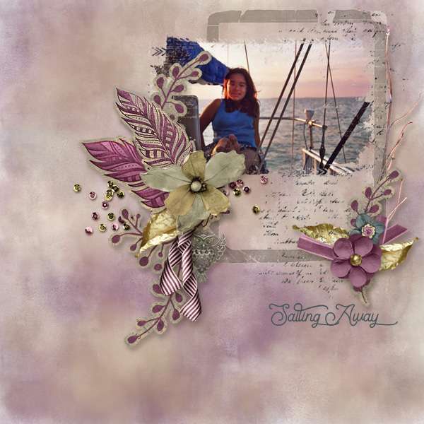
Paper-to-Digi 3D Emboss
![]()
I’m back!! I’ve recovered about 85% from my unfortunate tumble and should be all there again soon. Thank you all so much for your kind wishes for my speedy healing, I’m positive it helped. (I think that’s my post with the most comments ever!)
Before we get started, I want to apologize for the lack of consistency with the images I’m sharing with you. I’m still not happy with the way this laptop does screenshots and wish I could go back to how my dead one did it, where I could hover over a control so you could actually see what I was selecting. But alas. Add that to the changes WordPress has made to their blogging software, and now I’m also having to resize every image before I write the text. It’s a real drag!
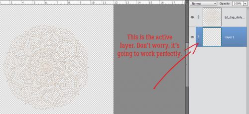
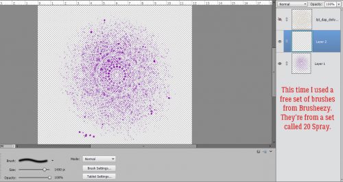
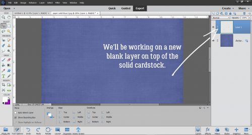
Okay, so. Another suggestion I got from calgirl (Steph) via YouTube video was to show you all how to create a deep 3D embossed look with digital tools. I had to play around a bit to make this work the way it looked in my head, and I think I succeeded. I’m working against a solid cardstock background using a nice blue one from Ooh La La Scraps‘ Pocket Full of Sunshine. I’ll also be using a brush – on a separate layer, of course!
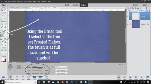
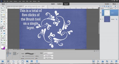
The brush I used is from Brusheezy, one of a free set called Frosted Flakes. (linked) I’ll use it at full size. The Opacity isn’t totally important, as you can see it’s set at 65%. I’m going to stack the brush until it looks dark and sharp enough for the technique.
Here’s what the first click created. I think it has a lot of 3D potential, don’t you?
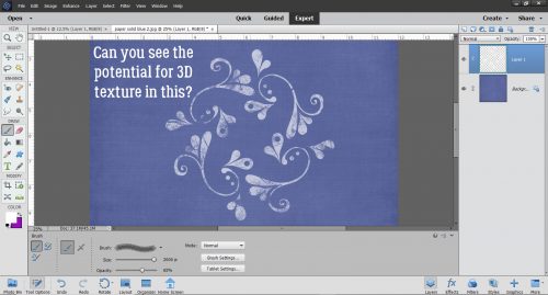
I kept clicking until I had an almost solid image, a total of 5 clicks. I used white to make the steps easy to see as we go along.
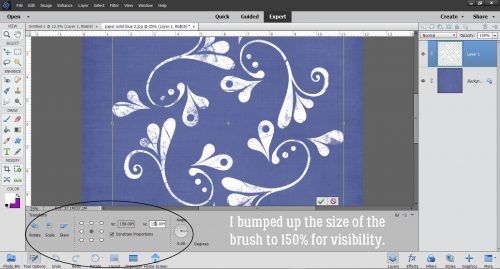
This is another non-essential step. I enlarged my brush image to make everything more easily visible. You do you!
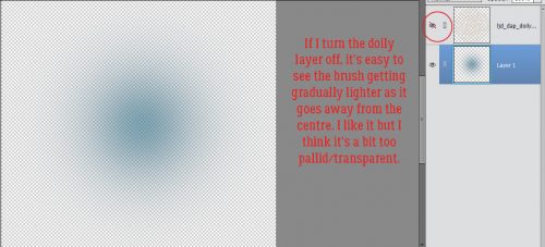
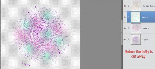
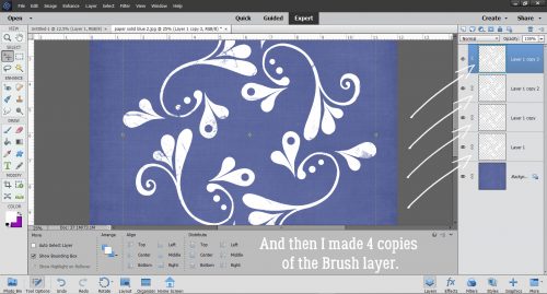
Then I made 3 copies of the brush layer. At this point, I thought I’d use them all, but I ended up only using 3 total. It’s always better to have something and not need it rather than need it and not have it. Onward.
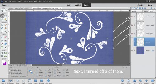
I turned the visibility of the copy layers off, because this is a bottom-up technique.
My next step was to click on Styles and choose the Bevel set.
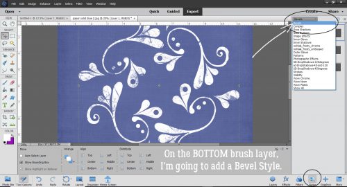
For the bottom brush layer I used the Simple Pillow Emboss option.
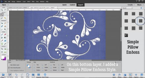
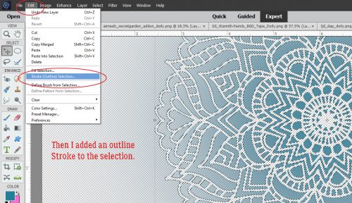
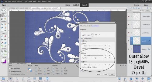
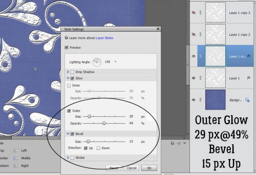
You can see that there’s some texture there now. I clicked on the fx icon on that bottom layer to bring up the Style Settings menu. Then I added an Outer Glow of 13 pixels at 50 % Opacity. The Bevel is set at 27 pixels. Now, this is a matter of taste, and I found that the Outer Glow added some depth that wasn’t there with just the Bevel.
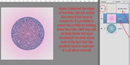
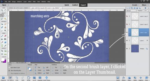
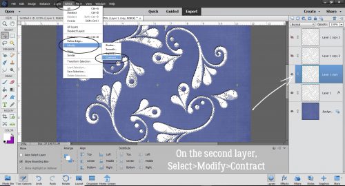
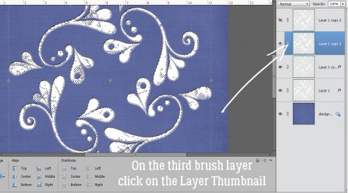
With the second brush layer now visible, I CTRL/CMD>clicked on the Layer Thumbnail (the little picture on the left side of the column) in the Layers Panel to Select the edges of the brush. Selecting an object brings up the marching ants.
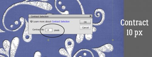
To enhance the 3D effect, I decided to shrink the second brush layer a bit by Select>Modify>Contract.
I opted to Contract by 10 pixels, meaning that the outline of the brush will be moved toward the inside by 10 pixels all the way around.
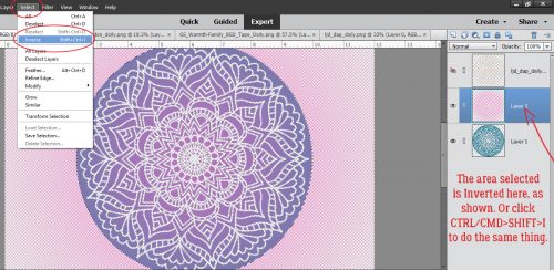
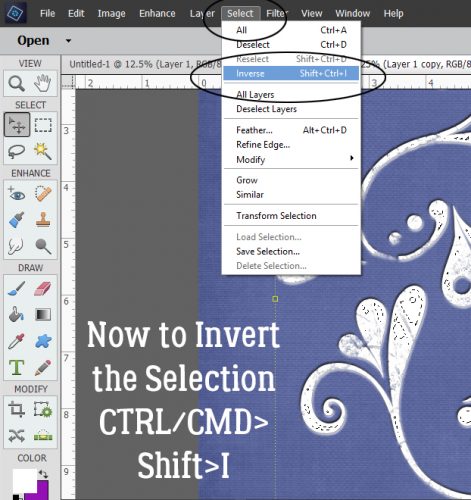
Then I Inverted the Selection by Select>Inverse (or CTRL/CMD>Shift>I)
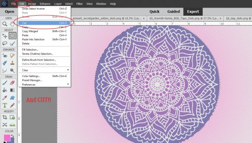
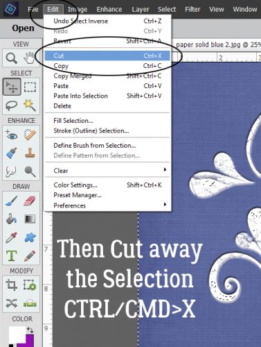
And then I Cut away the outer piece of the Brush layer that was now Selected through Inverting. Edit>Cut (or CTRL/CMD>X)
Just like on the first brush layer, I used a Bevel, this time the Simple Emboss as shown.
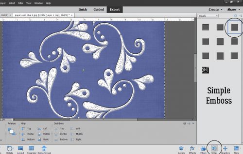
See the new texture that adds?
I also tweaked this layer, adding an Outer Glow of 29 pixels at 49% and adjusted the amount of Bevel to 15 pixels.
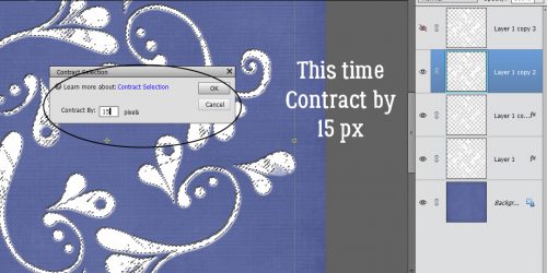
Now on to the third brush layer. I think you know what’s coming. Select the outline again.
This time Select>Modify>Contract to 15 pixels.
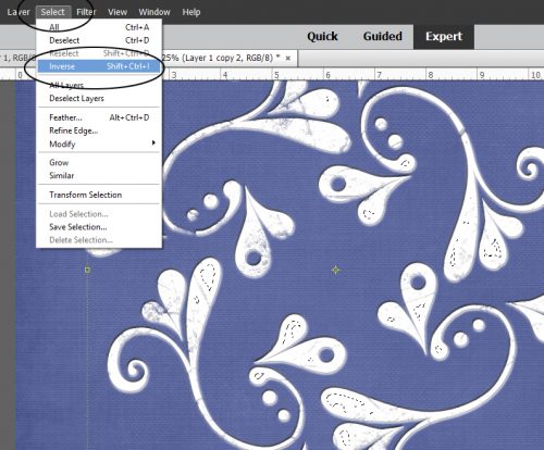
And then Invert the Selection (CTRL/CMD>Shift>I)…
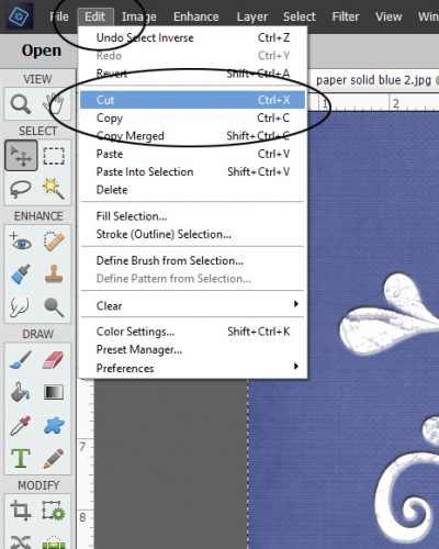
and CTRL/CMD>X away the Selected area.
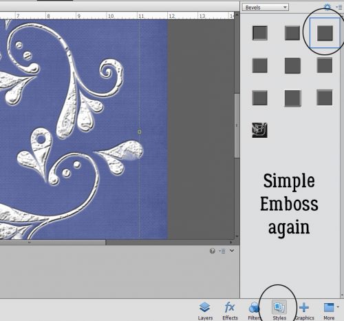
Hit it with the Simple Emboss Bevel.
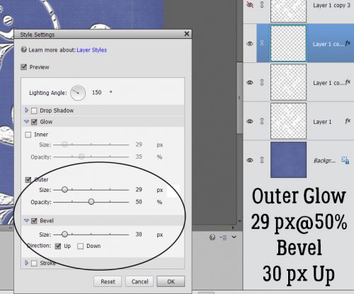
Adjust the Style Settings to add an Outer Glow of 29 pixels at 50% and the Bevel at 30 pixels.
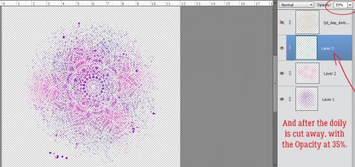
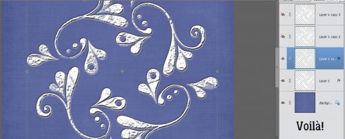
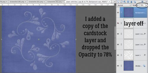
I realized that I’d gotten the effect I was looking for without that 4th brush layer. I could have left the resulting image as it was, which would look like a very detailed 3D white paper die cut, but I wanted to see how it would look as a true embossing of the blue paper. I opted to add a copy of the paper layer on top of all my brush layers, in case I changed a Blend mode for the paper and lost the original blue. Here I’ve toned down the Opacity of the top cardstock layer to 78% and it looks pretty much like I’d expect an embossed blue cardstock to look.
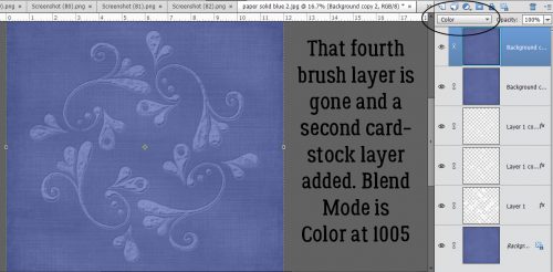
I don’t know if doing this step made much of a difference to the overall effect, but I added another paper layer and changed the Blend Mode to Color. What do you think?
Have a look through your brush collection to see what you have that might work for this and give it a whirl!
![]()