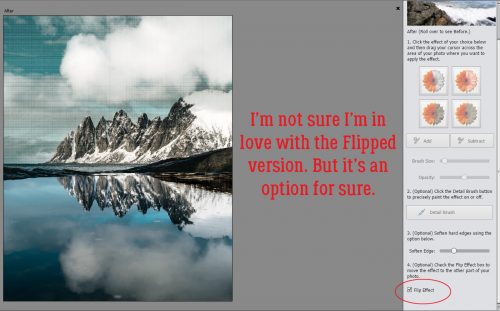
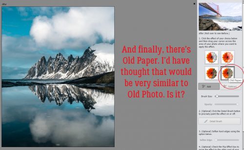
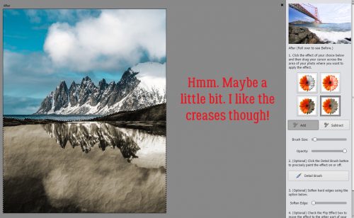
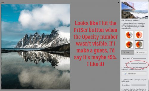
![]()
Hey there everyone. Just popping in here to talk about our August Feature Designer. This month we are focusing on Marina of Magical Scraps Galore. She was awesome about answering the questions I had for her. Let’s see what she had to say.
How long have you been designing?
I started designing in 2011, so it’s been 8 years now.
What made you decide to design?
I started to make my own digital papers and embellishments for scrapping our second trip to Disney World, which of course were very basic. I had so much fun that I decided that I wanted to learn more about digital scrapbook designing, so I spent hours and hours reading and watching Photoshop tutorials. Then I took park in the design challenges hosted by MouseScrappers, and after that I opened my first shop in 2013.
What do you use to create your designs (program, additional tools, etc.)?
I use Photoshop, Illustrator, and ArtRage.
Describe your design workplace.
I design in my studio at home, with my two cats sleeping by my computer or on my lap.
What motivates and inspires you as a designer?
My main motivation and inspiration are my kids and my trips around the world.
What is your favorite kit currently in your GS store and why?
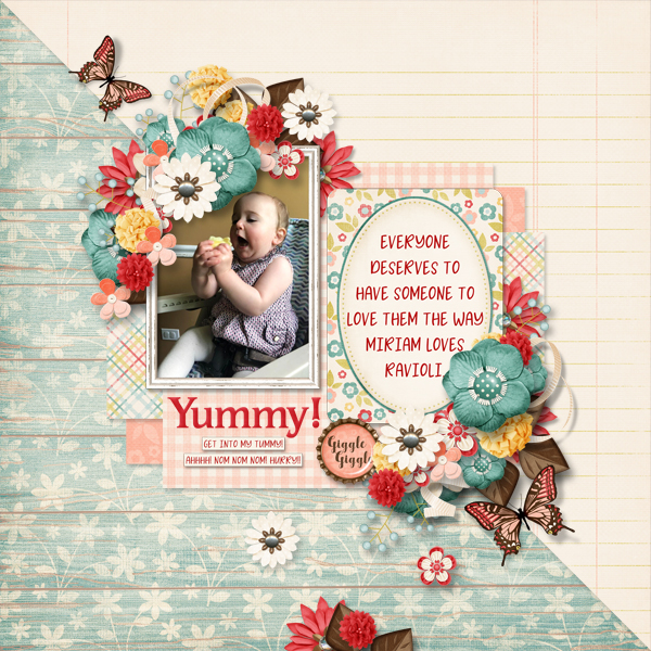
Mmmm this is a tough one … I have several kits that I love, especially my travel collection, but one of my favorite kits is Destinations: Road Trip. I love the colors and the retro feel.

What was your first job?
My first job was as a proofreader for a consulting firm.
Have you ever met anyone famous?
Yes, I met Tom Felton (Draco Malfoy in the Harry Potter films)
What are you reading right now?
I’m currently reading Book 2 of the Game of Thrones series (A Song of Ice and Fire)
What is your favorite quote?
Life isn’t about waiting for the storm to pass. It’s about learning how to dance in the rain.
What is something you want to do in the next year that you’ve never done before?
Next year I’m celebrating both my 50th birthday and 20th wedding anniversary with a roadtrip from Mt Rushmore to Las Vegas, making stops in many Utah and Arizona National Parks.
You have your own latenight talk show, who do you invite as your first guest?
Jason Momoa
If you had to delete all but 3 apps from your smartphone, which ones would you keep?
I’d keep Spotify, Instagram, and my running app.
If you could have someone follow you around all the time, like a personal assistant, what would you have them do?
I’d have them cook!
Would you rather travel back in time to meet your ancestors or to the future to meet your descendants?
To the future, definitely!
What commercial jingle gets stuck in your head all the time.
I’d say none, I’ve been watching Netflix only lately.
If you could turn the ocean into a liquid other than water, which one would you pick?
Red wine!
Thank you so much Marina!!
Make sure to check our her GingerScraps store, her Facebook Fan Page, her Facebook Group, and her webpage (she has some freebies if you sign up for her newseletter).
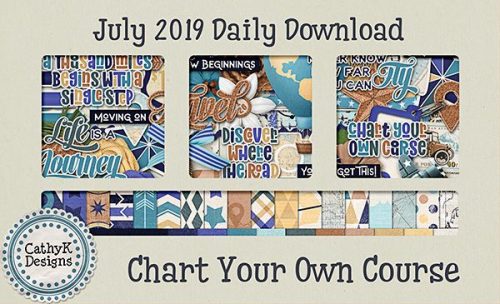
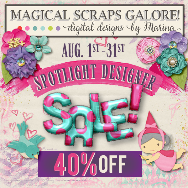
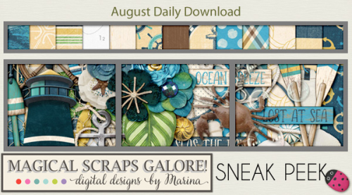
She’s having a sale all month to celebrate being our Feature Designer. And make sure you are grabbing the Daily Download as well.
Have a great day!!
![]()


 .
.