Happy Thursday! Are you ready for the weekend? Are you ready for a peek of what’s releasing tomorrow?? I hope the new releases from our amazing designers spark your creativity this weekend! Let’s check them out!
From Mags Graphics


From Down this Road


From Lindsay Jane


From JoCee


From Miss Fish


From Tinci


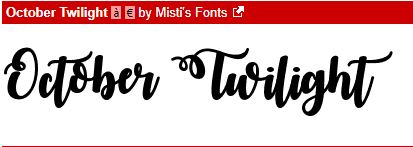
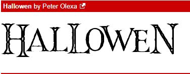
From CathyK