Tutorial Tuesday (Photoshop Elements)


Digital Duplication: Embossing

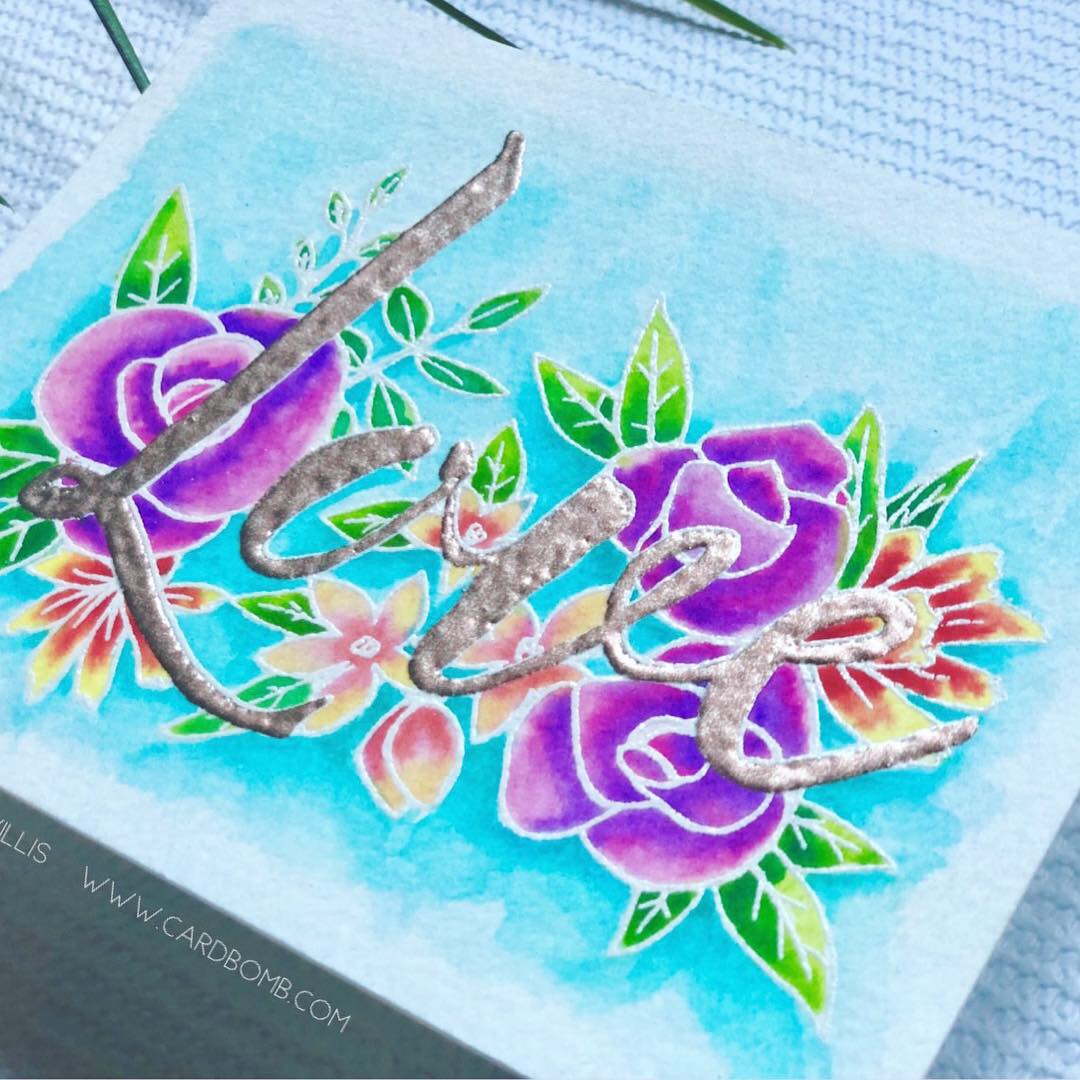
Lately my head has been turning toward the upcoming holidays, and crafting handmade cards for those special people in my life. I’m also always seeking inspiration for my next tutorial… and suddenly several trains of thought collided in my head. There’s a paper-crafting technique that I LOVE, especially for cards, and it occurred to me that I should figure out how to achieve the same look digitally. That technique is called heat emboss resist, and when you do it on paper it’s a lot of messy steps. Using Versamark ink and a favourite stamp, you first make your stamped image on your paper. Then you sprinkle embossing powder over top of the wet Versamark. Then you heat the powder, which melts, adheres to the ink and gets a nice shine on it. Then you can paint over it with either ink or watercolour. The end result is a raised image that repels the ink or paint, and allows the embossing powder colour or base paper to show through. See the photo below that I borrowed from cardbomb.com. You can see the dimension and the way the paint is repelled. So how can that be done digitally?

from cardbomb.com

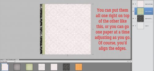
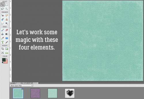
I had to play around for quite awhile until I had it all figured out. But first, I wanted to create a suitable canvas for this project. I took three papers from Lindsay Jane‘s Denim and Flowers collection and the mask created by the lovely Jenn of Shepherd Studio for the September Brush Challenge.

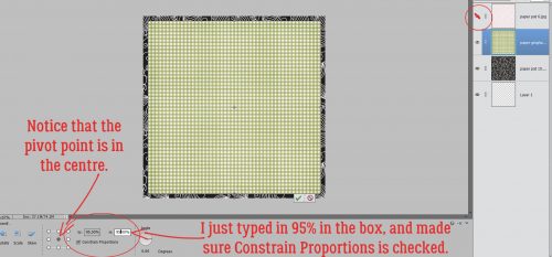
I dropped the solid aqua paper on my workspace, then added the purple solid on top of that. Of course, that made the aqua paper disappear. But by changing the Blend Mode on that purple paper, I can create magic! (But magic usually means trial-and error!)

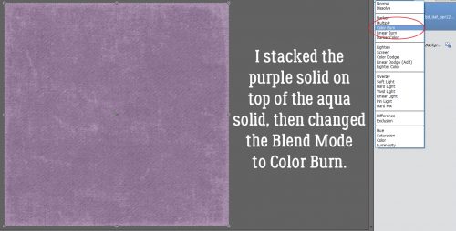
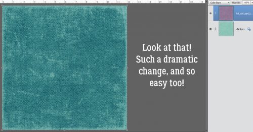
I settled on Color Burn for my Blend Mode and this is what happened.

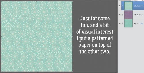
But just to be REALLY fancy, I also used the patterned aqua paper.

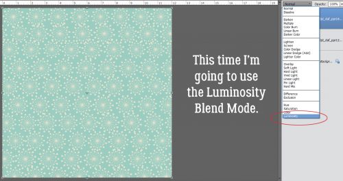
For that I chose Luminosity.

This is what happened with that move. But the rest of my efforts will be wasted if I leave it like this.

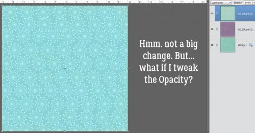
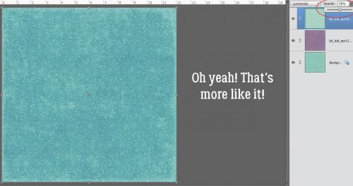
So I dropped the Opacity 50% and now I like what I see.

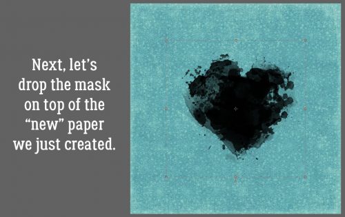
Then I added the mask onto the canvas.

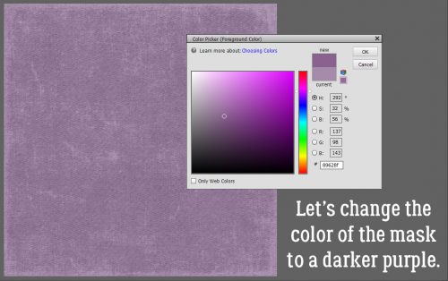
I decided I wanted a purple mask, not black, so I went to my purple paper and chose a spot with the Eyedropper tool, then made it a bit darker. You can see the difference in the color selector box to the upper right of the menu box.

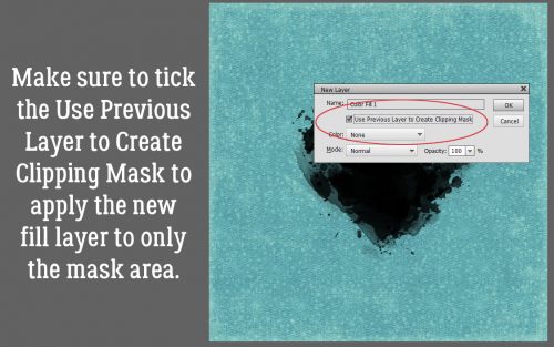
To change the mask’s colour quickly and easily, I clicked Layer>New Fill Layer>Solid Color….

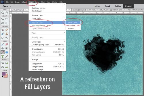
Then when the tool menu opened, I made sure the Use Previous Layer to Create Clipping Mask was checked. The tool will then only fill the selected area with the new colour.

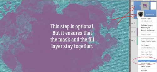
Boom! I like to Merge my Fill Layer with the layer under it so they stay together for later. But you don’t have to do that.

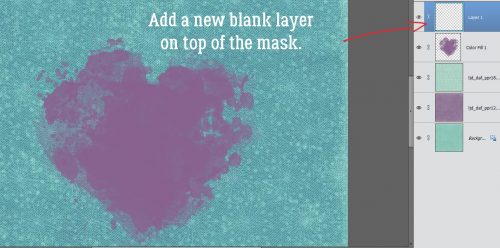
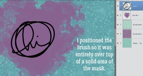
Now I’m going to use a Brush… the digital equivalent of rubber stamps. I ALWAYS put my brushes on their own layer for greater control. If I need to make the brush bigger or smaller, change the orientation of it, copy it or reverse it, I can. Oh, and I can apply Styles to it too…

I didn’t need to play with this brush (created by the talented Karla Noël) to get it to look right, other than to adjust the size so it fits into a solid area of the mask. The colour of the brush doesn’t matter for this technique, so I went with black for maximum visibility.

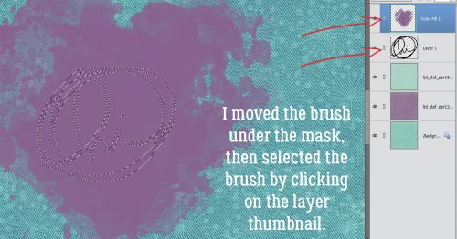
I want the paper to show through so I moved the brush layer under the mask layer then clicked on the Layer Thumbnail to select the edges of the brush. With the MASK layer selected, I Edit>Cut (CTRL/CMD>X) the brush outline out of the mask.

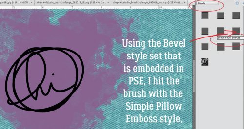
Remember, I was experimenting and taking screenshots as I worked, so there are some unnecessary steps in here, as you’ll see later. I wanted to give the brush some dimension so it looks like heat embossing, so I clicked on the Styles button at the bottom of the Layers panel then chose Bevels. These styles come embedded in the software. The style I used (after I tried almost all of them!) is the Simple Pillow Emboss style, with the default settings.

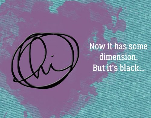
This is what it looks like with the default settings. It surely does look like puffy paint!

Here’s where some of the unnecessary steps come in, but bear with me. I duplicated the embossed brush then went back into the Styles menu and chose Wow Plastic, which also is embedded in the software. I chose the White one down there at the lower left.
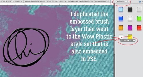
Black’s gone!

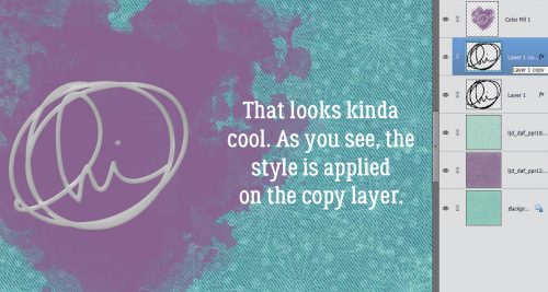
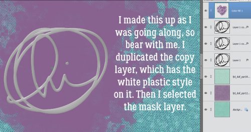
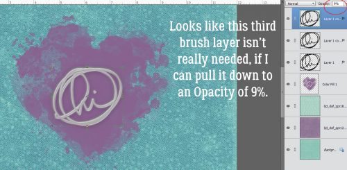
Here’s where you’ll be shaking your head because I’m working hard, not smart! I made a copy of the copy layer with the white plastic style applied. I didn’t need to do it, as I learned in a moment… Then I selected the mask layer. Because I’m going to move it.

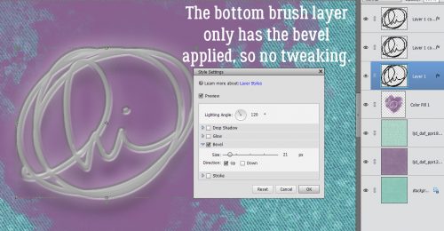
By putting the mask layer underneath all three brush layers, I can see all sorts of effects that were invisible before.

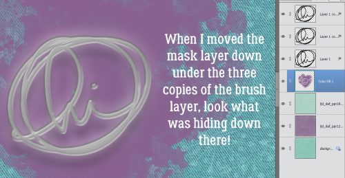
So I checked out the fx on the bottom, embossed-only layer. No adjustments to be made there.

But the middle layer, that’s where there’s a ton of potential. I want the brush to look grounded but also dimensional. So I played with the settings here and settled on what you see. Can you see the changes?

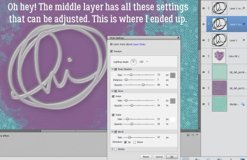
Here’s where I found out I wasn’t smart. But I have what looks a lot like a white heat-embossed stamp on my layout, “resisting” the watercolour mask.

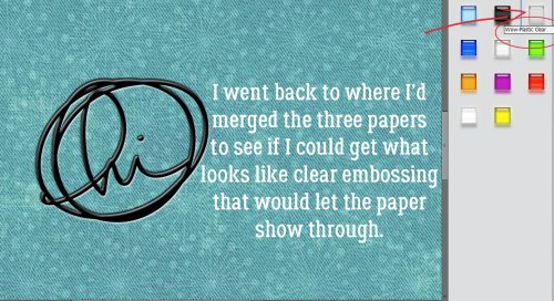
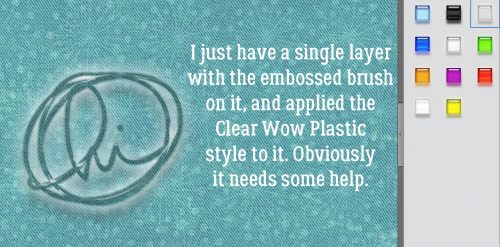
I thought I’d leave it at that, but then I started thinking about transparent embossing powder – which really is a thing – and how it would allow the background paper to show through. Could I digitally duplicate that? Let’s see! Up to this point, I’ve blended the papers and merged them, dropped the mask on the paper and recoloured it then added the brush (just one layer) and used the Soft Pillow Emboss style on it. The mask layer has its visibility turned off for now. In the Wow Plastic styles set there’s a Clear one. What does that do?

That’s what it does! But it still needs some help to look more realistic.

With only a single brush layer there’s only a single fx to play with. I made some tweaks, but I’m not sure they’ll be right until I add the mask.

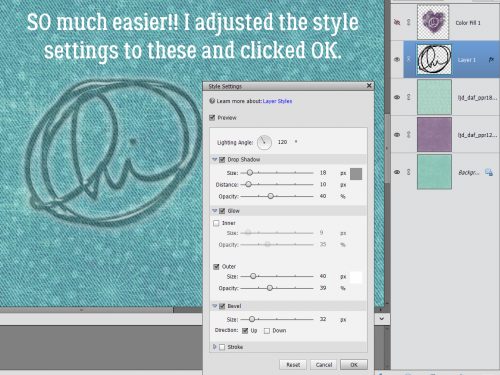
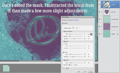
Oh. No. That’s not quite the look I’m after, so I made a few more fx adjustments.

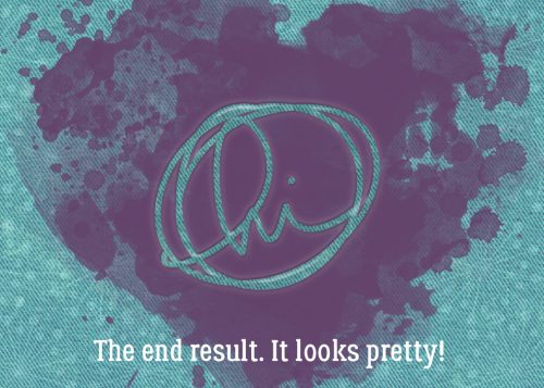
But it still didn’t look quite right, so I lowered the Opacity to 50% and NOW I’m happy!

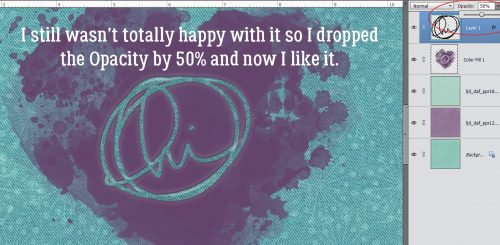
There’s just a hint of shine on it, some dimension and it looks just fine!

Is there a paper-crafting technique you’d like me to translate to digital? Let me know in the comments and I’ll see what I can do.

Sneak Peeks August 29th 2019

Happy Thursday! It’s the last Thursday of the month so I get to show you a sneak peek of the new Buffet coming on Sunday! I hope you will enjoy the holiday weekend and find some time to scrap!

From Down This Road

From Tinci

From Heather Z

From Lindsay Jane

From Aimee Harrison

From JBS Templates

From Alexis Designs

And now lets take a peek at the new buffet!

Have a great weekend!

Tutorial Tuesday (Potpourri)

Making the Most of Milestones

Before I get into today’s discussion I want to thank all of you for your get-well wishes last week. I’m not completely back to normal but can see it from here. I had bronchitis and am still coughing, but no longer running a temp, waking up with a vicious headache or feeling like I’d been run over by a train. I’ve eaten a party-pack of Popsicles over the last two weeks and think I’ll need to keep them in the house all the time now. I forgot how much I like them!

Here in the northern hemisphere, kids are going back to school and summer is winding down. Is it just me or has the first-day-of-school photo shoot gotten as complicated as wedding photos? When my kids were still in school, first day photos were taken standing by the front door for a height reference, with various grimacing and bellyaching. These days it seems, there must be props, special backdrops, dozens of poses and expense. But what can the average mom do to commemorate their precious kiddos’ first days without the headaches? Turns out getting memorable shots doesn’t have to be a huge hassle. Let’s talk about how!

Think about it ahead of time! Planning is never wasted and in this case it can be squeezed in wherever you have a free moment. Think about what you want, how much time you want to put into it, how much advance prep you want to involve and don’t forget to think about your child’s personality. If you have a few minutes, take a look on Pinterest for ideas so you can start palling for them.

Don’t be a slave to the calendar! Nobody’s going to change dramatically in a few days so those first-day photos can actually be taken the weekend before, when nobody’s rushing to get out the door. The weather doesn’t have to be a factor if you don’t take those photos on the exact first day. It’ll also give you a chance to be sure the chosen first-day outfit still fits, is clean and doesn’t have buttons missing.

You don’t need to buy a bunch of props! A simple chalkboard or whiteboard can be highly useful. You can write whatever you want on it and change it between kids. Have your child write his name on the board, then write in the date and their new grade. Simple! Felt signboards can be just as useful, if you already have one. The child’s name, date, grade and school name will all fit on the small ones. An apple, a couple of books or handful of pencils will work as visual connectors to the occasion. Backpacks, lunch bags, new shoes, all those things can serve as props. One image I think would be awesome is of their new shoes, on their feet, with their new backpack leaning against their leg.

Simple backdrops are free! Think a brick wall, the sidewalk in front of your house, their school, a school bus 0r even the siding on your house. Brick walls are classic school images and are nicely neutral. Stand slightly to the child’s side so you’re not perpendicular to the wall, have the child lean his shoulders against the wall then turn a little toward you and start shooting! Have your child stand on the sidewalk with her backpack in hand. Use the portrait setting on your camera, crouch down so you’re on the same level as her eyes and snap! The background will be slightly blurry but still be recognizable. It’ll give the sense of the journey about to begin. Another really effective pose has the child/children walking down the sidewalk AWAY from you, maybe glancing back over one shoulder. OR – use sidewalk chalk to write out the important stuff then have the child lay down on the sidewalk looking up at you. Or shoot down looking at their feet with their new grade in chalk on the pavement. Shooting with the portrait setting from the sidewalk in front of the school can give nice depth of field to provide that sense of growing up and away. If there’s a big sign in front of the school, you could pose your little person sitting cross-legged on the concrete anchoring it to the ground. Another option is to have them posing as if they’re entering the school. And even if your child isn’t going to ride the school bus, they’re dandy backdrops. If your house has clapboard, aluminum or vinyl siding, those horizontal lines can provide a handy journaling spot right on the photo. Simply pose the child to one side of your frame so you have some lovely white space there.

Teenagers can still have first day photos! I know mine gave me serious eye rolls every year after they finished middle school. But I still made them stand there for 10 seconds while I snapped off a quick photo. One way to make it less onerous for them is to print out some little signs on plain paper for them to hold up, using hashtags (let them choose for even more cooperation) like #senior, #backtoschool, #lamephotoday or #almostdone. Tater Tots and Jello has a nice collection of printables all ready for you. Oh, and let them decide how they pose.

Telling stories is what it’s about! Especially for the really little ones, that first day of school is going to be exhausting. They’ve gotten up earlier than they have in weeks, they’ve had a lot of overwhelming new experiences and met a ridiculous number of new people. So you might want to get a photo of them as they arrive home, looking tired and out-of-sorts. One idea I particularly like is the t-shirt one: buy an oversized t-shirt in your little one’s favourite colour (at the moment, ’cause we all know that’s going to change!) then have “Class of [graduation year]” printed on the front. Each year, take a photo of them wearing it. It’ll perfectly chronicle their growth and development and eliminate the conundrum of “what to wear”. Another way to capture that changeling changing is to take a first day photo AND a last day photo for each year. Oh, before I forget, I saw a brilliant idea yesterday. Print out LAST year’s first day photo as an 8×10, frame it in a dollar store frame and have your child hold it in front of them. Perfect record of them as they grow!

These tips can be applied to other occasions as well with just a little thought and very little money. Look online for free printables. They’re everywhere and for every possible event. I’m looking forward to seeing all the back-to-school layouts that I know will be filling up the Gallery any day now!

Sneak Peeks August 22nd 2019

Happy Thursday! Let’s get to seeing a peek of the awesome new releases coming out tomorrow!

From Down This Road

From Just Because Studio

From Aimee Harrison

From Miss Fish

Be sure to check out all the new releases tomorrow!

We Interrupt Your Regularly-Scheduled Tutorial…

I’m so sorry, y’all. There isn’t a Tutorial Tuesday post this week. I’ve been so sick since Wednesday and don’t have the ability to concentrate hard enough to do much other than decide what my priority will be with my next coughing spell: holding my aching head, trying to keep my chest from hurting, hoping that the gunk I get moving doesn’t escape into the room or trying not to pee my pants. I hope to be back up to snuff by next Tuesday though. Thanks for your understanding.

Sneak Peeks August 15th 2019


Happy Thursday! It’s the first week of school down in Florida! My oldest is in school and that gives me more time to scrap! Celebrate the start of the school year by treating yourself to some of this week’s new releases! Let’s take a peek!

From Dagilicious

From JB Studio

From Down This Road

From Tinci

From Lindsay Jane

From Aimee Harrison

From Miss Fish

From Snickerdoodle

From Neia

Have a great weekend!

Tutorial Tuesday – Back to Basics

Anatomy of a Well-Composed Layout

Last week’s tutorial about stacking papers brought this comment from Franghurst: “I found this article very useful.  I have never stacked a paper digitally and I now feel comfortable enough to give it a try.  It’s great when you give us a brand new idea about doing something but I must admit, I like the articles when you go back to the basics.  It’s fun to be reminded how to do things that you learned about a while back.” Of course, that got me thinking. And thinking some more. Today we’re going to go right back the most basic aspect of scrapbooking: composition!

When I look at the layouts in the Gallery, there are layouts that snag my attention right away. I think you know what I mean. There are some things these really fabulous layouts have in common: they’re well-composed. It might not be obvious what makes them catch the eye, so let’s talk about the six basic components of composition. These are focal point, leading lines, balance, rule of thirds, white space and movement.

Focal point: Usually the purpose of a layout is to showcase a photo, or photos. So typically they will be the focal point. But not always. Sometimes the scrapper wants the focus on the story it’s telling, and sometimes the focus is on some other aspect of the layout. This piece by shawnbear is definitely focused on the large photo. She has used several tools from the composition list to achieve her goal.

The size of the photo is the first tool; the rays of paper and the column of elements does the rest.

Leading lines: What exactly are leading lines? They are whatever linear aspects of a layout that lead the eye right to the focal point. Like shawnbear‘s papers. This layout by gwalters goes even deeper into leading lines because they’re both in the main photo AND the layout.

The wire of the fence draws the eye to his face. with one eye framed by them. The chevrons lead the eye to her title. And the concentric paper squares emphasize the converging lines of the layout quite neatly.

Balance: There are lots of ways to create balance in our layouts. The goal is to have areas of equal weight. Flissy61 has done just that.

She’s got the large blended photo balanced by the trio of smaller photos at the bottom. Let’s talk about those small photos for a second. Notice how she has a photo of just the sculpture and a photo of just her daughter, flanking a photo of both. Bingo! Balance. Then she’s used repetition to add more balance to the image with the two vines and the pennants.

Rule of Thirds: This is something I discussed in a previous tutorial on taking better photos. The “Rule of Thirds” means imaginarily dividing your image into thirds, both horizontally and vertically, then placing any (or all!) intersection of those imaginary lines over a focal point. lmtroch has done that in her layout below.

Do you see it? (My lines might be a little off… I eyeballed them.)

White space: This isn’t a literal thing… more of an uncrowded area of the layout where the eye can go to rest. Jill is a master at the use of white space – literally in this layout!

I think white space is a vastly underused tool. But see how effective it is to have these two large areas of just paper.

And last is Movement. By this I mean the way the layout guides the eye around to take in all its components. becky_a makes it look easy.

It really doesn’t matter where you start with this layout, your eye is moved around the whole thing perfectly. Here again, the placement of her photos is key; they all are facing the centre of the layout – harmonious and very pleasing. The bubbles act as a vector to move the viewer, as does the piece of string. And the three little flower clusters keep things on track.

Okay. There you have the factors that create strong compositions. I invite you take a good look at each of these layouts and see if you can pick out each of the “rules” in them. You might also take a critical look at the templates you really like and analyze what makes them attractive to you. I bet you’ll find at least a couple of ways to fit them into the “rules”!

~August Feature Designer – Magical Scraps Galore~

Hey there everyone. Just popping in here to talk about our August Feature Designer. This month we are focusing on Marina of Magical Scraps Galore. She was awesome about answering the questions I had for her. Let’s see what she had to say.

How long have you been designing?

I started designing in 2011, so it’s been 8 years now.

What made you decide to design?

I started to make my own digital papers and embellishments for scrapping our second trip to Disney World, which of course were very basic. I had so much fun that I decided that I wanted to learn more about digital scrapbook designing, so I spent hours and hours reading and watching Photoshop tutorials. Then I took park in the design challenges hosted by MouseScrappers, and after that I opened my first shop in 2013.

What do you use to create your designs (program, additional tools, etc.)?

I use Photoshop, Illustrator, and ArtRage.

Describe your design workplace.

I design in my studio at home, with my two cats sleeping by my computer or on my lap.

What motivates and inspires you as a designer?

My main motivation and inspiration are my kids and my trips around the world.

What is your favorite kit currently in your GS store and why?

Mmmm this is a tough one … I have several kits that I love, especially my travel collection, but one of my favorite kits is Destinations: Road Trip. I love the colors and the retro feel.

What was your first job?

My first job was as a proofreader for a consulting firm.

Have you ever met anyone famous?

Yes, I met Tom Felton (Draco Malfoy in the Harry Potter films)

What are you reading right now?

I’m currently reading Book 2 of the Game of Thrones series (A Song of Ice and Fire)

What is your favorite quote?

Life isn’t about waiting for the storm to pass. It’s about learning how to dance in the rain.

What is something you want to do in the next year that you’ve never done before?

Next year I’m celebrating both my 50th birthday and 20th wedding anniversary with a roadtrip from Mt Rushmore to Las Vegas, making stops in many Utah and Arizona National Parks.

You have your own latenight talk show, who do you invite as your first guest?

Jason Momoa

If you had to delete all but 3 apps from your smartphone, which ones would you keep?

I’d keep Spotify, Instagram, and my running app.

If you could have someone follow you around all the time, like a personal assistant, what would you have them do?

I’d have them cook!

Would you rather travel back in time to meet your ancestors or to the future to meet your descendants?

To the future, definitely!

What commercial jingle gets stuck in your head all the time.

I’d say none, I’ve been watching Netflix only lately.

If you could turn the ocean into a liquid other than water, which one would you pick?

Red wine!

Thank you so much Marina!!

Make sure to check our her GingerScraps store, her Facebook Fan Page, her Facebook Group, and her webpage (she has some freebies if you sign up for her newseletter).

She’s having a sale all month to celebrate being our Feature Designer. And make sure you are grabbing the Daily Download as well.

Have a great day!!

Sneak Peeks August 8th 2019

Happy Thursday!! This is the last week of summer for the kids in Florida. I must say I am so ready for school to begin! Our designers are releasing new goodies to help you scrap all those summer memories you made! Let’s check out a peek!

From Dagilicious

From Aimee Harrison

From Tinci

From JB Studio

From Miss Fish

Have a Great Weekend!

Tutorial Tuesday (Potpourri)

Anatomy of a Paper Stack

I don’t often give a lot of thought to the process of creating layouts, but a comment I received from becky_a on a layout I prepared for Katie of Just So Scrappy and Ooh La La Scraps with her August Buffet collection Live Life started me thinking about it. The two layouts I created for this collection were a little unusual for me, because I didn’t use templates for either of them. (I just couldn’t find one that I liked enough!) The layout becky_a commented on is this one:

… and this is what she said: “I love stacked papers like this and I have the most difficult time making them look right, lol. You make it look so easy.” I had to go look at the layout because I wasn’t sure what she meant! And then I thought maybe it might be worth talking about.

There are no rules for paper stacking. None. It’s pretty much a free-for-all! You can use whatever papers you like, mixing patterns and colours, shapes and angles to suit your whims. Let’s talk first about choosing papers. I’ve always struggled with boldly-patterned paper. They don’t often work with my style of scrapping, but using them in a paper stack like this is one way I can feel comfortable using them. As you can see, that black and white patterned paper is pretty bold! But it’s black and white, so it can work with pretty much anything. I like the paper closest to the photos and elements and largest by area to be relatively neutral, so it doesn’t draw the eye away from the meat-and-potatoes part of the layout. If I’m not planning on journaling ON that paper, patterns can work. I also like to mix up scale. A bold paper needs to be balanced by some smaller patterns or solids. But that doesn’t mean you CAN’T use another bold pattern, because you can resize to so it works well with  your other papers and what you’re doing with them. This is pretty much how I approach paper stacking all the time, whether or not I’m using a template; I like to contrast bright with neutral, bold with subtle, pattern with solid and to have some visible difference between them. But that’s how JAN stacks papers. I’ve seen lots of fabulous stacked-paper layouts where the scrapper has used a monochrome palette, mixed lots of patterns together or only used solids, so as I said, no rules!

Let’s look at this layout, also with the same collection and sans template. I use the Marquee tool and Inverse (Select>Inverse or CTRL/CMD>Shift>I) to cut my random shapes. To make concentric circles or ovals, I make a copy of the first oval then use the Select>Modify>Decrease path, typing in a pixel count to make the new oval smaller. Clip a paper to it and move on.

(My daughter and sister might not like to know I’ve called them both weird people. Or maybe they’d take it as a compliment. IDK!) When talking about colours, I often pull colour from my photographs. OR… I go for contrast. Here, the photo is pretty neutral, so the red, orange, purple and green from the kit all work together. You can see that I’ve mixed in some ovals and rectangles, some pennants and the square background papers. I’m going to tell you how I do those backgrounds, which might be news to those still learning digi-scrapping but is probably old hat to the more experienced in the group.

First step is to choose your papers. Then open a new 12×12 (or your favourite dimensions) canvas on your workspace. Decide which paper will be your main background, the one you want right under your elements and photo(s). Decide on the order of your other papers, keeping in mind the aesthetics of the layout as a whole. I usually use 3 papers for these stacked backgrounds because, as my dear friend Sandy Scott likes to remind me, 3 is an aesthetically pleasing number. You can drop them all onto your layout, turning visibility off to the topmost ones so you can see what you’re doing as you climb the stack. Or you can add them one at a time. Whatever suits your workflow. I’m showing them all piled on at once and in the screenshot after this one, you’ll see that the topmost paper is invisible.

To make a visually pleasing rotated stack, you’ll want to make the upper papers a bit smaller than the background paper. (Or not. Remember, no rules!) The easiest way to do it is to click on one of the corner “handles” on the bounding box, then either pull that handle in toward the centre, or take the quick-and-lazy route and type a number into that box I’ve shown you here. That keeps the papers centered one on top of the other. Just make sure you’ve got the Constrain Proportions box checked so it shrinks the paper in both horizontal and vertical planes.

Then rotate that second piece of paper. The Pivot point selected is the centre one – the default. The angle will be half of the percentage by which you’ve shrunk your paper, unless you want your corners to extend off the page. There are two spots where you can see the angle you’re rotating to, the black pop-up box and down in the Tool panel. I usually just eye-ball it.

I like to keep the papers in a rotated stack, other than the actual background, all the same size. It’s obviously not required, it’s just my OCD-ness. Shrinking the paper is done in exactly the same manner.

Then I tip the next/top paper in the opposite direction, to about the same angle. And that’s all there is to it! Shadow those babies up and you’re ready to move along.

The second example is even more straightforward.

When you’re doing this kind of stack, if you want a symmetrical border of the background paper visible, make sure your Pivot point is in the centre. It’s important! Typing a number into one of the dimension boxes – either one is fine, as long as you’re Constrained – is quick.

But if your Pivot point is in the lower right corner, for example, when you type in your number, this is what will happen. It’s not necessarily a bad thing, because there are ways it can make your workflow more streamlined if you want to work from a corner out. (You can tell this screenshot was an after-thought. Sorry!)

Here, you can see what decreasing the paper size by 5% for the first one and 5% MORE for the second one will look like. You can use any amount you like; if you want a wider border of your very bottom paper, go with a bigger drop. If you want one border wider than another, choose a smaller or larger decrease. A nice solid paper with a narrow gap looks really good. Oh, and you CAN use a decimal in that box. You don’t have to go with whole numbers.

All of these tips can be applied to any stack of papers you might contemplate, either as part of a template or freehand. Give it a shot becky_a, you’re probably underestimating yourself a LOT!