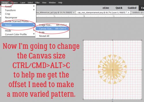
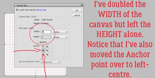
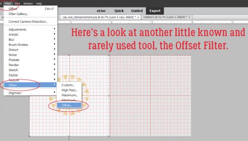
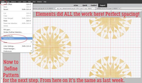
![]()
Happy May!! Has everyone recovered from INSD? I hope everyone was able to join in on the fun and found some great deals!
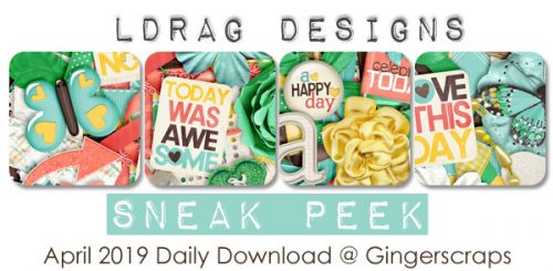
This month we have TWO designers that have teamed up for this month’s Featured Designer. Miss Fish and Shepherd Studio are bringing you this month’s Daily Download. They both slowed down for a few minutes to answer my questions.
Let’s chat with Juli of Miss Fish first.
How long have you been designing?
2- and three-quarter years so far.
What made you decide to design?
I wanted to make some extra money to get my hair and nails done monthly.
What do you use to create your designs (program, additional tools, etc.)?
My laptop, hooked to a double wide monitor, Photoshop, my new iPad Pro and Procreate.
Describe your design workplace.
I sit in our Family Room at a self-made desk in our bookcase. That puts me in the middle of everything going on in our family. I can also pick and go anywhere (can you say Starbucks?) with my laptop.
What motivates and inspires you as a designer?
Fun colors and fun patterns. I’ve started designing kits this year because of this.
What is your favorite kit currently in your GS store and why?
My favorite template pack is Wordly Templates. These make me think of vacationing and documenting all my adventures.

What was your first job?
First ever??? Probably babysitting.
Have you ever met anyone famous?
I don’t think so.
What are you reading right now?
I work full time and design; this girl has no time to read.
What is your favorite quote?
Live for the moments you can’t put in to words.
What is something you want to do in the next year that you’ve never done before?
Learn how to draw.
You have your own latenight talk show, who do you invite as your first guest?
Michelle Obama
If you had to delete all but 3 apps from your smartphone, which ones would you keep?
Texting to stay in touch with my kids and family. Pinterest for design inspiration and ideas. Google maps because I don’t like getting lost.
If you could have someone follow you around all the time, like a personal assistant, what would you have them do?
Drive my car to work and clean my house, maybe even make dinner.
Would you rather travel back in time to meet your ancestors or to the future to meet your descendants?
To the future.
What commercial jingle gets stuck in your head all the time.
“Sometimes you feel like a nut. Sometimes you don’t”.
If you could turn the ocean into a liquid other than water, which one would you pick?
Margaritas!!!
Make sure to check our her GingerScraps store, her FB Fan Page and her Facebook Group, The Fish Bowl.
Now, let’s talk to Jenn of Shepherd Studio.
How long have you been designing?
About 10 years, but I just came back to digital scrapbook design last year.
What made you decide to design?
Peer pressure.
What do you use to create your designs (program, additional tools, etc.)?
I use Paint Shop Pro mostly, but also use Photoshop and Illustrator.
Describe your design workplace.
I have a designated office space in our home, so it’s filled with my planners and paper crafting as well as my computer for designing. I also have a second monitor I mostly use to stream movies while I work. I keep everything white including all the furniture as I prefer a minimal, clean look.
What motivates and inspires you as a designer?
I’m most inspired by themes and colors. I enjoy designing papers and patterns and work hard to create unique patterns as well as favorite basics with each kit.
What is your favorite kit currently in your GS store and why?
My favorite kit is Wildflower. I loved the sketches and creating the fun patterns for it. The blues and yellows just remind me of being outside. It’s the kit most like me.

What was your first job?
I worked in the kitchen at a Summer Camp in the Adirondacks
Have you ever met anyone famous?
Several people. I even got to shake President Bill Clinton’s hand.
What are you reading right now?
“How to Be Well: The 6 Keys to a Happy and Healthy Life” by Frank M D Lipman
What is your favorite quote?
“Be the change you want to see in the world.” by Mahatma Gandhi
What is something you want to do in the next year that you’ve never done before?
Take my husband to a foreign country. He’s never been outside the US.
You have your own latenight talk show, who do you invite as your first guest?
Oprah
If you had to delete all but 3 apps from your smartphone, which ones would you keep?
Instagram, Etsy, Gmail
If you could have someone follow you around all the time, like a personal assistant, what would you have them do?
Rub my back and feet
Would you rather travel back in time to meet your ancestors or to the future to meet your descendants?
Back in time
What commercial jingle gets stuck in your head all the time.
Dada da da da I’m lovin’ it.
If you could turn the ocean into a liquid other than water, which one would you pick?
Herbal tea
Make sure to check out her GingerScraps store and her Facebook Fan Page.
Also, make sure you are grabbing each day of the Daily Download for a great kit and templates from both ladies.

![]()