Hi ladies! I’m so sorry to tell you there isn’t a Tutorial Tuesday post for this week. My real job intruded and left me with no free time and totally exhausted. But there will be a new Tutorial next week, with some tips on shadowing stacked elements. So stay tuned!
Sneak Peeks June 6th 2019
June 6, 2019 by

Happy June! My son has been out of school for a week now! Summer is officially here in Florida. It’s hot and humid and now I have to entertain a 7 and a 3 year old. But at least there’s a lot of memories to take pictures of! Our designers have great releases to get us into the summer spirit!
From Mags Graphics


From Clever Monkey Graphics


From Snickerdoodle


From Tinci


From Lindsay Jane


From Miss Fish


From Down This Road


From Wimpychompers


From Aimee Harrison


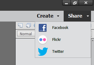
Tutorial Tuesday (Photoshop Elements)
June 4, 2019 by
Deconstructing the Custom Shadow
![]()
I think we all agree that shadows are an essential and integral part of a great digital layout. There are lots of ways to add shadows in Photoshop Elements, and some of them are easier than others. But to create a true, realistic-looking shadow, there are a few things to keep in mind. Drop shadow styles are included with the software and can be useful; a number of digital designers have also created a set of drop shadow styles that make the task simple. However, to have the most realistic shadows, it’s not enough to “drop” them onto your layout. That’s because objects don’t have even lighting and they don’t have uniform and even shadows either. Objects CAST a shadow. So let’s deconstruct this concept a little.
Here are three identical flowers. I’m going to show you the default drop shadow style, a commercial drop shadow style and how I shadow a flower like this. See if you can pick out the differences.

First let’s look at the PSE default Drop Shadow set, found in the Styles menu. It’ll add a drop shadow to the object with one click. Because I’m shadowing a flower, I selected the Soft Edge version. Don’t know which is which? Hover your cursor over the thumbnail and it’ll tell you. These Styles are adjustable; by double-clicking on the fx icon on the layer’s thumbnail in the Layers panel you open up the adjustment menu. Move the sliders for Size (this determines how sharp the edges of your shadow will be – the bigger the size, the softer), Distance (this isn’t accurate, because it adjusts the size of the shadow) and Opacity (darkness) until you like the look.

There’s the default shadow on the far left, unadjusted. For the flower in the middle I’m going to use a commercial drop shadow styles set from Tracie Stroud. (Tracie has retired from designing, so her products are no longer available. Mommyish and Sahin Designs currently have drop shadow style sets in their stores.) This set is the 120° lighting angle set and I hovered until I found one called Flower. Click!

Hmm. Do you see much of a difference between the first one and the middle one? The one on the right side is the one I created a custom shadow for. This method seems to be really hard, with a lot of steps, but with practice it’s become almost automatic for me now and takes about the same amount of time as using a style does. I think you can see the difference here.

Here are the steps. The real thinking-about-it comes later with the adjustments. Start off by creating a NEW LAYER underneath your object. To do this hold down the SHIFT key and click on that little icon that looks like a piece of paper with the corner turned up at the left-top of the Layers panel.

This is what you’ll see in the Layers panel. If you forgot to hold down the SHIFT key, you can move the new layer down using the keyboard shortcut CTRL/CMD>[.

Next, click on the object’s thumbnail in the Layers panel. The thumbnail is the little picture.

Now the outside edges of the object have been Selected and have a line of marching ants around it.

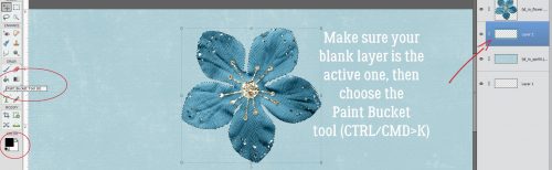
Before you go on, make sure the BLANK LAYER is the active one. Otherwise you’ll be undoing. Then choose the Paint Bucket tool (K), set your foreground colour to whatever your desired shadow colour will be (I just used black, 000000 but some people like to use a slightly browner colour like 2C1902) then click on your workspace. Elements will fill the selection with the foreground colour.
And there it is!

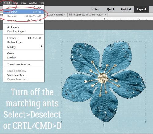
To Deselect the object’s outline you can go Select>Deselect, or just CTRL/CMD>D.
Next, decide where your light source is. Looking at the object can help with that, because there will be subtle highlights and shadows there already. For this flower, the light is clearly coming from the upper left. Now you need to activate the Move tool. I usually just go V. Then move the dark outline in a direction AWAY from your light source. Use the arrow keys to nudge it, if you like.

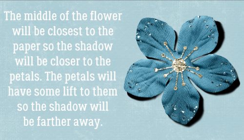
This is the interesting, fun part! Think about what parts of your object would actually touch whatever it’s resting on. The centre of this flower will be resting right on the paper, so the shadows around that part will be less noticeable – light can’t get underneath whatever is touching the surface, so no shadow can be cast. Use the Smudge tool (R) to push and pull the edges of the shadow into place.
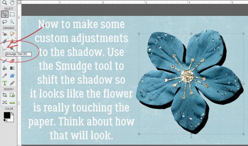
Can you see how I’ve adjusted this shadow? I pushed the shadow toward the centre between the petals. I pulled the shadow sideways and away from some of the petals and imagined the petal at the very bottom is twisted a bit so the left edge is touching the paper.
When you feel like you’ve got the shadow looking natural and real, it’s time to soften it up. Filter>Blur>Gaussian Blur is how that happens.
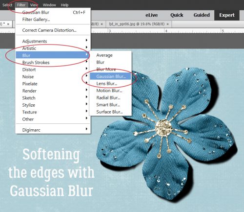
To see how much of an effect the Gaussian Blur has, click your cursor on a point somewhere over the edge of your shadow and your preview pane will shift to that spot. Move the slider until you’ve got a nice, soft edge. How soft will obviously depend on what it is you’re shadowing. A button would have a sharper edge, string a softer edge.

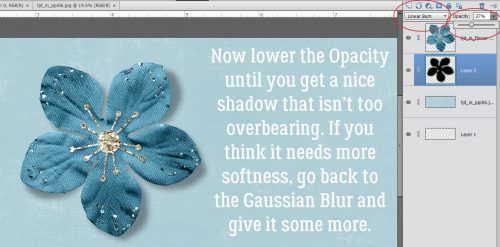
Almost done! Change the Blend Mode to Linear Burn for more of a shadowy look nearest to the object. It also allows the shadow to take on some of the colour of whatever is under it, in this case the blue of the paper.

Then lighten up up by decreasing the Opacity to somewhere around 40%, plus or minus. Keep an eye on what’s happening and you’ll see when it looks right. If you think the edges are still too sharp, use the Gaussian Blur again.
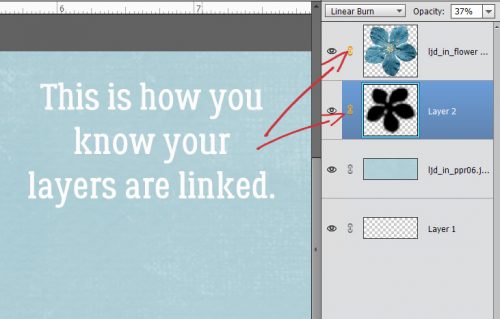
Last thing to do is to Link the shadow layer to the object layer. To do that, select the two layers then click on that little icon that looks like a couple of chain links. Alternatively, you can Merge the two layers by selecting them then right-click>Merge or CTRL/CMD>E. Why do this? Well, if you move the object and it’s not either linked or merged with the shadow, the shadow is going to be left behind and you’ll have a bunch of hassle positioning it right later.

When your layers are linked to each other, this is what you’ll see in the Layers panel.
This was a very basic custom shadow operation. Practice it a bit, then I’ll show you how to layer objects on top of other objects and get the shadows right in that situation. Even more fun!! Just let me know when you’re ready to take it up another notch.
![]()
Sneak Peeks May 30th, 2019
May 30, 2019 by
Happy Thursday! It’s the end of May! So I get to show you a sneak peek of tomorrow’s new releases and Saturday’s new Buffet!
From Miss Fish


From LDrag


From Down This Road


From Dagilicious


From Aimee Harrison

And a Peek of the new Buffet!


Have a Great Weekend!
Tutorial Tuesday (Photoshop Elements)
May 28, 2019 by
How Do You Know When to Upgrade?
![]()
Today’s tutorial is going to be a really wordy one. Lisa R made this comment on last week’s post: “That’s why I adore digital scrapbooking! I still have PSE 11 and since I use it mostly for photos (not scrapping), it would be interesting to hear the best things YOU like about it … I’ve been thinking of upgrading for quite some time but again, because I use it mostly for photos, I’m still on the fence.” I hope to make her decision easier by discussing some of the things that have evolved since V.11. I’ve never been one to upgrade just to stay at the front of the pack. There has to be something in the upgrade that I want… and I’m pondering whether it’s worth the money (about $120 Canadian for an upgrade, $140 for a new purchase) to jump to PSE 2019. But before I talk about that, let’s look at the changes from Lisa’s V.11 to my current V.15.
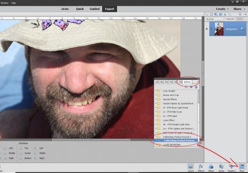
V.11 brought us some fabulous sketchy filters, and introduced automated actions to Elements – Photoshop CS/CC has had them for a long time. If you’re not familiar with actions, they’re little scripts that automatically perform a series of adjustments to your work. They’re especially useful for photo editing and professional photographers have their favourites, which then let them develop a personal style. Photographers whose specialty is newborns, for example, will use actions that tone down jaundiced skin, hide newborn “acne”, reduce mottling and so on. There are also actions that take the work out of getting the background right. There are lots of sources for free or low-cost actions online, with demonstrations of how they work. Here’s a demo of a free action from The Coffee Shop blog. It’s called Perfect Portrait 3. It’s pretty amazing!
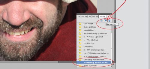
In V.15 there are two ways you can access actions, both the very basic ones that came with the software and those you’ve installed. The first is to click Window>Actions and the second is to click that More button then choose the Actions tab. If you look closely at this photo of my son, his skin is pretty gnarly-looking so let’s see how Perfect Portrait 3 fixes it.
When you’ve chosen the action you want to run by clicking on the folder to the left of the title, you can either click on the dark blue triangle to the left of the folder’s contents, or the dark blue triangle circled below. That sets the action in motion.
There may be some parts of the action that require your input, like this one. It’s actually the second spot where I told it what to do; the first was a Levels adjustment. In this screen I could change the source of the colour I want to replace.
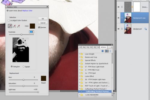
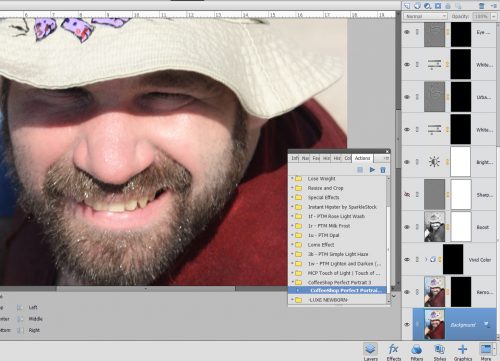
After I hit the OK button for Replacing Color, the action took off and in 30 seconds I had all these adjustment layers that I can now fine-tune. But even without any further input from me, those blemishes on Adam’s nose are gone, his skin tone is more even and his teeth are whiter. I think his crows’ feet aren’t as obvious too.
Another new feature that came with V.11 is in the Organizer. (I don’t use the Organizer because I didn’t like it with my first couple of versions, and created my own filing/organization system.) This version introduced user-determined tagging, allowing many more options for finding what you’re looking for by using your own tags. Options could be by name, by date, by location or by event, for example.
Last but not least, V.11 had the first Out-of-Bounds Guided Edit that allows cutting away the background from part of a photo but leaving things like heads, arms and legs in there. Think of those cool layouts where the photo looks 3D, like it’s bursting out of a frame.
V.12 brought a few more useful improvements. Content-Awareness allows for quicker, easier editing with the Spot Healing tool and with the Content-Aware Move tool. (I haven’t played with that tool yet, so I won’t try to explain how it works. We’ll save that for another day!) This version gave us a pet-eye correction in the Quick and Expert edit menus for the first time.
It also gave us the Zoom Burst Guided Edit that lets you add motion blur to an action photo that looks natural. That one looks like a lot of fun! Another new option in the Guided Edit menu in V.12 is Rotate and Straighten, making adjusting the horizon in photos super-simple. Here’s where the Puzzle edit and the Photomerge edit also came into play. One big drawback to V.12 was that everything was turned into a Smart Object, resizing things like buttons to the size of whatever the workspace it was moved onto was… 12×12 for example. It was a REAL pain in the butt having to then manually resize every. Single. Element. On my layouts.
V.13 got rid of that. It introduced the Refine Edge function to selections, which was a game-changer for lots of people. It allows for sharper extractions and cleaner edges. Some other benefits V.13 had include Auto-crop options – the software provides a preview of several ways to crop an image. [I turned that off eventually because I don’t want to be told what to do. ;)] They added Black and White (automatic and simple conversion to black and white), Black and White Color Pop (keeping a specific area of a photo in color while making the rest of it black and white) and Recompose (resizing your photos without losing important parts of them) to the Guided Edit menu.
And then there were these very useful additions! I haven’t actually played with these either, but I think I should!
V.14 is where there were huge changes made to Elements. Many of the techniques I’ve shared were made possible by these additions: Remove Camera Shake; Remove Haze (!); Batch Edit; one-click Whiten Teeth, frames, photo effects and textures; Photo Illustration; Paint-On Effects; select detailed edges (hair?); remixing 2 photos, improvements to the Recompose edit; RAW editing; new options in Photomerge and an opportunity to print at home came with V.14.
Compared to V.14, there weren’t a lot of changes in V.15, but improved function of some of the menus were a bonus. The Filter Gallery has been simplified and there were a few additions to the Guided Edit menu such as Photo Text (there was a tut on this one), Effects Collage (which lets you apply several effects to sections of a single photo), Painterly (there was a tut on this one too) and Speed Pan (giving a moving object a blurred background). There’s also a cool effect that lets you change a frown into a smile.
Changes to the appearance of the workspace, the location of toolboxes and buttons and other sort of housekeeping things have continued from version to version. There will always be a bit of a learning curve when you upgrade; the larger the gap between your old version and the new one, the steeper the curve.
So this is where my dilemma lies. Do I go from V.15 to Elements 2019? How hard will it be for me to learn the new stuff, and then translate it into easy-to-follow tutorials? Are there enough new things (there are 8 new Guided Edits) I can’t live without to make it worthwhile? 2019 has a powerful new function called Adobe Sensei AI, which does a lot of things automatically in both the Organizer and the Editor. It uses artificial intelligence to tag and organize your photos and videos based on image recognition, it allows for video editing, which V.15 does not, and it has several social media features. Oh and did I mention slideshows?? If you’ve ever had to create a slideshow, you’ll know how much work they are and how hard it is to get them just right. 2019 will automatically select the best photos from a selection and turn them into an animated slideshow guaranteed to impress. There’s also a more useful home screen. It looks like I have some thinking to do…
![]()
Sneak Peeks May 23rd 2019
May 23, 2019 by
Happy Thursday! School is almost out and summer is almost here!!!! Where did the Spring go??? To get you ready for the summer, our designers have some great new releases! Let’s take a peek!
From Dagi


From Mags Graphics


From Tinci


From Heather Z


From Down This Road


From Miss Fish


From Aimee Harrison


Tutorial Tuesday (Photoshop Elements)
May 21, 2019 by
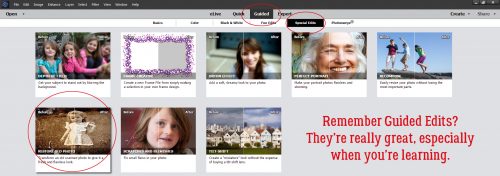
Restoring those Vintage Snapshots
![]()
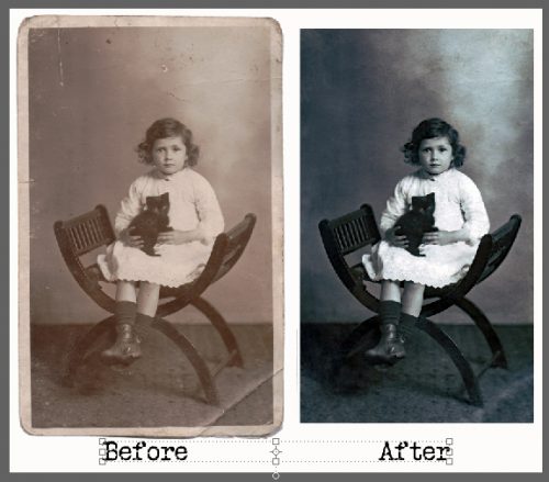
Halfway between my birthday and Mother’s Day, I had the most amazing visit with some relatives I’d never met before. One of the ladies I spend the day with is my Grandmother’s first cousin, who is actually only four years older than my mother. This delightful woman brought along a huge collection of vintage photos, some of them well over 100 years old. Today I’m going to show you one of them and take you through a Guided Edit to restore it. (Spoiler alert: This is NOT a quick edit. It took me about 2 hours to get it to the final version.)
The Guided Edit I’m going to demonstrate today is simply called Restore Old Photo. It’s in the Special Edit toolbox. What I love about these Guided Edits is that everything you’re going to need (pretty much) is all in the Edit toolbox. It’s especially helpful for those who are still learning how to use their software, because each tool in the box has a little explanation of how to use it. Like a mini-tut, if you will.
Here’s my photo. The little girl is my first cousin twice removed, Lily Annie Delia. She was nicknamed Laddie (for her initials) and she really didn’t like it! This photo was taken in the fall of 1916 and was sent to her grandmother as a Christmas gift.
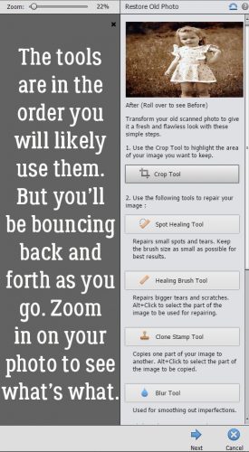
This Guided Edit has more tools within it than can be shown all at once, so don’t forget to scroll down and take a peek. Be cautious of that Cancel button I’ve circled. It resets EVERYTHING back to the original.
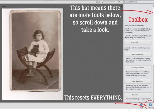
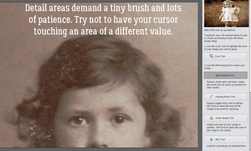
The tools are listed in the order you’re most likely to use them, but I found I was bouncing between them as the condition of the photo demanded. Zoom in really closely so you can see the imperfections better and what changes the tools create when you use them.
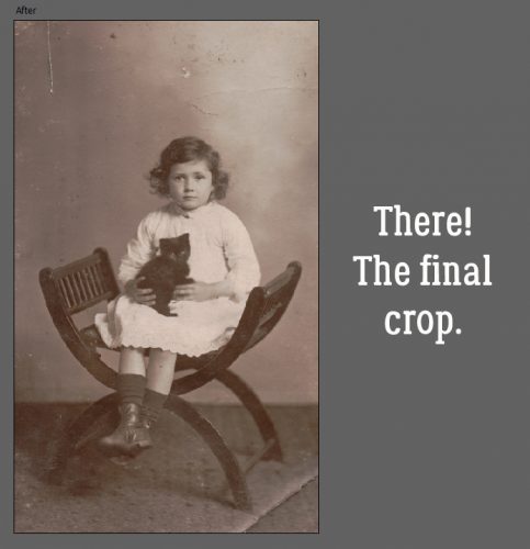
But first… This is a personal preference here. I like to crop off the white paper border before I do anything else. But there may be times when you want to leave it. Here I show you how I cropped this one. The image was printed slightly askew so I straightened the Crop window level to the demarcation between the carpet and the wall.
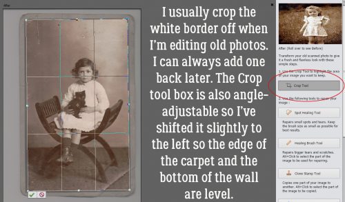
This is my new starting point.
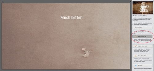
The Spot Healing tool in the Expert edit mode has a number of options for the tool, but within this Guided Edit, it doesn’t. If you’ve never used it before, you’ll be surprised at how one click can make a huge difference. The secret to a great, invisible edit is to take your time and use a SMALL diameter brush.
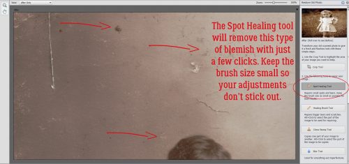
See how all that discoloured scratchy stuff is gone now? Typo spotters… that should read “down”. You can move your photo around on your workspace by using the Hand tool.
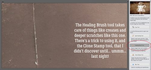
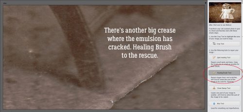
That scratch and the messy corner will need more help than the Spot Healing tool can provide, so I’ll use the Healing Brush. It’s similar to the Clone Stamp but can be stroked across a blemish like a brush. More details on how this tool works best are to follow.
Now you see it, now you don’t!
This is where I started moving back and forth between the Spot Healing tool and the Healing Brush.
This shows how sometimes there are several types of blemishes in a small area.
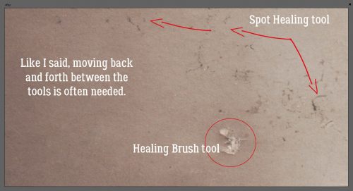
The Spot Healing tool is active in this screenshot. I’ve removed most of the discoloured stuff.
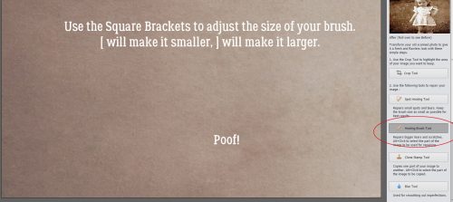
It’s very easy to change the size of the brush you’re using in either the Spot Healing tool or the Healing Brush. Those square brackets that don’t have much use outside of algebra are the volume up and volume down buttons for brushes. The [ one makes your brush smaller, while the ] one makes it bigger. I just made my Healing Brush slightly bigger than the scraped area, selected an unblemished area of my photo and painted over it.
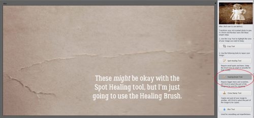
These scratches and creases might be erased with the Spot Healing tool, but I didn’t take any chances. I used the Healing Brush.
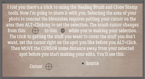
Here’s the secret to making the Healing Brush and Clone Stamp tools work to their best advantage. (And I literally discovered the trick LAST NIGHT!) If you don’t move the cursor away from your ALT>Click selection before you start using the tool, your “source” point will be… what you’re trying to cover. So always move it, even just a little bit, before you start trying to fix an area. You’ll be able to see where your source is because there will be a little white “plus” sign at the spot where the colour or texture is being sampled. Below I’ve mocked up what you’ll see, but in black to make it more easily seen.
When using either the Healing Brush or the Clone Stamp, work AWAY from your source so you’re moving from clear to unclear. You’re trying to blend away the blotches, not replicate them.
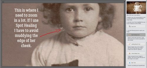
No matter what tool you’re using, when you’re in a spot where there’s lots of detail, you need to slow down and use the smallest brush possible. If you’re too close to an area where the colour or tone is different, your correction will actually only create another flaw.
Hair. It’s one of those love-it-or-hate-it things!
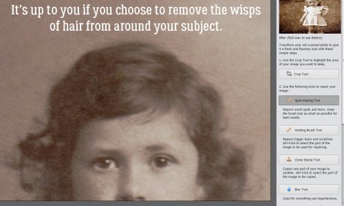
Use the zoom! The keyboard shortcuts – and + make it easy to do. Get in tight where you need to, pull back to make sure it looks right when you need to.
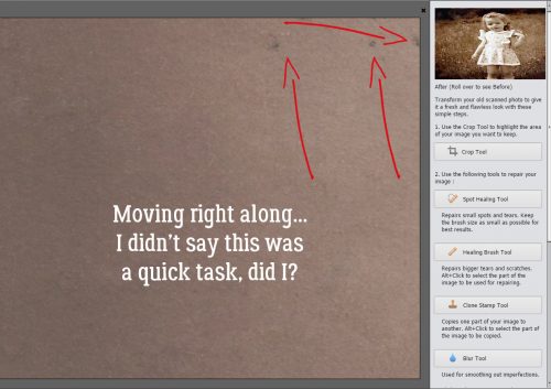
I used the Spot Healing tool, the Healing Brush and the Clone Stamp freely in this area. The Clone Stamp tool is terrific for repeating shapes and sharp edges. By selecting a spot along the edge, for example, I can replicate that perfect spot all the way down the rung.
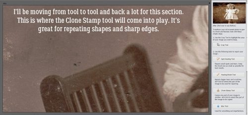
And on it goes.
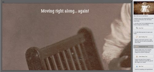
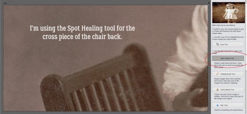
Spot Healing worked well for the cross piece here.
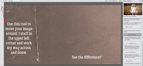
I made my way across the photo from the upper left corner over to the right, dropped my working area down then worked back from right to left, repeating until I’d covered the whole photo.
I could stop here, but I want to show you some more options, so let’s press on.
Even though I think I’ve done a great job, I think I want to use the Dust Removal tool to refine the image even more. It’s one of the hidden ones I had to scroll down to find. Adjusting the pixel size, I can tell Elements to find all the remaining flaws that size or smaller and Elements will fix them.
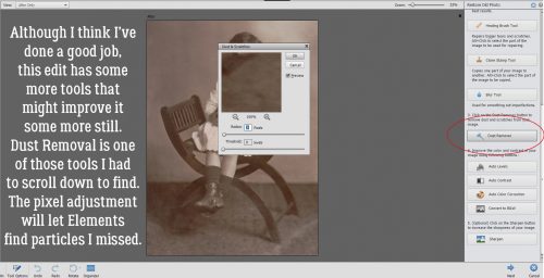
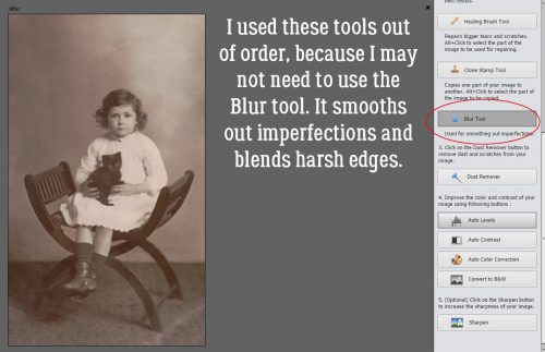
I wanted the Dust Removed first before I went on to the Blur tool. It does exactly what it says it does. It softens the hard edges of an edited area so it doesn’t stand out. I just brushed it over some of the background.
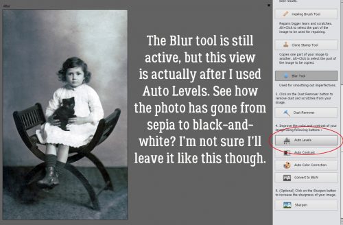
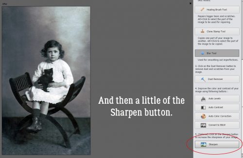
The next several adjustments aren’t using any of the tools, just adjustment modes, so the Blur tool looks like it’s still active. But this screenshot shows my photo after I used the Auto Levels mode.
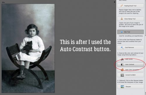
Then I let Elements adjust it with Auto Contrast.
And a touch of Sharpening.
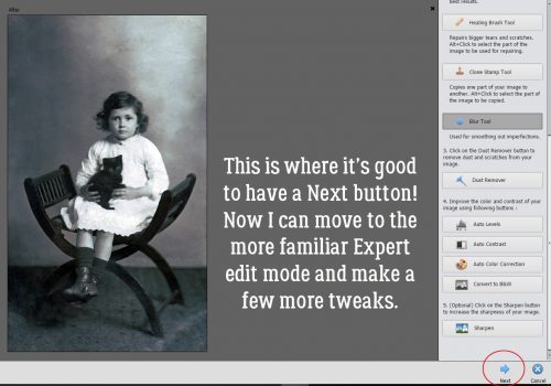
When I’ve gone as far as I want to with the Guided Edit, I can click on that Next button and go into the Expert edit mode.
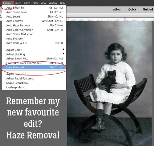
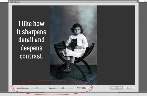
Since I discovered Enhance>Haze Removal, I’ve used it SO OFTEN! It does several things all at once – sharpening details and deepening contrast.
And the effect is fully adjustable. I’ve moved both sliders to the left from the default settings.
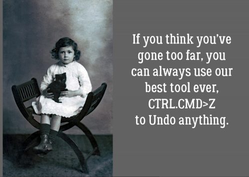
Don’t worry that you’ve gone too far… you can ALWAYS Undo it all! CTRL/CMD>Z is a scrapper’s best friend! (CTRL/CMD>Y will Redo, so you’ve got options!)
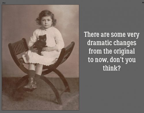
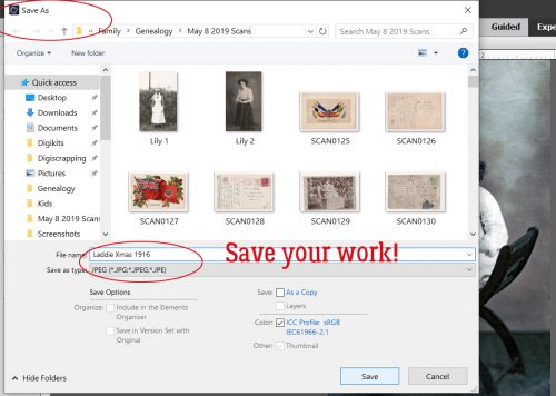
Don’t foget to save your hard work! I named my new photo Laddie Xmas 16 for ease of finding it later.
What do you think?
![]()
Sneak Peeks May 16th 2019
May 16, 2019 by
May is almost over which means school is almost out! I am not ready! It seems like the school year flew by and pretty soon spring will be done and summer will begin. Florida is officially in summer. It’s getting into the 90’s already. At least I can beat the heat and scrap to my hearts content this weekend! Our designers have lots of goodies releasing tomorrow! Let’s take a peek!
From Dagilicious


From LDrag


From Tinci


From Lindsay Jane


From Neia


From JB Studio


From Miss Fish


From JoCee


From Aimee Harrison


From Snickerdoodle


Tutorial Tuesday (Photoshop Elements)
May 14, 2019 by
Repeating Patterns, Part Three
![]()
In Part One, we built a repeating pattern essentially on a grid. In Part Two, we went a little further and created a repeating, staggered pattern. And now, in Part Three we’re taking all that we’ve learned to create a repeating pattern with multiple options. Ready?
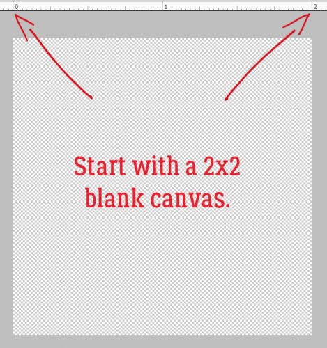
Open up a new canvas 2 inches square with a resolution of 300 pixels per inch.
Then duplicate your blank layer. The reason for this will explain itself.
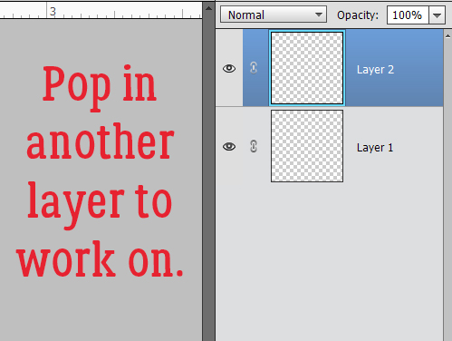
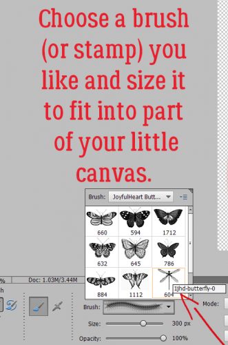
Now take a look through your brushes or stamps and choose the one you’ll use first. I used a dragonfly from a free set of butterfly brushes (sorry, can’t find a ling to them). Resize it so it fits into a fraction of your square.
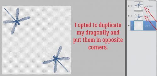
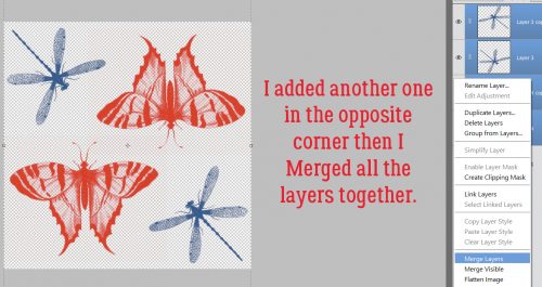
You can see that I’ve duplicated the dragonfly and positioned them in opposing corners.
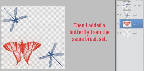
Then I changed my foreground colour and chose a butterfly stamp, adding it to one of the vacant corners.
And duplicated THAT layer then I Merged all the layers.
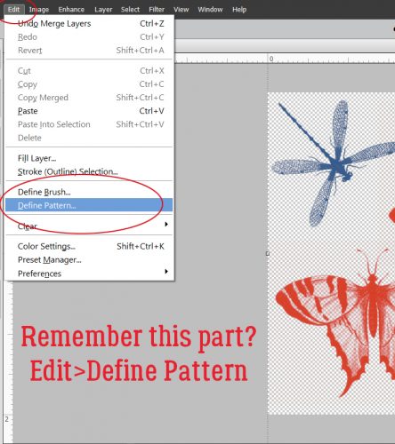
I think you might remember this part. Edit>Define Pattern will let you save your creation as a pattern for use with the Pattern Fill tool.
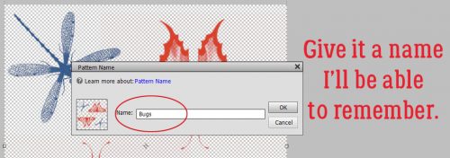
You don’t HAVE to give it a name, but it might make it easier to find later.
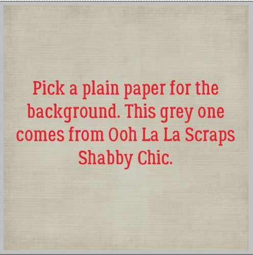
Now you need a solid paper for your background. It can be textured, or not.
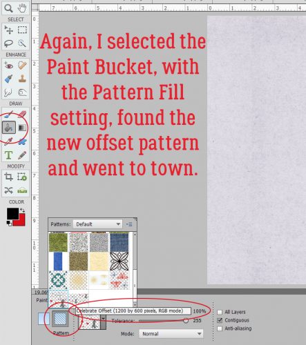
Then select the Paint Bucket tool, but instead of the Color Fill, go with Pattern Fill. Then go find your new creation.
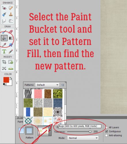
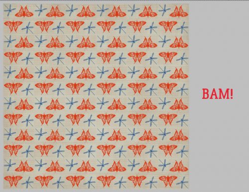
One click on the paper and BINGO!
But wait! There’s more!!

This time I added some glitter to my brush layer.
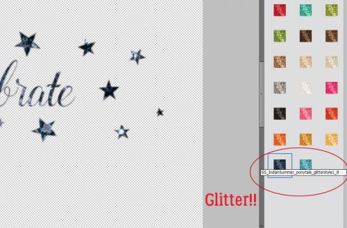
And then some hearts…

… and some MORE glitter.

I missed a screenshot where I added in the silhouette of a girl jumping for joy, but you can see the result here.
Look at how amazing it looks with the glitter, which is still there.

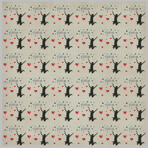
Let’s try that one in a staggered pattern. I opened a new 2 inch tall, 4 inch wide canvas and applied the pattern to it. Then I deleted the second repeat so I’d have somewhere to put the offset. Filter>Other>Offset.
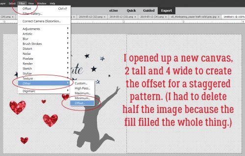
I used the same settings I had for the first staggered pattern we did back in Part Two. Then I Edit>Defined Pattern with a different name.
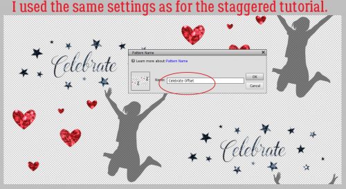
Yes, the same steps as before.
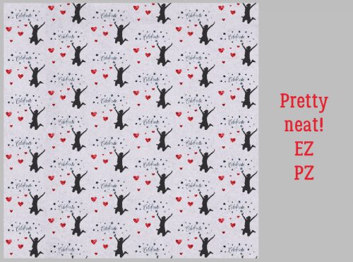
And there’s my new staggered-pattern paper! I could learn to love this technique!!
Have you tried any of the parts of this tutorial? I’d love to see yours!
![]()
Tutorial Tuesday (Photoshop Elements)
May 7, 2019 by
UnMASKing the MASK
![]()
Y’all remember Karyn Concannon‘s comment a few weeks ago where she offered me some topics for discussion? Well, we’ve done some paper-making (with one more version yet in the works) and now we’ll look at making masks. There has been a mask-making tutorial some time ago, but this one will go a little further and in a bit of a different direction.
Let’s get to work! Go big… it can’t possibly hurt. I’m going 12×12 here.
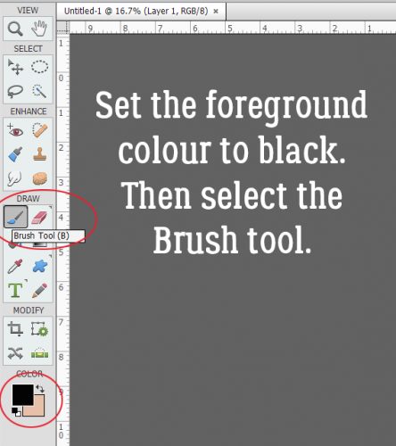
The whole process uses only brushes. If you’re low on awesome and fabulous brushes, there are TONS of free ones online, my favourite source being brusheezy.com where they have a huge assortment and literally something for everyone. Set your foreground colour to black then select your Brush tool.
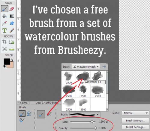
I love the look of watercolour paint so I have several brush sets of watercolour swashes. This particular set is called 20 Watercolor Masks and they’re truly fabulous. I’ve got my brush size set to 1600 pixels and the Opacity to 100%.
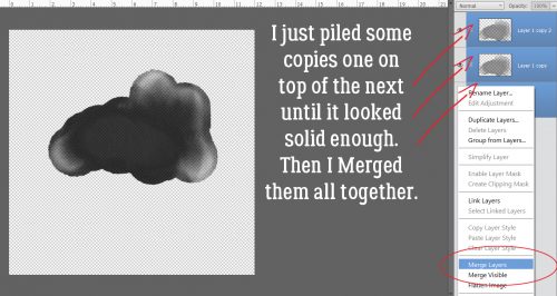
This is the result of a single click with the brush. Looks like a cloud, doesn’t it? And almost as um… ephemeral.

So I made some copies (CTRL/CMD>J) and stopped when I thought it had enough presence. Then I Merged all the copies into one layer.
But unless I use a very long-distance landscape photo, this isn’t going to be enough of a statement. So I added some more substance by choosing another brush from the same set.
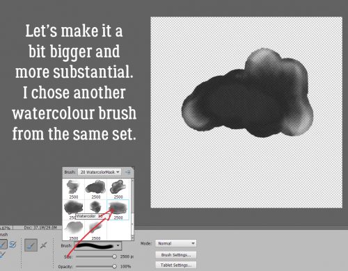
(Notice this second brush is on its own layer. If you get in the habit of doing things on their own layer you’ll have infinite control.) Single click. Interesting! But again, light on the weight.
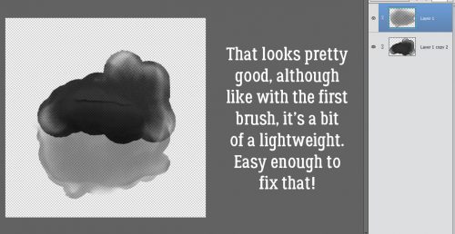
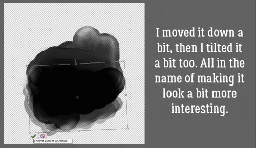
So I made some more copies. And I shifted them around a little to distribute some of the more obvious aspects. Then I Merged (CTRL/CMD>E) them.
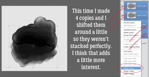
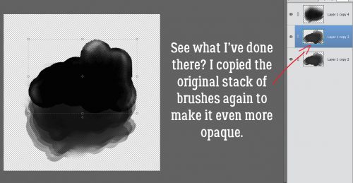
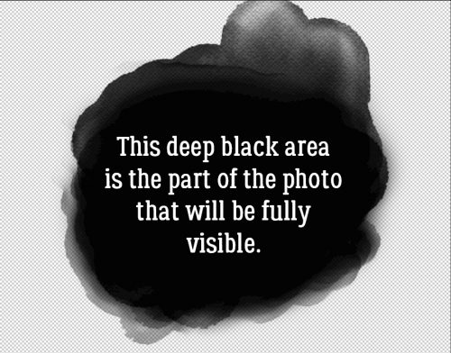
Mmmm. Still not quite the look I’m going for. So I made another copy of the FIRST layer. When you think about masks, you’ll remember that the darker (black) the area the more of the photo is revealed. So you can’t get blacker than black. You can always go back and adjust your layers until your mask pleases your eye.
Don’t be afraid to move the brushes around! You’re the only one you have to please, so make it what you want it to be!
If you’re still not happy with the way your mask looks, you can use a big, soft, round Basic brush (from the brush set that comes with Elements) to either darken areas more, or lighten them (if you’re lightening, use the Eraser tool and a low opacity to avoid going overboard).
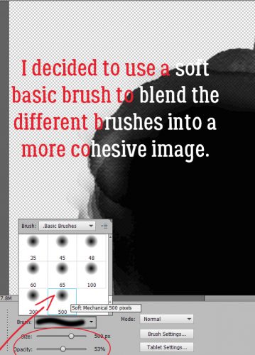
See how I’ve softened some of the edges? I only used a black brush. No erasing.
Like I’ve said, YOU’RE the boss here, so you can go as far as you want with your mask. I decided to add some paint splatters, again with a free brush.
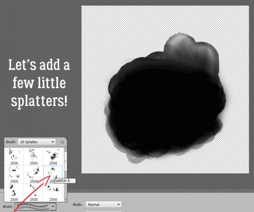
Oh my!! I LIKE it!! (If I don’t like how the more distant splatters look once I’ve clipped a photo to it, I can erase those parts OF THE MASK and still have the splatter effect in areas of the photo.)
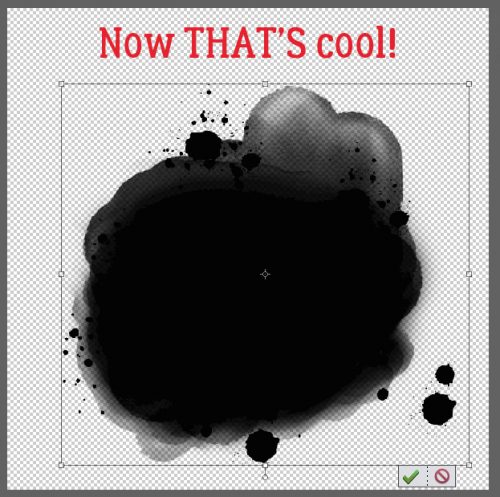
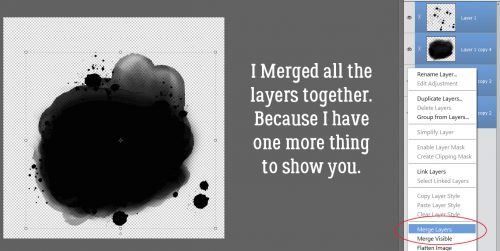
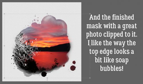
Now I’m happy with the depth and balance of my mask, I can Merge the layers all together. That’s an important step if you plan to do what I’m going to show you next.
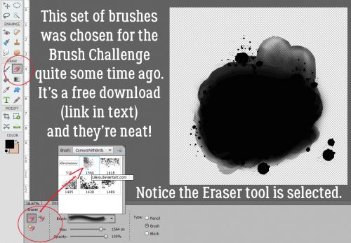
Some designers make phenomenally beautiful masks that are out of the ordinary. (Irina from PrelestnayaP is one such.) For this next step I used a brush that was part of a set chosen for the Brush Challenge back in October 2015. You can download these brushes, designed by Lileya Brogu, here. Take note that I’ve got the Eraser tool selected, NOT the Brush tool.
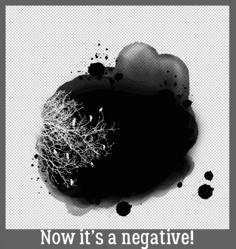
Whatdya think?
And here’s what it all looks like with a photo clipped to it. Pretty fancy!
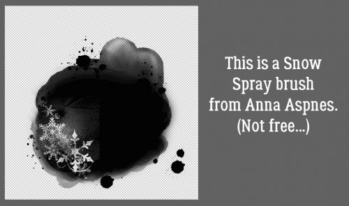
Just for fun, and to show you haw easy it is to customize your mask, I Undid (CTRL/CMD>Z) that last step and tried a few other brushes.
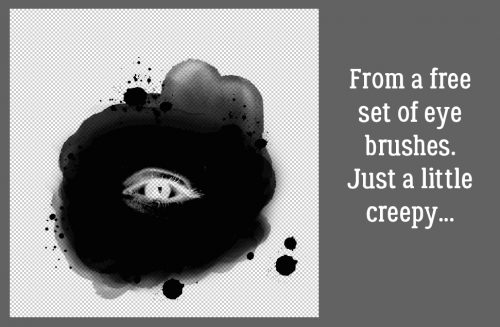
This one is really creepy. I downloaded the eyeball brushes for a Hallowe’en project.
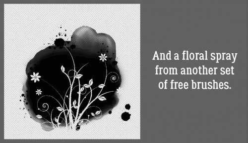
See? There’s really no limit to the possibilities – other than the limits of your brush collection!
So once I was done playing with it, I decided to Save it for later. I chose Save As (CTRL/CMD>SHIFT>S) because that’s where I can decide what format to save it in. To be a good mask, it needs to be saved as a .png with a transparent background. Then I decided where to save it – into my personal Elements folder, and what to call it.
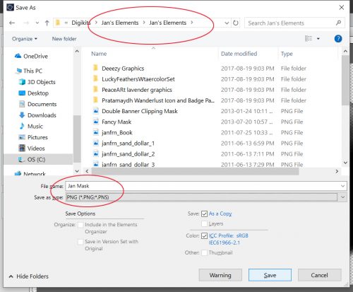
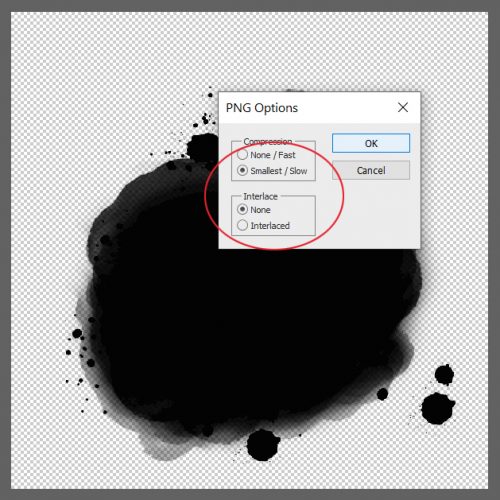
The last step is to select the .png options. To preserve the most detail, go with the settings shown below.
How much fun is that??
![]()