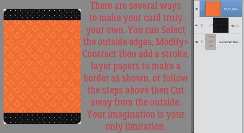
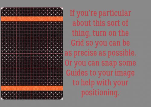
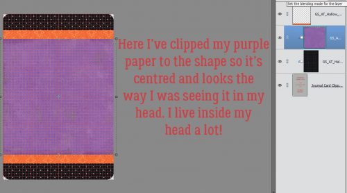
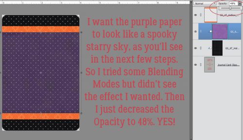
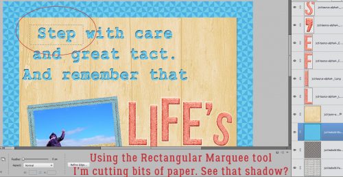
Tutorial Tuesday (Photoshop Elements)

Vacation Memories Sanitized!

I’m back!! My vacation to Ireland surpassed all my expectations and I’ve got about 400 new photos to turn into lasting memories. I’m still looking through them to see which ones are amazing and which are only so-so. If you remember the tutorial from this time last year where I talked about taking better photos you might already know that I’m a fan of cropping in the viewfinder. That means looking at a scene through the lens and moving around so that I can eliminate a lot of things I can’t (or don’t want to) fix later… like posts growing out of the top of people’s heads. One aspect we have no real control over is that people will unknowingly walk into our carefully-composed shot and get in the way of that perfect image. There are times when it’s possible to just wait for them to wander on, and others when it’s not. So I’ve started taking two or three shots from the same spot a few second apart, allowing the people in my way to move along a bit. Why? Because I know I can Clean the Scene with a Guided Elements Edit!

Elements has had a Scene Cleaner Photomerge edit since Version 7. It works in basically the same way, but it’s accessed a little differently. For versions 7-13, you need to go to the Edit tab then select Photomerge Scene Cleaner from the dropdown. For versions 14 and later, click on Guided>Photomerge>Scene Cleaner.

My example will only use two photos but you can merge as many as you need to in order to eliminate strangers from your memories. I’ve found that with my particular laptop (which gives me enormous grief sometimes) and my particular installation of PSE 15, it’s best not to have the target photo – the one with all the best angles and aspects – in the first position in the Photo Bin. You can reorder your photos and elements in the Bin simply by dragging them into the spot where you want them then dropping them there.

When you click on the Guided>Photomerge>Scene Cleaner button, that first photo in the Bin will populate the left side of your screen. Then drag and drop the TARGET photo into the right hand side. If you look closely you’ll see that the “Source” image is outlined in the Bin with blue, while the “Target” or “Final” image is in yellow.

You’re going to be shocked when you see how easy this is to accomplish. I clicked on the Pencil Tool in the Edit menu, then looking at the Final image, I scribbled on the Source image over the general areas where the two women (Gail on the left, Eleanor on the right) are using a moderate-sized brush tip. Usually that’s enough to totally solve the intrusion. If necessary, you could enlarge the area you’ve covered, or b some of it on that Source image. PSE will show you what your final image will look like so you’ll see where tweaking is needed.

As with all the other Guided Edits, once you’ve done what you set out to do, you click on the Next button at the lower right corner of your workspace and then either save your work or open it in Expert to continue working on it. As you can see, this Edit has made all the changes on a new layer. The easiest way to make the changes permanent is to Merge the two layers together.

I’m sure you knew I wasn’t finished with this photo. I want the clouds and sky to look better, and the stones to be a bit sharper. So first I chose Enhance>Adjust Lighting>Levels (CTRL/CMD>L) to make some exposure adjustments.

Don’t overdo this adjustment.

Then I moved on to Enhance>Adjust Lighting>Brightness/Contrast. Again, this photo didn’t need a lot of adjusting. But this slight tweak has added more detail to the clouds.

But I feel like the shadows are still too dark, so I went to Enhance>Adjust Lighting>Shadows/Highlights.

The shadows just needed a bit of illumination and there’s great detail visible there now.

And of course, once the rest of the image looked good, I hit it with my new favourite enhancement, Haze Removal.

I love that this tool adds drama to the sky, sharpens and deepens the stones and just brings the Oomph with it.

This tutorial marks the end of my second year as your faithful tutor. I can’t believe I’ve found enough new things to show you to build about 100 tutorials around them, but here we are!

This is the final image of St. Finian’s Roman Catholic Church, Aghowle, Shillelagh, Wicklow. It dates from the 12th century and is in ruins. It will be the star of a double spread at a later date.

One scene cleaned, a dozen or more to go…

Sneak Peeks July 26th 2018

It’s that time again! New releases debut tomorrow but we get a peek tonight! Thanks to our awesome CT, lets see what our amazing designers have in store for us!

From Tinci

From JoCee

From Aimee Harrison

From Miss Fish

From Neia Scraps

From Ponytails

From Luv Ewe and La Belle Vie

Have a wonderful weekend!

~~July Bake Sale!!~~

I can’t believe it’s already Bake Sale time. Goodness 2018 is flying by. Let’s see what our designers are offering up this month. Remember these kits or template packs are $1 each through July 20.

Head over to the store and grab these goodies.

Sneak Peeks July 12th, 2018

Happy Thursday! I hope you have some time to scrap this weekend because you are going to love everything coming out tomorrow!! There’s so much awesomeness! Let’s take a peek!

From Heather Z

From Miss Fish

From Tinci

From Clever Monkey Graphics

From JoCee

From Ponytails

From Aimee Harrison

Come back tomorrow to see all the awesome releases!

Tutorial Tuesday (Photoshop Elements)

Creating ‘Mazing Monograms

Lately I’ve been really interested in designing labels for decorative items I’m planning for my home. It’s a challenge, but it’s also a lot of fun and lets me use my creative eye, PSE skills and a little ingenuity. When my grand-daughter was born late last month, I thought I should design a monogram to use as the title of a layout introducing her to the world. I think we all know what a monogram is. But did you know there are some conventions around them?

Monograms have been used for about 2 millenia. Yep, they’ve been around since about 350BC when they began to appear on coins issued by Greek cities, identifying the coins as having come from there. They’ve also been used as signatures by artists and craftsmen, especially when trade guilds began enforcing their rules about membership and took measures against those engaging in those activities without authorization. They later were used as signatures of monarchs and noblemen to identify their holdings, their armies and their money.

Individual monograms came into use as a natural continuation of their use by Important People. They can be part of the letterhead on personal stationery, to identify one’s luggage, to fancify their handkerchiefs, shirts and ties and oh, yeah… wedding invitations! If the monogram is that of a woman, her surname initial is the central, larger one, with her first initial on the left and her middle initial on the right. For men, that convention is often ignored, and their initial are put in order of appearance in their name. Engaged couples may choose to have their two first initials entwined and newlyweds might have one member’s first initial on the left, their joint surname initial in the middle and the other member’s first initial on the left.

The example below has my grand-daughter’s initials following the first individual convention. I used MainType 7.0 (as described in the tutorial on organizing your fonts) to find the perfect font for the job. The font I ended up using is one I picked up at the FontBundles July $1 event. It’s called Quiska Regular and it’s gorgeous!

Once I’d settled on my font, I opened a new 12×12 document in PSE. I like to work large and then resize because detail is so much more visible. Then I found the font in my Type tool menu. (Keyboard shortcut is just the letter T.) I increased the size of the font to 100 pixels. And last, I changed the colour to that luscious fuchsia.

I put each of my 3 letters on their own layers. I know I’m going to want to make adjustments to one or more letters, but not necessarily all of them at once.

I’m not lecturing you, really… but remember to Simplify those letters as you go along. Elements has a bad habit of messing with your existing text should you decide to change fonts or colours if you don’t take that step. Once the layer is simplified you can’t change the font, but you CAN resize, recolour and play with it.

For that middle initial I changed the size of the font (just by typing in the number I want into the box I’ve circled below) to 150 pixels.

Then I went back to 100 pixels for my last letter. You’ll notice they’re randomly placed, and that doesn’t matter, because Elements has tools to fix that.

While I was playing with the letters, I didn’t like the size differential so I decided to increase the size of the smaller letters by 20%, to 120 pixels. Then it looked right!

By selecting all three layers, I could then use the Align tool to line up the horizontal centres of the letters.

I wanted a little bit of an overlap on the letters to tie the monogram together. So I used the Distribute tool too to shift the letters based on their vertical centres.

All that’s left is to Merge the layers together to make a single object. They’re already all selected; right-click on them and select Merge, or just hit CTRL/CMD>E and they’ll unite.

Those of you who read my tripe weekly will know that I wasn’t serious when I said I was done. I decided to add some flourishes to my monogram. I love brushes and have quite a collection of them that I’ve often downloaded free from Brusheezy.com. The one I opted to use here is part of a collection called 20 Dividers V2. Did you know that if you hover the cursor over your workspace you’ll get a preview of the brush just like I’ve shown you below? You’ll know what it looks like and can then adjust your size and angle before you even use your brush.

I know I sound like a broken record. Good habits are important to streamline your workflow and prevent oopses. If you put your brushes on their own layers, you have total control over them. If you put them right on your paper, you can’t do anything with them – can’t change their colour (easily) or opacity, increase or decrease the size, apply a style, copy them or any other tweak you might decide is needed. So just put them on their own layers!

For balance I want a second flourish; duplicating the layer is the easiest way to ensure they’re identical. Either right-click on the layer and select Duplicate, then click OK in the pop-up menu or simply CTRL/CMD>J to copy it.

Then I flipped the second brush vertically so the two brush layers are mirror images. The easiest way to do that is to grab one of the middle handles on the bounding box then drag the handle in the direction you want the flip to go. (Either horizontally or vertically.) Don’t obsess over dragging it to exactly the same size, because you can simply type -100 into the corresponding box in the tool options below. Then the software does all the work. WSNH!!

Again, let the software do the work to Align all the layers again. I opted to then select the two brush layers and shrink them somewhat so they were closer to the same scale as the monogram. Then I Merged the brush layers into one.

I might be done… but then again, I might not be done! Let’s see what we can do to really make this monogram pop. I’m going to use a Bevel Style.

I have the letters layer selected and used the Inner Ridge Bevel. It looks like enamel and I love it!

Then I selected my brush layer and hit it with the Scalloped Edge Bevel just to give it a bit more weight and dimension.

Isn’t that amazing?! And so simple!! I saved it as a png file so I can use it as the title for my layout when the time comes. Keep your eye out for it in the Gallery!

I’m departing tomorrow (July 11/18) for a two-week genealogical expedition to Ireland. So there won’t be a tutorial next Tuesday or the Tuesday after. If I’m not totally whipped when I get home again, there MAY be one ready for the 31st. Think about what I can teach you next. Sláinte!!

Sneak Peeks July 5th 2018

Happy Thursday!!! I hope everyone had a wonderful 4th of July and the fireworks didn’t keep you up too late! Our designers have lots of goodies ready for tomorrow! Let’s check them out!

From Ponytails

From Lindsay Jane

From Tinci

From JoCee

From CathyK

From Miss Fish

From Luv Ewe

From Aimee Harrison

Have a great weekend!

Tutorial Tuesday (Photoshop Elements)

Like a Broken Record

I was fooling around with a thought I had to see how it would look and a tutorial was born! I love papers with a small pattern repeat and I adore embossed cardstock. But I can’t always find what I want when I want it, so I decided to give creating my own a try. It’s so simple!! (But let’s not put our awesome designers out of work, ‘k?)

I started out with a plain Kraft-coloured cardstock from Scraps N PiecesOh Canada… Eh! collection. Then I opened a new document (CTRL/CMD>N). I knew I was going to use something that would resemble a tile effect and chose to work on a 300 x 300 pixel square canvas. Our 12 x 12 inch layouts are 3600 x 3600 pixels, so this size will be 1/12th of the length/width of the overall cardstock.

I opened up the Custom Shape Tool menu then chose All Elements to see every shape available.

I played with more than one of these shapes before I settled on this one.

I put my cursor at the upper left corner and pulled the shape diagonally across my square canvas to completely fill it. The colour I used isn’t important because I’m going to change it later. I wanted something I could see easily.

Then I clicked Edit>Define Pattern. This is going to allow me to use this little doodad as a repeating pattern on my paper.

The Pattern Name menu opens up. I gave it a name that meant something to me and would be easy to find later. There’s a clue in there as to where we’re going to end up.

If you’re familiar with my tutorials you’ll know I always tell you to work on a separate layer when using brushes. It goes double for patterns!

You may have noticed that many of the Tools in Photoshop Elements have multiple options. The Paint Bucket has one I’d never used before but now that I know what it does, I’m SOLD! With this versatile tool you can fill an area with colour or……. a pattern!

Make very sure you’re working on the new, blank layer. Click on the Pattern Fill button, the one that looks like a square with a bunch of diagonal lines through it.

When the Pattern Menu opens up look for your new pattern.

Elements will open up your pattern in the active box as shown.

Now just click anywhere within the borders of your canvas. It’s like magic!! I have 144 little repeats of my pattern creating an Argyle effect. I could stop here and have a cute custom patterned paper. I’d love to do something like this with a tone-on-tone, or with either white or black. Then I’d Merge the layers and save it somewhere I’ll be able to find it again.

But you know me… we’re going to keep going. I want to show you how to turn it into embossed cardstock, so turn off the visibility to your cardstock layer and have your pattern layer selected. Then Layer>New Fill Layer>Solid Color.

In this menu, click the Use Previous Layer to Create Clipping Mask then click OK.

Use the same colour as your cardstock by clicking on it with the Eyedropper.

Merge the Color Fill layer with your pattern layer. Then you’re going to hit it with a Bevel Layer Style. Bevels are included with the software and can be found in the Styles menu. Below I’ve used the Simple Inner bevel. It’s a nice, rounded bevel that raises the pattern off the surface beautifully.

If you feel that the bevel is TOO obvious, you can click on the fx icon on the layer and adjust it to suit. (This is the only Bevel I adjusted while putting together this tutorial.)

Turn on the cardstock layer and voilà… Merge the layers and now you’ve got a custom embossed cardstock.

Some of the other Bevel styles work for this technique too. Let’s look at the Simple Pillow Emboss.

Is this the effect you were expecting? It looks a lot like those sheets of die-cut chipboard!

Simple Sharp Inner looks like this on just the pattern layer.

I really like the look of this one.

One last one… Simple Sharp Pillow Emboss.

This effect is really interesting. If I went into the fx controls and reversed the direction of the bevel it would raise it off the paper. Might be worth trying!

I can think of a long list of ways these simple techniques can be used to elevate my scrapping. Can you?

Sneak Peeks June 28th 2018

Happy Thursday! The end of the month is almost here which means I can show you a sneak peek of the buffet as well!!

First lets see some new goodies coming to the store tomorrow!

From Aimee Harrison

From Miss Fish

And now for a peek at the Buffet!!

Come back tomorrow and on Sunday to see all the new products!

Tutorial Tuesday – Scrapbooking

Where the Boys Are

Today I thought I’d do something just a little different. Rather than me showing you haw I do some of the things I do for my layouts, I thought we could have a chat about how to increase the value of our templates and kits by using them in unexpected ways. For another few weeks, I only have grandsons, and I love to create layouts about them with the photos their mom takes of them. (You might have noticed…) But how many templates are really boy-centric? There are lots of kits out there that are boy-centric, but they tend to have the same sorts of elements and similar papers. I don’t let that get in my way though! So let’s look at some ways to make the most of our stash to scrap photos of our favourite boys.

I don’t believe in rules when it comes to creativity. So when it comes to colour, anything goes! So many of the boy-themed kits have a navy/brown/forest green/gray palette and there’s nothing wrong with that, but I’ve used a feminine, pink-heavy kit for boy layouts without making them look overly foofy. It’s all in how you use colour. If you start with a neutral background, you can add colour in lots of ways. Because my little men are just 4 and 2 1/2, I tend to use a lot of primary colours, but not always! I like to use soft greens, aqua, lavender, coral and even fuchsia for my boy layouts. Here’s an example.

Here’s another example.

What about flowers? Do you feel like you can’t put flowers on your masculine layout? Well, of COURSE you can! I’ve used flowers on both those layouts. I tend to choose flowers that aren’t overly fluffy, and natural-looking. Daisies will always work with photos of children. Some designers create beautiful composite flowers and I sometimes create my own by putting a screw head, a plain button or a gear – or all three – in the centre.

But what can I do when looking at a template FILLED with flowers, and the photo(s) I want to use are either of my son or my grandsons? I substitute lots of things for those flowers. Gears, paper rosettes, tags and labels, stars, hearts, buttons, flair, bows, string, ribbons and word strips all can take the place of flowers.

Or like this…

Ready for some audience participation? Okay, now the ball is in YOUR court… What are some of the ways you scrap layouts of your boys and men? Please leave your tips in the comments! I appreciate it.


Tutorial Tuesday (Photoshop Elements)

Still MORE Fun with FONTS!! 

We’ve done a lot of cool things with fonts, but I know there are still so many even cooler things to try. Last week I bought a new font bundle from The Hungry JPEG, a selection of vintage fonts for a smokin’ hot deal. It’s not as if I’ll ever have too many fonts, right?

Anyway, while I was downloading these fonts, several of which were actually font families, I looked at the samples the site uses for advertising and it hit me… Why not try layering two fonts from the same family and see what happens? Font families are a collection of very similar fonts with some subtle differences; there may be a regular, a bold, a light, an outline, a grungy and an italic version, for example. This tutorial was fun for me, because I really didn’t know what it would look like when I was finished, but the idea was firmly in my head and I had to try it. I impressed myself so much I needed to widen the doorways. But… it didn’t turn out the way I expected it to. It’s BETTER!

I went through my fonts, using High Logic’s Main Type, to find a font family that would hopefully give me the look I could see in my head. The one that looked most promising is called Nomos, by Cruzine Design. It has several variations on the basic font, so I went with it. I started with Nomos Regular Regular for my basic title. I selected a medium gray to be my starting colour from one of the papers I used in my layout. And I set the size at 100 pixels, knowing I’d probably resize it to fit my canvas. Remember, I usually create my title on its own canvas, sizing the basic working space to approximate the area I want it to fill. No distractions, nothing to work around. So once I decided on my font and colour, I opened a 5 1/2 x 1 1/2 transparent canvas on my workspace.

I typed out my one-word title, then resized it to almost fit my space. I made a careful mental note of the exact size of the final font so I wouldn’t have any guesswork for the next step.

Then I went back to my fonts and chose an outline version of the same font. It’s called Nomos Inline Inline. (I don’t know why the designer used so much repetition in titling…)

I Simplified the original layer then turned its visibility off. Why Simplify? When working with fonts in PSE, if you DON’T simplify the layer, then select a different font for your next text layer, that first layer will morph to that new font. And you might not notice it until MUCH later and have to go back and fix it. So don’t forget to Simplify once you’re satisfied with spelling, grammar and punctuation. After that, I typed out my title exactly the same as the first layer, only in white this time. And I resized it to the same size as my original layer. Here’s where the people really paying attention can give me the gears. My resized font is 114.31 pixels.

They weren’t in exactly the same place on the workspace, but it looks really cool just like this! If it was what I was after I’d just have gone with it. But I envisioned something more, so I kept going.

PSA: Simplify your text layers!!

I wanted the two layers stacked perfectly, white over gray, so I used the Move Tool Options to Align the layers, first by Center then by Middle.

I turned off the gray layer again and concentrated on the white outline layer. I clicked on the Layer thumbnail to select the edges of the letters as shown below.

I want the white sections to be thinner so more of the gray shows through, so I clicked Select>Modify>Contract. I didn’t want to lose too much, so I went with a single-digit shrink of 7 pixels.

If you look closely you can see where the new lines of marching ants have appeared. I’m now going to DELETE those sections. CTRL/CMD>X

Ah! Not exactly what I was expecting, but really, really neat!

I couldn’t wait to see what it looked like with the gray layer on. I wanted to add some dimension to the white layer, which I did by using a Simple Sharp Pillow Emboss bevel style, one of the integrated styles the software comes with.

It looked really good, but just a little TOO… too. Easily fixed by adjusting the bevel settings.

I clicked on the fx icon on the white layer and made the bevel much smaller. I think it looks like inlaid enamel and chrome, don’t you? Now I’m itchy to try this with other fonts and see what different effects I can achieve just by layering two fonts. Who knew it would be so much fun?

Here is my finished layout. It’s for the Designer Spotlight Challenge this month and was created with pieces of 3 kits by Connie Prince and a template from Trixie Scraps. The people in the photo are my grandparents; it was taken in the summer of 1961. By the following Easter he was gone; this is one of only 2 photos I have of him where he doesn’t have a cigarette in his hand. I see a little bit of my dad in each of them, and my sister’s eyes crinkle in the same way Grandma’s do. I’d never noticed it before, so this was a labour of love.