Custom Word Art using Only Fonts!
![]()
Greetings and salutations! Yesterday was Thanksgiving in Canada, which isn’t quite the event our neighbours to the south have grown into, but I still spent part of the day in a food coma. Let me offer you a little tip – don’t wait too long to buy your turkeys. Demand here was significantly greater than supply; even Costco didn’t have any turkeys this weekend. If you see turkeys in your supermarket, grab one! But I digress…
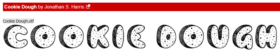
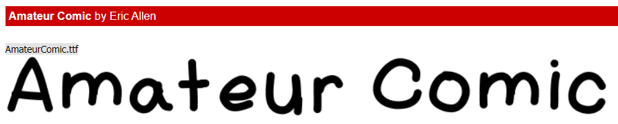
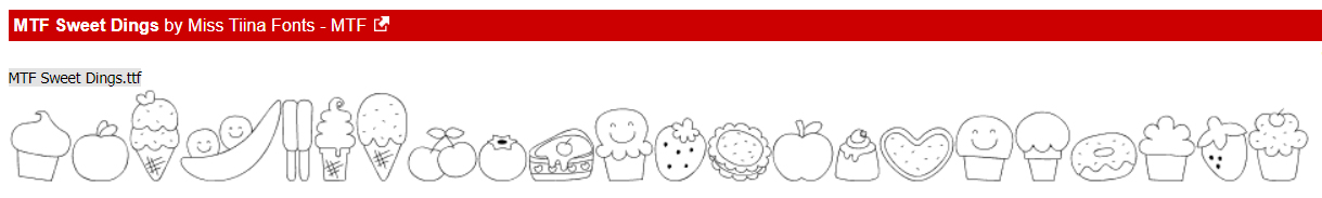
As you may recall, at the end of my last tutorial (with the childish fonts and dingbats) I said I’d show you how to use fonts and dingbats to create your own word art. You might also recall my inspiration was my grand-daughter. The little girl who eats like a lumberjack… I’m using Cookie Dough, Amateur Comic Regular and MTF Sweet Dings Regular today. For more guidance on how to choose fonts that will look good together, I have a tutorial for you here.
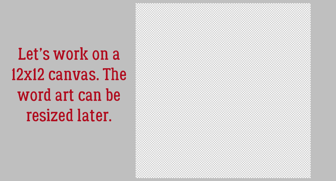
When I’m creating things like this I always use a 12×12 canvas with a transparent background. I like the larger image so I can see better how it all works together and the extra room for tweaking. The end result can easily be resized later.
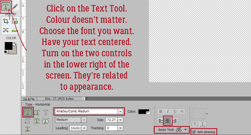
I’m going to start with Amateur Comic Regular. It doesn’t matter what colour I use, because I’m going to change it later. But I do want it centered and I want both Asian Text and Anti-aliasing on. The Asian Text control helps with kerning – spacing between individual characters. In later versions there is a kerning control, labeled Spacing but it doesn’t work quite as well as actual kerning. The Anti-aliasing control gives your fonts smooth, clean edges; it just diminishes the jaggedy pixels you’d see with larger text.
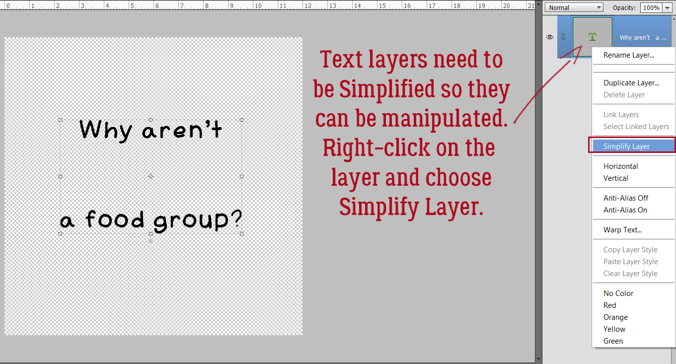
When using fonts the resulting layers need to be Simplified before you can manipulate them, so that any changes to that layer only affect that layer. If I typed out this text but didn’t Simplify the layer, then changed the font (as I’ll be doing in a minute) this layer would change to that font too. So always remember to spell-check. grammar-check then Simplify by right-clicking on the layer in the Layers Panel and choosing Simplify Layer from the dropdown menu.
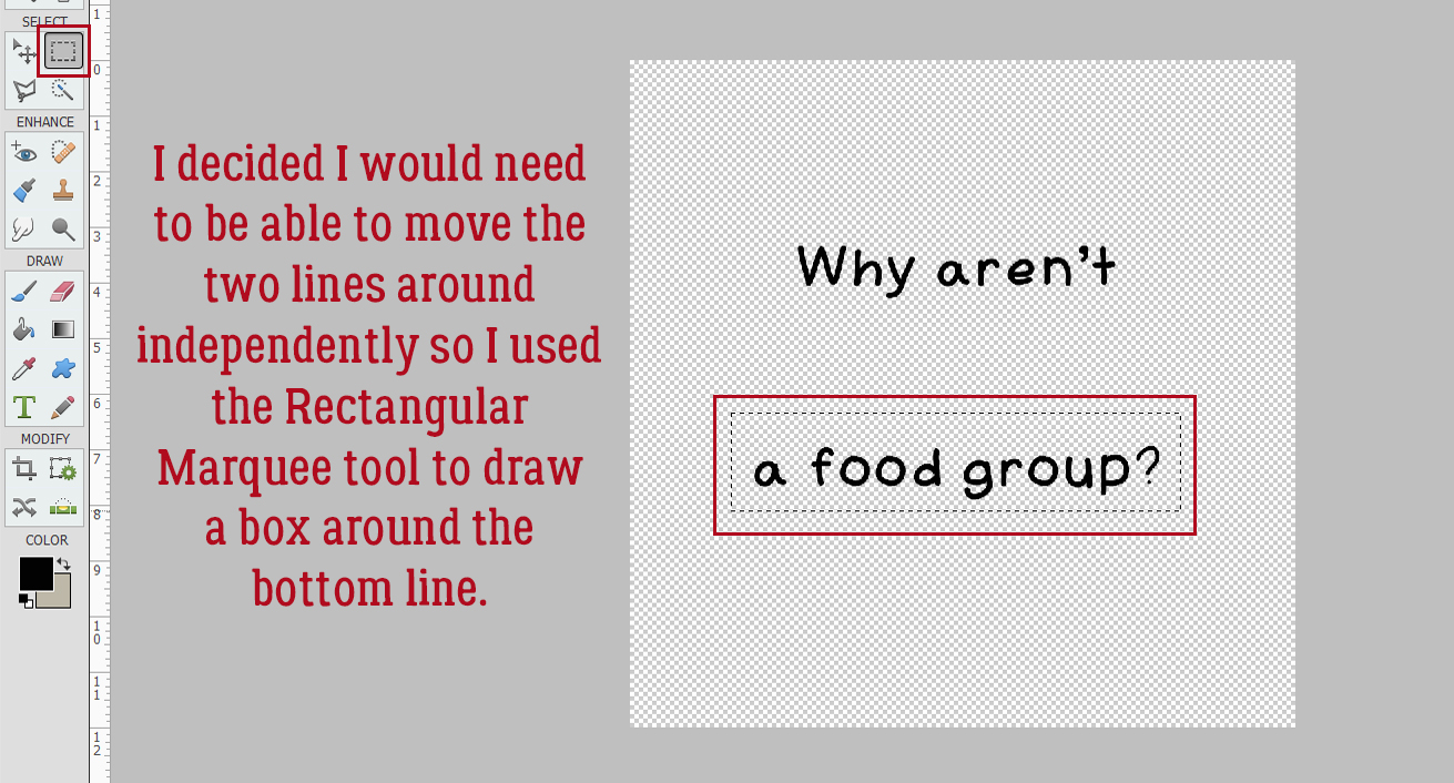
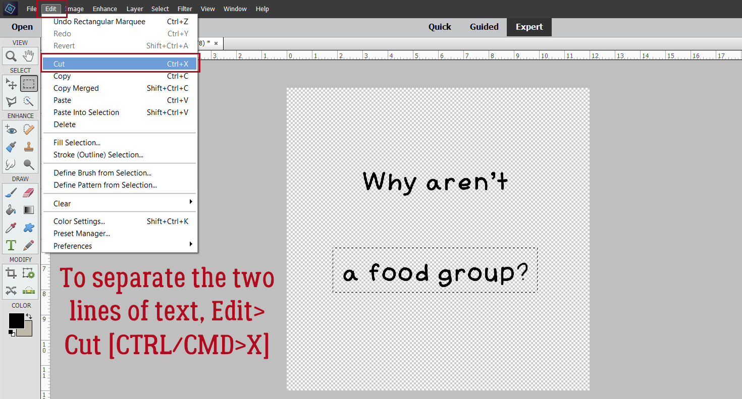
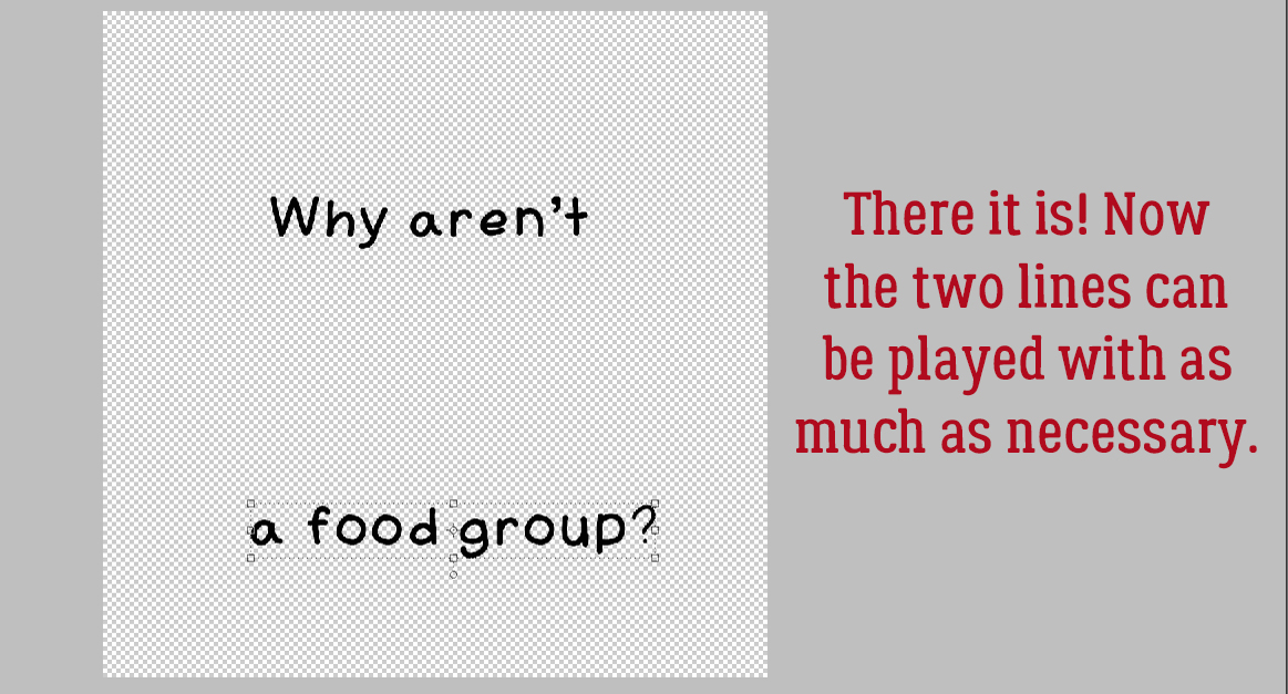
I may need to make some further placement adjustments to this text, so I opted to break up the layer into two chunks of text. With the Rectangular Marquee tool, I outlined the second line.
Next, I Cut that line away from the first line: Edit>Cut [keyboard shortcut: CTRL/CMD>X]
And then without any further ado, I Pasted it back onto the canvas: Edit>Paste [CTRL/CMD>V]
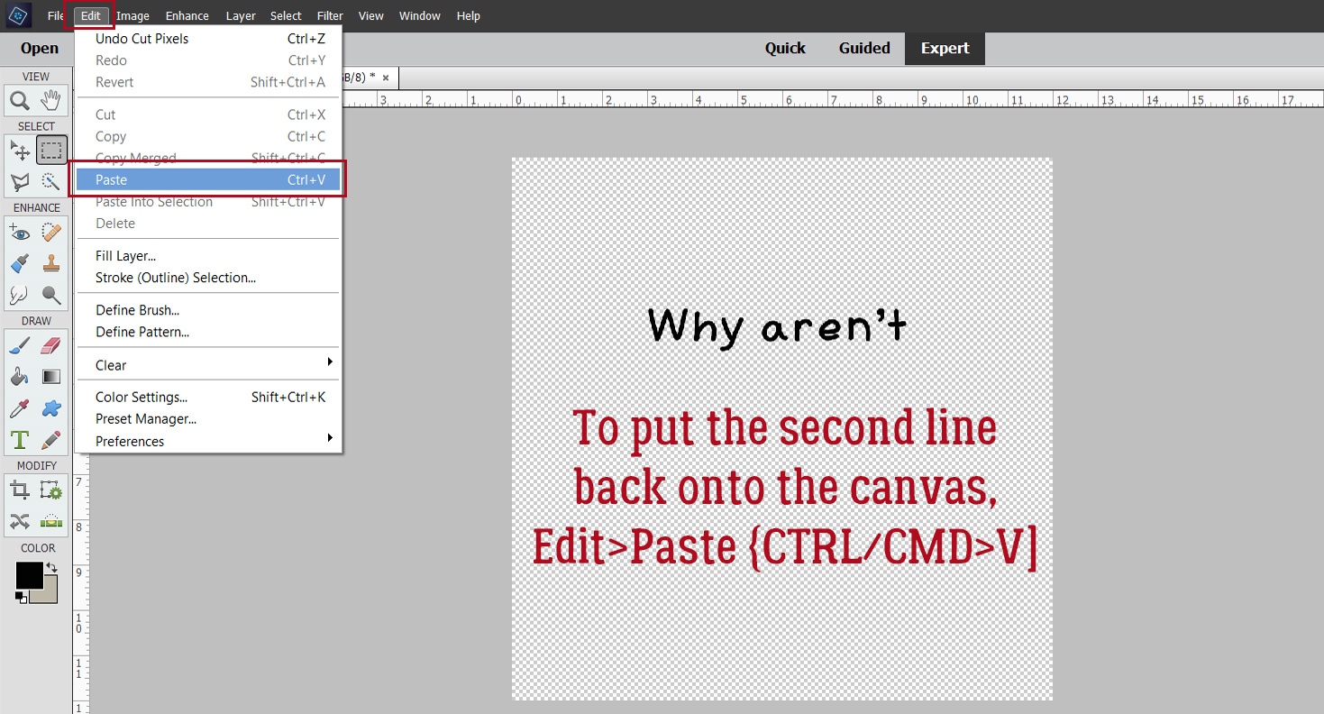
Now I can move each line around, resize and reposition as needed.
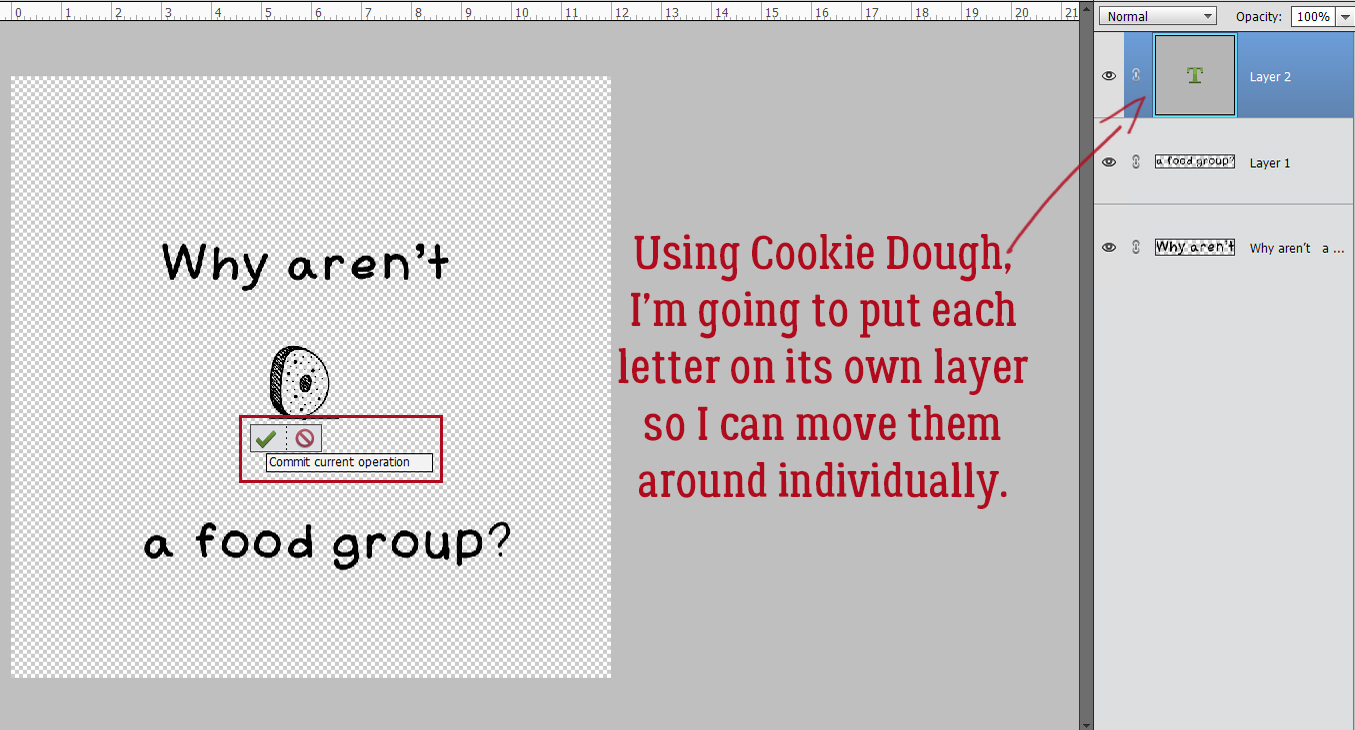
I changed my font to Cookie Dough. For this word, I’m going to put each letter on its own layer for now. (If you don’t intend to make many changes to the text, you won’t need to do these steps.) So I typed a D, Committed the Operation and then carried on. You can toggle between the Move Tool and the Text Tool by clicking [V] for Move, [T] for Text.
I wanted the letters to be a little off-kilter and shifted them around until I was happy with their positions.
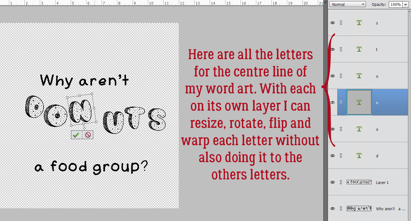
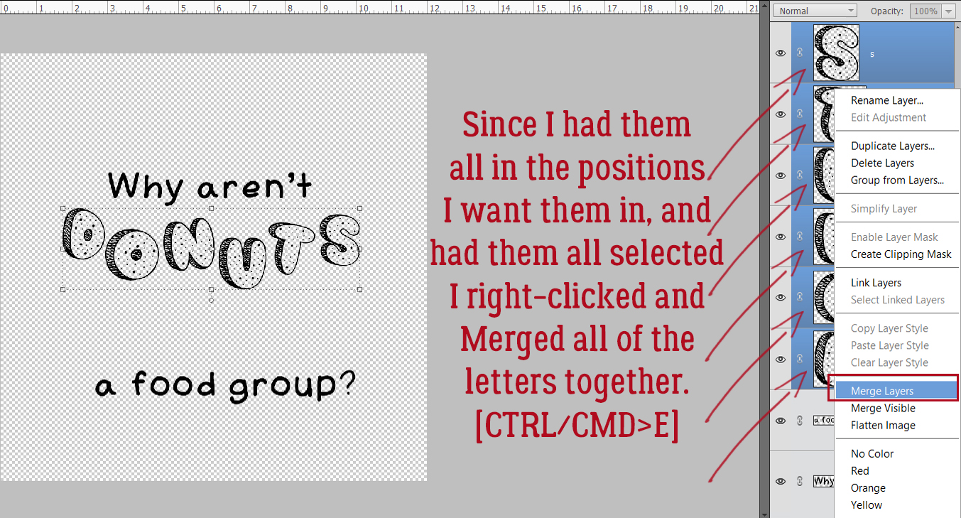
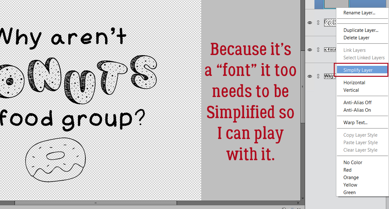
At this point, I’m planning to turn the letters into donuts so I’ll need to Simplify each layer. Because I was only rotating the letters before, I could wait until everybody was where I wanted them then I could Simplify in one step instead of 6. I Activated all 6 layers by clicking on the top letter layer, holding down the SHIFT key and clicking on the bottom letter layer. Then I right-clicked and chose Simplify Layer. Boom!
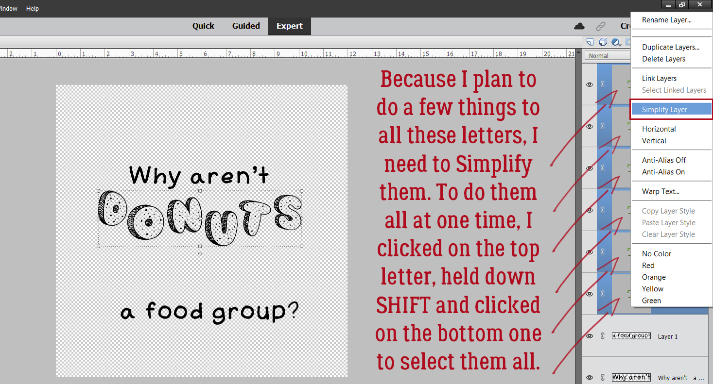
The layers can now be Merged into a single layer.
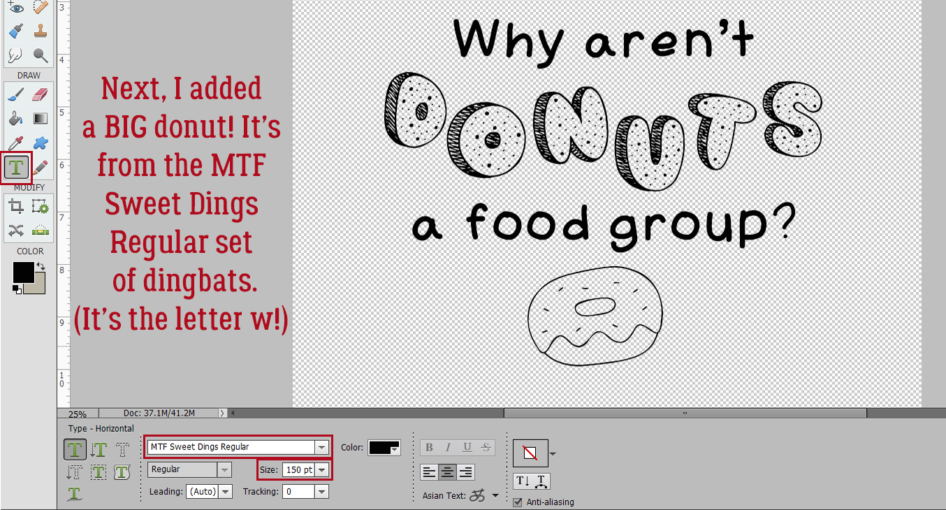
I added a MTF Sweet Dings Regular donut. Dingbats are drawings that correspond to the alphabet. The donut’s the letter W.
And of course, I Simplified the layer…
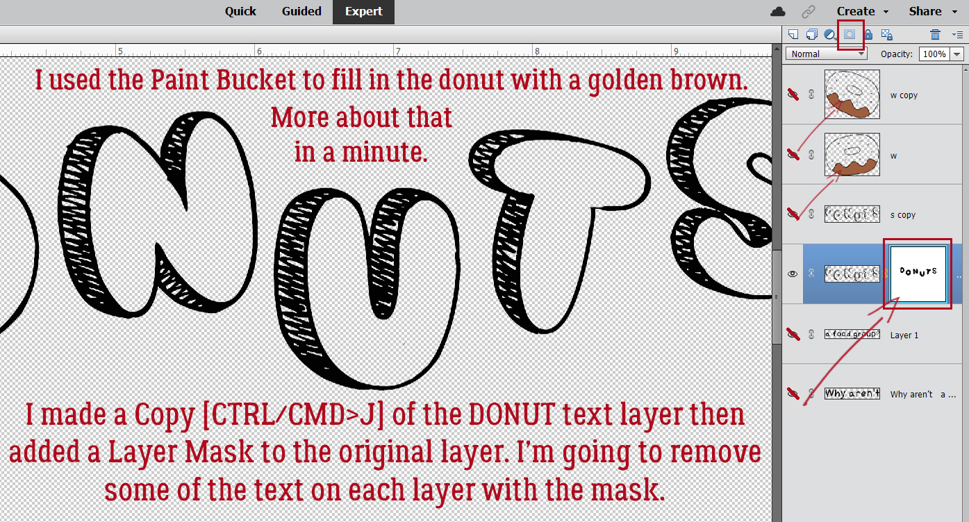
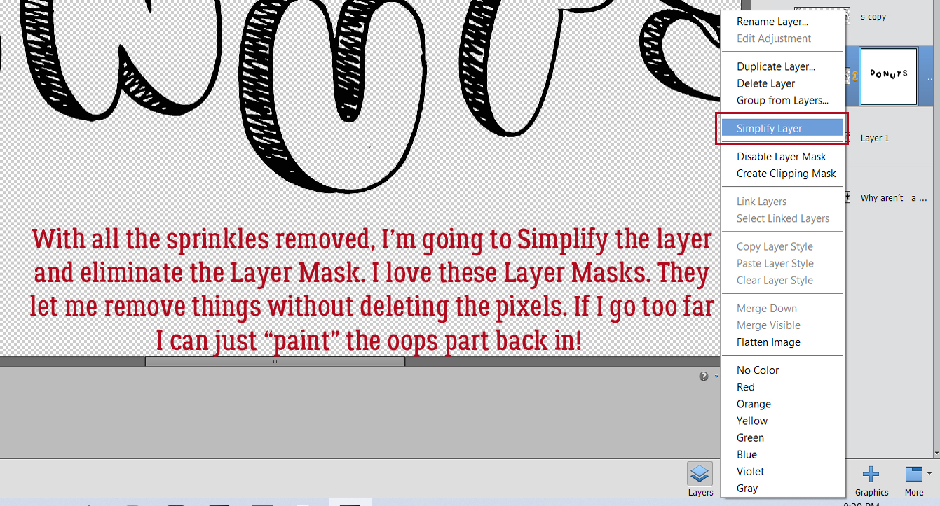
… made a Copy layer: right-click>Duplicate Layer>OK [CTRL/CMD>J] and used the Paint Bucket tool [K] to Fill the bare donut part with a golden brown colour. More about that step in a bit. I made some Copies of the DONUTS layer [CTRL/CMD>J] so I can separate out certain elements of the text for enhancement. I added a Layer Mask – click on the icon at the top of the Layers panel that looks like a blue square with a white circle in the centre – to the bottom DONUTS layer so I can remove parts of the image without actually deleting the pixels. This is the best way to remove parts of an image because if there’s an OOPS!, the accidentally-erased part can be painted back in. Remember, black conceals, white reveals – THE BACKGROUND. Using the Eraser tool and with white in the foreground I removed all the sprinkles. To paint back an OOPS, toggle to black in the foreground [X] and fix it.
To make the Layer Mask part of the layer just Simplify Layer. Right-click in between the mask and the image thumbnail.
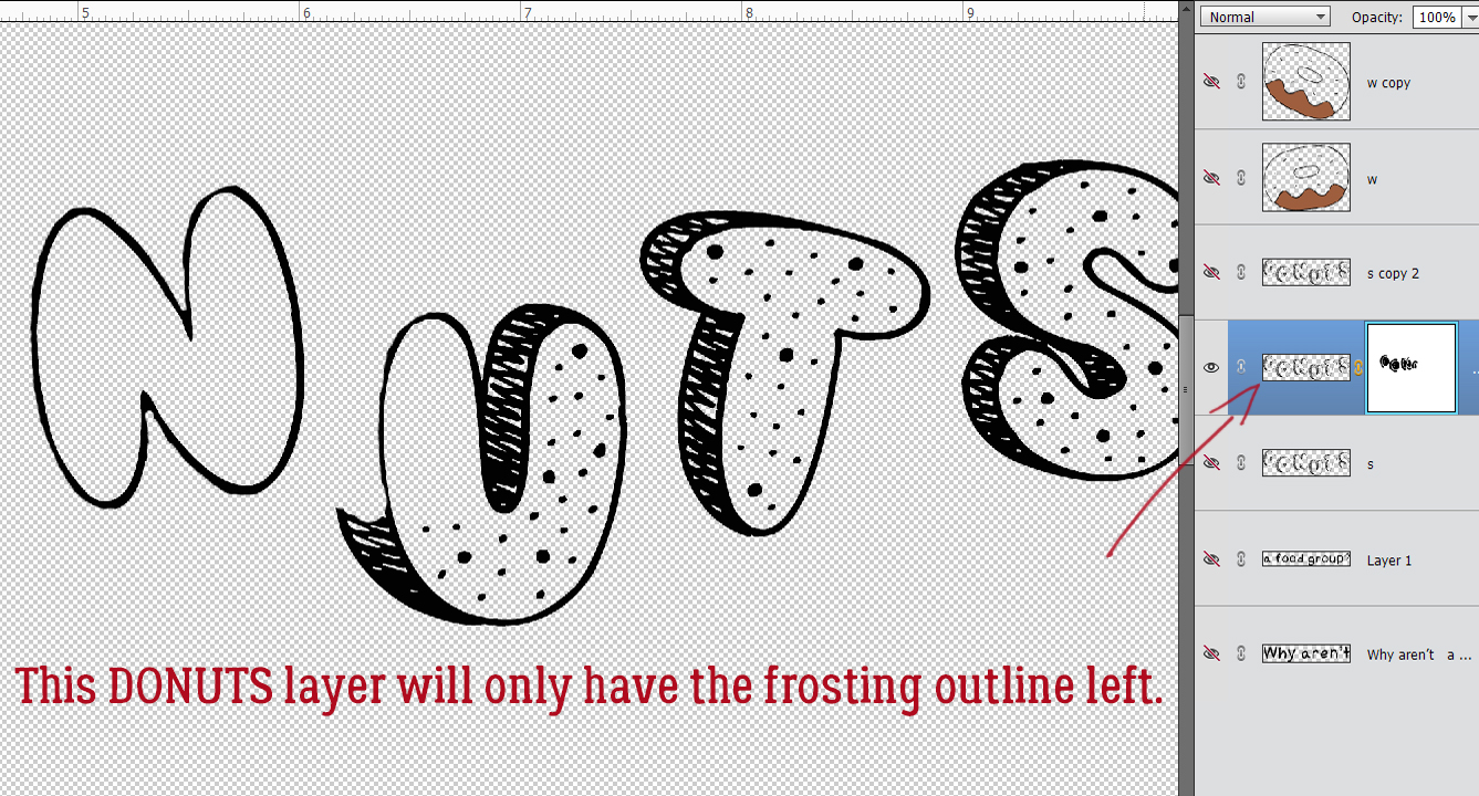
Next, I just want an outline of the frosted area of each letter. With a Layer Mask, I removed the sprinkles and the cakey parts. It doesn’t have to be perfect because the other layers will conceal any wobbles.
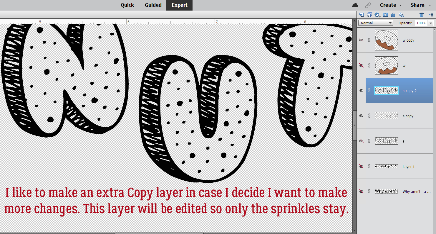
I like to make more Copy layers than I think I’m going to need, which usually is a good idea. Here I’m going to just leave the sprinkles, but I’ve already done the hard work.
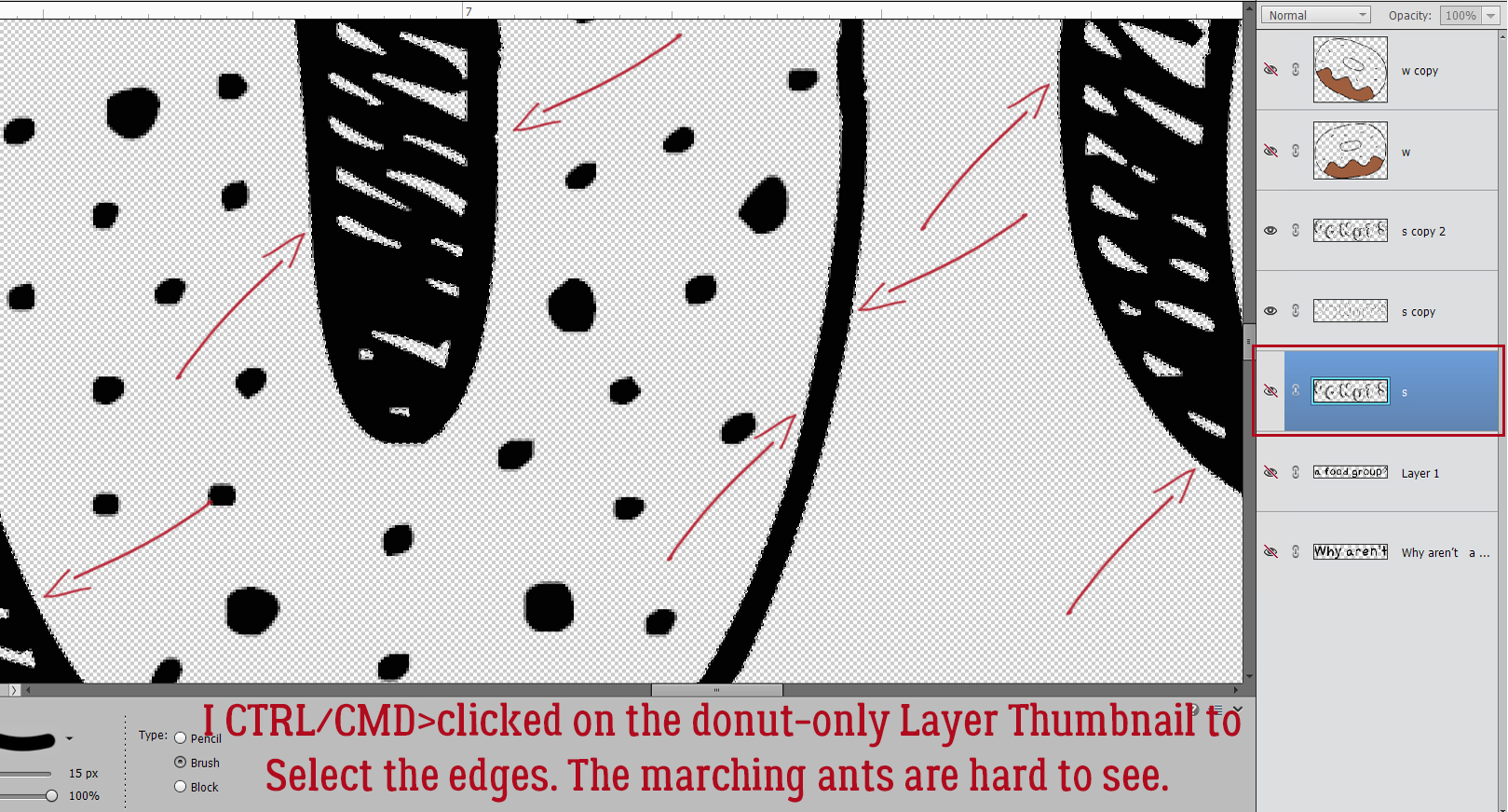
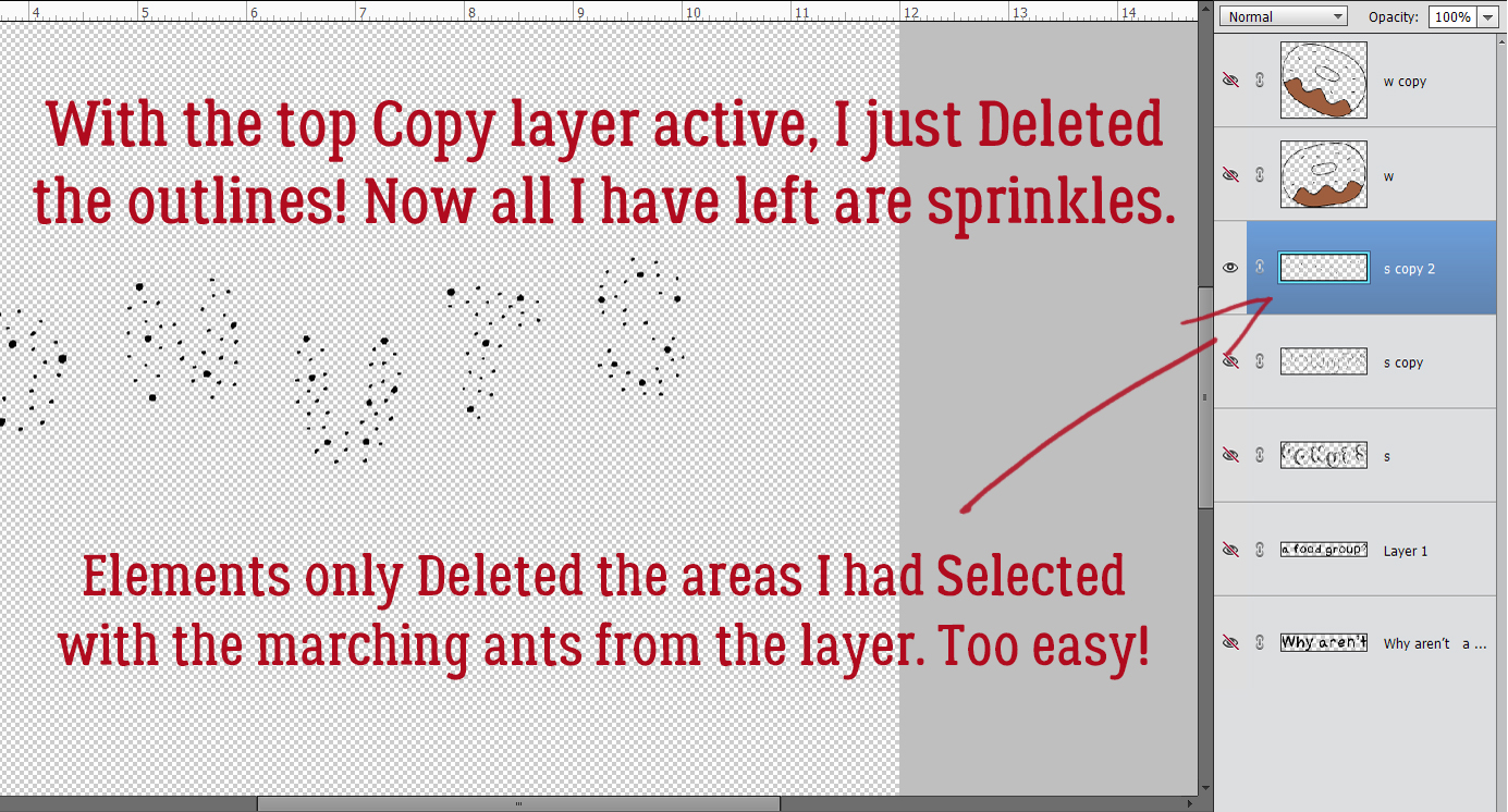
I CTRL/CMD>clicked on the layer thumbnail (the tiny image of what’s on each layer at the far left of the layer in the Layers panel) for the first DONUTS layer with no sprinkles. That Selected the edges of that layer. See the marching ants?
Then with the topmost Copy layer active, I just Deleted what I Selected. [CTRL/CMD>D or just hit Delete] and voilà! All that’s left are the sprinkles.
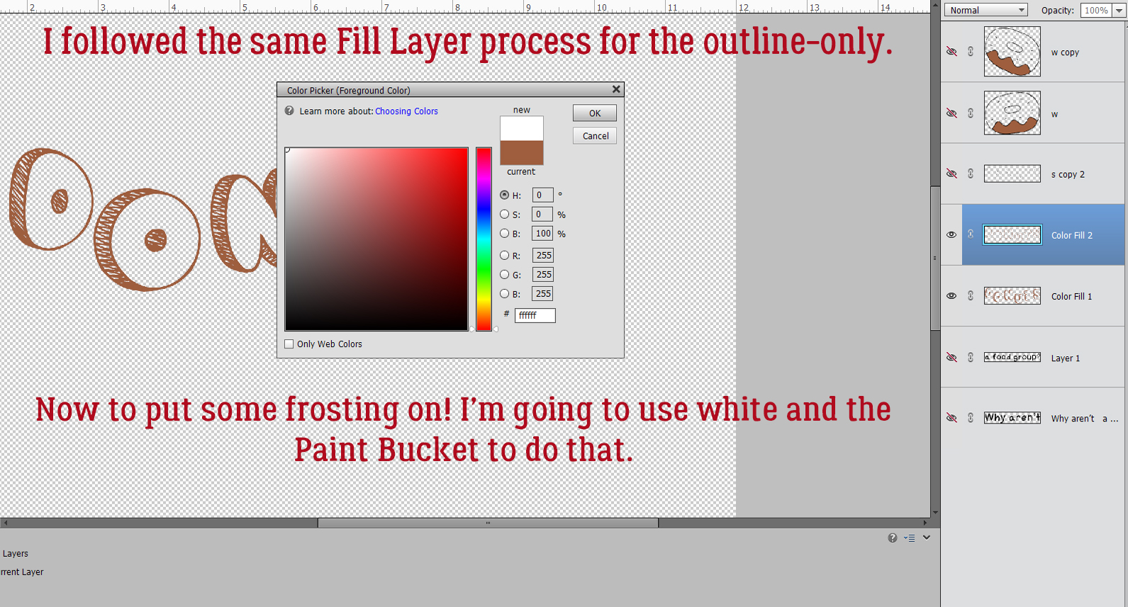
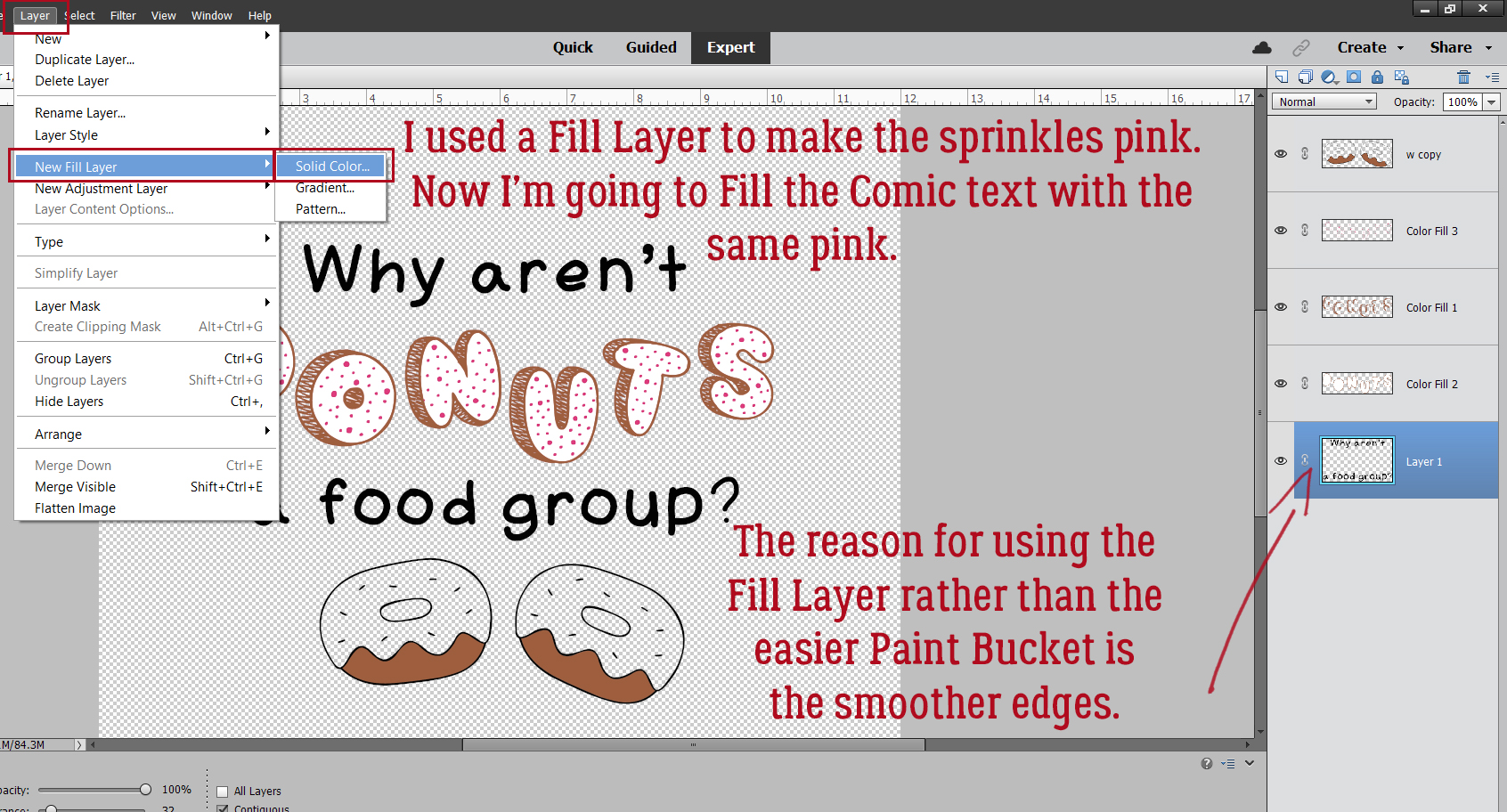
Now to get some colour into the picture. With the first of our DONUTS layer active, I’m going to add a Fill Layer. The reason for this is that the results are much cleaner than if I used the Paint Bucket. Layer>New Fill Layer>Solid Color.
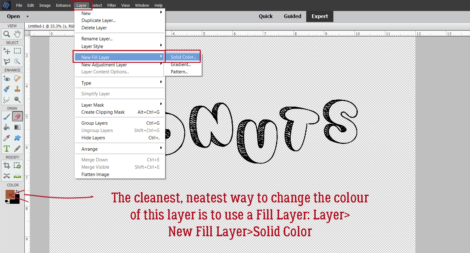
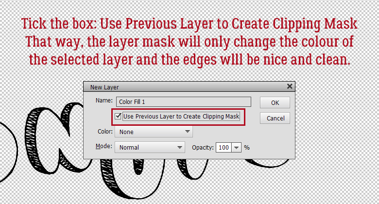
Tick that Use Previous Layer to Create a Clipping Mask box and let Elements do the work.
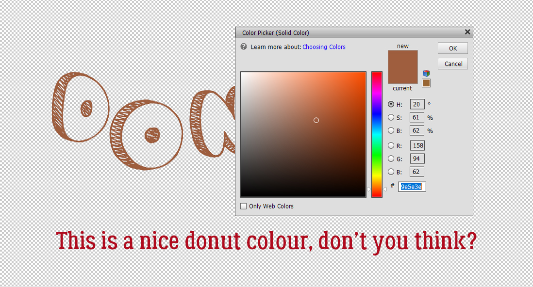
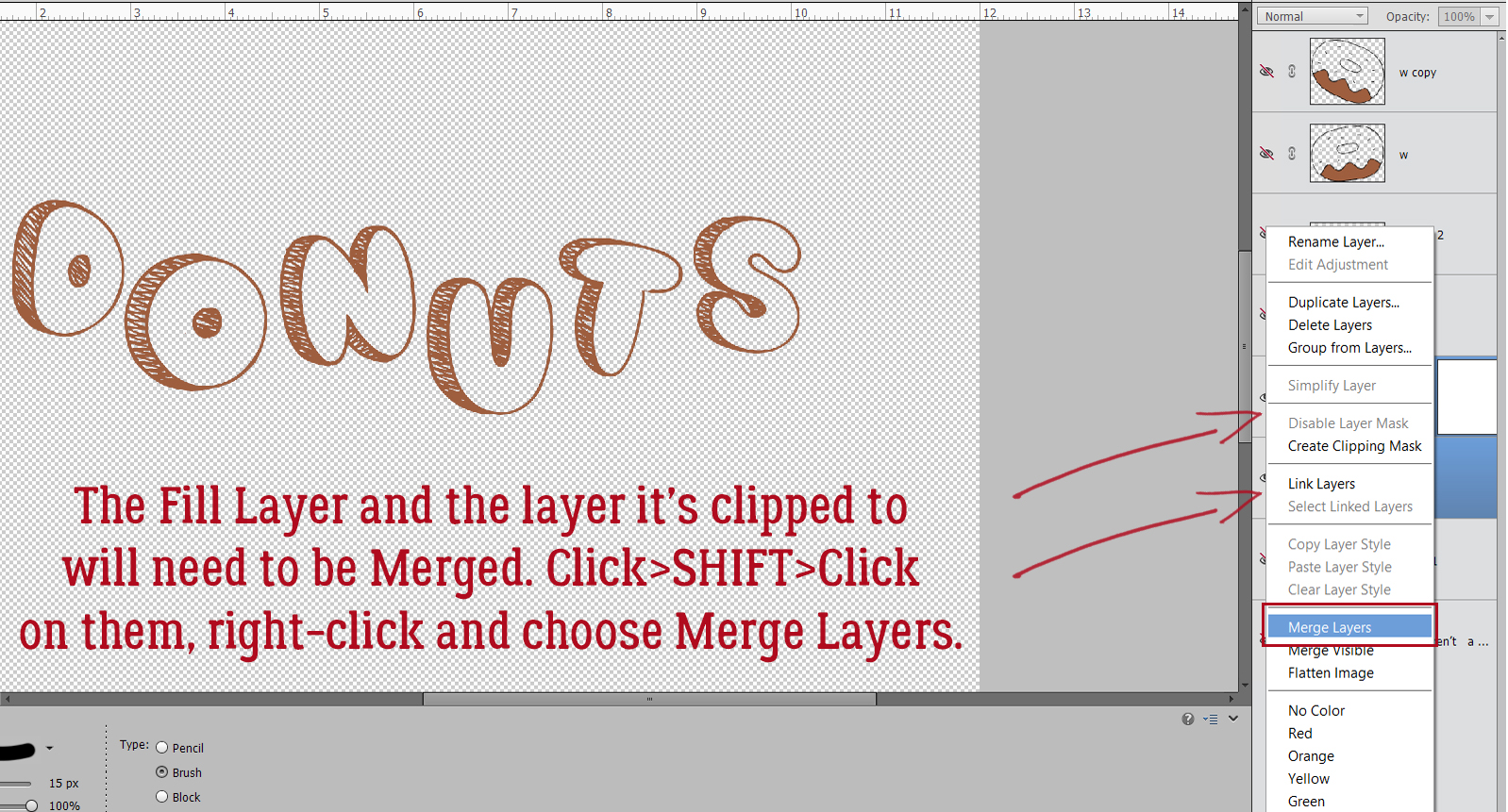
The Color Picker opens and I chose a nice golden brown.
The Fill Layer and the layer it’s clipped to need to be Merged, so click>SHIFT>click on the two layers, right-click and choose Merge Layers [CTRL/CMD>E]
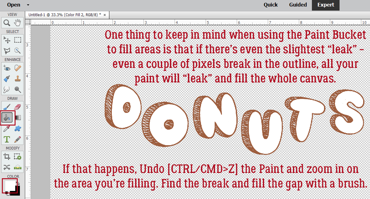
The frosting layer will be Filled with white using the Paint Bucket tool [K].
Make sure you’re not going to leak!
I also used a Fill Layer to make the sprinkles layer pink. I won’t show screenshots of those steps because that’s unnecessarily repetitive! But I will show you screenshots of the Fill Layer for the Amateur Comic text. I want it to be pink too.
I decided the pink text lacked a bit of presence so I’ve chosen to add a white Stroke to the outside. Edit>Stroke (Outline) Selection.
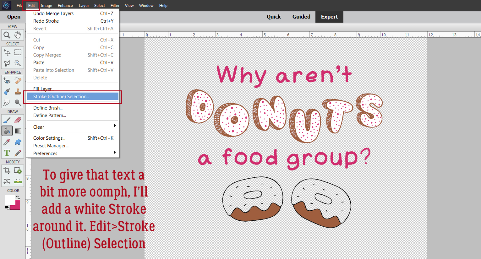
8 pixels makes a nice stroke for titles. I’ll position it to the Outside so it doesn’t hide any of the pink.
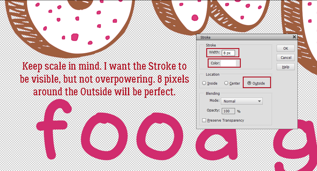
I think it looks good now.
I went on to use the Paint Bucket to frost the dingbat donuts, change some of the sprinkles to purple and position the layers so they look right. Then I Merged all the layers. To have my word art (and work!) saved for later, I’m going to Save As> [CTRL/CMD>SHIFT>S].
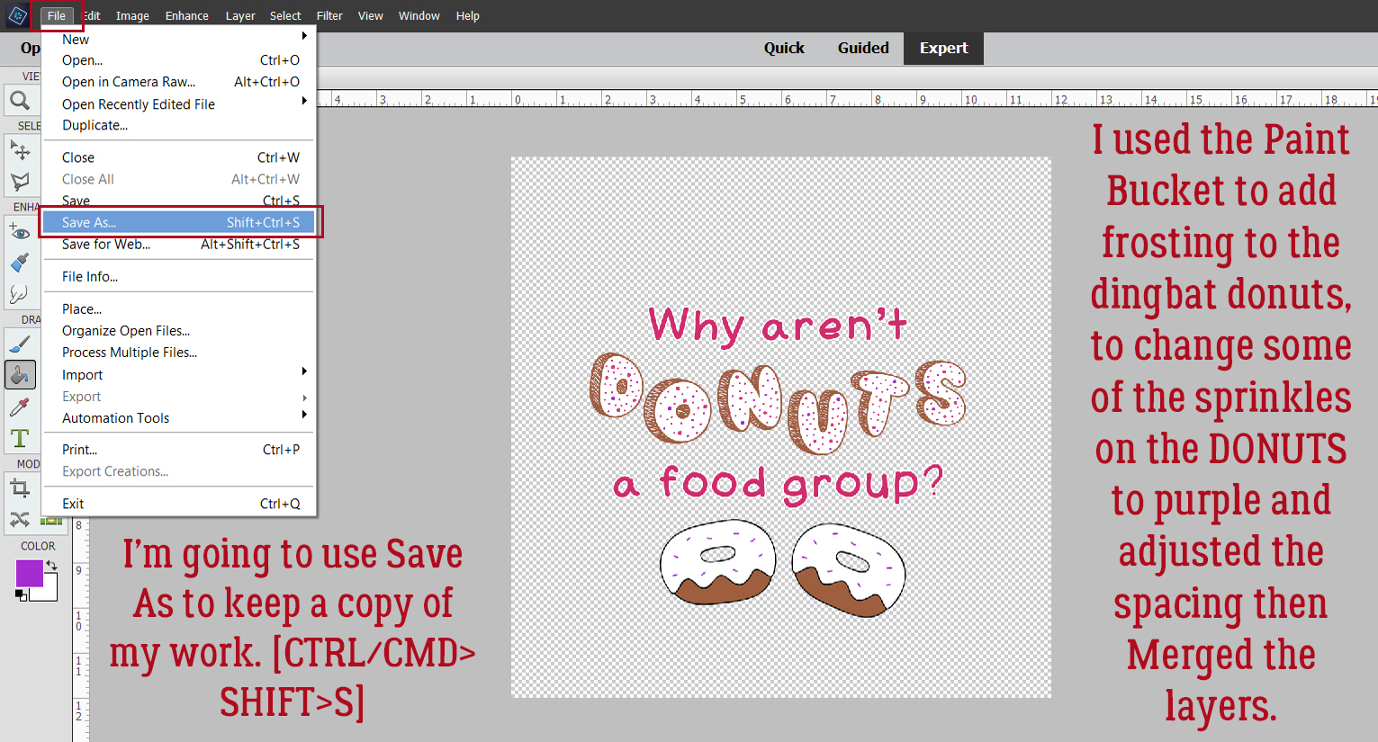
I have a Jan’s Elements folder on my laptop, so that’s where I’ll put it. I named the file Donuts Word Art and will save it as a PNG so the background stays transparent.
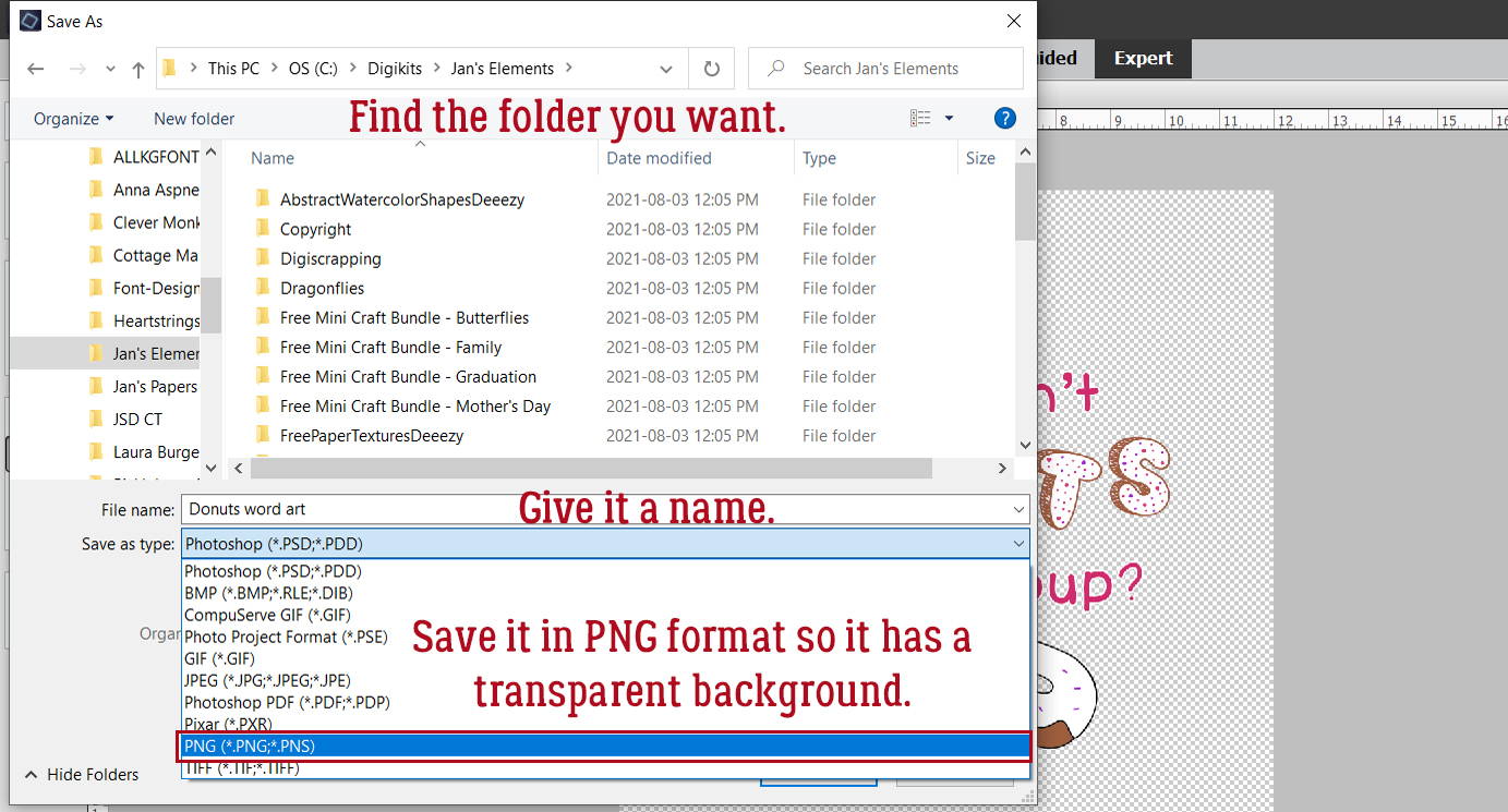
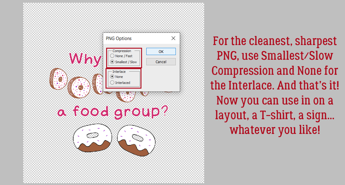
Smallest/Slow Compression and No Interlace will preserve the word art for me in the cleanest and neatest format so I can use it as the title for my layout.
I’ve been told there are a LOT of new members of the GingerScraps family, so I’m going to do a few basic tutorials in the coming weeks to help them feel more comfortable here. Stay tuned!
PDF Version: https://bit.ly/3FNtvOy