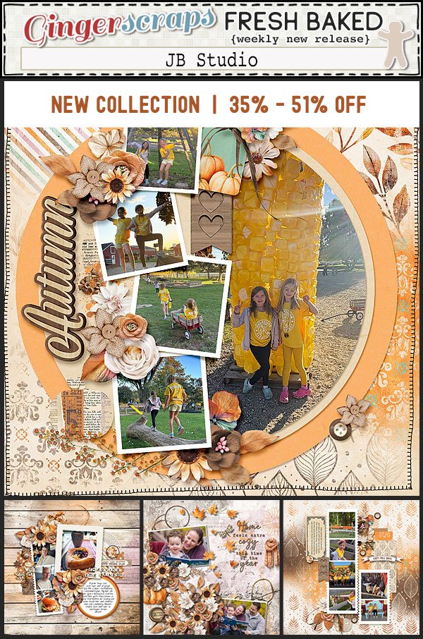
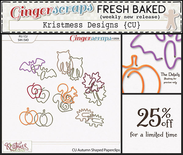
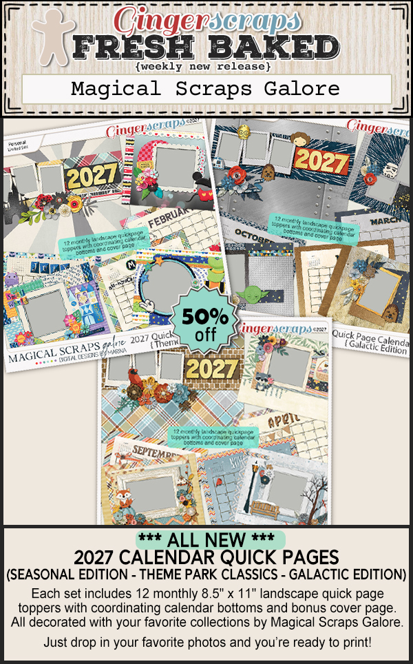
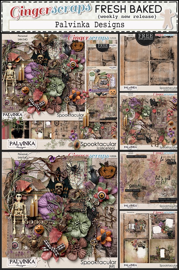
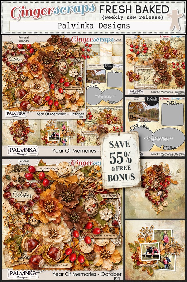
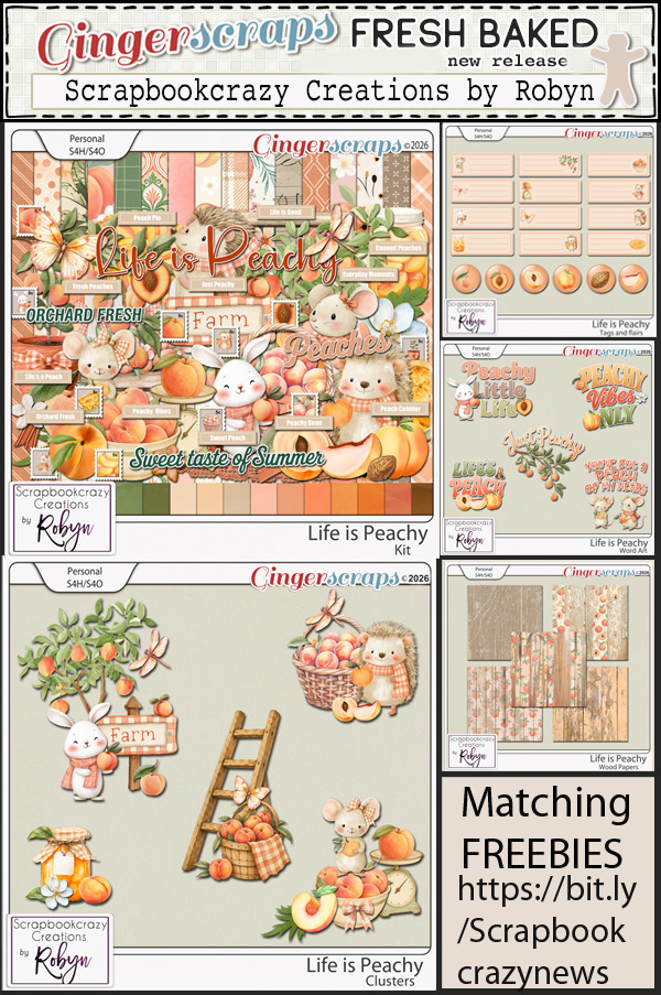
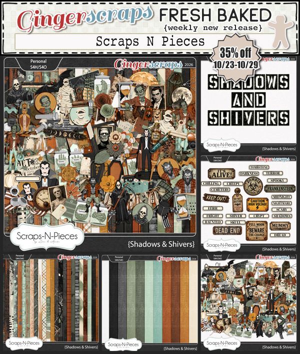
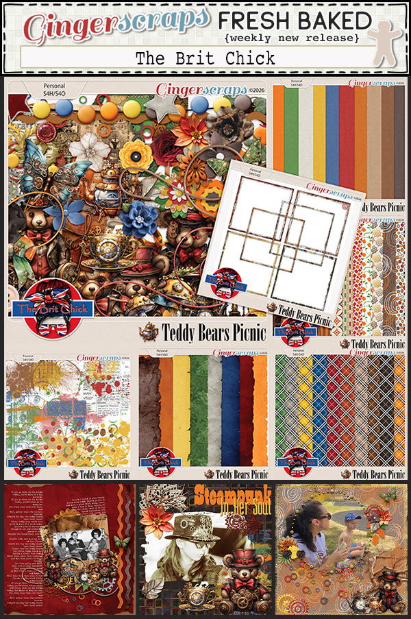
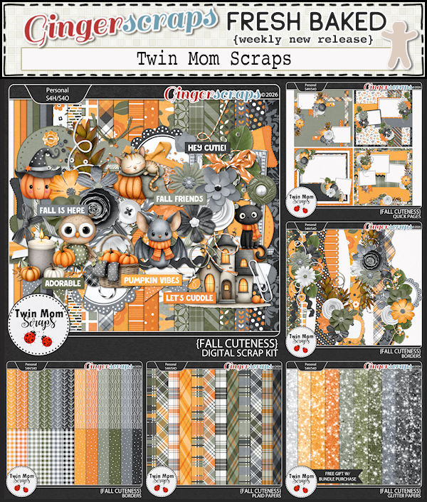
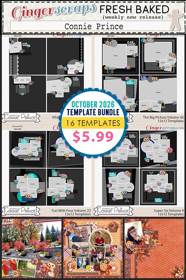
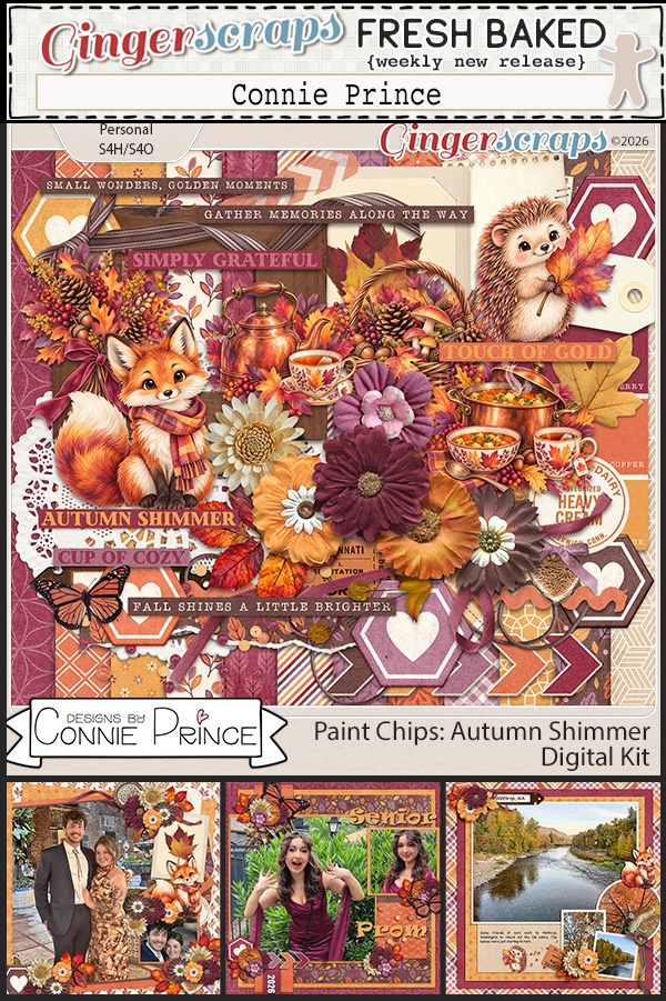
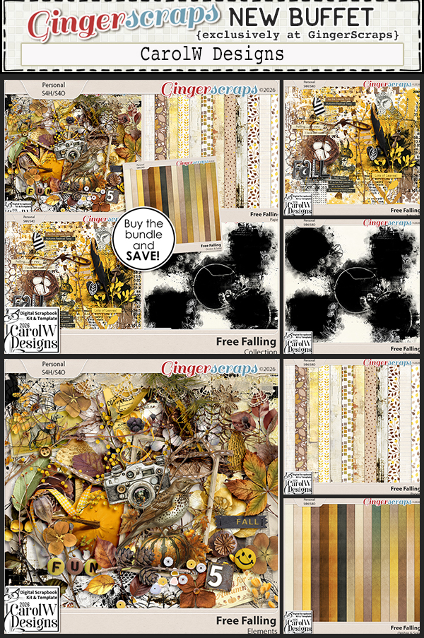
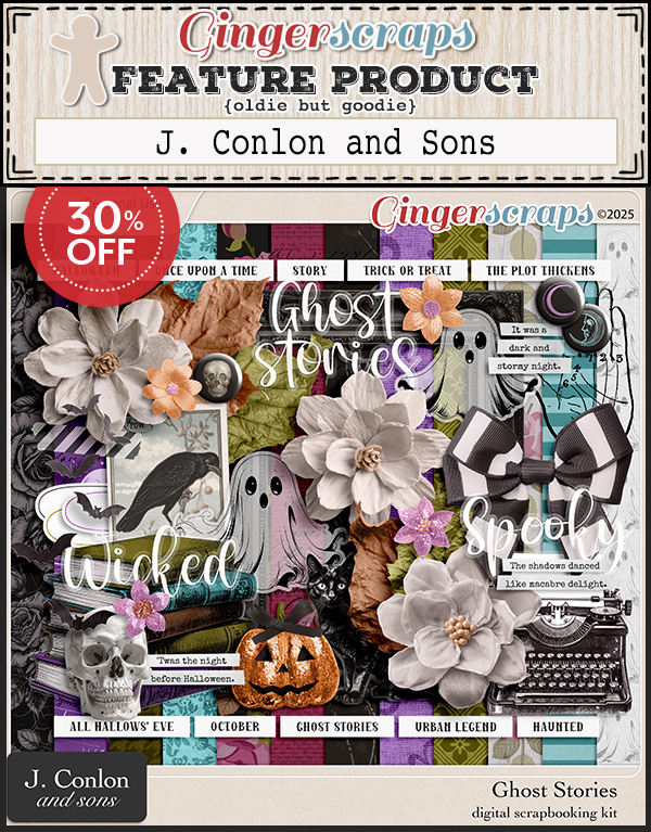
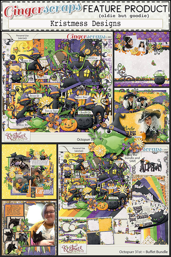
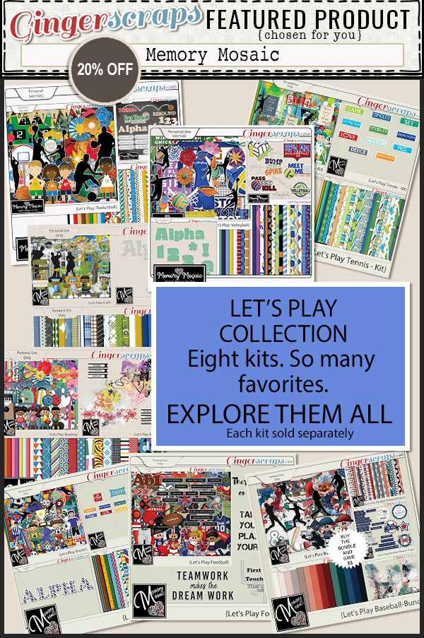
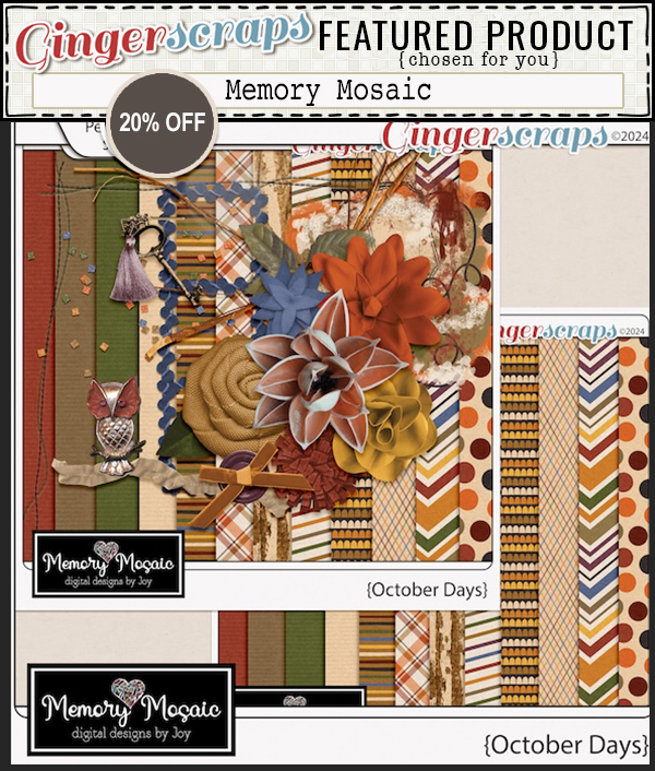
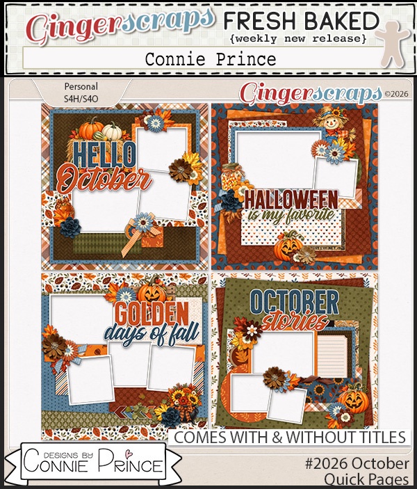
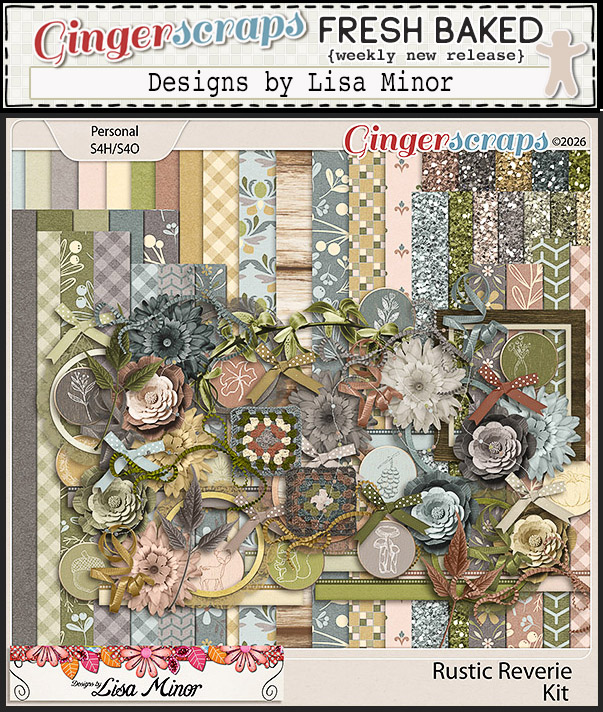
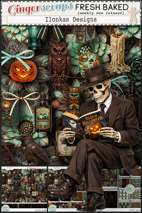
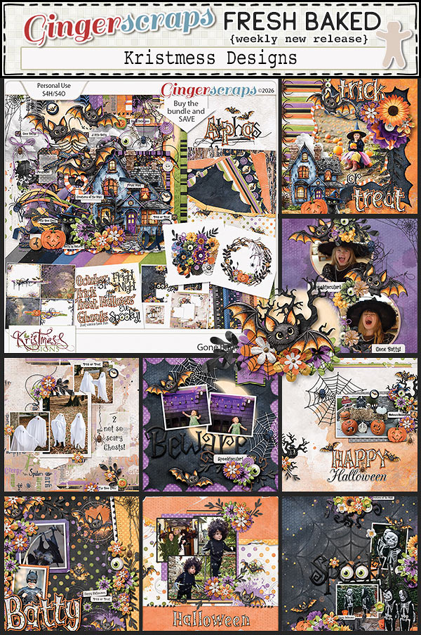
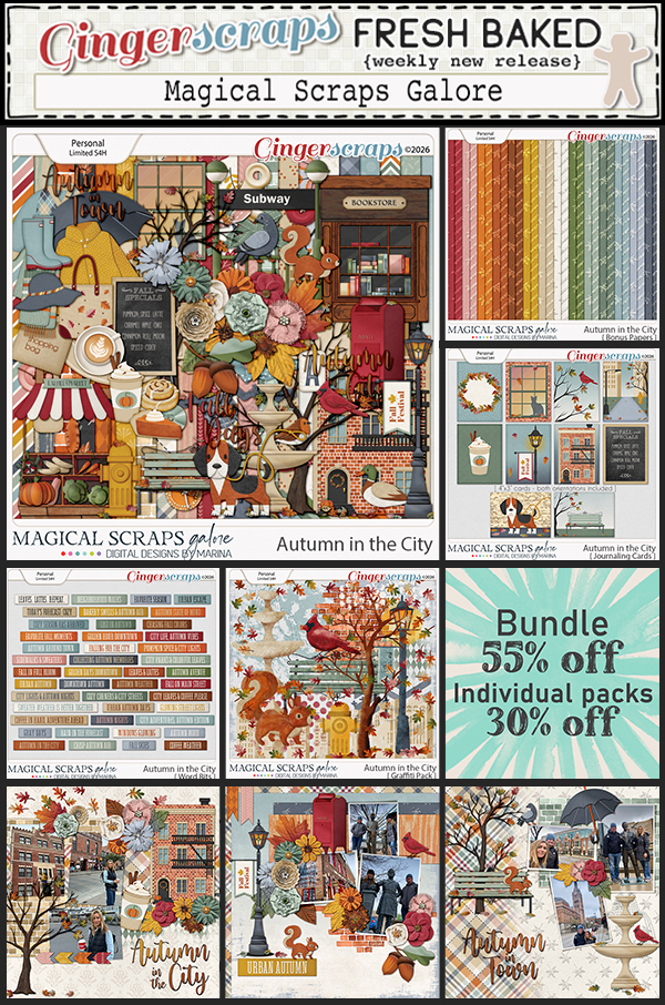
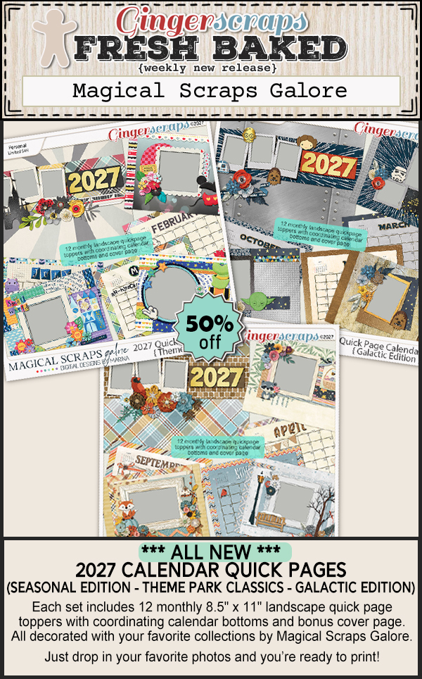
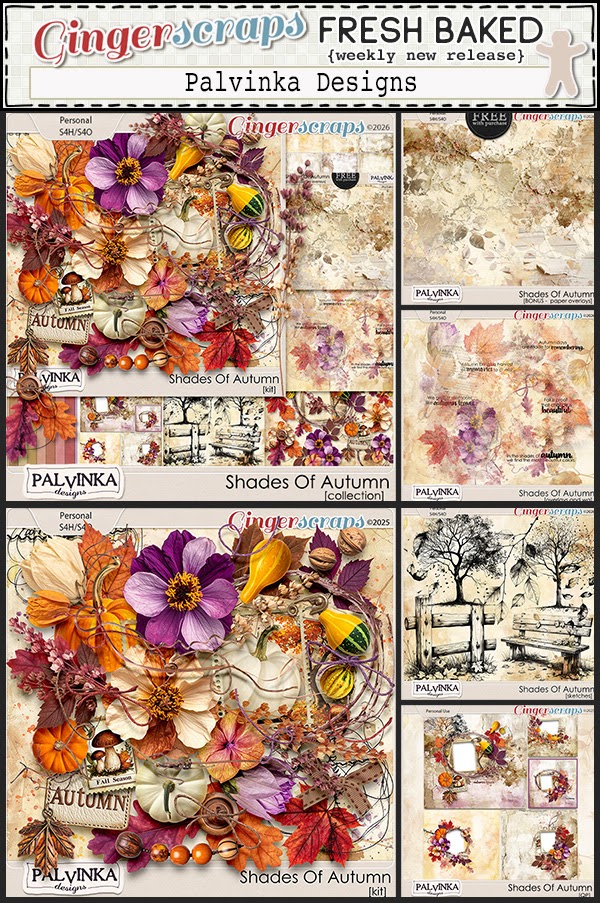
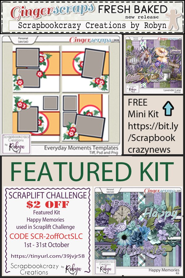
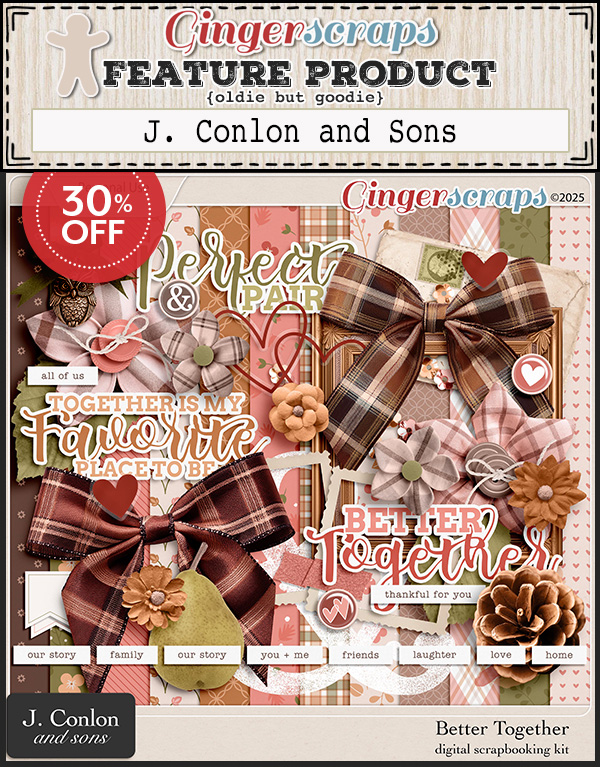
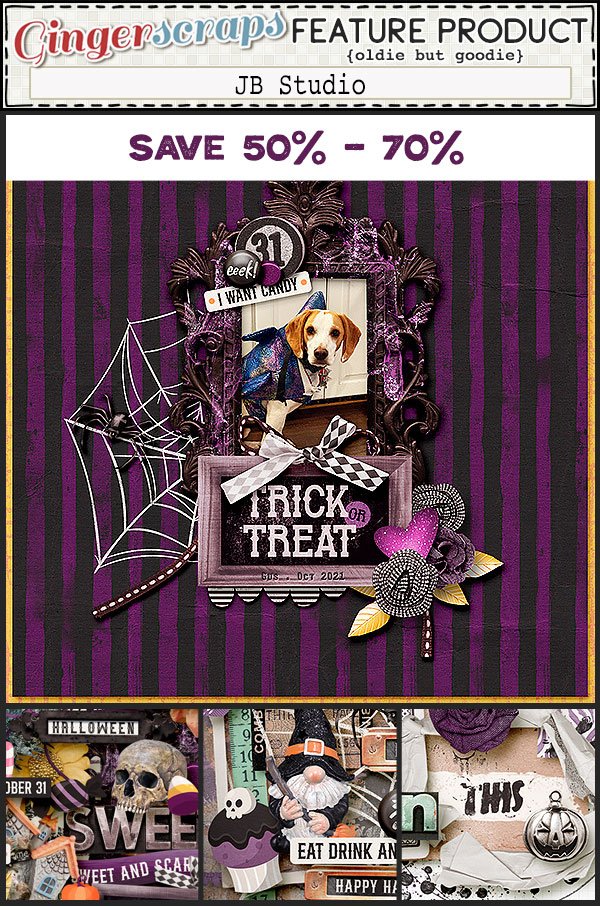
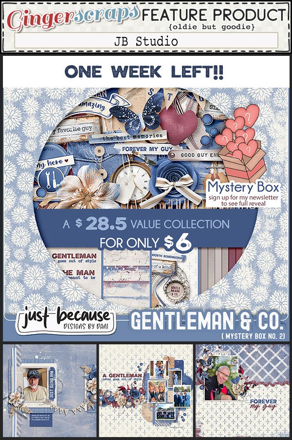
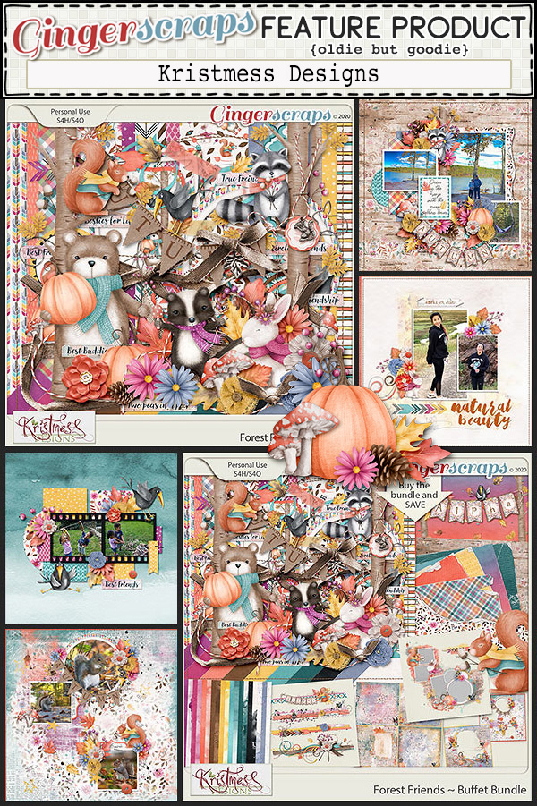
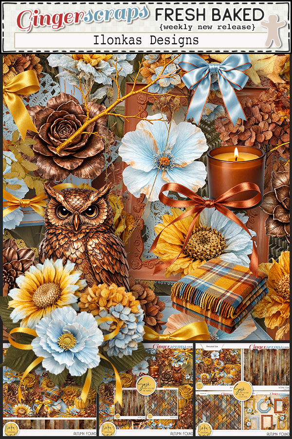
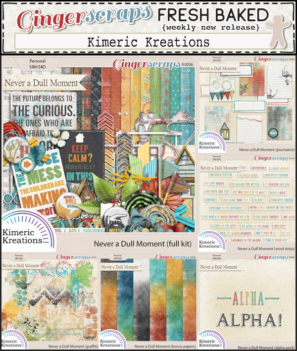
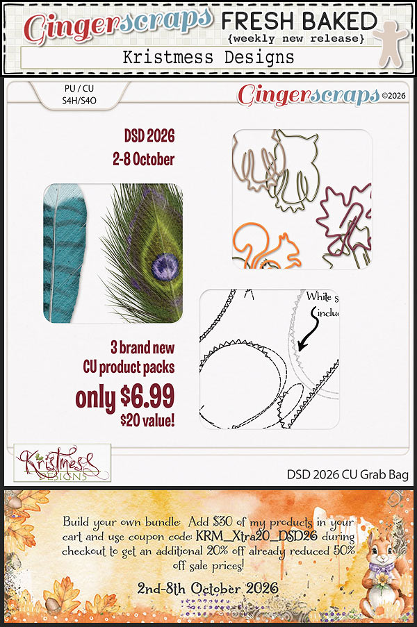
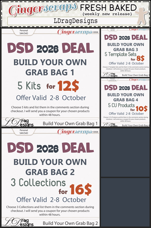
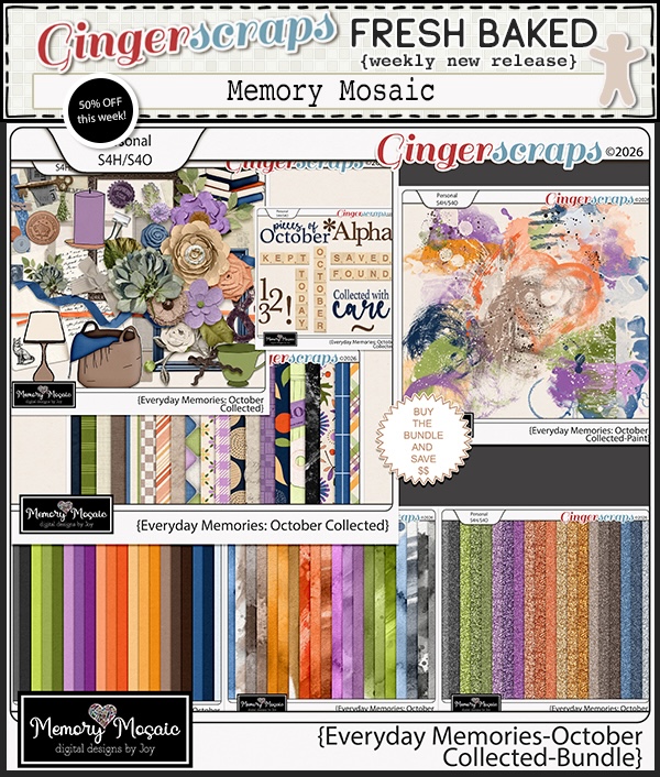
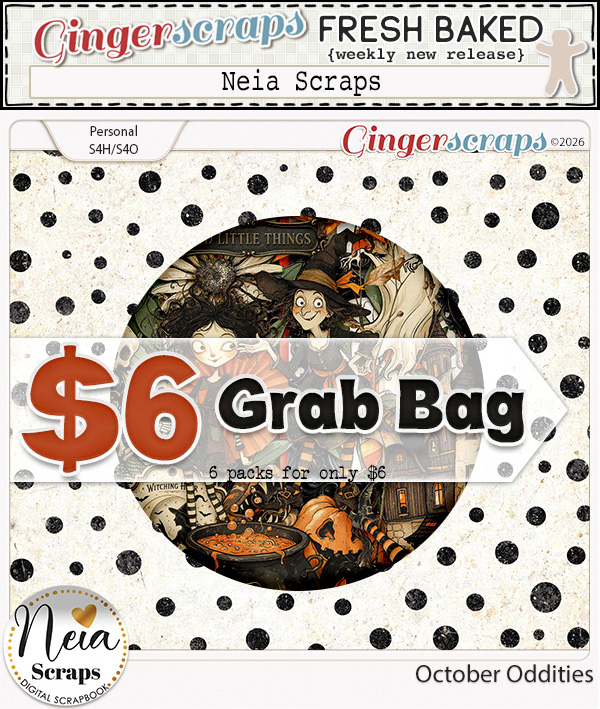
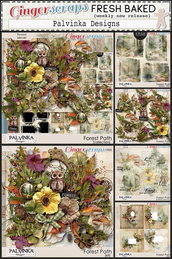
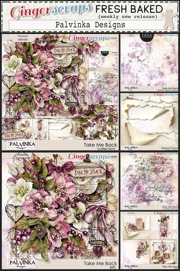
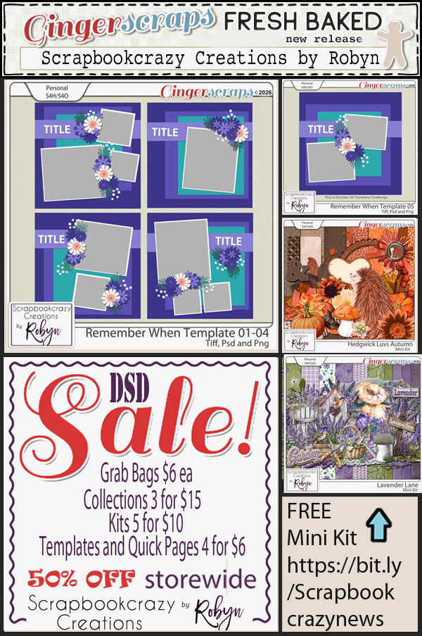
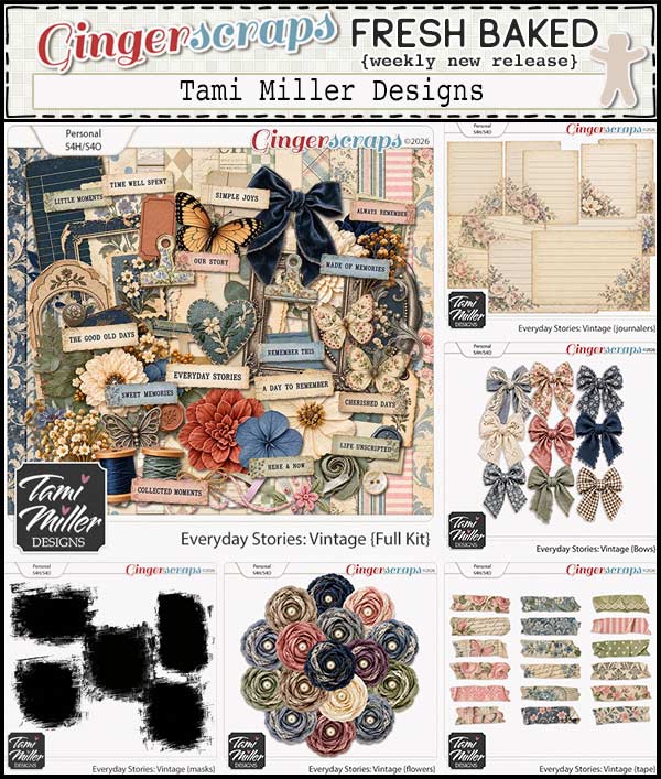
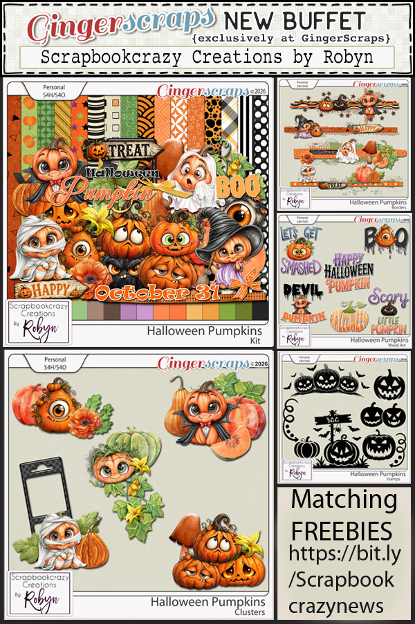
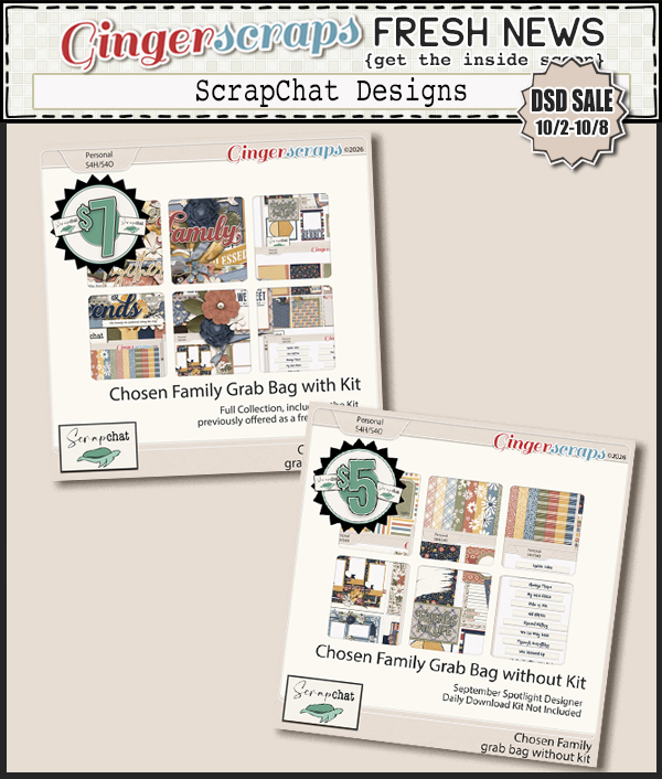
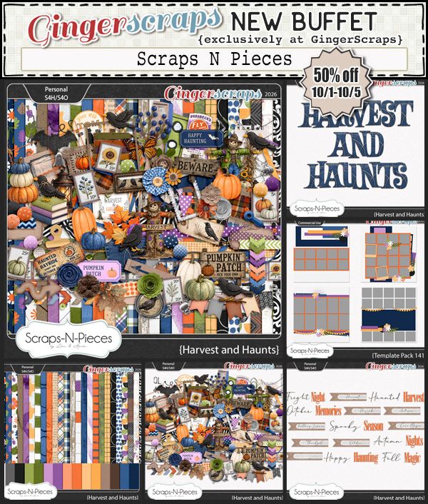
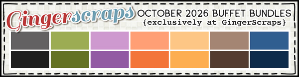
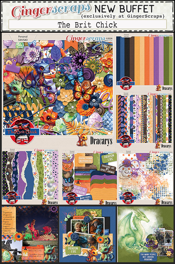
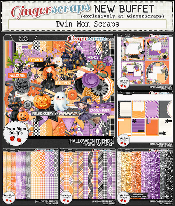
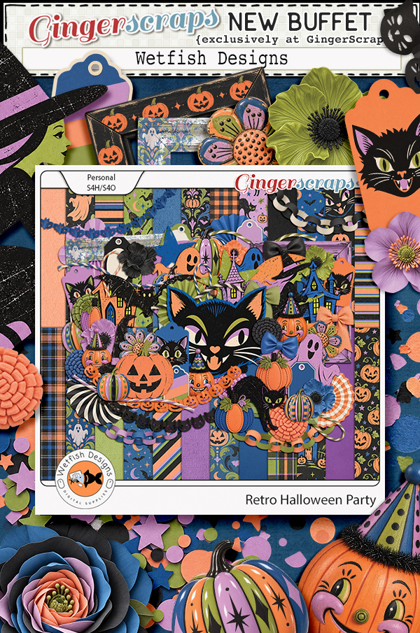
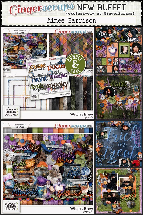
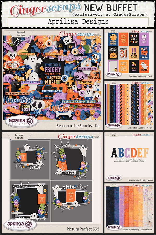
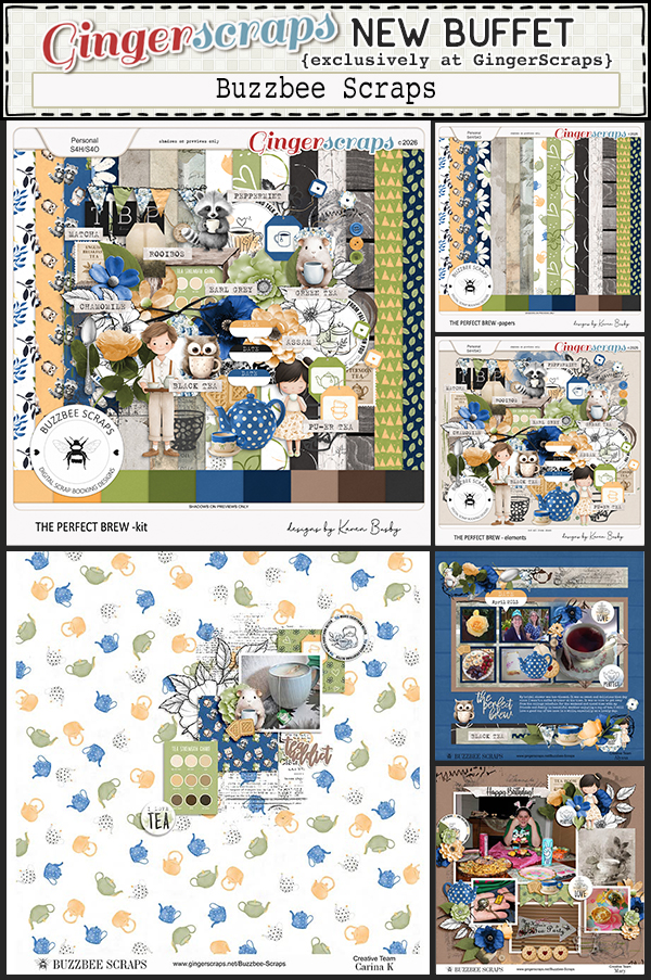
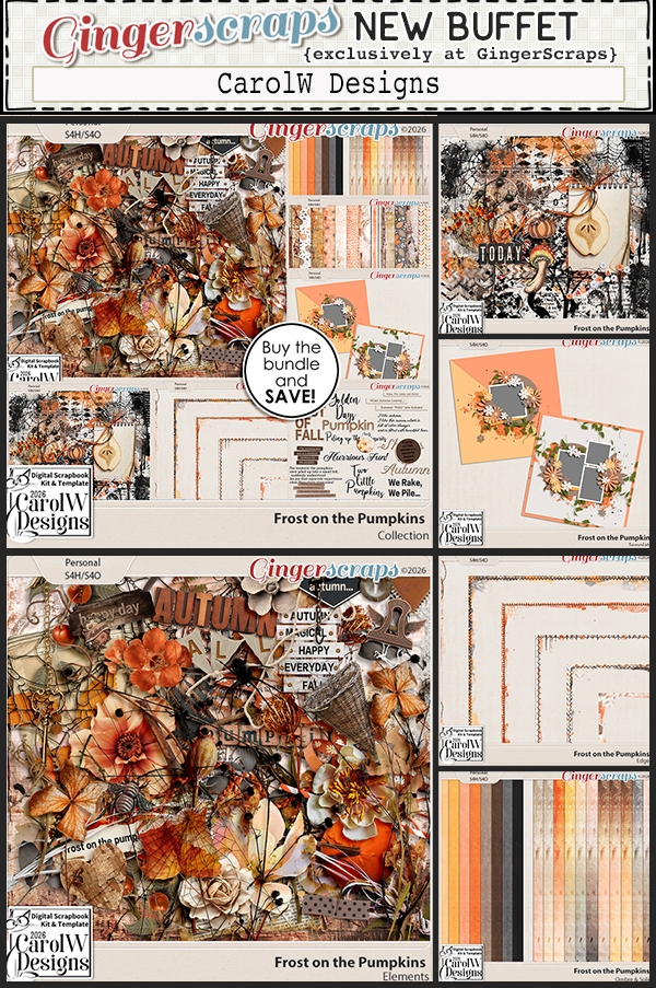
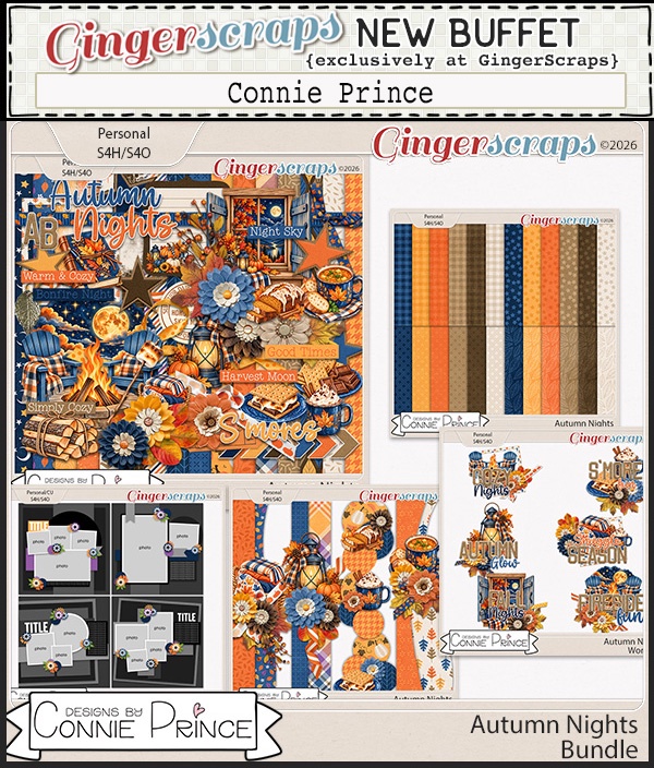
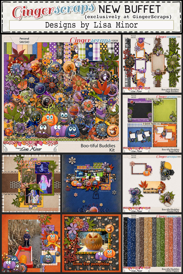
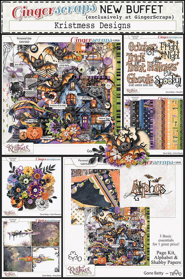
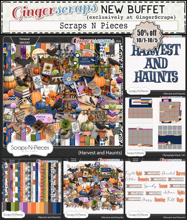
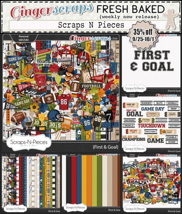
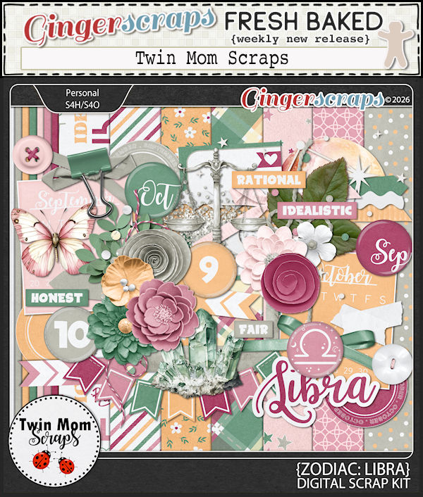
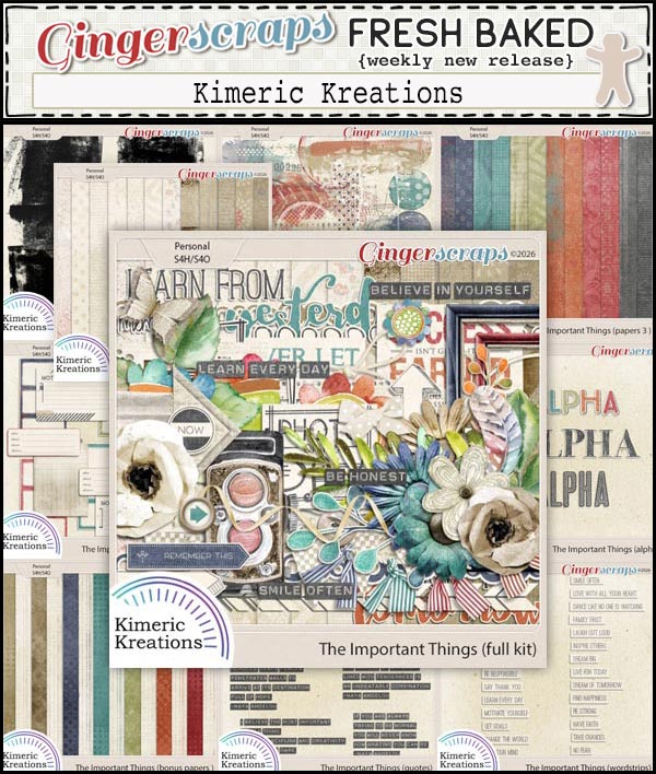
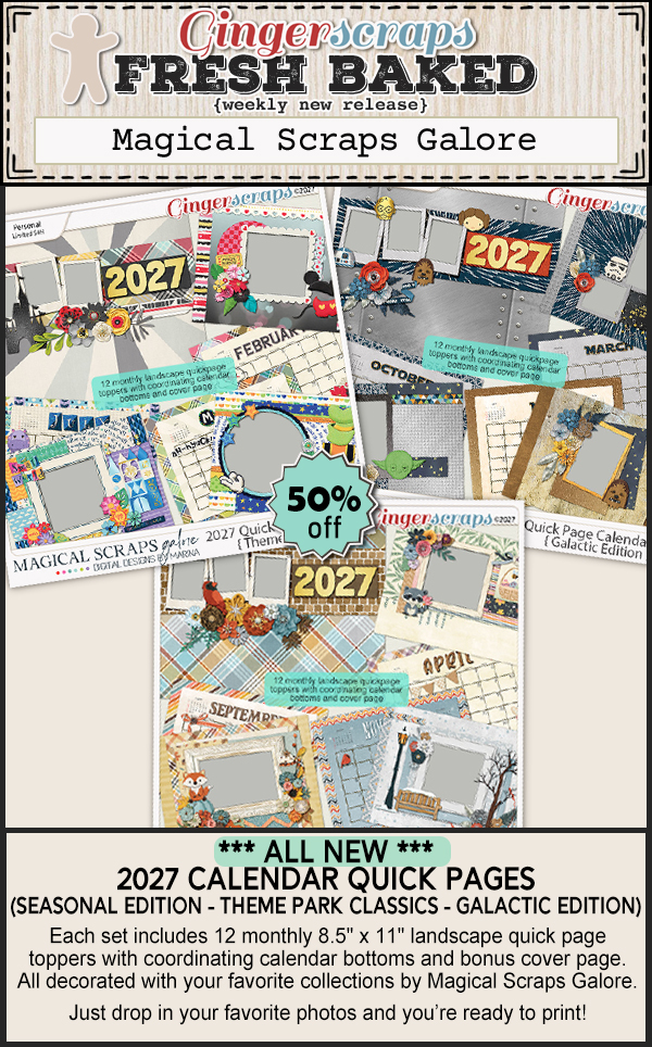
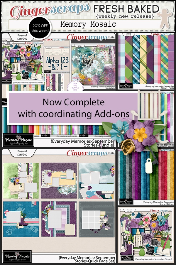
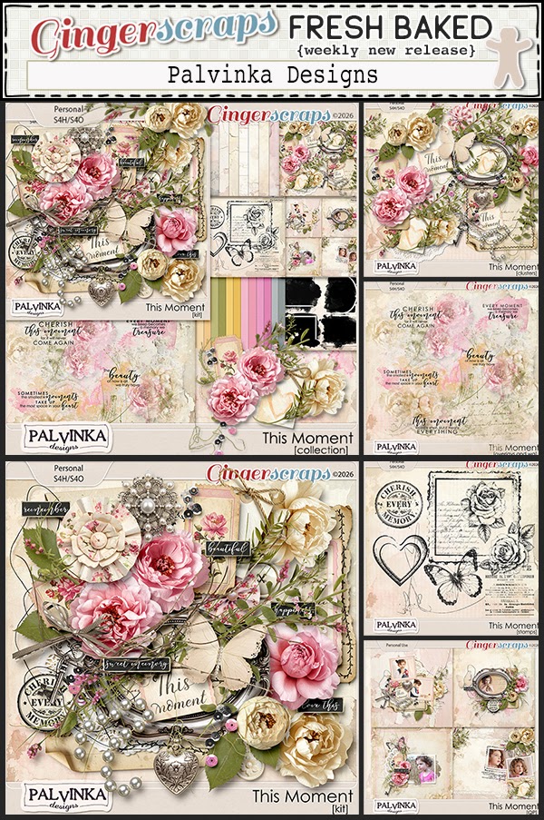
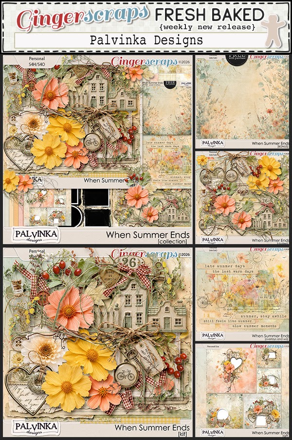
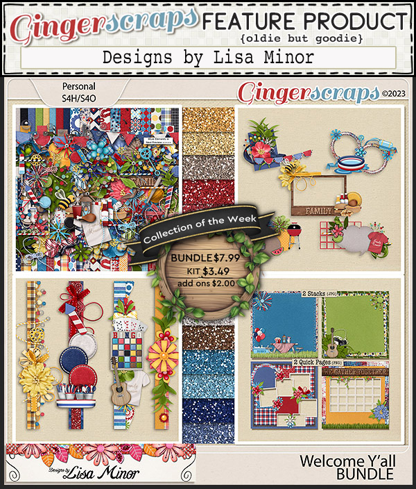
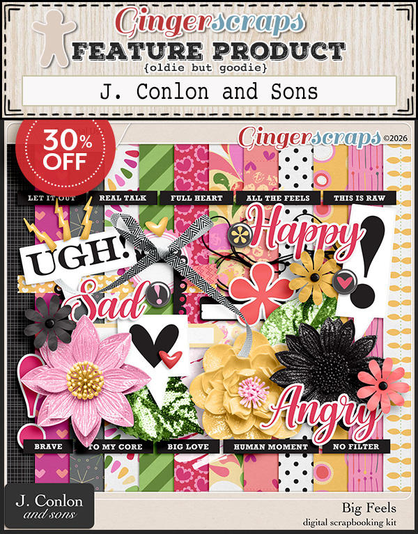
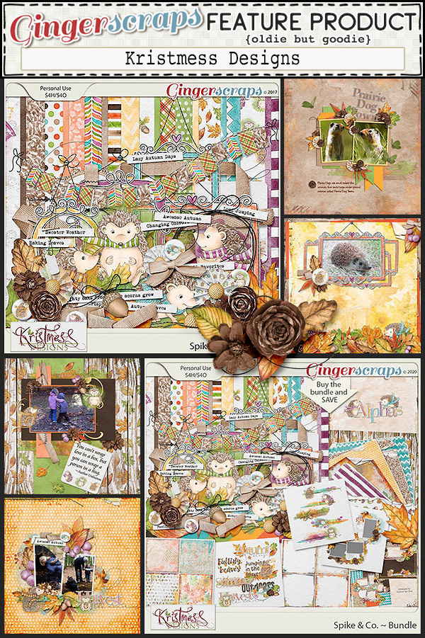
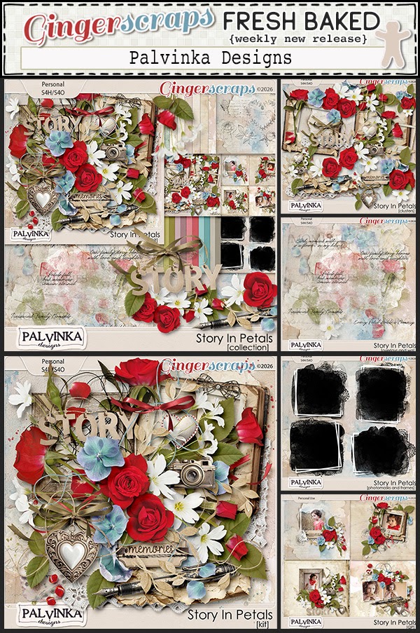
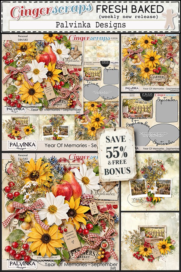
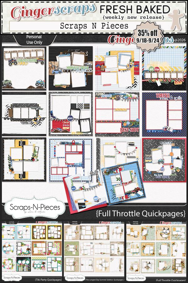
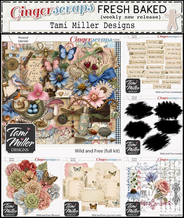
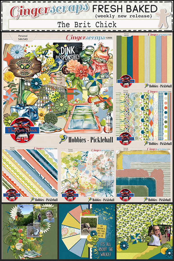
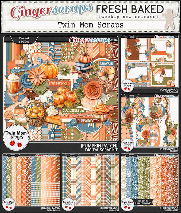
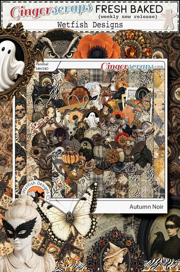
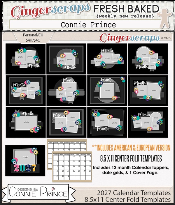
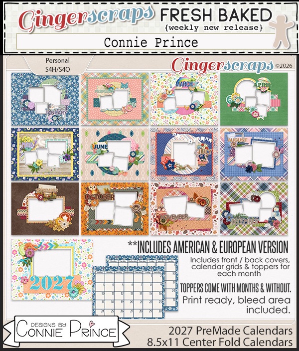
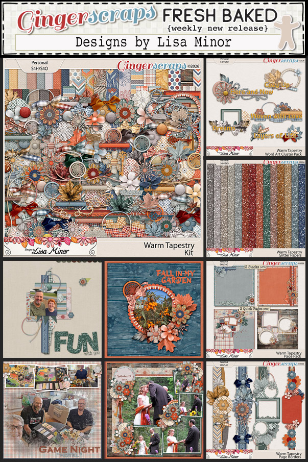
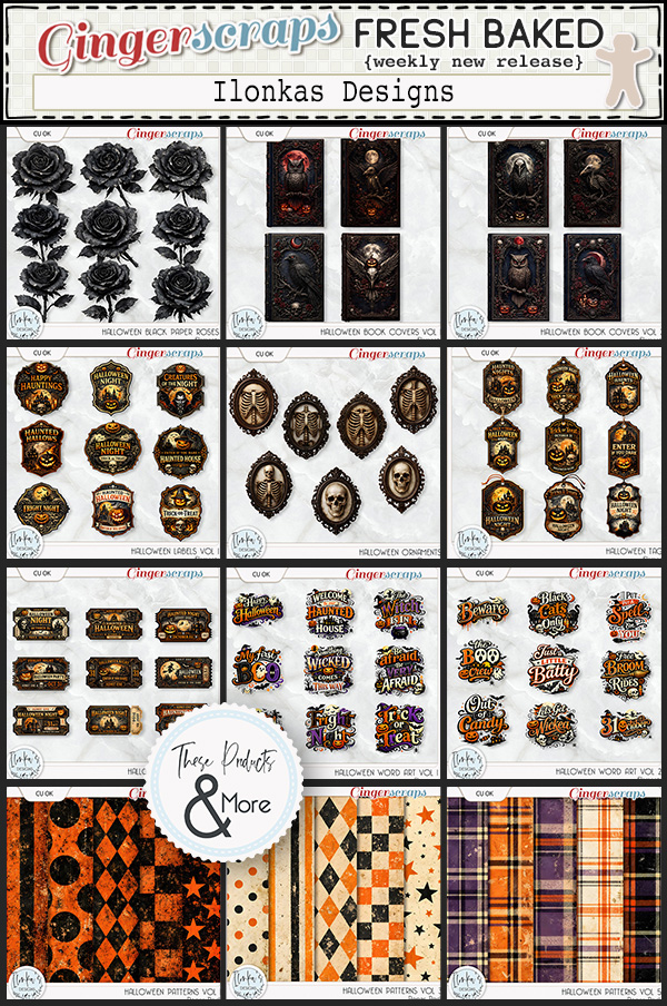
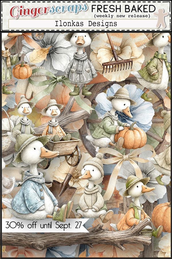
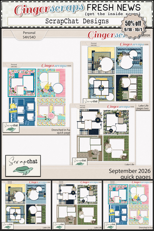
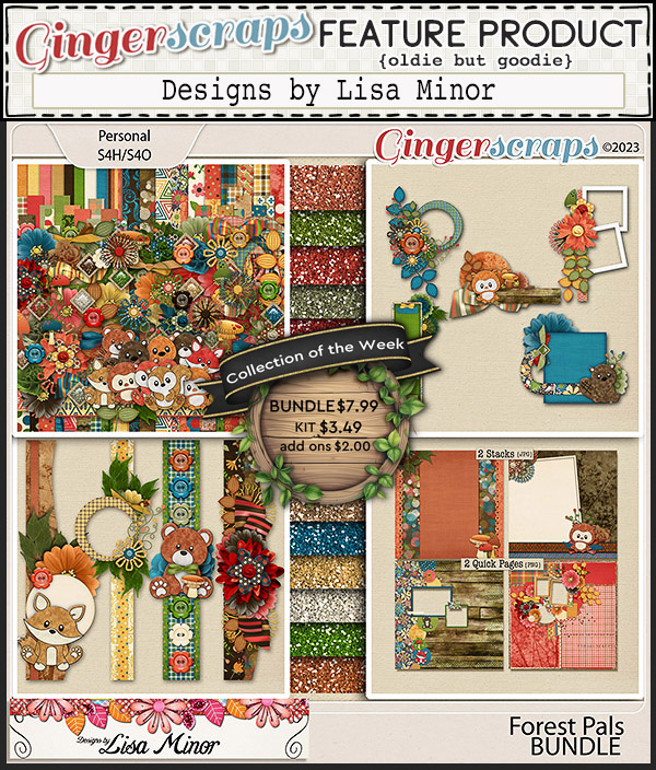
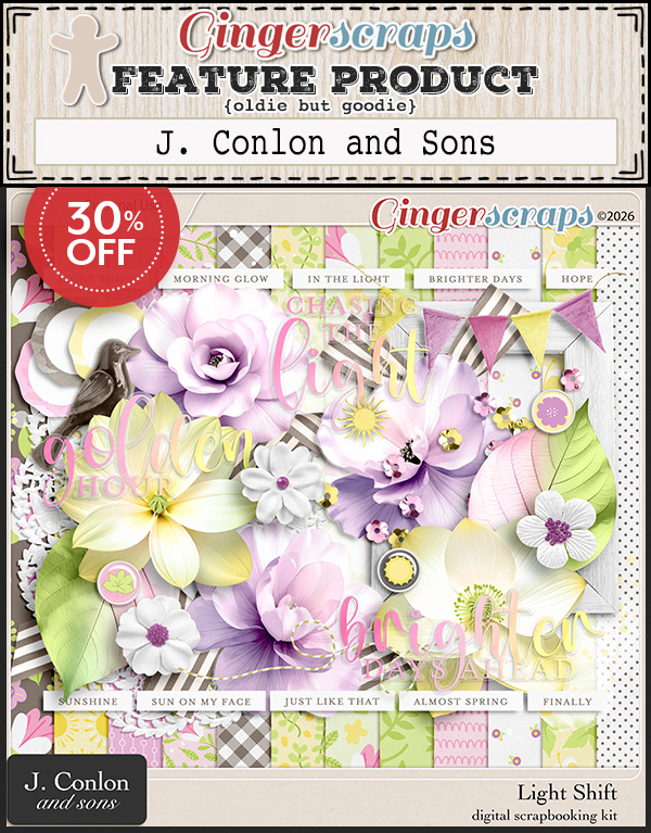
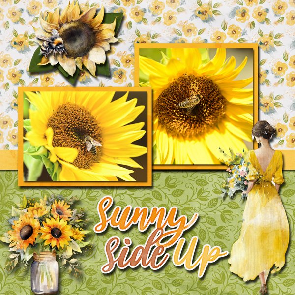
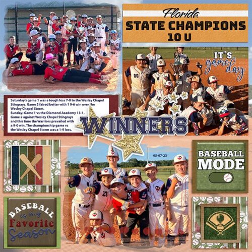
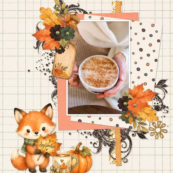
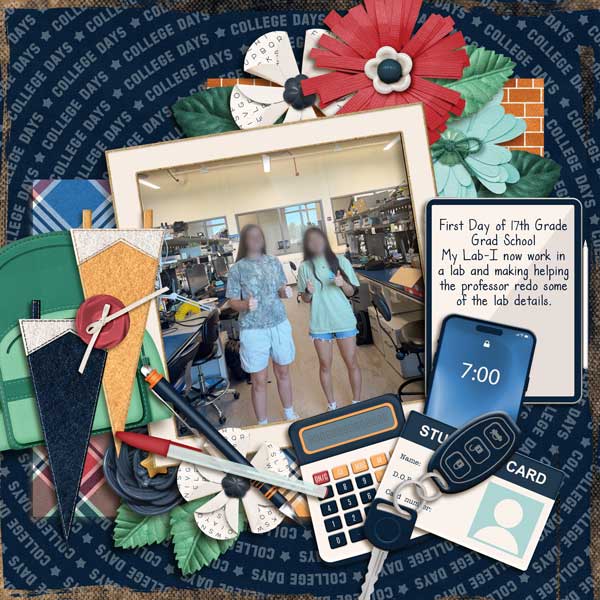
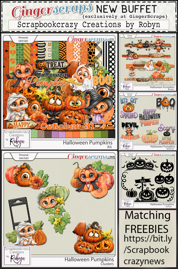
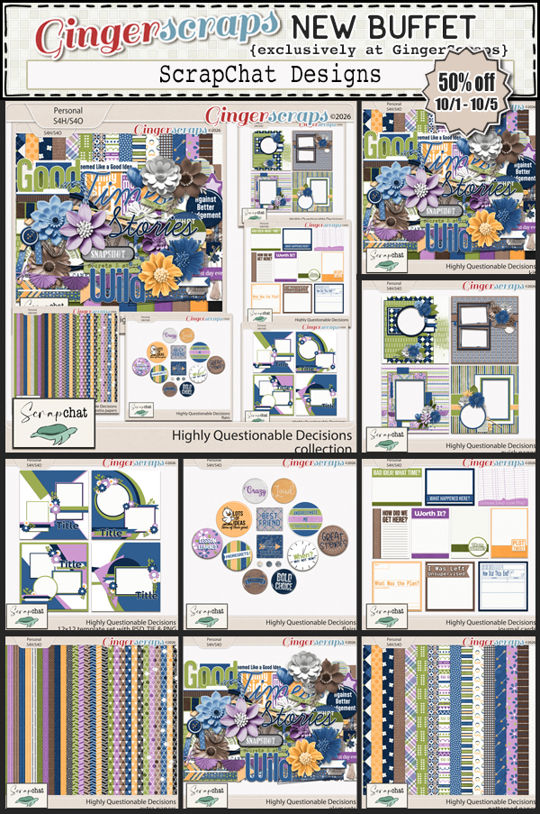
Happy Friday Scrapppers. We have got a lot of great new kits for you this week with Fall and Halloween making prominent appearances.
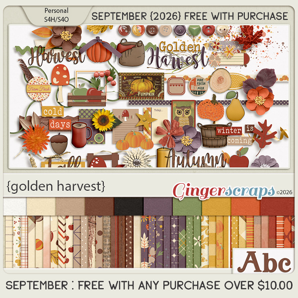
Remember if you spend $10 in the store, you’ll get this great collab free.
Happy Friday Scrapppers. We have got a lot of great new kits for you this week with Fall and Halloween making prominent appearances.
Remember if you spend $10 in the store, you’ll get this great collab free.
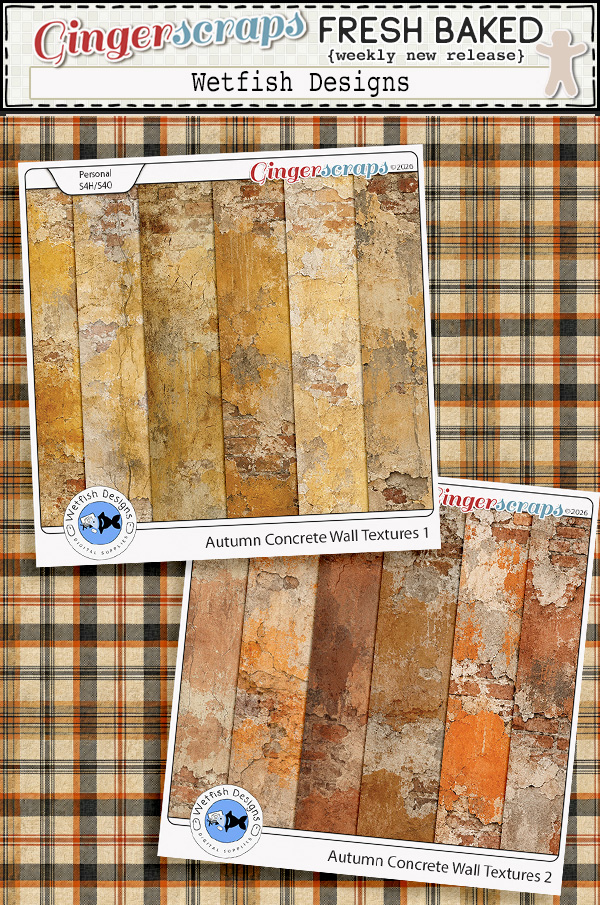
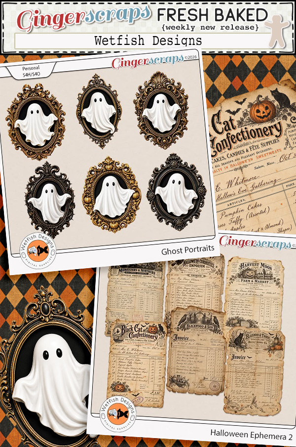
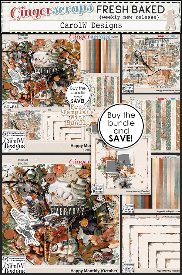
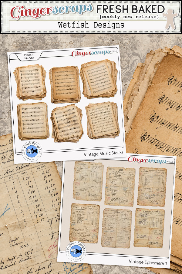
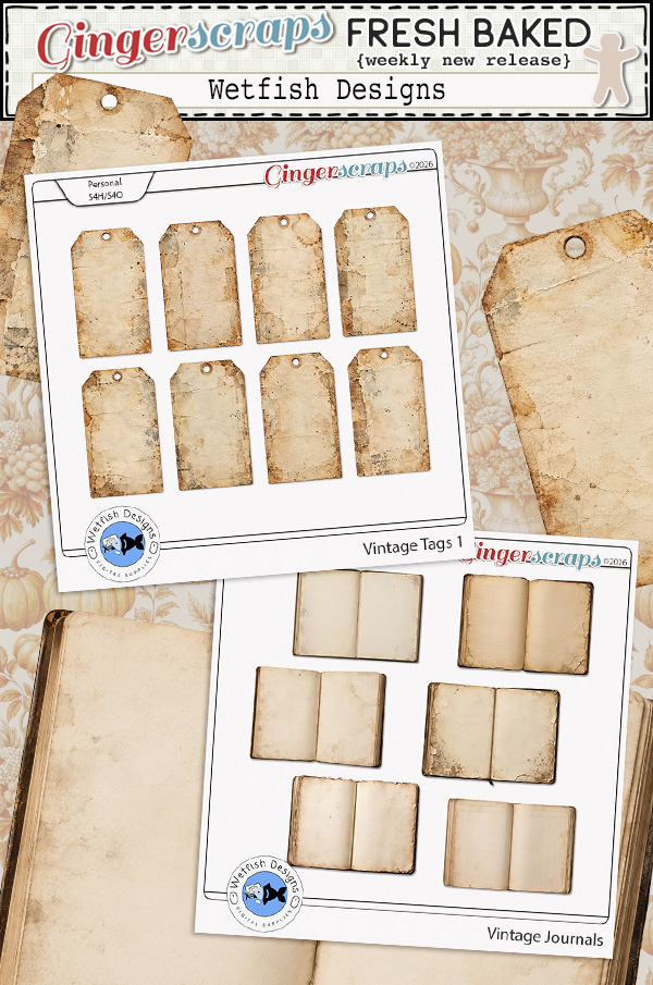
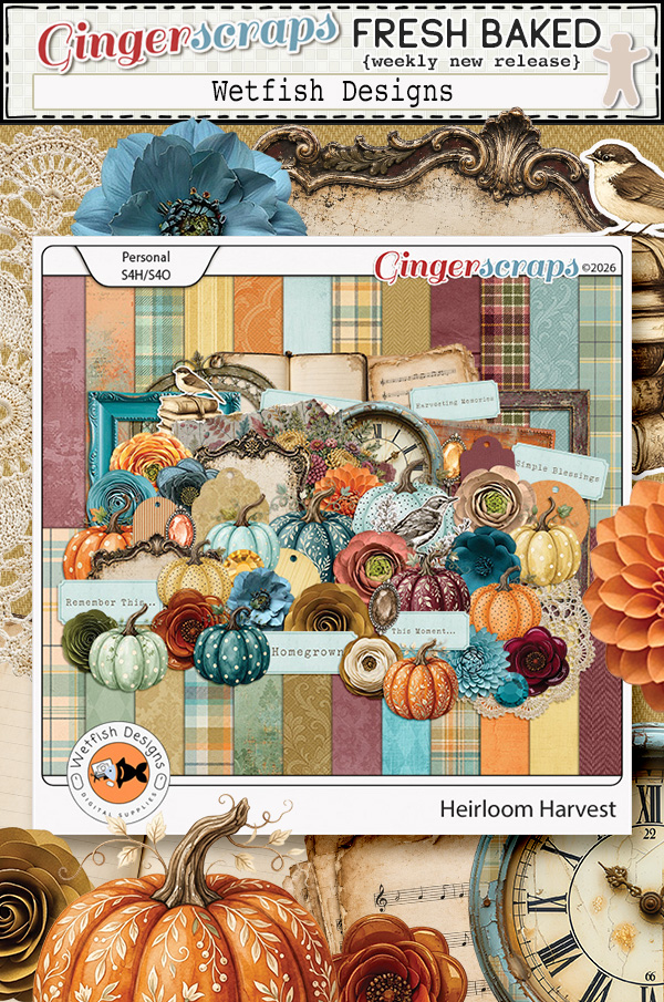
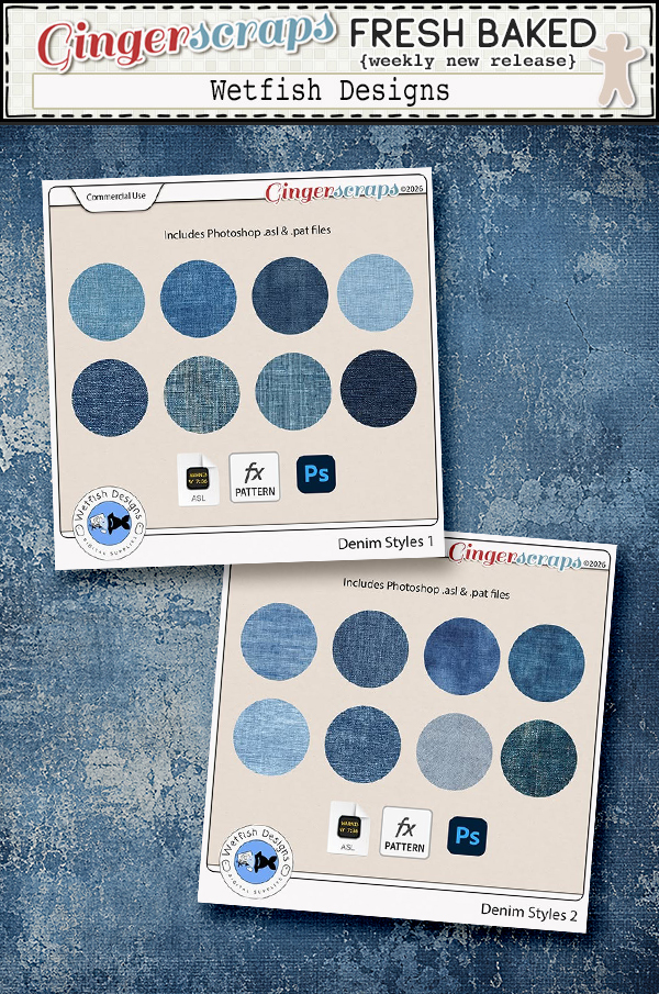
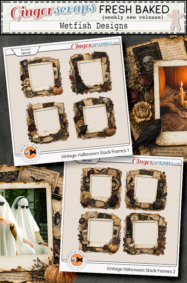
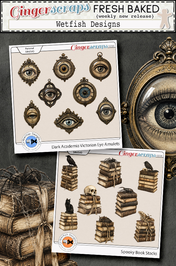
Wetfish Designs

I know you’re all trying to get your Digital Scrapbooking Day activities out of the way, but Cyndi and I hope you have a few minutes to get to know her better. Cyndi is the creative mind behind Wetfish Designs and it’s her turn in the GingerScraps Designer Spotlight. I wasn’t able to fit in an actual coffee date so we chatted by phone.
J: Cyndi! How are you? I’m sorry we have to do this over the phone but my life has been a gong show lately. Let’s start with a softball: If you could describe your design style with just three words, what would they be?
C: The Kitchen Sink (a little bit of everything)
J: Hahahaha! Sometimes that brings the best results. Trying to shoehorn your work into a given shape can be the opposite of creative. Do you have a kit or collection that really makes you proud?
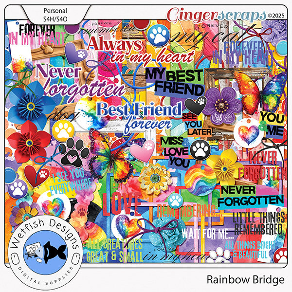
C: My Daily Download kit from last year, Rainbow Bridge. <hyperlink> When I designed that kit I had just lost two of my pets. Every time I see a layout in the gallery with that kit I am reminded of the joy that can come from remembering a love of a pet with boldness and without reservation. It is bursting with color and expression.

J: Pets are family! My two pups are what keep me from sinking some days. Our older one (she’s eleven) has a heart condition, but the vet says it’s stable for now so I’m feeling relieved. I know I’ll have to use your kit eventually, so thanks for making it cheerful. We know what inspired THIS kit… what inspires you more generally?
C: Home interiors are my go to inspiration for most of my kits. I stay up to date on design trends with Pantone and of course, Pinterest. Anthropologie, Home Goods, Crate and Barrel, Pottery Barn and similar retailers also give me ideas.
J: Not the answer I was expecting, but being familiar with your work, it makes total sense! What do you find challenging about digital scrapbook designing?
C: I try not to think of things as challenges as much as opportunities. Recently Facebook started charging small businesses to post more than two active links a month. It is way too expensive for me so I’m trying to think out of the box and come up with other ways to reach my customers with my new releases and sales. Ginger had suggested being more active in the forum so that is my goal for this month, to do just that. So the challenge may be Facebook placing limitations on my reach, but the opportunity of using the forum (which I really have not used to date) is the now upon me.
J: As IF Mr Zuckerberg needs more money. <sigh> I used to enjoy Facebook and kept in touch with so many people I don’t see all the time, but now it seems like all it is is ads, sponsored posts and “suggested for you” stuff from accounts I couldn’t care less about. I’ve significantly decreased my interactions there and may let it go altogether. But the GS Forum? That’s great social interaction with like-minded people. I like the way you framed this challenge-vs-opportunity concept though. But let’s move away from the oligarchy and the sad world we live in. If you could live in a fictional universe, what would that look like. (No superheroes needed.)
C: I read a lot, so this one is tough. It is like choosing a favorite child 🙂 I’m currently reading Pirate Queen by Ariel Lawhon and really loving it. So today I think I want to live in 16th century Ireland!
J: I know WAY too much about 16th century Ireland to even consider that… 51% of my DNA is from there. My more recent genealogical Irish history is pretty bleak so, no thanks. I love Ireland to my core and would teleport myself to modern-day Ireland in a heartbeat, but I’d never time travel there. Where would you choose to teleport if that was a thing?
C: I would definitely be beaming myself up and over to Scotland! I’ve never been there and it is on my bucket list. I love the moody atmosphere and the breathtaking scenery. When I’m reading I often put ambience videos on my tv and Scottish Highland videos are my favorite!
J: AHA!! The tie-in to your Wild About Styles Challenge that I completely missed! I’m one of those weird people who enjoys bagpipe and tin whistle music, so I may want to join you! I could listen to Celtic Thunder’s Caledonia on repeat. (Don’t tell anybody, but I HAVE! 😉 ) If you had a theme song, what would it be?
C: Goodness of God by Jen Johnson/Bethel Music. This has been the song Apple ranks as my “Anthem” every year when it gives me an overview of my listening habits on iMusic. There are many covers of this song that I also enjoy but this is the version I gravitate towards anytime I need encouragement. It is also probably one of the only worship songs that I can sing by heart without pretending I’m doing karaoke.
J: I’ll have to look that one up. Y’know… for those moments when I need encouragement, instead of grabbing a tub of ice cream and a spoon. I’m all in on Chapman’s Salted Caramel super premium these days. And the scale is complaining. What flavour would you grab?
C: Baskin Robbins’ Jamocha Almond Fudge. All day.
J: I’m having dessert at your house! If we were having a dinner party and you could invite (and have them accept!) any three people – real, living or not – who would they be?
C: This is hard because I think who I pick is very much determined by where my head and heart are at the moment. But today? I want to be in my childhood home at the dining room table with my now deceased mom and dad and my grandfather, Pop. Lots of memories around that table and I miss them all so much.
J: I feel you. Last weekend we scattered my dad’s ashes and it was both draining and comforting. It felt like he was there, just out of sight. I know my mom was feeling him next to her. Anyway, enough of that. One last nosy question… If you weren’t a digital scrapbooking designer, what other creative path do you think you’d take?
C: A writer. I finally started writing the novel I always wanted to write. I took a few months off from that to let it breathe. As the weather turns
colder and I’m inside more I will return to my novel and keep crafting it. I am completely addicted to watching book influencers and YouTube videos about books and writing. I don’t ever see myself as having a YouTube channel or video channel of any kind though!
J: They say we all have a book inside of us. Keep on writing!! Who knows, you could be the next Elsie Silver, with several best-sellers and your own Netflix series in production! Thanks for the chat. Time to get to the practical part of the Spotlight…
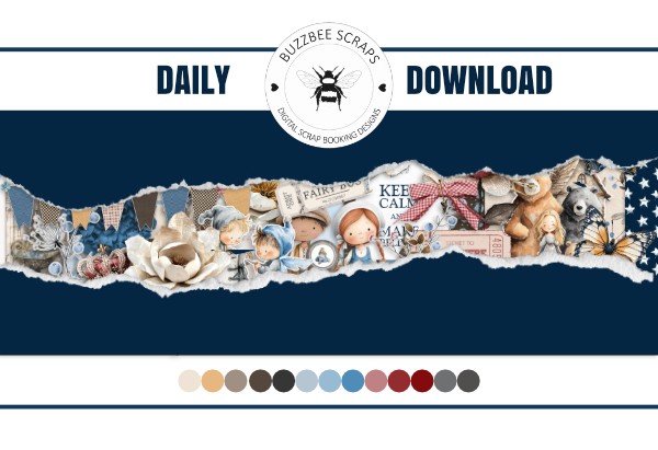
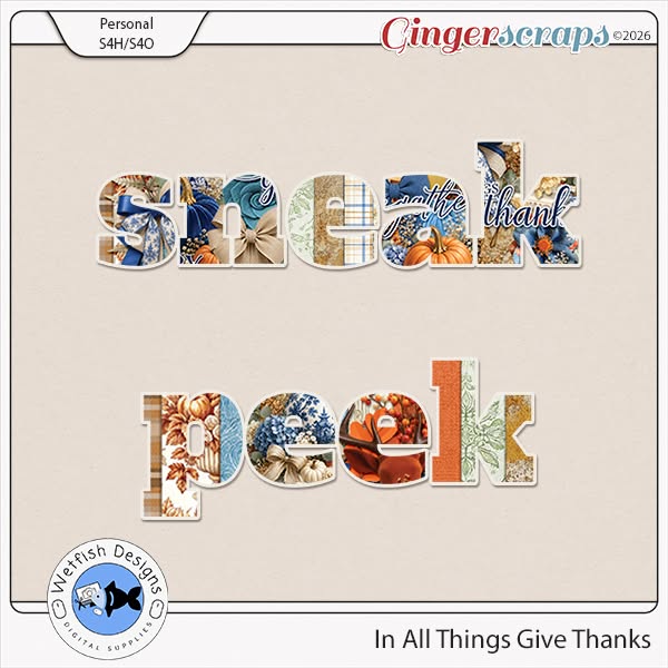
There are two Designers in the Spotlight this month; Karen (Buzzbee Scraps) hasn’t chosen so far to be grilled on my spit. But she and Cyndi are both providing a Daily Download kit for all of us. Cyndi‘s sneak peek is below.

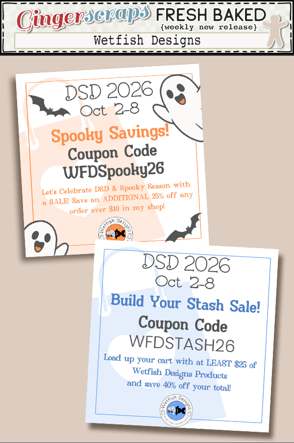
Cyndi has a Spotlight coupon code too…
And in addition to her regular monthly Wild about Styles Challenge, she’s also hosting one of the Designer Spotlight Challenges for October. Go check them out!!!
![]()
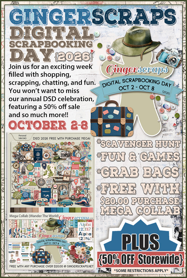
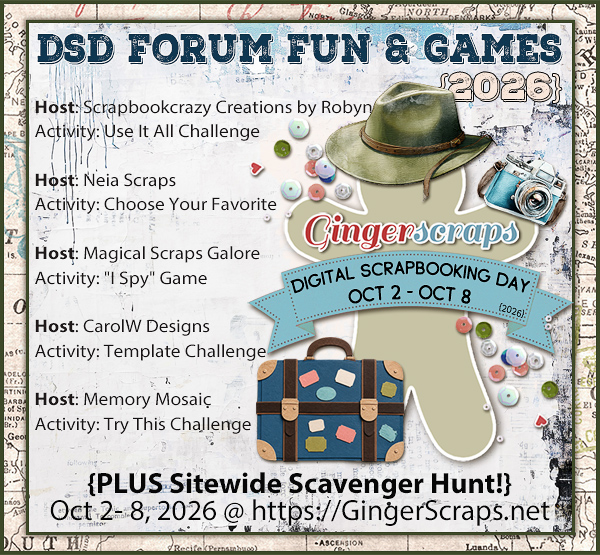
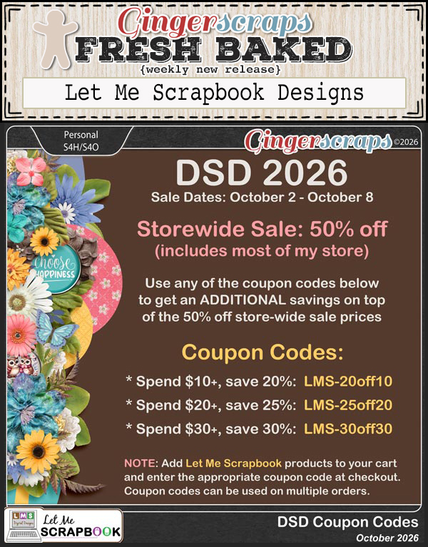
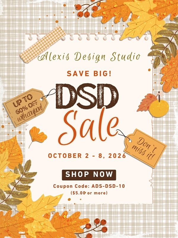
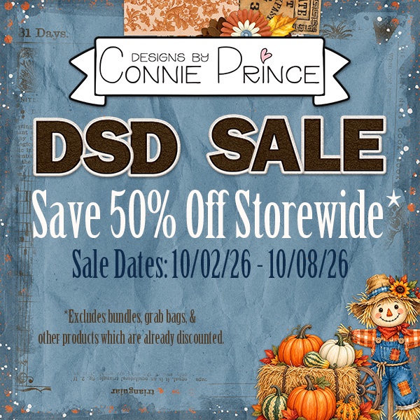
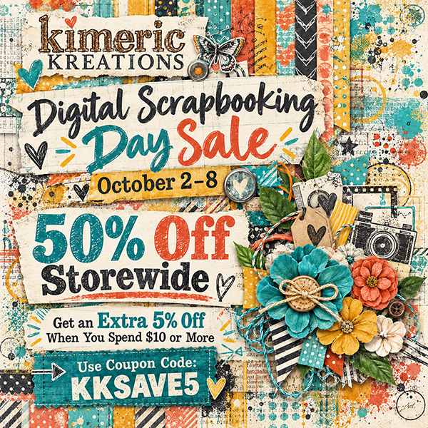
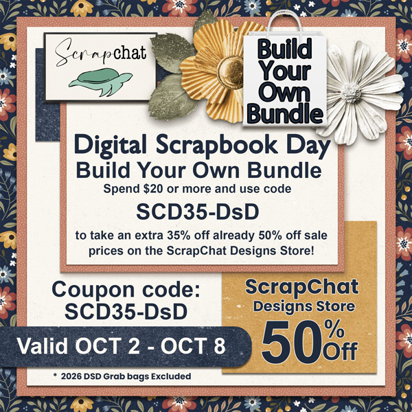
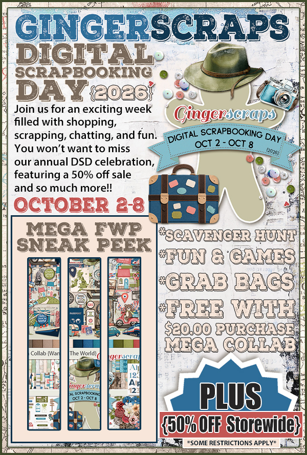
Are you ready friends? It’s DSD time again. I hope you are ready for a week of sales, fun and games, and more!
The Mega Collab for DSD is amazing if you love to travel.
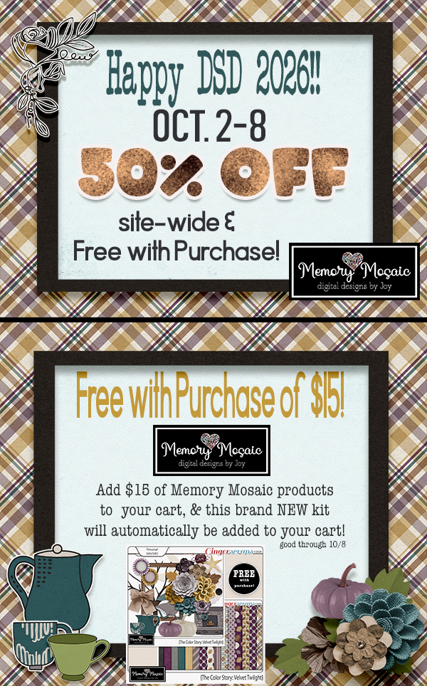
Remember if you spend $10 in the store, you’ll get this great collab free.
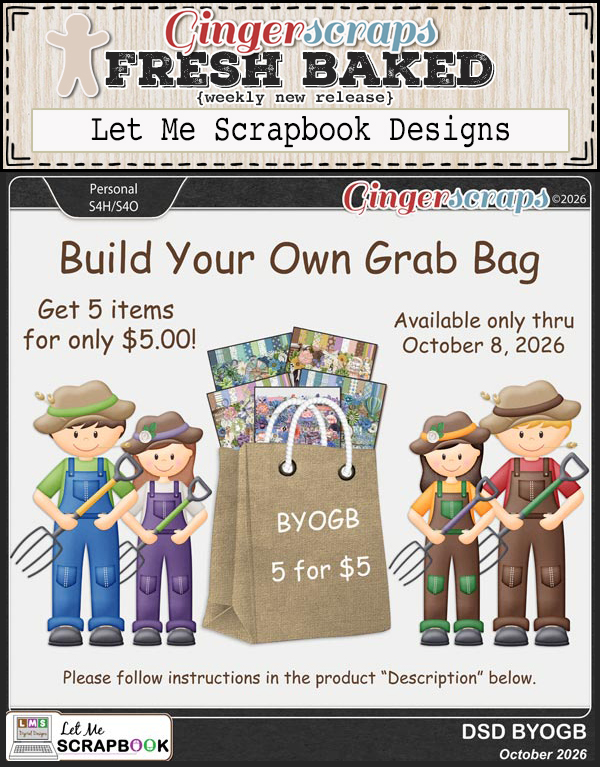
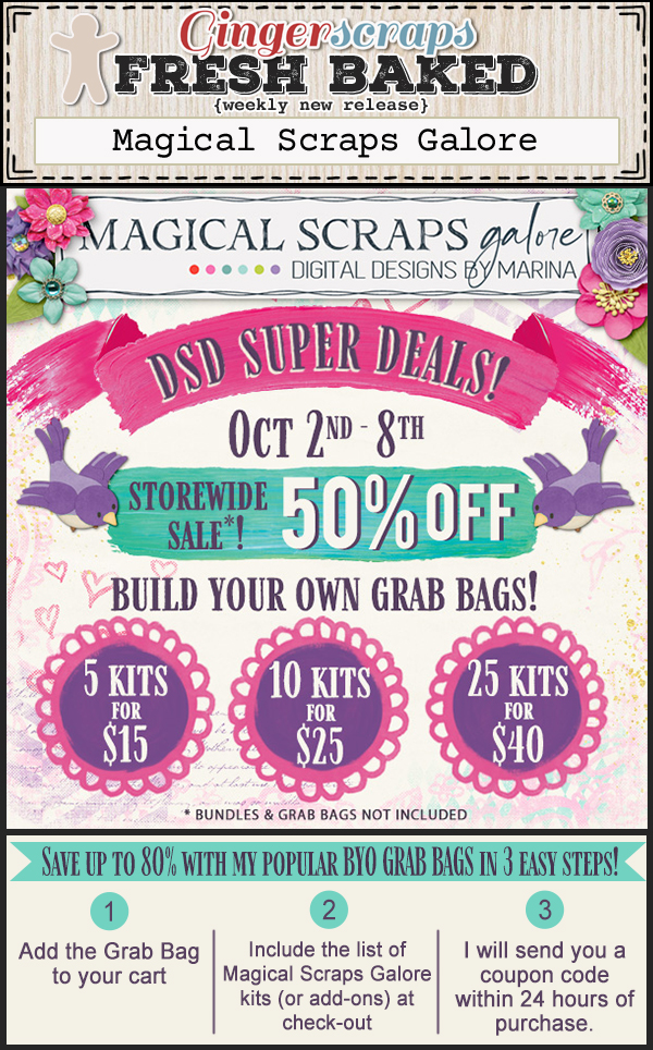
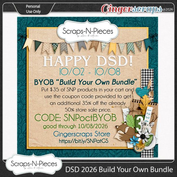
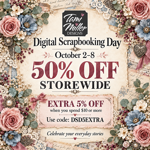
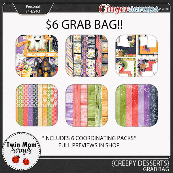
Let’s see what we have this week. There are a lot of Grab Bag, Build Your Own Bundle, and big sales opportunities for DSD.
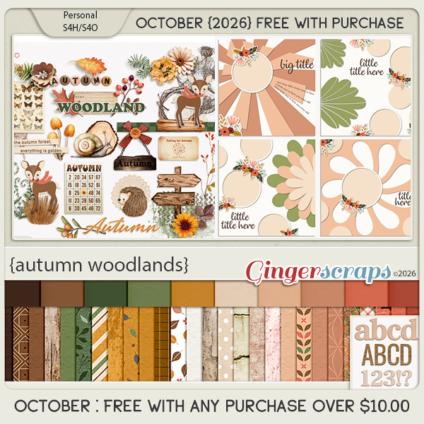
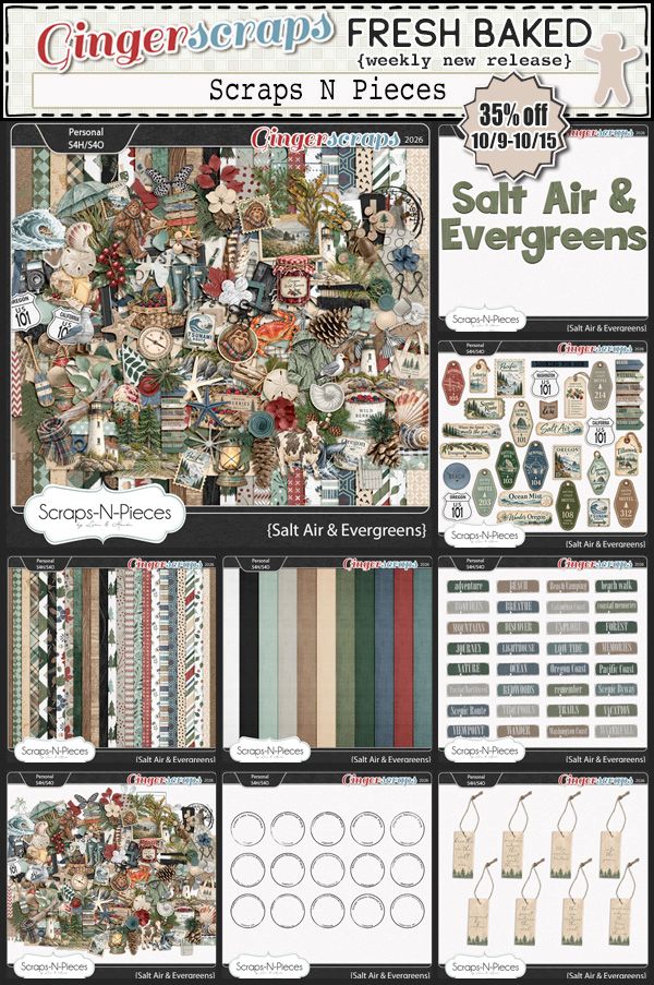
Step into the beauty of the changing season with Autumn Woodlands, a charming collection inspired by peaceful forest walks and crisp autumn days. Filled with woodland deer, hedgehogs, mushrooms, butterflies, acorns, leaves, berries, flowers, rustic wood textures, and forest-inspired details, this collection captures the cozy magic of autumn in nature. This collab is a little smaller BUT it includes a 4 pack of templates!
A warm palette of deep brown, earthy greens, mustard, golden ochre, soft cream, peach, and muted coral gives Autumn Woodlands a beautiful rustic feel, while delicate florals and vintage-inspired details add a touch of sweetness. Perfect for documenting fall adventures, woodland walks, nature photos, pumpkin season, and cozy autumn memories.
This collab includes: 1 Alpha {Uppercase, Lowercase, Numbers & Punctuation}, 37 Papers, 41 Elements, and 4 12×12 Template {png & psd file formats}.
This Free With Purchase was created by CarolW Designs, Craft-tastrophic, and Scrapbookcrazy Creations by Robyn.
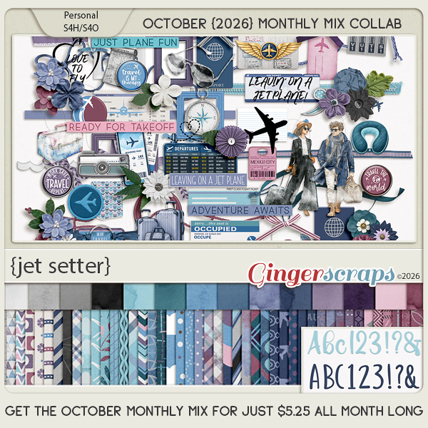
Pack your bags and get ready for adventure with Jet Setter, a stylish collection celebrating the excitement of travel. Filled with airplanes, passports, luggage, travel documents, cameras, maps, globes, boarding passes, airport signs, and fashionable travelers, this kit is perfect for documenting vacations and journeys near and far.
A sophisticated palette of blues, teal, lavender, plum, soft pink, and neutral tones gives Jet Setter a fresh and modern feel, while the coordinating papers add plenty of patterns and texture. Whether you’re scrapping a dream vacation, a weekend getaway, an international adventure, or simply your love of travel, Jet Setter is ready for takeoff!
This kit includes: 2 Alphas {Uppercase, Lowercase, Numbers & Punctuation}, 59 Papers, and 100 Elements.
This Monthly Mix was created by Aimee Harrison, Connie Prince, LDragDesigns, Let Me Scrapbook, and Moore Blessings Digital Design.
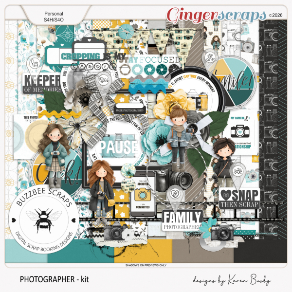
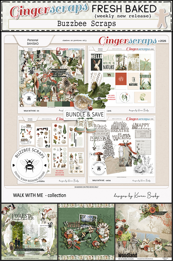
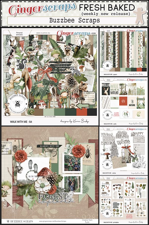
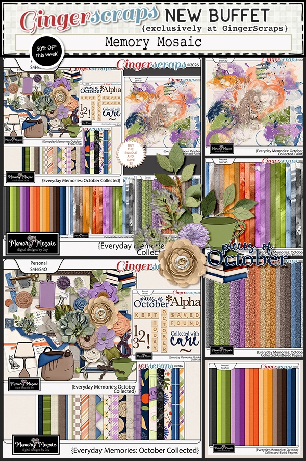
October’s Daily Download is provided by Buzzbee Scraps and Wetfish Designs. Stop by the blog each day in October to collect pieces of these beautiful kits.
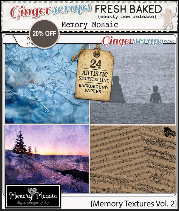
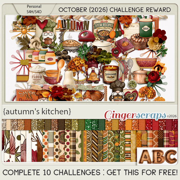
Bring the warmth and deliciousness of fall into your scrapbook pages with Autumn’s Kitchen! This cozy collection celebrates autumn baking, homemade treats, and all the little comforts of the season. Filled with adorable kitchen details, pies, breads, pumpkins, apples, spices, mixing bowls, flour, sugar, recipe cards, cozy mugs, and charming autumn florals, it is perfect for documenting baking days, family recipes, harvest traditions, and time spent together in the kitchen.
Rich shades of rust, orange, mustard, deep green, brown, cream, and burgundy create a warm vintage-inspired palette, while beautiful patterns and coordinating glitter papers add even more versatility. Whether you’re scrapping favorite recipes, Thanksgiving baking, pumpkin treats, or simply the cozy feeling of an autumn kitchen, Autumn’s Kitchen is sure to make your memories look delicious!
This kit includes: 1 Alpha {Uppercase}, 60 Papers, and 124 Elements.
This Challenge Reward was created by Cutie Pie Scraps, Designs by Lisa Minor, and Ilonkas Designs.
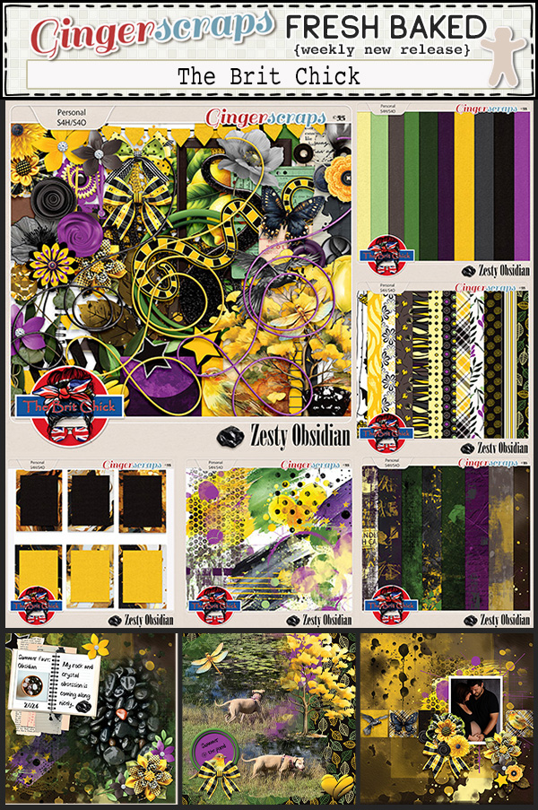
Sneak Peek time. DSD 2026 starts on Friday, October 2.
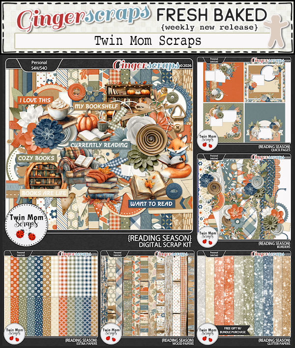
Happy Friday friends. I hope you have all had a great week. We are firmly into Fall and the new kits by our designers show that.
Don’t forget this great Free With Purchase kit you get with any $10 spent in the store!
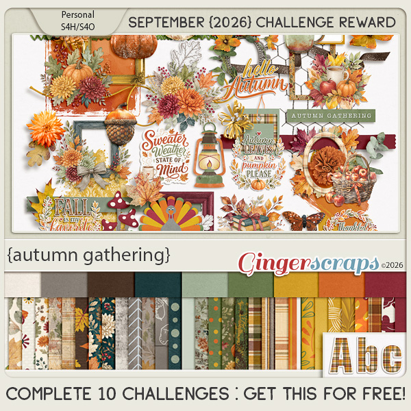
Take a look at the new challenge reward kit. If you complete any 10 challenges this month, you get this gorgeous collab (or a variety of other choices from previous challenge collabs) as a reward!
Greatest Hits: Paper Tears Updated
![]()
You might wonder why I’m doing another rerun here. If you worked through the shadowbox effect tutorial from earlier this month, you might recall that Jill‘s request had two examples of shadowbox techniques. I showed you how I duped the first one, and mentioned that when I showed the second one, I’d be focusing on paper tearing. Since I wrote the original posts I’m going recap today, I’ve learned a few things… and those tears can look even more realistic. Yes, you read that correctly: I’m doing a double-header today! The first technique tut is 9 years old already…
THIS LOOKS REALLY LONG!! DONT PANIC. IT’S NOT THAT BAD!!!
Obviously, the easiest way to add a paper tear to a layout would be to use an already-roughed-up paper from any of the GingerScraps Designers, or to use a Photoshop Elements Action that automates the process. But if you don’t like those options you definitely can create your own tears.
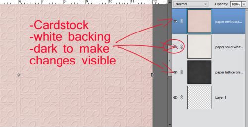
If you were to tear a piece of high-quality cardstock, which generally has colour applied to one or both sides with a white core, you’d get a bit of an irregular edge, with varying amounts of white backing paper showing along it. So to demonstrate this, I’ve used an embossed cardstock from Ooh La La Scraps‘ simply gorgeous bundle You and Me. Fortunately for me, there is also a solid white, textured paper in the kit too, so I’m going to use it for the core. (For the first few steps, I turned the visibility of the white paper layer off.) And to make it easier to see what I was doing, I put a piece of gray patterned paper behind it all.

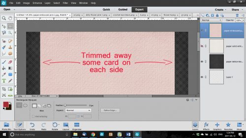
I wanted to have tears along both vertical edges of the paper and I wanted some of the background to be visible. I also wanted to Work Smart Not Hard. So I selected the layer with my pink cardstock on it and using the Rectangular Marquee tool, I selected a portion of paper then Edit>Cut [WSNH: CTRL/CMD>X]I trimmed away some paper from each side. You’ll see why this is a WSNH tip as we go along.

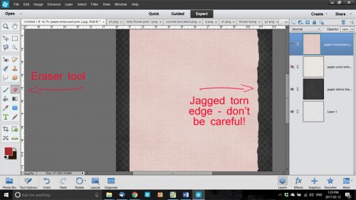
I then selected the Eraser Tool and a relatively small brush size. [Update: Instead of using just a round Basic Brush for this step, check out the Artistic Brush set that’s included in your software. There’s a Rough Bristle option in there and when you set the Size to about 100 pixels, it adds some amazing texture to your tears.] Working along the right side of my canvas, I erased away some of the pink cardstock in an irregular, jagged manner. Don’t try to be too careful because you want it to look… well, TORN. If it might make it easier for you to visualize, take a real piece of paper, any kind, and tear it. For real. Then look at the edge. It’s not gonna be perfect!

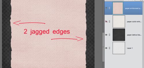
Because I wanted both sides to be torn, I repeated the process on the left side of the canvas too. You may have noticed that I broke my own rule of only erasing on a Layer Mask. If you’re wondering why, it’s because it really doesn’t matter if I erase too much of these papers. It doesn’t have to be perfect. It’s better if it ISN’T perfect.

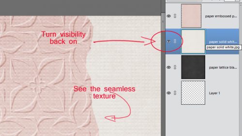
Once I was happy with the edges of my tears, I turned the visibility of my white paper layer back on and trimmed away some of it along both edges in the same way I did with the pink. It made me so happy to see that the texture of the white paper was the same as the pink – that core layer should have some texture to it too. [Update: if you’re using a flat paper or a Fill Layer for your white core, you can get some texture by using a Filter>Noise>Add Noise set to 5%, Gaussian Distribution and the Monochromatic box ticked. If it’s too in-your-face, you can tone it down by adding a Blur>Gaussian Blur>1 pixel.]

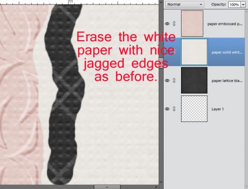
The next step was to erase the edges of the white paper just like I did with the pink cardstock. Zoom in close to your work so you can see exactly what you’re doing.

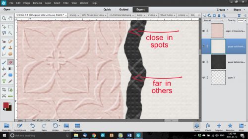
This time I erased close in to the pink paper in some places and veered away a bit in others.

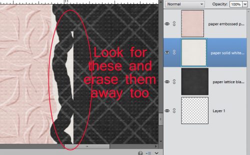
When you zoom back out, there may be some bits of white paper still there. These have to be erased too.

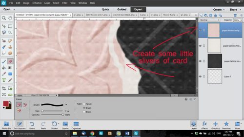
After I had my white edges the way I wanted them, I selected the pink cardstock layer again and went back with the Eraser Tool and created some little slivers of torn paper as shown below. This would happen with real cardstock, so I always include a few little shreds.

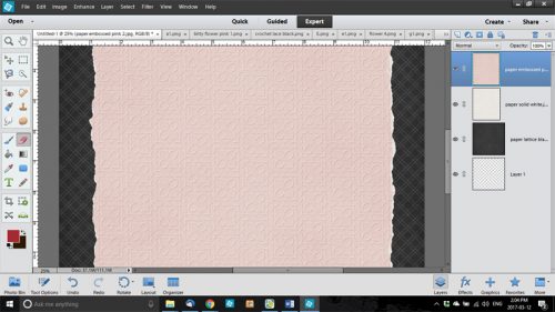
Here’s a full screen view of the two torn edges.

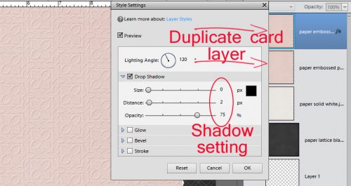
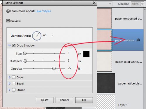
The last step to ensuring realism is to add a very infinitesimal shadow to the cardstock layer. I like to have shadows visible on both edges, so to accomplish that I Duplicated [WSNH: CTRL/CMD>J] the pink cardstock layer before I applied a drop shadow. I used a simple shadow, with the following settings: Size 0, Distance 2 and Opacity 75. (These aren’t hard-and-fast, use whatever settings look the most realistic to you. Just remember them for later.)

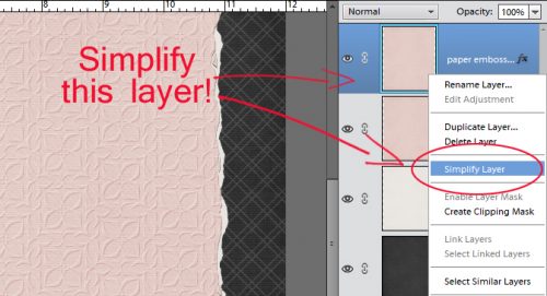
When I had my shadow just so, I Simplified the layer. Doing that locks the shadow to the cardstock so it doesn’t change later.

Then I did the same thing with the second pink cardstock layer, with one difference – the angle of the shadow.

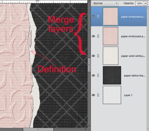
After both layers had that little extra definition provided by the shadows, I merged the two pink cardstock layers with the white paper layer. [WSNH: Select all layers then CTRL/CMD>E]

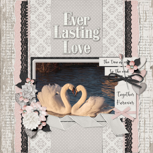
And here’s the finished layout.

Now, the second trick I’m going to add is to Copy a paper tear from a template! This one is so simple!
There’s a way to import a paper tear from a template into a layout-in-progress that only takes a few easy steps and very little time. However, you must have a template with a paper tear on its own layer, or a commercial-use paper tear template. They have their own limitations, and may not give you the look you’re after. So try this.
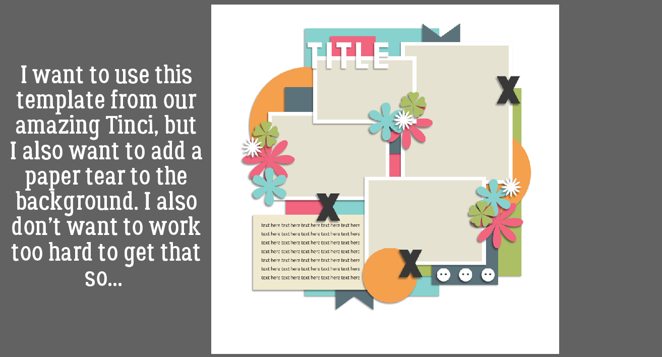
I started out with this template from (former GingerBread Lady) Tinci Designs’ Second Chances V.2 collection. I resized all of the layers (except the background paper) to allow for adding a tear.

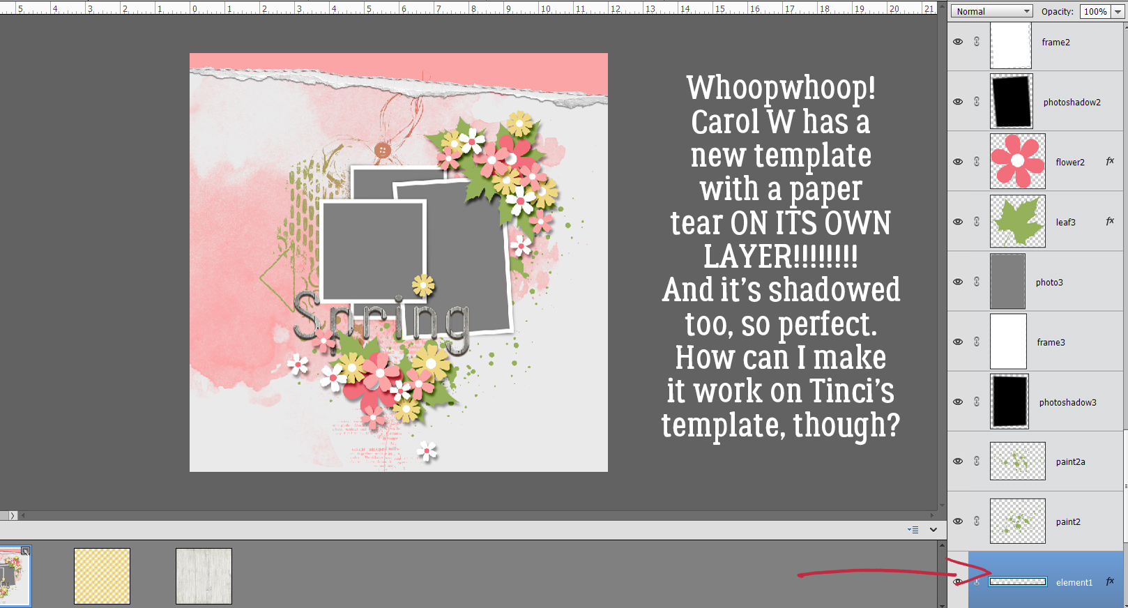
I was waiting to find a template like this one from CarolW Designs’ Spring Dawn. That tear is moveable!! But how can I move it onto Krizstina’s template?

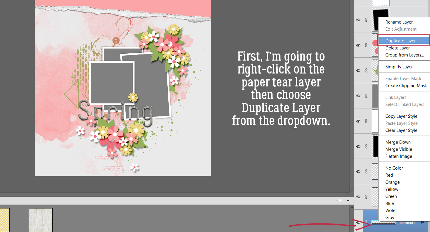
There are a couple of steps that need doing first. But to start, I found the tear layer in Carol’s template, right-clicked on the layer and chose Duplicate Layer from the dropdown menu.

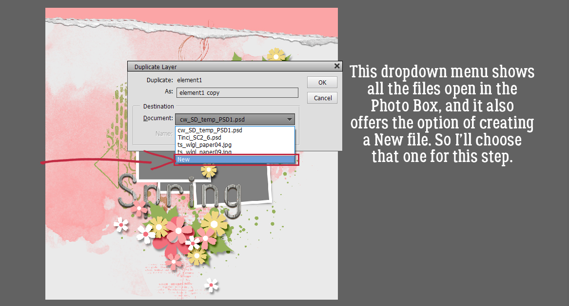
Now Elements needs to know where to put it. The new menu shows all the files currently open in the Photo Box, and offers the option of creating a New Document. That’s what I’m going to do.

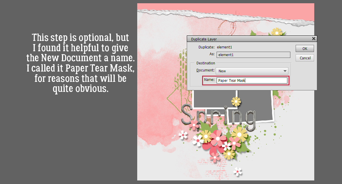
This step is completely optional. I chose to give my new document file a name, Paper Tear Mask, for clarity.

And this is what happens.

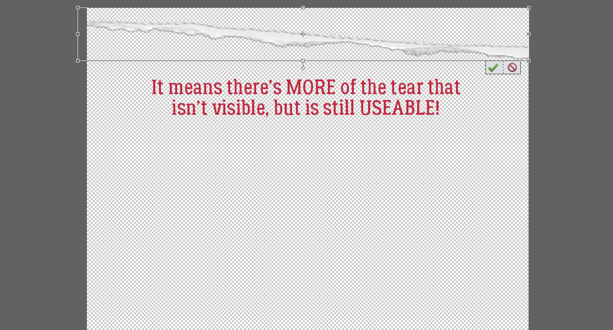
But look at that Bounding Box! I was thrilled to see there’s more to the tear that can be used just by Resizing it.

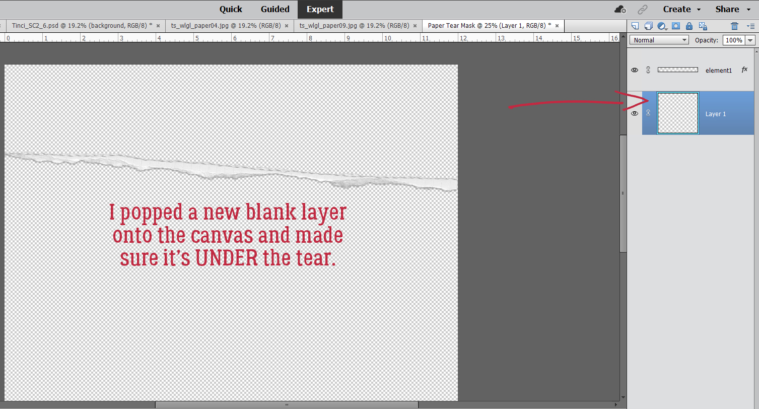
Now to make it useful and not work too hard while I’m at it. I added a new blank layer underneath the tear layer. Just hold down the CTRL/CMD key and click the sheet-of-paper icon at the upper left of the Layers Panel.

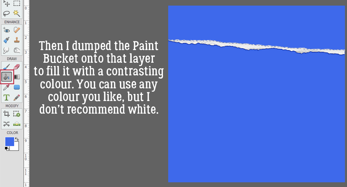
Next, I used the Paint Bucket Tool to fill the whole of the blank layer I just created. Pick any colour you like (but not white) for this step.

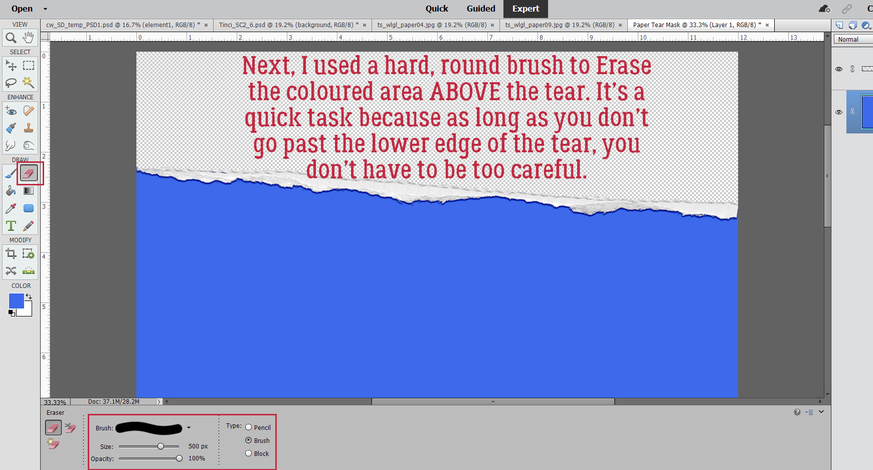
To turn the coloured part into a Layer Mask so papers can be Clipped to it, I used a hard, round brush within the Eraser Tool to remove the coloured part above the tear. This can be done quickly because as long as I don’t cross over the tear into the lower part of the coloured area, I can just scrub it away.

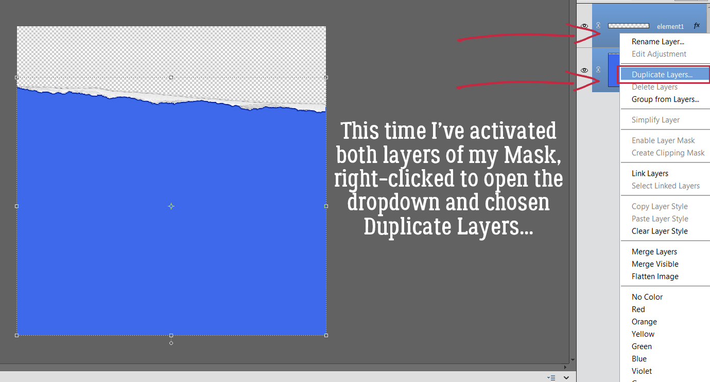
And that’s it for creating the tear mask! To move it over onto Krizstina’s template, I’m going to Activate both layers by click-shift-clicking on each of them, then right-click to open the dropdown menu to Duplicate Layers…

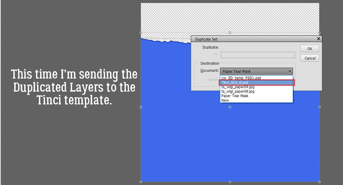
This time, I’m going to send them onto the Tinci template.

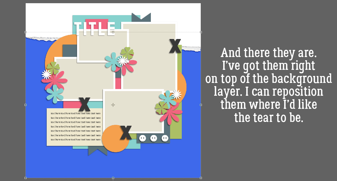
‘MKay. there are the tear and the mask, placed on top of the background paper and underneath the rest of the layers.

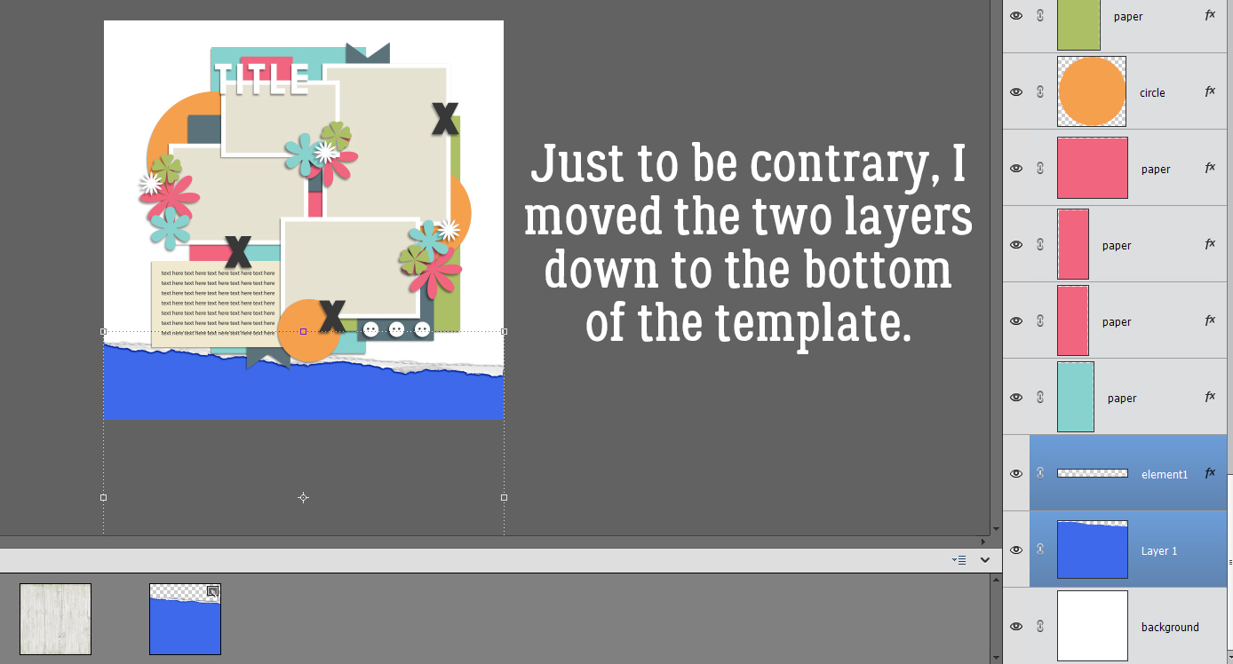
I don’t like the tear up there, just to be a non-conformist. So I’ll move it.

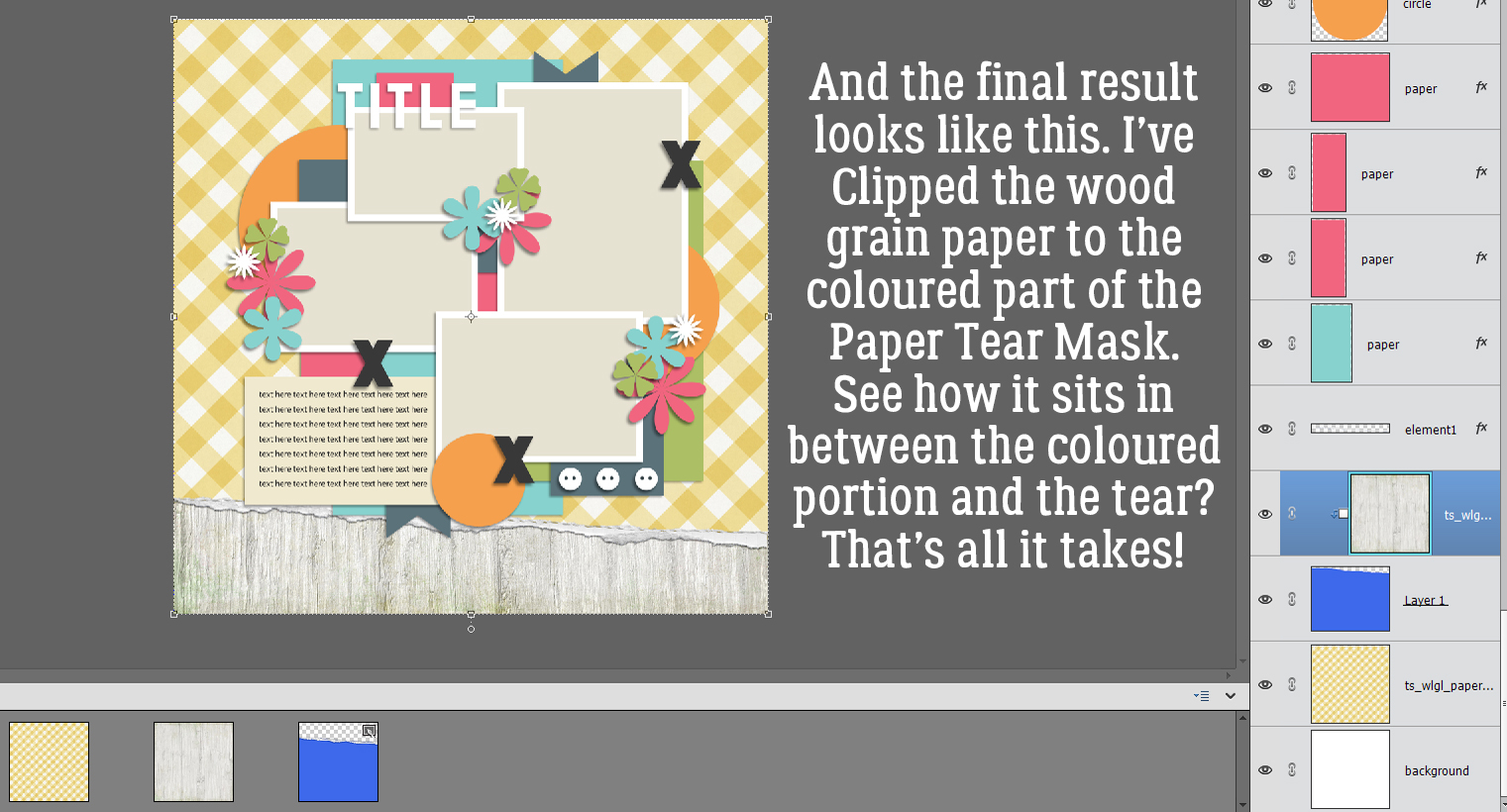
And all that’s left is to add the papers. I’ve used North Meets South Studios’ March 2022 Daily Download kit, When Life Gives Lemons. I want the woodgrain paper to be my background and the yellow gingham to be a tablecloth, sort of – maybe one of those vinyl ones with the fuzzy background and now it’s torn . By Clipping the woodgrain paper to the coloured part I added to the tear, that’s what I get. Cool, right?

Now, if you’d like to do this technique again sometime, you can Save your work As a .psd or .tiff file and reuse it again and again. By having all that coloured area, you can pretty much put the tear anywhere!
So, how will this novella make next week’s tut easier to follow? The review will ground you in the basics, so when I throw in some curls on those torn edges, you’ll already have great tears to play with! Have I piqued your interest?
![]()
Happy Friday Friends! We hope you have had a wonderful week. In this weeks newsletter, you will find new kits with beautiful colors to get us ready for Fall and Halloween. It will all be here before we know it.
As a reminder, make sure to check out the September Bake Sale going on until September 20th.
Don’t forget this great Free With Purchase kit you get with any $10 spent in the store!

Take a look at the new challenge reward kit. If you complete any 10 challenges this month, you get this gorgeous collab (or a variety of other choices from previous challenge collabs) as a reward!
Challenge Spotlight: Initial Inspiration
![]()
I must say, September arrived and our weather flipped a switch. It’s chillier than usual and we’re actually getting some rain. We’re so happy!
This month’s Challenge Spotlight is focused on a new Challenge hosted by Alexis Designs. It’s called Initial Inspiration and it looks like a LOT of fun! I’m going to let Alexis explain how the Challenge works:
“Each month, I will choose a letter of the alphabet to use as the starting point for your page. Your challenge is to incorporate words, colors, themes, supplies, techniques, or other creative details that begin with that month’s featured letter.
This month, we will use the letter “S“.
Create a layout inspired by the letter S. You may interpret the challenge in your own creative way, but the featured letter should be clearly represented throughout your page.
Theme: (thought starter)
School, September, Solstice, Students, Scarecrows, Sunsets for a few thought starters.
Background:
Sienna, Sapphire, Scarlet, Sepia, Straw, Saffron or other colors beginning with S
Embellishments:
Stars, sweaters, squash, squirrels, soup or anything else beginning with S
Flowers of September:
Asters, Morning Glories, Sunflowers, Snapdragons, Salvia, Wildflowers and other flowers that align with September. It could be anything really.
Journaling:
Write about back-to-school, late summer days, early autumn, farmers markets, September activities, adventures, or annual traditions.
Photos:
First day of school, leaves turning, long drives, campfires, etc.”
As always with the Challenge Spotlight, I’m going to share some of the participating layouts submitted to the Gallery for this month, and we’ll examine each to see how the Scrapper has met the Challenge‘s criteria. Each layout will be linked to the Gallery via the Scrapper‘s user name so you can get a closer look or leave a comment. Or both! This is your reminder that whenever you see bold text that is underlined and in colour, that’s a clickable hyperlink. There were quite a few entries in the Gallery already so I edited the selection to ODD numbered layouts to keep this from turning into War and Peace. Let’s jump in!
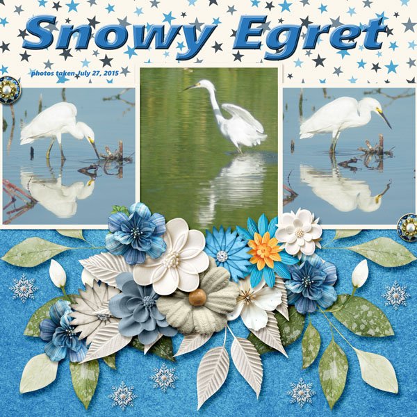
Katherine Woodin was first out of the blocks, as she often is. I think she’s the most prolific Scrapper we have! 😉 She has the letter S in her title, she’s used starry paper, snowflakes to play off the bird’s common name, silver and sapphire colours. That’s a pass!

Windswept chose to stick to sunflowers and the letter S in her title, plus some saffron-coloured paper mats. That’s a pass!
Here, msbrad has lots of places where the letter S appears, including her subtitle, and a bunch of stars.
Grace went with the month, September, and a straw-coloured background for the autumnal elements she used. The tag has sepia inky edges. Those sparkly swirls… that’s also a pass!
Aha, a back-to-school layout, but with a justpennys twist! She’s used a lot of school supplies elements and a classroom photo to incorporate the theme. Pass!

FormbyGirl chose an alliterative title with S for the initial consonants, a straw-coloured background, string, and her journaling is all about the title’s subject. Pass!

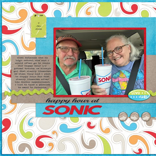
BriannasScrapper chose to focus on Sonic for her title, her journaling and her photo. Shall we call the shapes in the background swirls? Pass.

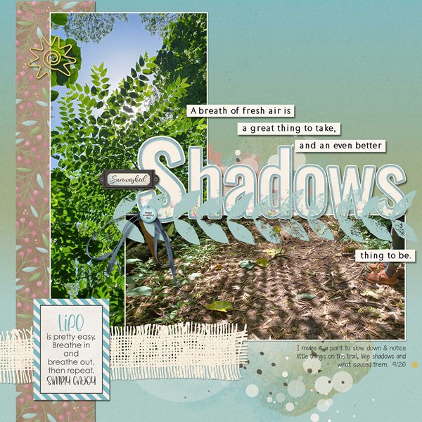
Shadows – the title, photos of them, how they’re created (sunwashed), a stylized sun paper clip, a stamp, some striped paper… glee‘s got the bases covered. Pass! <whispers: That looks like a tree-of-heaven. which isn’t heavenly at all, it’s demonically invasive.>

I’m going to keep this Challenge on my radar, because I think it’s a fantastic concept. Do I have a layout for it in mind? No, not really, but I DO have thousands of photos of sunsets… What do you think? Something to try, or no?
![]()
Happy Friday Scrappers!! Did you enjoy the Gingerscraps Birthday Party. There were so many sales and games going on.
This week we are jumping both feet into fall it seems. I think these are becoming my favorite color combinations.
Don’t forget this great Free With Purchase kit you get with any $10 spent in the store!
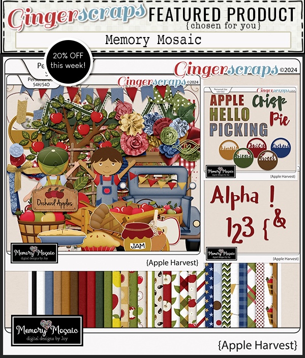
Let’s see what we have in the store today. I’m seeing quite a few kits with apples in them. It’s that time of year.
Take a look at the new challenge reward kit. If you complete any 10 challenges this month, you get this gorgeous collab (or a variety of other choices from previous challenge collabs) as a reward!
Are you ready to party? You know Ginger when it comes to celebrations. And this one is big because Gingerscraps is “legal”. So we’re having a HUGE party!!
Have you participated in one of the Scavenger hunts? They are so much fun and I always find kits I “need” while I’m looking for that crazy Gingerbread Man (he’s a little sneaky).
And our designers have some fun games going on in the Forum as well!
Don’t forget this great Free With Purchase kit you get with any $10 spent in the store!
On top of all that fun, we have some great kits and other special sales and new releases!
Take a look at the new challenge reward kit. If you complete any 10 challenges this month, you get this gorgeous collab (or a variety of other choices from previous challenge collabs) as a reward!
Autumn Baker's Best bake sale Book Club buffet Calls celebrate challenge spotlight craft Crafts crafts with kids Daily Download Designer Spotlight Digital Scrapbooking Digital Scrapbooking Freebies fall Feature Designer font fonts freebie Fresh Baked From the Archives gingerbread girls GingerBread Ladies guest designer halloween holiday home made hybrid let's celebrate March 2025 Challenges mini kit new products new releases news reuse sales Scrap-a-thon Scrapping Survivor sneak peeks Team Spotlight template Tutorials Tutorial Tuesday Weekly Wrap-Up
Full and detailed Privacy Statement can be found here: Privacy Statement