HAPPY NEW YEAR!!!
It is the 1st of the month and you know what that means; a huge, exciting newsletter! We have a New Buffet, New Monthly Mix, New Free With Purchase Collab, New Challenge Reward, and a New Daily Download at GingerScraps! We also have two new permanent designers.
Don’t forget to check out the Buffet Bundles. One easy click to add bundles of Buffet goodies to your cart.

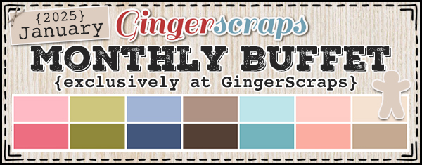
These colors for January are gorgeous. I love the teal and peach in this. You’re going to love what the designers came up with.


Remember any $10 spent in the store gets you this great collab.
Step into a world of quiet wonder with the “Starry, Starry Night” Kit by The GingerBread Ladies. This enchanting collection features a cool-toned palette of purples, blues, beiges, and greens, perfectly evoking the serene beauty of a starry winter night.
With magical elements like twinkling stars, glowing moons, wise old owls, and delicate snowflakes, “Starry, Starry Night” invites you to capture the peaceful essence of nighttime. Add charming touches with stacks of books, icy textures, and cozy accents to bring your layouts to life. Whether you’re documenting winter memories, stargazing adventures, or serene evenings, this kit has everything you need for your creative journey!
This collab includes: 3 Alpha {Uppercase, Lowercase, Numbers & Punctuation}, 51 Papers, and 99 Elements.
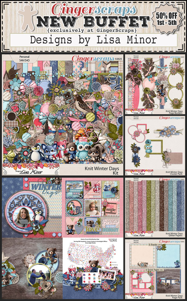
This Free With Purchase was created by Aimee Harrison, Chere Kaye Designs, Designs by Lisa Minor, and Ilonkas Designs.

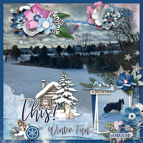
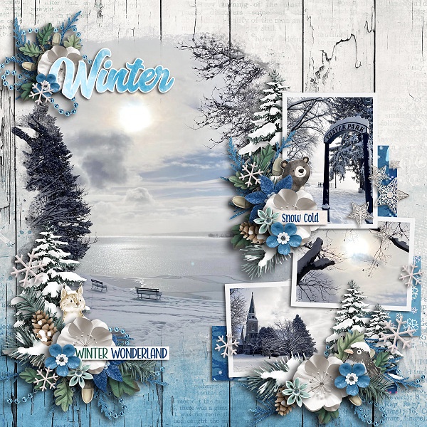
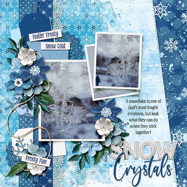
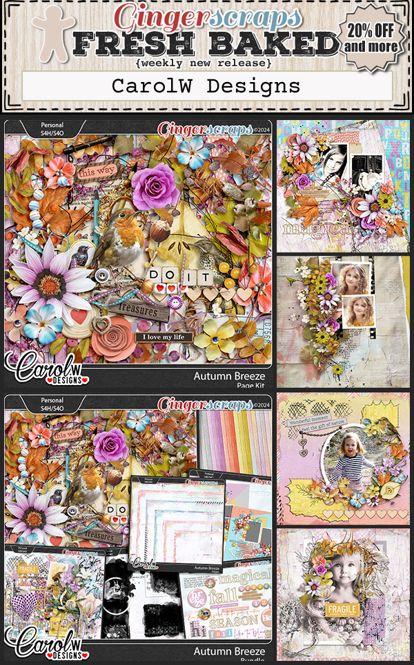
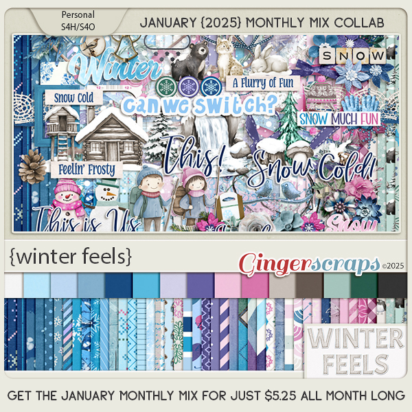
Embrace the magic of the season with the “Winter Feels” kit by The GingerBread Ladies. This cozy collection brings the beauty of winter to your projects with a delightful palette of pinks, purples, greens, and blues. Celebrate family time, walks in the snow, and the warmth of a cozy home. Capture the thrill of winter sports, the beauty of nature blanketed in frost, and the comfort of family on chilly days. With charming elements inspired by all things winter, “Winter Feels” is perfect for documenting your winter memories and crafting layouts that sparkle with seasonal joy!
This kit includes: 1 Alpha {Uppercase, Lowercase, Numbers & Punctuation}, 61 Papers, and 115 Elements.
This Monthly Mix was created by Buzzbee Scraps, CarolW Designs, Cindy Ritter Designs, Connie Prince, and LDragDesigns.
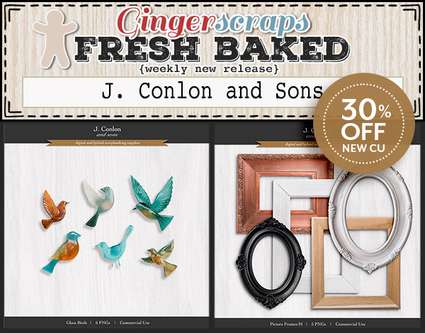
Now to the January Daily Download Sneak Peek. This month’s Daily Download is from J. Conlon and Sons! Make sure you are checking the blog every day to get all the pieces of this kit!

We are two wonderful designer announcements.
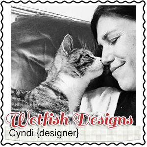
Wetfish Designs is staying on as a permanent designer.
And we are excited to announce that Boomersgirl Designs will be joining us back as a permanent designer.

BIO:
I’m Lori of BoomersGirl Designs (my hubby’s nickname is Boomer). I’m the mom of seven wonderful kiddos – 5 boys and 2 girls – from age 2 through age 29. I also have three adorable grandchildren. I live in Maryland. I’ve been a nurse for 33 years in long-term skilled care. I love working with the elderly. I’ve been designing scrapbook kits since 2012. My kits tend to be whimsical with a touch of humor although I do try to step outside of my comfort zone at times. I also create some double page layout templates and commercial use goodies. I’m thrilled to be back at GingerScraps and I’m looking forward to seeing everyone around in the forums!


Take a look at the new challenge reward kit. If you complete any 10 challenges this month, you get this gorgeous collab as a reward! (Or a variety of other choices, visit the forum for all the details).
Embrace a fresh start with the “Reboot and Rise” kit by The GingerBread Ladies. This rejuvenating collection captures the essence of new beginnings, self-care, and endless possibilities.
Featuring refreshing designs and uplifting elements, “Reboot and Rise” is perfect for documenting your journey of renewal, whether it’s a life reboot, a new chapter, or simply moments of inspiration. Let this kit inspire you to celebrate the beauty of transformation and stepping into new opportunities with confidence!
This kit includes: 4 Alpha {Uppercase}, 61 Papers, and 125 Elements.
This Challenge Reward was created by Craft-tastrophic, Cutie Pie Scraps, Let Me Scrapbook, Moore Blessings Digital Design, and Scrapbookcrazy Creations by Robyn.

Here are a few layouts from our store CT using the January Monthly Mix.