Tutorial Tuesday (Photoshop Elements)
Paper-to-Digi Tone-on-Tone “Heat Embossing”

PDF Version : https://bit.ly/3Y74JUO

Faithful readers, I have to thank you once again for your tolerance! So much has happened in the last 6 weeks, my head is still spinning. But I’m ready to get back to normal now.

Where are my paper-scrappers? I’m always looking for ways to bring paper techniques to digital scrapbooking, with the goal of creating realistic dupes. When I was watching a video tutorial with the über-creative Gina K, it never even occurred to me that this particular technique would translate as well as it did, so hang on! I’m talking about tone-on-tone heat embossing, of course! For those who were never paper-creators, let’s explore. Heat embossing is a technique that uses slow-drying watermark or pigment ink, stamps and embossing powders to create slightly raised, slightly (or brilliantly – depending on the powder) shiny embossed looks on paper. The ink is applied to the paper with the stamp, then powder is poured over the ink. Yes… it’s messy! Then the embossing powder is carefully melted using a heat gun. Yes, fingers get singed… unless like Gina, one holds their paper in a clothespin. The look is beautiful, which is why people do it. But how does it work in the digi world, you ask? Let’s check it out.

Gina demonstrated with gold and silver paper, as well as a solid colour so let’s do just that. We’ll start with gold. The cardstock she used had a slight shimmer and this one doesn’t but it doesn’t matter.

The digital version of stamps are Brushes. At the risk of sounding like a broken record, please get in the habit of putting your Brushes on their own layers. First, and most important, by doing this, when you make changes to the Brush, you only change THE BRUSH. For example, I’ll be using Styles to dupe the ink-embossing powder combo; if the Brush is right on the paper layer, when I apply the Style, Elements is going to change the whole shebang, not just the Brush… and you’ll be mad. In addition, by isolating the Brush this way, you can Resize, Rotate and Flip your Brushes for the best effect.

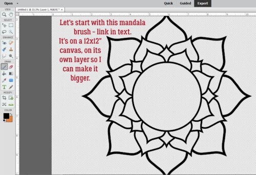
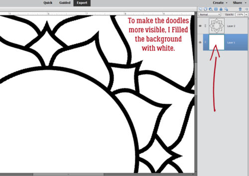
Are you familiar with brusheezy.com? They have millions of FREE, no-pennies Brushes. The one I used comes in THIS set (which isn’t free any more, sorry!). As the screenshot says, you’ll get best results with a Brush with some solid areas and sharp details. THESE ones would be great, too, and it IS free.

There are 3 ways to find your Styles. The long way is to click Window>Styles. The keyboard shortcut is F6, and the quickest way is just to click on the Styles button at the bottom of the Layers Panel.

To see all the Styles that have been Loaded in Elements, click on the bar shown at the top of the Layers Panel. Scroll down the list and find the set you want. Or if the set you want isn’t there, Load it. [If you’re shaky on how to do that, The Style File: Where is It? can help.]

I tried this particular version with several different gold Styles and settled on this one. It came from a non-GS source, so I won’t link it here. I wasn’t able to find anything suitable in the GS shop, but maybe we could ask for one!

Wut?! Look at that! I think it’s just a bit too thick – the paper method would need several coats of ink and embossing powder and nobody’s got time for that! But it definitely is pretty!

Shaving some of that Bevel is super-easy in Elements. Just double-click on the fx icon on the Brush layer and the Style dialog box will open. First thing I like to do is make sure the Lighting Angle is the same as the rest of my layout so it doesn’t make the brain scramble. Then I slide the Bevel slider to the left until I like the result. I went from the default 20 pixels to 6 and it’s a lot less in your face.

I followed all the same steps for this silver version, only this time I was able to use a GS product! It’s a Karen Schulz Style set. The result could use a little deflation… kinda chunky.

This time I did something a little different. I went literally tone-on-tone. You can see the red Brush against the red paper, and it’s a nice look. Changing Blend Modes might make it really spectacular, but that’s not what we’re doing today.

The closest to a heat-embossed look for this example was to apply another Karen Schulz Style set, this time Glass. [We’ve used that set before.]

Just for kicks, I tried the gold Style on the red.

And the silver one too! I think I like it better than the gold.

Really, the possibilities here are endless.


Tutorial Tuesday (Photoshop Elements)

Taking Distress to the Next Level

PDF Version : https://bit.ly/4d1IYdD

Happy July! Happy Canada Day! Happy Independence Day! Happy Muharram! Happy Bastille Day! On to the second half of the year……….

Last week’s Quick Trick elicited this response from Steph: “I gave this tut a try and like the effect I got. While I was reading the text, i was thinking that we would be “roughing up” the edges of the text or shape. What i ended up with was a distressed look on my whole word. Is it possible to do a roughed up edge just on the outside edge? This might be tough on a font, but would a simple shape be more possible? Thanks!” Well, yeah. It’s possible! Some parts of this technique are similar to an old, old tutorial on inked edges, but I’ve added some twists.

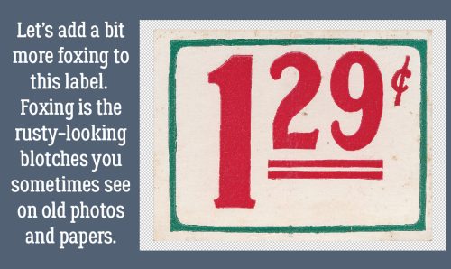
What better object to create a beat-up look on than a piece of ephemera? I chose this price label from the GingerBread Ladies‘ collab Like Them Apples. If you look closely along the right side of the label, it shows some foxing – that rusty, splotchy, discolouration seen on old photos and documents. We’re going to add some foxing to the lower right corner of the label.

Because we’re working with the Brush Tool, repeat after me: “Brushes go on their own layer!” Before we go any further, pop a new blank layer on top of the Label Layer by clicking on the sheet of paper icon to the top left of the Layers Panel. My foreground colour was picked using the Eye Dropper Tool, from a darker are of the foxing already on the label. Now to choose a Brush. In the Natural Brushes set there are a bunch of Stipple Brushes. (One of the most recent updates to my firmware removed my ability to show you a lot of things, like the Brush Options Panel in screenshots. Grr.) I chose the 21 pixel size, then Resized it to 30 pixels. (To quickly Resize Brushes on the fly, use the [ – bigger and ] – smaller keys.) Then I clicked the Brush – Opacity at 100% –  randomly along the edge of the label, overlapping the edge in several spots. That’s not a problem, it’ll be fixed in a minute. But don’t DRAG the Brush, that just makes a mess.

When I’ve got enough colour there, next step is to Select the outside edge of the label. With the Brush Layer active, CTRL/CMD>click on the Label Layer Thumbnail. The marching ants will appear around the edge.

If we went ahead and Cut away the Stippling right now, it would disappear from INSIDE the edge, so the Selection has to be Inverted. You can click Select>Inverse or use the keyboard shortcut CTRL/CMD/SHIFT>I.

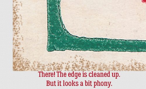
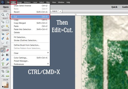
If it seems like I’m belabouring the point about being positive what Layer is active, it’s because I am. Edit>Cut or CTRL/CMD>X the stippling that falls outside the label’s edges to clean it up.

The only issue I have with how it looks is that it’s a bit too dark and looks artificial. Easy fix!

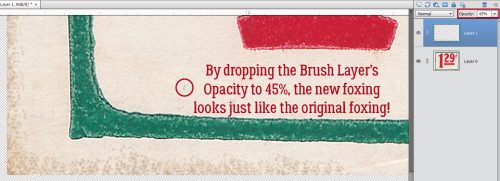
I’ve circled a foxed spot that was part of the label before I started messing it up. I used it to guide me as I dropped the Opacity of the Brush Layer to 45%. Now it looks natural!

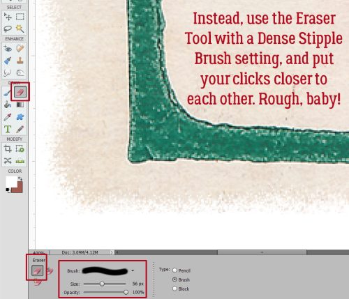
To simply rough up the edge, rather than Brushing ON, Erase away! Choose the Eraser Tool, pick one of the Dense Stipple Brushes, make it fairly big and rather than spreading the clicks out, group them closer together. (I’ve put a white background layer behind my sample so you can see the rough edge better.) If you want to give the effect of white-core cardstock, “fox” this new edge using white. So many ways to make this work!!

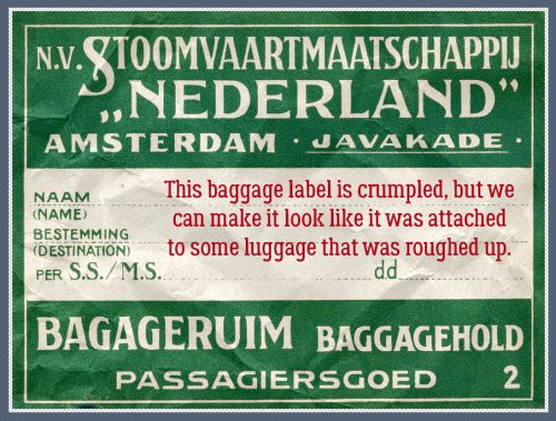
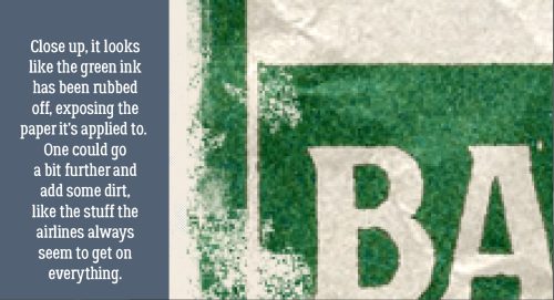
Now let’s distress this baggage label from Cindy Ritter‘s One in a Melon. The label has been crumpled, but if it had ever been on a bag, it would look more beat up than this.

This kind of label is ink-printed on heavy paper, so distressing it should show the base paper through the ink. To that end I picked my colour from the lightest cream area of the paper. I’ll use a Dry Media Brush, Pastel on Charcoal Paper to add some “wisdom” to the label.

On your shiny new layer that you’ve popped on top of the label, start clicking the Brush over areas that logically would be rubbed against the wall or other baggage. The tops of those creases need to be rubbed a bit too. You can adjust the size, roundness and angle of your Brush by clicking on Brush Settings… and making your changes.

Now, if you’re really Type A and want to replicate what your luggage tag looked like after your last airline experience, you could add some dirt….

Once you’ve got your label roughed up enough, Select the edge of the label as we’ve done before, but with the Brush Layer active.

Invert your Selection.

And clean up your background.

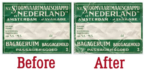
Yep, it’s scuffed alright!

Side-by-side comparison…

Does that give you some ideas, Steph?


Tutorial Tuesday (Photoshop Elements)

Quick Trick: Distressing Elements

PDF Version : https://bit.ly/3zNdf1K

I’m still processing last night’s Game 7 Stanley Cup final. What a game!! I’m sad that the Oilers didn’t win, but I know they’ll be back in the fall, this time stronger and more determined. Congratulations Panthers on a great series.

This Quick Trick might be of particular interest to the former paper scrappers in our midst. Remember using an emery board to rough up the edges of your cardstock or to “age” a tag, label, frame or other element? I’m going to show a digital technique that has the same effect. I’m demo-ing it on some text, but you can apply the technique to almost anything. And it only takes a couple of easy steps. I’ve used Amastery Script and the paper behind it is from Aprilisa‘s Evolving.

If you’re trying this Trick on text, make sure you’ve Simplified it so it can be manipulated.

Click on the sheet-of-paper icon at the top of the Layers Panel to open up a new blank layer on top of your text layer.

Now go to the Brush Tool and look for the Faux Finish Brushes set. It’s one of the standard brush sets that comes with the Elements software. You’re looking for the Rolled Rag – Terry Brush; it’s about halfway down the palette. If you hover the cursor over the thumbnails, their names will appear on the screen. (I can’t catch them with a screenshot or I’d show you!) No need to adjust any of the settings, other than the size.

Next, with the blank layer active, CTRL/CMD>click on the text layer’s thumbnail to Select the edges of the text. This will ensure that the Brush is only applied to the text, not the whole thing. More about this in a minute.*

Now, look at which layer is active before proceeding. It must be the blank layer! Adjust the size of the Brush (you can use the slider or the [ and ] keys) so it covers roughly half the height of the text. You’ll see the image of the Brush on your canvas so you can judge your adjustment. Don’t fuss about the colour you’ve got selected in the foreground. I’ve used white, but it’s going to be removed so it’s not a factor. Then randomly click the Brush over your text. I went a little overboard, just so you could have a good look at what it does. Whatever you do, don’t DRAG the Brush – it’ll be ugly and you’ll be CTRL/CMD>Z-ing it away.

Next, Select the edges of the blotches you’ve created with the Brush by CTRL/CMD>clicking on the Brush Layer’s thumbnail. You can kinda see that I’ve outlined the marching ants with red in my screenshot.

To remove the Brush‘s blotchies, click CTRL/CMD>X and they’re gone. All that’s left is to Merge the layers. Activate the Text and Brush Layers then CTRL/CMD>E and it’s done!

* So, the tutorial I based this one on said to Lock the Pixels on the Text Layer and then use the Brush. Well, I tried that – the Brush wouldn’t work. So I created a workaround.

Next week, we’ll be into the second half of the year. I know! Gah!!

Tutorial Tuesday (Photoshop Elements)

DIY Christmas Card Workshop

Woohoo! I’m on deadline today!! Things are looking up. Today’s tutorial isn’t necessarily scrapbooking-related, but it definitely uses digital scrapbooking supplies. It’s also not really in time for this year, but it can be a thought for next year. I’m going to show you how to make 2 personal Christmas cards from 1 sheet of cardstock. The resulting cards are 4 1/4 inches by 5 1/2 inches. You can get 50 envelopes that will hold these beauties at Michaels for $8 (Canadian, so about $5 in the US).

If I would have been thinking I could have skipped this step by putting the dimensions in reverse in the New Document screen. But I didn’t so I had to Rotate the canvas 90°.

Next I snapped a line across the centre of the page, and another from top to bottom. I used the Ruler and the Pencil Tool. To snap a straight line in a project, select the Pencil Tool and set the size of the line you want. I wanted these lines to be faint, so I went with 1 pixel. Line up the cursor with the halfway point along one side of your canvas. You can see a moving dashed line on the Ruler so you’ll know when you’re in the right place. Click once just barely inside the edge of your canvas. Then hold down the Shift key and move the cursor to the same spot on the opposite side and click again. It’s just that easy. Then do the same with the top-to-bottom centre point. These are guidelines for placement of elements and for cutting and scoring later.

Then I opened up the folder where I’d collected the objects I wanted to use. I have a photo taken several Christmases ago, a 3D snowflake from Lindsay Jane‘s Snowed Under kit and a mask from PrelestnayaP‘s December Wishes.

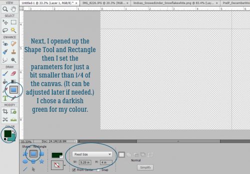
Working in the lower left corner of the canvas, I opened up the Shape Tool, chose the Rectangle, set a Fixed Size of 5.25 by 4 inches and chose a darkish green colour.

The resulting rectangle will fit inside the guidelines for one card. and by Simplifying the layer, I can make adjustments to it as needed because it’s now a Smart Object.

The next step is to add the mask. I resized it to fit inside the green rectangle completely.

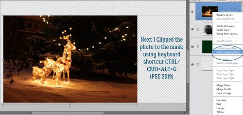
The photo went on top of the mask and was resized to approximately the size I’d need. I want the deer and some of the illuminated snow visible later.

Clipping the photo to the mask is simple. Right click>Create Clipping Mask or CTRL/CMD>ALT>G for more recent versions of PSE or just CTRL/CMD>G for versions pre-15.

Final position tweaks included a little shifting and a little more shrinking.

I chose a gold colour from my photo to use for the sentiment. Here’s where all those amazing fonts you have in your stash will come in handy. You can make this text as personal as you want, even making it family- or person-specific. But it still looked like it needed something. So I CTRL/CMD>clicked on the green rectangle layer’s thumbnail to select the outer edges of the rectangle. Then Select>Modify>Contract.

I pondered for a nanosecond how much I should shrink my selection and settled on 25 pixels.

And then I added a Stroke to the new selection. Edit>Stroke (Outline) Selection

I then used the same gold as for the text and added my Stroke. The position for this isn’t a make-or-break thing, so don’t obsess over it.

Yes, I think that’s what it needed.

The final step for this card is to add a trademark to the back. I went with the green for this.

Knowing that it’s on the BACK of the card and should be readable with the card right-side-up, I Rotated the text 180°.

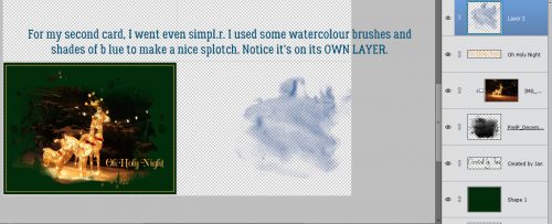
I’m going for 100% honesty here… I saw a card like this second one on Pinterest so I’m not taking credit for the idea. (Ignore the typo on the screenshot please!) I added a new blank layer to the stack and Loaded some watercolour Brushes. These are from a set of 20 free brushes from Brusheezy. I chose 3 shades of wintery blue for the brush area.

I layered the brushes, each on its own layer so I can make adjustments to just one – or all – if I need to.

For a bit of contrast I chose an aqua for the topmost brush layer.

I added in the snowflake and sized it appropriately. But it wasn’t quite enough by itself. So I added a Layer Style from Ooh La La ScrapsIn the Frosty Air collection.

It still was missing something so I turned off the snowflake layer for a second and added a white paint splatter. That makes a big difference!

A few words and it’s pretty much what I was looking for.

A trademark on the back in the dark blue and it’s finished!

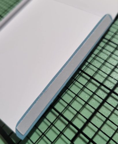
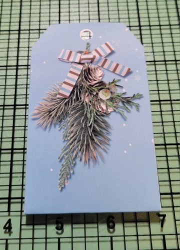
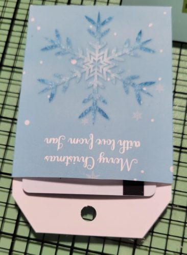
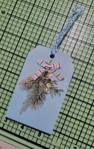
I saved the file as a .png so the printer wouldn’t need to add a white background to everything. To turn this into cards, I’ll load up my printer with white cardstock and print several copies. Using my guillotine cutter I’ll cut the cards apart on the top-to-bottom guideline and score then fold along the side-to-side guideline. I choose to print my sentiments for the inside of the card on resume paper (it’s a bit fancier than regular printer paper) and trim to fit the inside of the folded card. Word art would be perfect for this! Another option is to use a sentiment stamp and ink in a colour to match the front of the card. All that’s left is to sign them, pop them into their envelopes and mail them!

Whew… two weeks until Christmas Eve! Better get on that!

Tutorial Tuesday (Photoshop Elements)

Hybrid Pillow Box

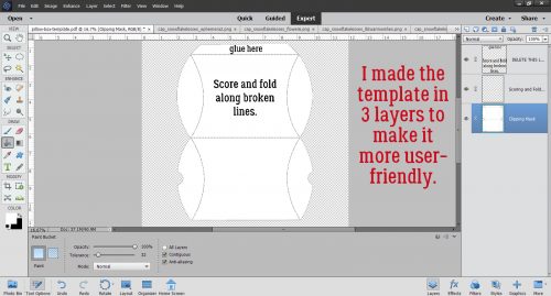
Have you ever wished you could customize your gift boxes and make them really personal for the intended recipient? Well, have I got a treat for you! And once again, the credit goes to calgirl (Steph). She found a printable template online for a pillow box and thought I could bring you a great seasonal tutorial for doing it digi. I thought it would be a lot more complicated than it ended up being, and I even managed to come up with a layered template for your crafting pleasure. You can grab it here: Dropbox

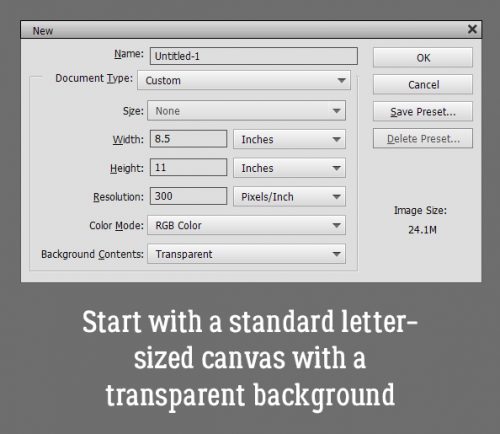
The template is on a letter-sized canvas so it can be printed on standard (inexpensive) cardstock. You can easily resize it a bit bigger or a lot smaller, and really make it your own. When you’re ready to print it you can either turn off the top (instruction) layer or delete it altogether.

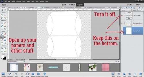
So, go to your stash and decide what you’re going to use for your special pillow box… papers and embellishments for the occasion. I used Aimee Harrison’s A Rustic Christmas kit. Turn off that top instruction layer for now, or go ahead and delete. You’ll know what to do without it.

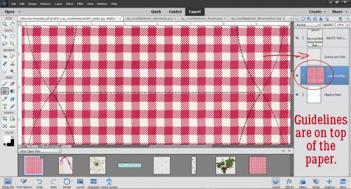
Drop your paper on top of the bottom layer. You’ll still be able to see the guidelines.

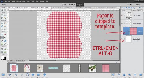
Then Clip (right-click>Create Clipping Mask or CTRL/CMD>ALT>G) your paper to the template.

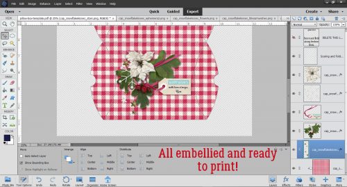
Using the guidelines, add in your embellishments. If you’ve added a tag or a label, pick a pretty font and type in your sentiment. What could be better than NOT to need a tag or label? Once you’ve got your clusters and what-have-you in place, add in your shadows. All that’s left is to print it, cut it out from the cardstock, score it and fold it up. A little dab of glue along the very top edge to hold it together and you’re DONE! You can use a bone folder, or a stylus or a totally dead ballpoint pen to do your scoring. If you’re worried about the guidelines showing on your finished box, you can decrease the Opacity of that layer down to barely visible. Or… If you want, you can put the guidelines on the back simply by flipping over the paper and running it through the printer again. Just turn the rest of the layers off and everything will line up perfectly.

I make jewelry for gifts, and I think this would be a perfect way to present them. In a custom box with my signature on it! How many ways can you think of to make this work for you??

Tutorial Tuesday (Photoshop Elements)

Numbers-Go-Round

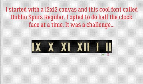
I almost didn’t think there would be a tutorial this week. I spent a huge chunk of time going through the paper clutter in my dining room sorting what needs to be kept and what could go to the shredder and at the end of it I was mentally exhausted. So I figured I’d do something fun; we’re redecorating and I want one of those huge farmhouse style clocks to go in the dining room. Bargain shopper that I am and not thrilled with the retail prices on these clocks, I took my $50 Lowe’s gift card and bought an 18″ chunk of stain-ready pine then started looking at examples on Pinterest. I knew I wanted Roman numerals on my clock so those are the ones I concentrated on. But how to get those numerals onto my slice of pine… PSE to the rescue. I thought.

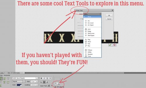
I wasn’t anticipating the number of times I’d have to undo it all and start over. So I thought, “Maybe someone else could learn from my mistakes!” I had already decided I would use the Warp text tool and had to figure out how to bend it to my will.

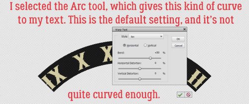
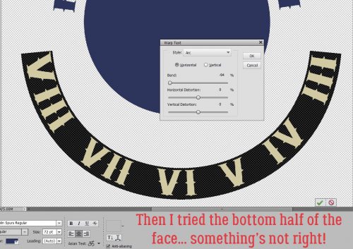
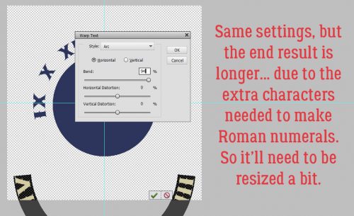
I tried a couple of options from the menu before settling on the Arc warp. It gives a beautiful curve but doesn’t distort the text too much.

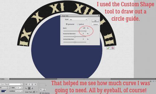
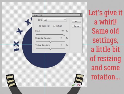
To give myself something to gauge the curve against, I used the Custom Shape Tool to pull out a nice perfect circle. The sliders do some crazy things to text! I went all the way over to the right with the Bend slider, but felt it didn’t leave quite enough space between the 8 and 9 or the 2 and 3. So I adjusted back to 94%

Then I typed out the rest of the numerals and warped them. But something doesn’t look right. I went back to my example on Pinterest and yep… it’s not right. The numerals on the bottom half are backwards.

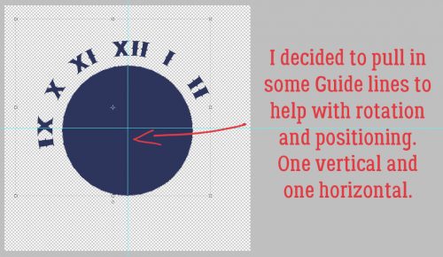
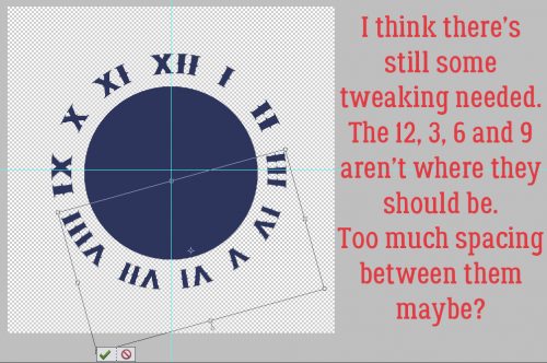
So I deleted that text layer but while I was trying to figure out how to turn the numerals on the bottom half around, I pulled in some Guide lines to make positioning the 12, 3, 6 and 9 easier.

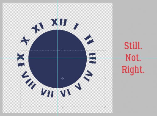
And I tried it again.

And failed. Again. So I thought, what if I flip the numerals horizontally?

Think it worked? As you can see, the bottom arc is a LOT bigger than the top one, which I did nothing to other than warp it.

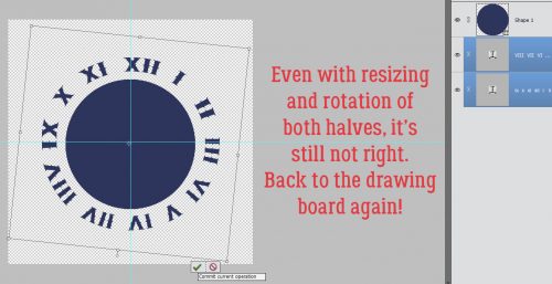
Even after I resized and rotated the two halves to a more correct position, it still was wrong. Even after several more tries to get it right, I still didn’t have it.

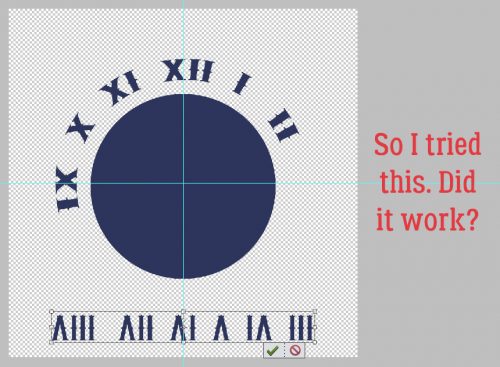
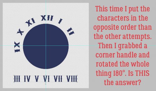
So I took a break. I went to work, spent the day recertifying my special competencies and writing two exams. I put it out of my mind altogether. Then after I got home and had a nice glass of pino grigio to forget the stress of my math exam, I had a EUREKA moment! Maybe I needed to put the characters in reverse order then spin them around 180°.

Did it work?

YES!! With some caveats.

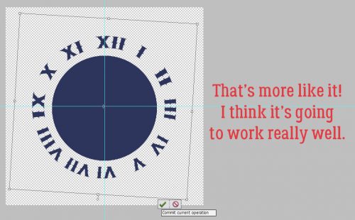
I adjusted the space between some of the numerals and rotated everything a smidge.

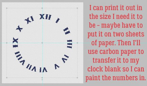
WooHOO! Now I can print it out in the size I want – even if I have to put it on four sheets – and trace them with carbon paper onto my clock. I’m so excited to see it all finished!

So there’s another way to add some originality to your text!

Be Pinspired – Christmas Advent Calendar

For those who celebrate, Christmas is right around the corner. I know that for here in the states, we have already been Christmastized since November 1st. That doesn’t mean (for me at least) that we cannot enjoy counting down until Christmas!

That is what we are going to talk about today. Christmas Advent Calendar. What is that?

An Advent calendar is a special calendar used to count or celebrate the days in anticipation of Christmas.

I am going to show you some great examples from Pinterest on making your own Advent calendar. Then I will follow up with some great Christmas goodies from the store. Digital scrapbooking doesn’t have to stay digital, you know! Print those items out and get to gluing!


Here are a few Christmas items from the store. Images are linked!


Be Pinspired – Back to School

Earlier we talked about some great back to school items from the store along with some inspirational layouts from the gallery. Today we are going to take a look over at Pinterest to get some more inspirational ideas for back to school. (images are linked!)

Most all of these seem to be done the traditional way, glue and paper. You can take most any craft and put a digital scrapbooking twist on it. All you need is a bit of inspiration, your imagination, and a printer! I chose all these ideas with that in mind! They could all easily be turned to a digital scrapbooking craft.


Think about all those lovely papers you have in your digital scrapbooking stash! Think about how standout and amazing this hand-print flower would be with those papers!


This is more of just and idea for a photo. You know, so you can scrap it! I love love love this idea!!


This one is my favorite of today’s pins. You can do every single bit of the paperwork on this via digital scrapbooking. You just need to pick your size, decorate, print and laminate. My son loves to read and loves finding fun bookmarks. This is on my to-do list!


These are super cute and look like they would be pretty easy as well. Especially since you can do most of the paper-working via digital scrapbooking!


Here is another great idea for the 1st day of school photo. That sheet would be super easy to make in photoshop with your lovely digital scrapbooking goodies as well!

I know this isn’t the longest blog post ever. I hope you got some ideas from it and found some inspiration for your back to school projects!

Be Pinspired – Summer Crafts

Summer is in full swing here in the states. I don’t know about you, but I am ready for school to start back. With that in mind, we are going to get some inspiration from Pinterest today. Today’s post isn’t strictly about digital scrapbooking. However, I think you could use just about any of these ideas with your digital scrapbooking stash.

So let us get started! All images are linked. To start out with we are going to take a look at a fun list of scrapbook layout titles. I am awful at titling a page. Here are some great examples to help out!


To go right along with these titles, here are some fun fonts to use on your digital scrapbooking layouts about summer (or any layout really!) The “Sunshine” using the Janda Stylish font is awesome and totally going to be on one of my next layouts!

In my search for fun summer time craft and scrapbook ideas, I found this really cool traditional layout with movie ticket stubs! How cool is that? I got to thinking how that could be taken and turned into a digital scrapbooking layout. Here is the pin that got those ideas flowing.

To round things up, here are some fun paper, paint and glue crafts for the summer. Put your gray matter to work and see how you can flip these to digital scrapbooking crafts. I would love to see how you do it!!


Now, get to scrapping and crafting!

Let’s Get Crafty – Combining DigiScrap and Crochet

Happy Tuesday everyone. I’m here today with a new twist on our blog posts. How many of you have another craft you do? Beading, vinyl, quilting, crochet, knitting? If you do have another hobby, do you ever use your projects in your digiscrap layouts?

I LOVE to dabble in so many things. My husband just rolls his eyes and shakes his head when I jump into another craft because when I jump, I go all the way in. But I seem to have stuck with crocheting the longest. When I started digi-scrapping, I was finding I didn’t have a lot of recent pictures to scrap. My kids absolutely hate having their pictures taken, so those are few and far between. I have a bunch of older photos (both digi and printed that I can scan) but I wanted something more recent, so I started using pictures of crochet projects.

I love to find a pattern that I want to try and then do the project – mostly afghans. Problem there is, we only have so much room and only need so many afghans. So I started doing them to just give away. Below are some of the layouts I’ve done with my projects.

I can definitely see how my scrapping style has changed in the last few years.

Now it’s your turn! Do YOU have a hobby you have used as the focus of a layout. Post the link in the comments. I would LOVE to see what you’ve done.

Enjoy your week!!