For all the Mac Users – Unlocking Secrets in Your Fonts
![]()
I honestly wasn’t sure if I’d get a tutorial out this week. I made a flying visit to BC to check in on my parents (they’re both fine, thank Heaven) over the weekend and didn’t get home until early this morning. But looking through my mailbox led to this!
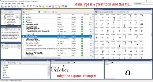
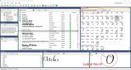
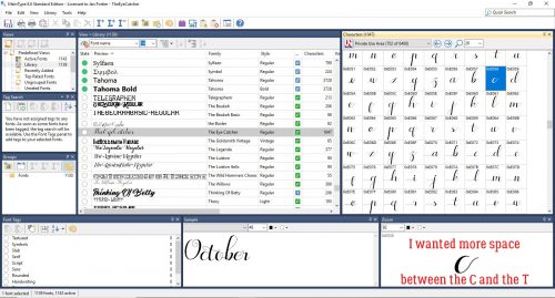
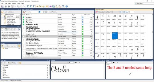
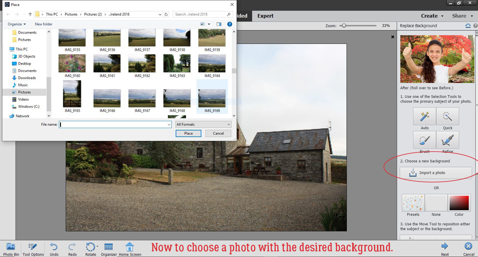
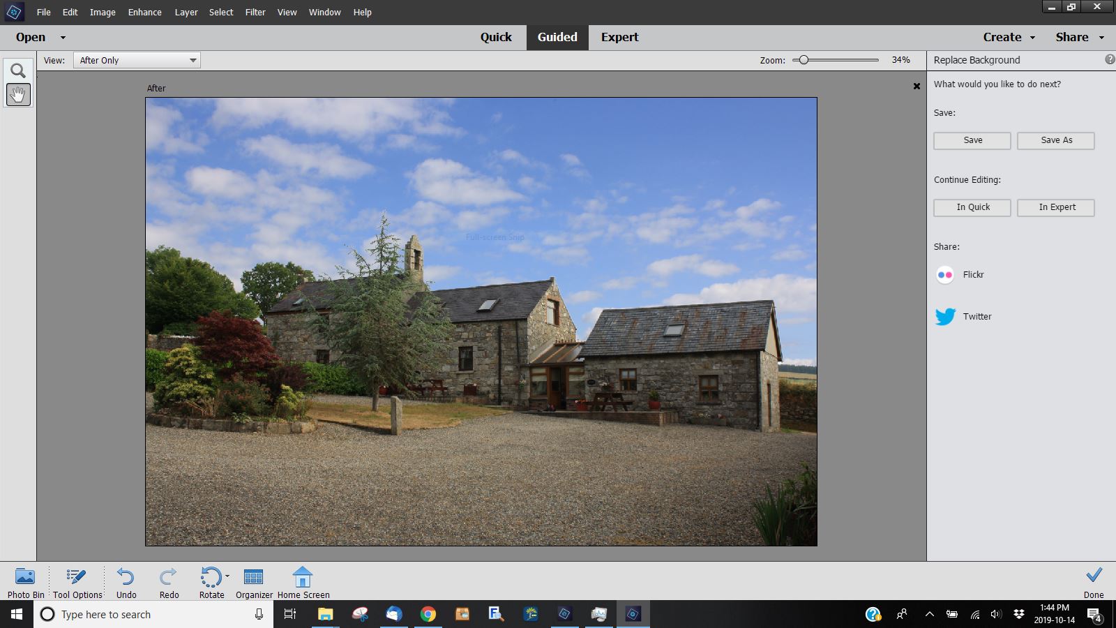
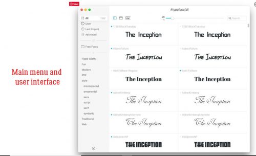
I was really pleased that last week’s tutorial on using the hidden extras in our font files was so well-received. I had fun putting it together and hoped it would be a good choice. A comment from Carina got me thinking about what might be a suitable, similar font manager for Mac users that could work for the tut the way MainType does. And darned if I didn’t find one! It’s called TypeFace 2, and like MainType they have a free version and a paid version. (If you click on the software name above, it’s linked to the app store.) Of course, the user interface is different, but it has the same options. You can customize your tags so they make sense for you, you can move similar fonts into folders so you can quicken your search for the right one, and you can preview the fonts using the text you’re planning to put into your layout.
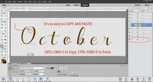
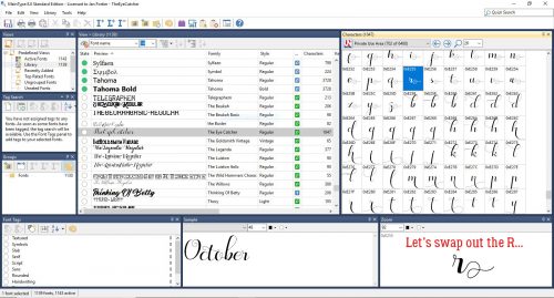
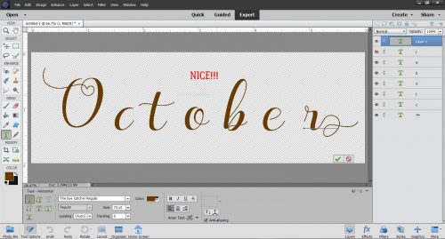
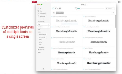
Here’s an example of a customized preview.
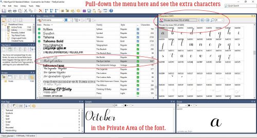
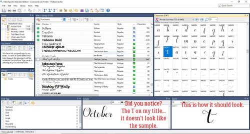
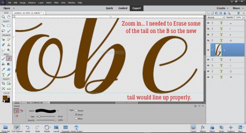
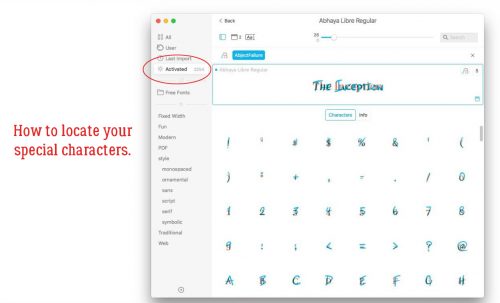
To be useful for finding, selecting and using the special characters that come with the fancy fonts, there needs to be a way to access them. I will admit that I didn’t test it, but reading the description of the app and some reviews, I’m pretty sure it’s going to work in a very similar way. One other benefit to this one is that it’s available for both Mac AND PC!
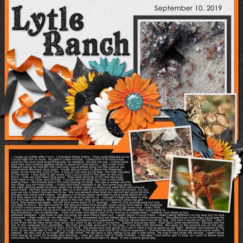
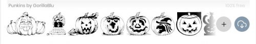
Now, for your viewing pleasure, some awesome (totally free) Hallowe’en fonts and dingbats!
This one I found at FontSpace.
The rest are from my second-favourite site, Dafont. You can grab this one here.
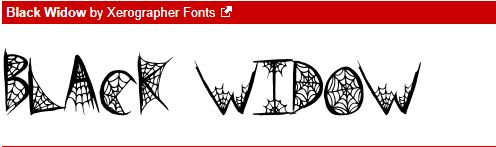
This is a bit of a variation on a theme, perfect for bold titles. Get it here.

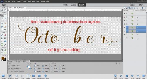
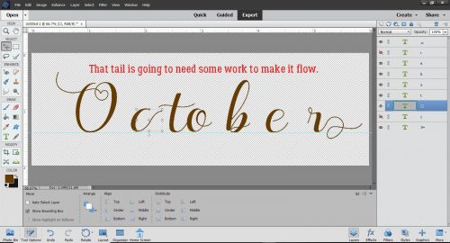
This font isn’t quite a Hallowe’en one, but it’s very pretty, and the curlicues are reminiscent of the tendrils on pumpkin vines. It’s here.

I like this one for its simplicity, and its slight grunge. Find it here.
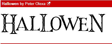
What do you think of the Gothic look of this one? Look for it here.

I think this would make the most interesting border on a Hallowe’en layout. You can find it here.

Happy haunting!
![]()