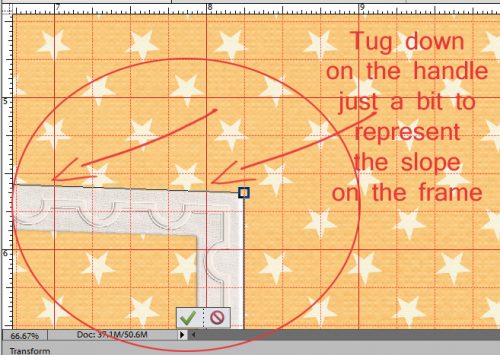
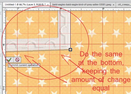
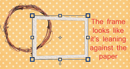
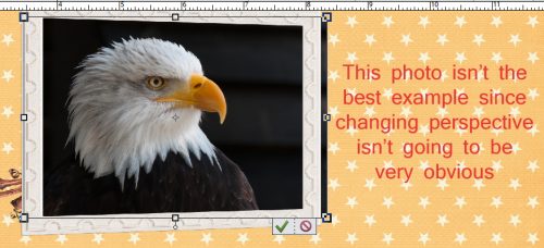
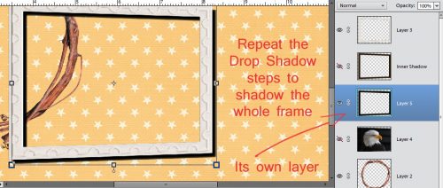
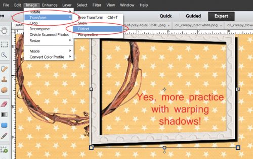
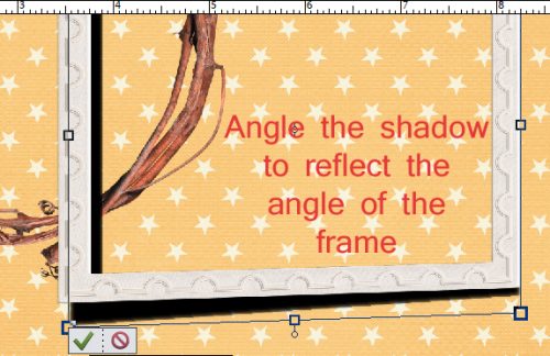
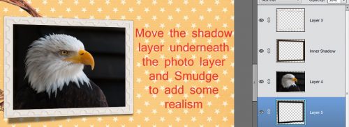
![]()
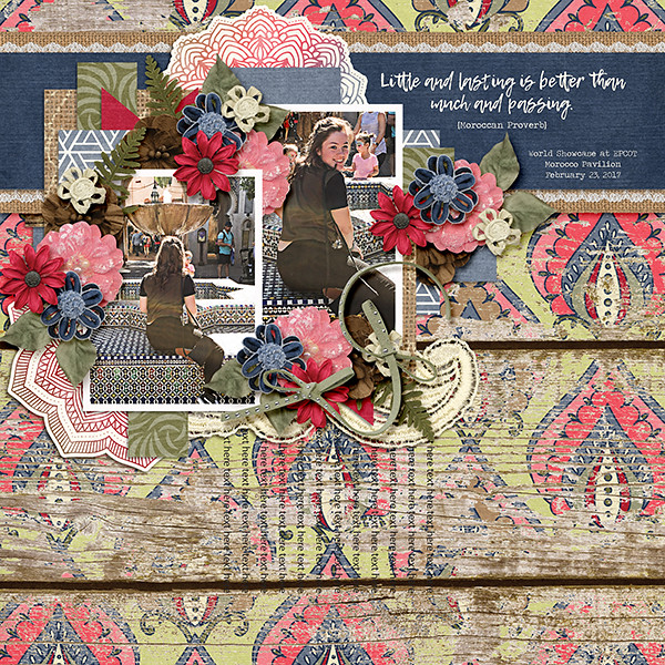
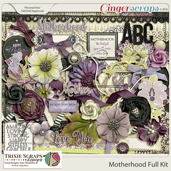
It is Mother’s Day here in the states tomorrow. I realize that in other parts of the great big world, Mother’s Day has come and gone. You can celebrate and scrap mothers any time of the year though! With that in mind, we are going to take a look at some of the great Mother’s Day (or just mom inspired) digital scrapbooking supplies from here at GingerScraps! Hold on to your hats. We are about to blow you away with some great stuff. All images are linked to the store of course.
Don’t forget that there is an entire section dedicated to Mother’s Day in the store as well. In case you don’t find anything that strikes your fancy in today’s post. I’m talking pages-and-pages worth!


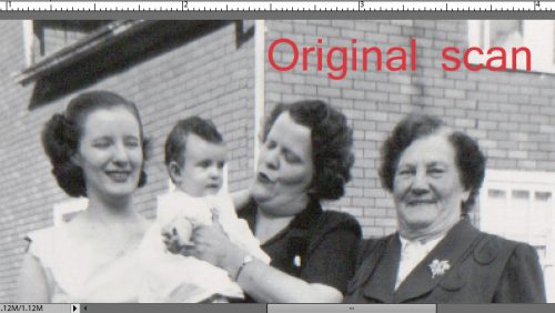
Don’t forget the Grandmothers!


![]()