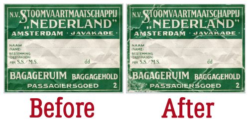
Here we are at another Friday. These weeks are just flying by. I feel like it was just Monday.
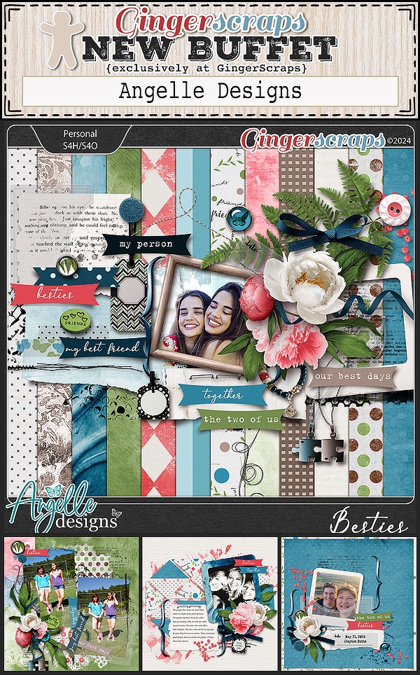
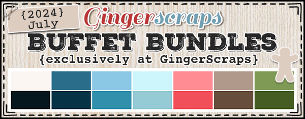
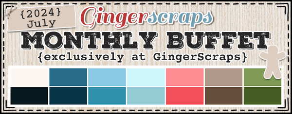
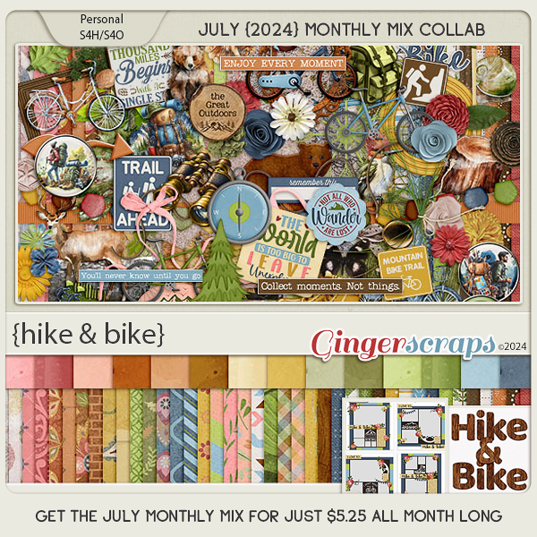
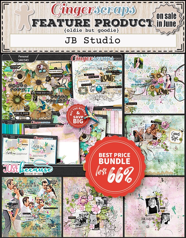
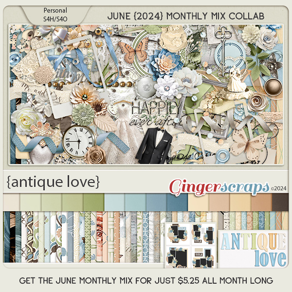
Remember any $10 spent in the store gets you this great collab.

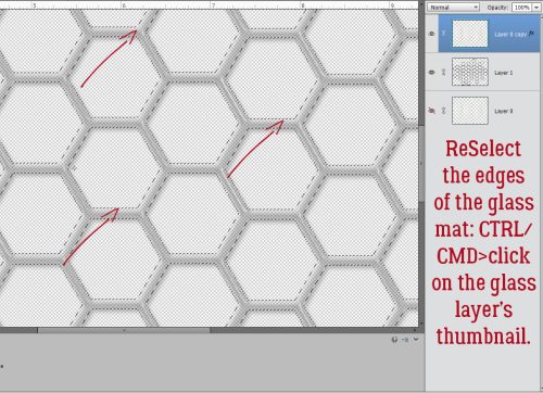
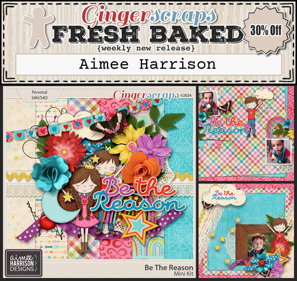
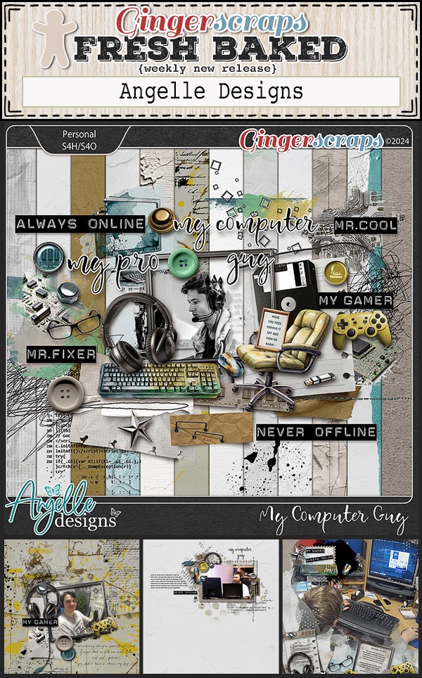
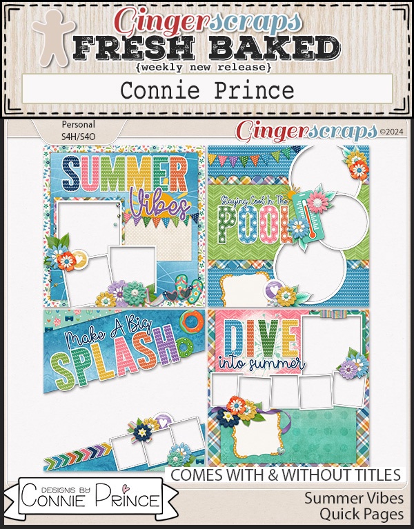
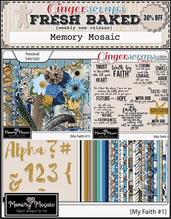
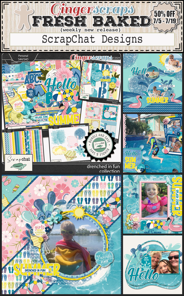
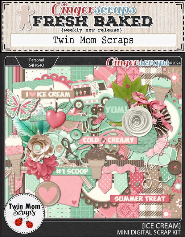
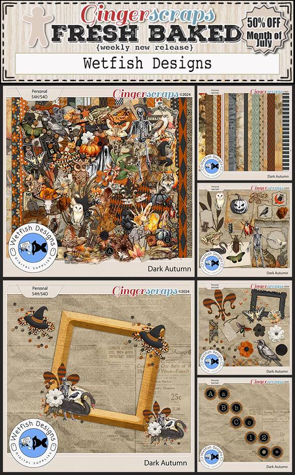
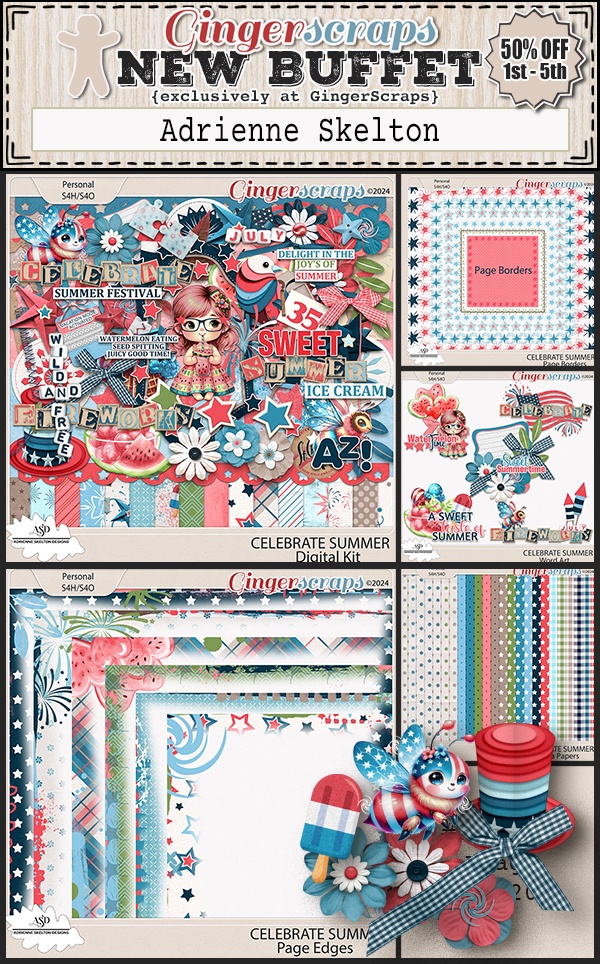
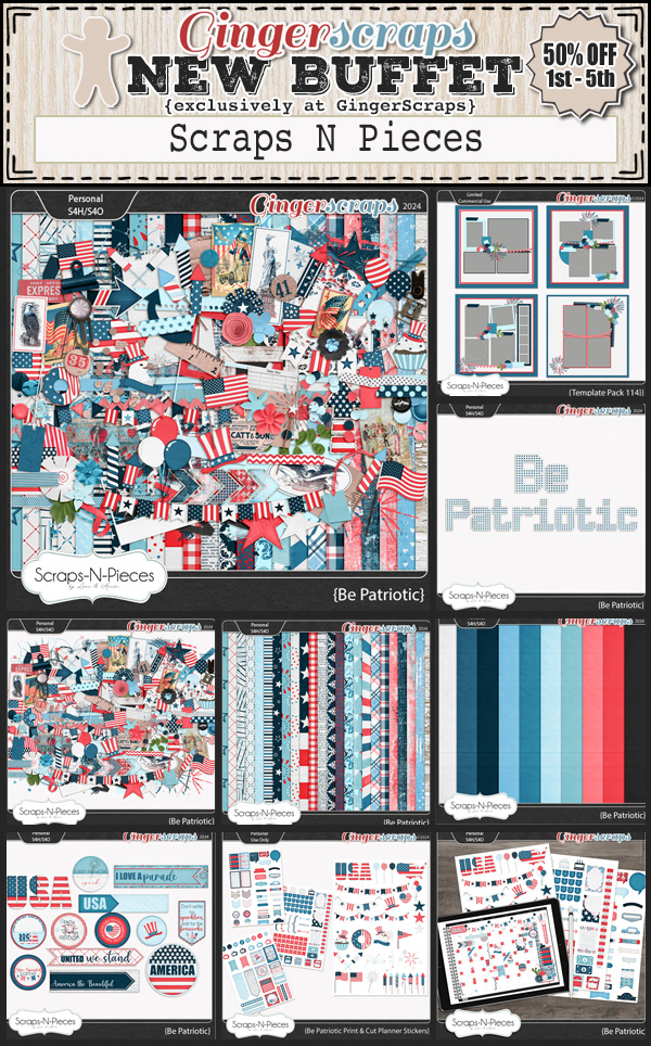
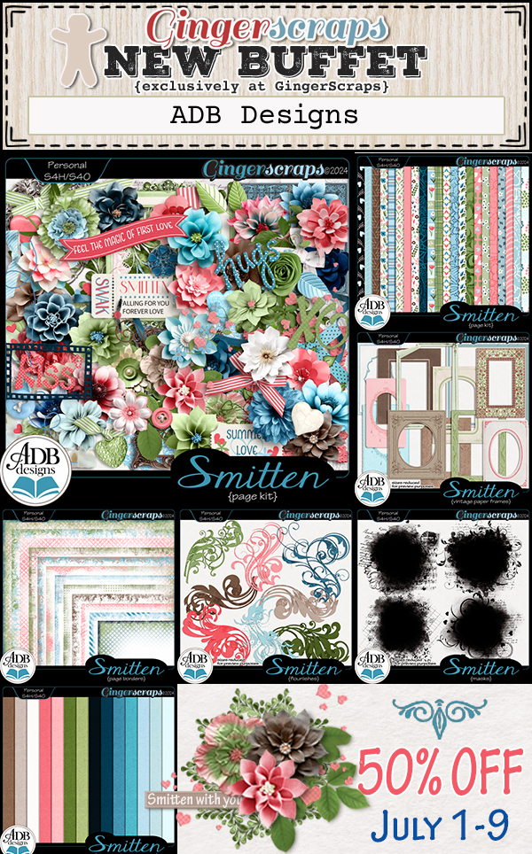
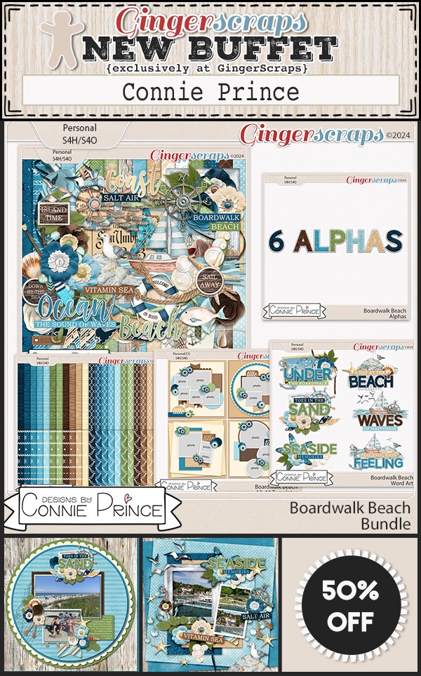
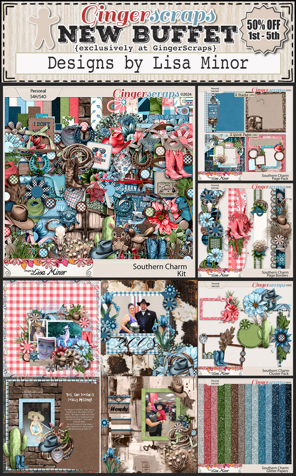
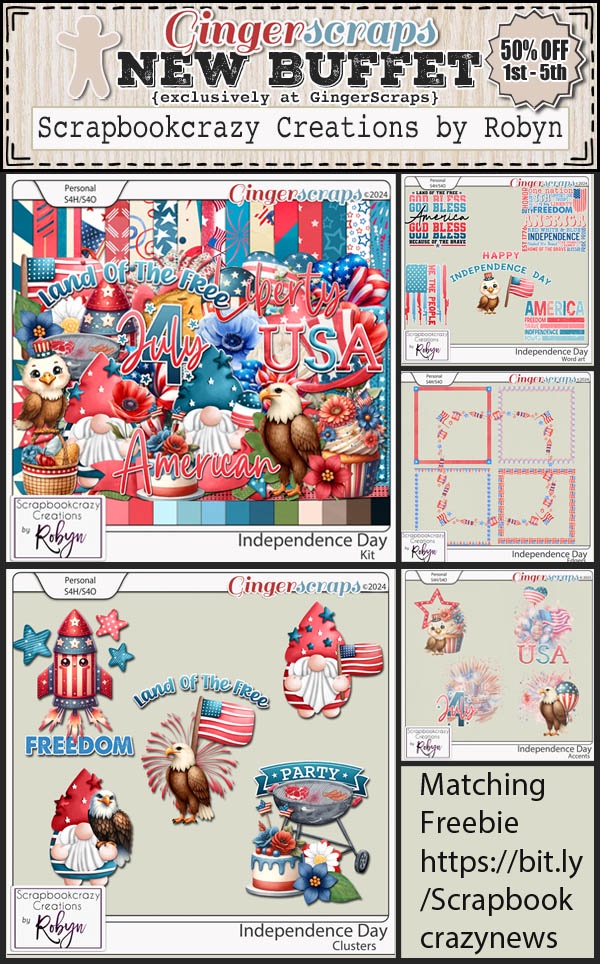
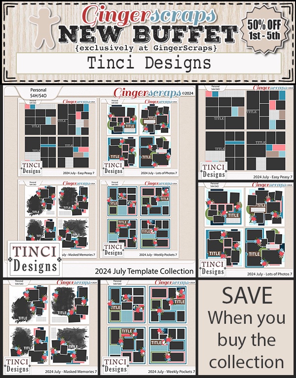
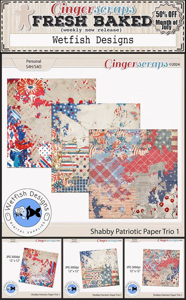
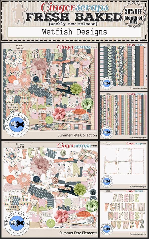
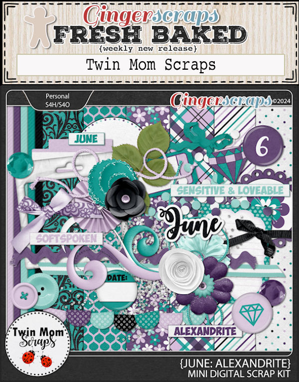
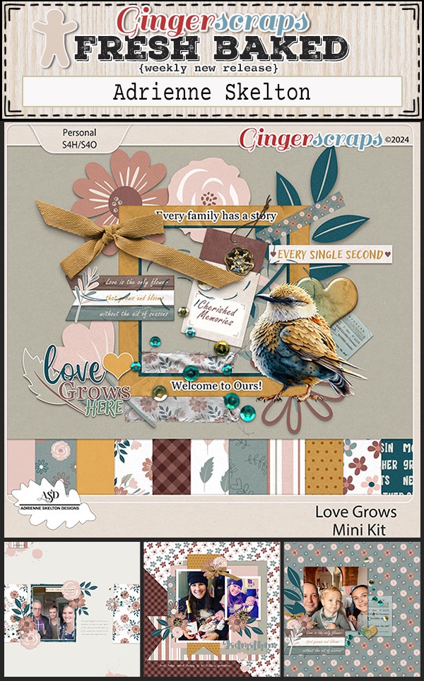
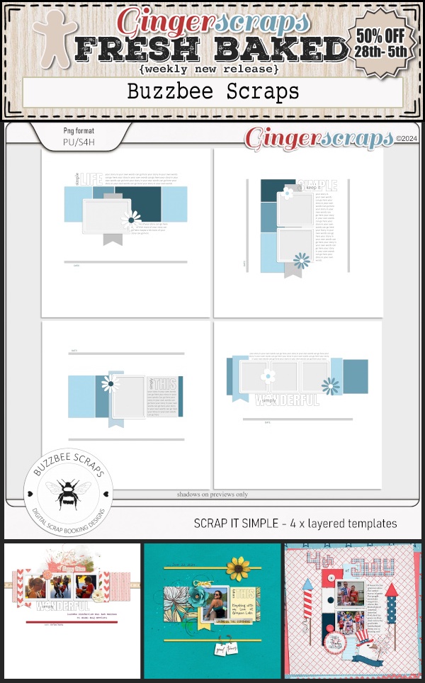
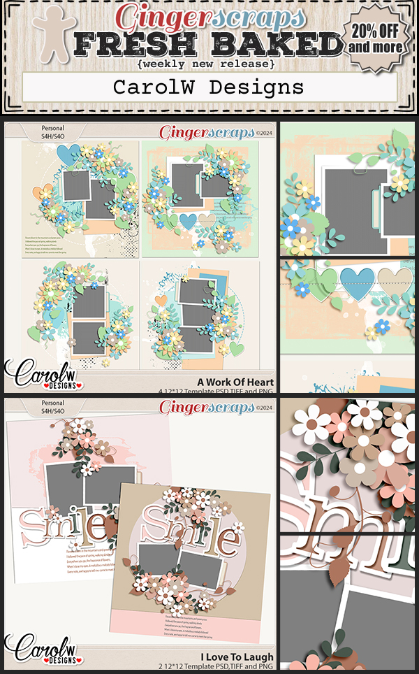
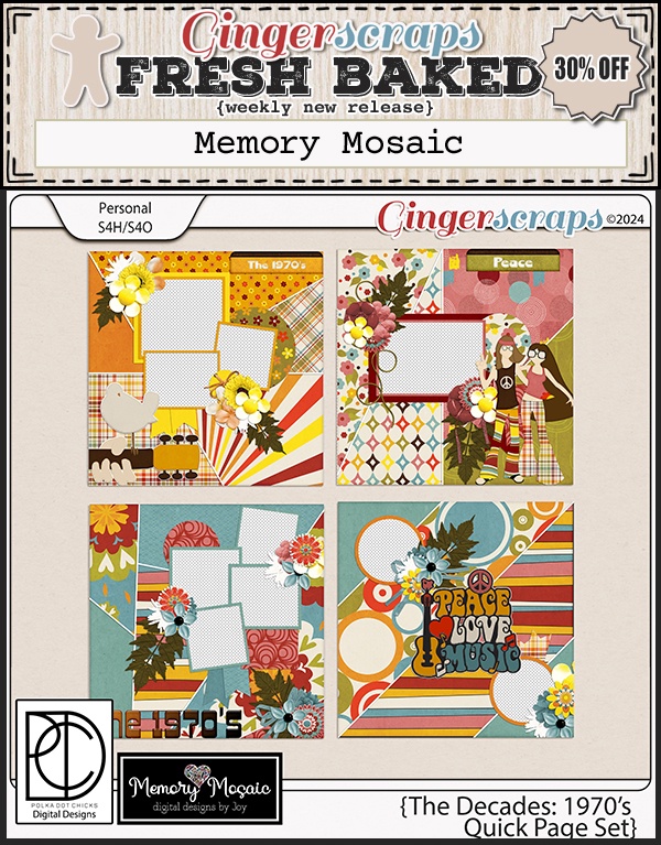
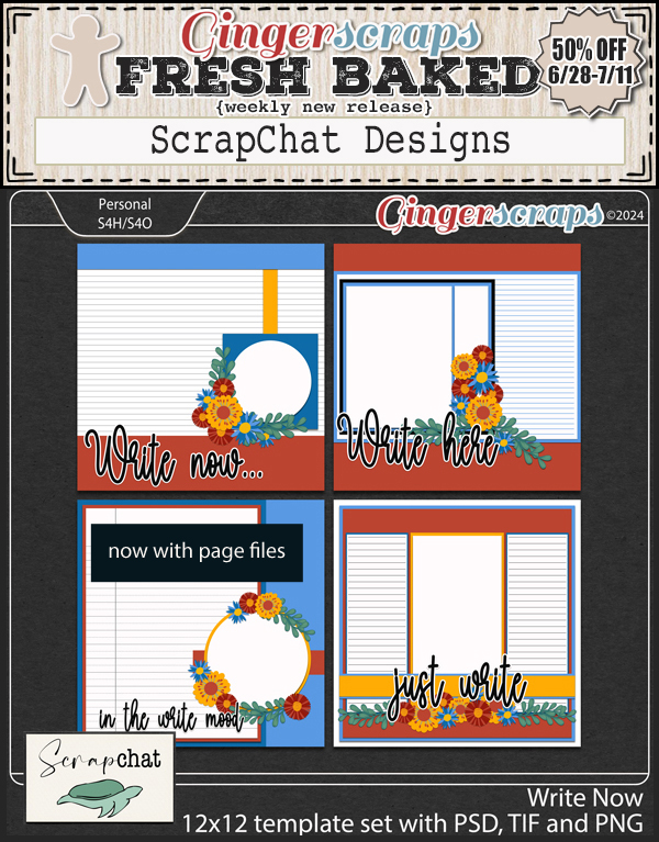
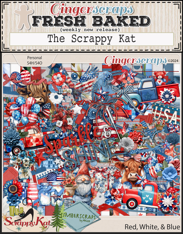
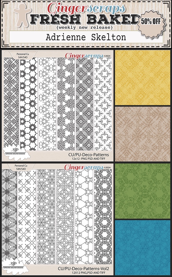
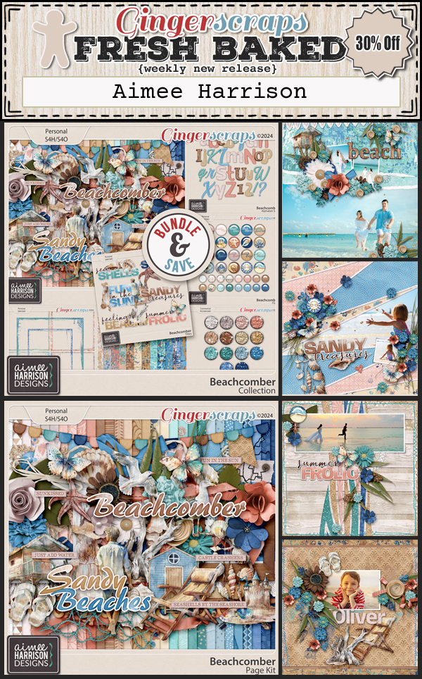
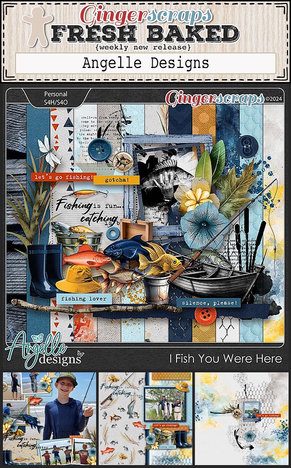
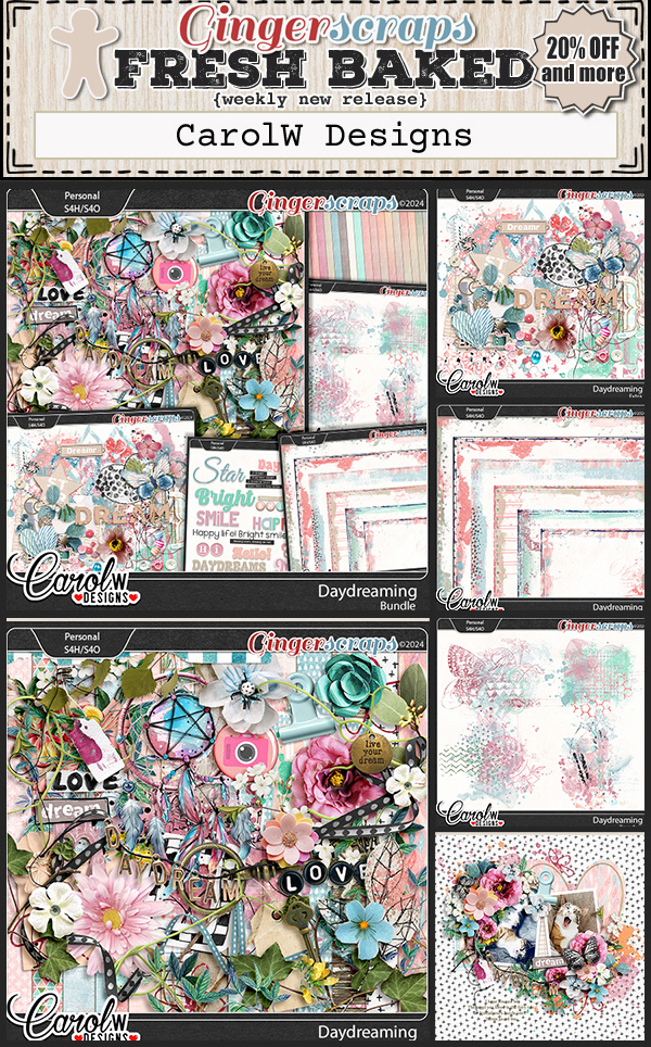
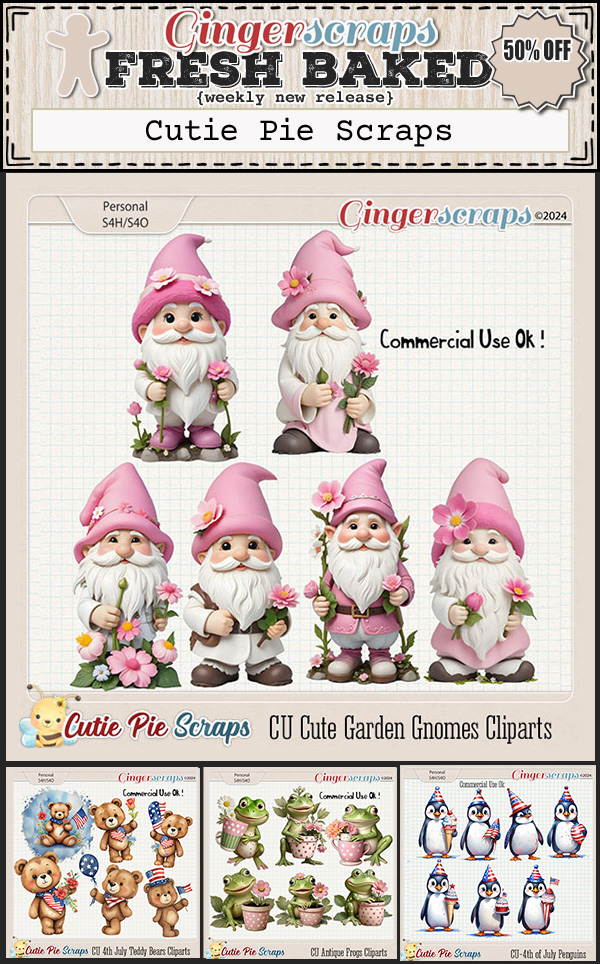
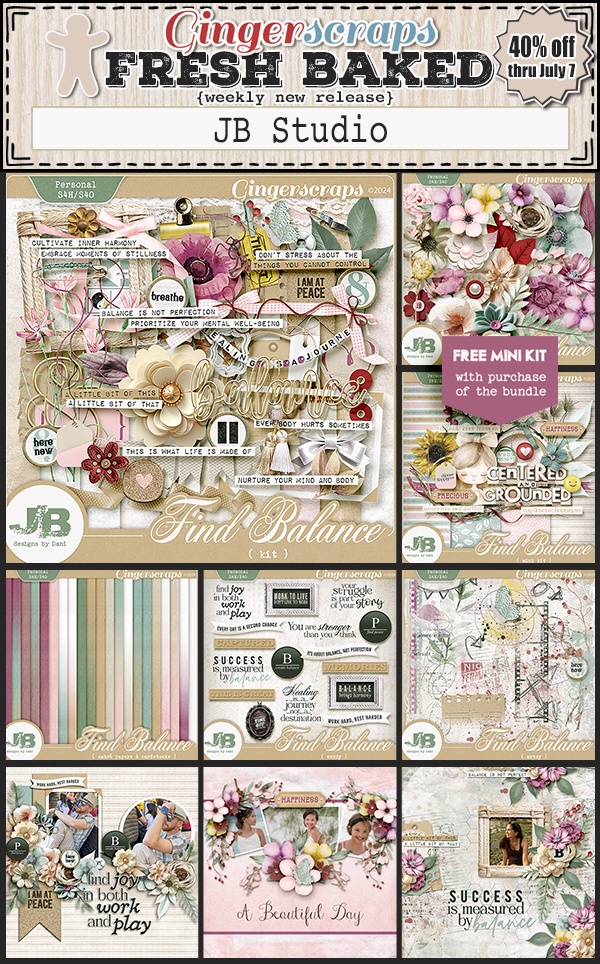
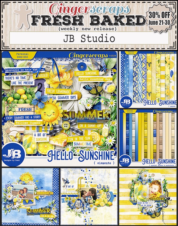
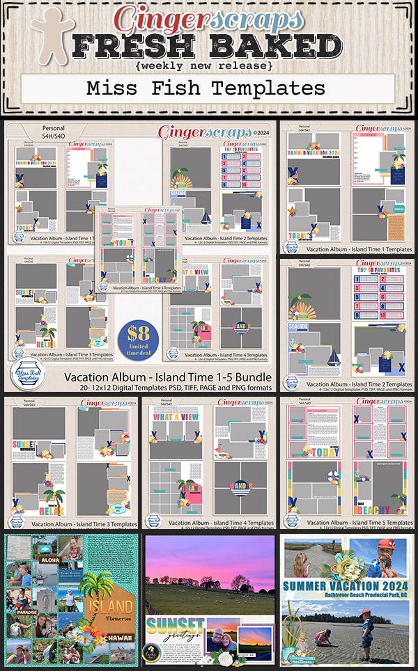
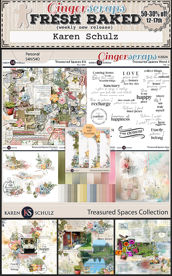
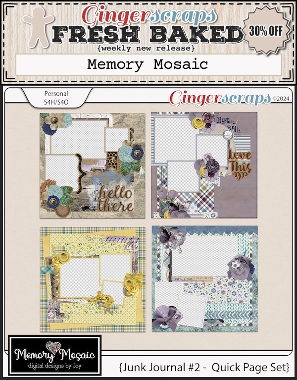
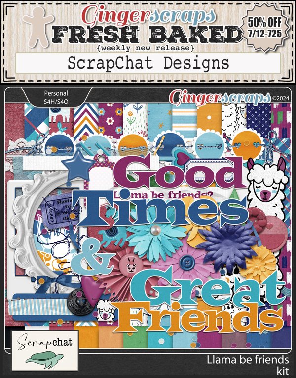
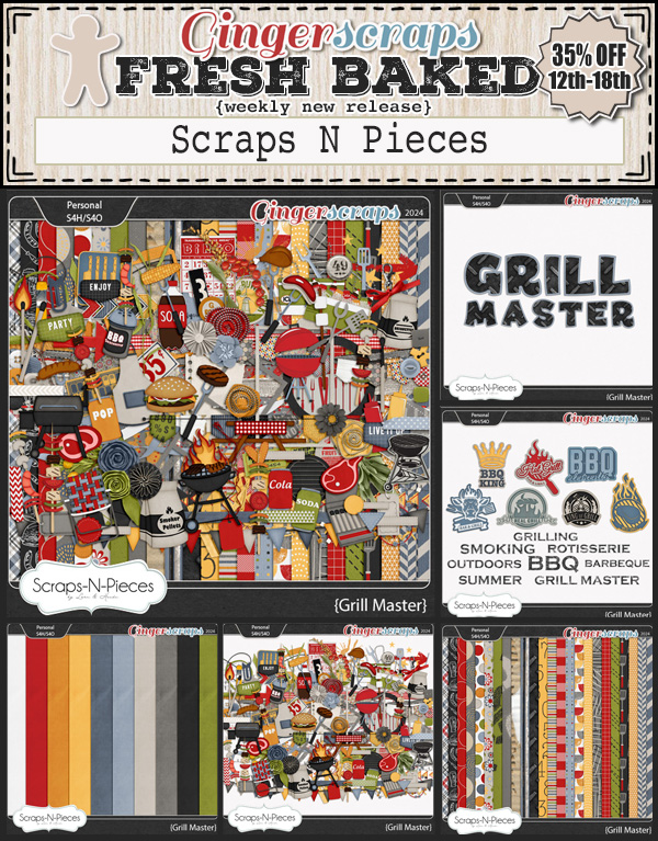
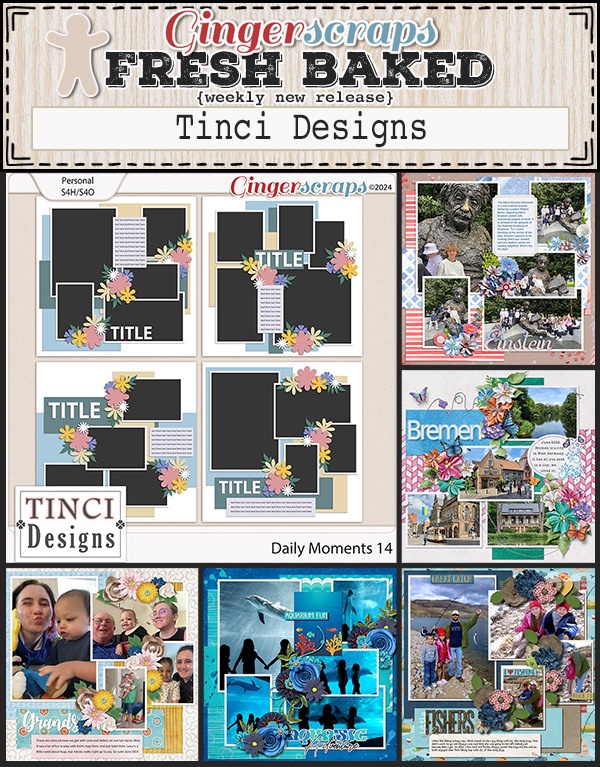
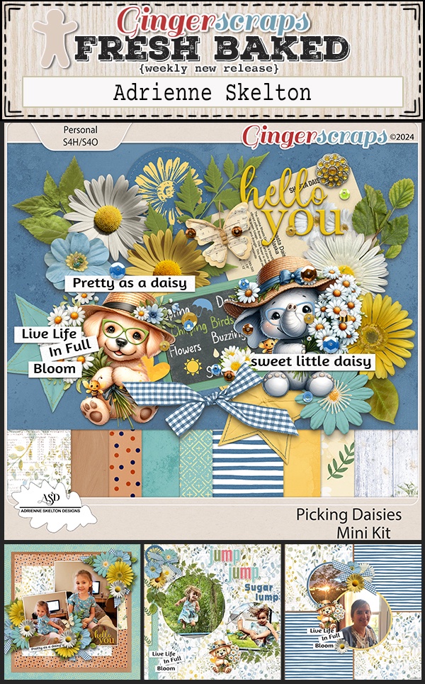
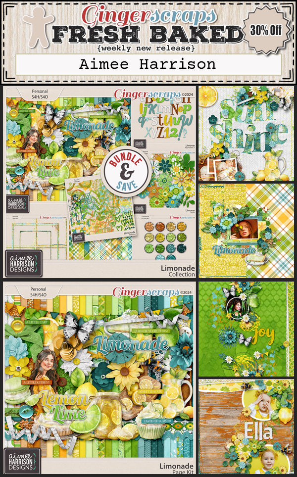
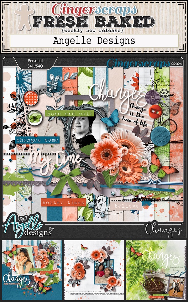
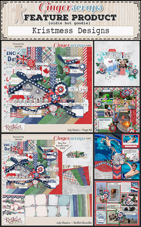
What’s new in the store this week?


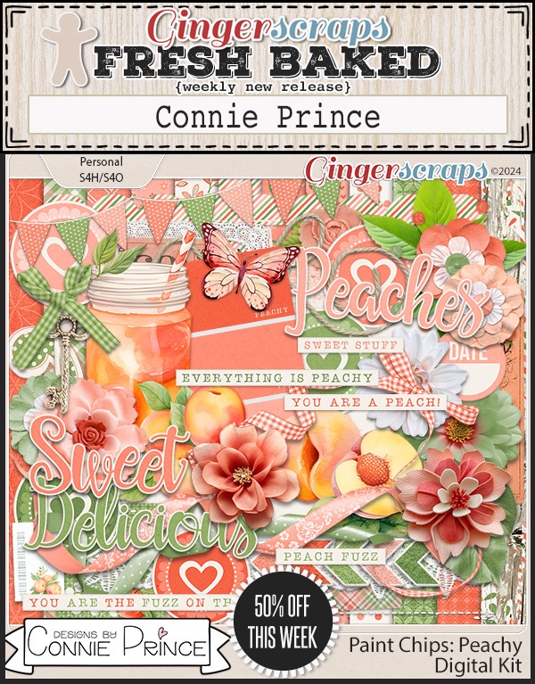


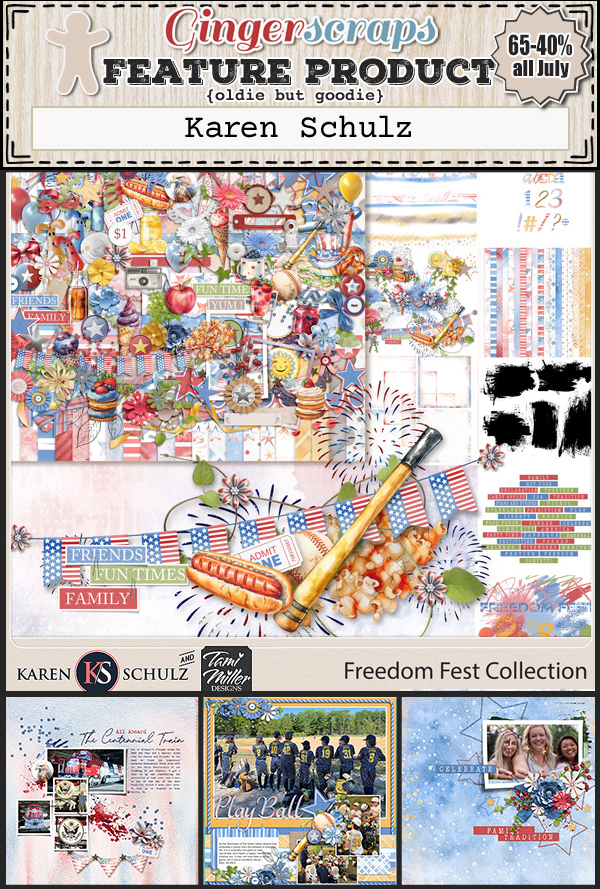
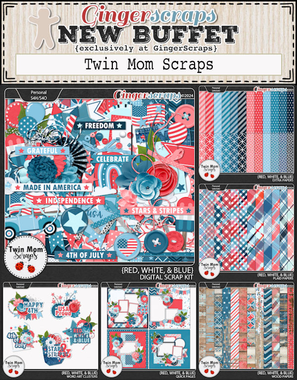
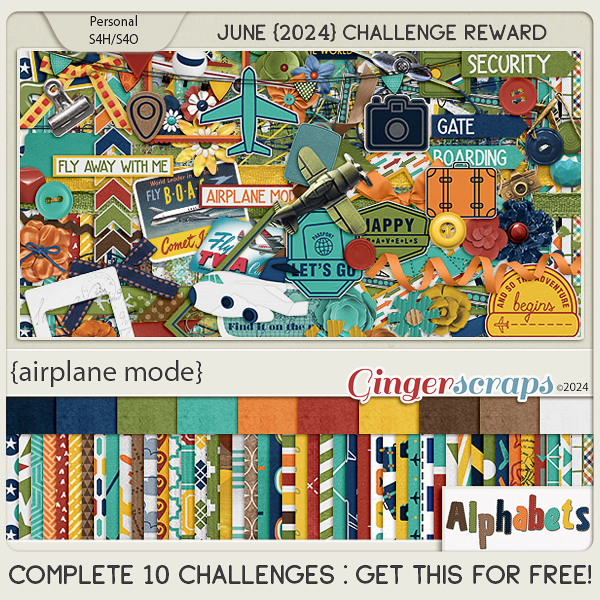
How are your challenges going? Complete any 10 for this kit as a reward!