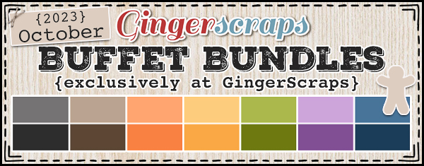
Are you excited? It’s DSD time. You know we always do it big here at GingerScraps. I hope you are ready for a week of sales, fun and games, and more!

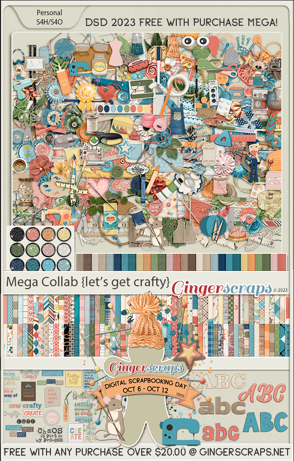
Here is a close up of the MEGA free with purchase over $20.00 during the 2023 DSD celebration.
Don’t forget to stop in the forum for some DSD Fun & Games!

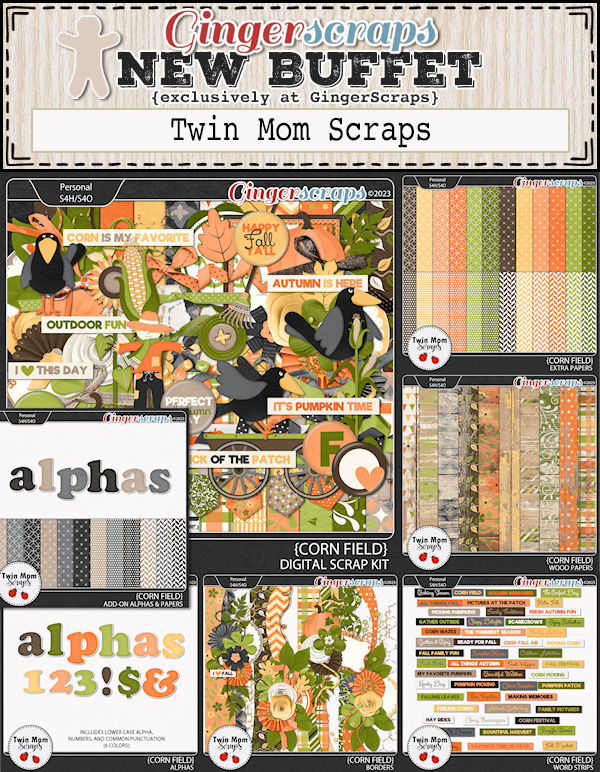
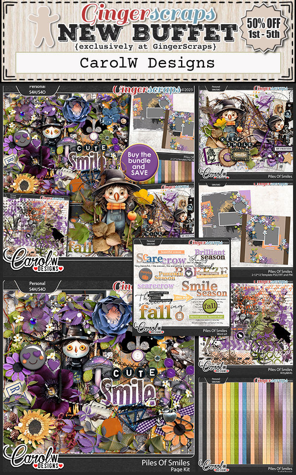
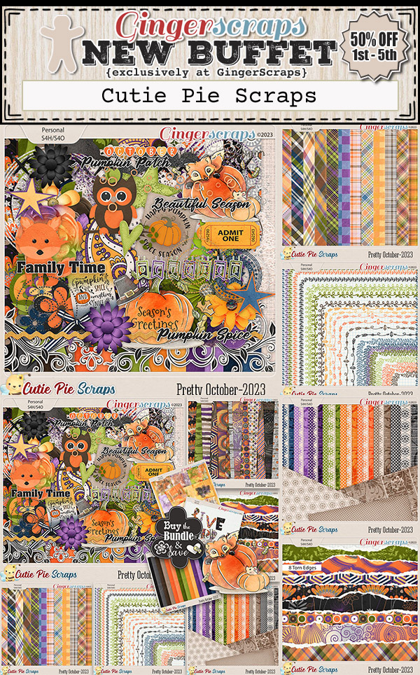
Are you ready to see what our designers have for this great celebration?


Whew – that was a lot. So much to choose from this week.
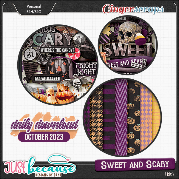
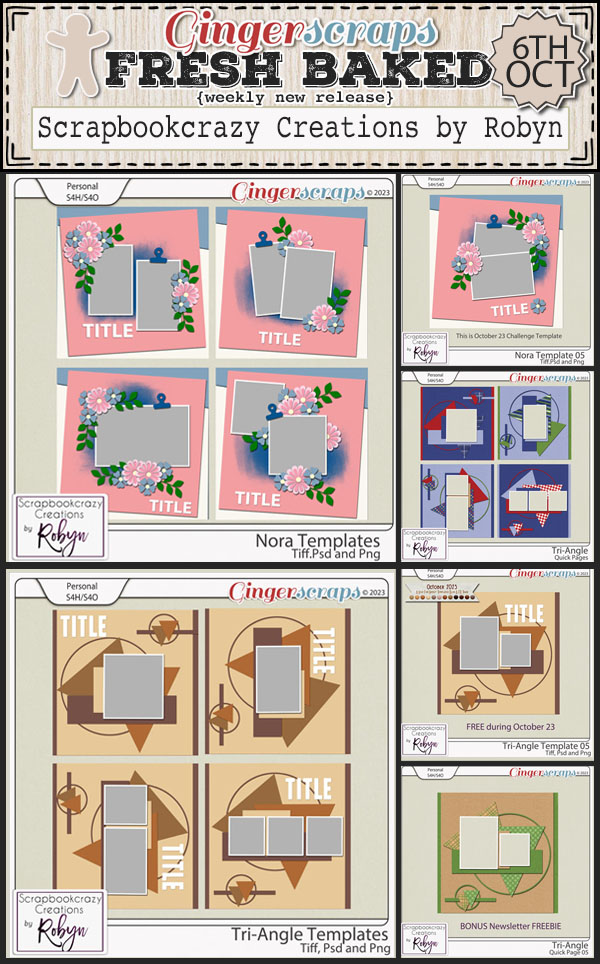
Have you gotten a start on your challenges for October? If you complete any 10 challenges you will get this great kit as a reward.