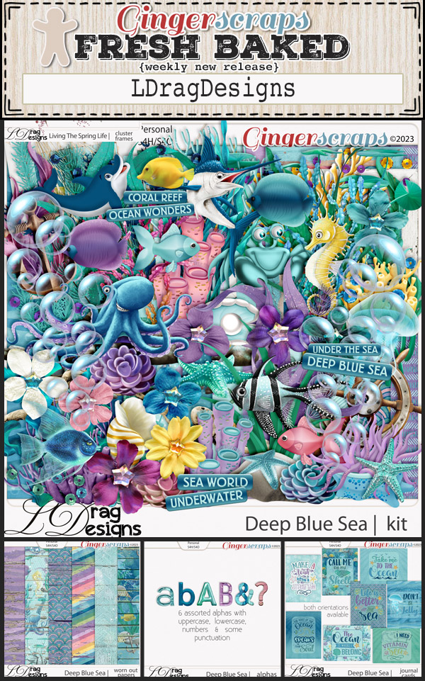
Happy Friday everyone! My week has been all messed up with the holiday on Monday so I’m not sure if its really Friday or not. (Good news – it is!)
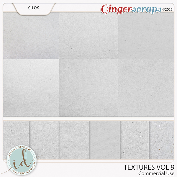
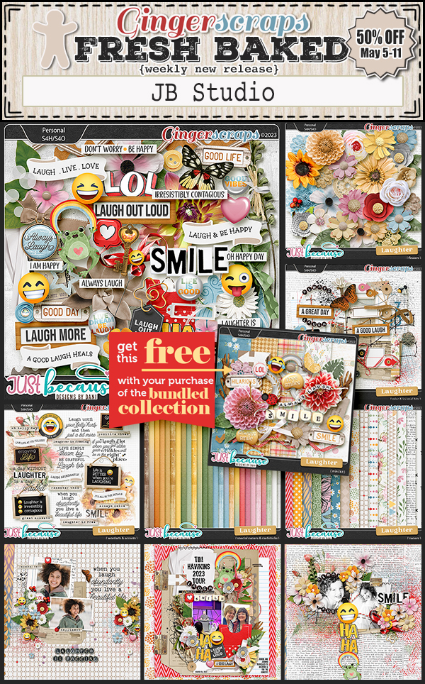
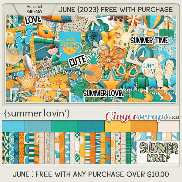
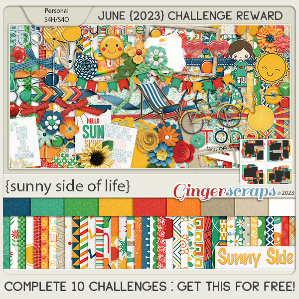
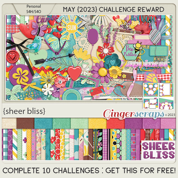
Remember with $10 spend in the store, you get this beautful kit for free.
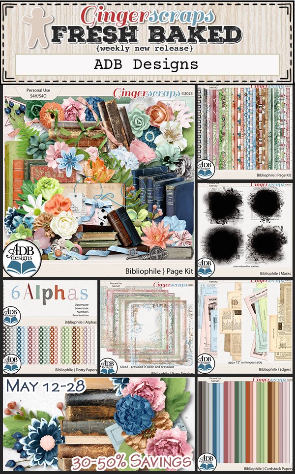
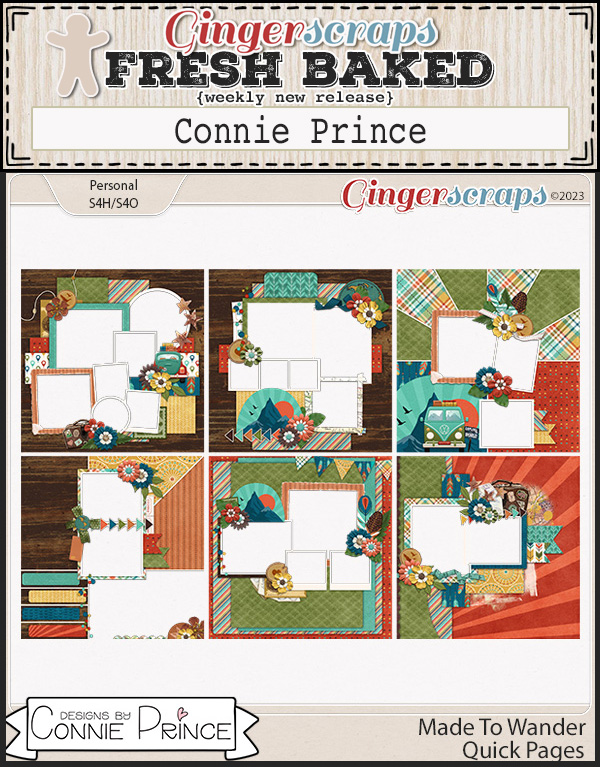
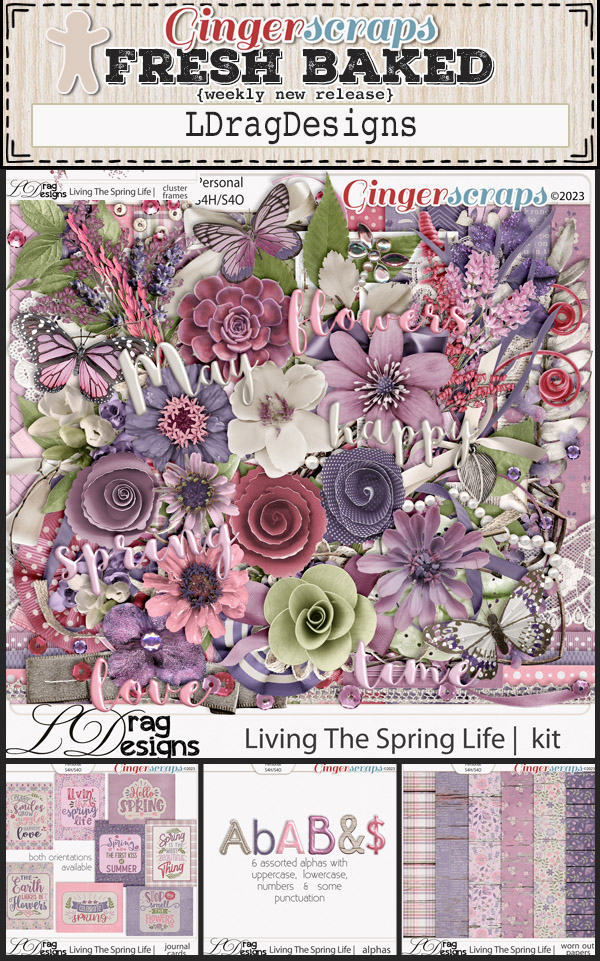
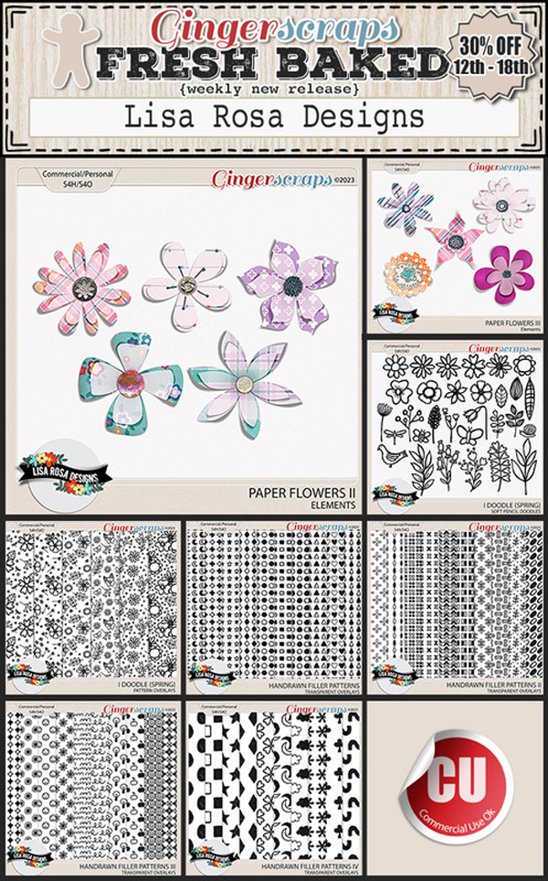
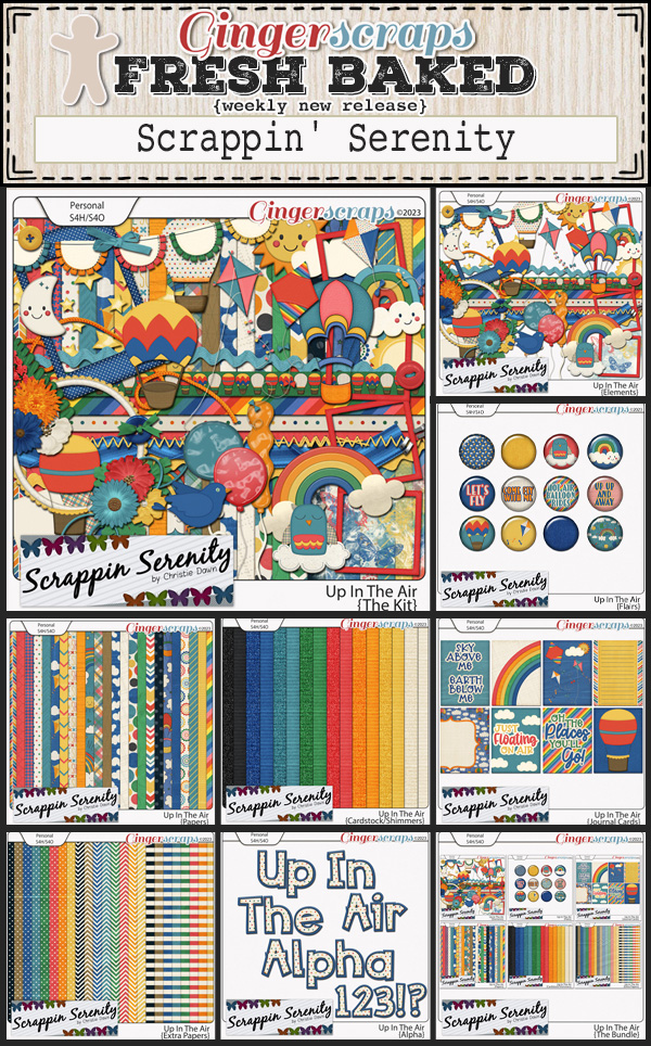
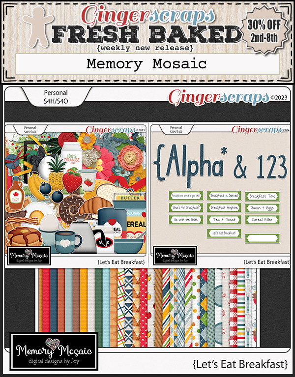
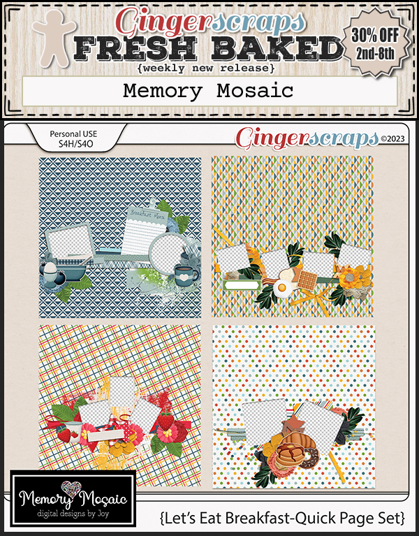
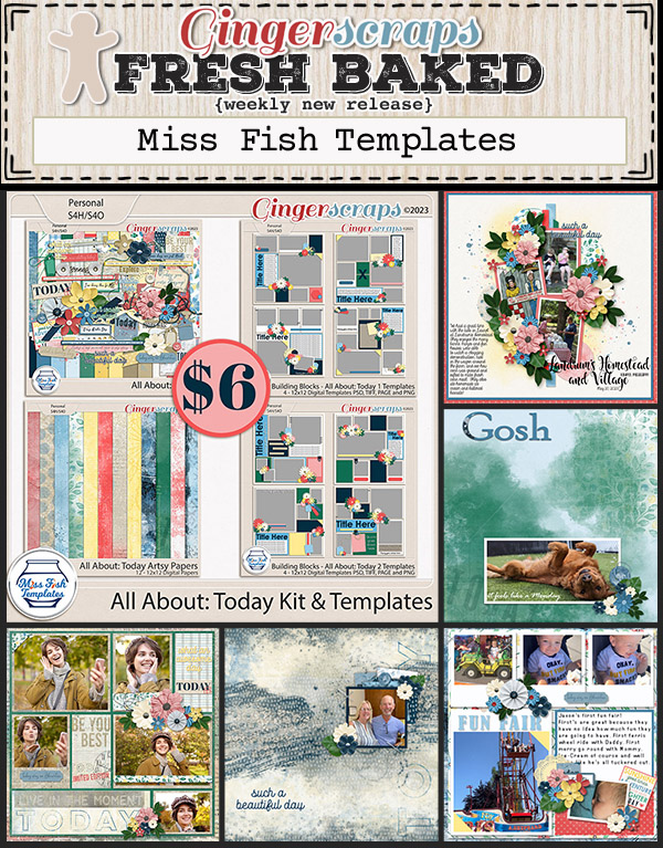
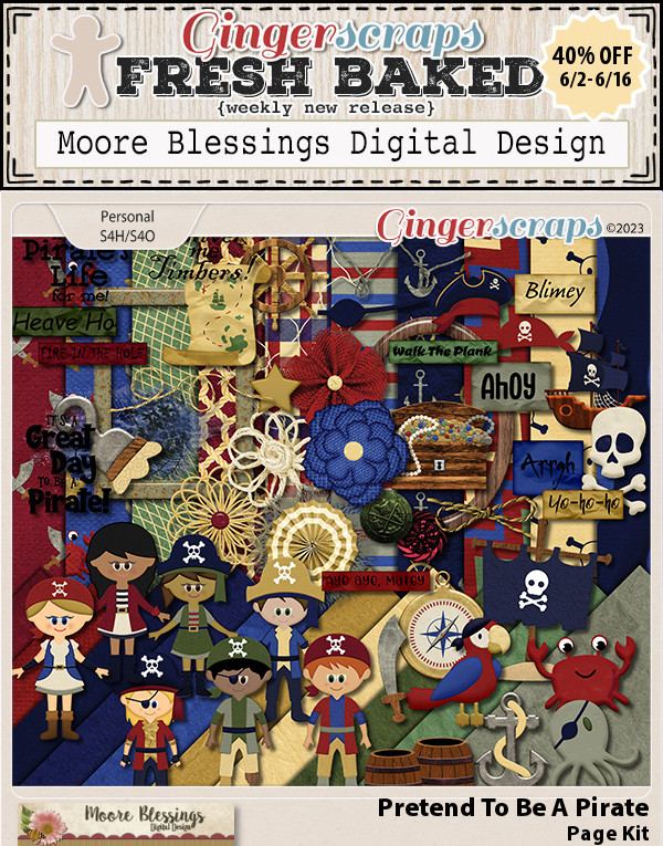
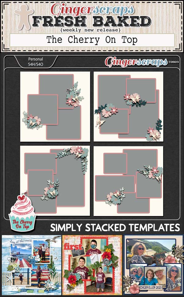
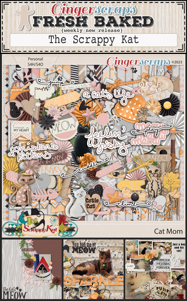
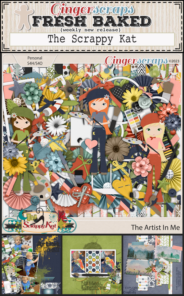
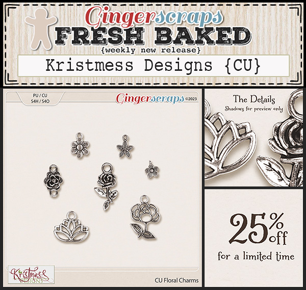
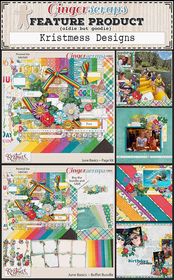
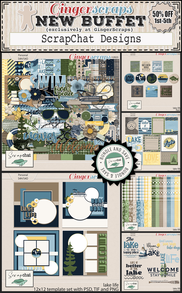
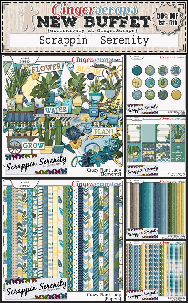
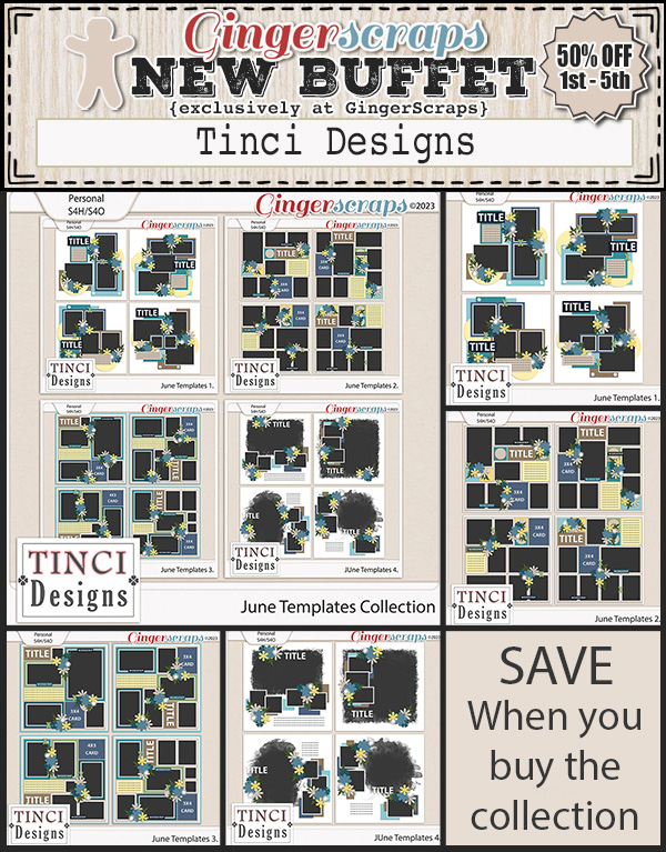
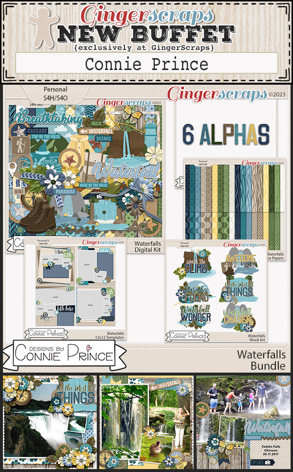
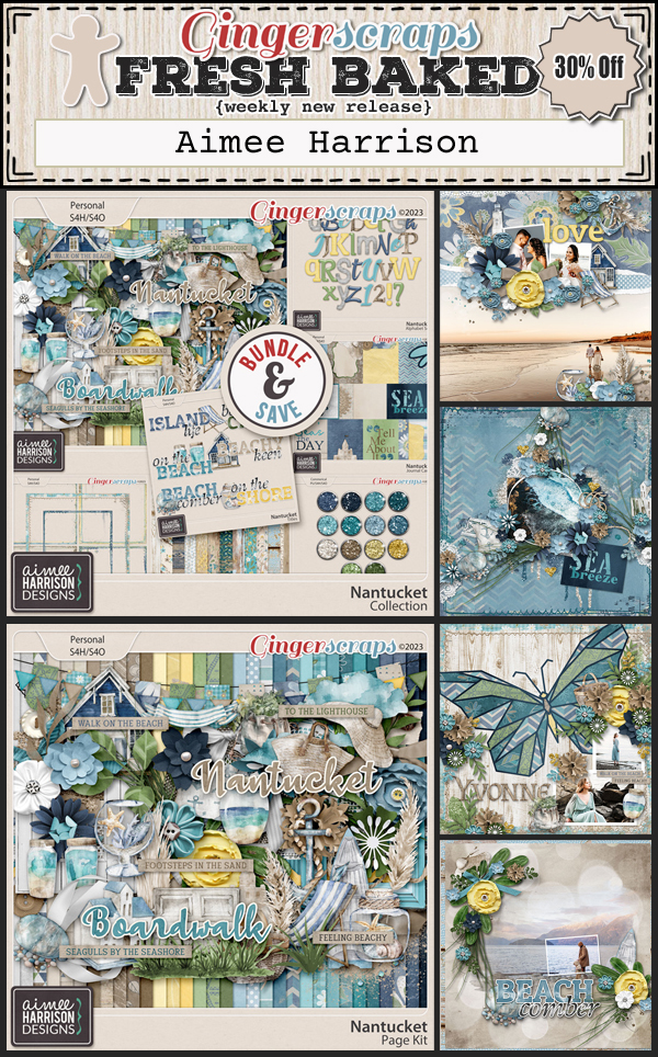
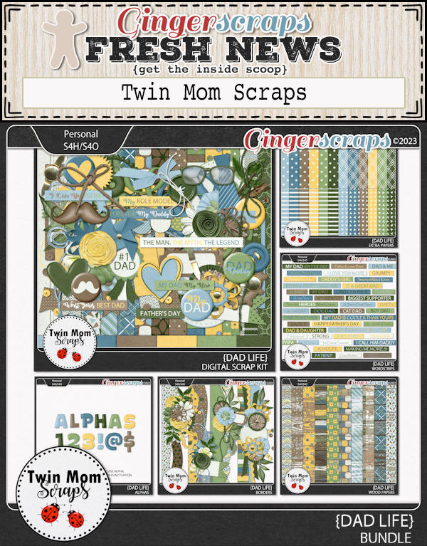
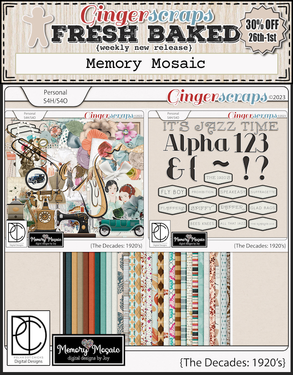
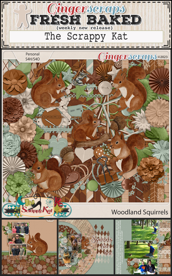
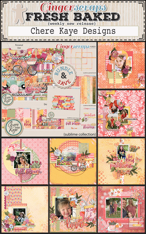
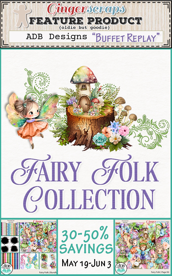
Let’s see what our deisgners have for us this week!
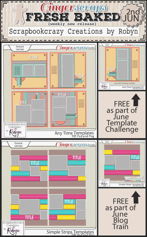


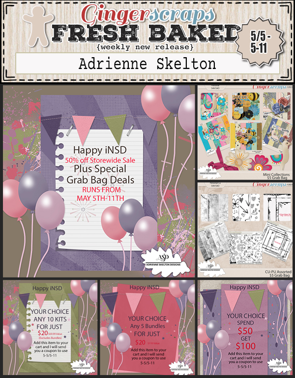
Don’t forget to work on those challenges. This kit is yours as a reward if you complete any 10 challenges. I just love these colors.


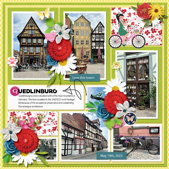


") ” Jen commented she likes to have lots of journaling on her layouts, and that her favourite papers or cardstock are the lighter, more neutral papers.
” Jen commented she likes to have lots of journaling on her layouts, and that her favourite papers or cardstock are the lighter, more neutral papers.