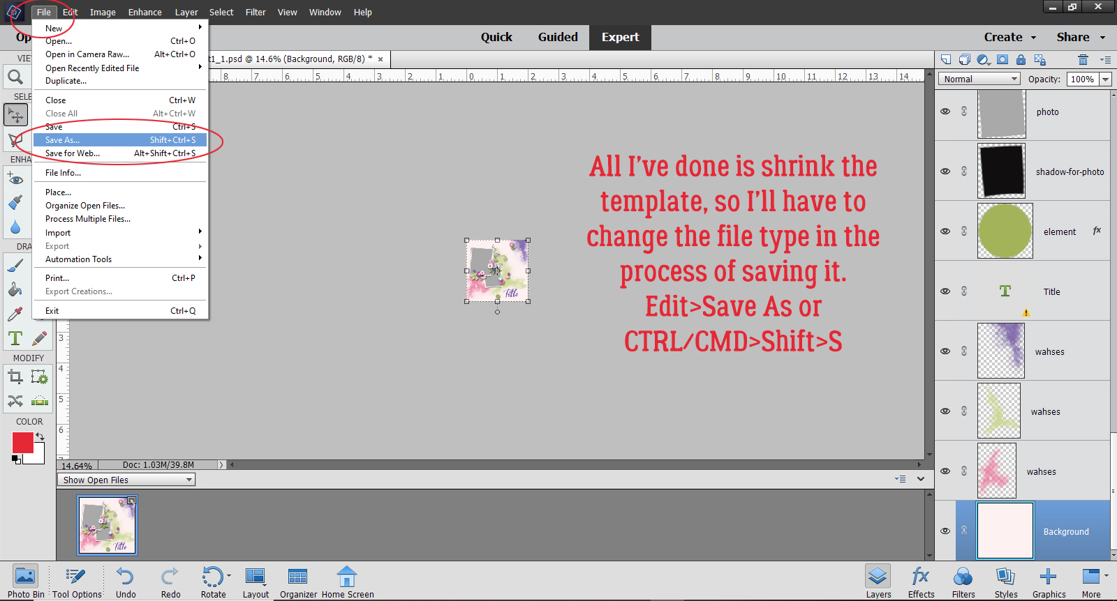
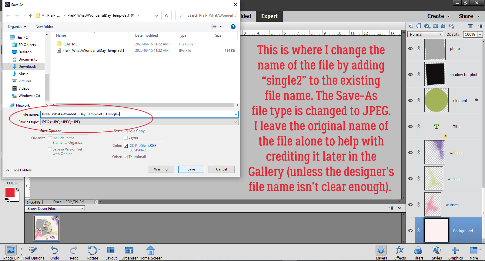
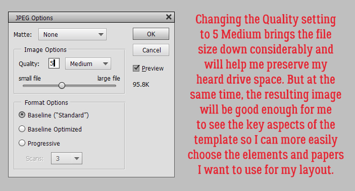
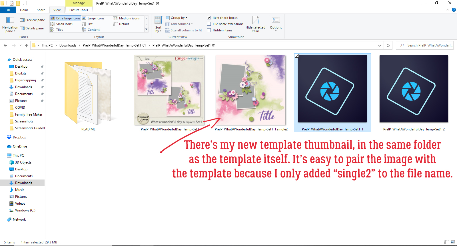
Customizing Template Banners
![]()
First, I want to thank all the GingerScrappers who reached out with kind thoughts and prayers for my Dad. I can’t tell you how much they were appreciated and how much better they made me feel. I wish I could say he’s back to normal but he’s back in the hospital and will be there for the foreseeable future. He’s in the safest place he can be for right now and although he’s not happy about it, he’s accepted it. And life will go on.
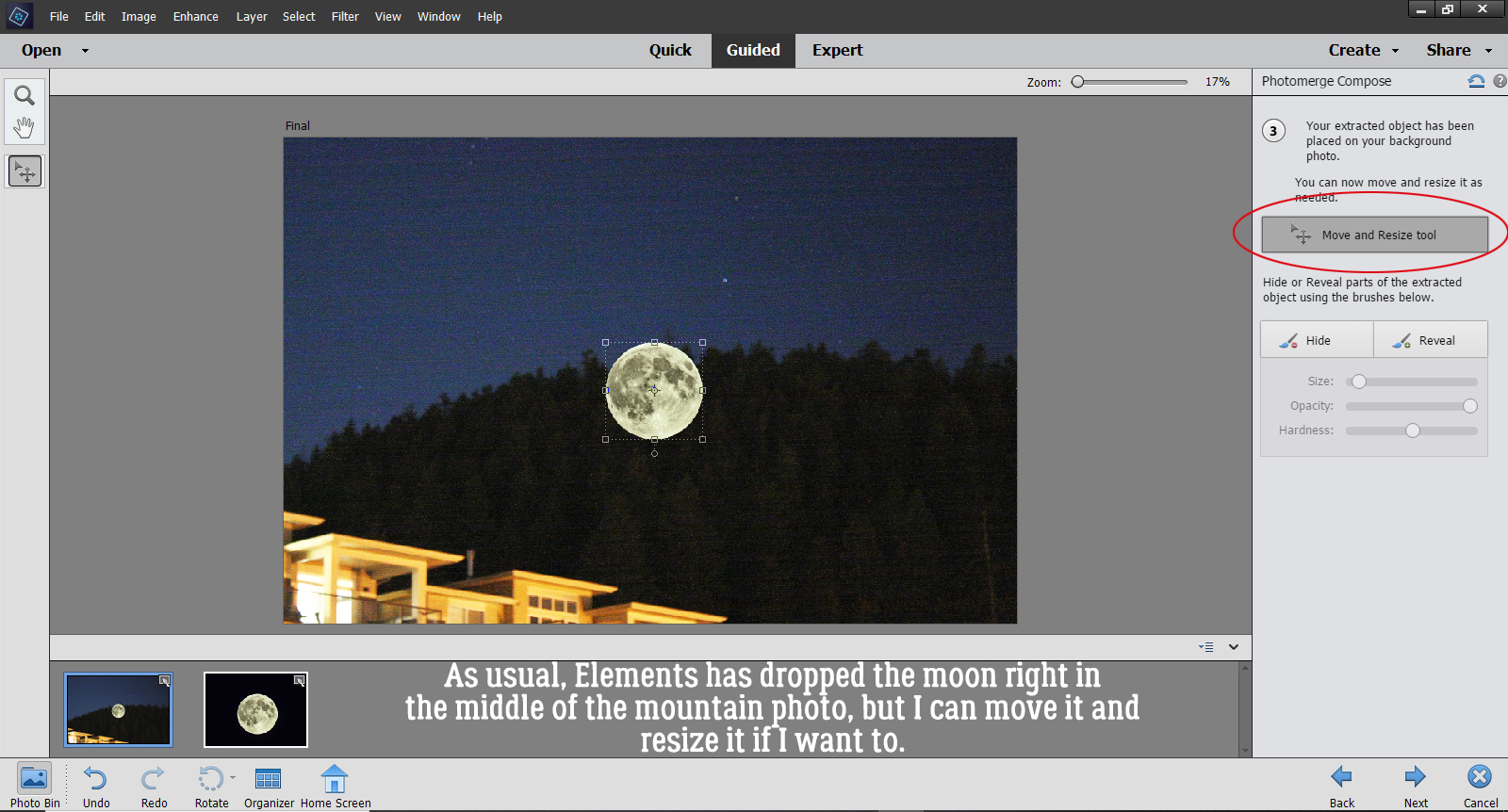
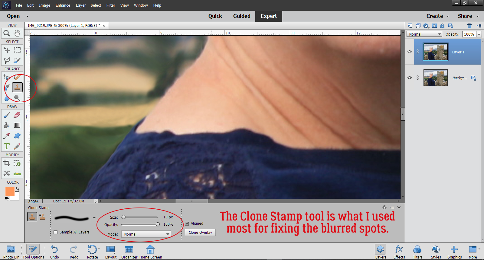
I got a request from Bernice (bkasko) about making banners look more realistic. “I would love help with making a banner look more real. I am not talking about the shading on the banner flags even though help with that would be great but on the top of the banner where it meets the string. I have tried the dodge and burn tool and I just cannot get the look I want. I saw an action that unfortunately only works on the banner that the action makes and it looks like a blurred line is made but I could not duplicate it. I would love help with making a banner from a designers kit look more real or even a banner in a template that I add my own papers to. Thanks.” I wasn’t totally sure I understood what she was asking so I asked her some questions. Her response: “I have an action that will make a banner for me and I really like the shading on it and would like to be able to create the shading that it does either on a banner that comes in the kit I am using or sometimes a template has a banner on it and I like the placement of that banner so I would like to use it.” So I settled on this.
I looked through my stash and found a Connie Prince template in a retired Triple Threat pack that has a banner and would work with some of the photos of my grandkids I’ve been saving up for layout creation. This is the one I chose.

The first thing I did was select the kit I wanted to use and gather up an assortment of papers from it. Then I went through the template and turned off visibility to all but the banner and background paper layers so I could see clearly what I was doing… and so could you! To clip different papers to the pennants on the banner, I’ll need to separate them from each other and set them up on their own layers. So I’m using the Rectangle Marquee tool to select each pennant and will start on the far left.

To detach the pennant from the banner, Edit>Cut (CTRL/CMD>X) works well.

It’s gone, but it’s not gone-gone. Elements is hanging on to it for me, I just can’t see it. To bring it back, Edit>Paste (CTRL/CMD>V) does the trick.

The neat thing is that although Elements drops it right on the centre of the workspace, it’s exactly the same size and positioned at the exact angle of the original, so sliding it into place is simple. See it over there in the Layers Panel? This process is repeated for each of the triangle pennants across the banner.

This image shows what I was looking at on my workspace several pennants down the road. Each of the pennants I’ve Cut and Pasted are back in line and on their own layers.

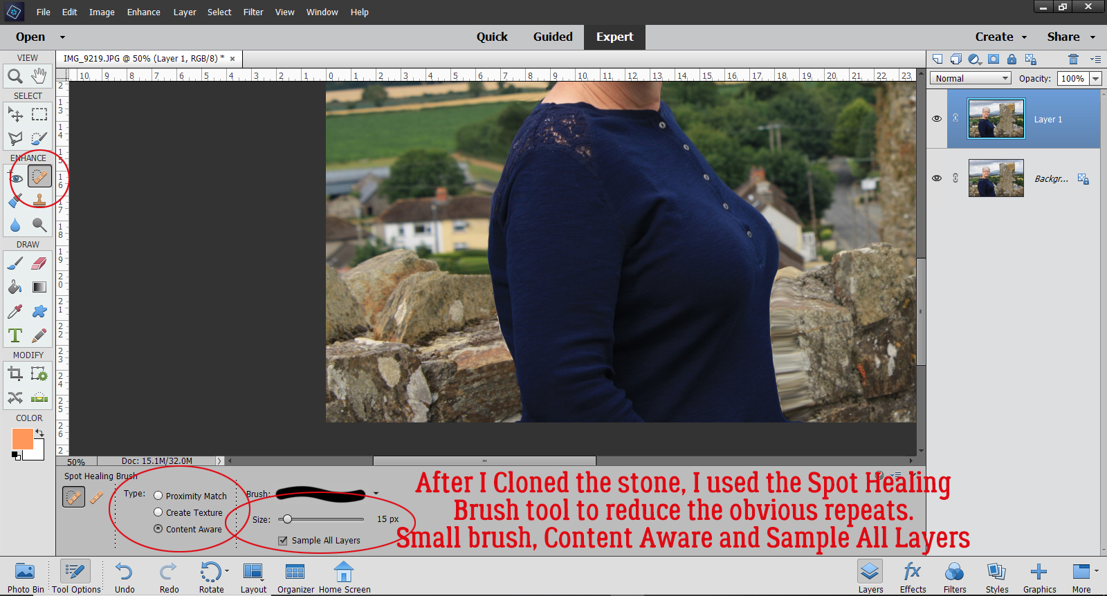
After all the pennants have been separated onto their own layers I can use them as Clipping Masks for my papers. The kit I’m using is also a Connie Prince creation called Sense of Wonder. (It’s not available at GingerScraps yet, but should be here soon.)

The pennants are small and the patterns on some of these papers aren’t, so I’ll Resize and Rotate them to give a pleasing look. This can be done before or after you’ve clipped the paper to the object under it.

Now to Clip the paper to that pennant. For those who aren’t sure what I’m talking about, Clipping a paper or photo to a shape underneath it “cuts” the paper or photo to conform with the shape. There are two ways to do this: Right-click on the paper layer and select Create Clipping Mask from the dropdown menu, or use the keyboard shortcut CTRL/CMD>G (for Elements versions up to 14) or CTRL/CMD>ALT>G for versions 15 and up.

Here I’m showing how I Rotated the paper so the arrows line up with the pennant better. I just clicked on one of the little square “handles” on the outside edge of the paper and moved it in the direction I wanted it to go.

I followed the same steps with each of the pennants across the banner, using the same paper twice in some instances.

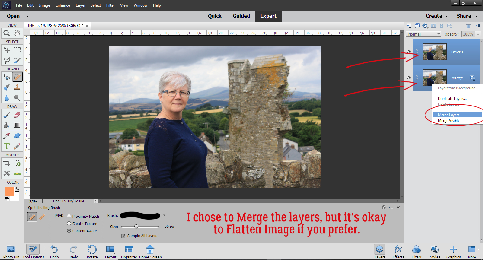
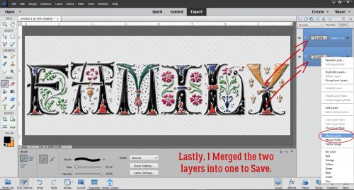
Once I had all the pennants Clipped to papers I went through the Layers Panel and Merged the papers with their pennants. I did this to make managing the banner and working through the next series of steps easier. But I’m not going to Merge all the pennants together because I’m going to use one of the Warped Shadow techniques from a previous tutorial to customize the way each looks based on what it’s sitting on when the layout is done. Merging layers can be done in two different ways. Select the layers to be Merged (hold down the CTRL/CMD key and click on each of them) then Right-Click, choosing Merge Layers or use the keyboard shortcut CTRL/CMD>E.

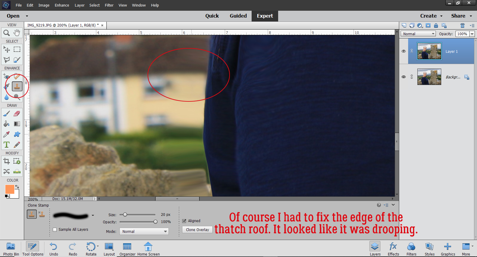
After each paper and pennant have been Merged, it’s on to adding some dimension, to make it look like the pennants are wrapped around some string. I’m going to start at the far left and work to the right, but you do it whatever suits you. For these steps, Zooming in will make it easier.

To simulate the look of paper-wrapped string, we’re going to use the Dodge and Burn tools. These tools are digital versions of good old film photo printing techniques to spot-correct exposure. When printing an old-fashioned paper print, the developer can lighten up areas that are too dark in the original contact sheet image by Dodging – holding a piece of paper or an actual dodging tool over the area that’s too dark, moving it continuously to prevent demarcation lines around the edges, between the enlarger and the photo paper, decreasing the amount of light that hits the paper. Yes, it’s just as much work as it sounds, and I never got good at it. The Dodge tool in Elements has an icon that looks just like a Dodging tool! Burning, conversely, darkens areas that are too light with a similar technique but this time using a larger piece of card with a hole in it, moving the card between the enlarger and the paper over the area that’s too light to allow more light to hit the paper. Here, the Burn tool icon is a hand with the thumb and fingertips touching. They’re are very labour-intensive processes and totally a trial-and-error thing. I wasted so much paper back in my film days! Aren’t you glad digital is so much simpler?? And that your faithful Obijan does the trial-and-error stuff for you! Let’s get to it!
First I want to show you the way I’ve set up my Preferences for Cursors. The next part will make more sense to you if I show you.

Starting with the Burn tool, using a 9 pixel round brush on the Midtones, and a 45% exposure, I put the intersection of the crosshairs right on the upper left corner of the pennant. (You don’t have to be super-precise for these steps – the cursor can start somewhere off the edge of the pennant, because the only layer this step will actually affect is the pennant itself. But this Burn process has to be at the very edge.) Click at that corner then holding down the Shift key, move the cursor to the opposite, upper right corner of the pennant and Click again. You’ll see a faint but noticeable darkening of that edge.

Then I changed to the Dodge tool, set to Midtones, 15 pixels and 45% Exposure. I’ve positioned the cursor with the top edge of the brush tip at the upper edge of the pennant. Again, Click, Shift, move, Click. This step lightens up the area it covers. The effect is pretty subtle but once the last step is done, you’ll see quite a difference.
Just a word about the settings I’ve used. They’re right for the scale of this banner. If I was using bigger pennants and creating a thicker string, I’d go with a bigger brush for both steps, keeping the ratio roughly the same.

Flipping back to the Burn tool, oh look! The settings are still the same as the ones I used for the first Burn step! Isn’t that just perfect?! I don’t have to remember them, Elements does it for me. Knowing this makes the rest of the process look a lot less daunting. I’m again going to put the cursor on the left side of the pennant, with the top edge of the brush tip at the edge of the lightened area. Click, Shift, move, Click.

Now that I’ve done a couple of the pennants, I think it really looks like there’s some string in there.

Using the same three steps, I worked my way all across the pennant and down the Layers Panel until all the pennants have been wrapped around my imaginary string.

The effect is more obvious on solid papers and those with smaller patterns, but when you look at it as a whole, it looks pretty realistic.

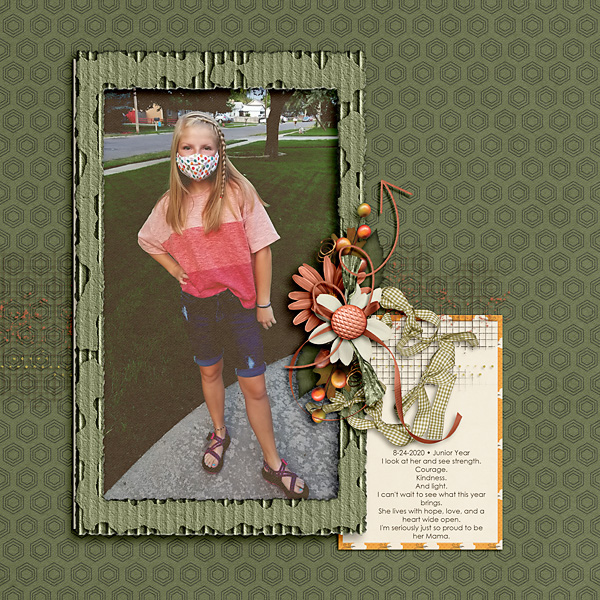
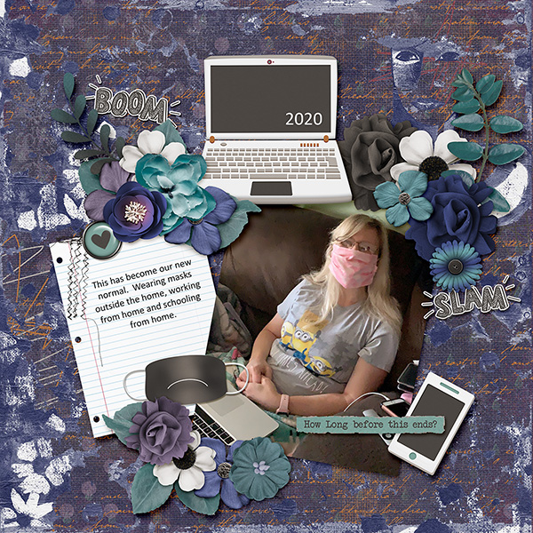
The ends of the banner will be hidden behind other embellishments on my layout so I’m not worried about having tails on my “string”. If you’d like to see my finished layout, you can find it here.
Well, that’s a wrap for this week! Thanks for the suggestion Bernice. I had fun doing this for you. I hope it’s what you were looking for. If not, I can try again another time.
![]()