Standing Out in a Crowd
![]()
Last night (before I was side-tracked by a bunch of genealogical records) I was thinking about creating a layout for this month’s first Template Challenge. I love template challenges – they couldn’t make scrapping easier! And of course, who doesn’t love free stuff? But on the wings of those thoughts, I found myself pondering how to make MY layout stand out from the rest. When everybody is working from the same template, it’s easy to end up with something very similar to all the others. So that led me to have a look at the layouts already completed and posted to the Challenge thread to see how others have made their layouts unique. And I’m going to show you some of those examples today.
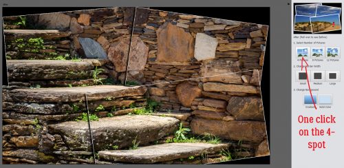
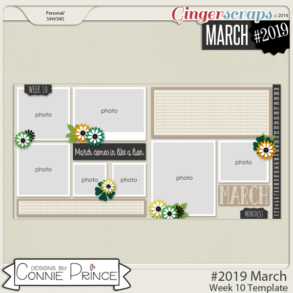
First, let’s look at the template Dagi has created for this challenge.

It’s got so much potential!!
This first layout, by basicbear2, has been rotated 180° and she’s spread that cute photo of the boy with the tube over the blended photo spot and the one with the frame. The other cool technique she used is to clip a paper (the rubber duckies) to one of the painted areas.

Next, let’s look at this lovely one from JeannieK. She’s left the template in its original orientation, but by clipping that daisy-floral paper to all the painted areas, securing her photos with the large daisy and adding both the gold paper around the edges and the blue-triangle border, she’s changed it up into something quite lovely.

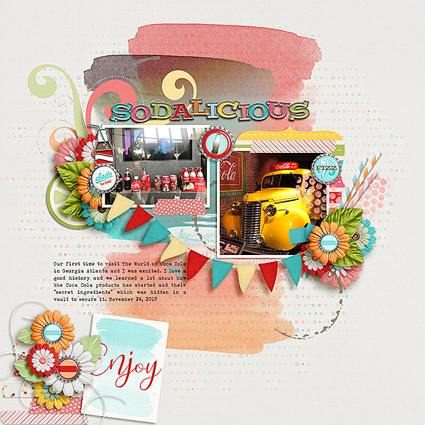
CherryLej has tweaked the template a lot! The gorgeous watercolour areas elevate the background of her layout and I love the way she’s tied the photos together with the pennant banner. She’s substituted washi tape for the wordstrips, created a matching frame for her square photo and added in a beautiful cluster. Stunning!
knclark has used repeating images to great effect here by clipping a blue paper with puffy white clouds to the painted background in such a way that it blends right into her photos. The sun-and-clouds cluster is the cherry on top.

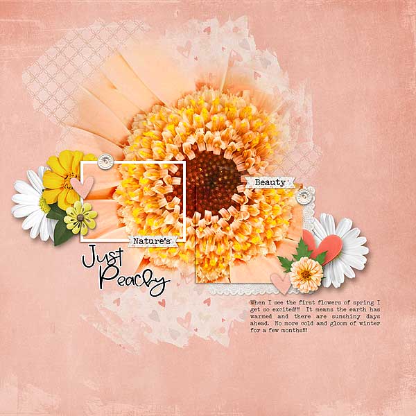
Pixel Palette has shifted the photo spots around to allow more of her large photo to show.

Keevs has added several papers to her background, popped a stamp into the upper left corner and shifted one of the photo spots to reveal more of her large photo. By really subduing the paint in the background she’s changed the look of the template in a most pleasing way. And all that texture!
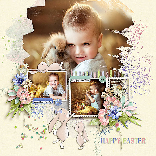
jirsev has a fantastic take on the template here, where she’s made the blended photo much larger, she’s added a lot of texture to the background and she’s emphasized her smaller photos with her choice of elements.
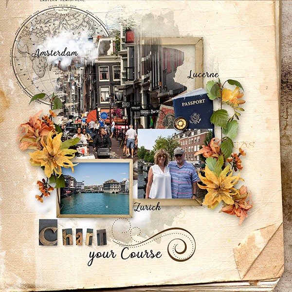
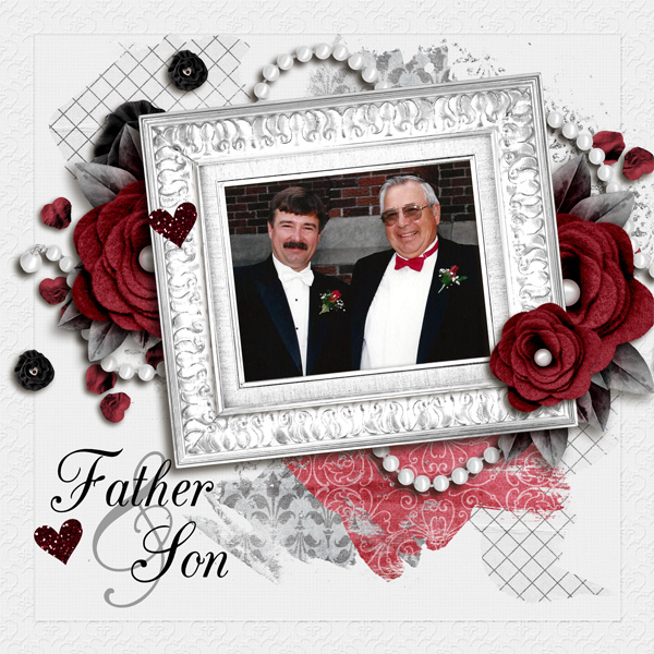
This masterpiece is by kabrak1207. It’s impressive how she’s spread her photo over all the photo spots and accented it with the papers clipped to the painted spots.
gmae has taken it a long way from ordinary here, keeping only the painted areas and the general placement of the clusters and title.
As you can see, there are so many ways to make a template look less cookie-cutter and more work-of-art. Now that I’ve completely intimidated myself, I’m off to see what I can do to create something special. Will you join me?
![]()