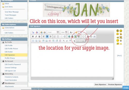
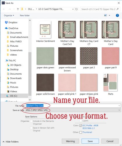
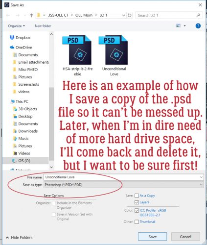
Still MORE Fun with FONTS!!
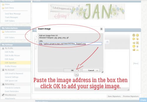
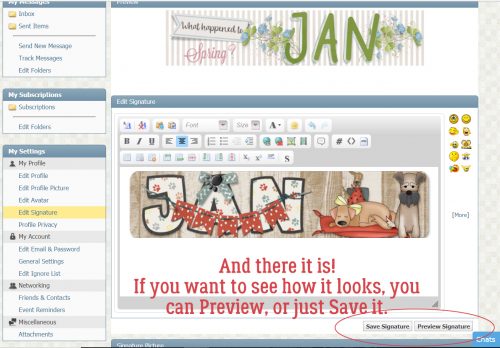
![]()
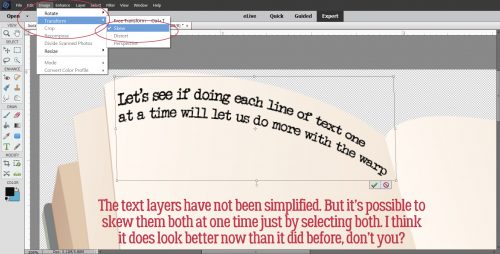
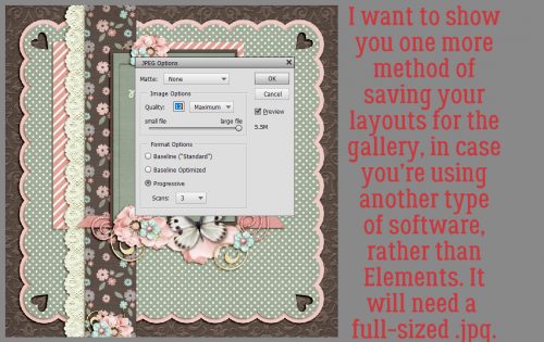
We’ve done a lot of cool things with fonts, but I know there are still so many even cooler things to try. Last week I bought a new font bundle from The Hungry JPEG, a selection of vintage fonts for a smokin’ hot deal. It’s not as if I’ll ever have too many fonts, right?
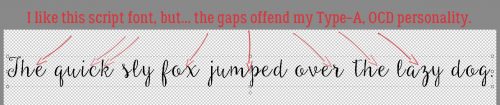
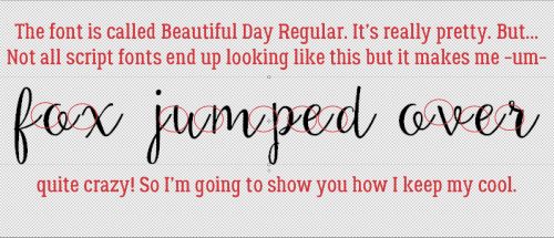
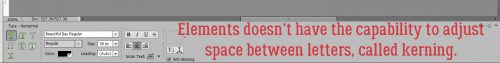
Anyway, while I was downloading these fonts, several of which were actually font families, I looked at the samples the site uses for advertising and it hit me… Why not try layering two fonts from the same family and see what happens? Font families are a collection of very similar fonts with some subtle differences; there may be a regular, a bold, a light, an outline, a grungy and an italic version, for example. This tutorial was fun for me, because I really didn’t know what it would look like when I was finished, but the idea was firmly in my head and I had to try it. I impressed myself so much I needed to widen the doorways. But… it didn’t turn out the way I expected it to. It’s BETTER!
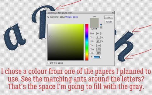
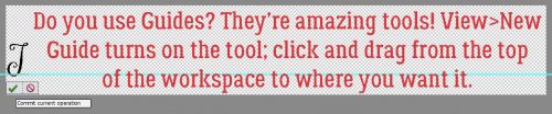
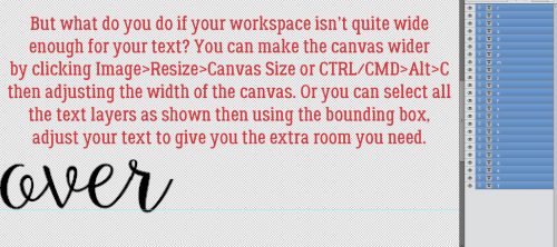
I went through my fonts, using High Logic’s Main Type, to find a font family that would hopefully give me the look I could see in my head. The one that looked most promising is called Nomos, by Cruzine Design. It has several variations on the basic font, so I went with it. I started with Nomos Regular Regular for my basic title. I selected a medium gray to be my starting colour from one of the papers I used in my layout. And I set the size at 100 pixels, knowing I’d probably resize it to fit my canvas. Remember, I usually create my title on its own canvas, sizing the basic working space to approximate the area I want it to fill. No distractions, nothing to work around. So once I decided on my font and colour, I opened a 5 1/2 x 1 1/2 transparent canvas on my workspace.
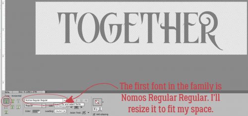
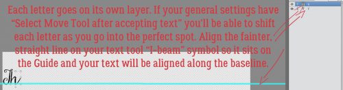
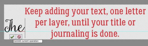
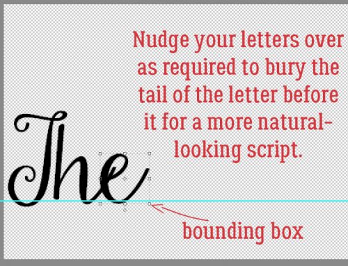
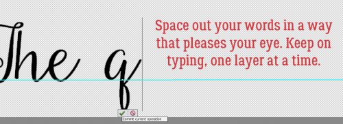
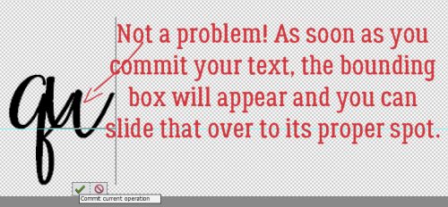
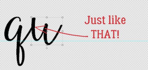
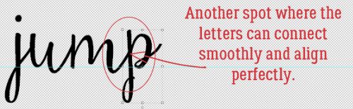
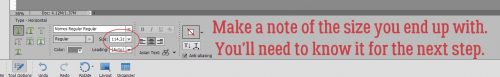
I typed out my one-word title, then resized it to almost fit my space. I made a careful mental note of the exact size of the final font so I wouldn’t have any guesswork for the next step.
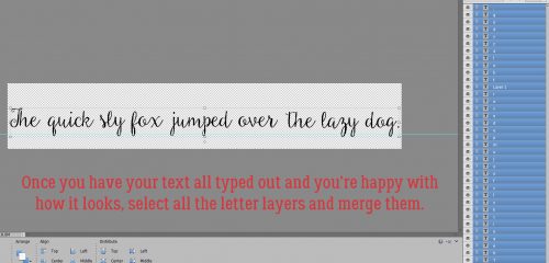
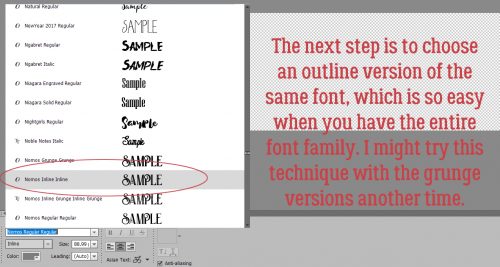
Then I went back to my fonts and chose an outline version of the same font. It’s called Nomos Inline Inline. (I don’t know why the designer used so much repetition in titling…)
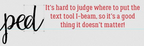
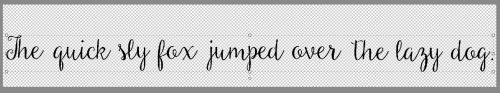
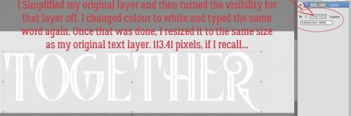
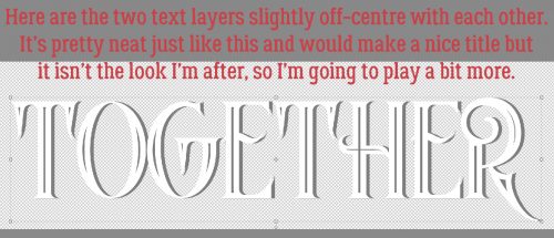
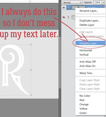
I Simplified the original layer then turned its visibility off. Why Simplify? When working with fonts in PSE, if you DON’T simplify the layer, then select a different font for your next text layer, that first layer will morph to that new font. And you might not notice it until MUCH later and have to go back and fix it. So don’t forget to Simplify once you’re satisfied with spelling, grammar and punctuation. After that, I typed out my title exactly the same as the first layer, only in white this time. And I resized it to the same size as my original layer. Here’s where the people really paying attention can give me the gears. My resized font is 114.31 pixels.
They weren’t in exactly the same place on the workspace, but it looks really cool just like this! If it was what I was after I’d just have gone with it. But I envisioned something more, so I kept going.
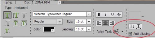
PSA: Simplify your text layers!!
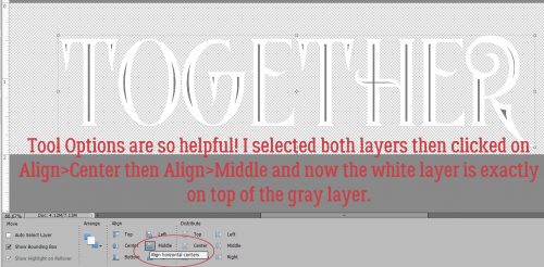
I wanted the two layers stacked perfectly, white over gray, so I used the Move Tool Options to Align the layers, first by Center then by Middle.
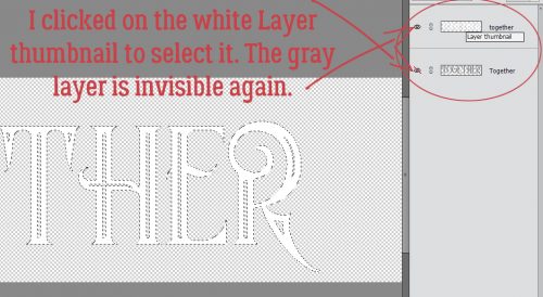
I turned off the gray layer again and concentrated on the white outline layer. I clicked on the Layer thumbnail to select the edges of the letters as shown below.
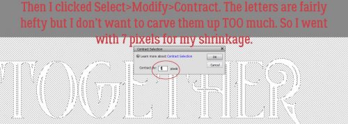
I want the white sections to be thinner so more of the gray shows through, so I clicked Select>Modify>Contract. I didn’t want to lose too much, so I went with a single-digit shrink of 7 pixels.
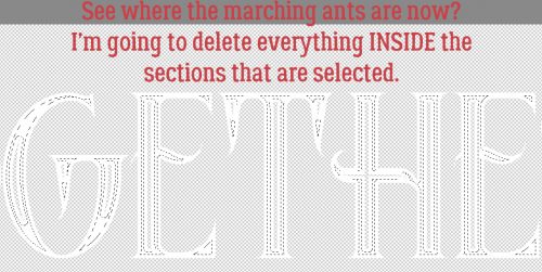
If you look closely you can see where the new lines of marching ants have appeared. I’m now going to DELETE those sections. CTRL/CMD>X
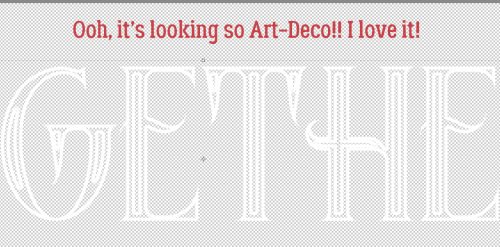
Ah! Not exactly what I was expecting, but really, really neat!
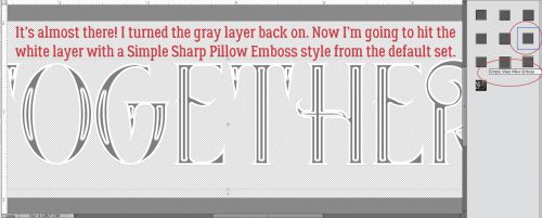
I couldn’t wait to see what it looked like with the gray layer on. I wanted to add some dimension to the white layer, which I did by using a Simple Sharp Pillow Emboss bevel style, one of the integrated styles the software comes with.
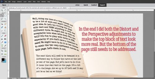
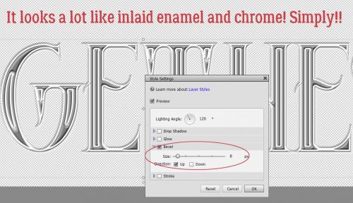
It looked really good, but just a little TOO… too. Easily fixed by adjusting the bevel settings.
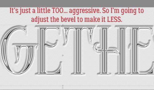
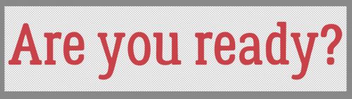
I clicked on the fx icon on the white layer and made the bevel much smaller. I think it looks like inlaid enamel and chrome, don’t you? Now I’m itchy to try this with other fonts and see what different effects I can achieve just by layering two fonts. Who knew it would be so much fun?
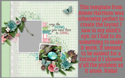
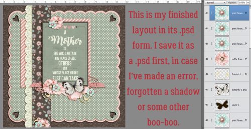
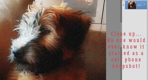
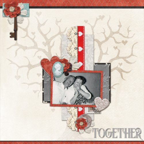
Here is my finished layout. It’s for the Designer Spotlight Challenge this month and was created with pieces of 3 kits by Connie Prince and a template from Trixie Scraps. The people in the photo are my grandparents; it was taken in the summer of 1961. By the following Easter he was gone; this is one of only 2 photos I have of him where he doesn’t have a cigarette in his hand. I see a little bit of my dad in each of them, and my sister’s eyes crinkle in the same way Grandma’s do. I’d never noticed it before, so this was a labour of love.
![]()