UNZIP Me Dahling!
![]()
I don’t know about you but I will never have too many digikits!! But being a digikit hoarder has its downside… All those kits have to be unzipped and organized. Who has time for that? And then there’s National Scrapbooking Day (well, more like NSWeek!) coming up in no time, with all the fantastic new products it brings with it. That you’re going to want to play with right away. What to do, what to do?
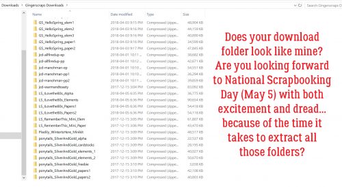
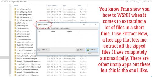
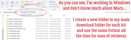
I’ll be the first to admit that my downloads folder is a mess. I’m trying to develop some better work habits, and keeping on top of unzipping is one thing that would really make a difference. So I’m going to show you a terrific app I found that lets me unzip multiple files with only a few keystrokes. It’s called Extract Now (clickable link) and it’s FREE! I work in Windows, but there’s a Mac version too. I’m guessing it’s similar in layout and behaviour, but I can’t say that for sure. I’ve tried a few others, one of which carried a virus… and this is the one I liked best for its ease of use. It’s on my taskbar now for ease of access. The menu looks like the image below.
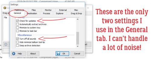
There are several ways you can customize the performance of the app. I don’t use a lot of them, but the ones I do use include letting it check for its own updates and turning off the sounds. I’m surrounded by noise all day every day (if you’ve ever been on an intensive care unit, you’ll know what I mean), so I don’t want a bunch of added noise in my environment if I can turn it off.
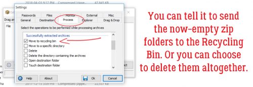
In the Process tab, you can tell it what to do with the zip folders after they’ve been extracted. At first I had the app delete them as soon as they were extracted, but I had to retrieve some stuff and now I manually delete them.
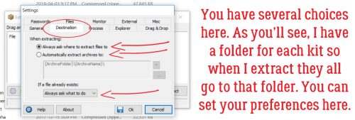
This is where Extract Now really shines. You can designate exactly where your unzipped files are sent by using the Destination tab. I had it set up to extract everything into a Downloads subfolder, but found I left things in there forever and eventually forgot about them. The Help button is really useful at showing you how to customize the app for your purposes.
I create a new folder for each kit I’ve downloaded. If you’re into keyboard shortcuts, hit CTRL/Shift>N (Windows) and you’ll have a new folder you can call whatever you want.
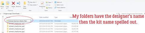
Over the years I’ve refined how I manage my digikits. They all go into their own folder, which later becomes a subfolder within my store folders. I name them all with the same format, designer’s name and kit name spelled out in full. That makes it so much easier to find what I’m looking for later, and it helps too with credits when I post my layouts to various galleries.
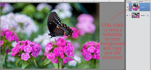
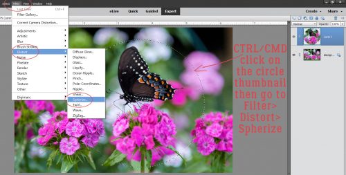
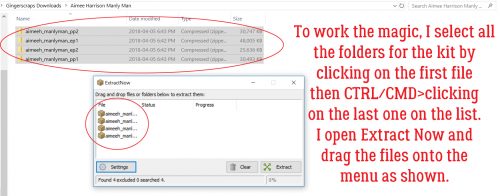
I select all the zipped folders for each kit by clicking on the first one on the list, CTRL/CMD>clicking on the last one and voilà!! Then I can open up Extract Now and drag them onto the menu.
When I click on Extract, a submenu opens asking me where I want the files to go. This is when I find the new folder I’ve created for the kit in my Downloads folder and click on it.
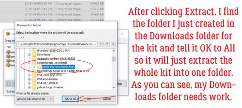
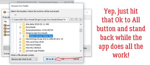
Click on OK to All and the app goes to work.
You can watch the progress as your files are extracted. When all the files are successfully unzipped, you’ll see green check-marks next to each one and there’s a new button activated at the bottom right. Click on Clear and all the files are removed from your app workspace. I can extract several dozen files in a matter of a couple of minutes with this useful tool.
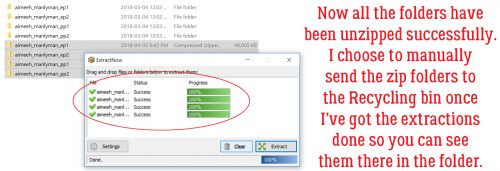
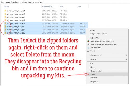
Like I said, I choose to manually delete the zipped folders from my kit folder, which is super-simple because they’re all still selected. After I minimize or close Extract Now, I only have to right-click on the selected files and choose Delete from the menu.
We all have much better things to do with our time than extract one file at a time, right?! Give it a try and see what you think. (You can always remove the app if it doesn’t work out for you.) May 5 will be here before we know it. Now go get your scrap on!
![]()