Tutorial Tuesday (Photoshop Elements)
Quick Trick: All-in-One Alphas

PDF Version : https://bit.ly/4bl74QA

January has flown by! It’s already the last tutorial of the month. Whew!

Susan asked for a tutorial on using those all-in-one sheets some designers provide with their alphas, and it just so happens that topic fits nicely into the Quick Trick deck. Now, I don’t use them, as a rule; I typically delete them and keep the individual letter files. But then, I’ve got a ton of hard drive space for that, and I know not everybody does. However, when I ran a search through my GingerScraps kits, I found more than one folder that had the all-in-ones inside – the only form of the alpha(s) provided. So I was set to get this tut out to you.

For my sample, I’m using this pink striped alpha from the GingerBread Ladies Summer Treats collab.

Once the all-in-one is in your Photo Bin, I recommend opening a New Project/canvas [CTRL/CMD>N] to create your text in a clean, no-distraction space. I have several presets in my Elements bag of tricks, including this one, a Title Strip 6 inches wide and 1 1/2 inches tall.

So on to the actual task at hand. Open up the all-in-one and using the Rectangle Marquee Tool, draw a box of marching ants around the first letter you want to use.

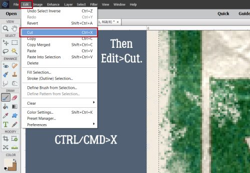
Now click Edit>Copy or use the keyboard shortcut CTRL/CMD>C.

Flip over to your blank canvas. It will show in your Photo Bin, as well as in the strip across the top of the Elements workspace. Click Edit>Paste or use the keyboard shortcut CTRL/CMD>V. (They couldn’t use P because that’s already in use for Print. 😉 )

And there’s your first letter! It’s just that easy. Follow the same steps to add the rest of your letters. If you’re reusing one or more, you can always use CTRL/CMD>J to make a Copy right there, rather than going back and forth between your all-in-one and your text.

Each letter you Copy and Paste in this manner will be the same size. Once you’ve got all your letters on the canvas, they’ll need to be organized and distributed, because Elements dumps EVERYTHING in the centre of the canvas, and not always in order. When you’re happy with it, you can Link or Merge [CTRL/CMD>E] all the layers so you can move the whole text box onto your layout. Then you can treat it as you do any of the embellishments you add to your layouts. Easy peasy!

I’ll be back over the weekend with the February Designer Spotlight, so stay tuned!

Tutorial Tuesday (Individual Style)

Making Multi-photo Layouts Work

PDF Version : https://bit.ly/42fFbp4

Last week I threw out a “tutorial-writer-needs-topics” plea at the end of the Challenge Spotlight. In the comments, lisar threw a couple of topics back. (For one of them I need some clarification.) “I don’t remember if you’ve done one on a gazillion photos on a page…” As someone who tends to want to scrap single-photo layouts, I’ve discovered I actually have quite a lot of multi-photo (but not quite a gazillion) layouts that turned out quite well. So that got me thinking. What makes a good multi-photo layout? So today, I’m going to pick apart a dozen of my own layouts. Brace yourselves!

I started off thinking about what I consider to be “multi”. Four photos are easily scrapped within the constraints of a 12×12 or 8.5×11 canvas, five only a little less so. That led me to only looking at layouts I’ve created with six or more photos. What became immediately apparent was that the photos I used for each had something in common. A theme, if you will. Some of them were taken on the same day, some of them were taken on different days but were linked in some way, some showed a progression.

Let’s start with this six-photo layout from my 2013 trip to Boston. The theme of my photos is the Boston Marathon bombing. Because we were there only 5 weeks after it happened, it was very much front-of-mind; the blast area was still filled with memorials. Rather than focusing on tragedy I looked at resilience. I chose a template designed by Dagmar Krupalova (who no longer has a shop at GS) because I could fit in all the memorial images I had. The photos are roughly the same size so no one image is the focal point. With the photos arranged in a loose circle gave me room to journal about the event and its aftermath.

You may have seen this layout here on the Blog. The photos are a mélange of images from my two trips to Ireland. They were selected to coordinate with the blessing I chose as my theme. The largest photo reflects both the iconic Celtic cross found everywhere on the island and my Irish Catholic ancestry, the others the beauty of the country. I used a Miss Fish template from her Travelers Notebook V.9 pack.

This layout is built on a Neia Scraps template from Enjoy the Moment V.10 (retired) to commemorate Maeve’s first week with us.  I liked it for this layout because I could have a large photo of my husband holding her the moment she became ours. The smaller photos offer glimpses into her personality. The way they overlap the large photo lets me conceal some background that isn’t interesting. Neia has quite a selection of multi-photo templates that I encourage you to check out.

My last six-photo layout for today is another travelogue with a mariner theme; the photos were taken by my sister who took a 3 week-long driving tour through Canada’s Maritime provinces. I used LDrag Designs‘ May 2019 challenge template because it has large photo spots in both landscape and portrait orientations. That let me crop the photos to keep the important elements of each. I like the asymmetry of the photo spots too. Lina likes journal cards but I tend not to use them, so I swapped them out for journal spots; there was lots to say about this fishing village. At the end I’ll talk about photo and template selection a bit more.

I have a couple of seven photo layouts to dissect next. My “celebration” of Orangemen’s Day in Northern Ireland was memorable for several reasons. The things I saw that stayed with me are a metaphor for struggle. The churches in the village of Derrylin are one kilometer apart at opposite ends of the main road and are starkly different in design. St Ninnidh’s (Catholic) is smaller and plainer than Holy Trinity (Church of Ireland/Protestant). The village is much closer to the Republic of Ireland than it is to most of Northern Ireland, which may be why there’s a visible Catholic presence in the village. Enniskillen Castle was the garrison for English soldiers and looks more Scottish than Irish; it represents the Plantation of Ulster in my mind. Okay, enough history. That’s not what we’re here for. I chose this template for the pocket-scrap organization. Each photo is quite separate and the eye moves around the page easily and it has a big spot for storytelling – which could easily be replaced with another photo.

I like the different photo spot shapes so much better than I like some of my hairstyles in these photos. I used a template from  JBStudio‘s Put It All Together V.1 that I rotated a quarter turn to the left which gave me lots of room for the quote I wanted to use as a subtitle.

Now let’s do some eight-photo layouts. The first two are a sort of diary looking at the same topic from slightly different perspectives. The first was built on a Dear Friends template now retired. The basic grid style works well to provide continuity and the varied sizes of photo spots let me show the details of each.

Its counterpart is more venting than art. I was so glad to see the last of the porta-john! The template I used is one from Tinci Designs Autumn Stories V.1. I replaced the journal card with a photo. The symmetry of the template echoes the symmetry of the new houses being built and shows the haphazard placement of the porta-john so clearly.

Another eight-photo layout captures the horror of Ronan Gillespie’s Famine Memorial in Dublin. I couldn’t leave out any of these images. It would have felt incomplete and dismissive. It’s based on another of Tinci Designs Autumn Stories V.1 templates, and again, I rotated it a quarter-turn to the left. I felt it was suited well to the photos I’d chosen; the four small photo spots let me zoom in on the faces of the statues. I moved and rotated one of the rectangular photo spots, moved the circle of paper up and rotated the paper flag to better accommodate my photos so they told a story.

Let’s move away from sad and depressing. I wanted to document the transformation of our new yard from dirt to landscaped. I like the diagonal arrangement of this Pixelily template; it took some fiddling to get the photos positioned so the overlap concealed things that should be concealed, but didn’t hide what should be visible. But it was worth it in the end. Each of the eight photos here lent itself to my story.

And last, I have a layout with NINE photos. It was created for a Journaling Challenge using another Dagmar Krupalova template. The ring-around-the-page orientation suited the photos and having the journaling in the centre added to the effect. I was able to show the significant parts of each photo clearly, despite the number and size of the photo spots.

So what’s the process for creating a multi-photo layout you can be happy with?

  1. Choose your photos first!
  2. Examine each for the parts of them you want to be featured. Don’t get hung up on orientation. Cropping can deal with that.
  3. Think about the story you’re trying to tell.
  4. Look for a template that will tell your story with the photos you want to include. If you’ve organized your templates the way I do, renaming the preview with the number of photos for easy searching, this step can be a lot simpler than it sounds.
  5. Don’t fixate on using your template exactly as designed. If you find one you like but it’s short a photo spot, look at how you can add one in. Similarly, if you like one but it has too many photo spots, how can you remove the extras? Can you make each spot slightly bigger? Can you combine two spots into one? Substitute journaling for a photo? This applies to photo spot orientation too. If you have 4 photos that are in landscape and 3 that are portrait, but the template has 3 portrait and 4 landscape, rotate the template! If other aspects need to be tweaked, tweak them! You’re cooking, not baking; you don’t have to follow the recipe exactly to have something you love in the end.
  6. Once you’ve settled on the basics, you can choose the kit(s) you want to use. You may have already picked a kit, so now you’ll need to figure out how to make all three components work together. This is the fun part.

So there you have it. Multi-photo layouts that tell your story and look great doing it!

If any of you are wondering about the shelves… I finally had them up securely on Friday by suppertime, and I only had to make one trip to Home Depot for better anchors. Sheesh.

Okay, so next Tuesday is the last of January (insert collective groan here) so it’s Quick Trick Tuesday. I’ll be filling a request…

Tutorial Tuesday (Photoshop Elements)

Texture Overlays – Whut?

PDF Version : https://bit.ly/48LXfch

Just before Christmas I had a request from Hilary: “I didn’t know where to stick this so here goes. Can you do a tutorial on the .jpg textured-overlays please? Or an explanation of how to use them? When I try using them all I’m seeing is dark splodges, you can’t see the underneath photo/picture. TIA” Of course I can! But let me start by saying that texture overlays are better suited to applications on paper, and not photos, unless you’re doing a very arty layout. The following tutorial will work with photos, with the same caveats as for papers. The textured overlay I’m using in my samples is from Karen Schulz‘s  CU Textured Overlays V.01. (CU stands for Commercial Use, meaning the item can be used by designers and others without crediting the original designer. This is in contrast to Personal Use (PU), where crediting the original designer is part of the terms of use of both the designer and GingerScraps.)

These Overlays are intended to by adjusted using Blend Mode and Opacity tweaks to achieve the look you like best. As you’ll see, there are infinite combinations which provide very different looks. I can’t show you every possible permutation; you’ll have to experiment a little. Nothing is final until you say it is! In the example below I’ve simply dropped the Overlay onto a solid colour Fill Layer, which in its unadjusted state just looked like “dark splodges”. I changed the Blend Mode on the Overlay to Multiply. Opacity here is 100%. I like it, and might use it as is.

By decreasing the Opacity to 50% the texture is still visible, but much more subtle. For most of the subsequent versions, I’ll leave the Opacity at 50% for comparison.

Color Burn gives a bit brighter look with a slight increase in the Overlay’s visibility.

Linear Burn darkens everything somewhat, even without an Opacity change.

See how Lighten changes everything? The teal is softer, the Overlay is grayer.

Screen lightens and softens everything. I like this version a lot too.

Overlay brings a ton of detail into the Overlay that was less obvious in the previous versions. Note too how the centre of the paper looks lighter and brighter.

Soft Light is very subtle and reads as almost a solid. I would keep this one in my repertoire.

Hard Light brings the detail back, lightens and brightens everything, as you would expect.

Vivid Light is really dramatic! The teal is so much brighter and the detail sharper.

Linear Light maintains the tonal change of Vivid Light, but lightens and softens it all.

Luminosity has preserved the sharper details, while changing the colour only slightly.

Now, let’s look at what happens with a patterned paper. This one is from Ooh La La ScrapsFreezing collection. It’s got a similar shade of teal in the plaid for consistency. Right here, it just looks like it’s been dragged through the mud. It could work for an arty layout just the way it is.

With a 50% drop in Opacity, now it looks more distressed and less depressed.

Switching to Multiply dampens the texture but doesn’t hide it completely.

With Color Burn, the texture all but disappears. The patterned paper does look brighter, though.

To my eye, Linear Burn gives a sort of grungy grease-stained look. Could work!

Lighten gives the appearance of worn paper in the more transparent areas of the Overlay.

Screen completely obliterates the texture and blows out the pattern too much. But… maybe it could be salvageable with an Opacity increase. Remember, I’m just showing you samples. You’re in control of your work.

Overlay isn’t dramatically different from Screen at 50%. Maybe at 25% it might look good. Here’s a tip: use the SLIDER. Watch what changes as you move it. Stop when it looks right.

Soft Light just basically makes the whole image soft and light. Boring…..

Hard Light gives some slight variation in depth, but not really a visible texture.

Vivid Light. Just no.

Pin Light shows more variation in depth than Hard Light. Think of a tiny flashlight shining on it.

Luminosity brings back the grunge.

If we go a step farther and add that solid colour teal Fill Layer between the Overlay – Opacity at 50% – and the patterned paper, a whole other world of possibilities opens up. Color Burn on the FILL LAYER at 100% changes the entire look!

Drop the Fill Layer Opacity to 50% and the texture pops back into view. With the three layers, you can tweak both the Overlay and the Fill Layer Blend Modes for an incredible variety of looks.

As I said many times before, don’t be afraid to play around with your options. It hurts nothing and isn’t permanent unless you want it to be. CTRL/CMD>Z (Undo) is your friend! If you don’t like it, make it go away. When you find something you really like and think you might use it again sometime, don’t forget to Save it. For papers the format is JPG, for elements the format is PNG. Put it somewhere that you’ll be able to find it again. 😉

The new dishwasher was installed on Friday and it’s FABULOUS! Whisper-quiet, gets everything spotless and even gets the plastic stuff dry. Now I just have to pay the credit card bill… Next week is Challenge Spotlight Tuesday. Which Challenge will I choose this time?

Tutorial Tuesday (GingerScraps)

New Year, New Challenges

PDF Version : https://bit.ly/48J0lOv

Hopefully everyone has had a smooth start to 2024. It was quiet for us, and that’s a good thing! Last year’s first tutorial was about resolutions and how those artificial goals are too easily discarded. This year’s first tutorial is also about goals, in a way, and they’re achievable goals! I’m talking about GingerScraps‘ monthly Challenges. They tick a lot of those goal-related boxes. There are some changes to Challenge Rewards, and some brand-new Challenges so let’s dive in.

Effective this month. the Challenge Reward offers some choice. Previously, each month a Challenge Reward collaborative kit was created and for all the Scrappers who completed and properly documented ten (10) Challenges in that month, a link and coupon code for the kit was sent by Private Message to the deserving Scrappers. There were some downsides to that, one being that if there was a Reward kit you really liked but your life interfered with your scrapping, you missed out on it. Those kits eventually turned up in the Shop, but it’s not the same! The opposite could also apply – maybe you didn’t love the Reward but felt obligated to download it anyway. All that has changed. You still have the ten (10) layout requirement, but now you’ll have a choice of collabs! There will still be a new collab created for each month, but you can also look in the newly-added Challenge Rewards section of the Shop for something you might like better. You’ll receive a coupon code in your Private Messages (value $7.00) that can be redeemed for any one of the collabs in the Rewards section.

What hasn’t changed is the ten (10) layout rule. To review, you’re eligible for the Challenge Reward in the month you’ve documented a total of ten (10) Challenge Layouts that meet criteria. (More on that in a second.) For example, in October you complete and document three (3) layouts. In November you complete five (5) layouts. In December you complete three (3) layouts. That’s eleven (11). That eleventh layout won’t be counted, it doesn’t roll over to the next month. So be efficient! Keep track of your layout count so you know where you are. This isn’t as important now as it was when you might miss a Reward you really liked, but it’s still a good idea. Each month a member of the GingerScraps staff verifies and validates the Cookie Jar counts and tracks totals. For your own peace of mind, figure out a way to keep track in your own way. I’m a folder-maker; each Challenge layout has its own folder, and when I’ve uploaded and documented that layout, I add a number in brackets to the folder name so I know where I am. See below… In December, I got 4 layouts done. So when I made my January folder, I put a [4] after the folder name and I know exactly where I am.

Let’s talk about eligibility and documentation a little. For your layout to qualify, it must meet the following criteria:

a) It actually fits the description of the Challenge – such as “include at least 5 snowflakes somewhere on your layout“.

b) You’ve used a minimum of 80% product from a currently active GingerScraps designer. (The product can be a retired one, or one you found somewhere else, but the Designer must still have a presence in the Shop.) As explained in the Challenge Reward System update in the Forum, if a Designer leaves the Shop mid-month, their product is still eligible for the remainder of that month, and only to the end of that month. Another thing to pay attention to… That brings me to credits. When you download a Designer’s product, you literally agree to give that Designer credit for their work whenever you post that layout publicly. The easiest way to do that is to include the information in the description of your layout. One word of warning… sometimes the internet gremlins play with things behind the scenes and when your layout posts, your credits have disappeared. When you’re in the step between uploading your image and actually posting it, you’ll know your credits will also appear if you see them in the description box. If that box is empty, fill it in before you click your final Submit button.

c) Each Challenge requires a unique layout. For example, you can use the template from one of the Challenges to create your All About Me layout, but it can only be counted for one Challenge, whichever one you choose.

d) Your layout must be uploaded to the appropriate Challenge Gallery – there’s one for each of the Challenges within the larger GingerScraps Gallery. Just pick the one you’re adding to from the drop-down menu in the upload screen.

And finally, e) you’re required to track your layouts in your Cookie Jar.

Now for the fun part! There are THREE new Challenges this year!!! That brings the total to thirty-six (36) opportunities to create.

The first of these new Challenges is Documenting Your Life, hosted by Diane of ADB Designs. Diane is, like I am, a family historian in the genealogical sense, and many of her designs reflect that interest. Each month she’ll provide a prompt or two to guide your process.

The second new Challenge is Everyday Memories, hosted by Miss Juli Fish. Each month will bring a new prompt reflecting literally the everyday ordinary parts of our lives that we lose track of. This month’s is “START”.

And the third? It’s the Photography Challenge! It’s hosted by Triple J Designs and the goal here is to learn more about what makes a good photo to build our layouts around. The inaugural principle is “the rule of thirds”, a concept that forms the basis for all truly noteworthy photos.

Challenges are the best way for new digi-scrappers to learn new skills and for all memory-keepers to get those special moments immortalized. Check them out!

Tutorial Tuesday (Photoshop Elements)

Quick Trick: Deselect

PDF Version : https://bit.ly/4aMI2d5

Here we are, on the very last Tuesday of 2023, and I have probably the Quickest Trick I’ve ever shared with you. I’m still in my pyjamas, exhausted from all the Christmas Day busyness, deliberately avoiding all the Boxing Day sales going on. [More about that in a minute.] I’m sure many of you are feeling the same. So without further ado, here’s my Quick Trick for you…

There’s an even FASTER way to Deselect things on your workspace. I know I’m always offering keyboard shortcuts to streamline workflow, and until recently, I didn’t know this was a thing. To refresh, when you’ve Selected something – text, the outer edges of an element for adding Strokes, Styles or custom shadows, an area of a photo you want to tweak… whatever – Select>Deselect is one way to turn off your marching ants. The keyboard shortcut I’ve been giving you is simply CTRL/CMD>D. But wait!!! All you have to do is hit the ESCAPE key!!! That’s it, that’s all!

As promised, I didn’t give you anything long and involved for the final tutorial of the year. Go me! December has been a dumpster fire for me so I’m hoping New Year, New Start, New Nomoredisasters is ahead. I have an Oh-that’s-bad-oh-that’s-good Boxing Day tale for you. On Friday – 3 days before Christmas – the dishwasher we bought brand new when we moved into this house in May 2020 cashed in its chips. Repair Guy came on Saturday and tsked a few times then said, “This is going to be a very expensive repair. I’ll get you an estimate.” [A while later the estimate arrived: >$600.] He put everything back together then said, “If you choose not to repair this one… get a Bosch. Merry Christmas.” Humbug!! Two hours later, thanks to Boxing Day sales that started early, I had a new Bosch dishwasher ordered, with free delivery and haul-away, plus discounted installation. It’ll be here first week of January. Now I’m too broke to shop for anything else. 🙁

I wish all of you a peaceful, healthy 2024.

Tutorial Tuesday (Individual Style)

Challenge Spotlight: Pinterest

Over the last week I’ve spent a lot of time browsing Pinterest in an effort to put myself to sleep. I clearly don’t see the same boards that Lisa Minor, host of our Pinterest Challenge, sees… This image would give me the most crushing anxiety!

This is what she had to say about it: “This pin truly made me LOL! Do you have an office out of the home? Would you just go ‘buck wild and decorate like this? I would “like” to think I just might! This pin says to me “at the office, decoration, going overboard, gingerbread house, Christmas Village and candy” So what does it say to you?” I’m going to let the participants speak for themselves this time.

As usual, the layouts are in the order they were uploaded to the Gallery. Each is linked to its spot in said Gallery, just click on the Scrapper‘s user name and you’ll fly right to it so you can get a closer look, or to leave a comment.

First up is msbrad. I gather her granddaughter interpreted the Pinterest image as a play fort… “She created her own after I showed her the original inspiration photo here.

Next is DianeInOz. Her Pinspiration: “Office party, Santa’s village, Christmas!

Tamsin McAtee seems to be on the same wavelength with me! “Here’s mine.. this is exactly what it says to me, its so busy its almost painful for me to look at, I get really bad sensory overload and this is very overwhelming to me.

I also think pinklily has a bit of pleasemakeitstop! “When I think of people going overboard, the Wiggles comes to mind, so I made this layout.

Grace. posted hers without comment, but she’s taken her Pinspiration from the overall Christmasy theme.

Last we have this one from Jill. “The Pinterest photo brought my local doctors’ centre to mind with all the Christmas doors.”

It looks like I’m in good company being crazybusy right now, given that only 6 layouts have been posted. As you’re reading this, I’m driving home from my parents’ house, a little over 2 1/4 hour drive from my house. I like to make a flying visit around this time, to take them a CARE package containing some Christmas treats and a nice bottle of local wine, as well as to wish my dad a happy birthday (the 21st). Last year the weather didn’t cooperate and it was the second week in January before I could make the drive safely. It was a crushing disappointment!

For those who are interested, my son’s new hospital bed is a huge hit with him! He hasn’t figured out that he can reach the controller yet, so we haven’t found him folded in half or standing on his head. Maybe he won’t notice? Thank you all again for your understanding and grace last week.

If you’re celebrating Christmas, I hope you have enough. Enough time with the ones you love. Enough good food to fill your bellies. Enough opportunities to have some fun. Enough help with the dishes… 😉

If this time of year is difficult for you, I hope you find a quiet place away from the frazzle where you can be whatever you need to be. That you have someone you can turn to for solace. That you have understanding people around you who won’t press you to put on a happy face. I hope you’re comfortable using your scrapping to release some of your anguish. You have support here.

I’ll be back on the 26th with a Quick Trick, but don’t feel like you have to read it!

Tutorial Tuesday (Photoshop Elements)

Realistic Snowy Titles

PDF Version : https://bit.ly/4an7OEw

Well, to be completely fair, I used this technique for my December siggy, but that’s not really any different from a title. Right? This technique will work best with either a simple font or a plain, flat alpha. I went with the alpha from the GingerBread Ladies’ Holiday Joy. It’s a painted kraft alpha and it was perfectly suited for the technique. I aligned and spaced all my letters, then Merged the layers – Click>SHIFT>Click on the first and last layers, which Activates all the layers in between, Right-click then choose Merge Layers. Or use the keyboard shortcut CTRL/CMD>E.

Why do all this extra work when you can just use a white glitter Style, you ask. This is why!

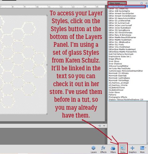
Instead, a Pattern Style will give me a much more realistic look. To find this collection of awesomeness – which comes with your software! – click on that Styles button at the bottom of the Layers Panel then using the drop-down menu found at the top, scroll down to Patterns. And there they are!

The Pattern I used is Fiberglass. It looks a bit (a lot) rough, but that’s not permanent.

To adjust Layer Styles, double-click on the fx icon on the layer to open up this menu. Then use the slider to make your tweaks. I decreased the Bevel to 8 pixels, which nicely softened the edges of the lumps, and changed the Direction to Up.

Yeah, it looks a bit like lumpy concrete, but that too is fixable. First, though, the layer needs to be Simplified. (Broken record, amirite?) Right-click on the layer and choose Simplify Layer. (No keyboard shortcut. 🙁 )

Now we can go into Enhance>Adjust Color>Adjust Hue/Saturation. Keyboard shortcut (yes!) is CTRL/CMD>U.

These sliders are the key to white! Pull the Saturation slider to the left to (about) -62 and push the Lightness slider to the right to (about) 45. You have control here; these are the settings I used, but you may like something different. Just watch what’s happening on your screen as you make your adjustments and stop when you’re happy!

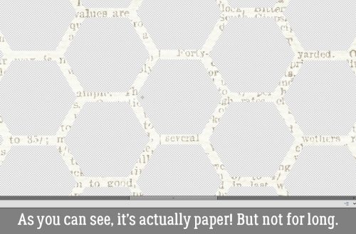
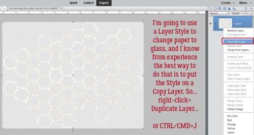
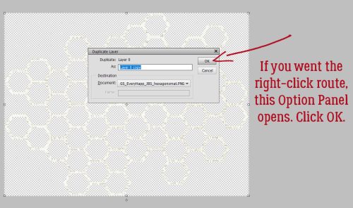
Now to give it a bit of sparkle! I’m going to go back to the glitter and apply it to a Copy layer – right-click>Duplicate Layer…>OK. Or CTRL/CMD>J.

Just So Scrappy‘s Winter Whimsy has been archived, but there are a LOT of choices for glitter in the Shop. Click HERE. After trying all the white options in the collection, I decided to use the fine glitter-gloss Style. It’s a bit extra, so I’ll tone it down.

All I had to do was decrease the Opacity of the layer to ~40% and now I have frosty snowy letters!

The last step is to Merge all the layers together to make the word move as one element. Too easy!

Maybe I should play with some of the other Pattern Styles and see what they look like. Maybe I’ll come up with another way to elevate our titles.

Tutorial Tuesday (Photoshop Elements)

Quick Trick: Type Tool Measurements

PDF Version : https://bit.ly/47YTe4g

When we talked about Editing Preferences awhile back, I sort of glossed over the units of measure for the Type Tool. Today, I think we should talk about it a little, not so much to make you change anything but to add some understanding. Let’s have a look at the options.

To access the Type Tool Units, click Edit>Preferences>Units & Rulers…

My Preset Measurements for New Documents are as shown. The best Print Resolution for digital scrapbook layouts is 300 Pixels/Inch. The rationale is that when your layout is printed up, you want it to be a sharp and crisp as possible. But what does all that mean? What’s a Pixel anyway? Pixel is the abbreviation for Picture Elements. At lower resolution an image becomes “pixelated” or much less defined. So you can see why going higher here will give a better image, even though it creates a humongous file. Screen Resolution can be set much lower, partly because the eye isn’t going to really distinguish the individual Pixels on a screen at normal viewing distance and at normal image size. The other options for both of these is Pixels/Centimeter. You metric thinkers, have at it! But why is the Type Tool default setting in Points? What the what??

First, let’s see what other choices we have here. Hmm. Pixels, Points and Millimeters. Still clear as mud. I can tell you that there are 254 Millimeters in an inch… and that a Point is just a smidge smaller than 1/72 of an inch. Which makes no sense either. I’m not even going to mention Picas. So maybe a practical demonstration is in order.

All of my basic Preferences are unchanged for this test. My canvas is 4 inches wide and 2 inches high. I plucked 30 out of a hat for my base number and using Points, typed out the top line. Here’s a tip: Changing Units doesn’t require a trip back through the Edit>Preferences menu, you can simply type in either “px” for Pixel or “mm” for Millimeter in that Size box as shown. Just remember, if you change the Unit for Size, you must also change the Unit for Leading (the space between lines of text), otherwise you’ll end up with a mess.

Here are the results of the rest of the test. At 30 Pixels, the text is virtually invisible. It’s right there under the “30 points” sample, but it might as well not be. When I boosted it to 300, the end result was almost the same size as the 30 Points sample. I don’t know what that means and my brain isn’t cooperating with the mental math bit. Last is the 30 Millimeter and again, I have no clue how that’s measured. 30 mm is 1.18 inch so that text shouldn’t eat up 3 1/2 inches of space, right? The numerals are a little less than 3/4 an inch tall. How does that work? No idea! At any rate, I’m going to stick with the default Points setting because it’s familiar, it’s safe and it’s comfy!

I’ll see you again soon when I bring you the December Designer Spotlight this weekend. Yes… it’ll be December on Friday. Argggh!

Tutorial Tuesday (Individual Style)

Challenge Spotlight: Scraplift

There are several great things about GingerScraps Challenges. They can provide inspiration when we might think we have no gas in our scrapping tanks. (That’s me right now.) They can get us out of our comfort zones. They can teach us new tricks or techniques. They can help us through tough times, through distraction or through acknowledging them. Some of the Challenge hosts provide us with free templates or minikits to use for our layouts. Other hosts offer participation prizes or coupons for their stores. (Were you expecting me to tell you which ones? Not today, Ray! I want you to go look at the Challenges!) Last, but definitely not least, there’s the monthly Challenge Reward kit, a collaboration between several of the GS Designers, that is completely free for simply completing 10 layouts. More about that later. This month’s Reward is this one:

My purpose behind the Challenge Spotlight is to let YOU, the lifeblood of GingerScraps, shine. This month I’m showcasing the Scraplift Challenge, hosted by Lena, aka LDragDesigns. This Challenge asks you to look at a layout created by a member of our Community, chosen by the host, and create your layout using the chosen layout as your inspiration. When I participate, I tend to be about 95% faithful to the exemplar layout, because why not? Others will be inspired by the colour palette, others by the way the clusters are arranged, still others by the subject matter. That’s what makes this such a great Challenge – we all have our own perspectives. So let’s look at how differently each Scrapper has interpreted the Challenge, shall we? [As usual, each of the layouts to follow is linked to the Gallery so that you can get a better look, and so you can offer some praise to the Scrapper. Just click on their user name and it’ll take you right there! Your layouts appear in the order they were uploaded to the Gallery.]

First, though we should look at the layout Lena chose as her exemplar. It’s from Cinna.

Firstoscartgrouch has the basic structure of the exemplar here, but she’s substituted 4 photos for the 2 Cinna used. Her clusters are larger but no less beautiful! She’s added texture to the background with brushes, a technique I love.

B2N2Scraps has the basic structure as well, but she’s used a journal card where the original has journaling; to make that work so well, her photos and journal card space are all the same size. I don’t think it would look as balanced had she made the journal card smaller to fit into the dimensions of the original. Another unique touch is the reversal of the colour palette. Well played!

GrannyNKy too has kept to the basic structure but has gone more minimalist. She’s used some confetti to add dimension without taking the attention away from her photos.

Grace. has the structure, and she’s replaced the journaling with a transfer (which I LOVE!) and embellished her title to emphasize her theme. I see she’s substituted a doily for the paper circle – I approve!

The bones are easily visible in chigirl‘s layout. She’s added some torn paper in the upper left corner, which coordinates well with her photos’ palette. Her title treatment sets her work apart as well.

This stripped-down layout by zanthia keeps the framework intact. Rather than complex clusters, she’s chosen themed elements to complement her photos.

Pups_r_Paps is one of only a handful of non-12×12 Scrappers. Her sense of humour is front-and centre here!

Jill has such vision! She has the basic blueprint here, but has really taken the Challenge seriously. Those paint splatters ground all the various elements of her work. This layout just bursts out of the Gallery… I think it’s the contrast between the blues, yellows and blacks, which draw from her photos. Love it!

For her layout, dhariana has gone stripped-down too. The muted colours of her papers and embellishments draw the eye to the bright kingfisher in her photo. There’s a lot of movement there too.

AJsRandom pulled the bones and the wooden background from the original, but chose a softer palette for her papers. The pops of yellow are very eye-catching. And of course, her heritage photos steal the show.

If you don’t smile when you see breoni‘s layout, you’re broken. Sorry. It’s true. She’s kept to the overall design of the layout, but those photos. Oh. My. Heart. The soft blues and golds are the perfect foil for them.

I’ve mentioned how much I admire KatherineWoodin‘s dedication to her daily layouts before. She always finds a way to create a layout that meets the Challenge criteria AND diarizes her day. She’s the only one to have made her journaling spot larger than her photos!

Our last entry is from 01lousmith. She really made the layout her own. She’s got the same number of different papers – 6 – and the same number of clusters – 3 – as the original and used a shabby painted wooden paper for her background. Double the photos. At first, I didn’t see that she’d also flipped the arrangement horizontally. Fabulous!

As I mentioned above, I want to talk about the Challenge Reward, because it can be confusing. Missi keeps a running total each month for each participant and she follows the rules. First of all, you earn the Reward in the month during which you reach 10 completed Challenge layouts, properly posted, since the LAST time you received a Reward. For example, if you completed 10 layouts in the month of September because you had some extra free time and lots of mojo, you’d qualify for the September Reward. Then October rolls around and you get really busy, so you only manage 4 layouts. That’s cool. It’s not a competition. In November, you’re pretty busy again so you get 4 more layouts done. Now you’re at 8 layouts toward your next Reward. December arrives and you’ve once again got some extra time (yeah, I know, right?!) and you’re super-productive, participating in 7 Challenges. Eeeerchhhhhhh! Only TWO will count. The other 5 don’t get carried over. Your counter starts over at zero on January 1st. I know I can’t be the only one who got caught by that, right? Right? Anyway, I highly recommend keeping track of your own count, and strategize your Rewards. Let’s face it, the Rewards kits aren’t ALL going to be attractive to you. If you don’t like the kit for a given month, don’t feel any pressure to hit your 10 layouts in that month. Simple!

Now… I haven’t created a single layout this month and it’s already the 21st. I have 6 in the can from October, so if I want this month’s Reward, I have 9 days to crank out 4 layouts. I should get to work!

Tutorial Tuesday (Potpourri)

Two Minute Warning! Holidays Ahead!!

PDF Version : https://bit.ly/49DmZsQ

Hey y’all! Life’s about to get VERY hectic for a lot of you, am I right?? In the United States, Thanksgiving marks the run-up to Chanukah (it starts at sundown on December 7 this year), Christmas, Kwanzaa and then the New Year. Diwali was this past Sunday; I’m sorry I missed you! (But I did get to see the fireworks!) Thanksgiving’s only 9 days away, and if the TV news is to be believed, a LOT of Americans will be traveling – they’re saying record numbers! – so that means TONS of photos will be taken. I know most of you won’t be even thinking about scrapping layouts for the next few weeks, and that you’ll be making a bunch of new memories at the same time. But hear me out. Your memory-keeping can be made easier if you do some planning ahead of time. I’ve covered a lot of these handy tips before but an updated refresher is never a bad idea.

  1. Find your camera’s battery charger NOW and make sure you use it! If your camera uses disposable batteries, stock up NOW. I keep a basket filled with several sizes of battery so I have them handy when I need them. (Like Sunday at 5 am when the battery in the smoke detector in my bedroom announced it was quitting and moving to Arizona. Fun times!)
  2. Check that you have a fresh SD card in your camera and that it has a decent amount of memory available. If you’re into phonetography, you might want to trim your in-phone collection by saving them to your computer or the Cloud, then deleting them from your internal storage. I have a handy little PhotoStick where I’ve backed up my phone’s gallery. If you’re an Amazon Prime member, you also have unlimited Cloud storage as part of your membership perks.
  3. Think about how your typical holiday events usually evolve. There will be some traditions that are carried out no matter whose house you’re having the celebrations at, so plan ahead to capture those moments. Make a list, if you need to. I’d need to!
  4. If you haven’t done it lately, review the manual that came with your camera. Review the settings and modes you’re most likely to use for your shots and remind yourself what each is doing while you’re shooting. I use the metadata from my most successful bokeh and full moon shots to set my camera up ahead of time so I don’t miss the shot.
  5. Refamiliarize yourself with your tripod, if you use one. I have two – an aluminum ball-head one that allows infinite adjustments but takes a lot of room and needs to be set up ahead of time and a Platypod Max, which looks like a little travel iron but is actually a very clever and sturdy tripod that can be set up in minutes on any surface. Why use a tripod? It lets you take longer exposures while keeping the images tack-sharp and it lets you be in the photo! Use the built-in timer and get in FRONT of the lens for a change. You’ll like the results much better than those you get with a selfie-stick.
  6. Practice a few creative techniques that you can memorize so that when you’re ready to take photos of the candles on your dinner table or that gloriously brown turkey, you won’t have to fumble. Practice, practice, practice! The best thing about digital photography is that we don’t have to keep the duds!
  7. Do you go all out with a gorgeous table-scape for your guests? I’ve never done it, but I love seeing what others do. (Okay, so I HAVE done a couple of table-scapes in the home decorating game app on my phone. But not a REAL one.) If you’re hosting and have your table all set well in advance (like the experts recommend for sanity’s sake 😉 ) take a few minutes to look at it with your photographer’s eye. Take a shot of a single place setting. Try and get the whole table in a shot, easiest if you shoot from one end. Take a closeup of your crystal.
  8. Don’t forget to get some shots of the dinner prep. Be stealthy and get some candids of the main cook, or if that’s you, get some of your helpers. Look for interesting camera angles of your turkey, ham or standing rib roast. Ask someone to be the carver and get some action shots. And look for smiling faces as the meal commences. When taking photos of food, get in close and vary the angles. Show the flaky texture of that piecrust, the glisten of the done-to-perfection skin on your turkey, the creaminess of your mashed potatoes, the detail of the frosting on your cupcakes.
  9. Composition is key for any photo. Remember the rule of thirds, but don’t be a slave to it. Decide what your focal point will be and compose your photo to make it so – use leading lines where possible and don’t forget white space. Crop your photos in the viewfinder – so much less work later! And don’t forget the background. Is there anything growing out of someone’s head? Take a step to one side or the other and recompose.
  10. Get in close to your subject! Even more so when that subject is a child. Get down on their level whenever possible so you capture their best smiles. Shooting from above should be reserved for those special-effect shots, not photos of kids having fun. For the most natural photos of people though, you can use a telephoto lens and shoot them from some distance. (As long as the light is right!)
  11. Don’t insist on smiles. You know what I mean… those cheesy grins aren’t going to be your favourite images. Rather than having everybody say “cheese” for your group shots, have them say “family” or “money” or “gotcha”. You could go with a made-up phrase, such as “moldy mozzarella”. Another trick is to tell everyone you’re going to shoot on “3”, then count, “1… 2… (shoot) WHOOPS 3!” then shoot a second shot right after that. You’ll get some natural smiles that way.
  12. We’ve all got a folder full of group photos where everybody is stiffly lined up and fake-smiling at the camera. So how can we take better group shots? Having the subjects doing something together is a good start. If you have snow in your area, have the group build a snowman, or have a snowball fight. Or play football in the snow. Beach ball volleyball (in sand or snow) would make some entertaining shots. But if you just have to have a posed group shot, give some thought to who goes where. If you can arrange the people so that their faces form little triangles, you’ll have a nicer image. Have them turn their shoulders toward each other or the centre of the photo so they can get a bit closer together. Make sure you’ve chosen a landscape setting so everybody will be in focus. Think about trying not to cut people’s legs off. If you can, shoot everybody down front from the waist up. Your subjects will thank you.
  13. If you’re celebrating Chanukah, there are lots of great ways to take photos of your menorrah. A series, with each night’s new candle lighting, would make a lovely layout. Look at the angles. On the last night, when all the candles are burning, an angled shot from one end with each flame visible would be incredible. Some of my favourite photos of my grandsons are of them lighting a candle, with the soft glow of the flame on their cheeks and wonder in their eyes. (Their mom takes amazing photos.)
  14. When shooting your tree, look for a different approach than the typical 8-feet-away-so-the-whole-tree-and-gifts-are-in-the-shot. Maybe take some close-ups of your favourite ornaments. Use a portrait mode to soften the background and make the ornament totally the focal point. Get down on the floor and shoot up toward the topper, or shoot down through the branches and make the presents the subject. Turn off all the room lights and shoot the tree with just the tree lights. Experiment with shutter speed and aperture to create some lovely bokeh effects. Add a human or a pet to the frame. Or take a photo of the lights reflected in a window. (If you don’t want your reflection in your photo, stand at an angle to the window and look carefully at what’s in the viewfinder.) Or take a photo of the tree THROUGH the window! Turn off your flash though, so you don’t spoil the shot.
  15. What about gifts? Well, there’re lots of opportunities around gift opening. Get down on the floor with the kids. Try to capture the moment when they identify what’s in the package. If it’s your thing, you can take some of them channeling Vanna White, holding up a favourite gift. If there’s a very special gift being given, arrange for it to be delivered when you have a moment to frame your image. I really wish I had a photo of myself when I opened a gift from my sister quite a few years ago. It was a resin frame with dragonflies on it, but what made it truly special was that it held a photo of me with my grandfather, who died when I wasn’t yet 4 years old. If you know in advance, you can be ready to catch the emotion.
  16. After the dust settles, you can relax, but don’t forget there might still be some great photos yet to happen. Like when a child falls asleep in the middle of a game, or the dog takes off with a long piece of ribbon… they could be the best shots you get all day. But don’t concentrate so hard on getting good photos that you don’t have fun! At a family reunion, my niece made a point of taking a selfie with every single one of us, and they were all fantastic. If you have mad selfie skills, give it a whirl. You might surprise yourself!

I would be remiss if I ignored those for whom the holidays are NOT the thing of loving memories and happiness. If that’s you, think about what DOES give you joy and take photos of that. Many of the above tips apply equally to photos of more ordinary events; sometimes getting out of our own heads and letting distraction help with that can be really therapeutic. Remember, if it’s something you feel, it’s perfectly okay to document it, even if it’s painful. Reality bites a lot of us, and the holidays can be really awful. Just know that I see you.

On that note. I’m going to land. Next week is Challenge Spotlight Tuesday, which is perfect timing… something that won’t require any effort from my readers. 😉