Dodge and Burn… NOT an Action Movie
![]()
Awhile back, Ellen (gmae) asked me to think about a tutorial on dodging and burning. I couldn’t think of how to introduce it at the time, but I’ve come up with a way!
Dodging and burning are old-school photography techniques for selectively adjusting exposure of photos to bring out details that weren’t all that evident. In the darkroom, it was done with a piece of cardboard (at least that’s how I did it back in the day). [I cut a round hole in a solid piece of mat board (for burning) and taped the cut-out circular piece to a thin piece of very stiff wire (for dodging).] First the photographer would print the desired negative on photo paper and examine the exposure. Then another print would be made with some fancy footwork to correct areas of over-or-underexposure. Dodging involved holding the end of the thin stiff wire with the cardboard over the area of the photo that was overexposed and then exposing the paper while keeping the wire-and-cardboard dodger moving. This decreased the amount of light that hit that section of the paper, so those blown details could be seen. Burning was done similarly but was concentrated on the under-exposed areas by moving the hole in the cardboard over the dark spots, allowing MORE light to hit that area of the paper. The cardboard in both methods had to be kept moving at a reasonably constant rate so as to prevent the obvious demarcation lines the enlarger would leave on the image. It was time-consuming, wasted a lot of expensive photo paper and was definitely a skill not everyone excelled at. To be honest, I totally failed at it! So it’s a WONDERFUL thing that dodging and burning can be done digitally and done well without a lot of fuss.
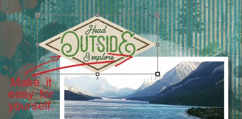
My first demonstration will show you how to make things like tags look like they’re stickers and washi tape look realistic, complete with that appearance of something thicker underneath it. I’m using CathyK‘s July Daily Download Back to Nature here. (If you missed it you can still get it, it’s in the store!)
I want this tag to look like it’s a sticker and it needs a little ridge where it overlaps the photo.
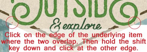
To make this technique easier on yourself the first couple of times you try it (until you get the hang of it) I suggest you position your item so that you can see the edge of the object underneath at both ends, as I’ve shown. But don’t worry about having it horizontally arranged because this will work no matter what the angle.
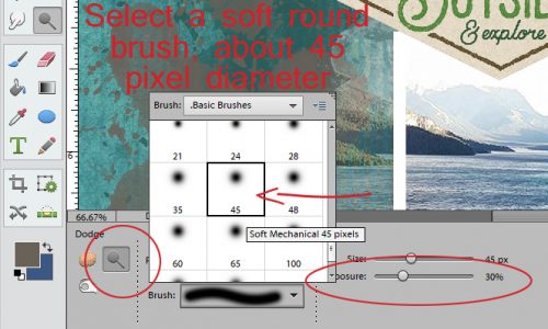
Now select the Sponge tool. It’s actually 3 tools in one… the Sponge, Dodge and Burn are all accessed through there. The keyboard shortcut is simply hitting the letter “O“. You can use that to toggle between the three tools. Neat, eh?

The Dodge tool is the one we’re going to start with. The icon looks like that little paddle the optician uses to check your vision.

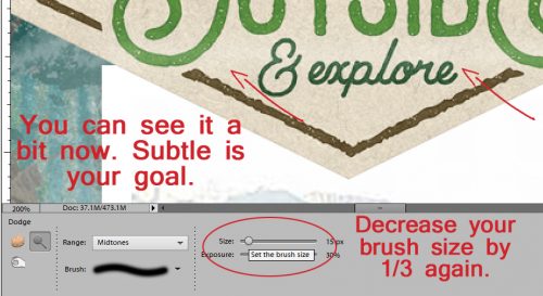
One of the important controls for this tool is hidden behind the Brush menu. It’s the one that lets you choose between Highlights, Midtones and Shadows. It defaults to Midtones, and that’s where you want it. Select a soft round brush of about 45 pixels in diameter and set the exposure (there’s that word again!) to no more than 30%. You’re going for a REALLY subtle effect, so start off light and build if you need to.
I learned something new while I was preparing this tutorial. Set your brush at the edge of the item UNDER your tag/sticker/tape and click once. You want it to overlap onto the layer underneath it a little so fix a reference point in your mind to help you later. Then move your brush cursor over to the other side of your tag/sticker/tape, hold down the Shift key and click again. Bingo! You’ve got a straight line of brush on your image!!
It’s really hard to see the change, but trust me, it’s there. Now decrease the size of your brush by about a third. Repeat the click-shift-click manoeuver again.
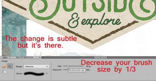
Once more with feeling… again decrease the size of your brush by a third (that’s why I chose 45 pixels… makes the math easy). Then click-shift-click one last time.
If you look really closely at my example, you can see the faint but definite lightening along the edge of my photo.
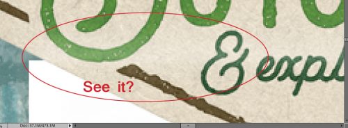
It’s actually easier to see from farther out.
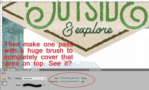
Now we’re going to Burn the part that overlies the photo. The Burn tool looks like someone making an “OK” sign with their hand. I left the size of the brush at 15 pixels with the exposure at 30% and used the very same click-shift-click to lay down a darker line.

Then I followed that up with a HUGE brush that covered the whole part of the tag that sat on top of the photo. The first pass set the edge, the second pass created a bit of a shadow that makes it look so much more real.
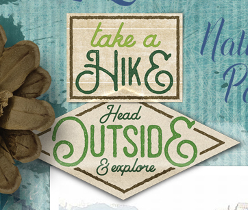
Here’s a zoomed-in view…

and a zoomed-out view. What do you think?

On my finished layout, I dropped another tag on top of this one and did the same technique with it. You can see the effect below.
Okay… let’s pretend we’re in the darkroom and we have this photo on our workspace. How can we use the Dodge and Burn tools to make it look better?

I darkened his eyes, his nasolabial folds (those grooves from his nose to the corners of his mouth), his dimple and the folds in his ear using the Burn tool with a small brush size and a light touch. The photo looks a little sharper, at least to my eyes.

Then I used the Dodge tool to bring the highlights back. Wherever more light would hit his face was dodged a smidge – the tip and bridge of his nose, the top of his ear, the apples of his cheekbones and a small section of his forehead. I also hit the catchlights in his eyes and brightened the whites a bit too. You could use these tips to make the eyes in your portraits sparkle: Burn the irises a bit, then Dodge the white and catchlights for some real drama. Just remember, if you’re not happy with how your images look, you can always Undo! CTRL/CMD>Z is the most useful tool in your arsenal! (Wanna know another way to use the Dodge tool? To soften crowsfeet!)

Now let’s look at what we can do with colour photos.
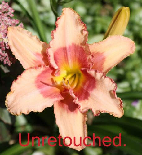
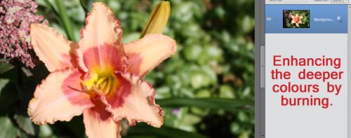
I went over the throat of this daylily with the Burn tool to deepen the fuchsia areas a bit.
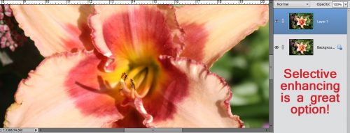
Then I went over the areas where the light hits and Dodged up the highlights. I worked on a copy of my photo so I could move from the original to the edited one and see how the changes looked.

And boom! The throat’s fuchsia is darker, so there’s more contrast, and the stamens and ruffled edges are lighter and stand out more. I LOVE being able to selectively enhance my images!
I’m not sure if this is what Ellen was looking for when she asked about dodging and burning. If it isn’t, I’m sure she’ll let me know. Have fun y’all, see you next week!
![]()


