Alphas Revisited
![]()
Are you ready for a really easy tutorial that looks a lot more involved than it is?
When I was looking at the June challenges at GingerScraps, I knew I wanted to do the Scraplift challenge – I already had the same template from Heartstrings Scrap Art in my stash, so it was a no-brainer! My dilemma came in the form of wanting to use a specific kit from Aimee Harrison called Tidepooling, that came with a selection of wickedly awesome alphas. And you know how I love those alphas! Now you get to see how I put that alpha to use.

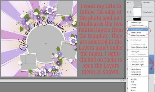
I wanted my title to follow the same curve as the title that came with the template and to sit in roughly the same place. But creating my title right there on the template would have been very difficult, due to all the distracting layers. I could have just turned them all off, but I prefer to compose my titles on their own workspace then move them onto my layout so I duplicated the two layers of the circular photo spot.
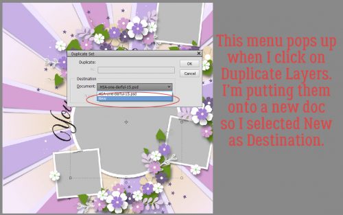
Then I sent the Duplicate Layers to a New document.
I could have left it untitled, but chose to give it a name, just in case I was interrupted and had to find my title in the Photo Bin again later.

Now I had a new 12×12 document open, with the two layers of the circular photo spot in the exact same place as they are on the template.

Next I went to my layout folder and opened all the alpha elements I chose for my title.

I spelled out my title in the centre of my canvas. I made sure they were in the correct order so when I started moving them, they’d be where I wanted them. (Notice I’ve turned off the visibility of those photo spot layers. They aren’t needed at this step.)

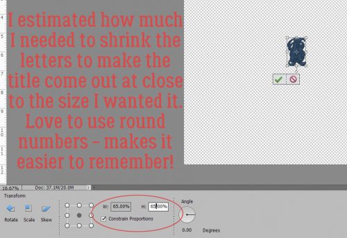
I knew just from lots of practice, that these letters were much too big for their purpose on this layout. So I selected ALL the alpha layers and resized them together at one time.
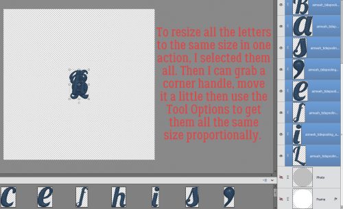
I estimate how much I need to shrink letters when I’m doing this, and I randomly chose 65% as my target. I like to use round numbers, especially if I’m going to resize other objects later and want them to be to scale. A round number is easier to remember! I also checked the box that says Constrain Proportions. That makes sure that I only have to adjust in one plane and the other will follow suit.
Because I’m going to work with just one letter at a time, I turned the visibility for all the other letters off. They’ll be turned back on as I go along. And I turned the photo spot layers back on; they’re going to be needed now.
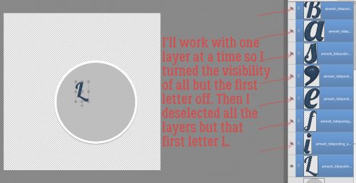
This alpha was super-easy to use. It has strong verticals, so I was easily able to position each letter perpendicular to the edge of the photo spot. Then I shifted the L into its place just sitting on the edge of the gray circle – my baseline – which will become my focal photo later.

I love that this L has a bit of a swoopy flourish to it.

The letter I will be a bit more of a challenge. It needs to sit close enough to the L so that it’s visually connected. It too is perpendicular to the baseline.
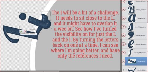
By turning off the visibility of the L for a second, I could be sure I had the bottom of the I touching the baseline. Then I turned the L back on and nudged the I into it’s spot.

The F also needs to be perpendicular. It’s got a strong vertical dimension and would look off if it isn’t perpendicular. But notice how the vertical aspects of the letters aren’t parallel. That’s how I want them.

Now, as you already know, I’m a bit… particular (or anal, you chose – most of us ICU nurses are) about some things. And this is one of them. The tops of the tall elements HAVE to be roughly lined up to look right to my eyes. But… some would argue the F could have a longer bottom end, and that would be right too.

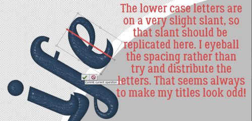
If you scroll back up to one of the screenshots showing all the letters in the Layers panel you’ll see that the lower case letters are very slightly slanted. So I want to make sure they’re slightly slanted in my title too. As for spacing, I’ve tried using the Distribute Tool Option and usually I end up really unhappy, so I eyeball the spacing between letters (also known as kerning). I only care about it looking good, not having everything perfectly spaced.
Where I AM a perfectionist is when it comes to apostrophes. (Don’t get me started about the proper USE of apostrophes…) So depending on the look you’re after, the top of the apostrophe can be aligned with the tops of the tallest letters, slightly above for a casual look, or slightly below. It’s all about what you like.

The letter S in this alpha presented a few options. I decided the right-most edge should be my focus and so I made it perpendicular to my baseline.

This lower case A is an article, so it’s a word, not just a letter. It needed to be spaced accordingly.
The upper case B is another letter in this set that is easy to position, with appropriate spacing, of course.

This E, unlike the one in Life, looked funny when I tipped it to the same degree, so I stood it up a little straighter.

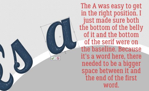
Below you can see the A as it looked when I moved it onto the canvas. It’ll need tipping for sure.

Perfect with both lower edges on the baseline.

When I played with positioning the C, my brain wanted the curved edges to be parallel, which actually made it easy to get it just right.

Last letter! This H was not upright when I moved it onto the canvas and so the upright section isn’t perpendicular to the baseline. The final position has the bottom of the upright and the curve of the serif resting on the baseline.

Zooming out, I was pleased with the spacing and the angles on each letter, but I wasn’t totally happy about where it starts and stops. So I selected all the letters so I could move them all together and rotated the title into a more pleasing position. With a little nudging of the entire title, it was successfully lined up with the baseline without having to adjust any letter individually.

Then I could go ahead and merge all those letter layers. For the remaining steps I don’t need to see my baseline so I turned visibility to the photo spot layers off.

The title would be just fine the way it is, but the original layout we’re scraplifting has a border around its title. So mine will too. I Selected my title’s edges by clicking on the title layer thumbnail in the Layers panel.

Next I clicked on the Select tab, then Modify>Expand.
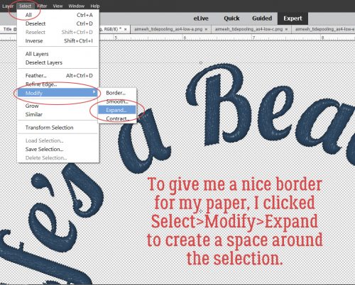
I want my paper border visible but not overpowering. So I chose a single digit number at random. 8 pixels should be right.

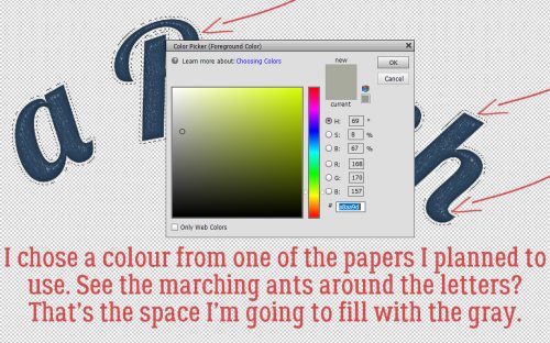
I pulled a colour from one of my papers to fill the area I just created. It’s a gray with a faint touch of green as shown.
If I just fill that space on the same layer as the title, there’s a faint void around the letters where it doesn’t fill completely. That might be okay, depending on how big your title is, how detailed your background will be and so on. But I’ll show you another way to eliminate the voids.
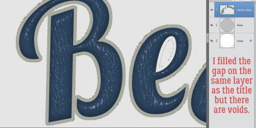
I created a new layer and filled the selection on it. Because it’s currently on top of the wooden letter layer, it shows you how the entire area is filled in. Alternatively, I could clip a paper here instead of filling the area.
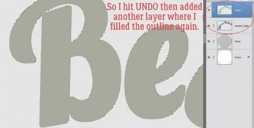
Then I moved it down under the wooden letters. If I wasn’t doing it for a tutorial I would have just put the new layer under the title from the beginning and skipped that step now.

The title on the original layout also had a narrow white stroke around it, and that’s what I did next.

I could have used black for definition but I wanted visibility, so I used white.

This stroke can be pretty narrow. I went with 4 pixels and set it to be centred on the edge of the gray layer. That’s the best way to minimize squared-off corners.

If you strain your eyes you can see it.
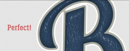
The last thing I needed to do was put a drop shadow on the wooden layer. It has dimension and needed a shadow to emphasize that. I used the drop shadow styles included with the software for my example; I don’t want anyone to feel like they can’t achieve any of my techniques without spending more money. The Low shadow looks like this, which is TOO much.

So I double-clicked on the fx icon to the right side of the layer in the Layers panel. Then I adjusted the lighting angle to match the rest of the layout, made it smaller, brought the shadow in closer to the letters and lightened it up.

Then I zoomed out to make sure it looked like it should.

Once I was positive, I merged all the title layers together so I could move it onto my layout. It seems like a very time-consuming technique but it really isn’t. Putting together a tutorial detailed enough to make sense to beginners takes me a full day… this title took only about 15 minutes.

Wanna see the finished layout? [whispers to Glee – the focal photo is of my daughter’s hands. She was in Nicaragua for turtle-hatching season.]

![]()