Archives for May 2022

Tutorial Tuesday (Photoshop Elements)

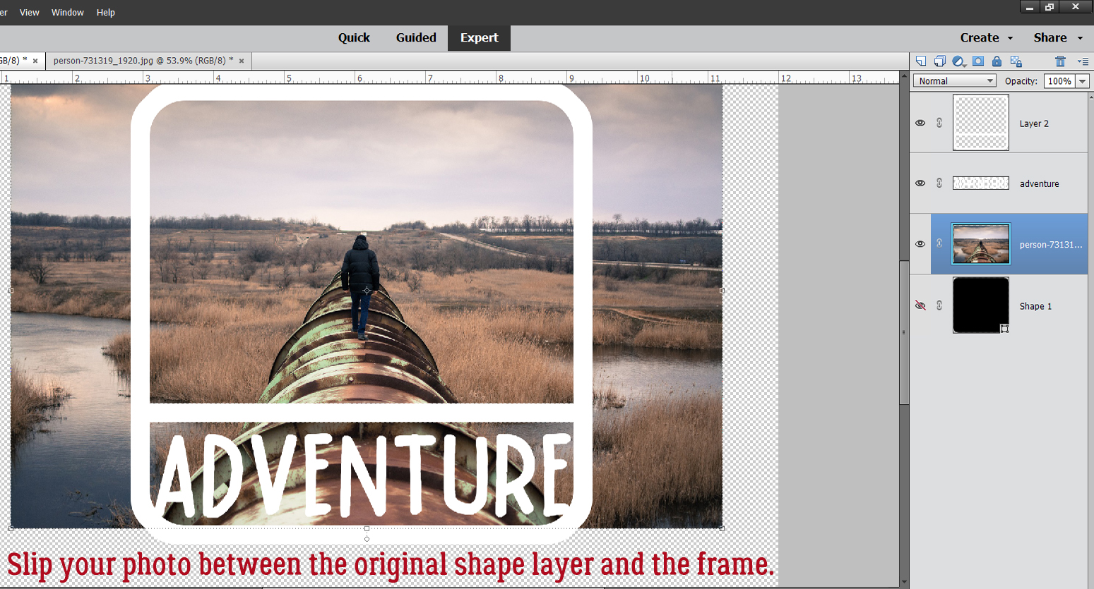
Creating a Title Echo for Your Layout

PDF Version : https://bit.ly/3x5YvpI

This week’s tutorial was inspired by Ellen (gmae); the directions are based on a video tut by Gina Harper and when I tell you I learned a couple of FANTASTIC Work Smart Not Hard [WSNH] tricks, trust me… they’re going to be game-changers. I’m going to walk you through creating a title with an echo, like the one I created for my Greyfriars layout. And it’s easy!

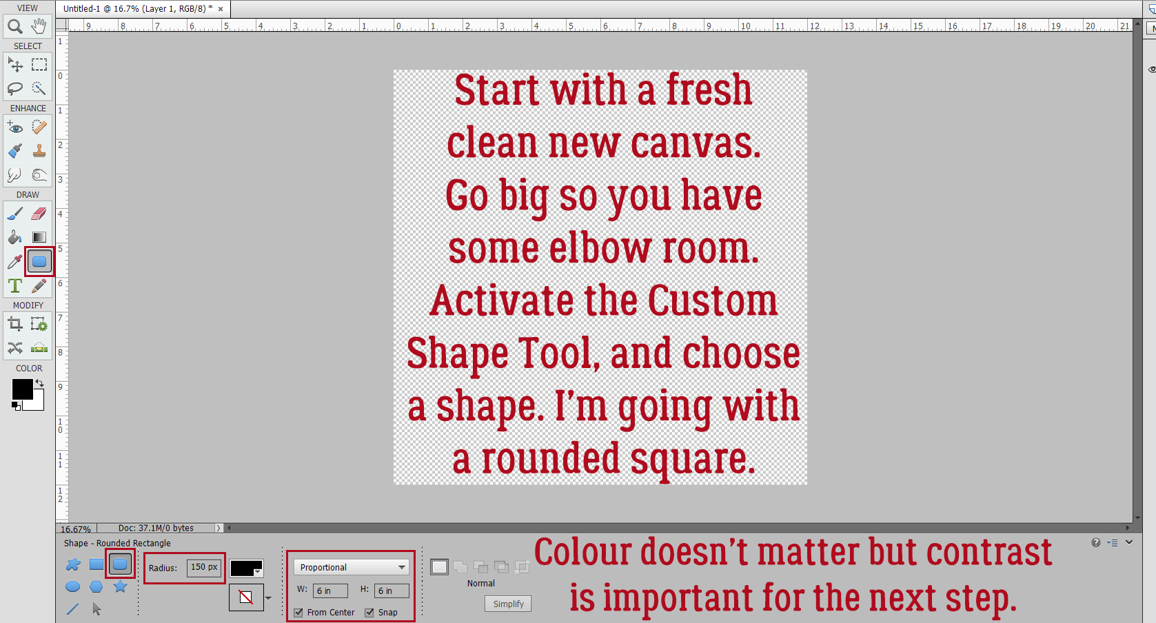
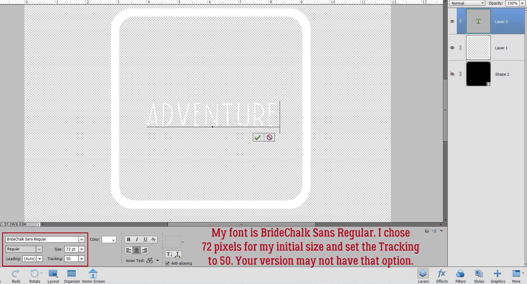
Start off with a brand new 12×12 canvas; you might notice I’ve got a solid white background here and that’s not my usual MO. Since we’ll be working with text layers the background doesn’t make any difference. I want to be sure you see exactly what’s happening and the contrast will help with that. Select a font for your title. Choose one that is clean and upright (ie a sans serif font), with some stage presence. I’m using Gill Sans MT Bold but Impact, Futura and Avenir would work too. You’ll be using only upper case letters. Set the Size to 100 points, the Color to black and choose Center for your text position.

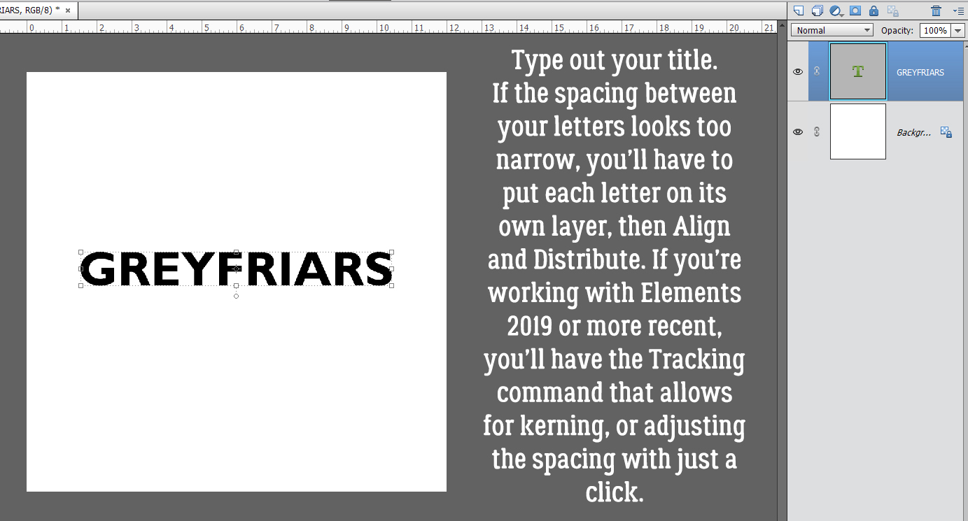
Type out your title. A one-word title would be best. If the spacing between the letters looks too narrow, the technique won’t work as neatly. If you’re using an Elements version previous to Elements 2019, there is no tool option for kerning (adjusting the spacing of your letters) so you’d then need to put all your letters on their own layer, position them then Merge the layers together. So maybe try a few other sans serif fonts first!

When you’ve got your text sorted, use the Move Tool Align Option to put the text in the Middle of the canvas top-to-bottom and Center it side-to-side.

Next, decrease the Opacity of the text layer to 50%. We’re going to apply a Stroke and I want you to be able to see it.

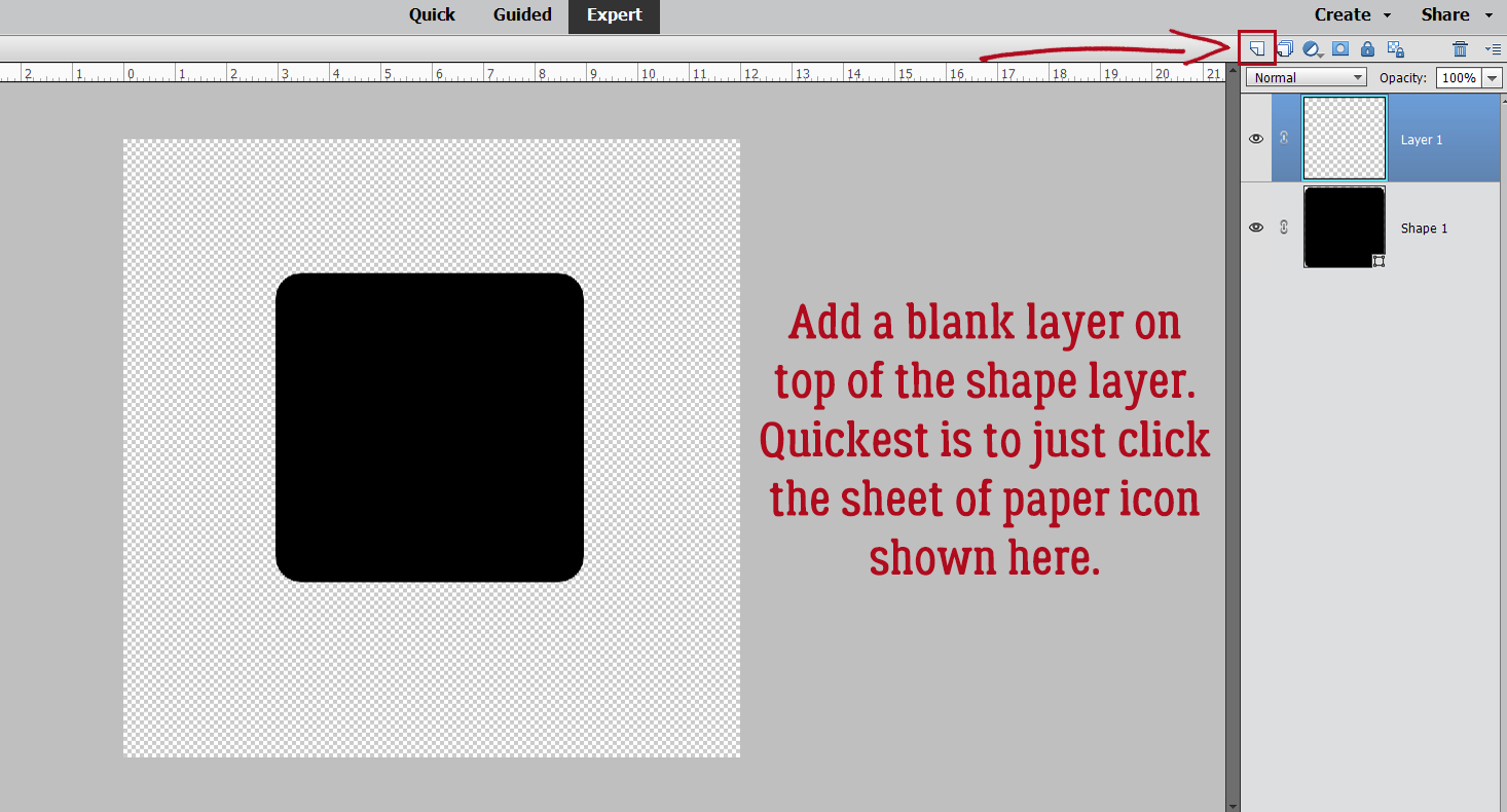
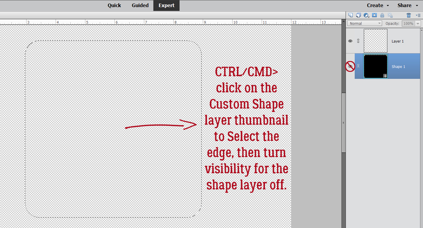
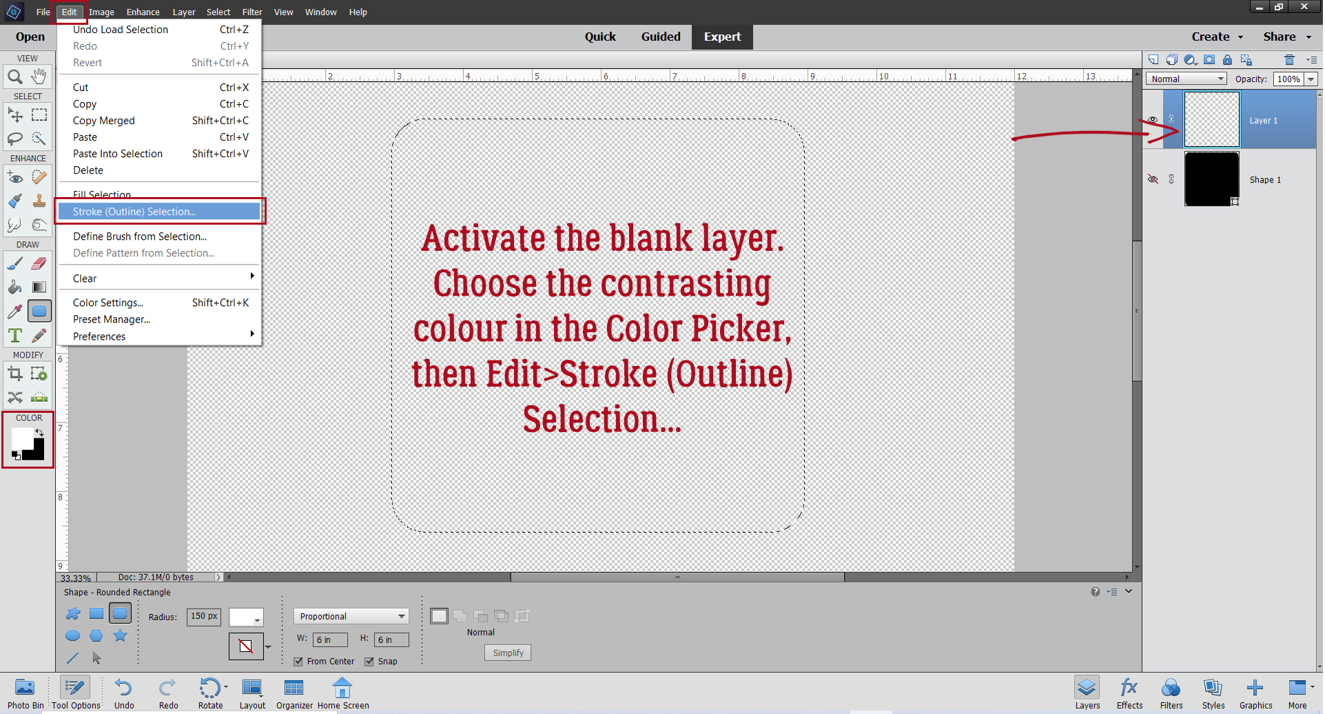
Add a new blank layer above the text layer. Then CTRL/CMD>click inside the text layer’s thumbnail – that image of what’s on the layer – to Select the edges of the text. That’s how Elements will know where to put the outline. Click Edit>Stroke (Outline) Selection…

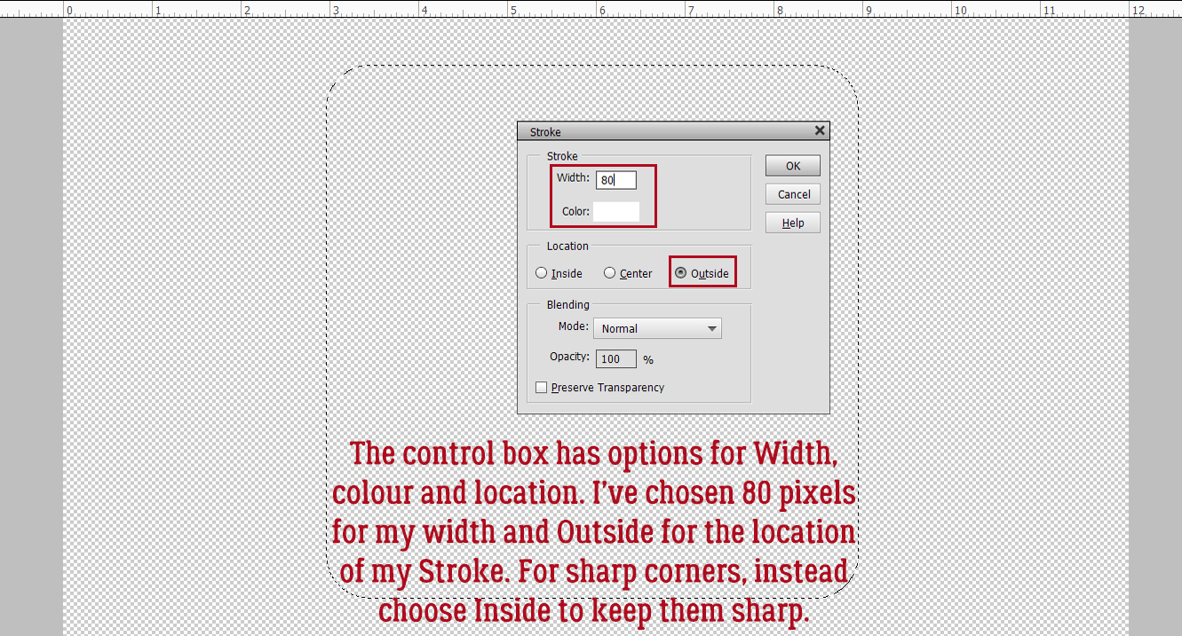
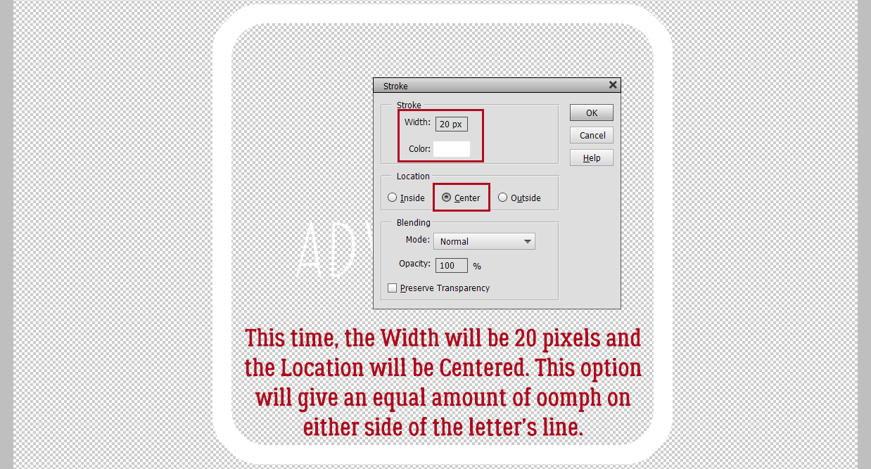
Your Stroke settings: Width 10 pixels. Color Black. Location Inside. Leave the other default settings as is.

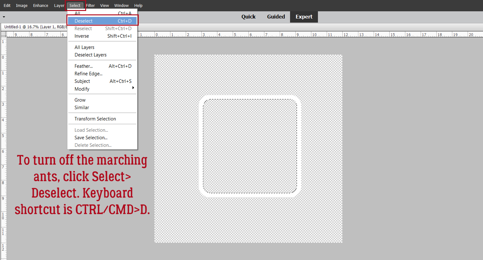
After your Stroke is in place, Select>Deselect Layers or CTRL/CMD>D to lose the marching ants.

To reduce confusion Rename the Stroke layer to Echo Bottom. Double-click on the layer’s name and type it in the box.

Now choose the Rectangle Marquee Tool; set the Aspect to Fixed Size, W to 12 in and H to 6 in. Basically you want to put that rectangle on half of the canvas.

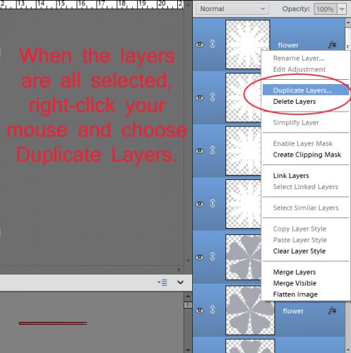
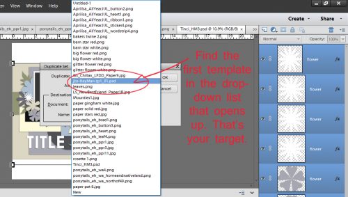
Set the rectangle at the top of the canvas. The lower edge of it will be exactly at the middle top-to-bottom. Next, click CTRL/CMD>SHIFT>J. This will cut the pixels inside the  rectangle away from those outside it, and create a new layer with them on it. That’s WSNH Tip #1. Rename that new layer Echo Top.


Move the new Echo Top layer up toward the top of the canvas so it separates from the title. Leave a bit of space between the top of the title and the bottom of the Echo. Here’s WSNH Tip #2… Hold down the SHIFT key when you drag an object and it will stay aligned with its previous position, either top-to-bottom or side-to-side.

Since an echo is a less-obvious duplicate of something, decrease the Opacity of this layer to 50%.

WSNH Tip #3! Hold down the SHIFT and ALT/OPT keys when you click and drag an object and Elements will make a duplicate of the object. Think how much this could speed up your scrapping with templates… all those flowers can be quickly duplicated and moved with fewer steps. Mind blown.

You should have two Echo Top layers now, one at 50% and the new one decreased to 20% Opacity.

Now to get the bottom sorted. As you can see, your padawan forgot to use the SHIFT key when she dragged the Echo Bottom layer down. And it’s obvious! I’ll nudge it into alignment before we go on to the next step.

Like for the Echo Top, that first Echo Bottom layer’s Opacity drops to 50%.

All aligned again… Hold down the SHIFT>ALT/OPT keys and drag the last Echo Bottom layer into place.

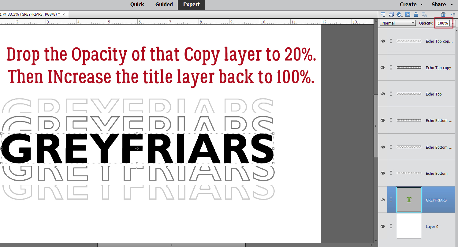
If needed you can adjust the spacing of your Echo layers so they’re closer to or farther away from the title. Change the Opacity of the lowest Echo Bottom layer to 20% and increase the title layer’s Opacity back to 100%. You’re done!!

What if you don’t want a black-and-gray title? You can change the color by Merging the layers then adding a Layer>Fill Layer>Solid Color and choose a color from your photos or papers. Or you could do what I did and add a Layer Style to the title. Leaving the Echoes gray worked with my subject, so I just put a wrought iron layer style on the title. But really, the possibilities are almost endless. When you’re ready to add it to your layout, either Link the layers together – click the little chain icon on each layer – or Merge them so you can drag them onto your layout all as one piece. Play with it, have fun with it!

When this tutorial posts, I’ll be miles away from home helping my “baby” sister celebrate her 50th birthday. My brother is having a hip replaced in Friday, so I’ll see him too. Have a great week!

PDF Version : https://bit.ly/3x5YvpI


May 27, 2022: Fresh Baked

Can you believe it’s the end of May? Remember me complaining about our warm temperatures last week? This week has been rainy, overcast, and unseasonably cool. I think Mother Nature has lost her mind. I hope you have had a lovely week!

Remember any $10 spent in the store gets you this great collab.

Let’s see what we have new in the store this week.

How are those challenges? Just 10 completed challenges gets you this great collab for free.


Tutorial Tuesday (Photoshop Elements)

Quick Trick: Correcting Colour Cast

PDF Version: https://bit.ly/3lWUZsm

It happens to all of us. We shoot a whole whack of photos on a special occasion or on a vacation, thinking we’ve got a great collection of memories. But then when we look at them, a bunch of them are just… ugh. Yellow, orange, red or blue casting a pall over the whole image, and every attempt made to fix it gives equally ugh results. Colour casts are usually the result of moving from indoors to outdoors and not changing the white balance setting on our cameras, and vice versa; it can also be caused by light reflecting off nearby surfaces. I’ve shown you some simple ways to improve lighting and exposure, but until just a couple of days ago I didn’t know there was an equally simple way to deal with colour cast. Trying to click on the exact white, black or gray pixel in an otherwise orange image can be enormously frustrating, right? When I tried this trick, I was gob-smacked! Let’s take it out for a run.

This photo was taken at Caesar’s Palace in March 2009. I’ve long-since forgotten what colours were actually present in this lobby, but I’m positive this ghastly golden glow isn’t right.

First step is to make a Copy layer of the photo. This step is ESSENTIAL. You can either right-click on the photo layer and choose Duplicate Layer… then click OK, or use the keyboard shortcut CTRL/CMD>J.

On the Copy layer, apply a Filter>Blur>Average. (I had no clue what this command did until I played with this trick!)

Did you guess it did THIS? (Me neither!) It’s supposed to do this, so don’t panic.

This step is another thing we’ve never played with… Adjustment Layers. Click Layer>New Adjustment Layer>Levels…

Make absolutely sure the Use Previous Layer to Create Clipping Mask IS NOT CHECKED!! The adjustment layer has to be free-floating.

The fly-out menu looks like this. Click on the Gray Eye Dropper icon as shown.

With the Adjustment Layer active, click anywhere inside the photo. The baby poop brown changes to medium gray.

To reveal the new-and-improved image, turn off Visibility to the Blur layer and there it is! It’s magic, y’all!!

To turn all of this into a useable photo, select all three layers by Click>shift>clicking on the top and bottom layers. Then right-clicking, choose Merge Layers or CTRL/CMD>E. If you feel the photo needs a bit more editing, you can do it now.

Let’s do another one. This photo is horrible, but it’s not awesome either. The yellow cast is unattractive.

Copy the photo layer.

Apply the Filter>Blur>Average.

Create a Layer>New Adjustment Layer>Levels.

Make sure that box is UNCHECKED.

Activate the Gray Eye Dropper and click on the photo.

Turn off Visibility for the Blur Layer and check out your results. See how much brighter the blue looks?

I’ll show you what this trick does to a too-blue photo now.

Hmm. It’s better, but I’m still not thrilled by it. So I’ll Merge the layers and do some more tweaking.

For those of you using Elements 14 or more recent, you’ll have the Enhance>Haze Removal command. If you’re working with an older version, I’m planning a tutorial just for you to give you the capability to duplicate this effect, so stay tuned. The keyboard shortcut for Haze Removal is CTRL/CMD>ALT>Z.

The tool options for this command look like this. There’s a large preview to show what the image will look like once committed, and can be adjusted to obtain the best image. There’s a little bit of the original image peeking out along the left side, so you can see how this command brightens and deepens colours and sharpens the image a bit.

What do you think? Is this a LOT easier than using the Enhance>Remove Color Cast command? Is it much more useful? I think so!

Next Tuesday I’ll have another quick title technique for you. And then it’ll be June…………………………….

PDF Version: https://bit.ly/3lWUZsm

May 20, 2022: Fresh Baked

Welcome to another Friday! I hope that you have all had a great week. We’ve had a heat wave. I’m so not ready for summer temperatures!

Remember any $10 spent in the store gets you this great collab.

Let’s look at our new releases. There are definitely a few I want to grab!

Have you grabbed the May Monthly Mix? Make sure to grab this before the end of the month to get it at a great price.

How are those challenges? Just 10 completed challenges gets you this great collab for free.


Tutorial Tuesday (Individual Style)

Challenge Spotlight: Perfectly Paired 

PDF Version: https://bit.ly/3NEtX4Y

Have you given any thought to taking part in the Perfectly Paired challenge brought to us monthly by Dandelion Dust Designs? We’ve already talked about combining two templates into a single creative layout earlier this month, so let’s look at five layouts and see how the scrappers did it. Each layout is linked to the Gallery via the scrapper’s user name, so please check them out and leave them some love. [Editor’s note: Jan had some issues with the Gallery today and might have missed some entries. She blames the two firmware updates her laptop forced this week. Mea culpa!]

First up is this artsy blend from Karen Diamond. For her layout she melded a template from Neia Scraps Artsy You Volume 2 and Jumpstart Designs Caught in the Act: Friendship. Take a minute and see if you can figure out which parts are which.

Next is khoskins‘ layout, where she’s used a template from the GingerBread Ladies’ Fruity Fun and Connie Prince’s Travelogue Hawaii. I think you’ll see instantly how she’s combined them.

Pixel Palette mashed up a template from Kristmess’s Single Page Layered Templates Volume 5 with a Miss Fish template I was unable to find in the Shop, but I have an image for it. You’ll easily see what came from which.

I like how Katherine Woodin melded two templates and still has a clean and tidy layout with lots of white space. She uses one of Connie Prince’s Full Circle Volume 11 templates with a free template from Miss Fish that was part of the A Love for Layout Templates Blog Train in December 2021*.

And last, we have this beauty from glee. The templates she blended came from Miss Fish’s Just the Basics and her 2017 Holiday Swap templates. Both those sets have been retired.

Now that you’ve seen some examples of how this template mash-up game is played, does it make you more confident in your ability to do it? I really hope so! You can really expand your repertoire and your stash.

* So… if you’ve never heard of A Love for Layout Templates, you’ve been missing out! If you’re a Facebook member, you can find the Group with the link above. The Group‘s purpose is to showcase the infinite versatility of templates, as laid out in their Group Rules. Every other month they run a Blog Train or Hop, and each stop has a free template attached. Of course, like with all freebies, there will be some you would never use, and others that just don’t suit your style. But you won’t know if you don’t check it out, and if you only download the ones you love, you still come out ahead!

Next week I’ll be sharing another Quick Trick with you. See you then!!

PDF Version: https://bit.ly/3NEtX4Y

May 13, 2022: Fresh Baked

Happy Friday everyone. Have you recovered from iNSD? Did you get some great deals? Just because iNSD is over doesn’t mean our designers have slacked off. There are some great new products in the store this week.

Remember any $10 spent in the store gets you this great collab.

Let’s see some of the great new items in the store.

How are those challenges? Just 10 completed challenges gets you this great collab for free.

Tutorial Tuesday (Photoshop Elements)

Create a Word Art Photo Frame

PDF Version: https://bit.ly/37KoqdK

Have you ever seen a set of word art frames in a digi-scrapping store and like the idea of them, but not the words the designer has used? Well, that’s an easy fix!

Open up a shiny, new blank canvas with a transparent background. Make it big so you have lots of room to manoever. Mine is 12×12. It can be big while under construction because we can always resize it to fit the layout when the time comes, right? Activate the Custom Shape Tool and pick a shape. I’ll use a square with rounded corners. By utilizing the Tool Options, I can set predetermined dimensions for the shape. In the Rounded Rectangle toolkit, I like a Radius of 150 pixels to give an obvious round edge to the corners but still maintain the “square” of it. As for colours, whatever you like will be totally fine, as long as there’s sufficient contrast for the next step. I’m going basic black and white.

With my predetermined settings all I had to do was click on the centre of my canvas and I had a perfect, 6×6 square with rounded corners in the middle of my canvas. Easy peasy! As I may have mentioned once or twice, the Custom Shape Tool output is ALWAYS a Smart Object – meaning it can’t be manipulated in any way but resizing. (I prefer to think of them as Stupid Objects.) To have the ability to make other adjustments to a Custom Shape, the layer has to be Simplified. But wait!! For this technique, Simplifying isn’t needed! Yes, you read that right… only Simplify if you want to. (But it IS another step.)

Next, pop a new blank layer on top of the Shape layer. The quickest and easiest way to do that is to just click on the sheet of paper icon as shown.

To Select the outer edge of the Shape layer, CTRL/CMD>click on the layer thumbnail – the picture of what’s on the layer. The marching ants will appear, and then the layer’s visibility can be turned off. Close that eye!

Activate the blank layer, where you still can see the marching ants. Change the foreground colour to your other colour. [The X key will let you toggle between foreground and background.] <whispers> you could use the same colour… Jan just likes everything to be easily seen. Then Edit>Stroke (Outline) Selection…

The control box for the Stroke process has multiple settings you can customise. It’ll show you what colour you have in the foreground. You decide the Width of the outline, where the outline will be Located, Blending Mode and Opacity. I opted for 80 pixels, which will give me a substantial but not overbearing outline. I’ve Located it Outside the Selection. If you’re using a shape with sharp corners, put your Stroke Inside to maintain their sharpness.

To get rid of the marching ants, Select>Deselect or CTRL/CMD>D.

Now for the word(s).The font you choose will be dictated by the subject matter of your photo/layout. I went with BrideChalk Sans Regular, a simple all-caps handwritten font and my word is ADVENTURE. I’m using Photoshop Elements 2021, so my font settings may not look like yours. Tracking ( aka kerning) was a new addition with Elements 2019. Basically, it allows for more or less space between characters; this can be a valuable adjustment, especially with script fonts that may not connect the characters together cleanly. In this situation I want space between my characters because I’m going to make my letters heavier. If you find your characters are too close together and don’t have Tracking, you can put them on individual layers and shift them around so you’ve got that room for adding some presence.

I want to make adjustments to this text layer other than resizing it, so BOOM! there it is… Time to Simplify. Right-click on the layer and choose Simplify Layer.

Edit>Stroke (Outline) Selection… is such a useful tool!

This time my Stroke will be 20 pixels and Centered on the Selection. That will put an equal amount of outline on either side of the line and it will be more balanced.

I resized the text to extend side to side and have the lower corners just overlapping the border a smidge. I’m putting it at the bottom, but it could just as easily be vertical and to one side, run across or down the middle, sit at the top… whatever looks right to you. This part is completely personal taste – if you want the word to float, let it float!

I want to add a divider above the word so that it’s framed. To make this step easy and give you control over the results, turn on the Grid by clicking View>Grid or use the keyboard shortcut CTRL/CMD>’. This will help with placement so much! In my Edit>Preferences I set the main grid lines 1 inch apart and the divisions at 4, so there’s a visible line every 1/4 inch.

Add a new blank layer to your layers stack. This will allow you more flexibility once you’ve created your divider – meaning that if it needs to be moved, you’ll be able to move it. Activate the Pencil Tool and set the Size to 80 pixels, the same dimension we used for the border. (Or to whatever you want… this is a guide!) Then choose a spot on one side of the border that sits at an intersection of Grid lines and click there. Hold down the SHIFT key and move your cursor to the other side of the border along the same horizontal line, then click there. Voilà, a straight divider line! To turn the Grid off, go back to View>Grid or CTRL/CMD>’ and it’ll go away

If you’re not happy with where the divider is, nudge it into place. Then CTRL/CMD>click on the border’s layer so the two layers can be Merged into a single divided frame. If you want the word to be connected to the frame as well, CTRL/CMD>click on that layer too before right-clicking and choosing Merge Layers. Keyboard shortcut for Merge is CTRL/CMD>E.

Now to add the photo. I like this Pixabay photo of a man walking on a pipeline so I dragged it onto the canvas between the original Shape layer and the frame, resized it and positioned it.


Once I turned the Visibility for the original Shape layer back on, I could use it as a Clipping Mask.

Now for the fun part! The frame and word art can be transformed in a number of ways, such as clipping a paper or cardstock to it and adding a drop shadow. Or… Layer Styles!! I like the Chipboard Styles from Just So Scrappy‘s Lucky Me with this photo/frame combo.

I really like the Kraft paper edge on this style and think it works really well with my photo.

With the word art separate from the frame, I played with some other Layer Styles and settled on this golden-yellow woodgrain Style from Ooh La La Scraps Nearly Fall. It adds a bevel to the letters.

I played a bit more with it, stretching the text so it touches top and bottom, then Merged all three layers. With the Chipboard Style applied, it looks like this.

I made another sample, this time using Levina Script Regular for my word. The Layer Style is Just So Scrappy‘s Lucky Me Chrome in white. The possibilities are endless with this technique!

I hope you try this one. It’s so simple, but so versatile.

PDF Version: https://bit.ly/37KoqdK

May 6, 2022: Fresh Baked and iNSD Sales, Fun and Games

Goodness y’all. It’s that time of year again. Are you excited for iNSD? You know we always do it big here at GingerScraps. I hope you are ready for a week of sales, fun and games, and more!

As always, our designers have put together some wonderful grab bags. The graphic below will take you right to that part of the store.

Are you ready to see what our designers have for this great celebration?

Remember any $10 spent in the store gets you this great collab. Should be easy with all these great iNSD sales.

Don’t forger to work on all your challenges! Just 10 completed challenges gets you this great collab for free.

Designer Spotlight: May 2022

Lisa Minor and ScrapChat Designs

Ladies, we’re in luck! This month we have a dynamic duo in the Spotlight!! I’d like to introduce you to Lisa Minor and Jill (aka ScrapChat Designs). I’ve put the coffee on… won’t you join us?

O: It’s so nice to meet you both, We might as well just jump in and get the basics out of the way. How long have each of you been designing?

J: I’ve been designing just a little over a year.

L: It’s been a little over 20 years.

O: Lisa, I had no idea it had been that long already! That’s dedication. Jill, what made you decide to start designing?

J: My decision to design was an impulse. I sat down at my computer and designed a template. It blossomed from there.

O: You’re still at it, so it must have been a good impulse! Can you tell us a bit more about what you use to do your design work, and where you create?

J: Ah those are good questions. I use Photoshop. I also use my handy dandy notebook. I sketch templates all the time. As for the where… We moved to our house late last fall. Between supply chain issues and installations, my office is still not complete. I currently sit at the end of my kitchen table with my laptop with a pretty view of our backyard.

O: How disappointing, Jill! Hopefully the work gets done soon and you can have a dedicated space. Lisa, I haven’t forgotten you. Where do you do your designing?

L: My office is in my kitchen. We actually have 2 home offices, but they don’t have the view that my kitchen does. Our pool has a waterfall, so it’s just great to open the window and hear the flowing water and the birds singing. Our oldest recently built me a custom 10 foot desk for my birthday. I have 2 monitors and all of the office goodies you can think of.

O: Do you have a favourite kit in the store? What makes it your fave?

L: Laugh Once Daily. I love bright and bold colors and I love the versatility of it as well.

J: Mine is Read Me Goodnight. I love it because I designed it for my grandson using all his favorites.

O: Those are both great choices. Are you into sports?

L: Men’s soccer. The view is fabulous.

O: HAHAHAHAHA! Tight buns in shorts. You’re not wrong! But seriously. Aside from necessities, what one thing could you not survive a day without?

J: Before I started designing, I would have said my phone. Now that I’m designing it would be my computer. You cannot do Photoshop on a phone.

L: Coffee!

O: I can relate to all of those. 100%. Tell me Jill, if you could only eat one meal for the rest of your life, what would it be?

J: Super weird! I would eat pepper jack cheese, pepperoni and honey nut cheerios.

O: That’s an… interesting… combo. Lisa, what one word would your friends and family use to describe you?

L: Foodie. I love showing gratitude and togetherness through food.

O: But probably not pepper jack cheese, pepperoni and honey nut cheerios, am I right? 😉 So. If you could have one super power, which one would you want?

L: Teleportation of course. Just think of the travel possibilities!

O: I used to wish for that ALL the time when I was walking back to my car after a long shift in the ICU. Blink and I’d be home and getting ready for bed, not driving 10 miles through a blizzard. We know where that got me. Jill, please tell us about your dream vacation, since we’re talking about travel.

J: My perfect vacation would be to Disney World in Florida. I dream about taking my granddaughter, grandson, two sons, their two wives, my youngest daughter and her boyfriend along with my boyfriend. Utrup Party of 10!!

O: That would be an amazing vacation! I’ve been to Disneyland, but when I was in Florida, my group decided to go to Universal on our day off. It was a lot of fun. Lisa, what would you do if you won the lottery?

L: I would by land in the Texas Hill Country and build a giant ranch with side bungalows for all my kids! Then I would take my entire family on a month long vacation to Europe.

O: That would be fantastic too. Has either of you ever met anyone who’s famous?

L: Yes, Dwayne “The Rock” Johnson, former President George W. Bush, Boomer Esiason, and Chris Collinsworth. My husband’s list is longer, and I’m jealous, he travels a lot.

O: Oh my! You’ve met some interesting people! Jill, if you had a warning label, what would yours say?

J: Warning: This person is fueled by ADHD and coffee!

O: Should we add coffee to your list of essential survival items, then? What did you want to be when you grew up?

J: I wanted to be a teacher. I went back to college at 42 and got my associates. Life had other plans for me before I got to the bachelors degree. Instead, I taught paper scrapbooking for almost 10 years. It was fun and rewarding. It helps me with my designing now.

O: Ah, we were both “mature students”. I started nursing school at 34. Now, last question… since May is pretty much full-on spring in North America and my plan for this week involves all the garden centres – do you have a green thumb? What do you grow?

J: No, but fortunately, I married a man who does.

O: Lucky you! Mine thinks watering my plants means dumping the last of his ice on them. Thank you so much for taking the time to chat with me!

Before I forget, Lisa has created a beautiful collection that will be the May Daily Download and Jill has provided a free template in the Spotlight thread in the Challenge Forum. You can collect the parts of the Daily Download each day by checking the Blog for the links. They’re also hosting the Designer Spotlight Challenge this month, so check that out in the Forum. Jill‘s store is 25% off for the month and Lisa has a coupon too!

Code: LM_May22
Good for 25% off, one use per customer
Expires: 05/30/2022

Don’t miss out on any of the fun!

Tutorial Tuesday (Photoshop Elements)

Template Mash-Ups Revisited

PDF Version : https://bit.ly/3LPJP4d

I was wandering through the May Challenges on Sunday, as I always do on the first or second day of each month, to decide which ones I’d participate in, and noted that Ginger (Dandelion Dust Designs) has asked us to combine two templates into a single layout for her Perfectly Paired Challenge. It’s not the first time she’s gone that route, and I’m sure there are newish scrappers who aren’t sure how to do that. After all, it’s been nearly 5 years since I ran a lesson on combining templates and we’ve embraced a LOT of new GingerScrappers in that time. So let’s have another look.

Templates are amazingly versatile tools. You don’t have to slavishly follow the design for them to help you create fabulous layouts. They’re intended as inspirational guides, with symbols as placeholders. With templates, your creativity is only limited by your imagination. I’m going to show you how to do a template mash-up right here, right now. To have the best results with your template mash-up, you should choose two templates with clusters, photo spots, masks or combinations of those that you really like, with a good amount of white space, so you’ll have lots of options. I apologize in advance for the relative illegibility of the text on the screenshots. They’re from the early days of my tutorial-writing career and I don’t have them saved so I can’t fix them. The text between screenshots is fairly explicit, so I think you’ll be okay.

I decided to use the JB Studios template shown below as my base template. (This template set has been retired.) I like the row of circles with the small cluster, and I really like the little wordstrip cluster in the corner. I made a mental note of what the file was named so I could find it later…

Then I chose this Tinci Designs template for my second one. I had 2 photos I wanted to use. Now, I could have resized the centre cluster, which would have actually worked beautifully, but I wanted my photos to be really visible.

I had to make room for the section of Tinci’s template that I was going to move onto the JBS template so I selected all the layers but the background and the little wordstrip cluster then moved them up almost to the top of the canvas.

See how that gave me a lot of room?

The next step is to go to my second template and select all the layers I want to add to the first one. If you don’t have the Bounding Box turned on, you might want to do that. It will help you move only the layers you want by including the shapes you’ve selected inside it. You can see my Bounding Box in the screenshot below.

Once you’ve selected only the layers you want to copy onto your other template, right click on the Layers panel to open the Layers menu. Then click on Duplicate Layers…

A new menu opens with everything you have in your Photo Bin included. Look down the list until you find your first template. If you can’t remember the file name, look for the .psd suffix. When you’ve found it, click on it.

Your dialog box will look like this. You can rename the group of layers if you want, but you don’t have to. When you’ve got the correct file selected, click OK.

PSE automatically centres everything on the canvas, so this is what the new mashed-up template looked like right after I added the Tinci pieces to the JBS base template. Time to fine-tune!

I moved all the Tinci pieces down so the JBS pieces peeked out above them.  Then I had to figure out what to do with that little wordstrip cluster that HAD to be in there.

Once I was happy with how it all looked, I could get my layout rolling. There were some layers from the original template that were completely concealed, so when I came to them in the Layers panel, I just deleted them. (I always work with copies of everything, never the original. That way I don’t have to worry about losing something I might want again later!)

If you decide to try this out, remember that you don’t HAVE to copy everything from one template onto the other. Choose the parts you LOVE. Forget about the rest. I could have copied just one of the photo clusters. I could have only copied the wordstrip cluster. It’s all about what you like most! Have fun!

If there are enough layouts in the Perfectly Paired Gallery by the third Tuesday of May, I’ll come back and talk about how each layout has mashed up the templates. Sounds like a lot of fun to me!

Don’t forget, National Scrapbooking Day is coming up fast… it’s technically on Saturday, but the festivities have already started. Make a budget and have some hard drive space. You’ll need both!!

PDF Version : https://bit.ly/3LPJP4d