Quick Trick: Brighter Photos the Easy Way
![]()
PDF Version : https://bit.ly/3DTBCdq
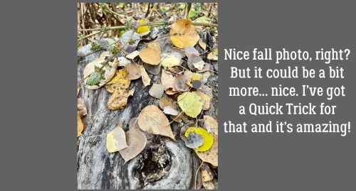
I know this is true. We ALL have photos that we like but would like better if… they were more vivid. But making adjustments to lighting and colour can be time-consuming and takes some practice. I’m going to show you how to take a nice photo to a NICE photo with just a couple of clicks. I’ve tried this trick on a lot of photos and am really impressed, as well as disappointed I didn’t know about it sooner! The photo I’m going to use as my demo is one taken by my friend Sandy and I’m using it with her permission.
Fall is all about colour. These leaves are pretty, but they’re just a little insipid.
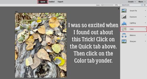
I haven’t really shown you too much under the Quick Edit tab, and that’s my bad. There are some pretty useful options in here and I strongly recommend playing with them when you have a few minutes. Today we’ll focus on the Color tab.
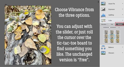
Click on that Vibrance option. This menu will open up. Notice the blue box around the “Free” space in the tic-tac-toe array. That’s the unaltered image. You can use the slider to adjust the colour vibrance or just click on one of the boxes. You can see the adjustments without actually committing to one by rolling the cursor over the array. Going up decreases the vibrance, going down increases it.
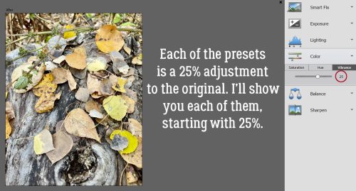
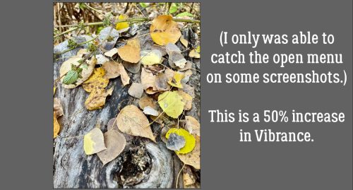
Each of the presets represents a 25% change in Vibrance. I’ll show you each of them.
With this laptop, I often struggle with getting the screenshots I want with the pop-up boxes open. Sometimes I luck out, sometimes I fail. Most times I fail – screenshots are captured by clicking CTRL>prt sc and as soon as I hit the CTRL key the pop-up disappears. SO frustrating!! Anyway, that’s what captions and text are for. This image is a 50% increase adjustment.
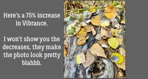
And on to 75%. Are you able to see the changes?
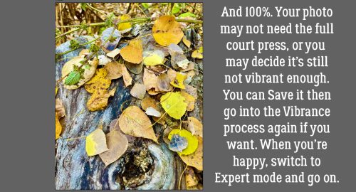
100% looks like this. Not only are the leaves brighter and more vivid, the fallen log under them has greater dimension and the whole image is just better. If you’ve gone to 100% and still think your image needs a boost, Save it with a new name then run the process again on the new version. When you’re happy with the way it looks, click on the Expert tab and you’re done, ready to use your bright, vivid photo on a layout! You can run through this process in the middle of a layout if you decide the photo needs some oomph. Moving between Expert and Quick won’t wreck anything, so give it a whirl!
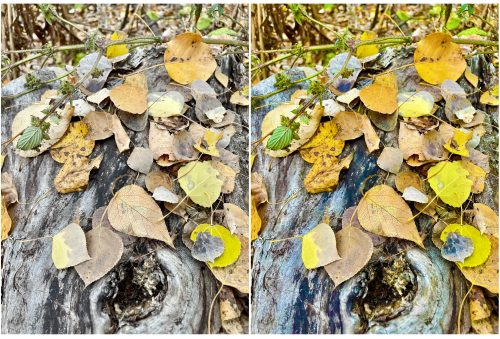
Here are the original and the new-and-improved version. Impressive, right? And so easy…
PDF Version : https://bit.ly/3DTBCdq
![]()