October-y Fonts
![]()
PDF VERSION : https://bit.ly/3MB8f2u
The calendar says it’s fall, although where I am it’s still quite summery – I’m wearing shorts and flipflops, which is very much NOT October in Canada. The leaves are changing and the nights have a chill to them. So much inspiration for layouts, right? How about we look at some autumn-themed fonts for titles and journaling. And some dingbats too. All of them are free, from dafont.com and are linked so you can go right to them if you choose to grab them.
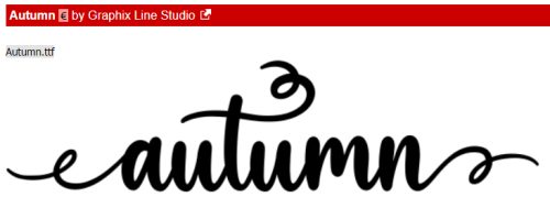
Autumn looks a lot like a vine, and is legible enough for journaling. It includes numerals and symbols as well as some alternate characters.
Autumn Pumkin is a more streamlined script that is also very versatile.

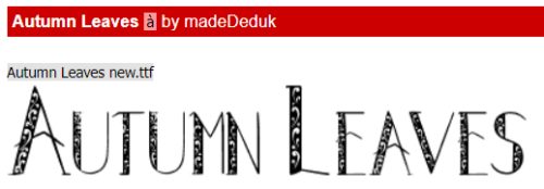
I like Autumn Leaves as a title font. It’s all upper-case, with a bunch of alternate characters and can be customized in so many ways.
Sketchy Autumn Dingbats can be incorporated into titles, filled with colour and turned into stickers or just resized and used much like a brush. The dingbats attached to the upper-case characters are different from the lower-case ones, so there are 52 sketchy little pics.

I like the simplicity of A Day in Autumn. It looks a little twiggy, a little leafy and is very legible so suitable for journaling. It has numerals and punctuation but no alternate characters.

LCR Autumn Harvest Dings is a limited collection of sketches. The characters A-P have dings attached. Don’t you love that scarecrow silhouette?

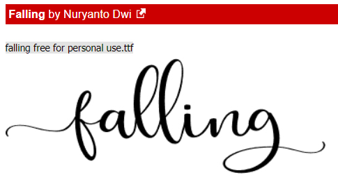
Falling is just a nice, curvy, script font; the only flaw is that it doesn’t include numerals.
KR Fabulous Fall is another 26-dingbat collection filled with leaves and other symbols of fall.

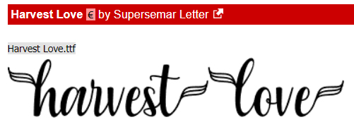
I think Harvest Fall would be ideal for subtitles, journaling and wordstrips. It has numerals, symbols and alternate characters galore!
WM Leaves 1 is another A-S dingbat font that includes a perfect Canadian-flag maple leaf. Yes please!

Tanaestal Doodle Leaves 01 looks like folk art. It includes 54 different shapes – upper- and lower-case and the period and comma keys have shapes attached.

Now, let’s do Hallowe’en! CF Halloween is up first. It’s an all-upper-case font with numerals but no punctuation.

I think Halloween Witches Script it my favourite, even though it doesn’t include the witch’s hat, spider or ghosts. It’s elegant and can (obviously) be combined with dingbats to make really fun text…

Dingbats like these! Freaky Halloween has it all.

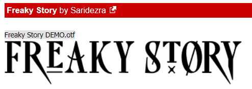
Freaky Story is both creepy and refined. It’s another all-caps font, with the special characters hiding in the lower-case keys. It includes numerals and punctuation too.
Halloween is another fabulous assortment of dingbats you could use to customize your other fonts. What’s neat with this one is that the B, C and P keys give you the word “Halloween” plus some ghosts, bats, spiders and drippy blood. And it’s the only dingbat set I’ve seen that also has images attached to the number keys. Check it out!

Halloween Bell has 26 more themed dingbats.

I can see Spooky Halloween as a title font, can’t you? Unlike the other fancy fonts, this one DOES come with the fancy characters and you don’t even have to hunt for them. Numerals only though, no punctuation.

Halloween Rules doesn’t include those funky little skulls. I think it’s a cute-but-creepy, legible option.

I like Tricky Night for titles or subtitles. But don’t exclude it from journaling – it has numerals, punctuation and a bunch of alternate characters.

Last but not least, Spooky Webbie is cute, but still Halloween-y. It’s also the full package so you can use it for whatever your little heart desires.

Did you see anything that inspires you? I hope so!! Next week is Challenge Spotlight time, so I’ll be doing a Gallery crawl as soon as I recover from Canadian Thanksgiving…
PDF VERSION : https://bit.ly/3MB8f2u
![]()