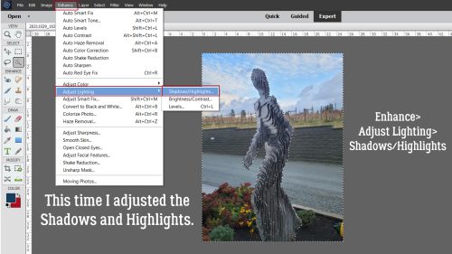
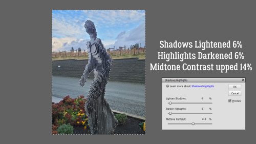
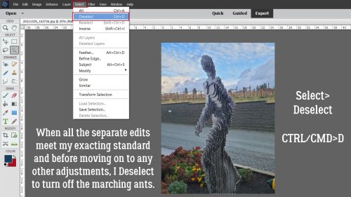
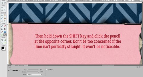
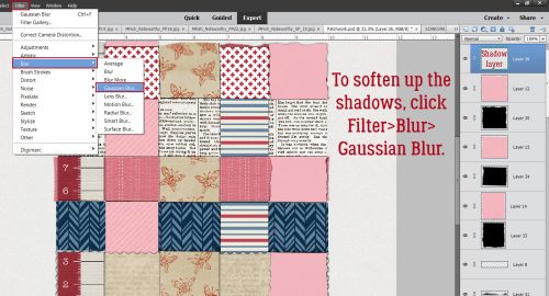
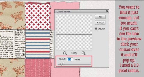
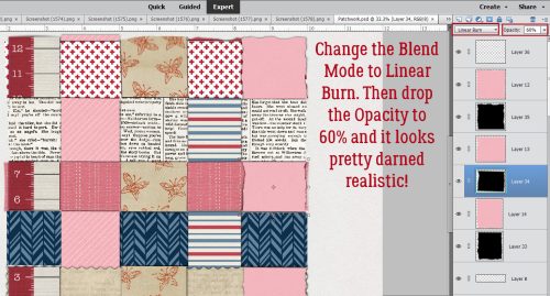
Can you believe we’re already at the end of March? The year is just flying by.
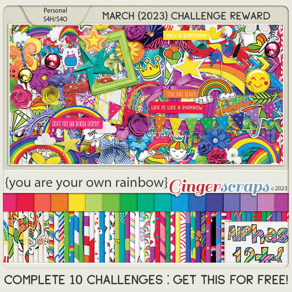
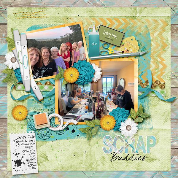
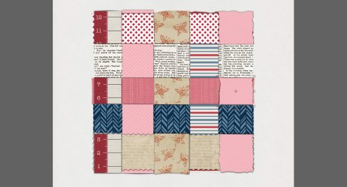
Remember, spend $10 in the store and get this great kit for free.

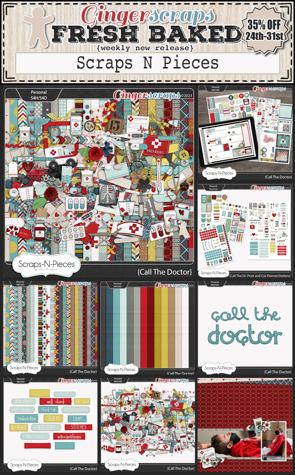
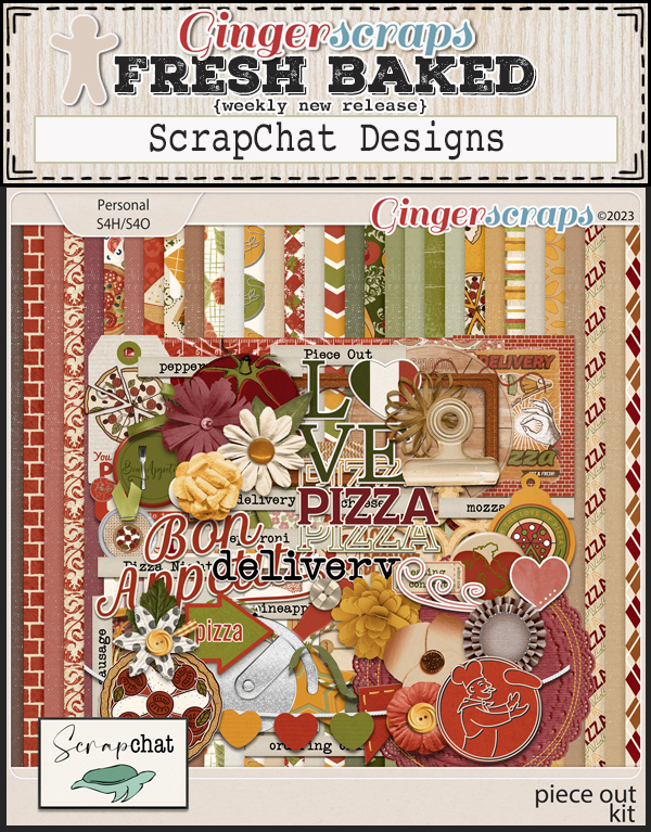
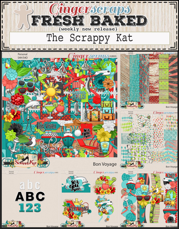
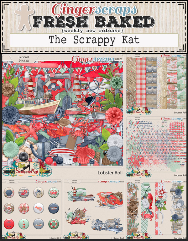
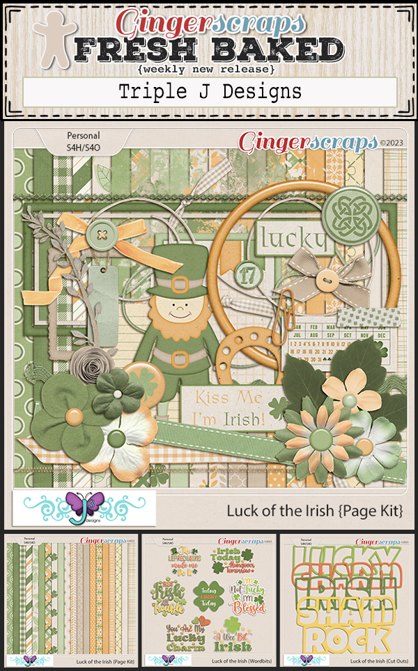
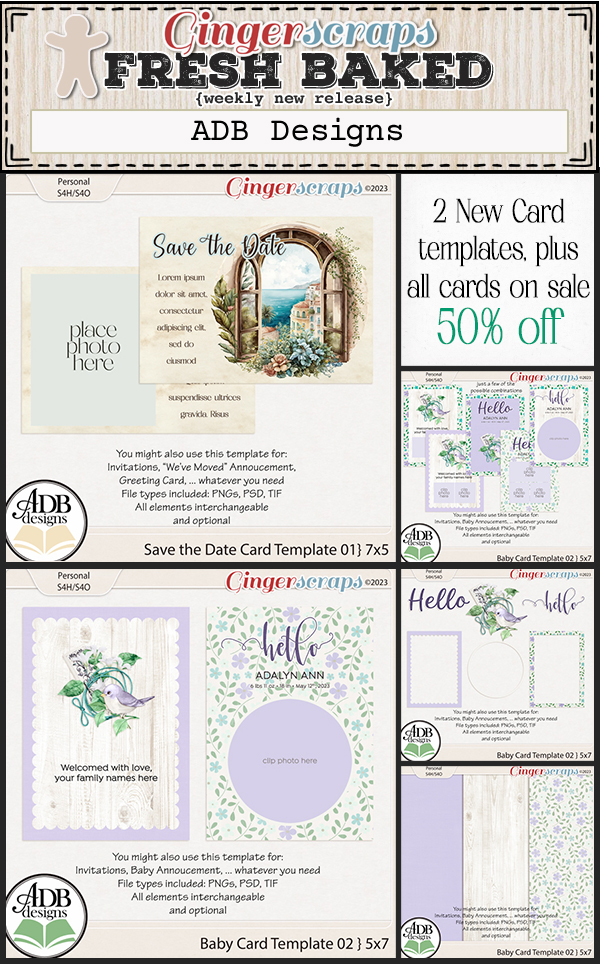
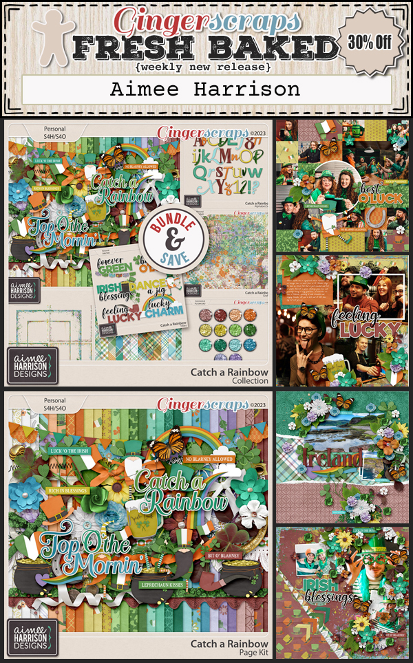
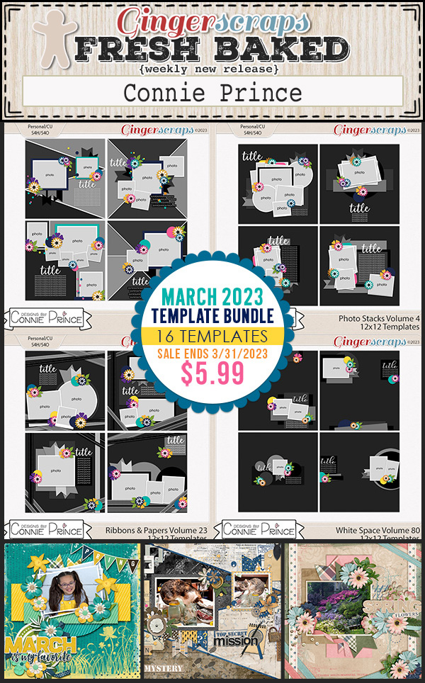
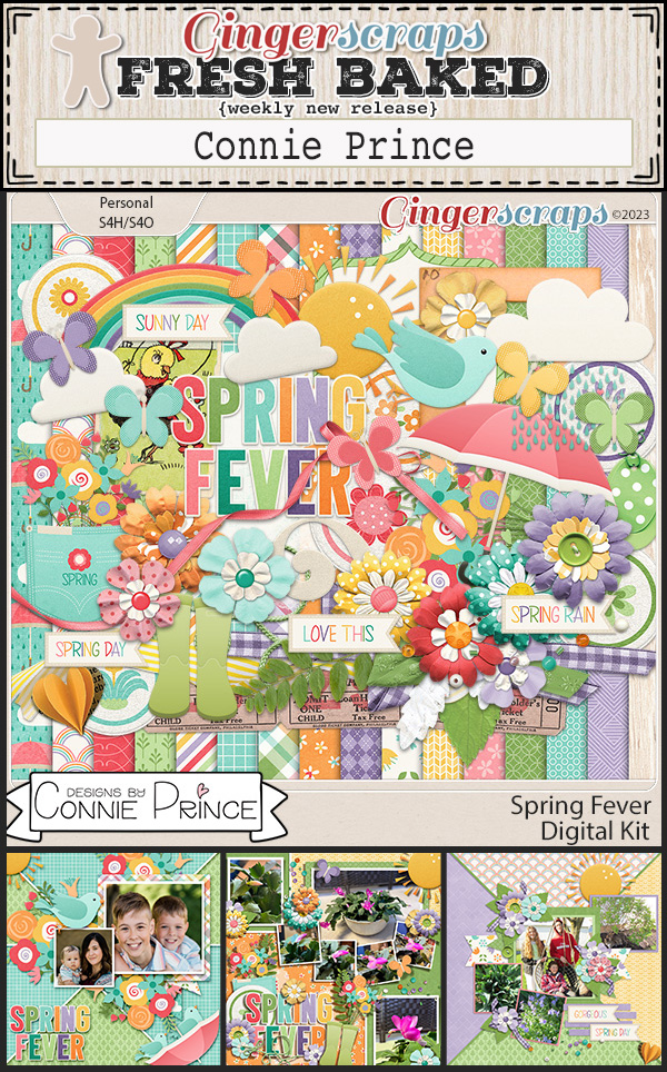
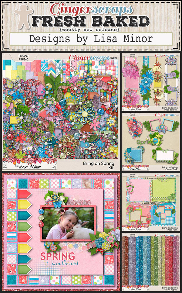
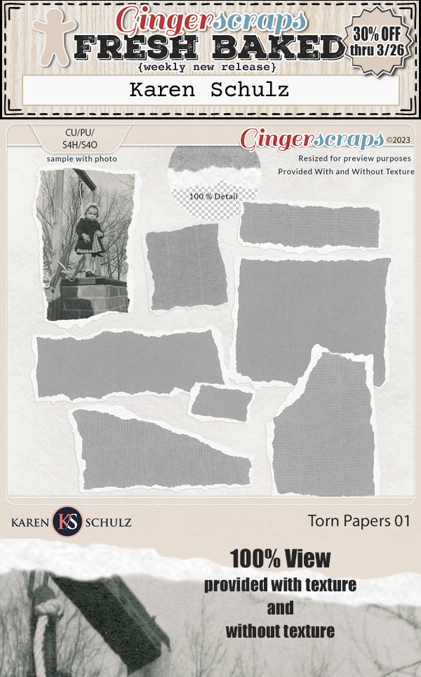
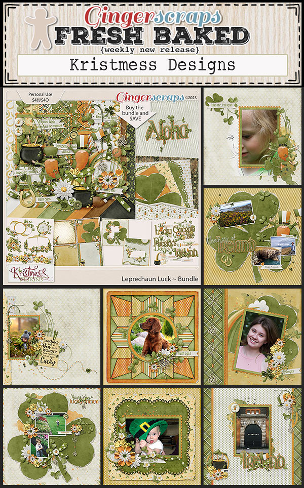
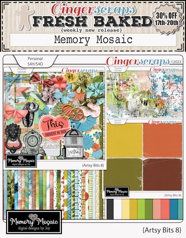
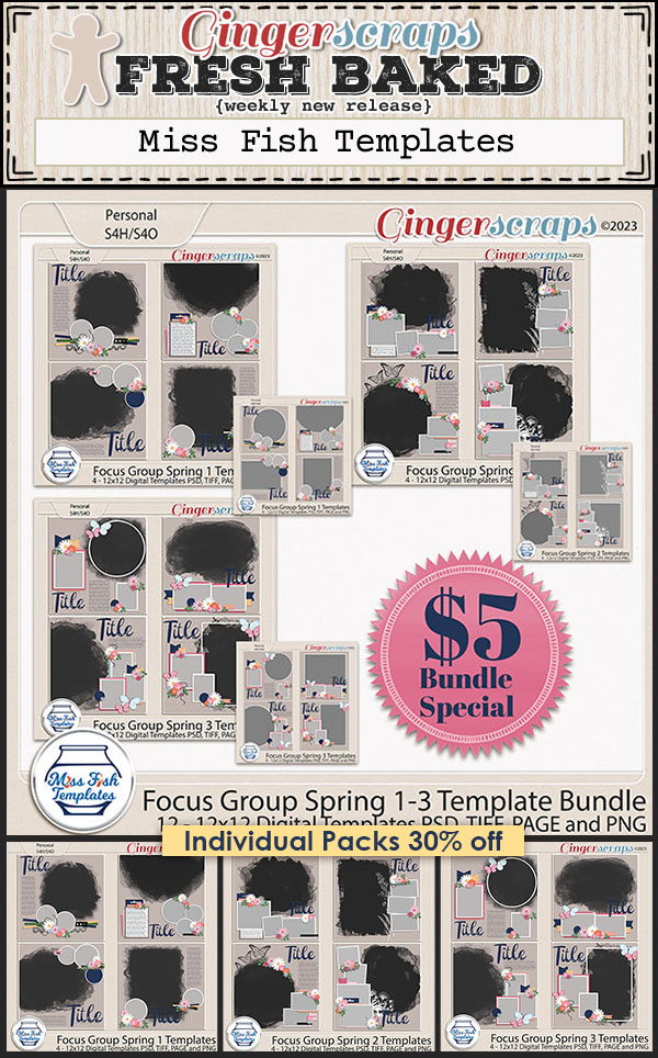
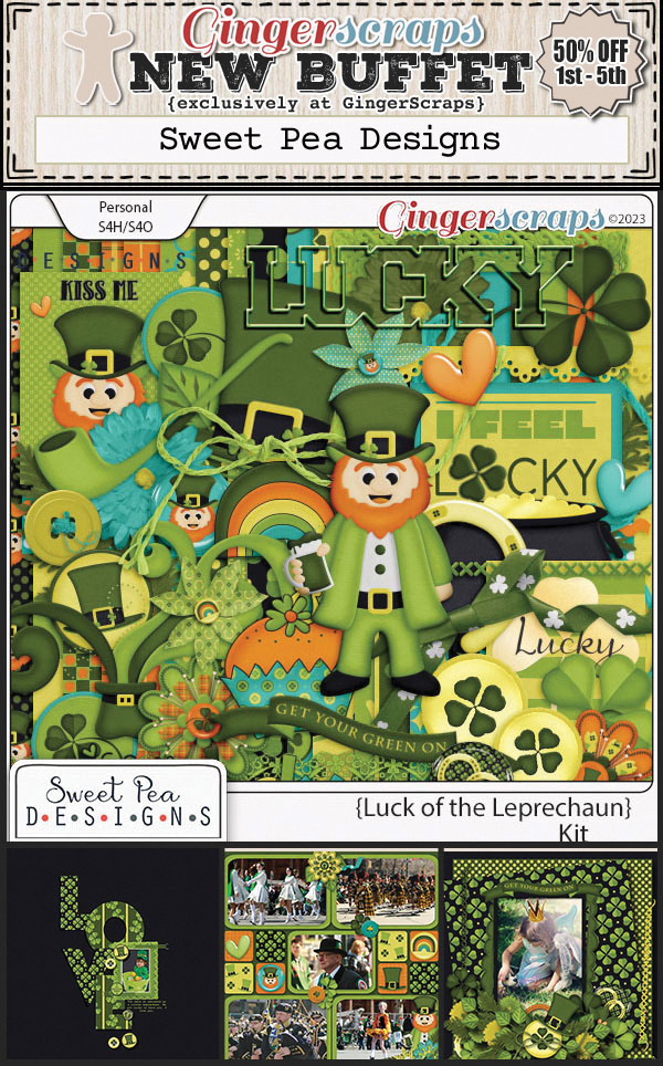
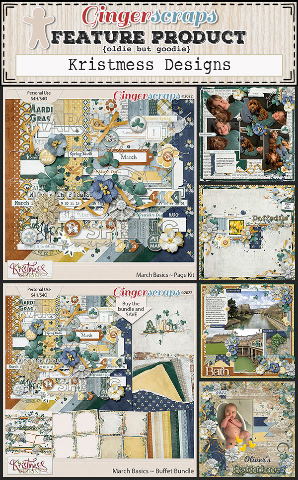
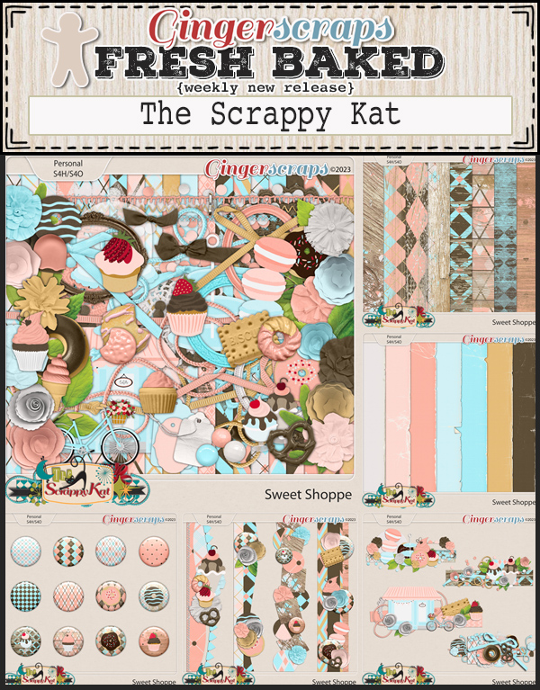
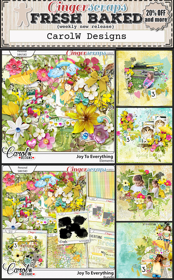
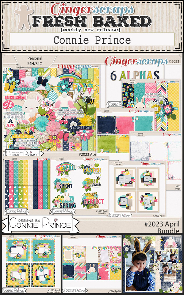
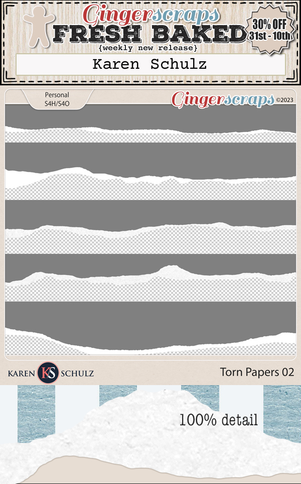
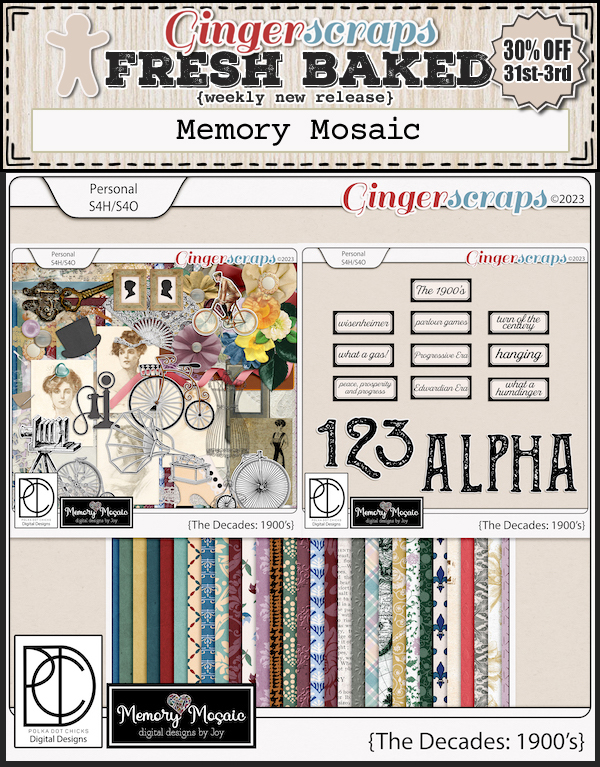
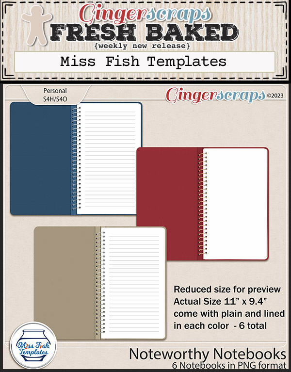
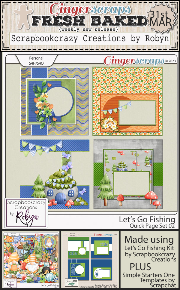
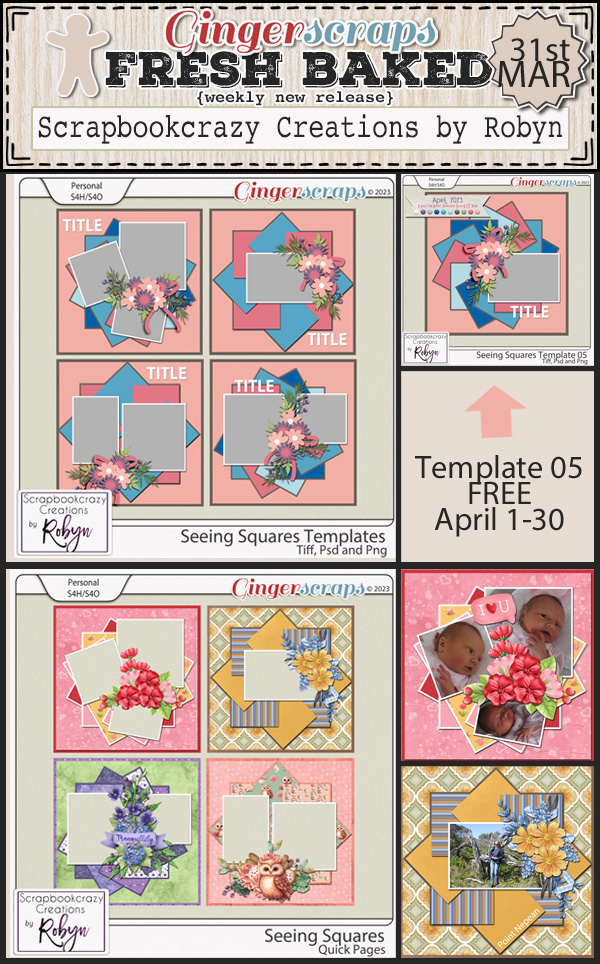
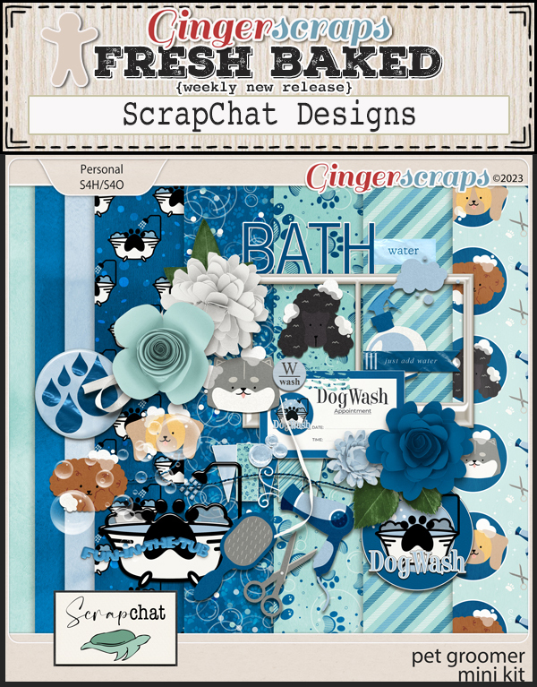
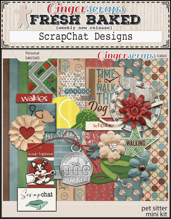
How about a peek a the new kits in the store this week?


Don’t foget to get your March challenges posted. Remember any 10 completed challenges gets you this great kit.