Challenge Spotlight: Minikit
![]()
September is surely flying by, isn’t it? It’s already almost the autumnal equinox and the slow slide into winter here in the Northern Hemisphere, while our GingerScrappers down under are looking toward spring. And life goes on…
This month’s Spotlight Challenge is the Minikit Challenge, hosted by Joy of Memory Mosaic. As the name implies, the Challenge is to use the pieces of a supplied (free) minikit to create a unique layout. This type of Challenge showcases individual style very well, since all participants are starting with the same tools. This month’s mini is shown below.

Now I’m going to share each of the layouts that have been posted to the Challenge Gallery as of noon today PDT. They’re in the order they were posted, and I’ve linked each to the Gallery so you can get a closer look and leave some praise for the Scrapper. Just click on their Forum handle.
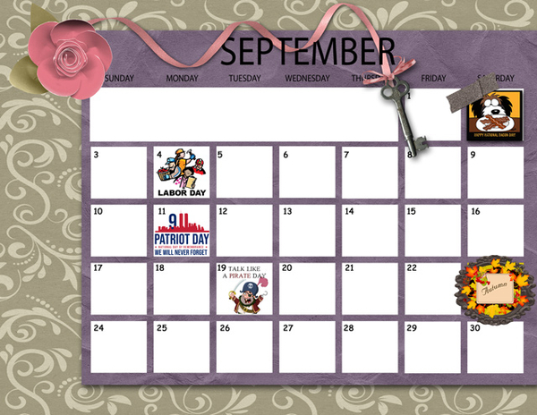
KAPOH has created a calendar with the mini. I see today is Talk Like a Pirate Day. I guess we should brush up on our “arrrhs”.
Alasandra has blended the papers to give herself some more options and flexibility, and flanked the ornate frame with two simple clusters.

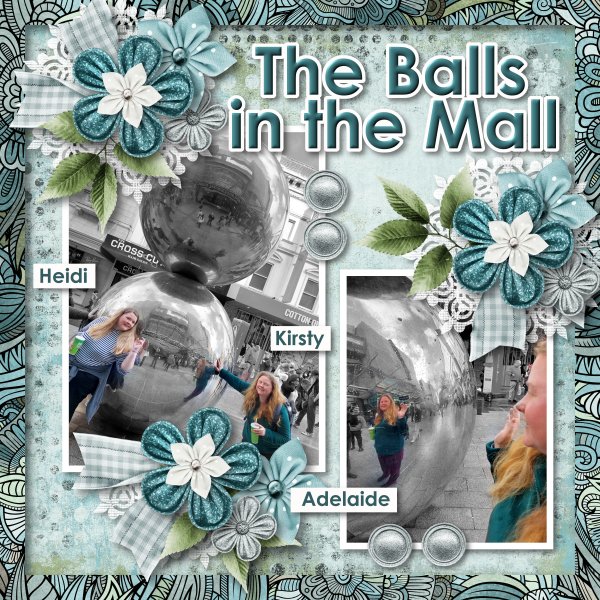
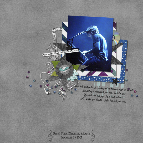
As most of you know, I’m a sucker for heritage photos. I LOVE how trinanne has adapted the frame to encompass each of the people in her photo. The emphemera she’s added are scans of her aunt’s actual teaching diploma and license… precious!

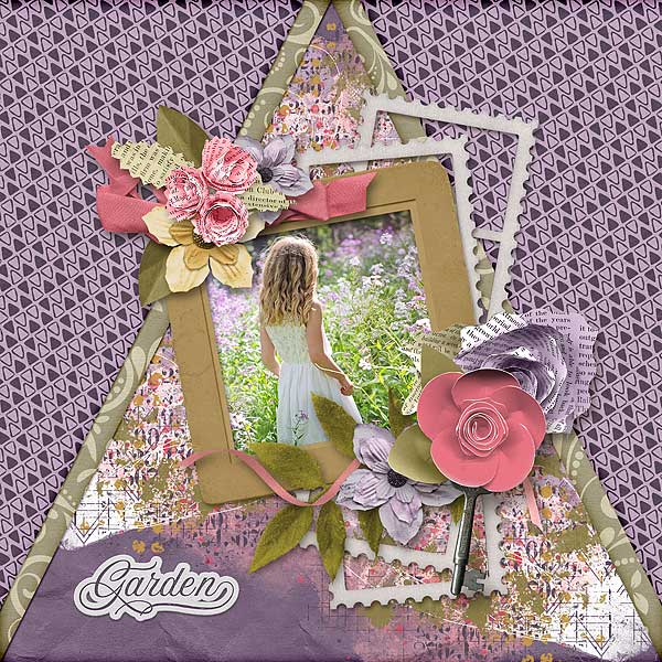
MarilynZ has used the frame very cleverly here, with one being lightened without losing detail. The diagonal placement of the ribbon, with the key centred and the repeating small paper squares, gives the layout balance.

Pippin chose the perfect photo to coordinate with this mini! The purple sunset behind the house is a very close match to the purple paper. Her simple cluster and all that white space are very effective at drawing the eye to her photo. Brava!

NHSoxGirl has reversed the order of Pippin‘s papers to create a minimalist layout where the photo is the star. Good choice to go with black and white. The white stroke around the purple paper is brilliant.

This is something I would do! Those old keys in the photo play with the key in the mini so well. I see angbrey has also recoloured a flower and has used the frames as mats. Creative!

AnnieA has used everything but the tape, and kept her layout minimalist, with strong diagonals. I like the rotated purple paper, it’s exquisitely shadowed. Very eye-catching!

What an interesting layout PixyGirl has created, with a very vintage feel. The patchwork effect with the papers is beautifully executed. The slight tilt to the frame mimics the slight tilt of her great-grandmother’s head for a very effective focal point.

It took me a few minutes to deconstruct kabrak1207‘s layout. She has used additional elements and papers from the coordinating Buffet bundle from Memory Mosaic – totally allowed! – and has created an outstanding piece. That centre cluster is perfection.
CathyS has also added some elements from other designers in the September Buffet. I like how she’s faded the papers together and mirrored the brick behind the flowers in her photo with arty paint.

Oh my! Look at that beautiful dissolve/fade effect lulumoon has created with the papers!! The clusters provide a pop of colour and the entire layout is a showstopper.

The mini is cleverly disguised in nimble4u‘s layout. The only element from the mini that I couldn’t find is the tape. She’s added some elements from other kits, which are included in her credits.

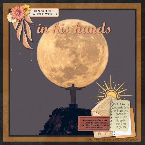
Lastly, this layout from hkeith87 has included the whole mini, pairing it with a stunning sunset photo. The purple clouds in the photo look like they just merge into the purple paper strip. Beautiful!

It’s always a learning experience to browse the Gallery. Next week it’s Quick Trick time again. I’ll have to see what I can pull out of the ether to share with you all. Have a great week!
![]()


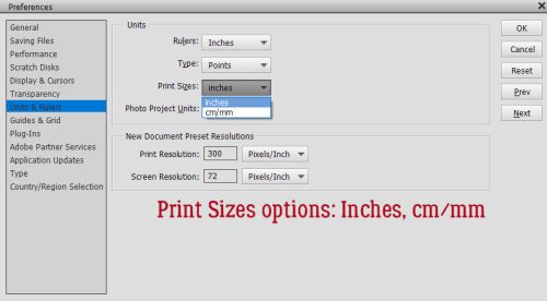
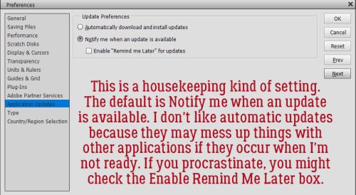
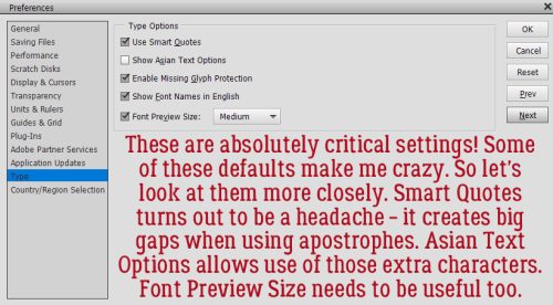
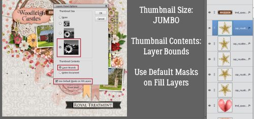
 In Expert mode, you can see the new layers Elements has added to the paper. The top and bottom layers are the only ones that matter. You can activate that pattern layer at the top and add a Layer>New Fill Layer>Solid>Clip to change colour, or you can play with the Blend Mode for that layer to see what works best for you.
 Here’s a close-up of the pattern so you’ll easily see the Blend Mode change.