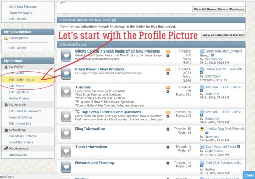
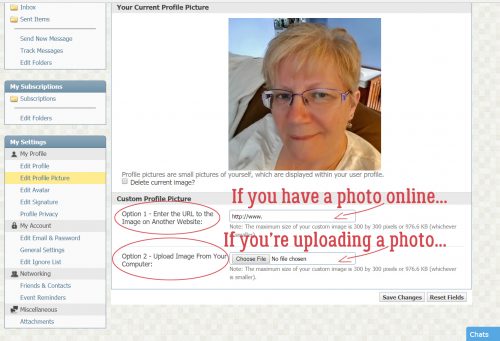
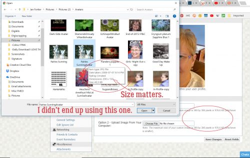
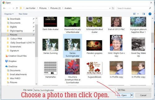
Pleated Paper? Maybe…
![]()
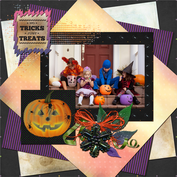
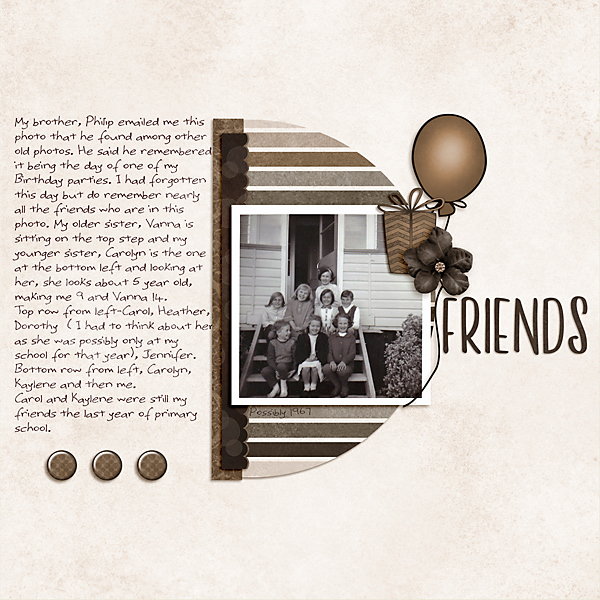
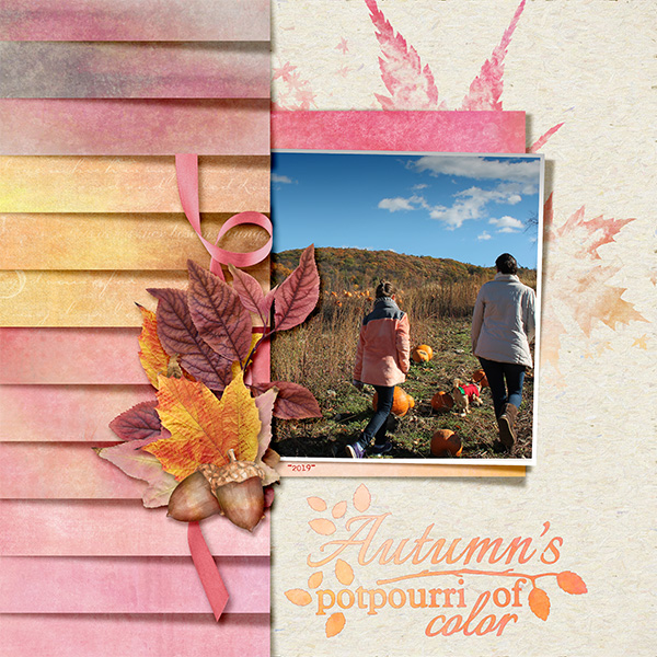
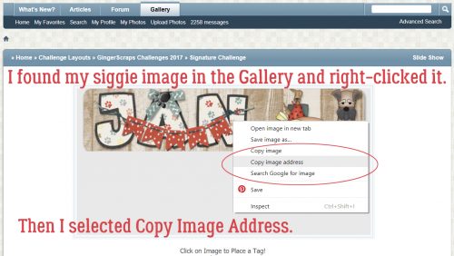
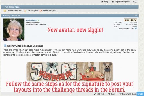
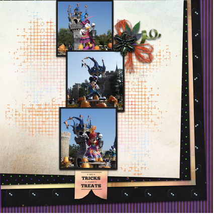
The other day I got a private message from Ginger, whose working title is Dandelion Dust Designs. “I’ve had some customers and CT members fall in love with this LO in the GS Gallery and would love a tutorial on how to do that amazing layered/shadow work on the left side of the page, if and when you have time as a future tutorial! Thank you!!” The layout she’s talking about is this one, wvsandy‘s Use It All challenge layout, and it’s FABULOUS! (I’ve linked it there so you can visit the Gallery and leave her some love.)
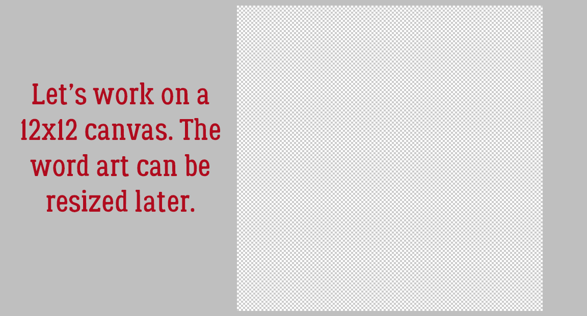
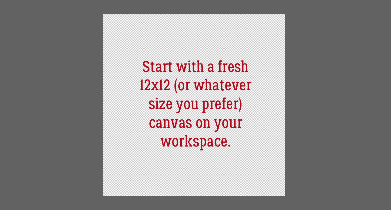
What follows is part of a literal scraplift of wvsandy‘s layout. As I was putting it together, I learned a few things about how layers work that I hadn’t known before, and so the screenshots are a bit muddled. I’ve tried to work around that to give you the most concise instructions and fewest extra steps that I can. Please tell me if you try this and come up with a better method! First off, I started with a blank 12×12 canvas on my workspace. (Obviously, you can make it whatever size you want. I just like 12×12!)
For best results this technique wants a light-coloured neutral background – otherwise the shadows that make it so awesome will be diminished. I’m using Jumpstart Designs‘ Good Friends Gather Here for my layout. (Sheri gave me a shout-out in her newsletter! Did you see it?)

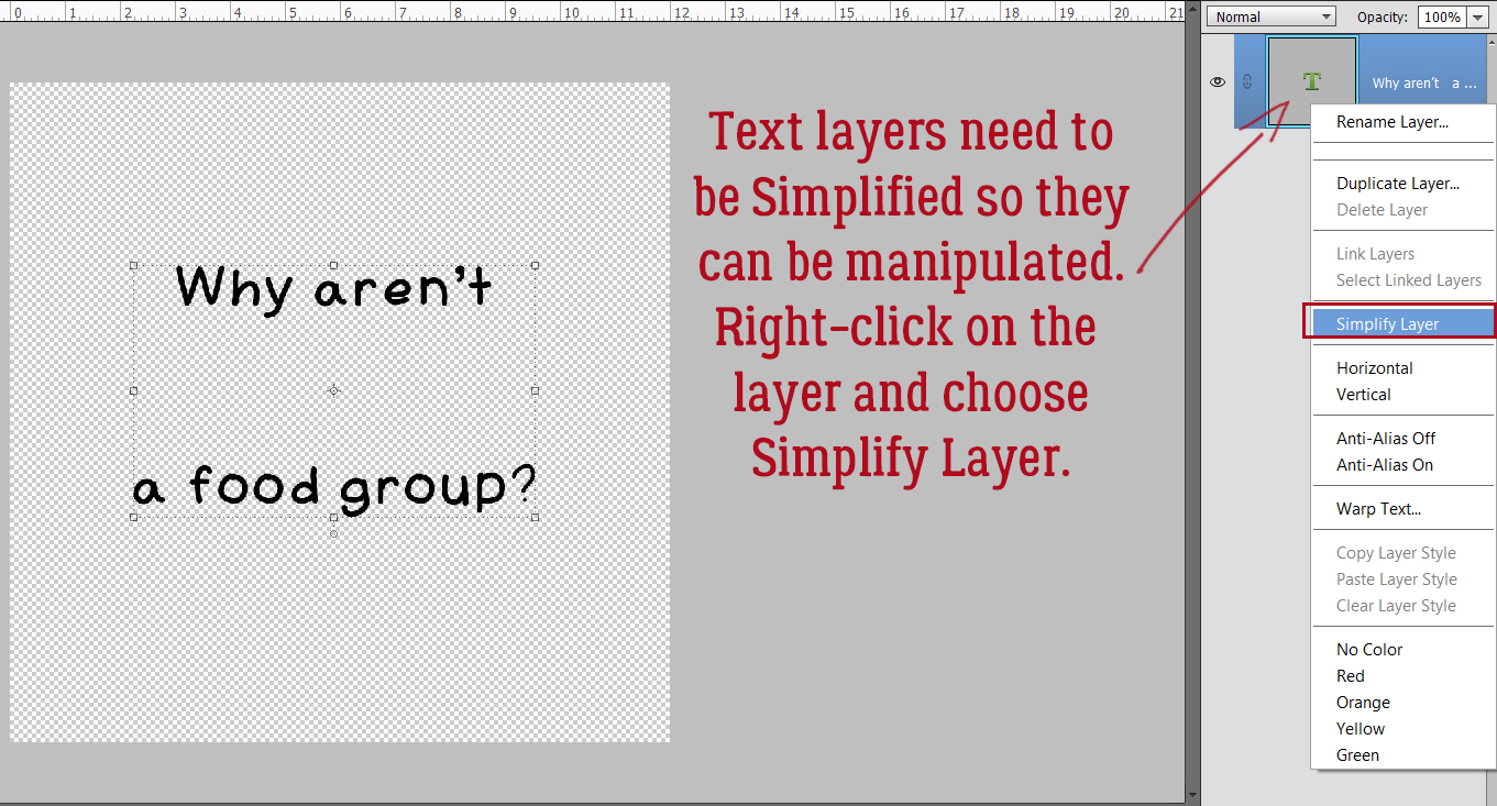
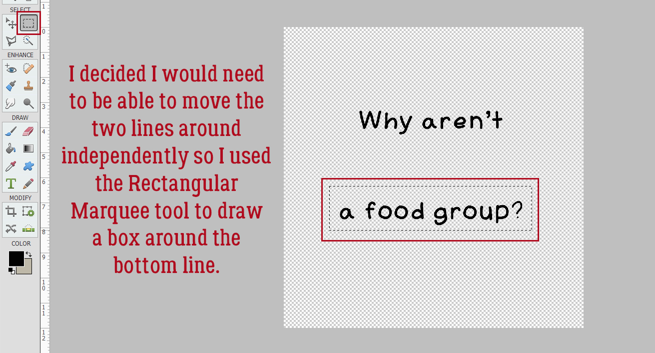
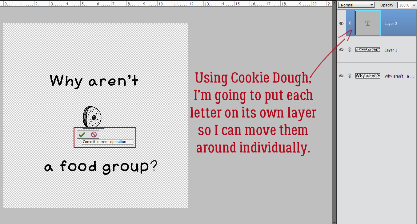
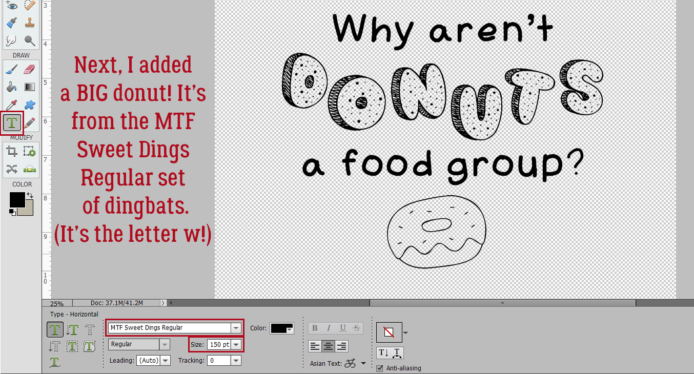
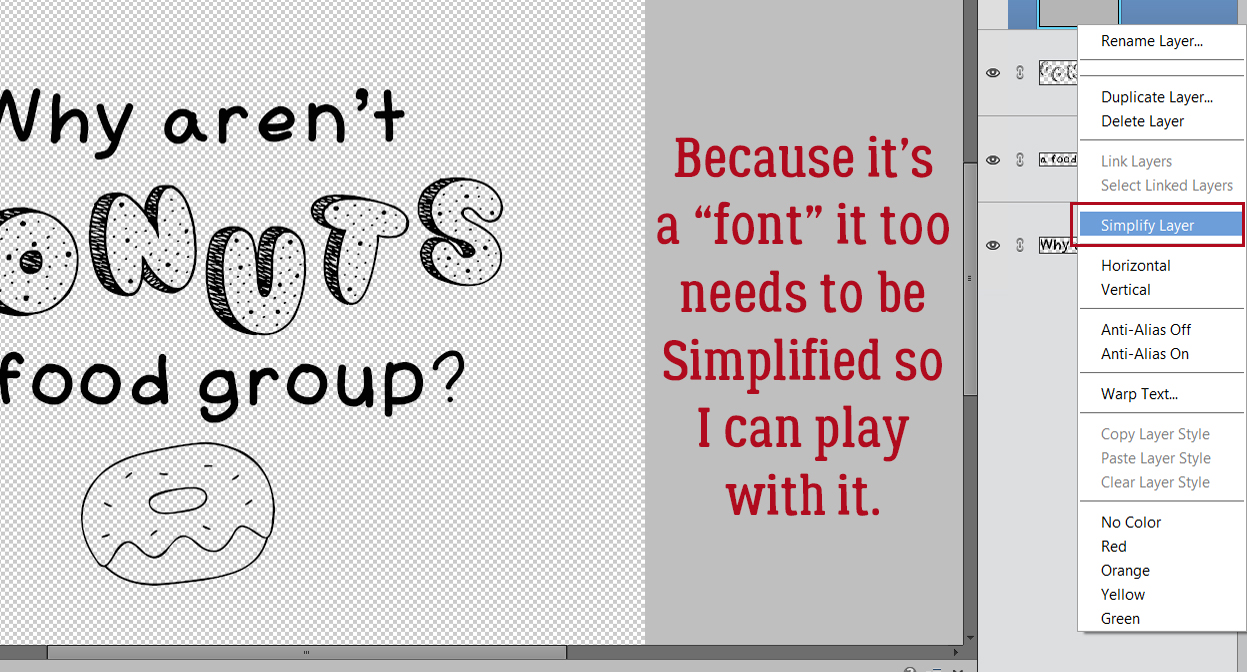
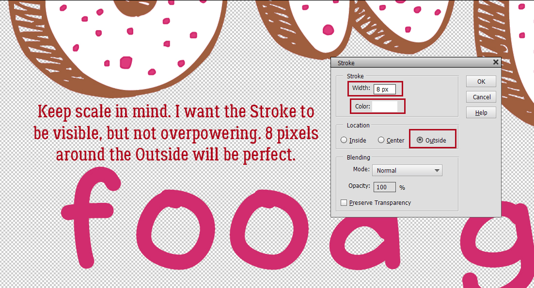
Essentially, I’m creating a template for the paper strips/pleats in these next few steps. Looking at the inspiration layout, the paper strips along the left of the page don’t reach to the centre and there are 12 of them. So using the Custom Shape Tool, with the Rectangle shape selected, I set a Fixed Size of 5 inches wide, 1 inch tall for my “cookie cutter”. The foreground colour isn’t important for this but should be something that contrasts with the background. This Tool creates a “Smart Object” which can’t be altered in its original form and must be Simplified. In later versions of Elements, there’s a Simplify button right there in the Tool Options panel. If your version doesn’t have that, right-click on the layer and choose Simplify Layer from the dropdown menu.

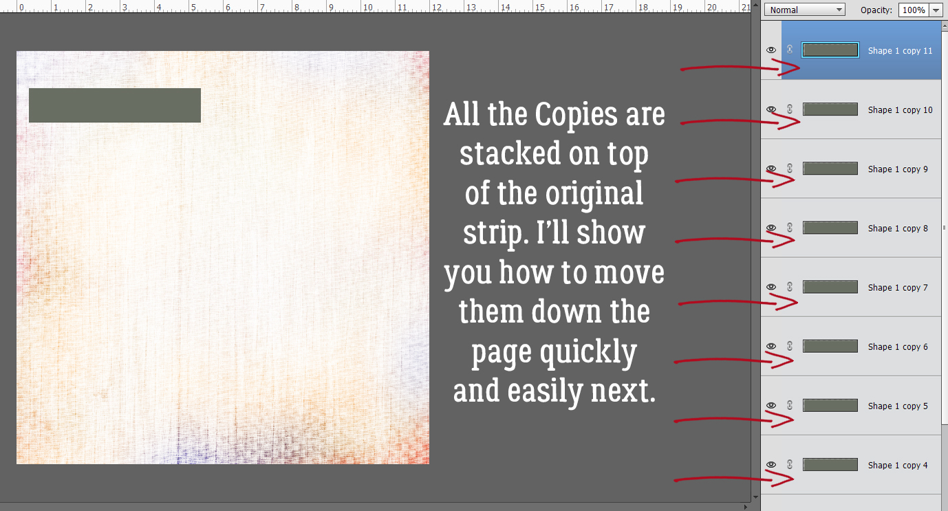
Next step is to make a bunch of Copies of that paper strip template. The quickest and easiest way to do that is to click CTRL/CMD>J as many times as you need copies. Or you can right-click, Duplicate Layer>Ok for each copy.

All the Copies will be stacked up on top of the original paper strip and will need to be moved up or down the stack to create the column of strips.
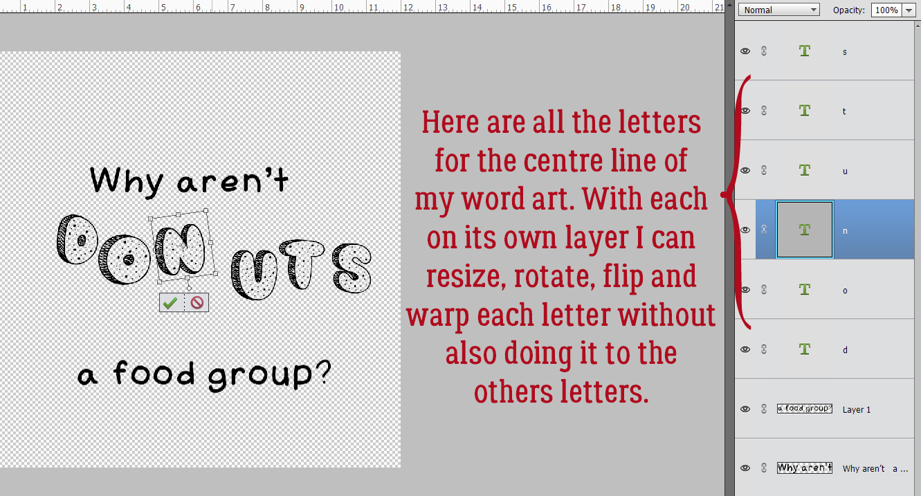
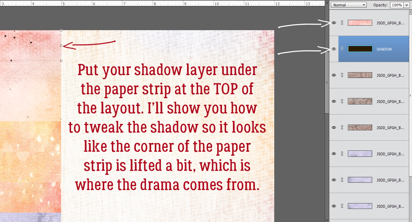
Because I screenshot as I work my way through the techniques I show you, if I discover I’ve taken the LONG way to get where I’m going, the images won’t sync well with the text. And of course, I figured out after I’d gotten more than halfway through that I wasn’t taking the most sensible route to my destination. (GPS anyone?) Please read the text on the images and the text for each step to see where I’ve messed up. (It’ll be in red here…) I’m going to show you how to quickly and easily Align the edges of all those strips and Distribute them the length of the page. For the shadowing to work best, the strip layer at the BOTTOM of the layer stack goes to the TOP corner of the page. So move that layer into place.

Now, rather than what the image shows, you’ll move the strip at the TOP of the stack to the BOTTOM corner of the page. The rest of the strips will need to be moved up and down the stack later, but for now they can stay piled on top of each other.

To Align all the left edges of the strips with the left edge of the page, first we have to Select all the pertinent layers. Click on either the top or the bottom layer then hold down the SHIFT key and click on the one at the other end of the pile.

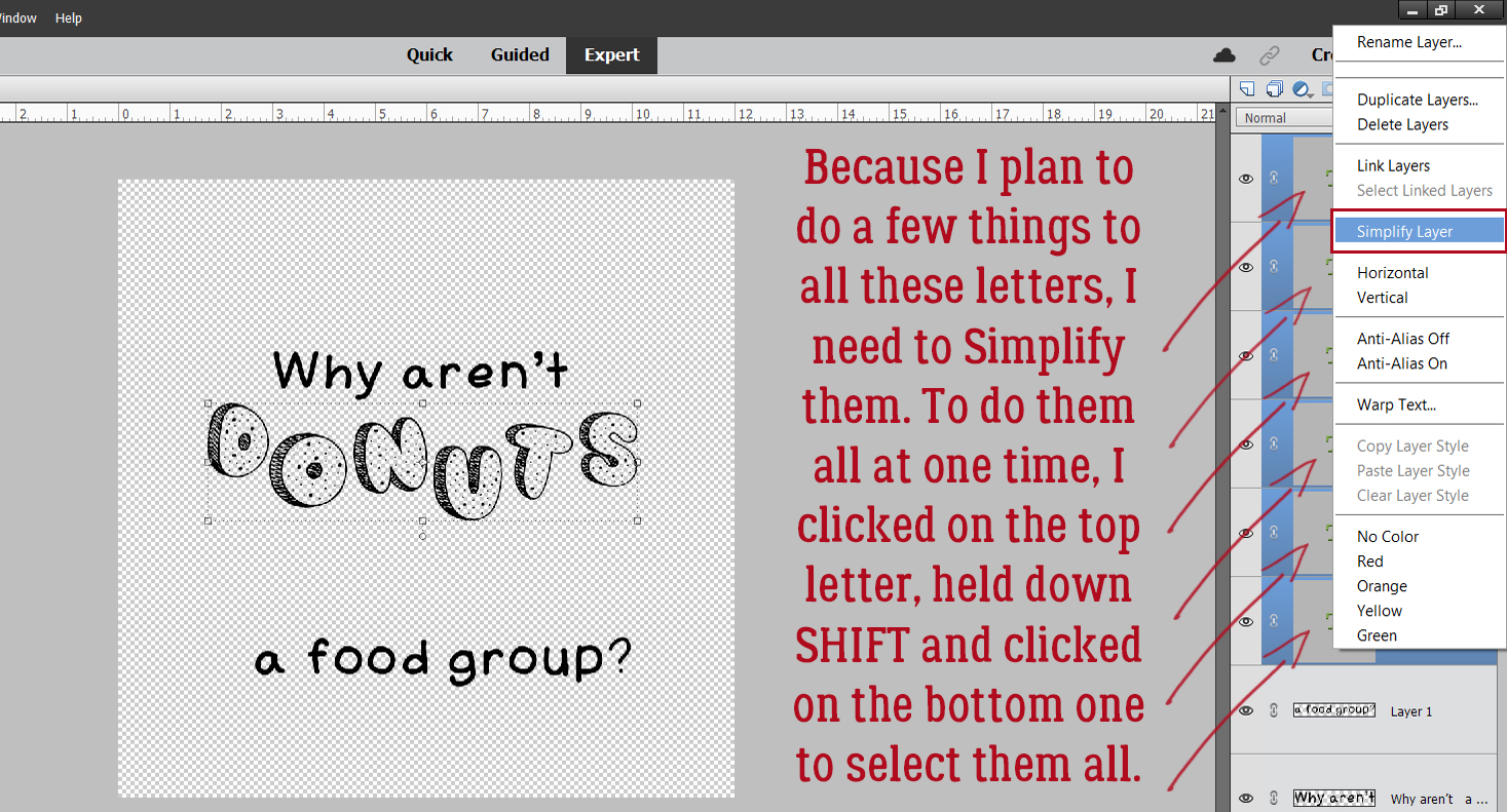
With the Move Tool active, look for the Tool Options at the lower left of the workspace. Click on the Align Left button and Elements will move all the strips so their left edges are aligned. With all the layers still Selected, click on Distribute Center as shown. Elements will move each strip so they’re evenly spaced down the page. If there’s a slight gap in the column, it could be that 3600 pixels isn’t exactly 12 inches. Just close the gap.

Then you can start Clipping papers to your strip templates. I’ll do three strips from each of four papers for mine, but you do you! Drag a paper on top of the first paper strip layer then right-click and choose Create Clipping Mask or use the keyboard shortcut CTRL/CMD>G for Elements versions 13 and lower, CTRL/CMD>ALT>G for versions more recent. You’ll need to move the various layers up or down the Layers Panel to have them in the correct order. You can drag them up or down or use the CTRL/CMD>[ key to move down, CTRL/CMD>] to move up.

You can shift each paper layer around while it’s just Clipped to the strip template so that the results are pleasing to your eye.

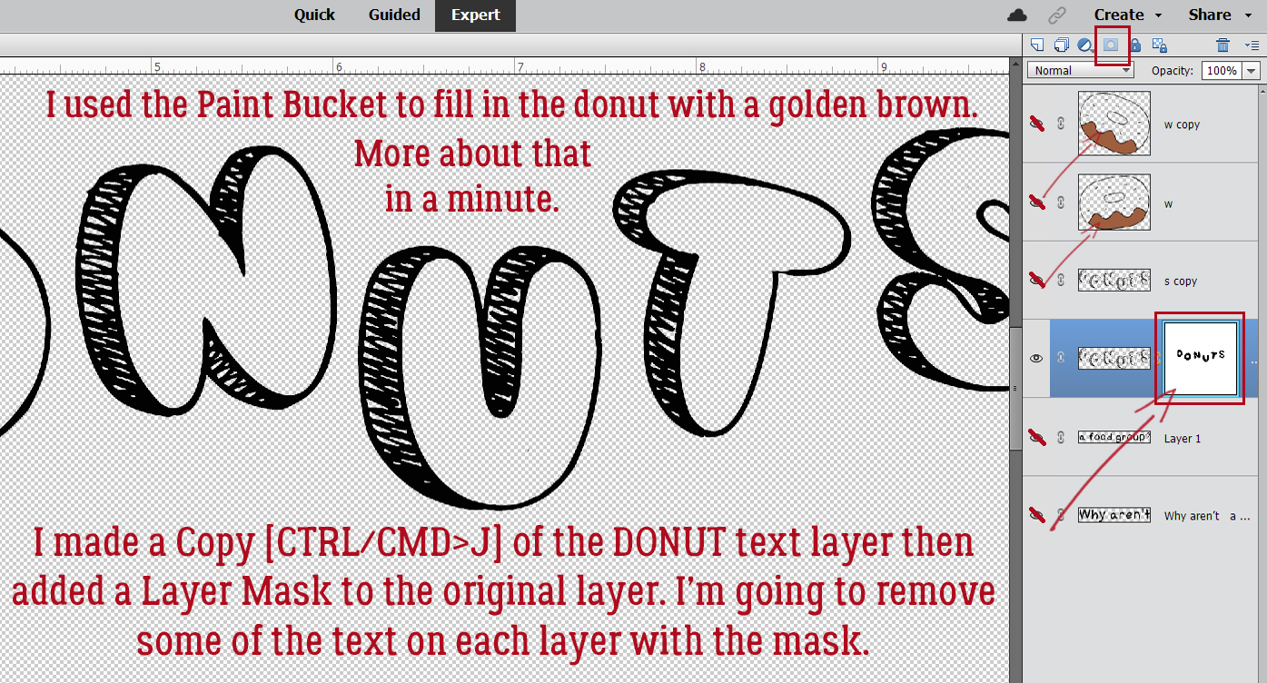
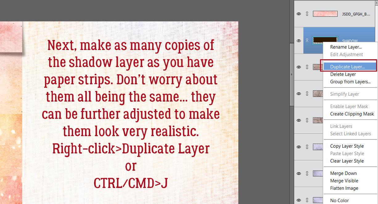
Before going any further, make one more Copy of the original paper strip template. It’s going to be the basis for the custom shadow layers we’ll be creating next.

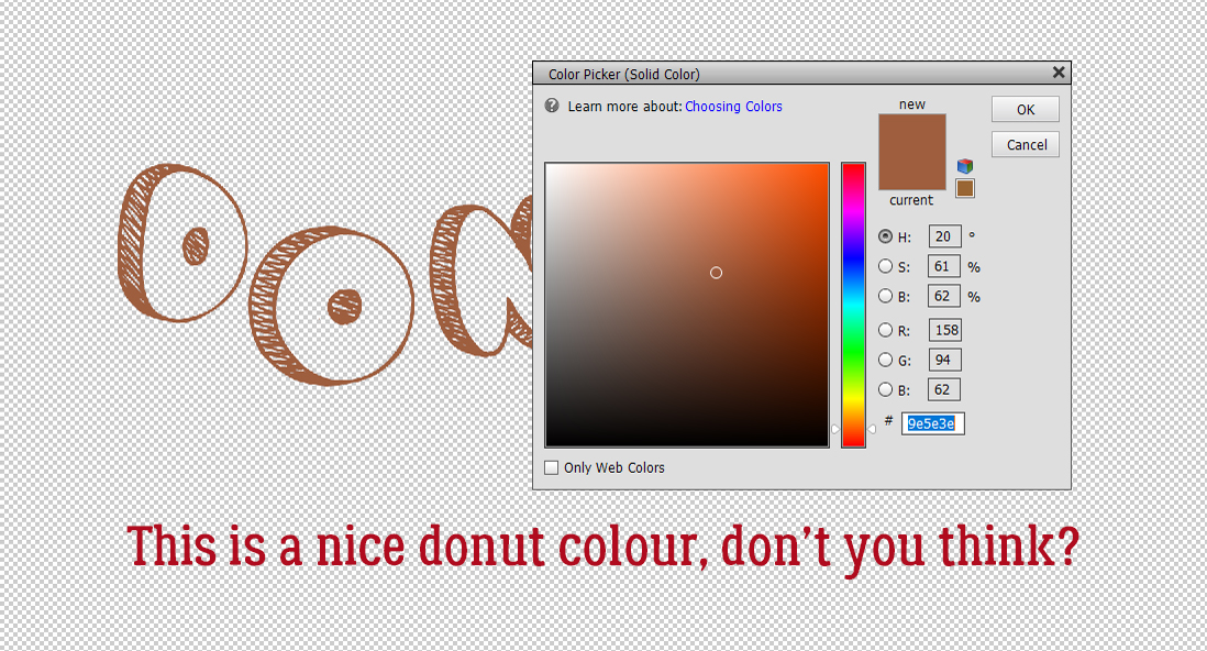
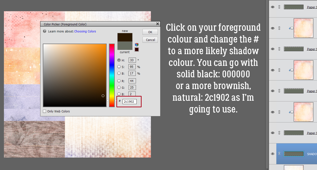
Some template designers use black for shadows, some designers like a warmer, softer brown colour. Click on the foreground colour and make your choice.
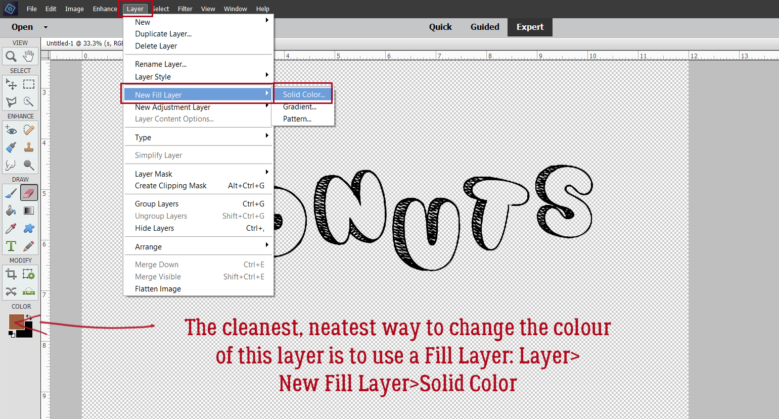
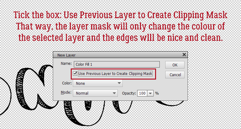
The quickest way to change the colour of the shadow layer strip is to CTRL/CMD>click inside the Layer Thumbnail and use the Paint Bucket. Just click anywhere on the canvas. Or you can click Layer>New Fill Layer>Solid Color>Use Previous Layer as Clipping Mask.

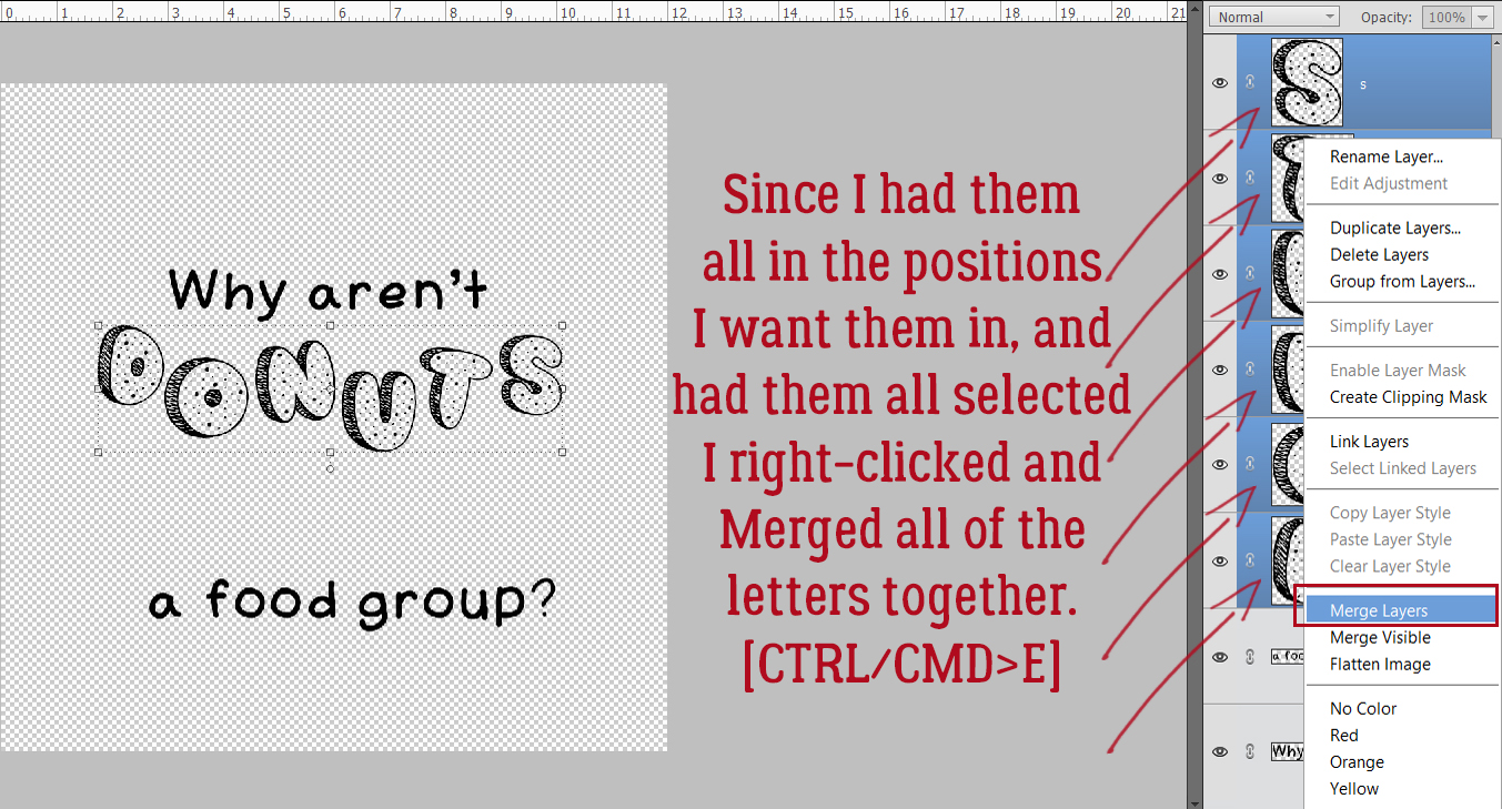
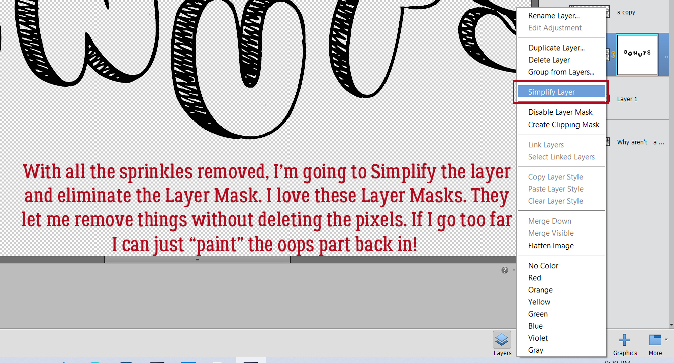
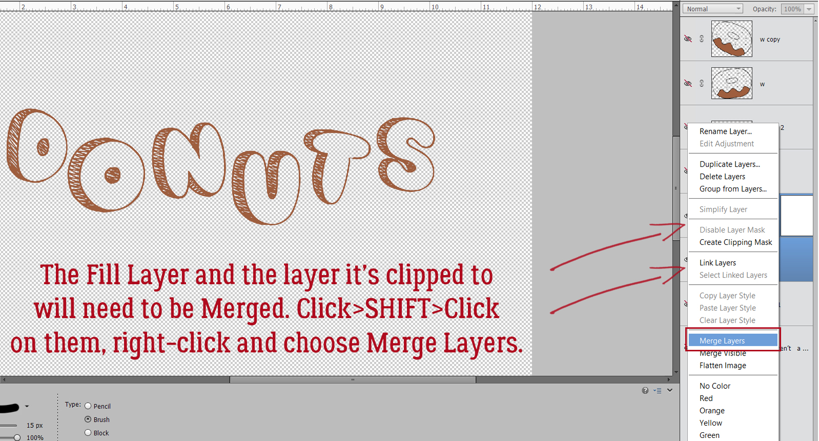
Before going on, to minimize confusion I suggest Merging each paper to its strip template. Select both layers by CTRL/CMD>clicking on each layer (not the thumbnail though!) then right-click and choose Merge Layers, or simply click CTRL/CMD>E.

Now Move that shadow layer so that it’s underneath the layer at the top corner of the page.
To turn a black rectangle into a realistic shadow, it needs to peek out from under the paper and give the impression there’s space between the paper and whatever is underneath it. You can nudge the shadow layer down and to the right using your arrow keys, but to get a truly interesting shadow, let’s go a bit further. Image>Transform>Distort.

Grab the “handle” at the lower right corner of the shadow layer and click>drag it a bit to the right and down. Don’t go too far! If you did that in the default Move Tool Options, and that Constrain Proportions box is ticked, the shape of the strip won’t be changed, it’ll just be bigger…

To further refine the shadow, let’s play with the Smudge Tool! The icon is a gloved finger. This tool is really versatile, but it’s easy to overdo it and sometimes the preview of it lags a bit behind its action. So a gentle touch is essential. I like to use a large diameter brush for creating a bit of a curve along an edge, then a much smaller one to pull a corner or tip out and over. Think of it like moving a pile of flour on the counter. If you use a glass and push it, you’ll get a curve. If you use a knife to pull it, you’ll get a tail. That’s how this tool works.

So now we have a very sharp, harsh shadow. Ew. Let’s hit it with a Filter! Filter>Blur>Gaussian Blur.
![]() The slider adjusts the degree of blur applied to the image.
The slider adjusts the degree of blur applied to the image.

Achieving realistic shadows also requires a change to the Blend Mode. Why? Well, you want to be able to see what’s underneath the shadow, but you still want it to have good saturation. Leaving it “Normal” means it’s opaque and completely conceals what’s below. Linear Burn and Color Burn both give the layer transparency so pick the one you like.

But it’s still harsh. So I’m going to lower the Opacity of the layer to 45%.

See how the edge of the paper layer below the shadow is visible? That’s the goal!

Now that we’ve made a nice shadow layer, let’s make a bunch of Copies! Same process as for the paper strip template layers. One for each paper strip. CTRL/CMD>J times x.
And just like all those paper strip templates, the shadow layers are piled up. Move them as you did the paper strips so that there’s a shadow layer under each paper strip and nudge it into place.

Again, let’s minimize confusion. If you turn the visibility of all the shadow layers but the one you’re working with off, it’ll make it easier to see what’s happening with it.

Here’s another option for moving layers around in the stack.

Here’s the almost-there arrangement of paper and shadow. It looks good!

Once each layer is shadowed, you might want to further tweak the shadows so it doesn’t look too perfect. Nudge some of them down a tiny bit more. Pull out your Smudger again. But make your changes subtle!

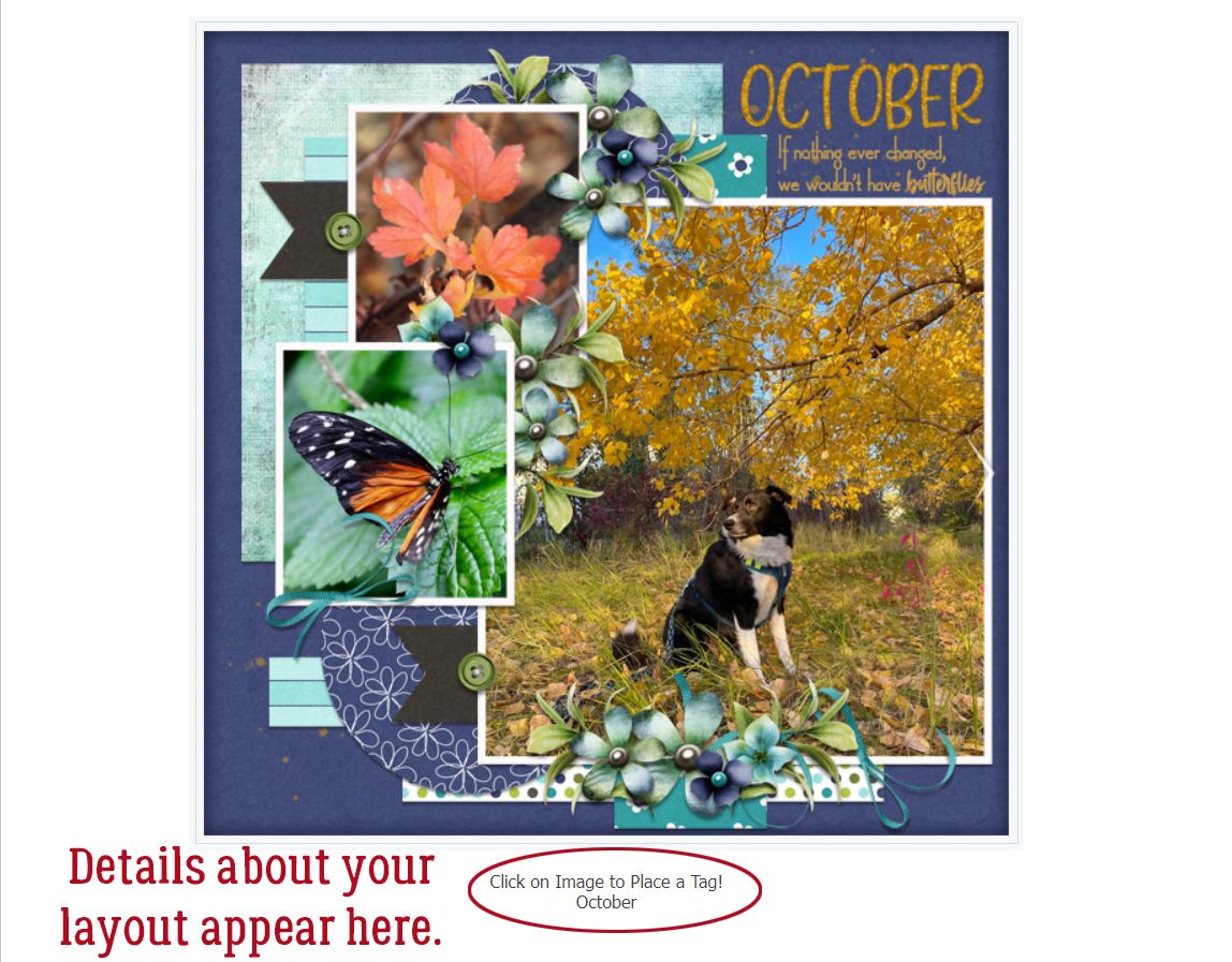
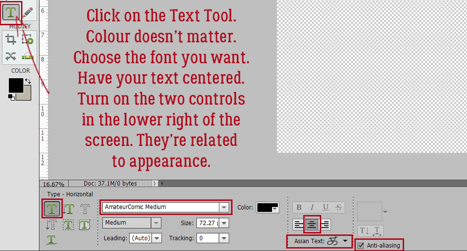
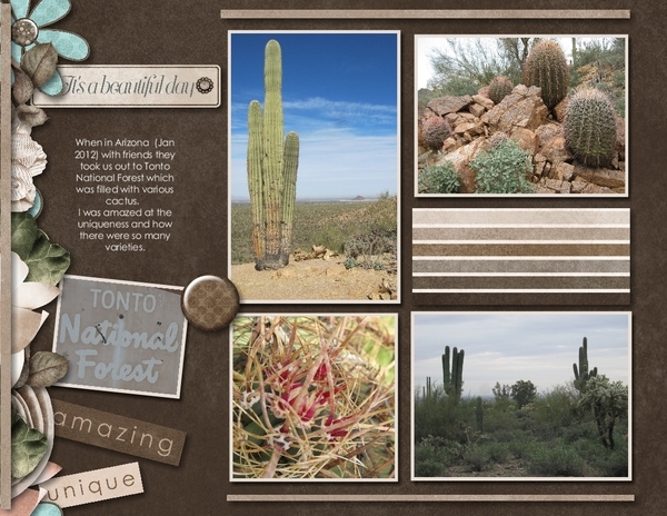
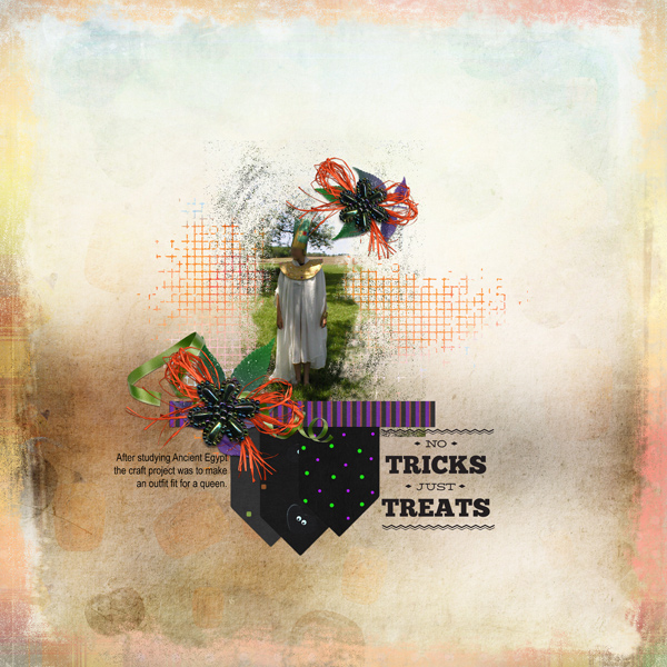
My finished scraplift will be my Inspiration challenge layout. I used some word art from Jumpstart’s Gracious Heart Graced Life (the not-so-secret add-on part!) and used a Gradient Fill layer to make it work better with my photo and papers. I love it!
See you all next week!!
PDF Version : https://bit.ly/32PvjYw
![]()


 By clipping the lighter-coloured paper to a mask on a black background,
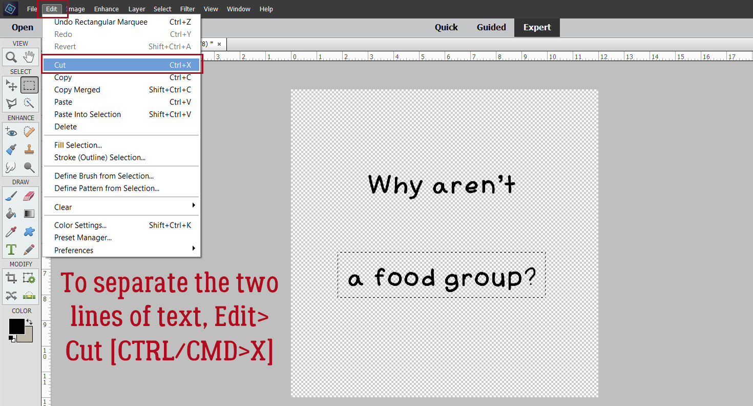
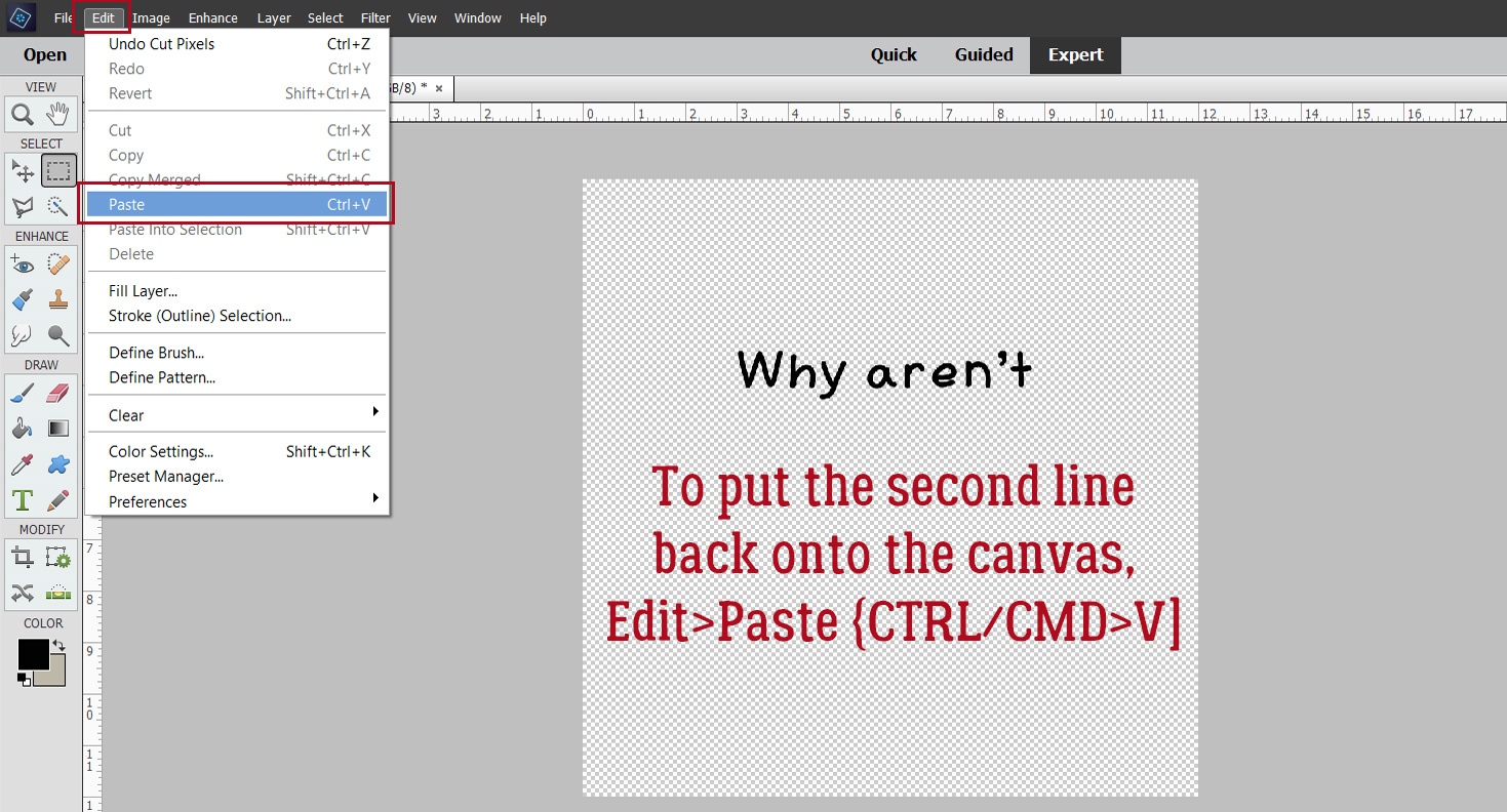
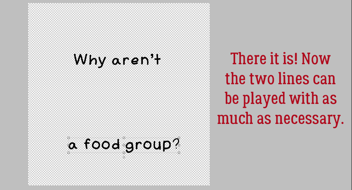
 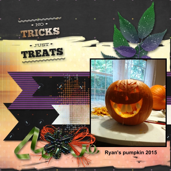 The way