Do you know Jennifer? No? Well, let me introduce you! Jennifer is the genius behind Luv Ewe Designs. She’s one half of this month’s Featured Designers. Jennifer graciously allowed me to “interview” her recently. Here’s a transcript.
JiA: How long have you been designing?
LED: Nearly 10 years.
JiA: What is your design process?
LED: I love looking at Pinterest for colors! Then I usually make my papers first. They come easy to me. I love to preview at the end and see how it all comes together. Sometimes I surprise myself. But better yet is when my CT (creative team) does an awesome job at showcasing the kit! They are a great group of girls!
JiA: What do you use to create your designs (software, hardware etc)?
LED: PS CC
JiA: Describe your design work space.
LED: Quite a small area, really. I really like my desk though. It belonged to my great-grandparents. My grandmother used to do her homework on it. There are inkstains on it from the dip pens they used to use. My grandmother asked me to never cover up the stains, they give it character.
JiA: What a fantastic heirloom that is! What motivates and inspires your designs?
LED: Weird things inspire me. Sometimes I just see a quote on Pinterest and BAM! There is an idea for a kit. Happened to me last night… now to start creating it!
JiA: What kit currently available in your GingerScraps store is your favourite? Why?
LED: That is a hard one. I think it might be the Grateful kit I did with Blue Heart Scraps. I love doing collabs with her! The colors are soft and cute, and it’s all girly! I like all-girly kits because I have all boys.

JiA: Do you craft outside of the digital world?
LED: Not as much as I used to. I love to decorate my home. Does that count?
JiA: Of course it counts! What is the last book you read?
LED: She Believes by Debbie Lindell. It is written by the pastor of my church. It’s very inspirational towards women. I don’t read much but I definitely loved this one!
JiA: How appropriate… it’s International Women’s Day! Tea, or coffee?
LED: Tea! Hubby is brewing some strawberry chocolate green tea right now. Yum!
JiA: Sounds… different. Do you have a guilty pleasure?
LED: Doctor Pepper and anything caramel.
JiA: I’m so glad I don’t have to answer that question. If time travel were possible, where would you go and why?
LED: I don’t want to go to the future. I will just wait and see what happens. Something may end up being depressing and then I’d just worry about it. Maybe go back to see Da Vinci paint the Mona Lisa.
JiA: What’s your favourite thing about GingerScraps?
LED: The gals are sweet and helpful there. I’ve been in other stores and there just was not much communication between everyone. I just felt like I was on my own.
JiA: If you could have any super power what would it be?
LED: Probably to be a fly on the wall and spy on people.
JiA: Invisibility would let you do that too! But you know what they say about eavesdroppers… they never hear anything good about themselves. Thank you for chatting with me, Jennifer.
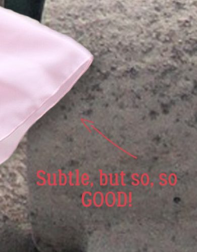
Ladies, before we sign off here, Jennifer has a terrific special sale for us! Let’s show our appreciation by shopping with her.

![]()


")