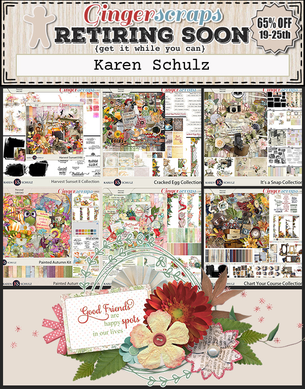
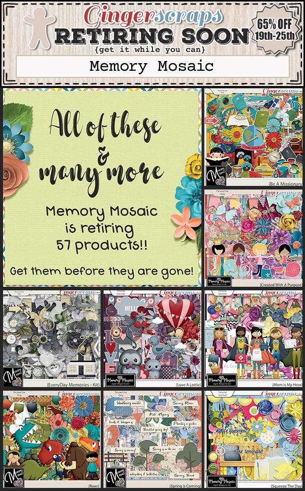
Tutorial Tuesday (Photoshop Elements)

Guided Edit: Saturated Film Effect

PDF Version : https://bit.ly/3NFN4x8

My sister recently took her first real vacation in about 10 years. She and a friend took a driving trip around the Maritimes. My sister was born in New Brunswick, but hadn’t been back there since she was 2 years old… she’s 51 now. So she was more than thrilled to see where her very first home was. She took a MILLION photos, and has given me permission to use them for scrapping purposes. I think you know what I’m going to do with them, right? Anyway, when I was looking for a likely photo for this tutorial, one of hers lent itself to the task.

I’ve played with Guided Edits before and found some I really like to use. I never could think of a use for the one I’m going to show you today – until today. The Saturated Film Effect Edit may be a real game-changer! As you can see, this photo is a bit insipid, but I’m going to fix it.

OMG! I JUST noticed the seagull on the far right, after staring at this photo for hours!

This is the path to the Guided Edit: Guided>Color>Saturated Film Effect.

The text on the screenshot is verbatim from the instructions for the Edit. Each time you click the Add bar, the effect will be increased.

Here’s what it looks like after one click. Give the result a quick but thorough look before you click again.

After two clicks, I’m seeing a nice deepening of the blue of the water, but a less-pleasing change in the colour of the grasses in the foreground.

Yeah… no. The grass after three clicks looks ghastly!

So I clicked on the Cancel button. I’m working on that Copy Layer (the original layer is turned off) and I’ll Mask off the grass and try again.

I opted to use the Selection Brush set to Mask, with a 75 pixel hard round brush. The Overlay is set to 50%. I could go a bit lower and still see my Mask well, but let’s leave it. I’m not going to be too fussy about the individual blades of grass. Here’s what the Mask looks like.

I want the grass to be untouched going forward, so I’ll Invert the Selection by Select>Inverse or CTRL/CMD>SHIFT>I before moving to the next step.

Now that I’ve protected the rocks and water, I can Edit>Cut or CTRL/CMD>X the grass away from the Copy Layer.

Okay, let’s run the Guided Edit again.

Aha! That seems to be the ticket! There’s good definition in the rocks and the shadowed area, the water is a beautiful blue and the seagull is just hanging out. So I’ll click Next.

This is another fork in the road. I need to decide if I’m happy with my results so I can Save As the image, or if I want to keep tweaking in Expert. Y’all know me, so you know where we’re going…

I expected Elements to add a new layer with each click, so I’m not sure where these extra layers came from. But I’ll go with it.

I think I want just a bit more punch so I’ll change the Blend Mode on the topmost layer to Multiply.

Oh. Maybe not that much! But since I have so many other layers, I’m sure I can figure it out. Maybe an Opacity drop will help.

It’s better at 75%, but maybe still not quite there. What happens if I change the second layer there to Screen? Remember, Screen lightens.

I adjusted the Opacity on the two Blended layers until I was satisfied I hadn’t ruined my image. There’s good contrast, the rocks look sharp and the grass looks natural.

Here are the two versions side-by-side. I’m definitely going to use this Edit again!

If you’re planning to watch some fireworks tonight, I have a tip for you for getting the best photos from your phone, courtesy of Chari at Persnickety Prints. Turn off the HDR mode and use Live Photo instead. For Android users that’s called Single Take. Essentially, you’re taking a very short video which will allow you to choose the perfect image. Turn the flash OFF. Hold the phone as steady as possible, then tap the screen to lock the focus. Make sure you have some landscape or monument of some sort in the frame to give you a sense of scale and to add visual interest to your composition. If you’re using a DSLR, make sure you’re using a tripod to eliminate camera shake. Again, no flash. If your camera has a fireworks setting, choose it and the camera will take care of the other settings. If not, set it to Manual, ISO 200, Aperture F/8 and shutter speed at 5-15 seconds. Check the first couple of images and adjust the speed as needed. And have fun!!

GingerScraps: New FREE with Purchase Collab, New Monthly Mix, NEW Guest Designer & More!!

It is the 1st of the month and you know what that means, a huge, exciting newsletter! We have a New Buffet, New Monthly Mix, New Free With Purchase Collab, New Challenge Reward, New Daily Download on the GingerScraps Blog, & a New Guest Designer! 

Let’s start out with the July Buffet. Don’t forget to check out the Buffet Bundles. One easy click to add bundles of Buffet goodies to your cart.

The Buffet colors this month make me happy. And with the buffet kits, you can mix and match to get the perfect kit for you.

Remember any $10 spent in the store gets you this great collab. It’s time for a {fresh summer’}.

This Free With Purchase was created by Chere Kaye Designs, Cindy Ritter Designs, HeartMade Scrapbook, and LDragDesigns.

This collab includes: 1 Alpha {Uppercase, Numbers & Punctuation}, 48 Papers, and 86 Elements.

What a cute name for a collab. It’s {sea la vie}.

This Monthly Mix was created by Aimee Harrison, CathyK Designs, Designs by Lisa Minor, Scrappin’ Serenity, and Key Lime Digi Design.

This collab includes: 3 Alphas {Uppercase, Lowercase, Numbers & Punctuation}, 60 Papers, and 111 Elements.

Now to the July Daily Download Sneak Peek. This month’s Daily Download is from Neia Scraps! Make sure you are checking the blog every day to get all the pieces of this kit!

We have a special guest designer for July.

Kimeric Creations

BIO:
Kim Lichtfuss, of Kimeric Kreations, was a renowned digital scrapbook designer known for her exquisite use of color and distinctive shabby design style. Kim poured her passion for creativity into every digital creation she designed. Tragically, she passed away in 2018, leaving behind a legacy of remarkable artwork. In honor of Kim’s memory and to keep her artistic spirit alive, her family has made the decision to share her extensive collection of work with the world. We invite you to explore and cherish the beautiful designs crafted by the talented Kim, celebrating her remarkable talent and the joy she brought to others through her art.

Are you ready for the July challenges? Remember any 10 completed challenges gets you this great kit.

This Challenge Reward was created by CarolW Designs, Craft-tastrophic, Ilonkas Designs, Triple J Designs, and Moore Blessings Digital Design.

This collab includes: 1 Alpha {Uppercase, Lowercase, Numbers & Punctuation},  63 Papers, and 118 Elements.

And now a few layouts from our great store CT. These were all made using the July Monthly Mix {sea la vie}.

June 30, 2023: Fresh Baked

I’m not sure how we’ve reached the last Friday in June already. This month seems to have flown by more than others. But we are now at the halfway point of 2023. I hope your year has been amazing so far.

Remember if you spend $10 in the store you will get this great kit for free.

Let’s check out the new kits in the store this week.

Have you picked up the June Monthly Mix? Only a day left to get it at this great price.

Have you got your challenges done? This kit is yours as a reward if you complete any 10 challenges.

Tutorial Tuesday (Photoshop Elements)

Quick Trick: Scroll Through Blend Modes

PDF Version : https://bit.ly/3PxeDv0

I’ve lost count of how many times I’ve suggested to try a bunch of Blend Modes on a brush, scribble, stamp or even photo layer. But I never thought to tell you how to do it quickly and easily. Let’s fix that right now! This will be one of the Quickest Tricks I’ve ever shared with you.

Make sure the layer you want to Blend is the active layer. Then just double-click on the Blend Mode control bar. Now you can use the scroll wheel on your mouse, or the and keys on your keyboard. It’s really just THAT easy! To turn it back off, just activate another layer. (If you forget to take that last step, Elements will continue to consider the ↑ and ↓ keys to be tied to the Blend Mode function and you won’t be able to usee them to nudge your layers up or down. You’ll figure it out fairly quickly!)

See? Quickest Trick ever!

June 23, 2023: Fresh Baked

Happy Friday!  I hope you have all had an amazing week. 

Remember if you spend $10 in the store you will get this great kit for free.

Time to see the new items in the store this week.

How are your challenges going?. This kit is yours as a reward if you complete any 10 challenges.

Tutorial Tuesday (Individual Style)

Challenge Spotlight: Back It Up

This month’s Spotlight Challenge is brought to you by ADB Designs (aka Diane). Her gentle reminder each month that we should practice good data management habits seems to be lost on me. I’ve backed up SOME of my photos. I’ve unzipped and organized SOME of my digistash. I’ve unzipped but not organized SOME of my digistash. I’m not the best one to be giving anyone advice on this topic and I know it! Diane uses her Back it Up Challenge to prod us into action, and while we’ve got those photo folders open, she gives us a theme to keep in mind as we’re backing them up. This month the theme is Picnic/Summer Food. There are so many ways this theme can be addressed in a layout. Let’s have a look.

As always, the layouts shown are linked to the Gallery so you can pop over there and leave some praise for the GingerScrapper. Just click on the user name and you’ll be right there. The layouts are in the order they were uploaded and I’ve snagged all of them this month. Ready?

Rhewko‘s large-and-in-charge photo is quite literally the centerpiece of the layout. Does it reflect the theme? 100%! I love the line of actual marching ants across the bottom that adds a nice whimsy.

There’s a casual elegance to kabrak1207‘s layout. The barbecued meat photo is making my mouth water. I almost didn’t notice the two grills used as circle elements behind the photos. Clever!

Tamsin McAtee has pulled colour from her photo and chosen a beautiful kit to build her layout with. How romantic?!

For her layout, lawyerlyn has also used colour from her photos. Those bright, summery paper pieces she’s scattered behind them are so pretty. That coconut shell beverage is the perfect foil for the street-food fruitshake photos.

CathyS has picnic food in a supporting role for her family day layout. I tend to remember more of the who and the fun and less of the menu with events like this, so I might have done the same!

I can also relate to DianeInOz‘s situation regarding group tours. The food looks delectable and she couldn’t really enjoy it! (Sorry about the broken foot, Diane.) The muted colours she chose for her layout work really well with the muted colours in her photos, so they’re the focus.

I love the steampunk feel to wendeeds‘ layout. Look at all those photos! What a great adventure they had. Victorian food isn’t exactly run-of-the-mill… terrine of pheasant and venison anyone? Beats the medieval dinner I once enjoyed – with my fingers.

Camping and cooking over an open flame can be so much fun. The cheery colours chigirl has used for her layout mesh with her photos, reflecting fun, and I bet there were smores galore later.

Is there any food that says summer quite like watermelon? Theme? CHECK! This layout by ollitko is such an attention-getter. Beautiful!

Is it just me, or does this layout not radiate warmth? Everything ranchcreations has used just blasts love and sunshine.

This layout by msbrad takes me back to when my daughter played softball and weekends were spent outside, food was scarfed down with abandon and everybody had fun. Her use of primary colours against a sheet of scribbler paper evoke those memories even more sweetly.

And finally, I’m always fascinated by how KatherineWoodin approaches a challenge. She never disappoints!

We’re having some weird weather in western Canada right now. Snow in the mountain parks in June?! WHY!! Maybe the wildfire situation can be sorted out now. I had a dream about tornados after seeing reports from the midwest. We’re not paying enough attention to climate change, are we? Anyway… go back up your important files before you forget!

June 16, 2023: Fresh Baked

How are we already halfway through June? I’m always amazed at how crazy fast the year seems to go. You’re in for a treat today too. Since today is the 15th, we also have the start of the Bake Sale today.

Remember if you spend $10 in the store you will get this great kit for free.

Let’s have a look at some of the new items in the store.

And now the Bake Sale goodies. Each of these are $1.50 each until June 20th. 

Tutorial Tuesday (Potpourri)

Are They Scribbles? Doodles? 

PDF Version : https://bit.ly/3PeNvRs

How was your week? Mine was ridiculously busy! We had a bit of a disaster-in-the-making when the top window frame molding in our family room just… came off. There’s a drapery rod attached to it, and it was hanging on to the wall just by a bead of caulk. <horrified> Turns out it was only secured to the wall with pin nails. Now it’s firmly screwed into the studs and everything is back in place. <whispers… my husband is NOT handy… pass me the drill and the screwdriver then step away from the ladder!> Anyway.

I was looking at my private messages and saw another one from Glee asking about using doodles. In May one of the Challenges required the use of either doodles or scribbles. They can be amazing additions to a layout, but how? And is there a difference? What follows is how I use them – and it’s all ONLY MY OPINION so consider what I say accordingly.

Doodles and scribbles are essentially the same thing, with doodles often taking some identifiable form. Some designers create doodles then colour inside the lines to make what looks more like a sticker. I’m not going to say anything much about those; I see them as simply another element to add to clusters. But scribbles? They can add such a cool touch. Scribble/doodle implies the result is sitting right on the paper, so my inclination is to put them in the background, on my (neutral) background paper. I pulled a bunch of scribbles from my GingerScraps stash and will show you what I mean. Keep in mind that you can recolour, change the Blend Mode and/or Opacity or add Layer Styles to all of them to change up the way they work with your layouts.

Scribbles and doodles are casual things, typically something we do with our hands while we’re required to pay attention to something else. When set into the background of a layout, they’re an anchor for everything that touches them and add a nice whimsy. That’s not to say they aren’t useful in a more formal setting. Ultimately, your layouts are YOUR layouts and you can do whatever you want.

Because I’m very visual, I tend to look at the scribble and think about the most appropriate use for it. With this one, oriented horizontally as shown, it almost looks like a scrawled signature. I might put it behind a ribbon or narrow strip of paper. It could also anchor a photo to the background.

I see this one in my mind’s eye tying together a list, a series of word strips or even several small photos.

Look at all that fury! The dark, heavy lines speak ANGER to me, making it perfect for art journaling.

Anybody like a #2 pencil? I have several boxes of them in my craft room. Maybe that’s why I like this scribble so much.

This is the actual size for this scribble when I dragged-and-dropped! I just had to play with it.

When I changed the Blend Mode to Overlay I loved the result. I might decide to Duplicate the layer though to give it just a touch more presence.

I like how sinuous this one is. I could see having several smaller photos overlapping the sides of it but letting most of the visual impact remain.

This aggressive scribble makes me think of people who sign documents with a great big flourish.

I instantly felt happy when I saw this. It’s so bubbly! It could make a sweet anchor for a cluster.

Sorta like this!

I would frame a face in a photo with this one. But my OCD would make me use it in such a way as to get the entire scribble inside the boundaries of that photo. Unless… I went down the realism rabbit hole… Maybe I’d turn it into a sticker by adding a white stroke around it. Then it would be a doodle. 😀

I might use this to underline a title or as a divider between title and journaling. Or. A border!

With a little Rotating, Flipping, Solid Fill Layering and decreasing Opacity I came up with this. It would be equally appropriate as a background paper border or a photo border.

I loved this one so much the second I saw it.


What say you?

This is definitely a background anchor.

It took me a minute to think about what I’d use this with. I think it could overlap the edge of a photo or even give it a don’t-like-this vibe.

But then… how about a very simple siggy?

Or a variation?

I’m going to use at least one scribble/doodle on a layout later today. See if you can pick out what I’ve done when it shows in the Gallery.

Next week is our monthly Challenge Spotlight, when YOU take centre-stage. See you then!

June 9, 2023: Fresh Baked and SUMMER DREAMIN’ SALE

We have a great sale for you starting today. It’s our Summer Dreamin’ Flash Sale. Select items in the store are 55% off today (June 9) through June 12.

Remember if you spend $10 in the store you will get this great kit for free.

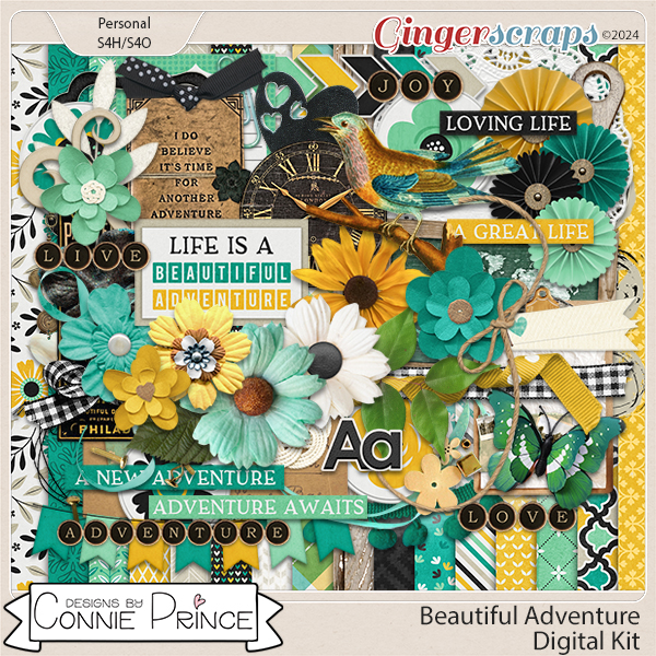
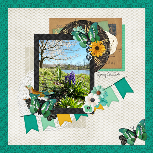
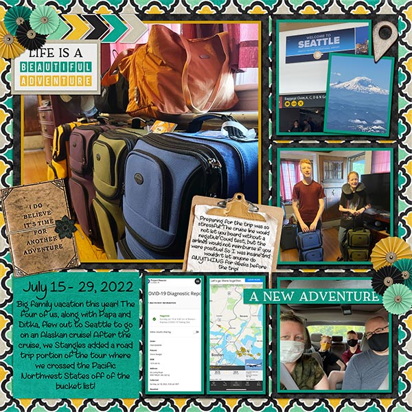
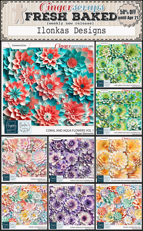
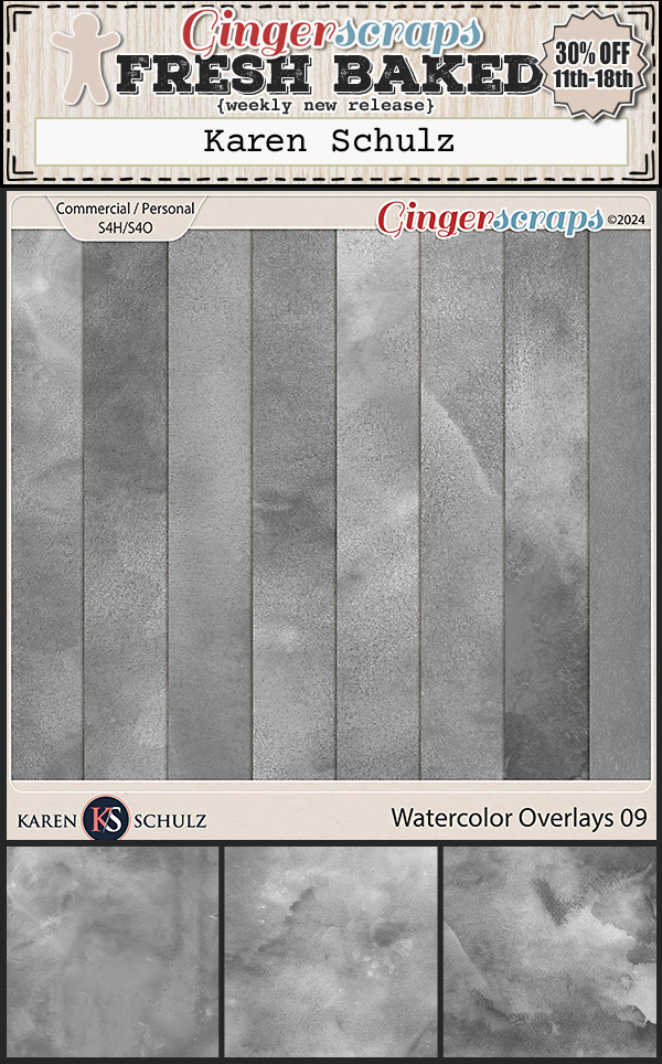
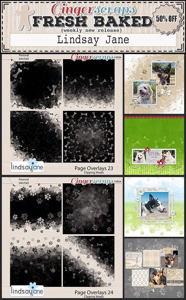
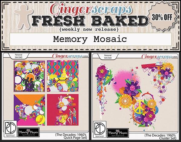
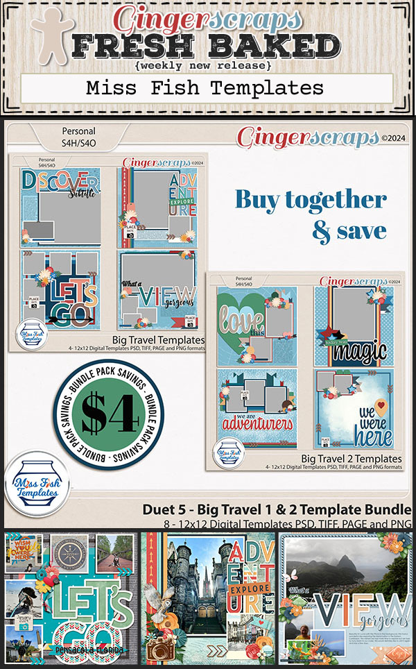
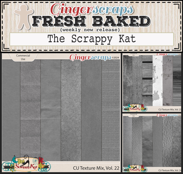
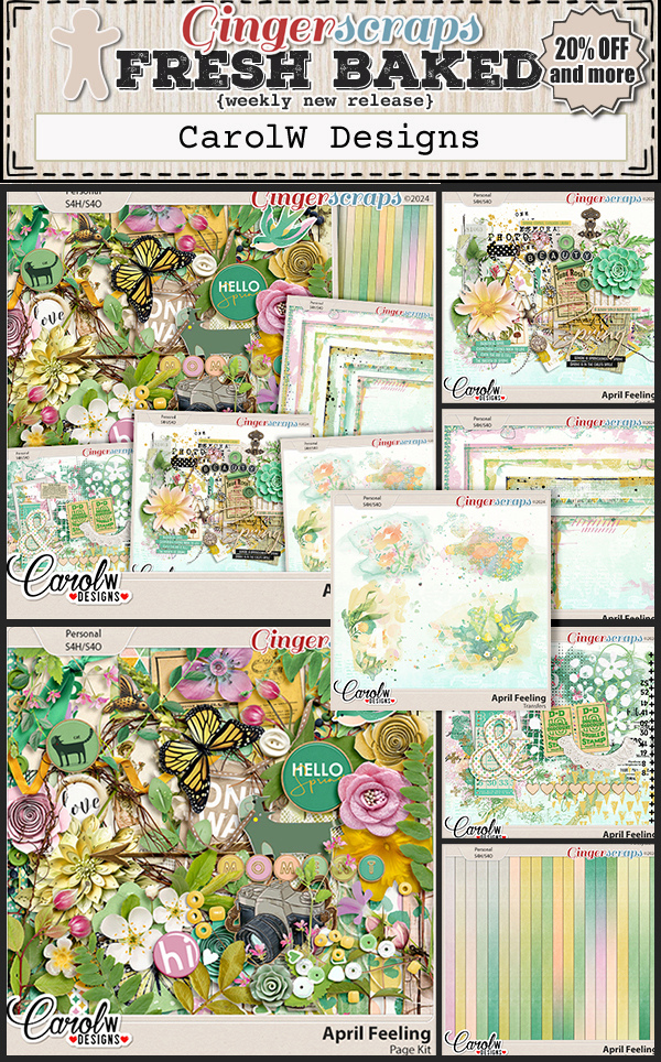
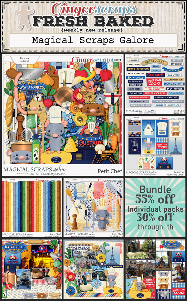
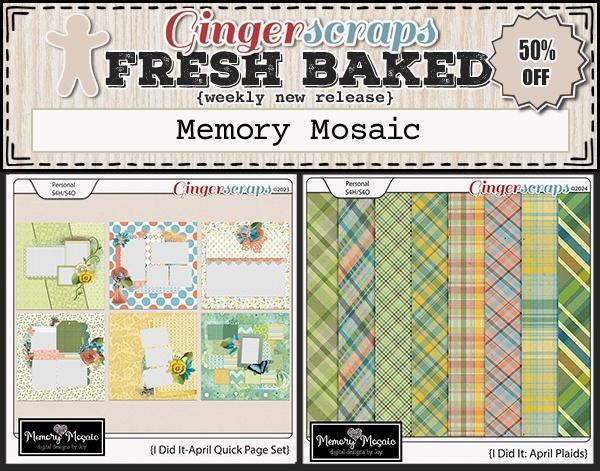
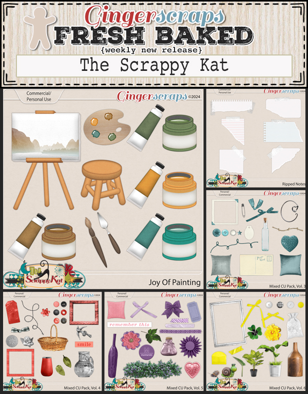
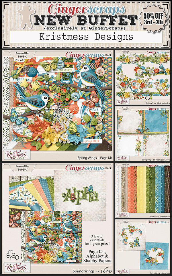
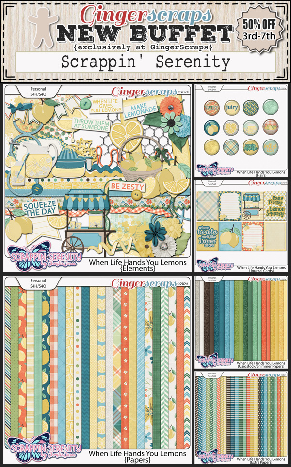
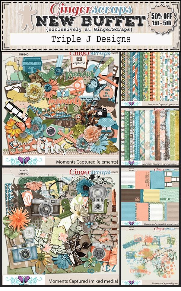
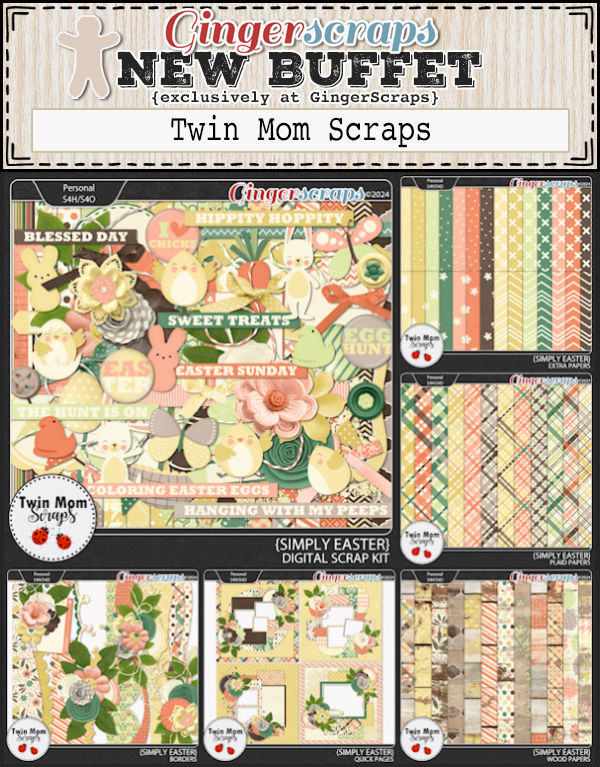
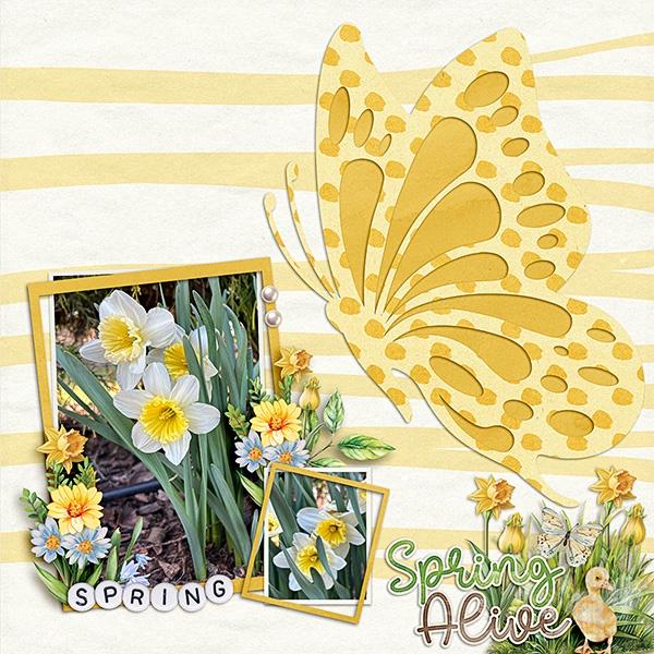
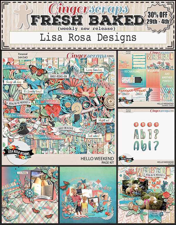
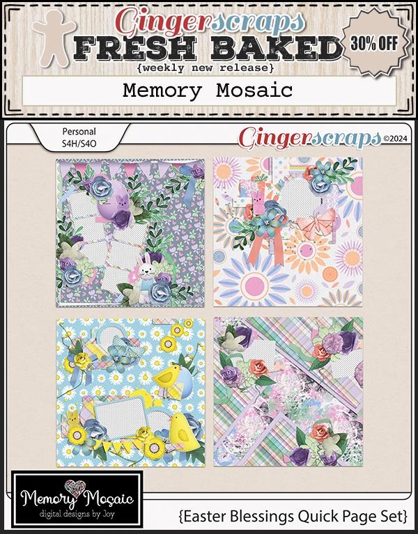
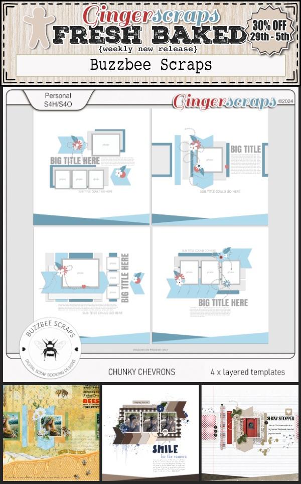
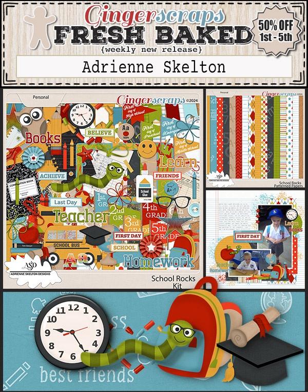
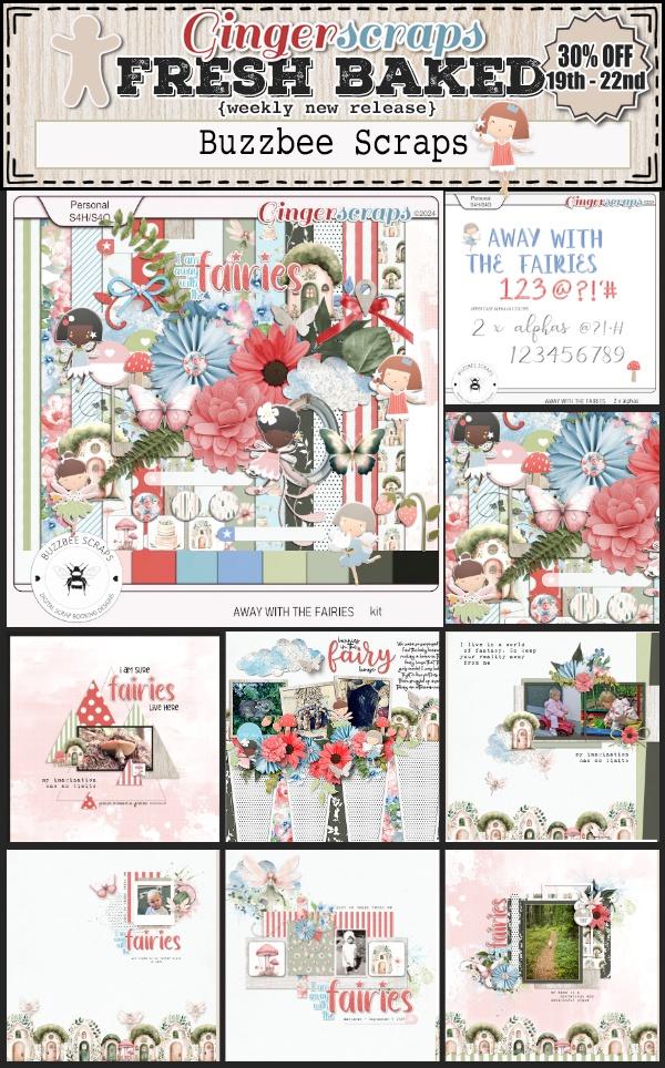
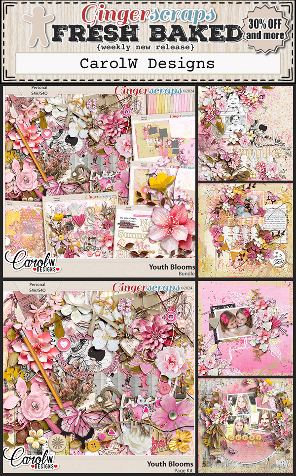
Let’s see some of the new items in the shop.

And now let’s see a sampling of what our designers have picked for the Summer Dreamin’ Flash Sale.

Tutorial Tuesday (Photoshop Elements)

3D Title – Paper Letters

PDF Version : https://bit.ly/3N838aO

Today’s tutorial is in response to a request from Glee. She’d seen a layout in a gallery created by biche57 that had a paper-letter title with the letters stitched to the background. The letters appeared to be lifted away from the background, sort of like butterfly wings. “How’d she do that??” Well, this is how JAN would do it…

I’m using the June Font Challenge font for my layout, and then Clipping papers to each individual letters. You can absolutely use an alpha to get it done faster and with fewer steps. The papers I’m using are from the GingerBread Ladies‘ collab Outdoorsy.

Here’s a little Quick Trick I just discovered. You can BATCH-SIMPLIFY all the text layers! To activate them all, click>shift click on the first and last text layers. Then right-click and choose Simplify Layer.

Here you can see that I’ve Clipped papers to each letter layer. Right-click>Create Clipping Mask or CTRL/CMD>ALT/OPT>G for Elements versions 15 and newer. For older versions the shortcut is just CTRL/CMD>G. To make each letter easier to manage, the paper and letter layers should be Merged. Activate the two layers then right-click>Merge or CTRL/CMD>E.

There! Now I have my paper title. Let’s stitch them down.


My granddaughter’s backpack is lavender, so I thought, why not use lavender stitches? You can put those stitches wherever you like; they’ll be your anchor for lifting the paper, so I felt it was best if I ran the stitches through the centre of the Bs.

We’re creating the illusion that those letters are lifted away from the background, and the easiest way to do that is to use custom shadows. For a lot of you this will be a review so feel free to skip ahead. I won’t mind! (I also won’t know. 😉 ) For those who haven’t seen the previous custom-shadow tuts, we start with Selecting the outline of the object we’re shadowing. To do that, CTRL/CMD>click on the letter’s thumbnail – that little picture of what’s on that layer – in the Layers Panel. That engages the marching ants and gets them doing their drill around the contours of the letter.

Now add a new blank layer UNDERNEATH the layer you’ve just selected. CTRL/CMD>click on the sheet-of-paper icon at the top left of the Layers Panel.

Over at the Color Picker, choose your shadow colour by clicking on the Foreground Color as shown. I’m using black [#000000] but a lot of people like a browner colour like #2c2801. It’s up to you. Then grab the Paint Bucket Tool and dump it into the outline.

Before Elements will let you do anything else, you’ll have to Select>Deselect or CTRL/CMD>D to stop the ants from marching.

The quickest, most effective way to simulate lifting the paper away is to use the Image>Transform>Distort Tool. This lets us change both the size and shape of the image in all directions. The only real limit is how far you take it. Remember to have your shadows all falling in the same direction; decide where your light source is so you can be consistent.

Click-drag one corner of the Bounding Box at a time until you get the shape you want. See how my Bounding Box isn’t symmetrical any more?

To hone the shadow and add realism to it, the shadow needs to be very narrow where the stitches are holding the letter down. I use the Smudge Tool for that. I push the shadow toward the letter at the stitches, and pull the shadow away where I want the paper lifting. The Smudge Tool also adds a slight Blur, but not usually enough to look real.

So… we’ll add a Filter>Blur>Gaussian Blur… to the shadow.

To be able to see a Preview of the Filter, click your cursor on the edge of your shadow. Then you can see up close how moving the slider softens the edges of your shadow. Remember, shadows are softer the more light is allowed to leak underneath an object – the farther away from the surface it’s sitting on it is, the softer the shadow. Hot Tip: you don’t have to go through all the Filter steps if you’re going to use the same settings for each layer. Just click CTRL/CMD>F and Elements will do the rest.

To be realistic, the background colour shows through the shadow. To achieve that requires changing the Blend Mode from Normal to Linear Burn.

To make it look less stark and harsh, decrease the Opacity of that shadow layer. Move the slider until you’re happy with what you see. I like 35% – for now – and it’ll be adjustable if I decide it’s too light or dark.

After each letter is shadowed, the stitches need shadows too. I just went with the same steps, but without the Distort and Smudge. I also used a much lighter touch with the Blur because the stitches are literally IN the paper so the shadows will be sharper.

Last thing is to make any tweaks you think will make your title really POP. I just use the Smudge Tool!

I know this method of creating shadows sounds complicated and labour-intensive. At first, it really is. But the more you do it, the easier and more intuitive it becomes. I don’t even really think about the steps now, they’re so familiar. It’s the shadows that really elevate a layout, so it’s worth practicing. Don’t forget to have fun! Next week we’re going to play with doodles.