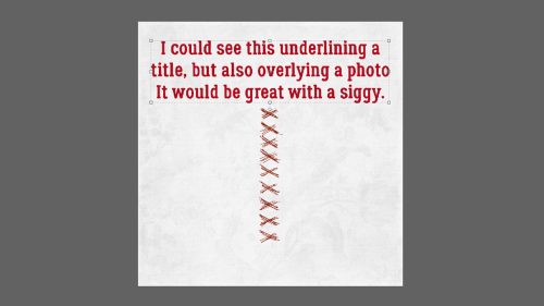
Quick Trick: Scroll Through Blend Modes
![]()
PDF Version : https://bit.ly/3PxeDv0
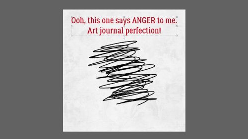
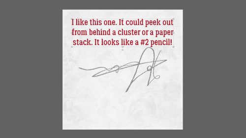
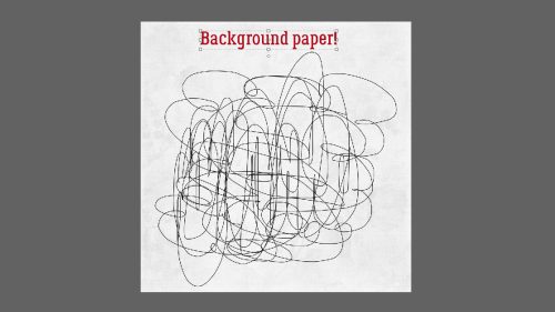
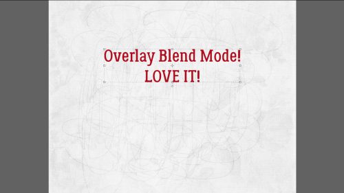
I’ve lost count of how many times I’ve suggested to try a bunch of Blend Modes on a brush, scribble, stamp or even photo layer. But I never thought to tell you how to do it quickly and easily. Let’s fix that right now! This will be one of the Quickest Tricks I’ve ever shared with you.
Make sure the layer you want to Blend is the active layer. Then just double-click on the Blend Mode control bar. Now you can use the scroll wheel on your mouse, or the ↑ and ↓ keys on your keyboard. It’s really just THAT easy! To turn it back off, just activate another layer. (If you forget to take that last step, Elements will continue to consider the ↑ and ↓ keys to be tied to the Blend Mode function and you won’t be able to usee them to nudge your layers up or down. You’ll figure it out fairly quickly!)
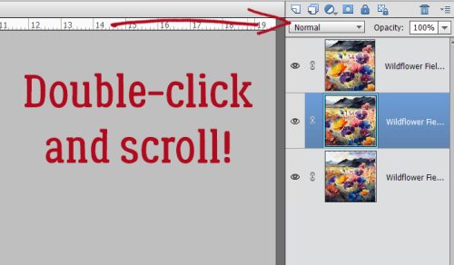
See? Quickest Trick ever!
![]()