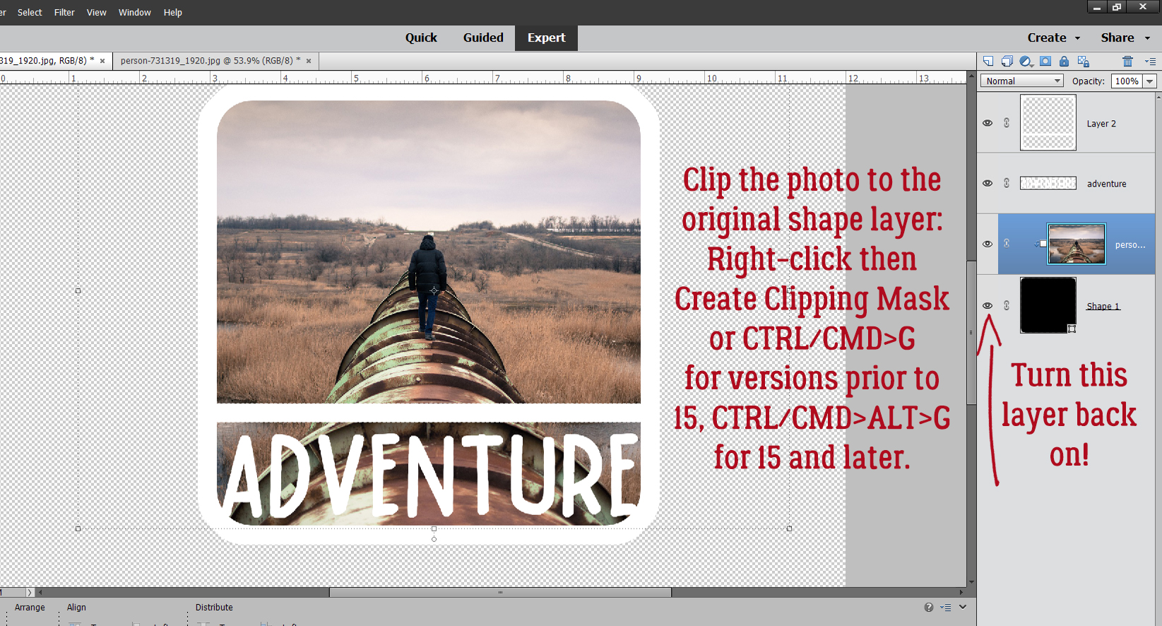
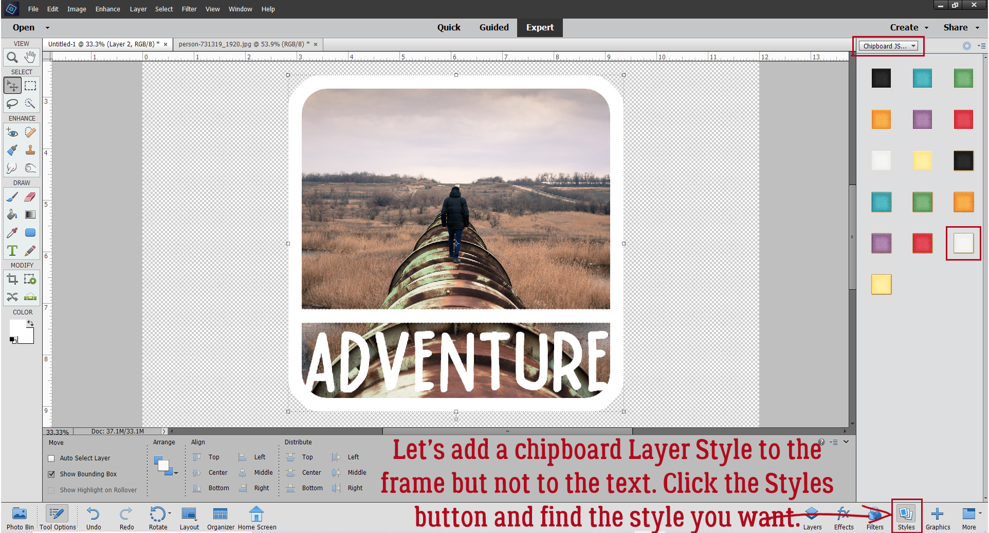
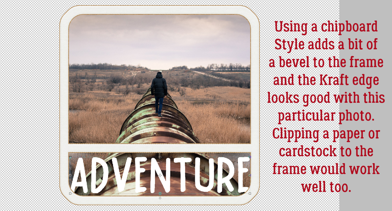
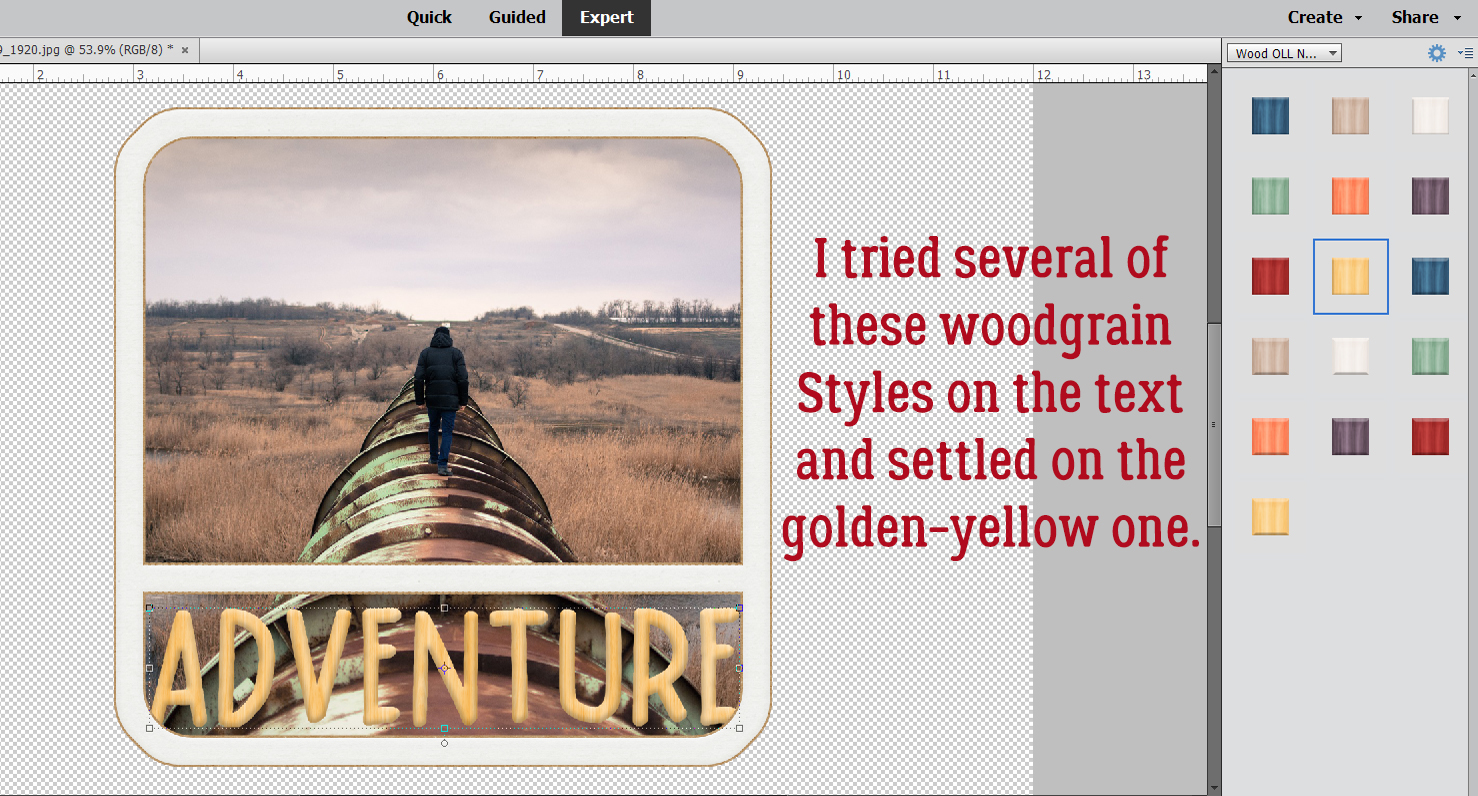
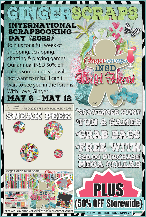
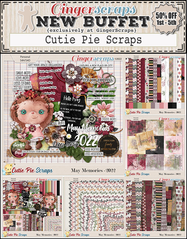
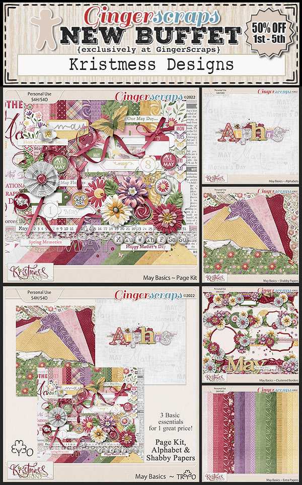
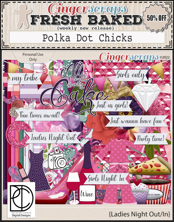
Happy Friday everyone. Have you recovered from iNSD? Did you get some great deals? Just because iNSD is over doesn’t mean our designers have slacked off. There are some great new products in the store this week.
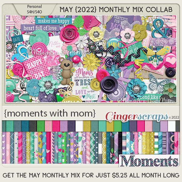
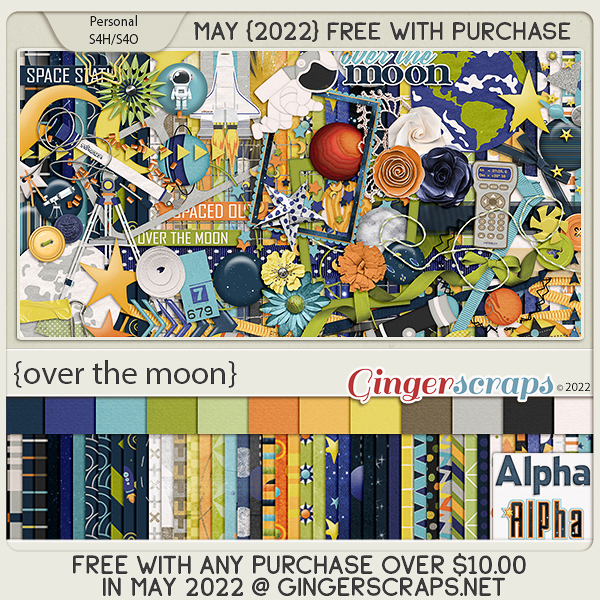
Remember any $10 spent in the store gets you this great collab.
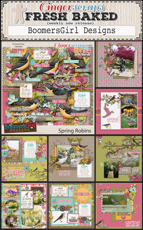
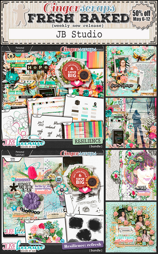
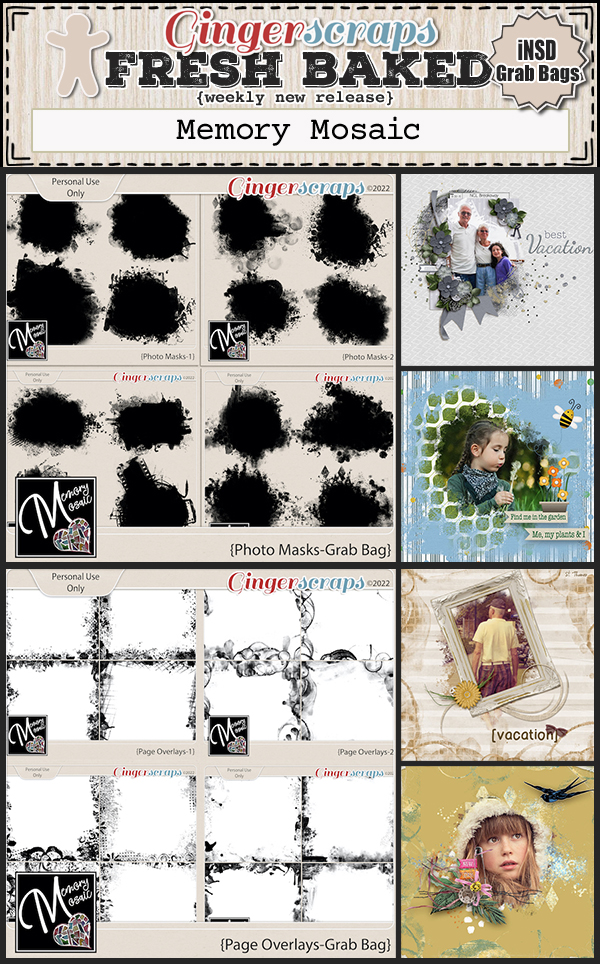
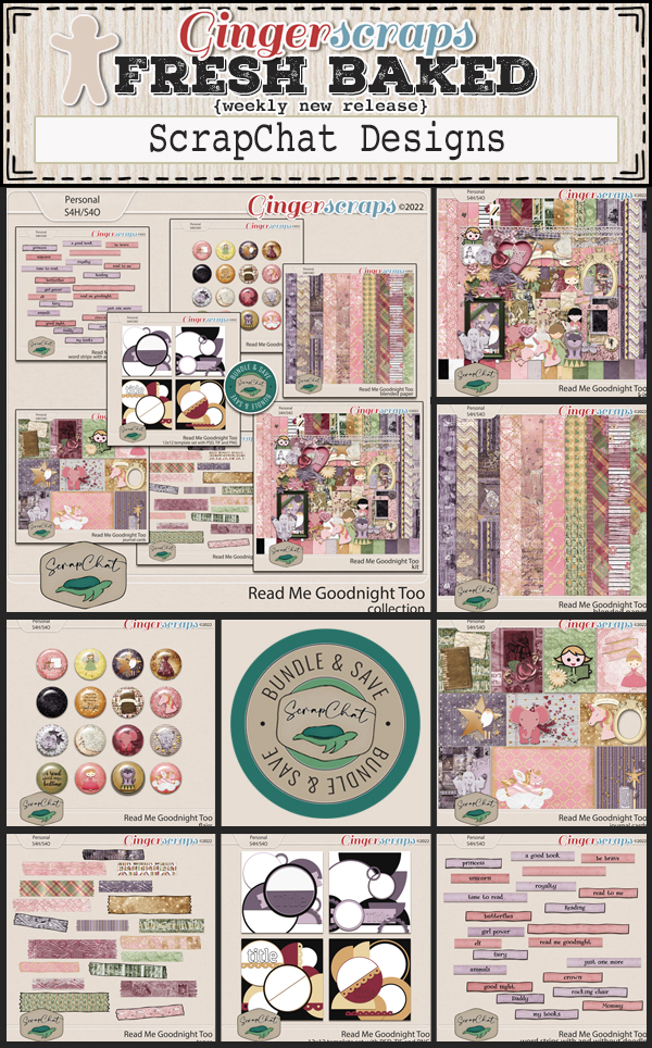
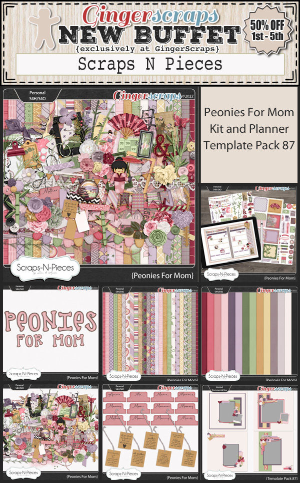
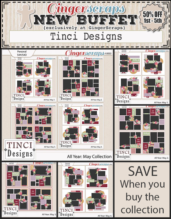
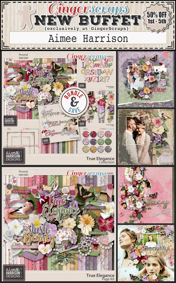
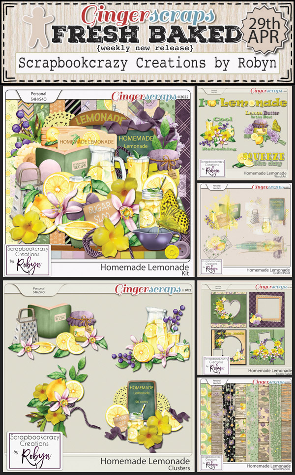
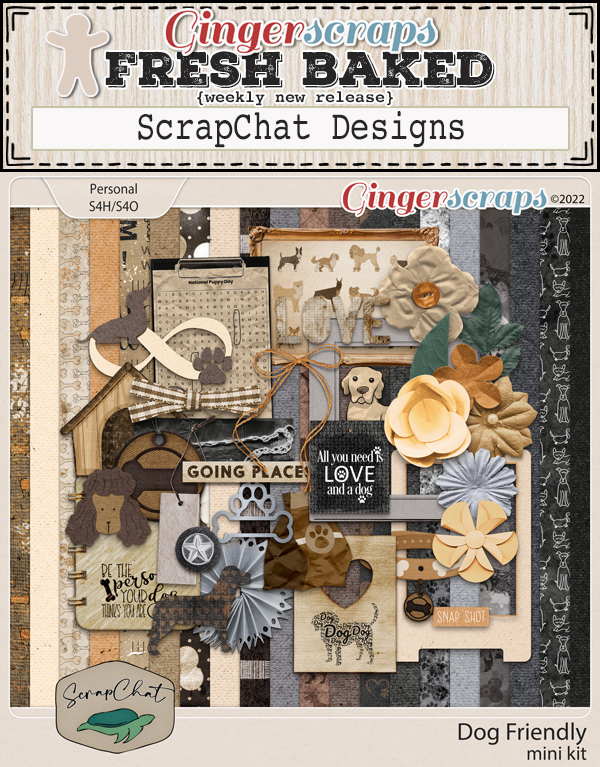
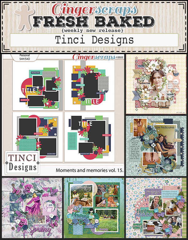
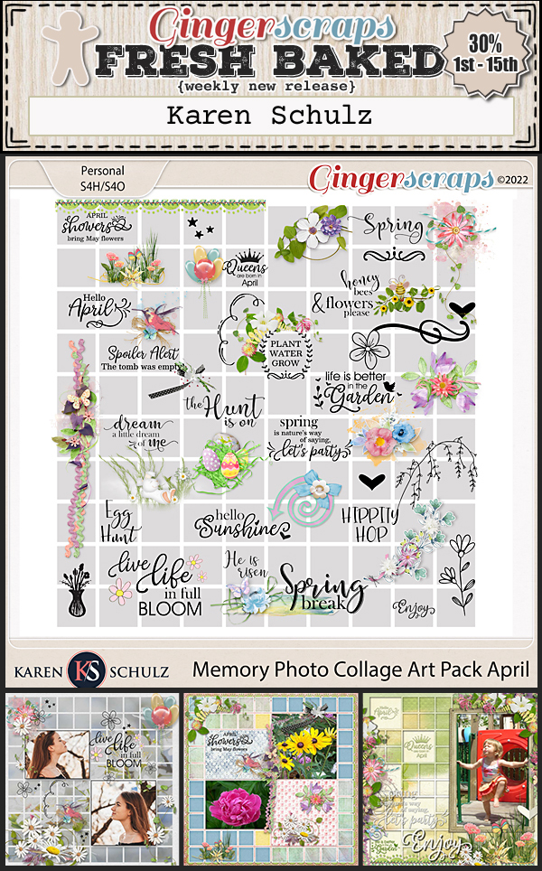
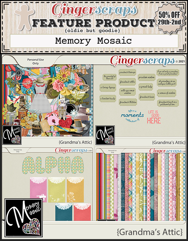
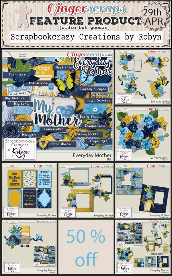
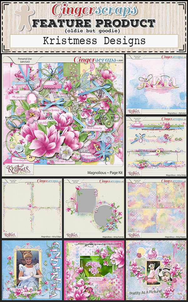
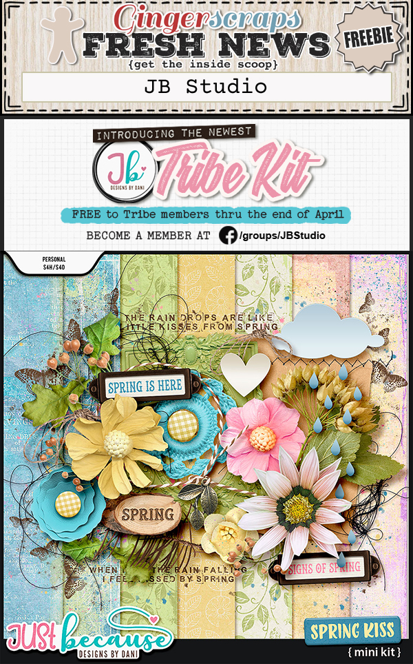
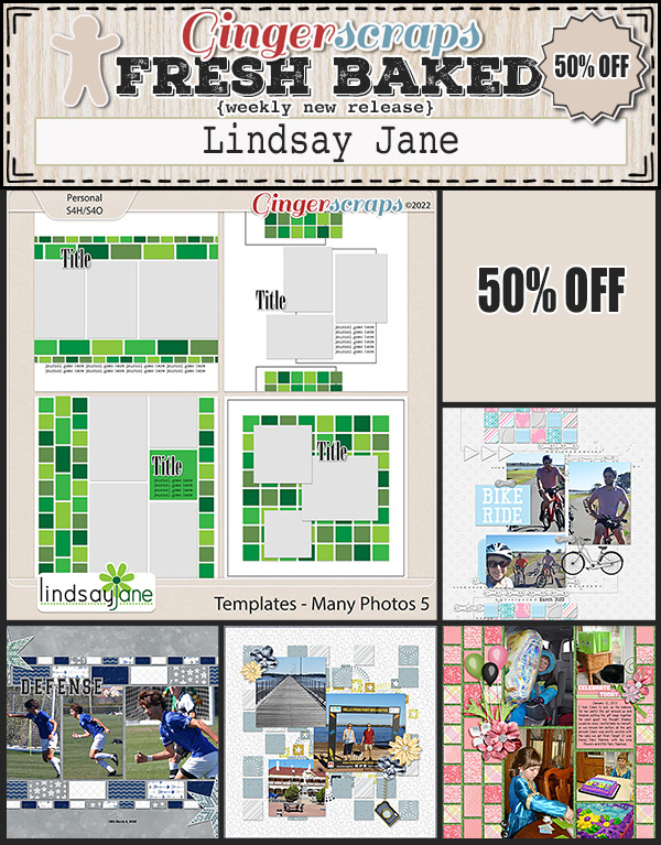
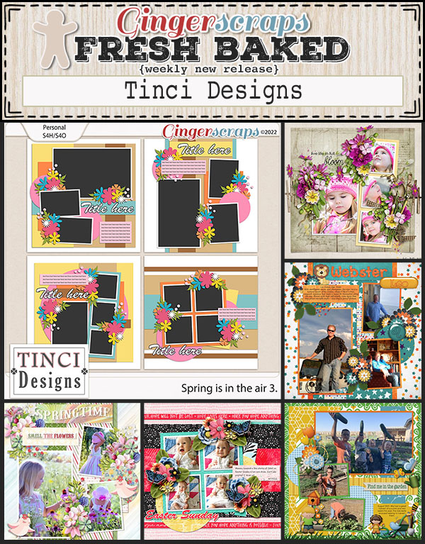
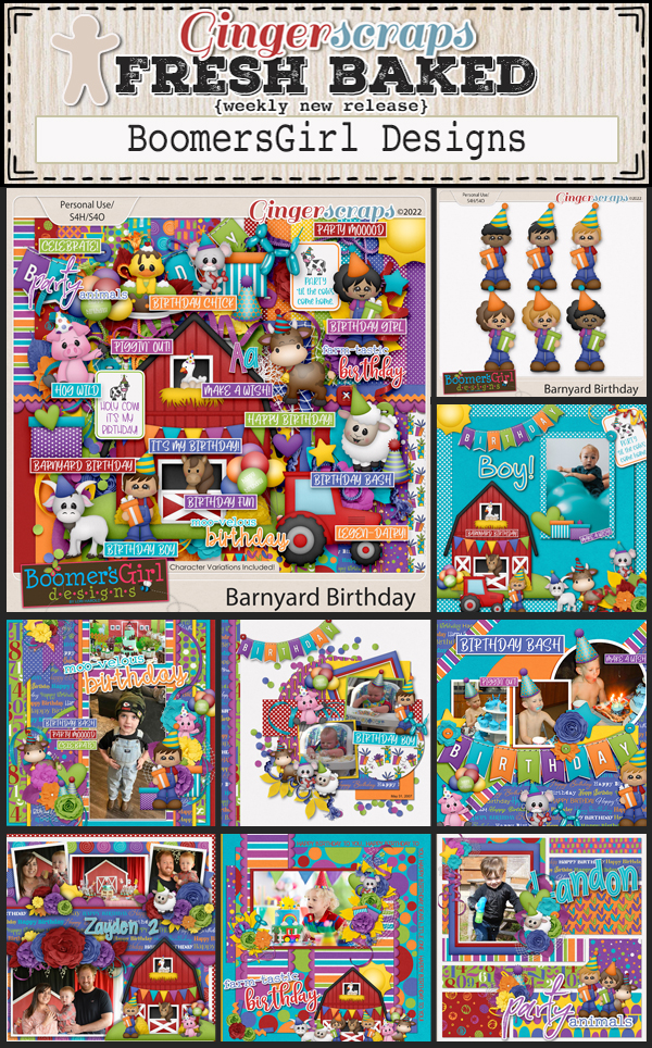
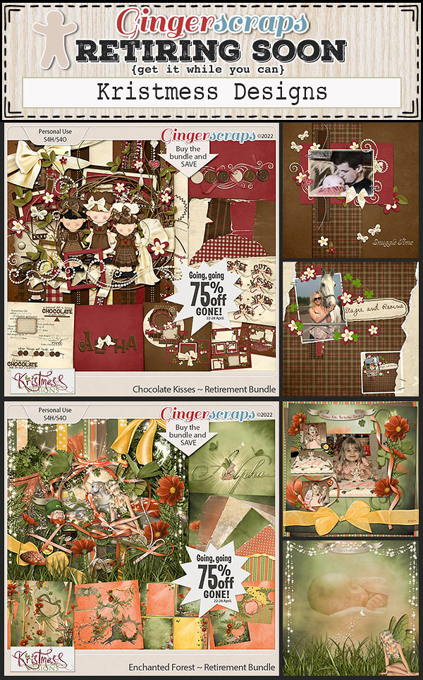
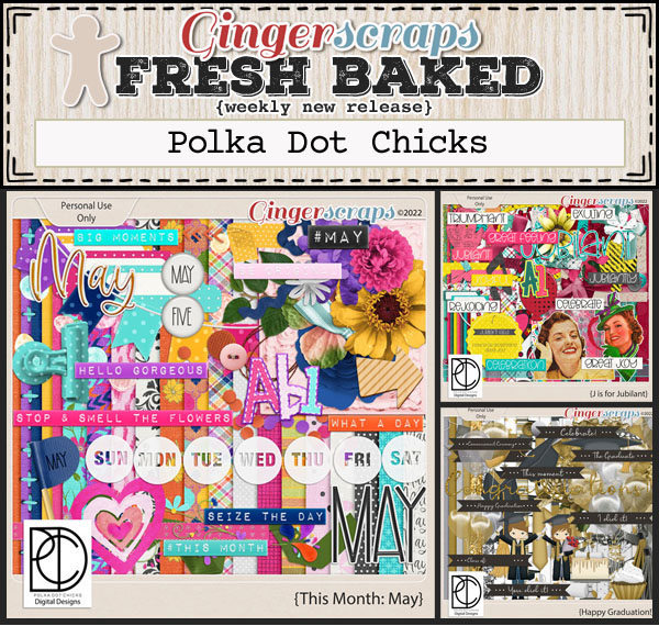
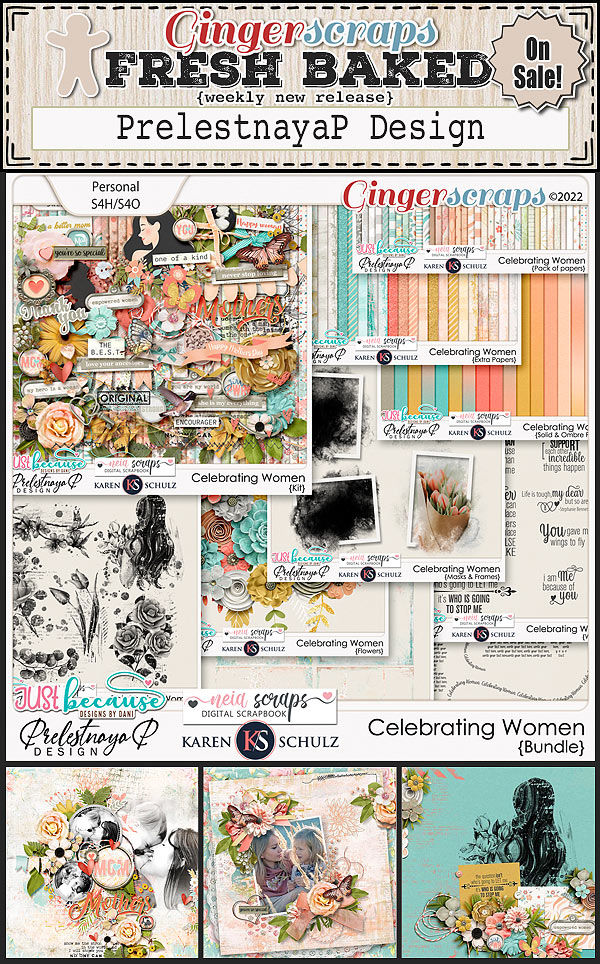
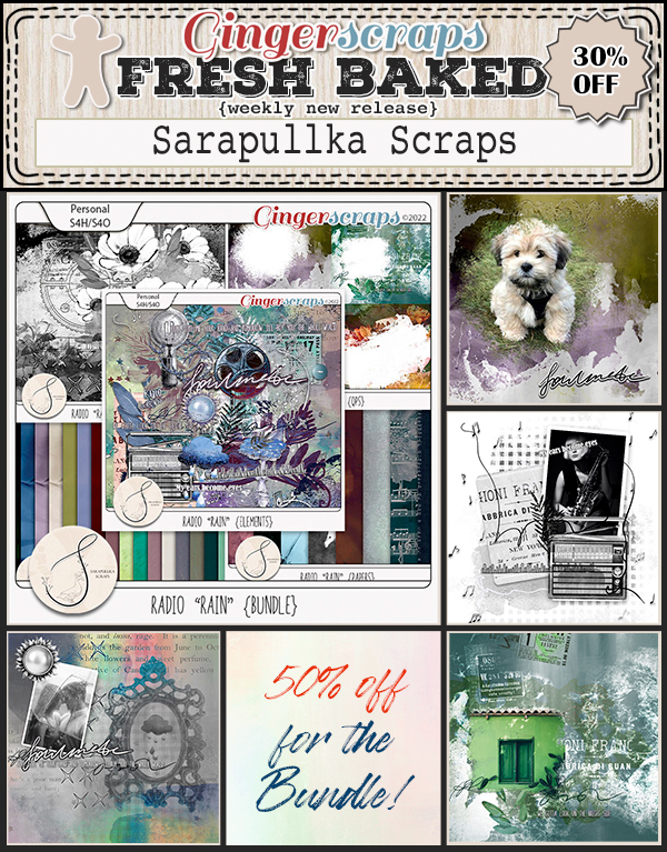
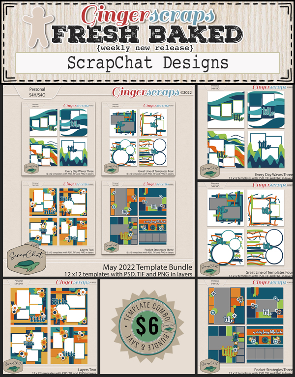
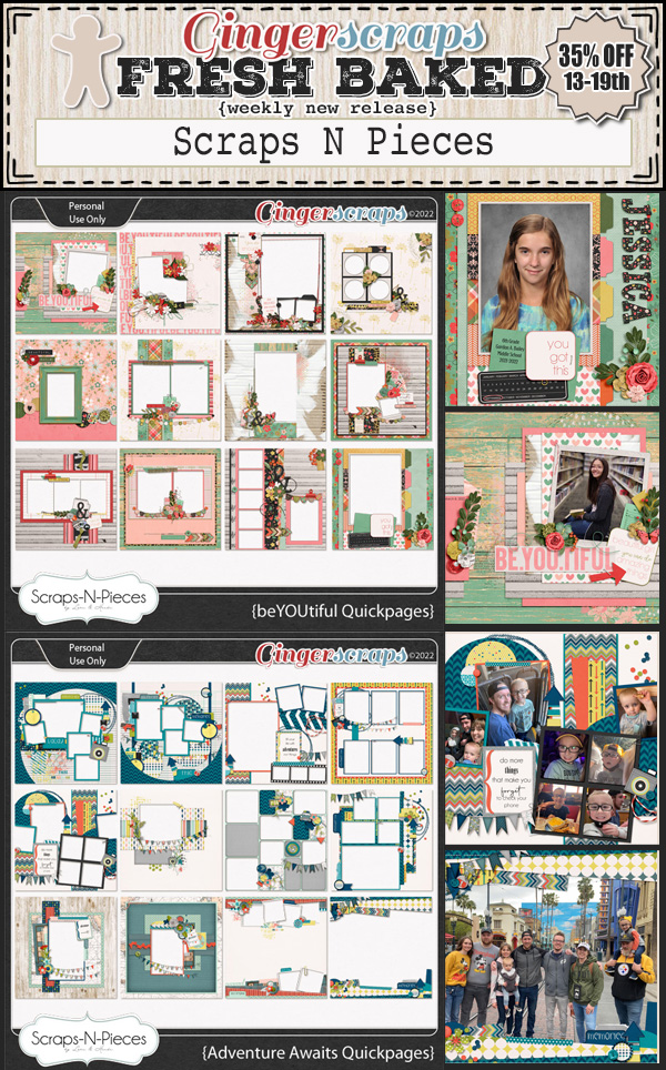
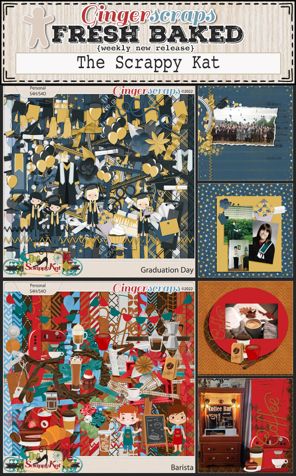
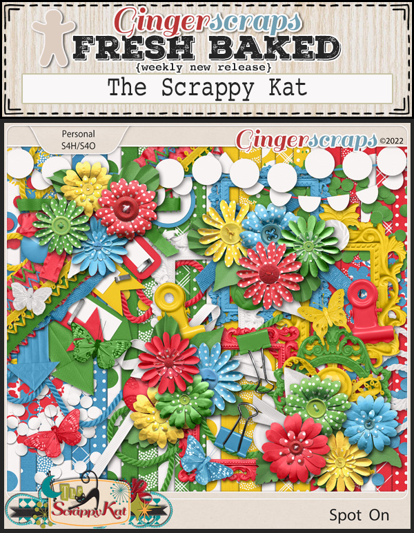
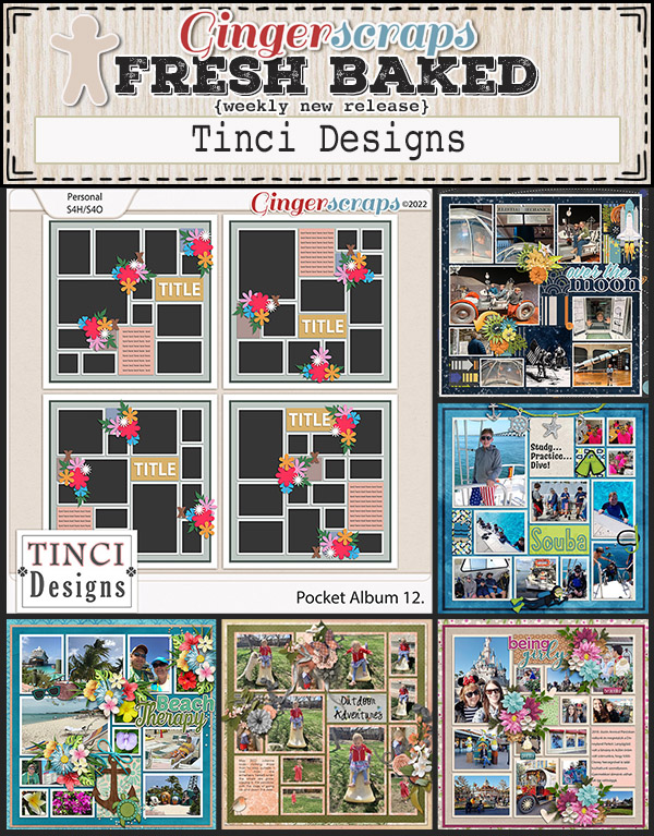
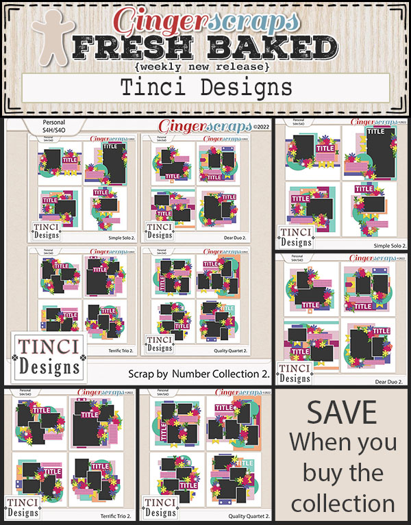
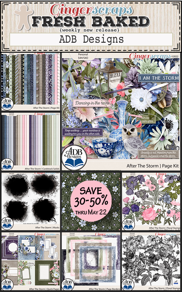
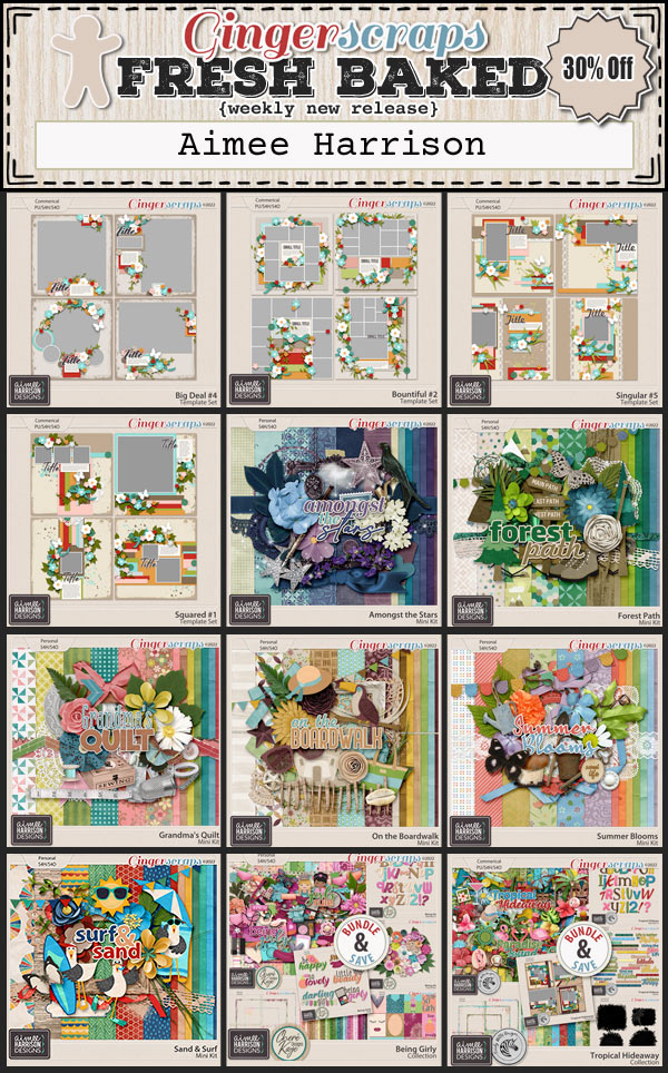
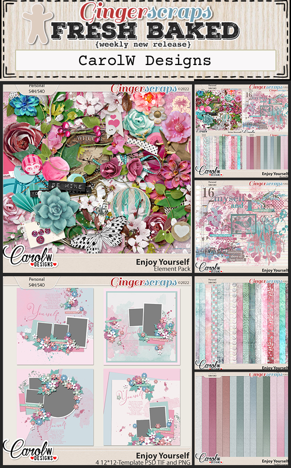
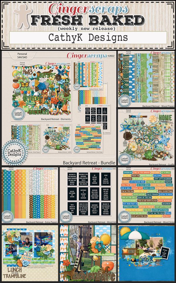
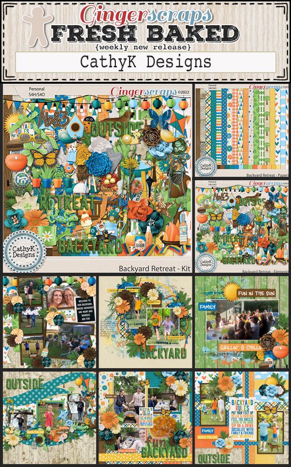
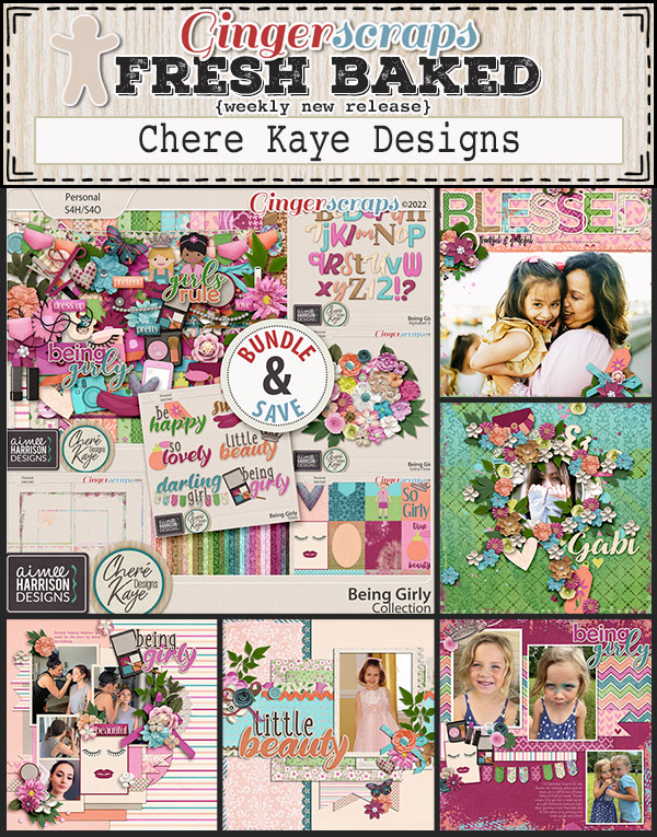
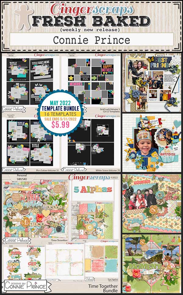
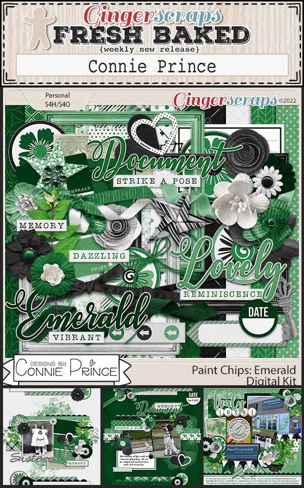
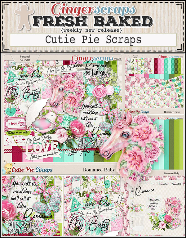
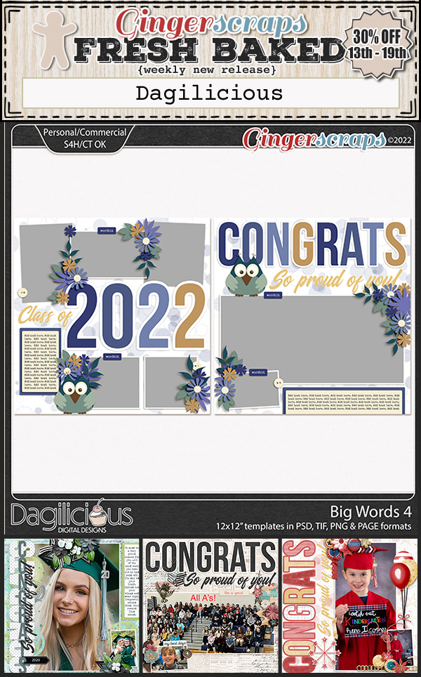
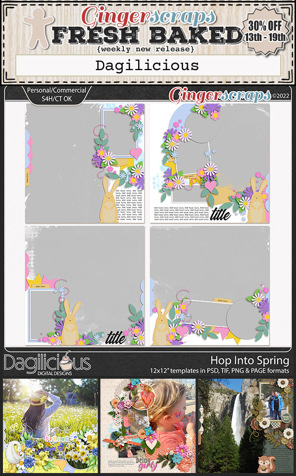
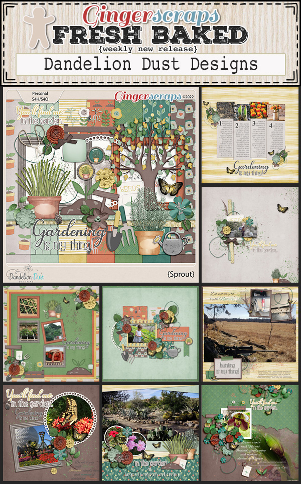
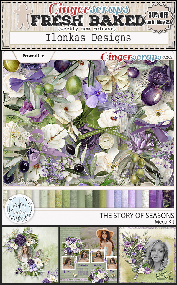
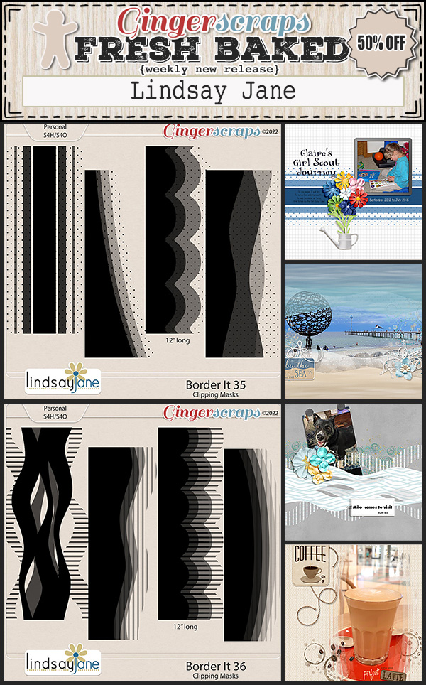
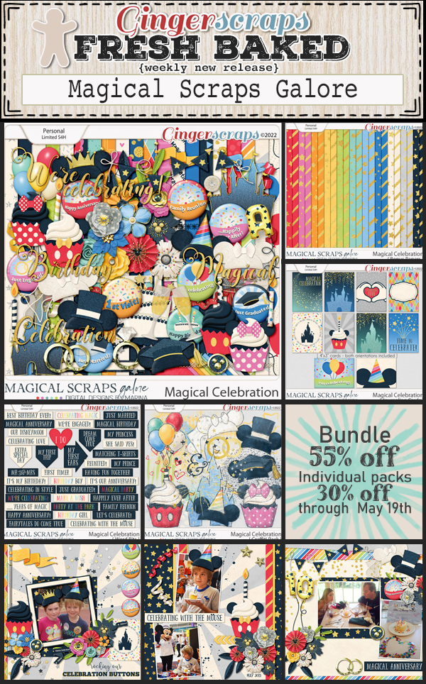
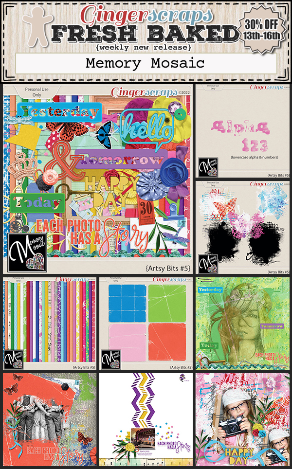
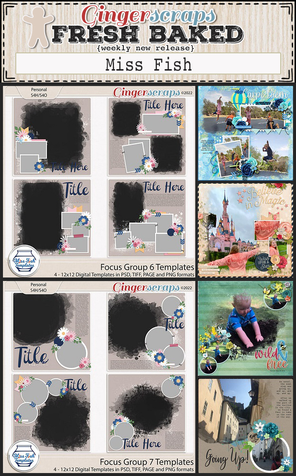
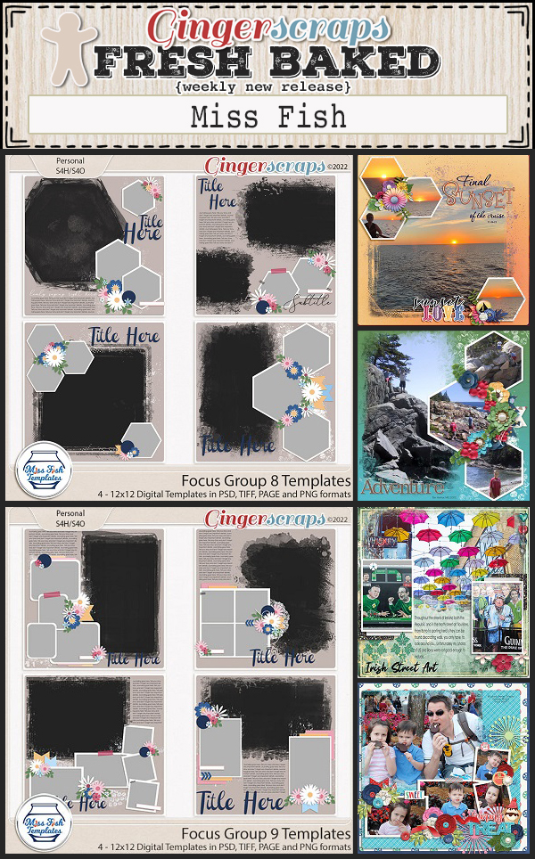
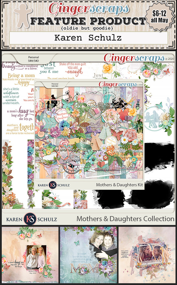
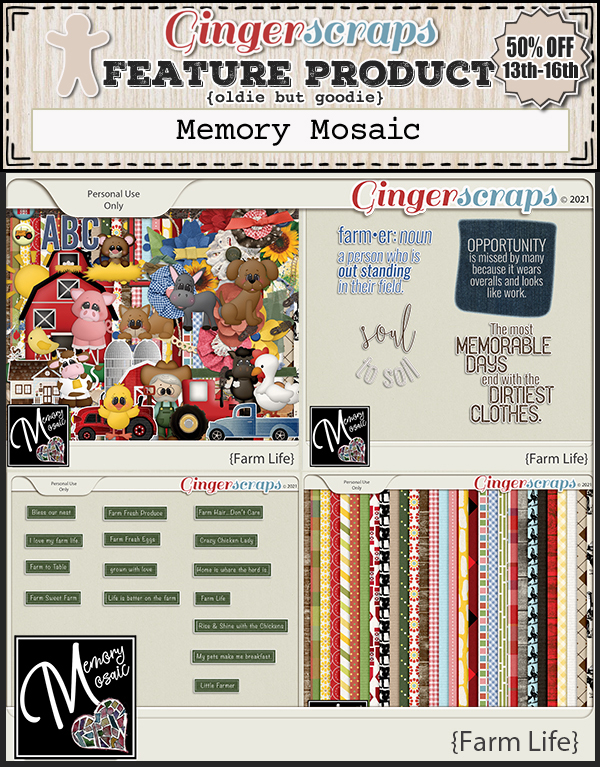
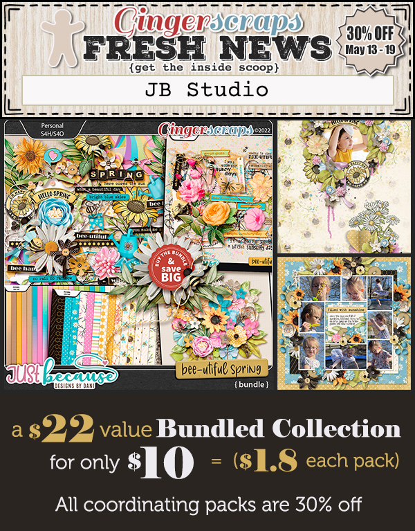
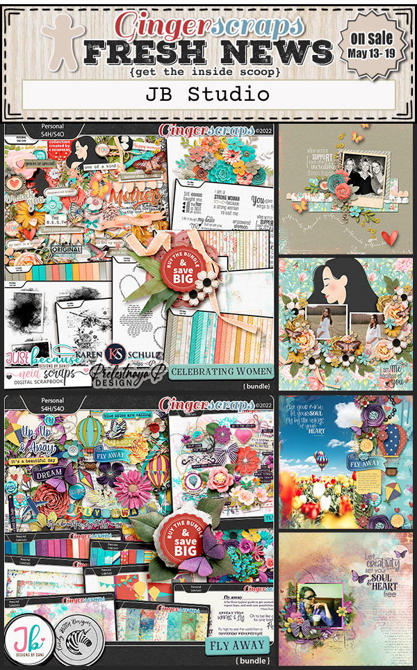
Let’s see some of the great new items in the store.
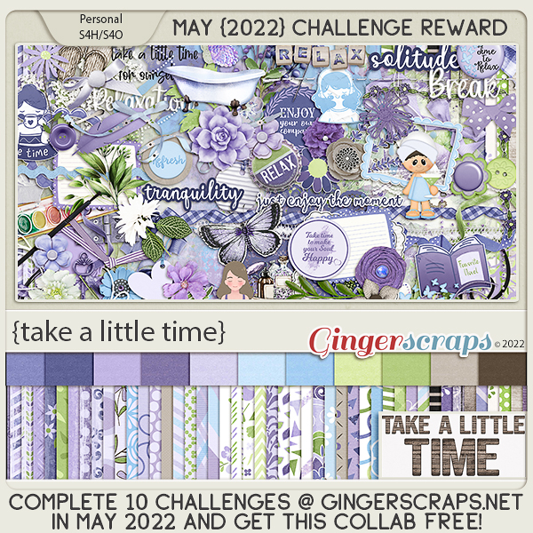
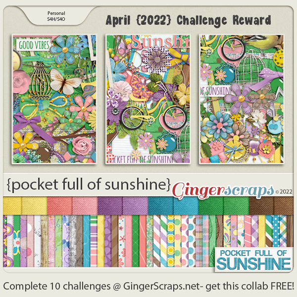
How are those challenges? Just 10 completed challenges gets you this great collab for free.