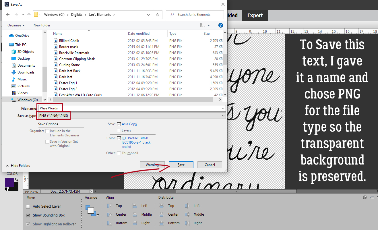
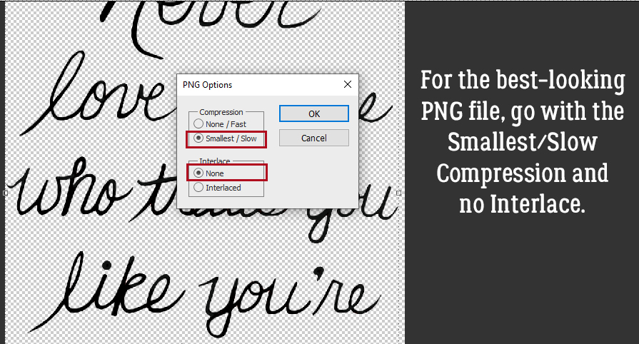
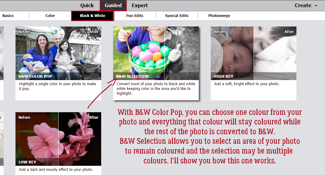
Selectively Colouring your Photos
![]()
This month’s Color Challenge is a bit different; instead of being presented with a swatch and asked to use those colours, Ivonne (Craft-tastrophic) has asked for layouts in black-and-white, with just some pops of colour. The examples she shows in the Forum are great inspiration, but what if you don’t know how to achieve “selective colour” in your photos? That was what Glee asked me. I thought I had a tutorial on the subject, but turns out I didn’t. So I set out to remedy that. I’m going to show you three different ways to accomplish it, at least one of which should work for you regardless of which version of Elements you have.
Some advice: This task is a lot easier if you have a photo with a lot of contrast between the item(s) you want to colour and the rest of the image. Let’s get started!
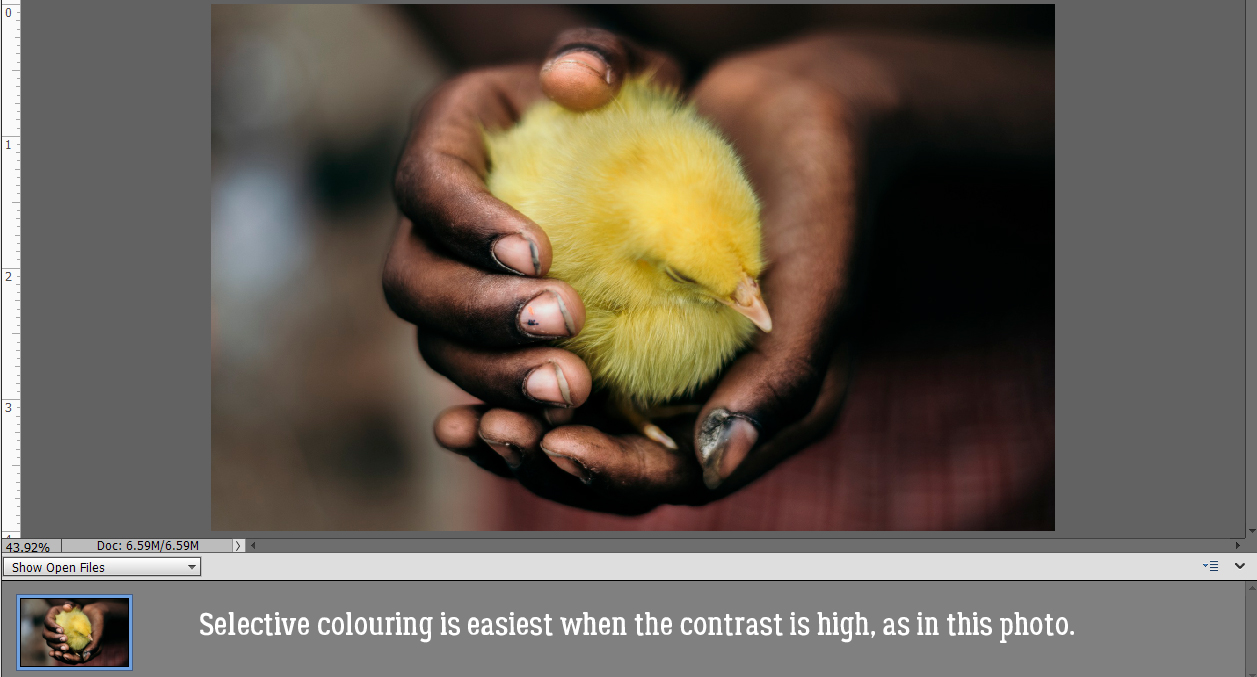
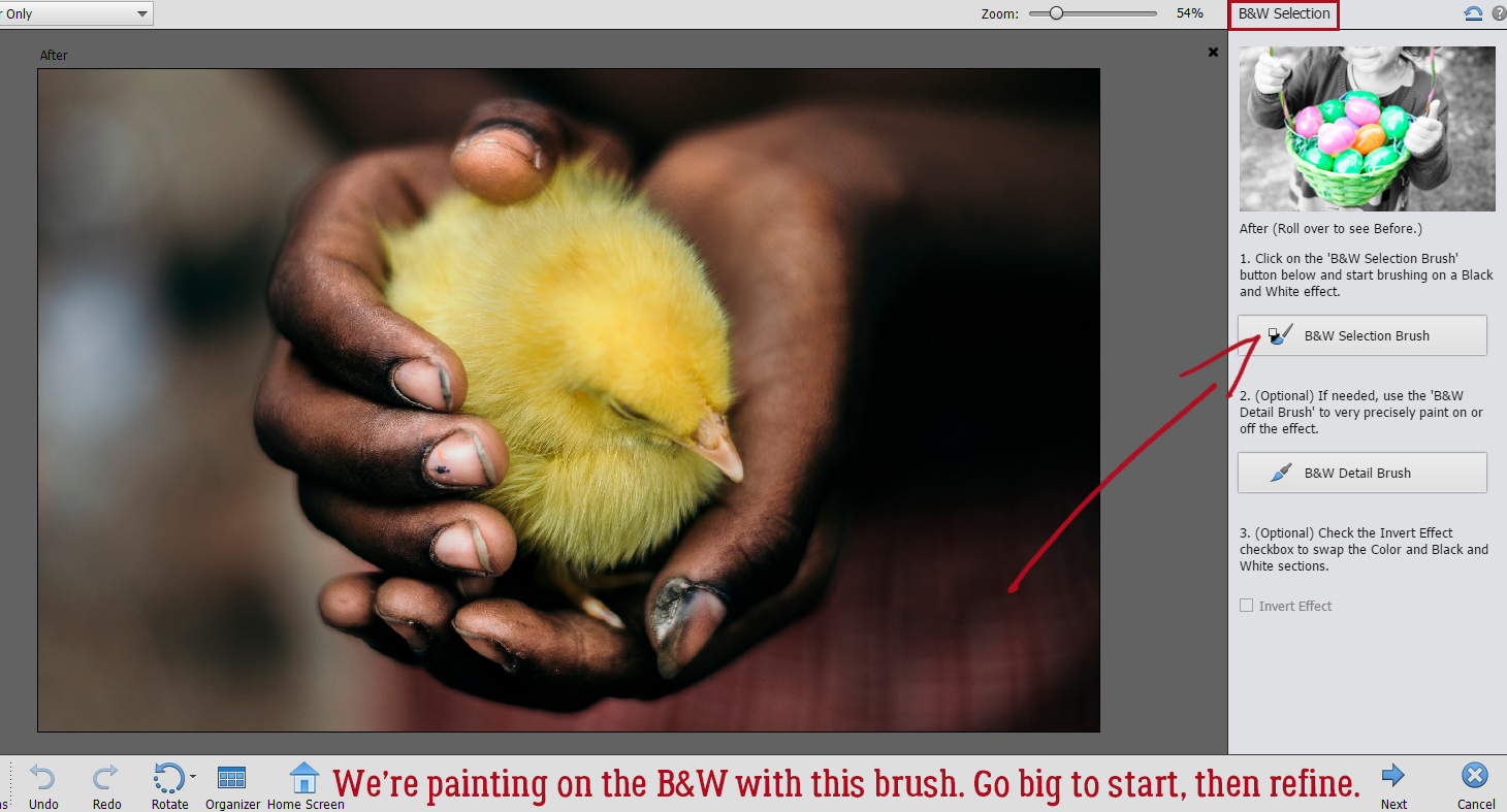
I chose this Pixabay photo for my example, a choice I came to regret just a little. More about that later. The first method I’ll show you is the Guided Edit version. I tried to find out when it was added to Elements, but didn’t succeed. I think it was likely Elements 14 or 15, but can’t confirm. I tried it first using the B&W Color Pop edit, which allows you to select a colour from the photo and it’ll automatically convert the rest of the photo to black-and-white, but it’s a lot restrictive. Super easy, but only good for a single colour. So I went on to use the B&W Selection edit.
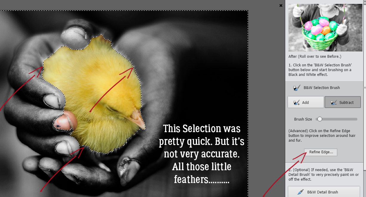
The Edit comes up with this interface, and it literally tells you what to do first. The B&W Selection brush goes on the part of the photo you don’t want to stay in colour. For this step you can use a pretty big brush to make quick work of the bulk of the background.
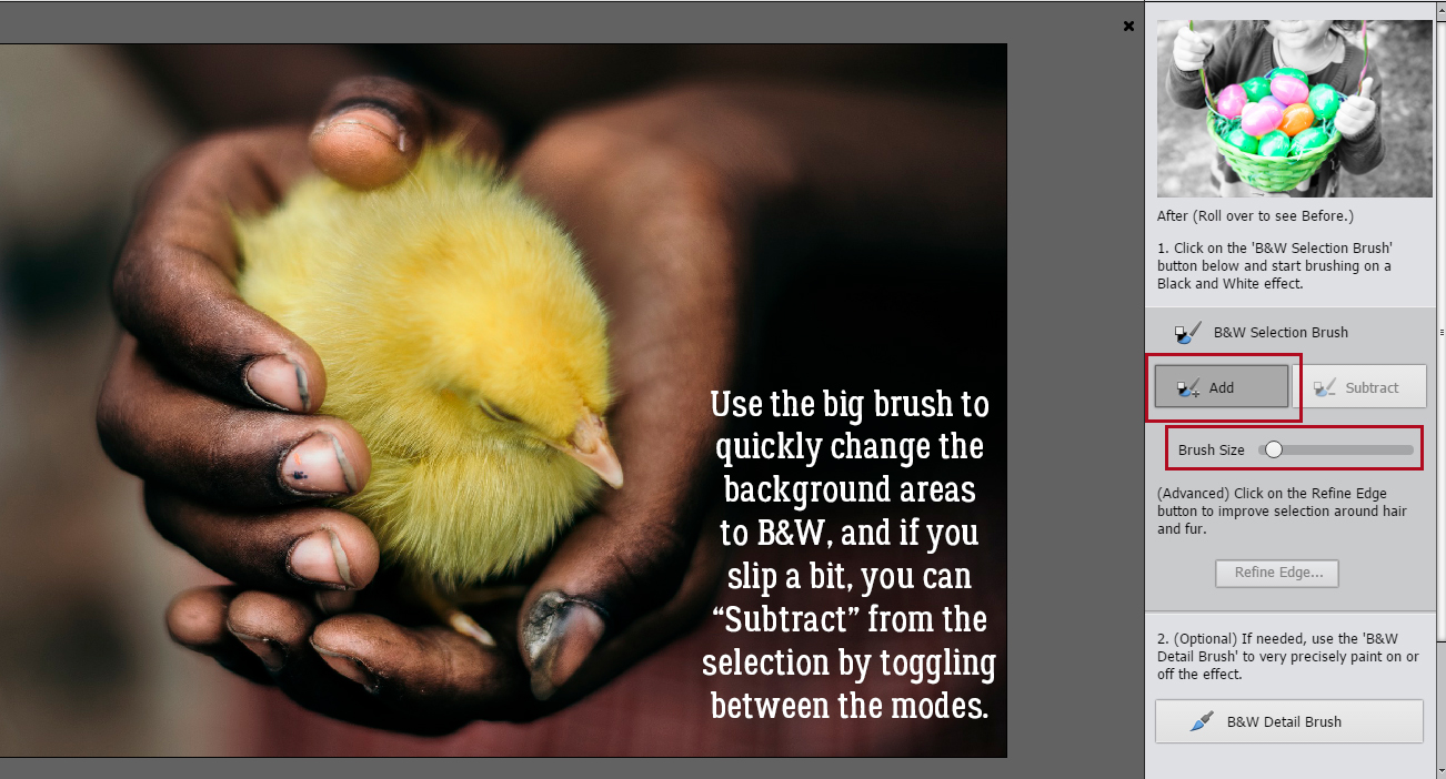
The cool part of this Edit is that if you oops and accidentally desaturate some of the part you want to stay coloured, you can toggle from Add to Subtract and just return the colour to the image.
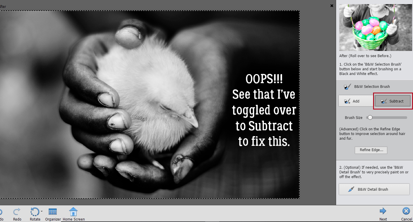
Yep, I got carried away with my big brush and messed it all up.
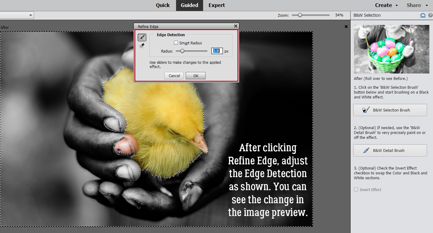
With a smaller brush I put the yellow back into the chick. But it’s not quite getting all the details… those darned little feathers! So I’m going to go on to Refine Edge.
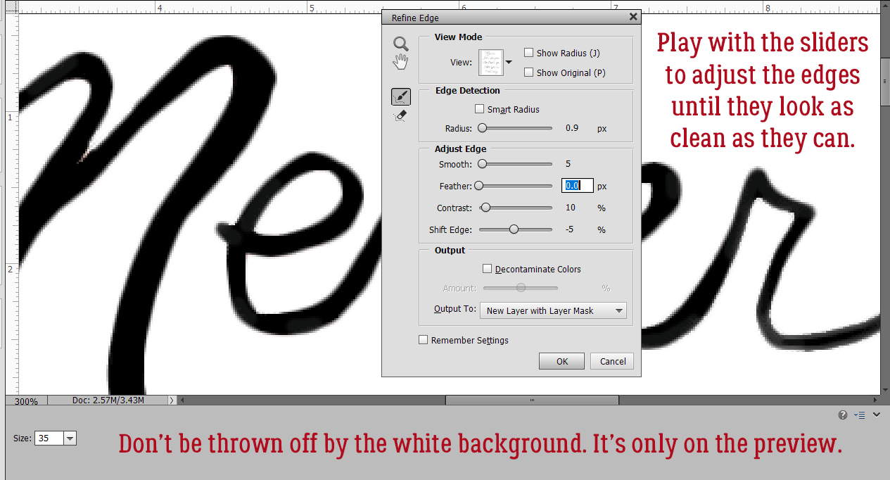
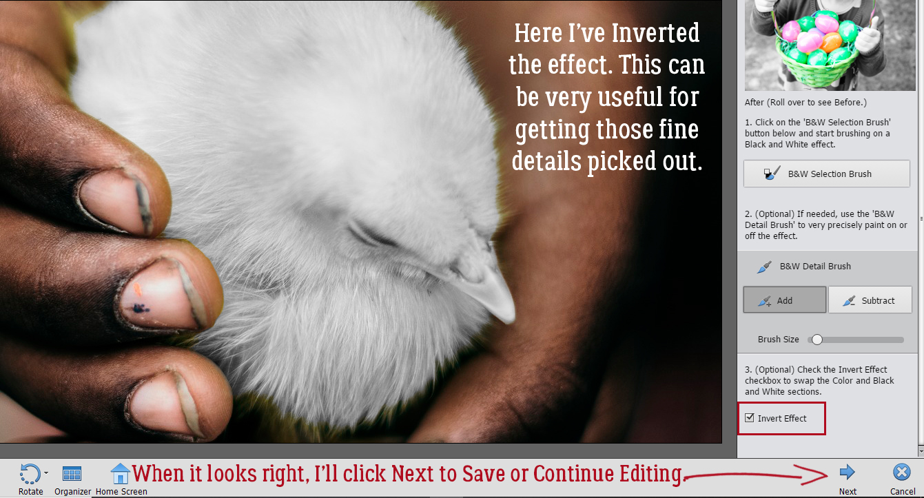
You’ll be able to see what effect the Edge Dectection slider makes on the photo. Did you notice there’s one fingertip in colour?
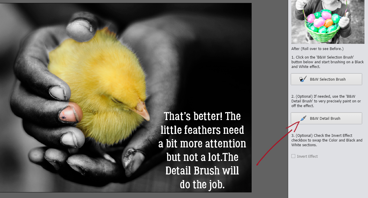
Next I’ll use the B&W Detail Brush to fix up the beak and feathers.
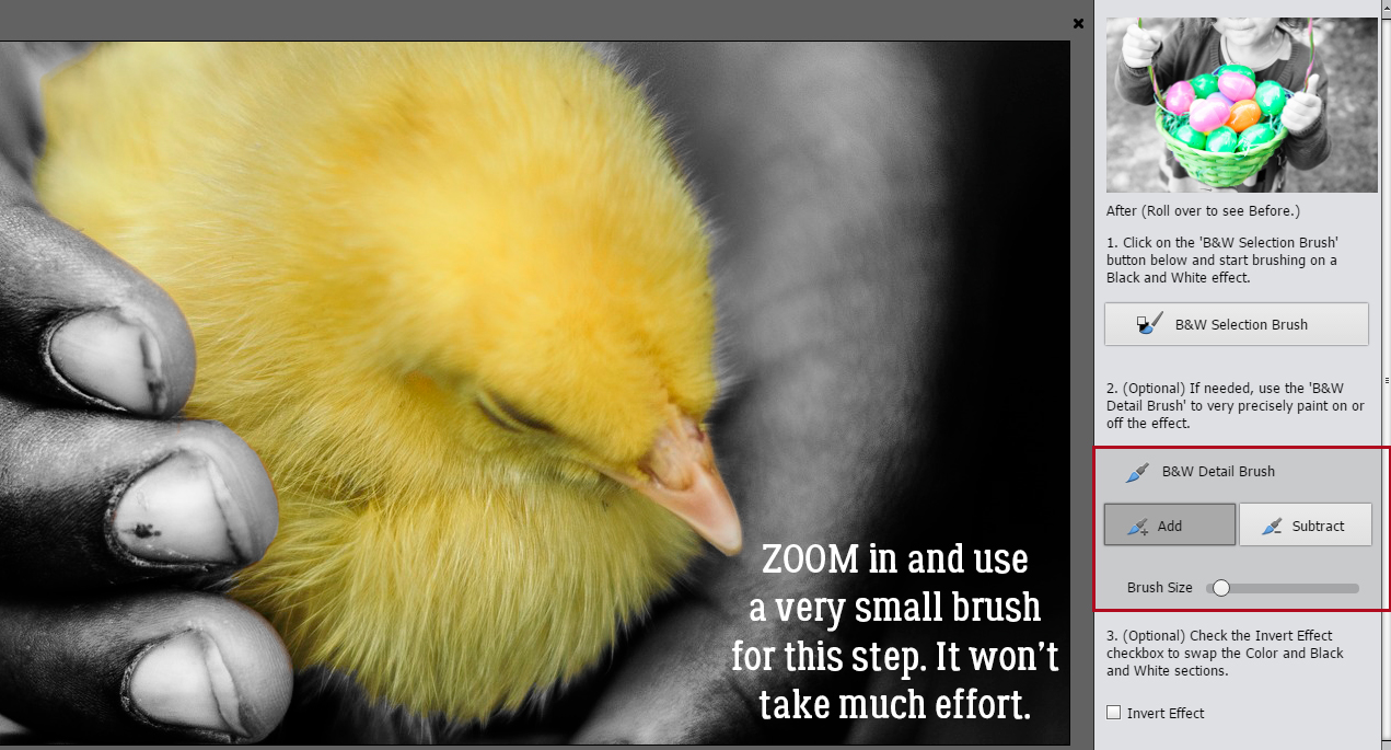
I ZOOMed in a LOT so I could be more precise, and used a small brush.
If you want to check your results, you can Invert the effect and it’ll show you where you’re still not quite there. When all the details have been fine-tuned, revert it so your coloured area is the actually desired area, and click on the Next arrow. Then you can Save it for later, or Continue Editing.
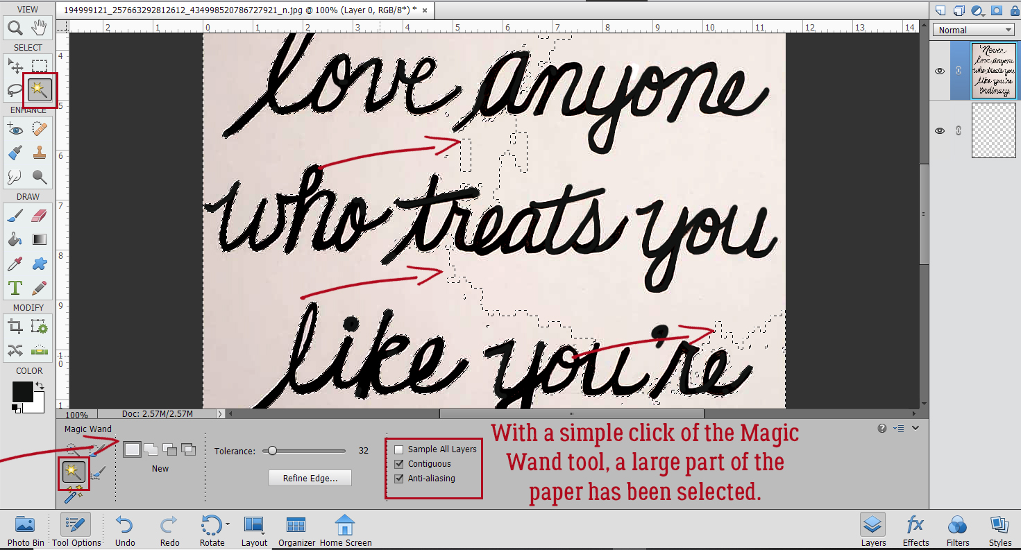
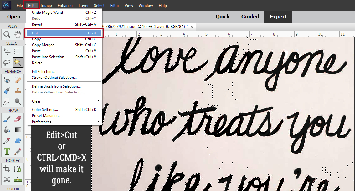
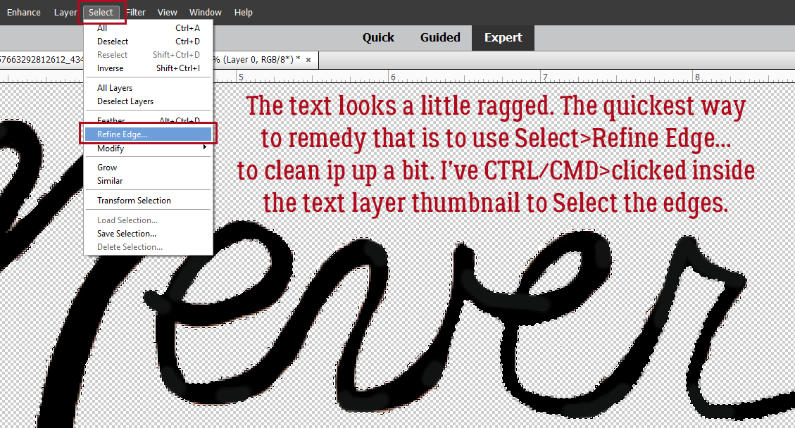
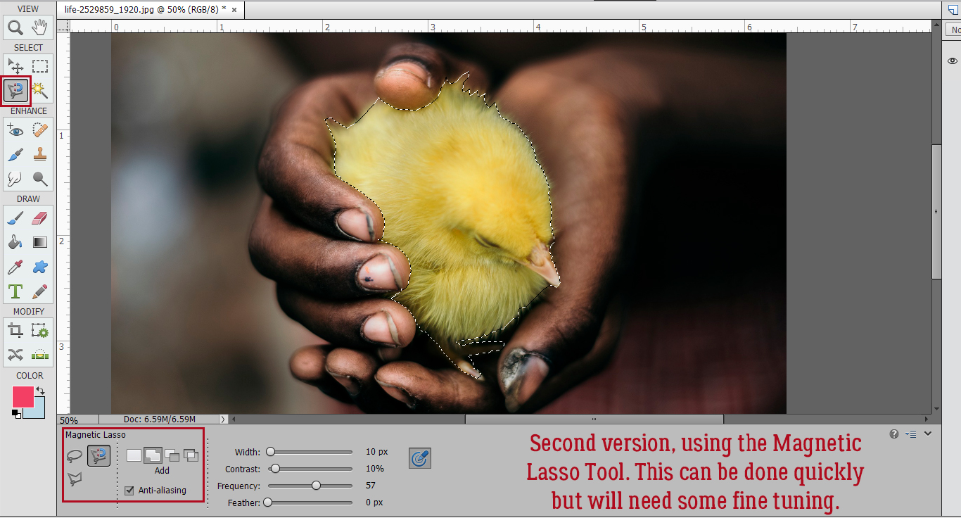
The second method I want to show you uses the Magnetic Lasso Tool, first seen in Elements 12. It’s a bit less automatic, but can give you great results. Not familiar with the Magnetic Lasso? It looks for contrast between the object you’re selecting and what’s beside it. Pick a spot to start from and click on the edge. You don’t have to hold down the mouse button, just draw a line around the edge of your object. Elements will add attachment points as you go. It won’t be perfect, but it’ll be pretty good. When you get back to your starting point, you’ll see the marching ants appear around the outline of your object. As you can see in the Tool Options box, there are many ways to tidy things up. I Added the tiny feathers into the selection area using a smaller tip.
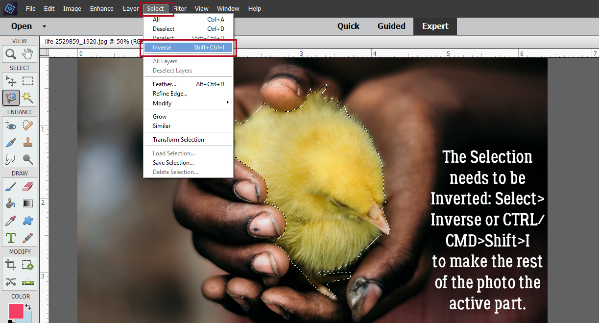
The next step is to Invert the selection. Select>Inverse or CTRL/CMD>SHIFT>I will move the edges of the selection to the background, ignoring the chick in the centre.
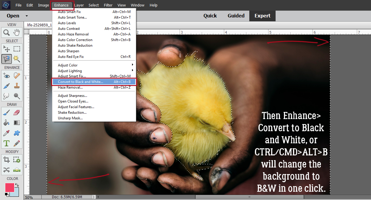
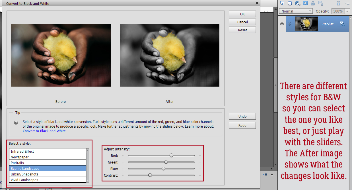
To change the background to black-and-white, click Enhance>Convert to Black and White… or CTRL/CMD>ALT>B. If you don’t have that option in your version of Elements, instead click Adjust Color>Adjust Saturation and pull the Saturation slider all the way to the left.
Did you know there were a variety of B&W styles? If you have the time, try the options. It’s fun! Each of these styles can be further adjusted with the color channel sliders. You can watch what happens to your image in the After pane.
For a quick selection this isn’t too bad! If your object has very smooth edges, this method can work really well and be as effortless as the Guided Edit.
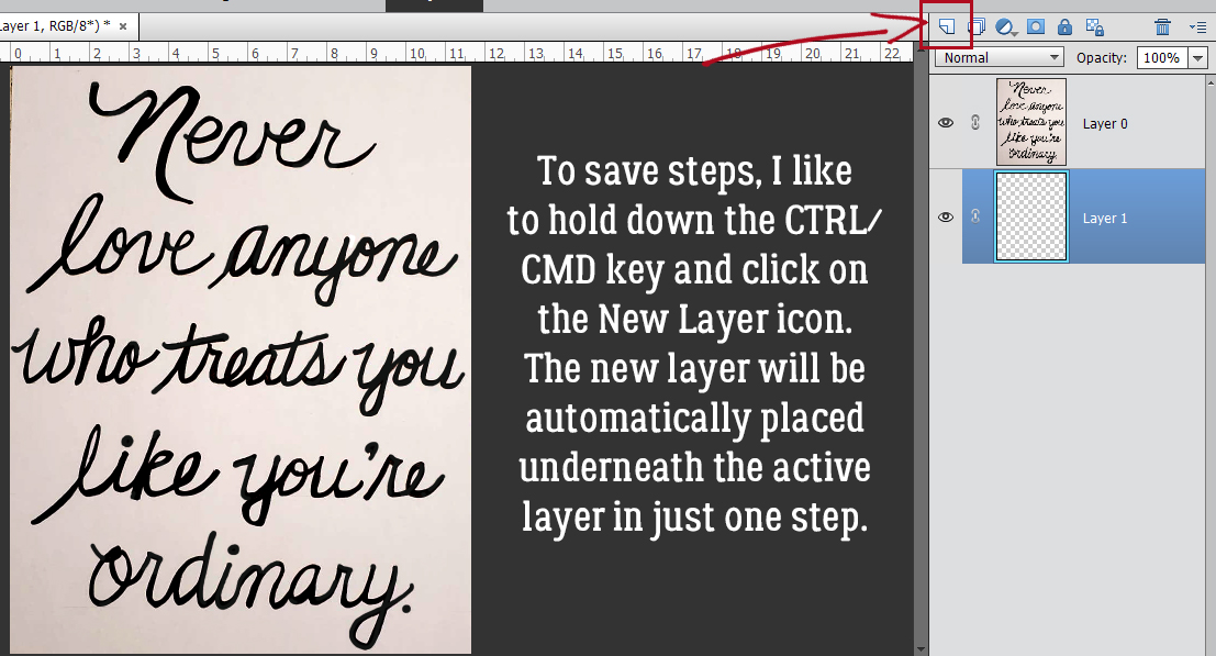
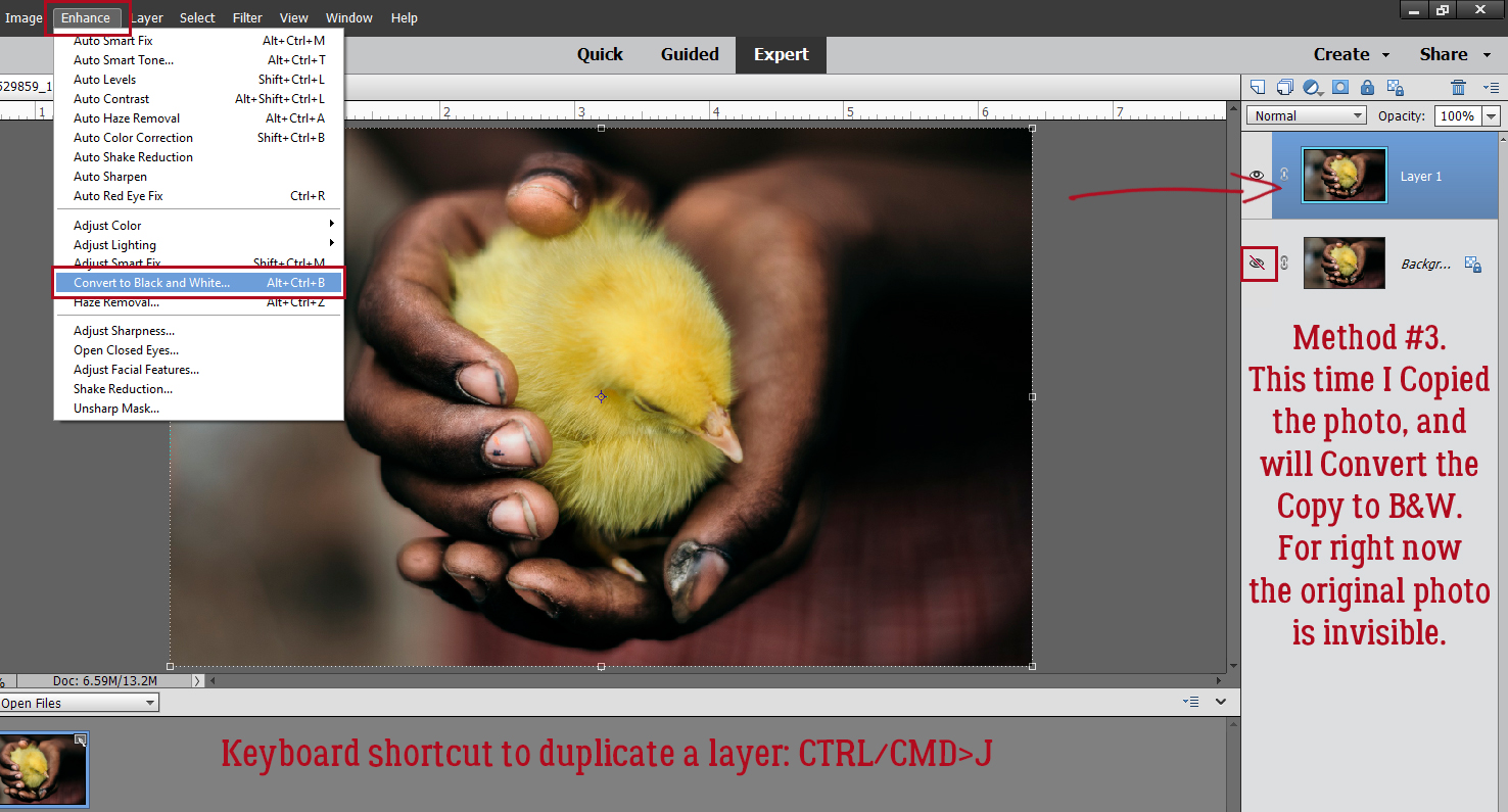
This final method is achievable with all versions of Elements. It’s the most labour-intensive, and if you’ve got a very irregular edge on your desired object, it’s the one that will give you the best results. First things first – make a Copy of your photo and do all your adjustments on the Copy. You can right-click on the photo and choose Duplicate Layer, or click Layer>New> New Layer via Copy or CTRL/CMD>J. Then convert the Copy layer to B&W as I showed you above.
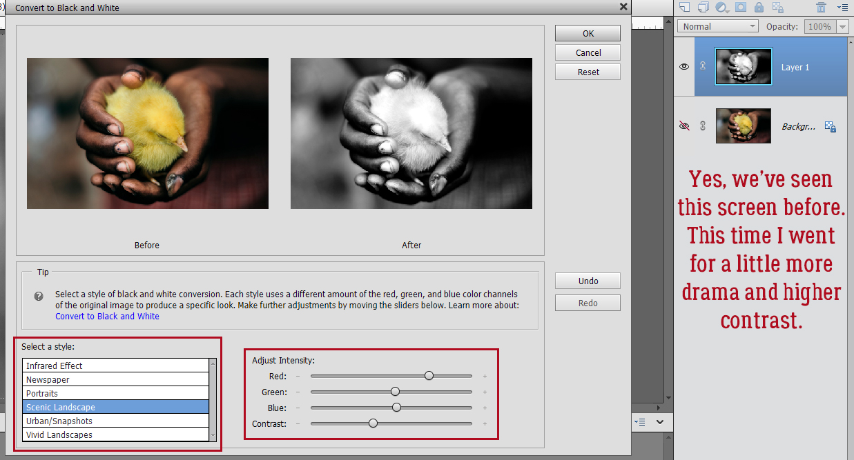
I wanted this B&W layer to have an even higher contrast to make the Selection part easier, so these are the adjustments I made.
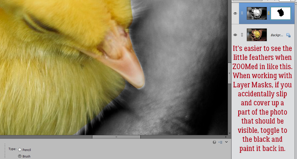
ZOOMed in you can see how much easier it is to see those little feathers. Now to add a Layer Mask.
The easiest way to add a Layer Mask is to use the Layer Mask button. (Duh.) It’s the one that looks like a circle divided into two halves, one blue and one white. When you click on it, the mask appears to the right of the photo. To be positive you’re working on the MASK and not the photo itself, look for the blue outline around the blank mask.
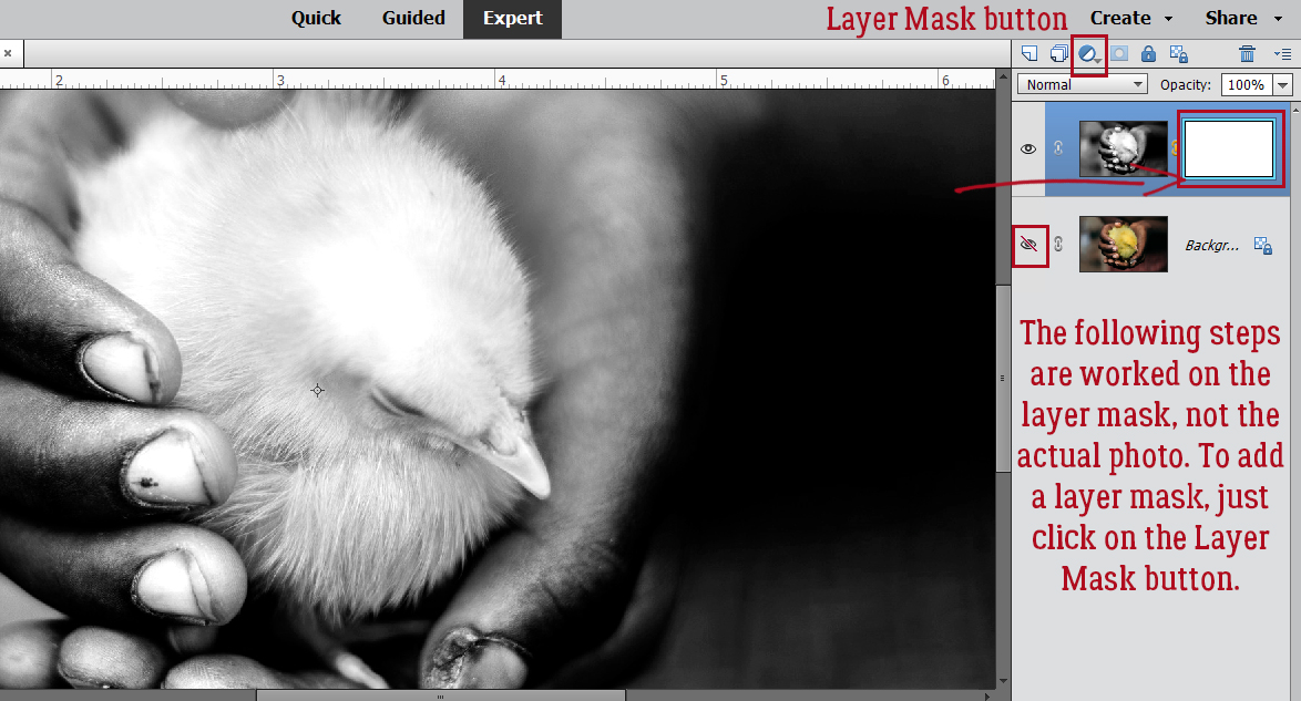
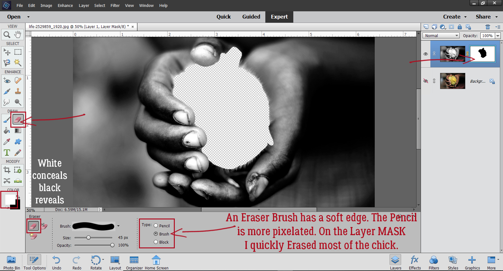
Layer Masks are considered non-destructive edits, because they don’t Erase the image, they only conceal it – even though I’m using the Eraser Tool! If the foreground colour is white, whatever I Erase will be concealed. If I make a misstep, I can toggle the foreground colour to black and un-Erase it. I like to use a Brush tip with the Eraser Tool when working on Layer Masks because the edges are softer. The Pencil tip is more pixelated. I’ve made the original photo layer invisible. See the transparent area where I’ve removed the bird? I prefer to do that for the initial scrubbing, where I can use a big tip and go as quickly as my laptop will allow.
For the detailed areas, having the original layer visible helps to see where more touching up is needed.
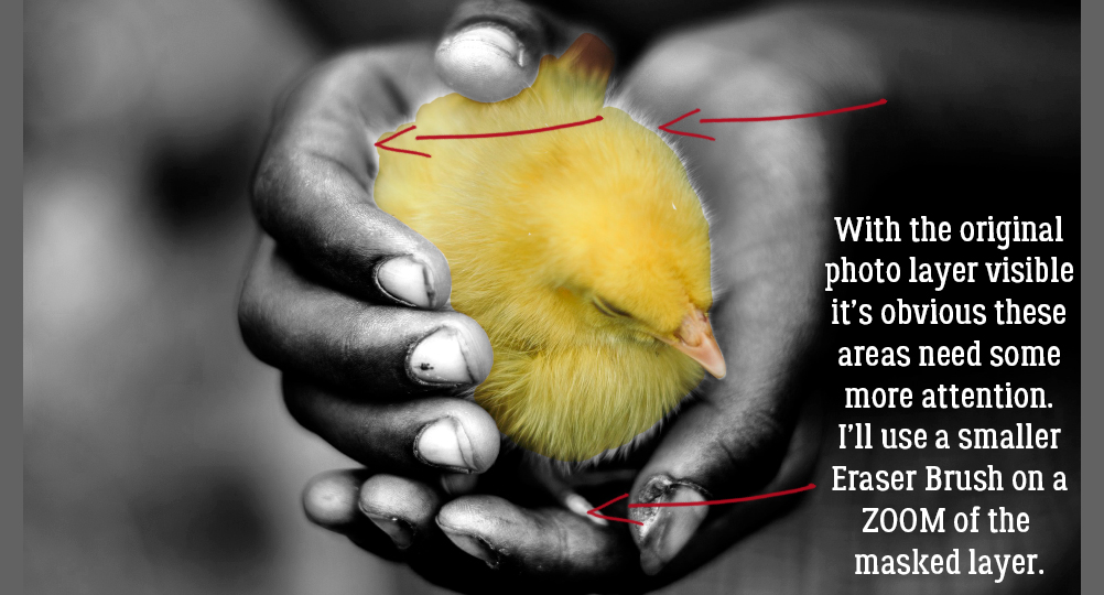
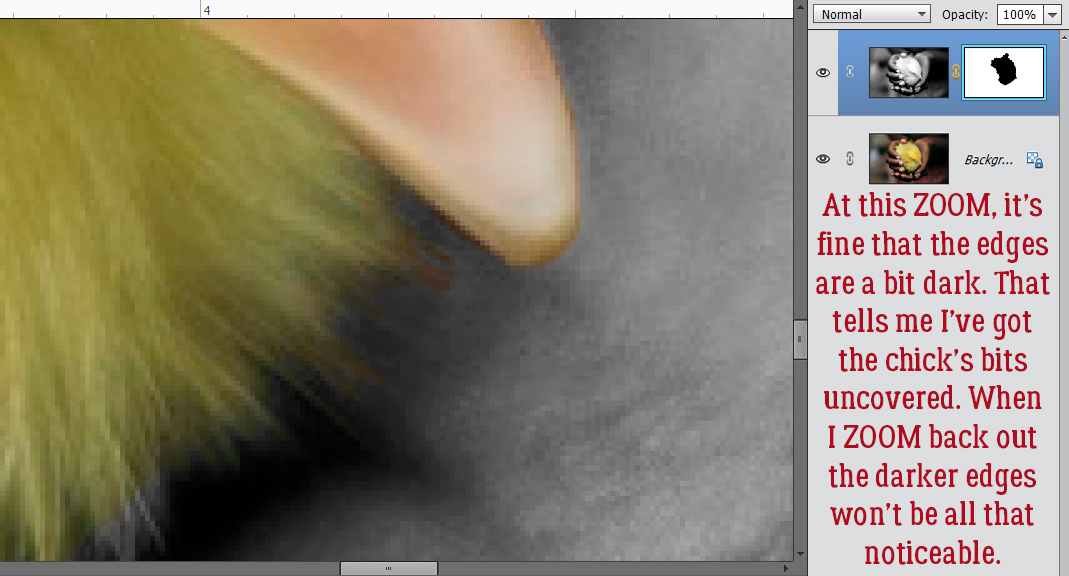
I ZOOM right in so I can see exactly what I’m doing, and bring all those darned feathers back into colour. The beak and feet need attention too.
Up this close, I can see a dark edge to the beak and some of the feathers. That tells me I’ve got the precise edge where the chick meets skin. It’s not going to be noticeable when it’s back at a more usual size.
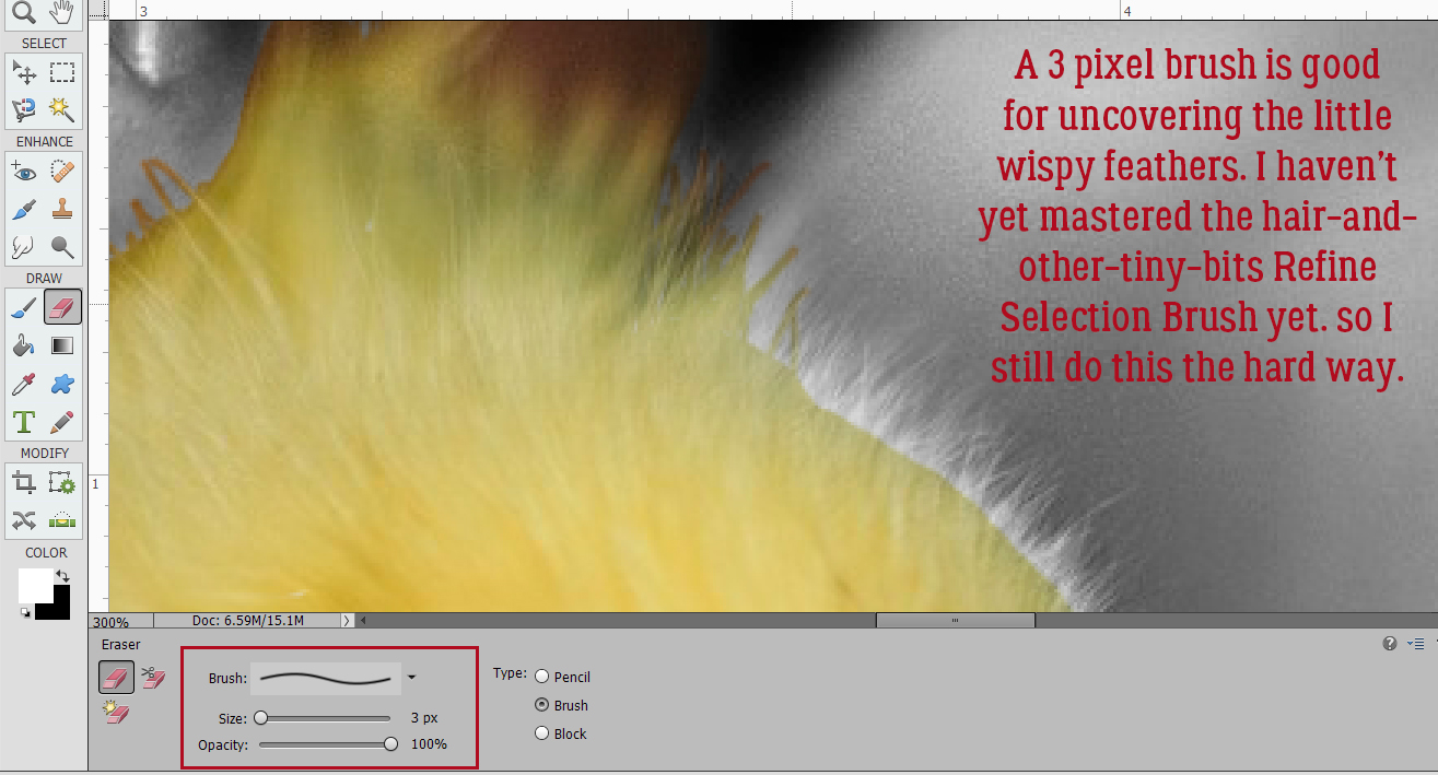
Yes, I used a 3 pixel Brush tip on some of these feathers. I actually went all the way down to 1 pixel, because that’s how I’m made. In later versions of Elements Adobe has introduced a Refine Selection Brush that I haven’t mastered yet, so I still do it the hard way. Later…
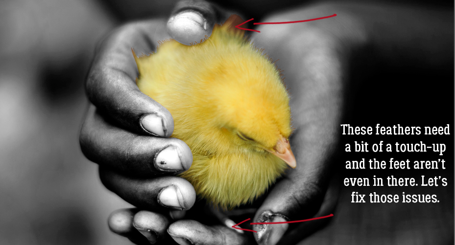
Almost there!
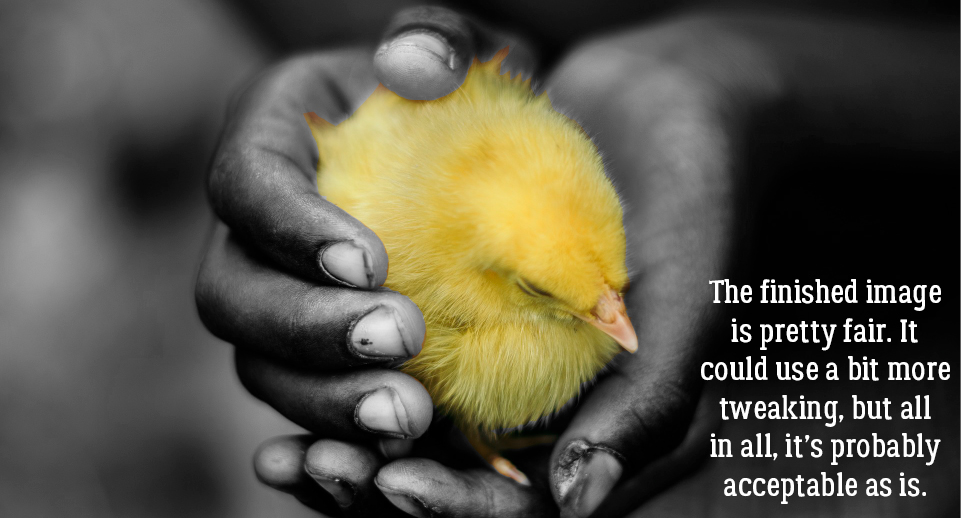
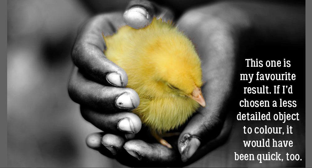
And this is the final result. I do like this method best for really detailed images, but isn’t it great to have some options?
As I mentioned in my last tutorial, my laptop is literally crumbling, but it still lets me get things done. I have a new one coming next week; I’m dreading the setting-up but have backed up all my important files so it should be okay. If you haven’t backed up YOUR important files, you might want to do it now, so it doesn’t get forgotten. Who wants to lose everything?!
PDF Link: https://bit.ly/3cM8l6E
![]()