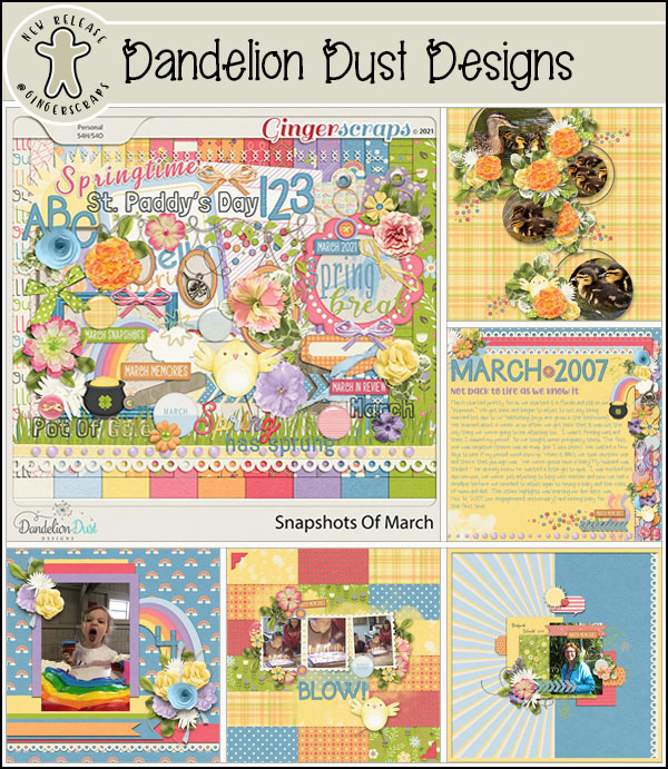
A 3D Title with Punch!
![]()
Thanks again to Ellen (gmae) we have another quick technique that has a great deal of appeal. Magical Scraps Galore has a a travel kit with some great title word art in it, called Destinations: Road Trip. The title Ellen particularly liked is the Road Trip one, but she wanted to use a different title in the same style. She messaged me that she tried to get this figured out on her own and eventually succeeded, but she knew there had to be a better way than stumbling around experimenting and undoing for hours. After all, that’s what I’m here for. 🙂 After a little thought and (not very much) experimentation, I can tell you, this does the trick and it’s not a ton of work. So let’s get started!

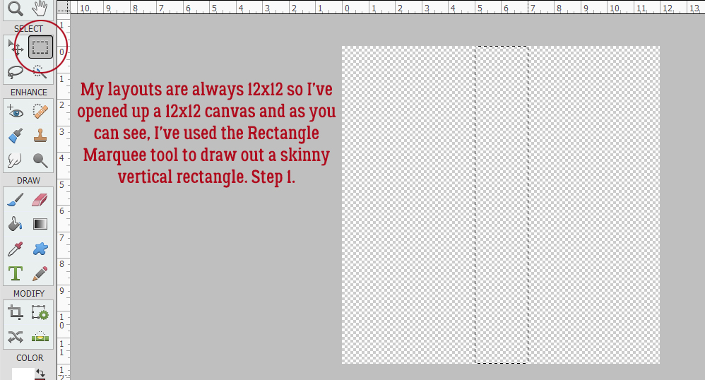
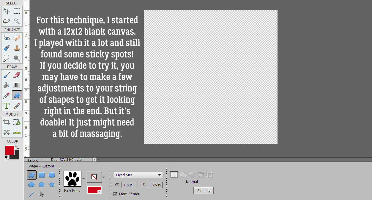
For this little demo I’m using a pretty striped yellow alpha from the GingerBread Ladies‘ Sunny Days collab. You can absolutely use a font if you choose, but each individual letter will need to be on its own layer. I opened up a 12×12 document on my workspace.

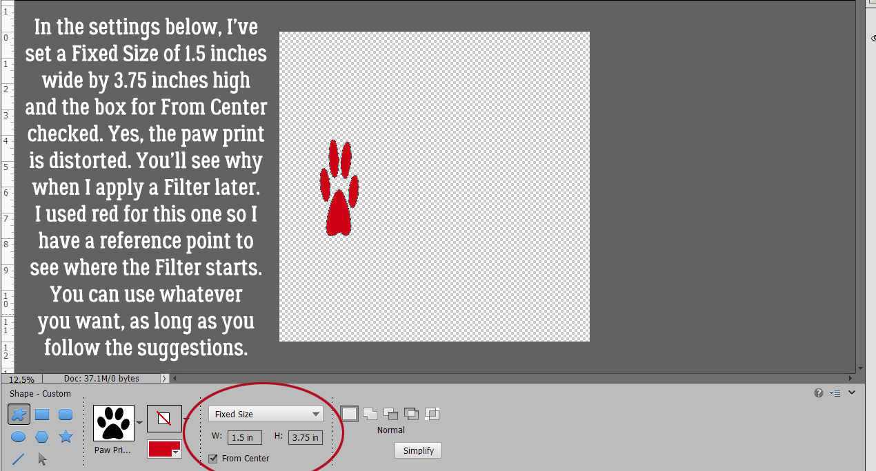
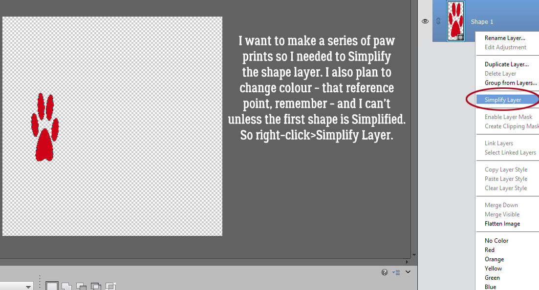
The first step is to create a elliptical shape to give the lower curve to the title. I pulled out a Custom Shape ellipse as shown. Whatever colour you have in your foreground is fine; I just had white already there. The ellipse should be slim and long, a sort of cigar-shape.

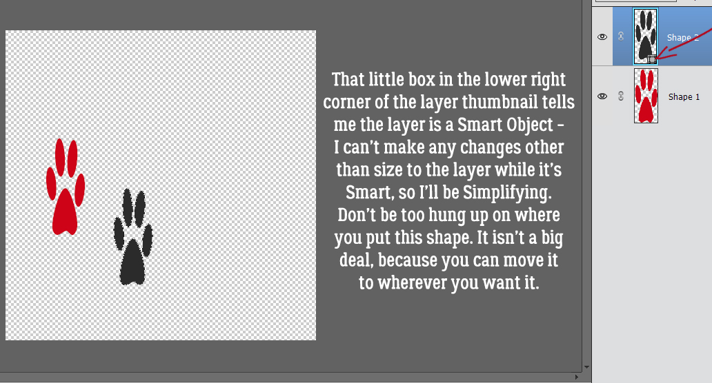
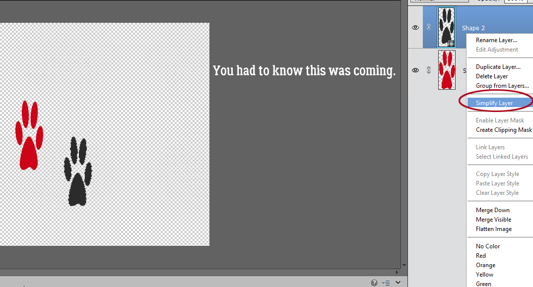
Remember, Custom Shapes are Smart Objects, meaning the pixels in it are locked and there’s not much you can do with them as is. I’ll be manipulating this shape so I right-clicked on the layer and hit Simplify Layer.

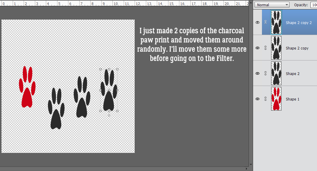
I want a Copy of the ellipse, which can be achieved in two ways: right-click on the layer and hit Duplicate Layer (then click OK on the pop-up menu), or simply by CTRL/CMD>J.

I enlarged the second ellipse quite a lot. My title only has 6 letters, but it’s still going to need some room.

I opened up a new blank layer on top of the larger ellipse by clicking on the sheet-of-paper icon at the top left of the layers panel, then I CTRL/CMD>clicked on the ellipse’s layer thumbnail (that little picture at the left side of the layer in the layers panel) to Select the edge of the ellipse. Boom Marching ants.

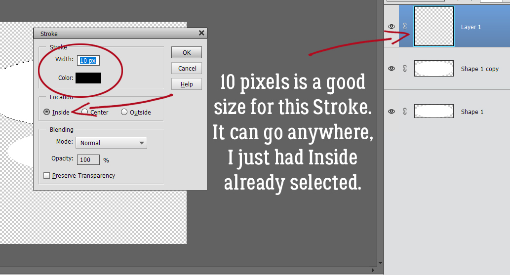
With the BLANK layer active and a contrasting colour in the foreground, I hit Edit>Stroke (Outline) Selection.
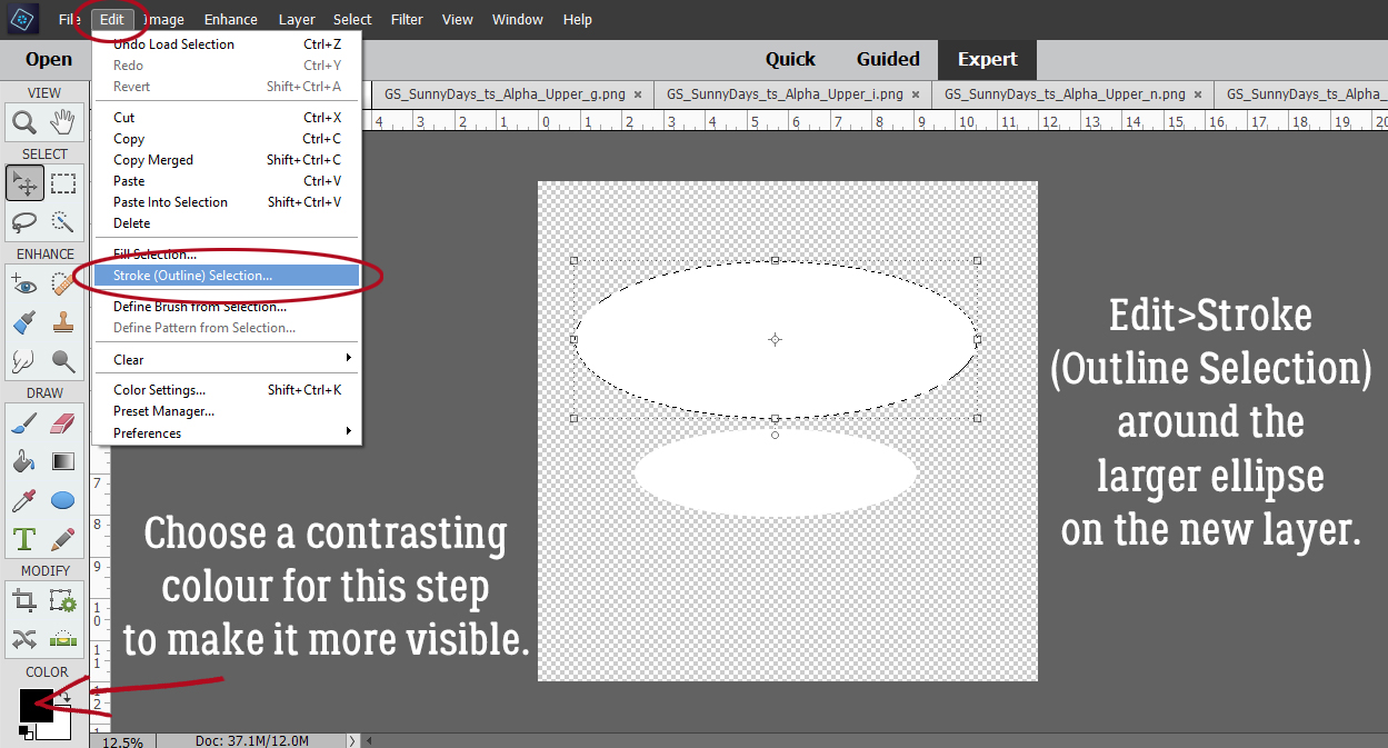
This Stroke can go wherever. I just had Inside already selected and it’s not important for this step. I want the Stroke to be easily seen so I have black and 10 pixels set.
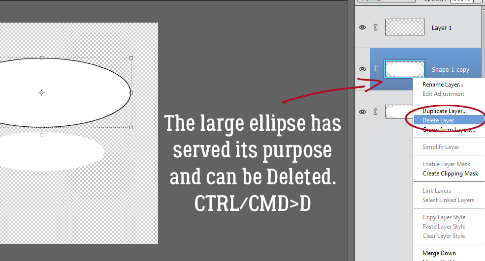
Now that I have a visible outline of the large ellipse on its own layer, the larger ellipse has served its purpose and can be Deleted. Right-click>Delete Layer or simply CTRL/CMD>D.
These two layers will be the guide for positioning my letters. They will sit on the edge of the smaller ellipse and stretch to touch the edge of the larger ellipse. To get that flare at the end of the title, the smaller solid ellipse needs a tilt.

After I looked at the gap for a minute or so, I decided the flare needed some more adjustment so I tilted the larger ellipse a bit in the opposite direction.

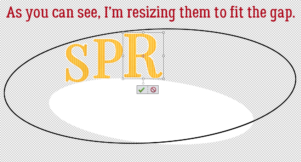
I have my guides in place, so now I can add my letters. For this step I’m just going to put them all on the canvas and position them so the bottoms are touching the solid, smaller ellipse.

As I’m placing them into the gap, I’m Resizing so the top is touching the edge of the larger ellipse.
Once all the letters were inside the gap, I took a long look at them. I could just stop here and have an interesting and eye-catching title.

If you’re still with me, I’m now going to Image>Transform>Distort each letter so that they more closely follow the contours of my guides.

All I’ve done is Move the corners of the Bounding Box so that they’re touching the edges of each ellipse. You can see that the sides of the Bounding Box have remained perpendicular to the bottom of the page.

To review: Image>Transform>Distort…

then move the corners of the Bounding Box so they touch the edges of the ellipses. Don’t change the orientation of the letter.

Here you can see what I mean about the length of your title related to the size of your ellipses. After all the letters have been placed, the ellipse layers can be deleted.

Now onward to getting that 3D look! Add a blank layer UNDER the first letter. You can start with it on top by clicking on the sheet-of-paper, and then move it down. Or you can hold down the CTRL/CMD key and click on the sheet-of-paper and it’s just go there by itself. With the BLANK layer active, CTRL/CMD>click on the first letter’s layer thumbnail to Select the edge.

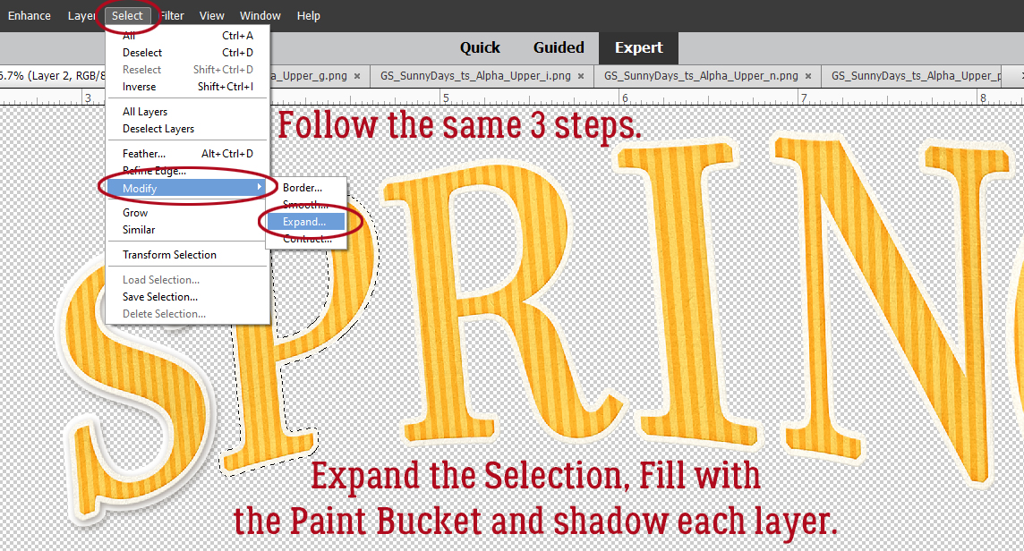
Next I’m going to enlarge the selected area: Select>Modify>Expand… and my BLANK layer is still the active layer.

The pop-up menu is asking how much to Expand my Selection. 10 pixels is about right.

And there it is. See how the marching ants have moved away from the letter’s edge? Verifying… on the BLANK layer, now I’ll Fill that selected area using pure white and the Paint Bucket tool.

The real 3D look comes from adding shadows to each layer. I used some shadow styles from Karen Schulz. You can find them here.

Let’s review again. Open a new blank layer under the next letter. CTRL/CMD>click on the layer thumbnail for the next letter to Select the edge. Select>Modify>Expand the Selection by 10 pixels. Fill the new Selection with white on the BLANK layer.
This 10 pixel setting will be saved until you change it, or exit from the software, although that doesn’t always reset it to the default. You can keep the Paint Bucket tool active as you work through the letters, which really saves time.

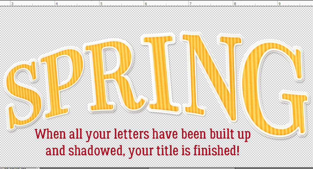
When all the letters have been shadowed, my title is essentially done.
I’ll make sure when I move the letters that I’ve got both layers active, otherwise I’ll be messing it up. The nice part about using a shadow Style is that any changes I make to the layers now will be followed by the Style. That’s to say, the lighting angle, size and opacity will stay the same. (Did you notice I missed a couple of my layers when I was Shadowing? I went back and Copied the Style onto those layers.)

If there are overlapping letters, I’ll shift them a bit so there’s a space between each. There was an overlap at the R and the I, so I’ve “kerned” them.

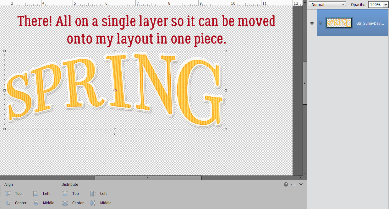
When I was happy with the way my title looked, I Activated all the layers so I could Merge them into a single layer to make using the title easier. Merging can be done either by right-clicking on one of the Active layers and hitting Merge Layers, or by CTRL/CMD>E.

And it’s done.
Is that what you were looking for, Ellen?
Here is the PDF version of this tutorial : https://bit.ly/3sVF93i