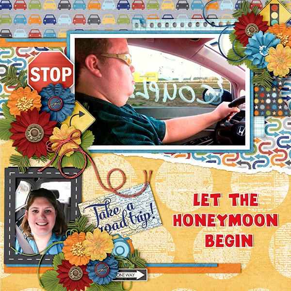
Cindy Ritter Designs

Are you all recovered from yesterday’s bisesquicentennial celebrations? (That’s 250, if you’re furrowing your brow.) We did our part and had hotdogs for dinner last night. 😉 If you’re wondering, we had homemade poutine for Canada Day. 😀
Cindy and I had a little visit recently; it was lovely chatting with her again. We did squeeze in some business talk at the beginning and then got on to the fun stuff.
J: Cindy, tell me about how you chose your designer name and logo.
C: The name is simple enough, but if you look closely you’ll find a zebra hidden in my logo. The zebra is the mascot for people with rare medical conditions. I have 3.
J: Ah yes, the old “when you hear hoofbeats, think horses and not zebras”, or “common things are common”. I’m sure there are a bunch of our readers who have walked the same path, having their symptoms downplayed and their concerns ignored before finally having a diagnosis. I see you. I feel you. <screech> Back to business. Do you have a favourite colour or palette that you like to use for your designs?
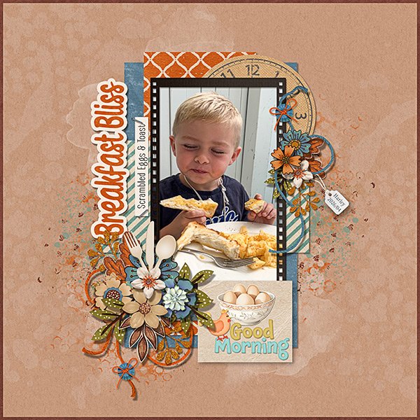
C: I love the colors of summer! Warm, sunny, happy colors. Green, yellow and orange are my favorite colors.
J: There was a lot of smoke in the air last night from a wildfire some distance away, so everything took on a warm, red-orange glow. That’s what summer here usually looks like. It’s still early in fire season, and we’re holding our own for now. Now, what are the 3 design tools you never want to be without?
C: Photoshop, Acrylic paint, scanner.
J: Your use of paint sets you apart a bit from most other digital designers. It’s something I appreciate about your collections. Has your approach to designing evolved over the years?
C: I’ve fallen in love with the Art Journal style and love making really artsy, messy, unique designs filled with color and feeling.
J: I feel like getting it right with Art Journaling is a real skill. Good for you! It must be quite therapeutic too. Do you have a favourite kit or collection? One that makes you really proud?
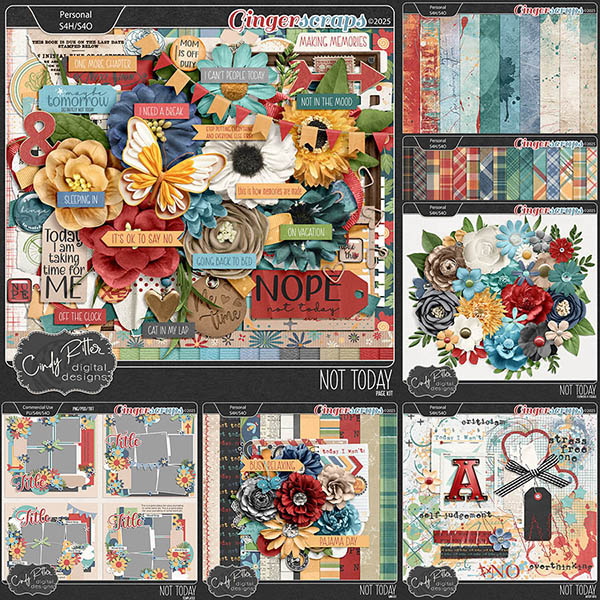
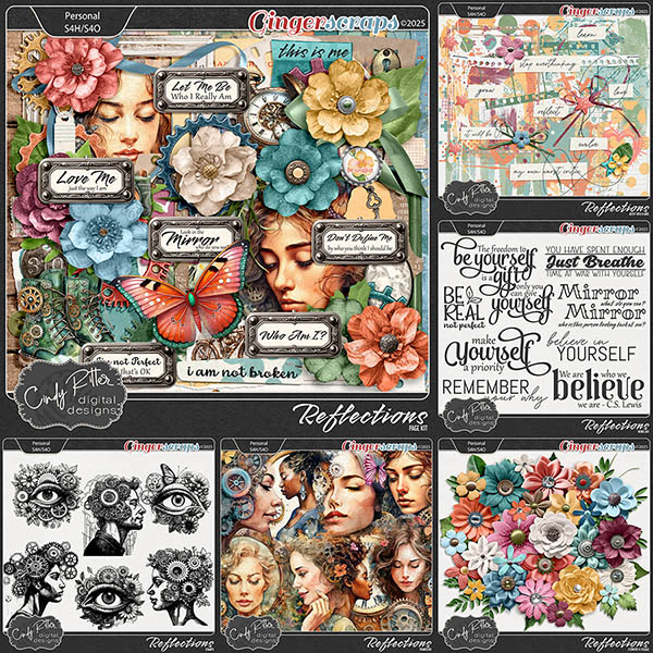
C: I’m torn between “Not Today” (hyperlink!!) and “Reflections” (hyperlink!!) -both are part of my personal journey to mental wellness. Art therapy in digital form.
J: Well, I have BOTH of those collections in my stash, so clearly I agree with you! So, they both lead to this: if you could instantly acquire a new skill, what would you want it to be?
C: How to let myself relax and be comfortable with not being productive.
J: Oh… you must be an eldest daughter. I SO relate! I sometimes wish I could just switch places with my husband, who happily amuses himself for hours without giving a thought to things that must be done. Or become one of those Real Housewives who sit around gossiping all day. It’s just not how I’m made. But hey, if you could live in a fictional universe – let’s face it, RH is a make-believe world – which would you choose?
C: That’s easy! Discworld!
J: Lemme just look that one up. <plays intermission music> Okay, I can see the attraction! Who wouldn’t want to have magical powers? The premise sounds like it was built on North American aboriginal beliefs. Fascinating! If you had the magic, and could teleport anywhere, whare would you go?
C: A remote tropical island. I need a vacation!
J: Hmm. Yeah! Maybe if you had the chance you could take up paragliding! I remember you mentioned wanting to try it. I don’t like heights, so it would be a hard pass for me. You know those silly social media quizzes like “how many of the things on the list have you done”? I can usually check off most of them. The ones I’ve never done include paragliding, ziplining, bungee jumping… there’s a definite theme. I’m not much of a daredevil, but I have done some… um… risky things in my life. And eaten some odd things. What’s the weirdest food combo you’ve ever partaken of?
C: Green olives & Jelly Belly jellybeans. I was pregnant. 😀
J: I just had a handful of Jelly Bellies before we sat down. Without the olives. Were you peeking? Thanks for the chat, Cindy! I’m just going to wrap things up and check on my friend’s cats – I’m cat-wrangling while she polices the World Cup events in Vancouver. Have a great Spotlight month, Cindy!
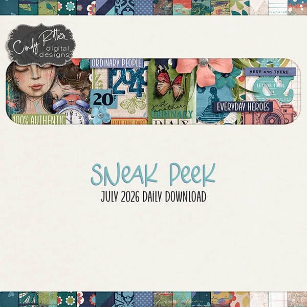
M’kay. Of course, Cindy‘s hosting the other of the July Designer Spotlight Challenges, and also of course, providing us with a Daily Download kit. I hope you’ll check out her store, since it’s on sale this month AND she has a coupon code too!
What are you waiting for? Go check it out!
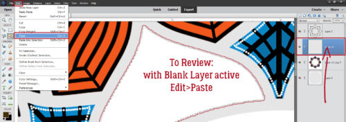
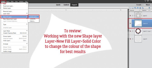
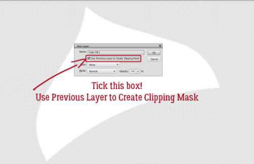
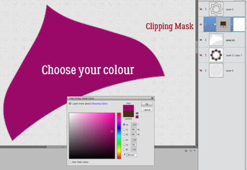
![]()