Jan’s Layout Salad Recipe
![]()
or… Taking the fear out of cohesively using parts of multiple kits to create a single layout.
Every time I post a layout with a lengthy credits list, I see several comments out how many kits I’ve used so successfully. I know most people are “kit Scrappers” using only what they find in a single kit. But boy, that’s too restrictive for me! It’s not that I CAN’T do that, I just like to mix things up. So how do I make it work? Grab a beverage and I’ll show you!
Before we get rolling, I should mention that the GingerScraps Buffet makes it really uncomplicated to mix and match kits. Each GingerBread Lady uses the same colour palette to design their contribution to the monthly Buffet, so you can easily grab papers from one Designer, elements from another and word art from a third Buffet kit and pull off a flawless layout. The following will give you a roadmap to making it work for you, whether you use some coordinating Buffet kits or pull from your whole stash.
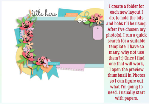
My process is usually: open a new folder > choose a theme (for Challenges, for example) > find photo(s) > template > papers > embellishments > title. I add the tools to the folder as I go along. Once I’ve chosen a template, I open the preview thumbnail and enlarge it so I can see all the parts it contains. Then I can start pulling pieces to build my layout with. I start with the papers… count then up so I know how many I’m looking for.
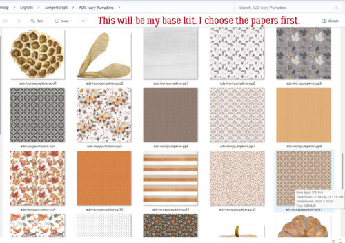
In keeping with my theme, I’ll look at a few kits that fit, looking into the folders for the major parts of the template I’m using. For this layout, I chose Alexis Designs’ Ivory Pumpkins as my base kit.
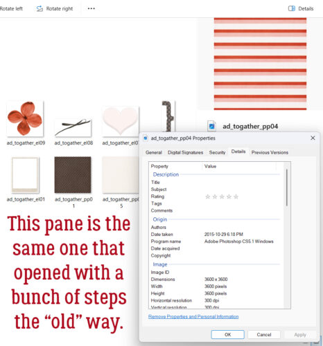
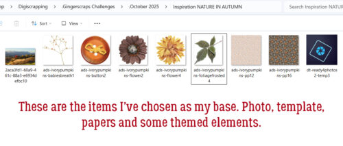
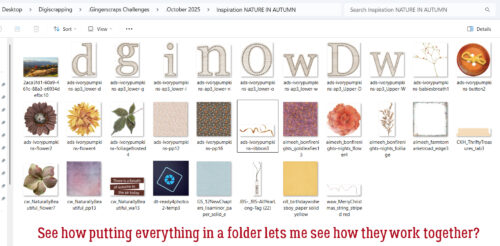
Once I’ve decided on my base kit, I’ll Copy (CTRL/CMD>C) each paper and element I’ll use, then Paste (CTRL/CMD>V) them into the layout’s folder. This practice is very helpful later, as you’ll see, for assessing how well each item works with all the other items. So far, my folder holds a photo, a template, two papers, a button, some baby’s breath, two flowers and some leaves.
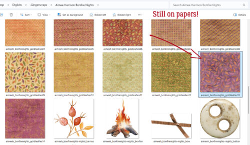
Sometimes I’ll go right to a kit I know will coordinate with my base kit and the theme of the layout. Here, I’ve opened Aimee Harrison’s Bonfire Nights and found a pretty paper I’ll use. I may find several suitable elements in the second kit, or I might just grab one thing.
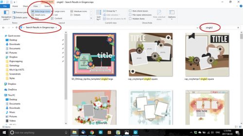
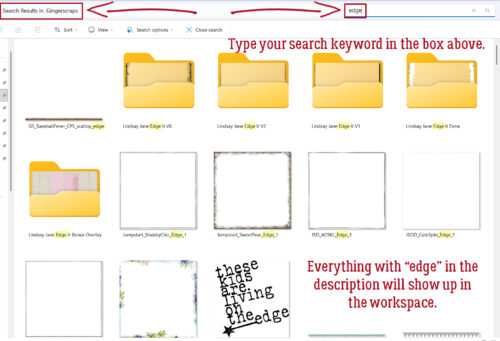
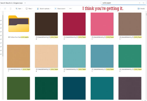
I’ve selected the papers I want to use, but I feel like the edge of the background paper needs a little something. So I turned to the Search function in File Explorer. All of my GingerScraps kits are in a single super-folder so I’ve got that open as my primary search location. In the Search field at the top right of the screen, I typed in “edge” and let my computer do the work. It usually takes under a minute. As you can see, EVERYTHING with the keyword “edge” anywhere in the metadata shows up in the workspace. 🙂 I chose one and moved on.
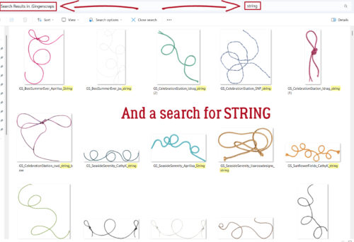
There’s a string on the template, but no string in my base kit, so I ran a search for “string“. And got a gazillion results. 😀
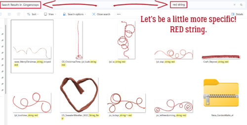
I knew I wanted a red string, so I tightened the search parameter.
But I still had a paper problem. I needed a solid to Clip to the notepad paper on the template. So I searched for “solid paper“. I think you can see pretty well how this all works, so let’s move on!
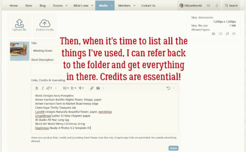
Now I’ve selected all the things I want to use to create my layout and moved a Copy of each into my folder. I can see clearly whether they’re all going to play well together. I think it’ll work!
When I’m ready to upload my layout to the Gallery, I’ve got a complete alphabetical list of everything I used already prepared for me… I just have to transcribe it to the description box!
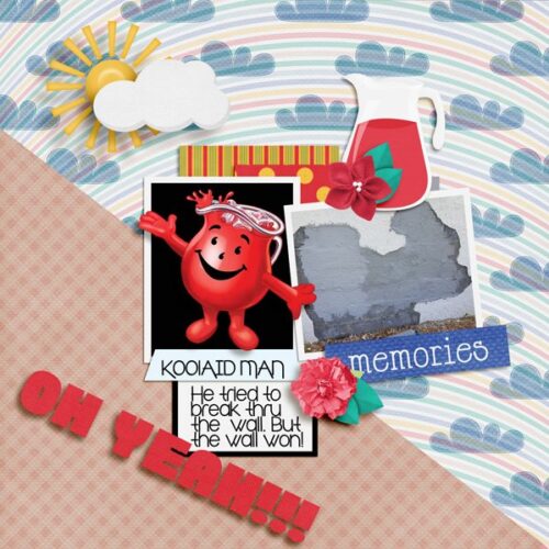
So let’s cast a critical eye at the final product. Did it hit the mark? Do the things I chose actually work with each other? You be the judge.

![]()