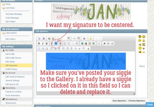
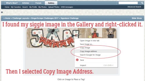
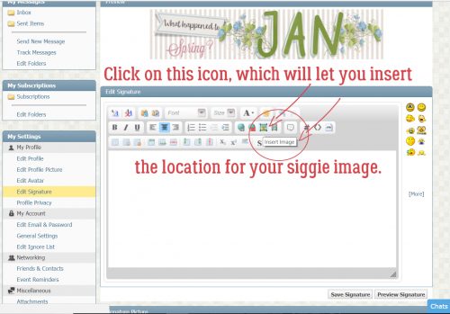
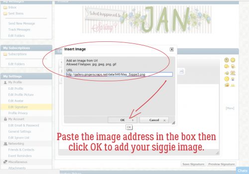
Adrienne Skelton

One of the changes made for 2025 here at GingerScraps was to have TWO Designers in the Spotlight each month – as long as two Designers signed up. 😉 This is the first month where we have two who agreed to let me tell you their secrets. 😀 Since Adrienne got to me first, she’s got the Spotlight first.
J: Thanks so much for chatting with me, Adrienne! You’re a relative newcomer to GingerScraps and we really want to know you better. How long have you been designing?
A: I started to design back in the early 2000’s . In 2010 I had to take a health break due to illness. I have been back since 2021 and loving every minute of being back!
J: Ooh, that’s a long time. I hope your health has improved and stays that way! So, way back when what led you to begin designing?
A: I used to do paper scrapbooking, but at the time I had young kids and being able to afford buying scrapbook kits was expensive, so I decided to put my art skills to use and design something digital using Paint Shop Pro and from that point on I was hooked!
J: Somehow I knew you started as a paper scrapper. I think most of us did. I also think most of us would agree that only having to buy papers or set of embellishments once and being able to reuse them a million times, with zero spilled glue, is a huge advantage. You mentioned Paint Shop Pro… are you still using it to design?
A: No, now I use Photoshop and Procreate on my iPad, sometimes I will hand craft items and scan and use them.
J: I’ve seen some of your doodles and I love them! Do you have a favourite kid — I mean KIT in your shop?
A: 😀 That is a very hard question! If I had to pick one it would be She’s a Wildflower. I just love how this kit came together. I designed all my drawings and doodles using Procreate ( I love to draw even if its digitally) and put it all together with Photoshop. I think because this kit reminds me of nature so much! Being out among the wildflowers.
J: Those are the doodles I was just talking about! I think I’d print them on watercolour paper and use them for greeting cards. I like the colour palette you chose; it really fits the theme. Dear readers, if you’d like to get a look at the collection just click on the name above – it’s hyperlinked! Do you have any other talents you’d care to tell us about?
A: I am self taught pianist although I am not very good, I still enjoy plunking on the keys every now and then.
J: I took piano lessons back in the Stone Age but we didn’t have a piano for me to practice on. Being the Type A, ADHD-adjacent person I am, that just couldn’t continue! So I let it go. How would those close to you describe your personality?
A: LOYAL , very faithful and sincere, to a fault. I can sense others emotions and am very supportive.
J: You’re an empath! That can be really hard to live with, the psychic cacophony that can’t be turned off. What sort of distraction works for you, other than designing? Do you have an special vacation spot that lets you relax?
A: My perfect vacation would be laying on the beach somewhere listening to the ocean waves, feeling the cool breeze on my face, Or that could also be somewhere / anywhere in nature where I can be at peace with my thoughts.
J: Got it. I’m not really a beach person, but I do like to be alone somewhere I find mentally restful when I’m stressed. My garden fills that pretty well. What would you do with your prize if you won the lottery?
A: First I would make sure my family was taken care of. Secondly I would buy a house where I had a lot of land, a lake and plenty of nature.
J: So, pretty much what we did… although we didn’t win the lottery, hubby received an inheritance. We don’t HAVE a lot of land, we actually don’t own the lot our house is built on, we lease it. But we have a view lot with a pond AND a lake! Lots of wildlife too, although I’m not a fan of our dog’s bestie – a coyote. She doesn’t seem to know that big puppy isn’t a puppy at all! Good thing it can’t jump our fence. The angle is just too steep. If you had a warning label, what would it say?
A: Be careful and stay away when she is angry!
J: My daughters would slap that label on me for sure. It takes a lot to get me to blow, so when I do, it’s epic! And I rarely give any sign I’m heading for a flashover; it’s my super power. Would you like to have one?
A: I’d love to be able to see the future!
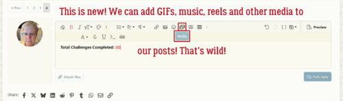
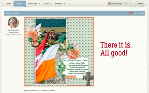
J: I think that would be awful! Imagine if we KNEW about what’s happening in the world right now this time last year, but were unable to stop it. That would be so bad. Anyway, I hope what’s in your future is a greatly successful Spotlight month. Dear readers, Adrienne is providing one of the Daily Download kits this month here on the Blog, as well as co-hosting the Designer Spotlight Challenge in the Forum. That’s on top of her regular monthly All About Me Challenge too! She has a coupon for us!
I’ll be back soon with our second Designer Spotlight, Jumpstart Designs.
![]()